seeing red

My world is pretty colourful; on a daily basis I’m in contact with colourful textures, materials and surfaces from fashion, interior and architectural contexts. Not only do I work with hard and soft surfaces in my design practice, I also teach undergraduates to work with colour in relation to textile design. It’s important to see beyond the broad definition of colour by name and to think about the context of colour; the surface qualities in that colour, the effect the material has on colour, such as gloss, matt and opaque for example.

Last week I managed to update some colour charts in my studio resources and it made me think about how we tend to have particular favourites when it comes to colour. I certainly have a comfort zone in sections of the colour charts and other areas I’d have to be persuaded to go near. Commissions often include discussions with clients about the intended colours of products, and I enjoy the challenges of pushing the boundaries of my comfort zone – within reason! I have a different palette I’m happy to wear compared with what I’d live with, and I certainly dress in colour relating to the mood. I remember many years ago dressing in very colourful clothes only to receive a rejection for something that mattered. I felt gutted I’d dressed for the wrong outcome!

Here are some REDs… I love the border colours between red and orange.
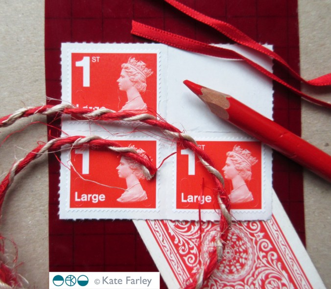
katefarley_red_100


learning with archives

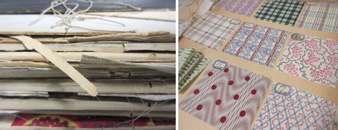
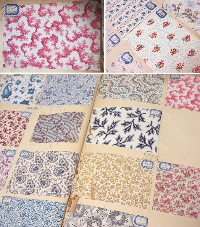
Recently I have been sharing joys from the fabulous archive of textile samples belonging to Birmingham City University’s library, some dating back from 1901. Myself and a colleague have been showing these treasures to our students, helping them to see their own learning as part of a history of design practices. In an age of the digital file it’s been fabulous to see how much interest these portfolios have generated with our students. It’s a tough call as we worry for the protection of these fragile items, and yet value being able to see and interact with them.

bcu_textiles1901_1

Being able to turn the pages, and reveal the hundreds of printed swatches is really an exciting journey and the students really engaged with the quality and preciousness of the items. The fact that all the samples are beautifully hand mounted and labelled adds to the beauty and experience. The range of design compositions is considerable, and the detail stunning. Tiny little flecks of print; an anchor, a petal of a flower, or coral texture printed on fine cloth demonstrate quality of the day. We noted the generosity of many designs, and discussed commercial appeal and production methods available before screen printing and digital printing possibilities. Of course this is pertinent at this time of financial cuts in the support to local and national libraries and associated archives, and with arts and culture being sold to the nation as a rather nice hobby we just can’t afford at the moment.

Seeing things with our own eyes helps to engage with the subject, making things real, and adding value to the experience. I spent an extremely insightful day at London College of Communication’s Learning Through Objects event #UALOBL last month discussing this subject with fellow academics, researchers and archivists. Yes it’s easier to deliver another ppt to a large group of students, but sessions with objects and physical activity are the ones that are likely to make far more impression, and make the difference to learning we are aiming for.

bcu_textiles1901_2