Pattern appreciation at the Whitworth

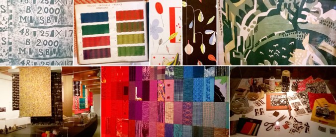
The Barbara Brown exhibition at the Whitworth in Manchester is really worth catching, especially if you like patterns.
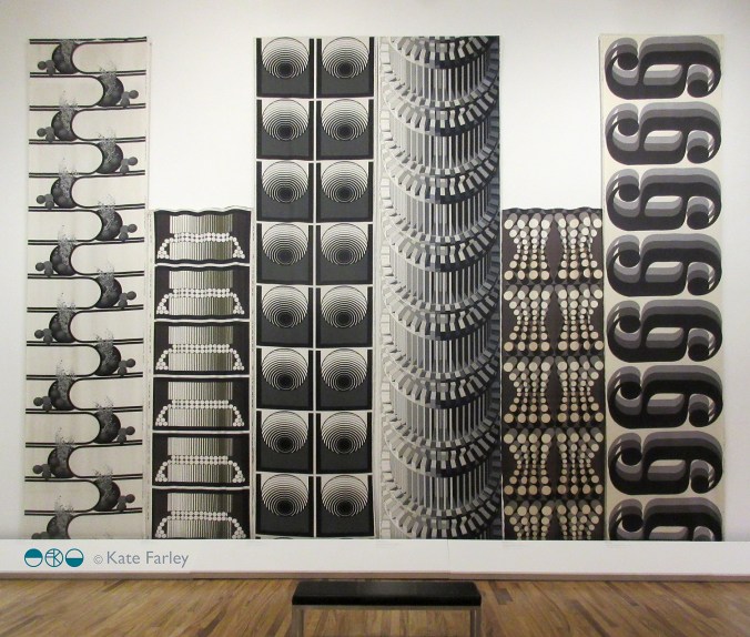
The layout of the gallery enables an overview; the broad visual statement of the textiles designed by Barbara Brown during the 1960s and 1970s, to be seen straight away and makes for a striking sight. Large-scale pattern in different colour-ways jostle for attention and yet the small gatherings of textile designs within the gallery also create more local dialogue for consideration. The repeats are large, not in the Marimekko sense but larger than we often see, taking the full width of the fabric to do the talking. Seeing the textile lengths on exhibition really shows off the bold rhythms of each pattern.

BarbaraBrown_prints

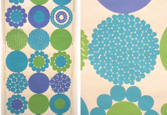
The designs on show demonstrate a variety of motif units across the fabric, some halved, some quartered, others full width. The corner of the gallery most impressive in my opinion was the monochrome series that really pushed her design prowess forward. Although strong graphic statements, these are far from flat patterns. The curves in Ikebana (below left) and Automation (below, third from right), both from 1970, differ in how they control and divide the space, toying with depth and dimensions. There is a sense of sci-fi and computer generated environments across this mono-chrome series. Escher should also get a mention as the optical illusions on the architectural scale appear to pay homage to him too.

BarbaraBrown_mono1_120

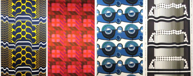
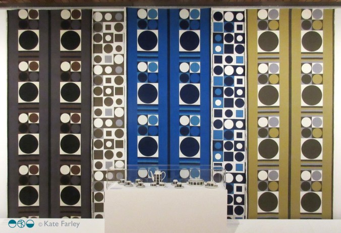
I have my favourites, but I really want to highlight the breadth of pattern compositions here. The design statements include many geometrics with cubes, columns and dots. There are stripes, spots, architectural themes and florals. I see more than a hint of Op Art, Psychedelia and modernism across the printed fabrics, some more than others, but the designs appear experts at communicating the populist aesthetic of those years.

BarbaraBrown_3

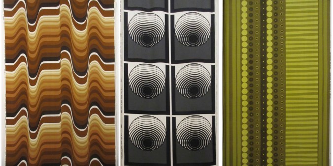
As a teaching aid for textile design, this exhibition does rather well. Design students can understand the potential to grow large repeats rather than stop at small ‘plonk – plonk’ designs we see far too much of – maybe a result of designing on computer screens. Designers need to understand that even domestic interiors can cope with so much more than a motif 10cm in diameter. Brown’s shapes are also not always contained by outlines, and this presents bold, solid shapes that hold their own. Colour statements include monochrome and full-on colour including oranges and blues. There is a sense of the colour palette dating the patterns but the combinations communicate bravery. The monochrome designs have a very formal spirit, and although different in style do remind me of some of the black and white, large classical columns Timney Fowler print designs of the 1980s.

BarbaraBrown_textiles

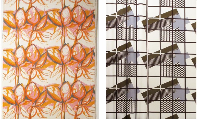
Barbara Brown was working in a very different time, and artwork was not created in Adobe Illustrator or Photoshop. Hand drawing full-scale repeats gives you a very different relationship with pattern compositions. Some designs appear not to show signs of drawing, but others do, almost standing out for doing so – particularly Sweet Briar, 1959 (above left).

The exhibition was dominated by the printed fabric lengths but a couple of later knitted pieces offered an insight in to the designer’s creative career progression, and reminded me of the direction Lucienne Day took with her silk mosaics, making a clear distinction away from the commercial print designs. The juxtaposition of some small ceramic pieces next to fabric lengths offered an interesting pause for thought too. Would you have matching china and curtains? Maybe not, but the patterns held their own at both scales and on the different surfaces.

BarbaraBrown_dots_120

This is one of those examples of why you need to see exhibitions in the flesh, and not rely on the computer or phone screen to do the job. Seeing Barbara Browns patterns are eye-catching on a small screen, but they are far more impressive in this setting.

The exhibition is on show until January 2018 (and they always have several interesting things on at the same time – and I can recommend the cafe!) NOW EXTENDED UNTIL MARCH 2018

http://www.whitworth.manchester.ac.uk/whats-on/exhibitions/currentexhibitions/barbarabrown/

pebble pattern collection

I know I’m not alone in having collections of stones, gathered from walks and adventures over the years. Heads down across the beach, we search for beauty in the lines, colours and patterns of pebbles. We look for skimmers, ones with holes, and stripy ones…

I was looking at some of the stones that are in my studio and realised I had the components of a traditional textile design collection. The key pattern structures often include an all-over design, a spot repeat, a stripe and a plain (from left to right in the image below). I had fun sorting the stones to find the most straightforward ‘collection’.

stonecollection

pattern prints

I’ve been working behind the scenes, offline at least, making new prints, mainly lino prints, and developing repeat patterns with them. I’ve not wanted to show the progress until I’ve worked out where I’m going with them, but finally I’ve decided to go public, in a small way, revealing one of the new prints, hinting at the direction my new patterns are going in…

KateFarley_weave2

I’m exhibiting at TentLondon again in September so between now and then I’ll show more on instagram, Twitter, Facebook and here on my blog.

seeing things

I’ve been giving a lot of thought to the idea of looking and seeing, and particularly how we evidence what we have seen. I have boxes of photographic prints of things I’ve seen: cracks in pavements, postboxes around the country, vapour trails in the sky, flowers I’ve grown and plants I wish I’d grown – and much more. When the world turned digital I stopped filling real boxes and filled virtual boxes, and some I look back at, but rarely do I touch the surface of the sights I have collected.

The engagement in social media, and the sharing of pictures begs me to think again about why we take pictures, and why we share them. As I spend most of my time in some sort of real or virtual context of people in the creative industries my Twitter and Instagram feeds are heavily laden with considerately photographed shadows of railings, colour combinations of socks on patterned tiles, recently obtained vintage finds, and dare I say it, beautiful breakfasts! Not only are we collecting imagery, we are proving that we are seeing and experiencing interesting / beautiful / different things and places, judged by us and hopefully ‘liked’ by others. Yes it’s marketing; a branding tool to evidence our aesthetic judgements.

KateFarley_seeing things_detail

Some questions then, are we seeing more? Do we notice more, and appreciate more?

It does seem as if there have always been people who see faces in clouds, and beauty in peeling paint, but I wonder if social media is driving us to become a load of aesthetes. In my world it may seem that way.

As a pattern maker I’m always on the lookout for eye-candy, and usually of the ‘just happened to be there’ kind of pattern, rather than a designed pattern – having said that, I’m equally likely to be stopped in my tracks by a well-designed wallpaper. There have been many books over the years, and more recently blogs that feature the beauty in the overlooked, or the ugly, or the mundane. The desire to collate / curate these sights are no more in evidence than in the world of Patternity a design-savyy duo with a manifesto about pattern! Their stunning website and book and interesting collaborations are clearly tapping in to this moment of ‘seeing’. Check them out if you are so far unaware.

KateFarley_seeing things_stripes

Pattern really is everywhere, formally and informally and that’s the pleasure. I remember the day I was taught the mysteries of repeat pattern making, and that evening in a pub in Great Yarmouth, Norfolk, I took great pride in identifying the repeat ’tiles’ in the carpet, wallpaper and curtains of the glorious / hideous 1990s pub decor.

I had the pleasure to spend time with the fabulous Sarah Campbell last month, and much of our conversation, as we were at New Designers, was about pattern making; why we do it, how we do it, and getting people to pay for us to do it. During the conversation Sarah spotted a lady beside us in a polka dot blouse, and we noted that pattern-makers never really switch off from pattern spotting (pun intended!), pattern making, and pattern appreciating. When we departed we both commented that we look forward to reading each others next blog post – well here you are, this one is for you Sarah – it was a pleasure to see pattern with you!

textile fragments

I have this textile ‘fragment’ that I think is beautiful in so many ways; the richness of colour, the manipulated folds of cloth as well as the resulting patterns of the geometric shapes of both the positive and negative folds of the fabric. There is aside to this, so much more connecting me to this old piece of cloth I acquired over twenty years ago, and when I see it, those thoughts come back to me in an instant. This is the power such materials and objects have over us.

I studied at art school, and although the main campus was in Norwich, I was at an outpost in Great Yarmouth. I loved being by the sea, and it was my first time away from home so it was a huge learning curve and time of growing up. I was learning textile and drawing skills and I have fond memories of it all. One day we had a visitor, a lady who had traveled the world collecting textiles, and she brought some of these to show us at the college. I had been interested in the Ghanaian flags of the Asafo, as well as Indian applique so I was fascinated to hear her talk and see the textiles from far-off lands.

KFarley_horsestrap_textile_web

Sadly excitement became upset as the textile pieces were laid out in front of us. I wonder now if I was the only one thinking what I was. When I saw the exquisite fabrics cut in to pieces and crudely stapled to paper with pencil written details of where they had come from I felt so concerned for the apparent brutal way they were being separated from the original whole, their link to their heritage and provenance. It occurred to me then that other nations were losing the heritage that they owned, as the fabrics became souvenirs for others. Had someone chosen to sell them; were they ‘acquired’?

That day holds further sad memories in actual fact. My dear Grandma had died that weekend, and I really wasn’t coping too well away from home, but I got through the day and decided to buy a piece of cloth from the lady as a way of treating my sorry self. I felt torn by the decision to buy it. Would my purchase make sure it was kept safe, or encourage more sourcing of cloth from across the globe? My piece states ‘fragment’ in its description and yet is has clearly been cut from a larger cloth. ‘Fragment’ suggests to me a museum piece, a fragment of history, a clue of a larger object salvaged from ruin rather than proactively separated from its other parts to form the sum – a folded patchwork Kathiawari horse strap from India.

The colours have altered over the years since its time of making no doubt, and the fabric has become worn too. I removed the rusty staples in an act of care and conservation. I also taught myself how to create the folds and layers of fabrics to understand, through making, the construction process. The piece inspired a fabric manipulation project during my time in Great Yarmouth – mostly lost to history and probably for the best! My fabric samples are nothing in comparison to my ‘original’ fragment. The pieces I made lack the authenticity, the ageing, the integrity of originality, but they too serve to remind me of the value of heritage, of belonging and remembering.

With so much talk in the media at the moment of cultural looting across the world both past and present, I am again reminded of this piece of cloth, its heritage and place in the world. The fabric also distinctively reminds me of the loss of my grandma at that time, and yet isn’t it strange that a piece of Kathiawari cloth – not any piece, ONLY this piece, can act as a token of a memory of my Grandma who as far as I know, had no connections with India?!

passing on pattern passion

In my role of academic as well as a designer I am regularly required to enthuse about print and pattern, and to be honest that’s fine, as I love designing and teaching pattern for print. This last week has seen me out and about to pass on my passion for pattern, firstly to Wolverhampton Embroiderers’ Guild where I was invited to talk about my practice. It’s always interesting having to consider what bit of the last twenty years to focus on, requiring reflection and evaluation, and how to tell the most relevant story without missing the bits that might be the most informative to others even if they didn’t seem so to me when living them. The audience were really generous with praise, and were really interested in my creative process, so sharing my sketchbooks, and anecdotes felt very easy to such an interested group of makers.

Tuesday saw me overseeing a morning of filming at Birmingham City University (BCU) with Laurence Llewelyn-Bowen and TV crew, working with our third years and our fabulous Print Technician. It was a morning of celebrating the Arts and Crafts legacy, William Morris in particular, and the importance of understanding the value of drawing to the process of pattern making. It was a pleasure promoting our talented third years, in the closing stages of their time with us.

This leads me to yesterday when I and a colleague took a coach of second year Textile Design degree students to Manchester, specifically the Whitworth Art Gallery to see several exhibitions. On walking in to the first gallery and the exhibition ‘Revolutionary Textiles 1910-1939′ I noticed a number of pieces that I had featured in my Historical Textiles lectures when I had taught this group of students as first years, including Barron & Larcher, Josef Hillebrand and Omega Workshops. It was fabulous to see the students’ excitement on recognising patterns and names of designers that had, until then remained theoretical, and not ‘actually real’. Their knowledge meant something tangible, and I think was empowering to them. It was an honour to share that excitement of learning, and understanding.

Having worked on the Tibor Reich show at BCU it was great to be reunited with the collection, also on show at the Whitworth, and to see the different emphasis this exhibition made to an amazing and extensive archive owned by the family. The students really responded to the way Tibor worked to create pattern, and explored pattern through drawing with layers of colour and line. I couldn’t help but point out Tibor’s excellent use of a sketchbook to explore ideas.

Image below: top row from Revolutionary Textiles, bottom row Tibor Reich

KFarley_whitworth_May16_100

The room that wowed me most was the wallpaper gallery upstairs, and again, this exhibition was exciting and inspiring to the students, leading to some really interesting conversations. There is of course no comparison between seeing metres of wallpaper stretching skywards, to a small screen of Google images. We talked about print production, the scale of motifs useful to a domestic space rather than in relation to a sketchbook page, and why thinking big should be embraced. We admired the Lucienne Day patterns that are so familiar to us, alongside new discoveries, and that is why a curated exhibition, unlike an online search can be so beneficial; the selection provides context. I encouraged the students to question how they would make the marks, the shapes and patterns without computers, and why the variation of hand-made can offer something that digital software excludes. I include an example below to illustrate my point – beauty in the irregular.

KFarley_PalladioMagnus_blog

We did have time to enjoy the beautiful surroundings of the cafe but also took in a quick trip to see the newly opened Fashion & Freedom exhibition at Manchester City Art Gallery, one I really do recommend too.

So, more pattern inspiration for me, and hopefully some more people inspired by pattern too…

Springtime shopping of Plot to Plate gifts

My ‘Plot to Plate’ collection inspired by gardening is celebrating Springtime with a special offer in my online shop. For orders over £20 placed during March and April there will be free gifts included.

All products are printed and made in England. Tea-towels, bags as well Hanbury and Parterre cushions are screen printed. Greetings cards are printed with British paper.

KateFarley_springtime16_Plottoplate

print progress

Recently I have been really busy with a variety of academic duties in Birmingham and further afield, taking me away from studio time, my freelance design practice, and of course blog writing. Also, in my teaching of Textile Design at Birmingham City University I have been leading a module of professional practice, assisting the students in learning about the life of a freelance designer. It’s definitely a double-edged sword, as the discussions between students and staff illustrated: It’s great to be your own boss, but you take all the blame when things don’t work out! You can get up when you want, but nobody pays you for just waking up!

The rhythm of freelance work is varied. Somehow it’s often the way of things that several deadlines coincide, and when you have a schedule to stick to, an urgent press request comes in. On the day you have time to make calls, those people are out of the office, and obviously you don’t get paid when you take a holiday. Yes there can be tough times, but I really like the variety of the weeks’ activities that freelancing gives me, certainly set in tandem with the academic life of very different demands. Each practice informs the other. Obviously there are freelance tasks I prefer and other ones I procrastinate over, lists are created, social media is checked and Radio 4 is listened too!

KFarley_knit1_blog.jpg

With so much to-ing and fro-ing on trains this last month or two and with several commercial projects on slow-cook I decided to give myself time to make, test and resolve some ideas that I have been exploring, with paper and print. The activity of printmaking is a fabulous discipline to work with. I love the excitement of planning a new print, and composing the plate, often taking me back to sketchbooks and previous ideas. The physical process of cutting the block can also be absorbing, and therapeutic and I have to decide the paper stock, the ink colour, and edition size too. It is important to maintain an experimental, inquiring practice and my prints and drawings are the evidence of ideas that have sustained my creative practice for the last twenty years. Between the commercial constraints of projects shaped by clients, costs and repeat patterns, printmaking can seem so free from limitations. This is why I make sure I keep printing – the creative sort, not just the invoices!

both prints featured here are available to buy, at £46 each unframed.

Knit 1, edition of 15, lino print, 9.5 x 9.5 cm print size

Meadow Grass, edition of 12, lino print, 9.5 x 9.5 cm print size

KFarley_meadowgrass_print_blog


print pattern show up and down… at Tent London

After months of planning, designing, making, printing, promoting and talking about the show… the time finally came… TENT LONDON! With very heavy bags, a display diagram, carefully planned tool kits, shelves, fabrics rolled, and so much more we set off to Brick Lane, London to put the show up. Our lives with small children are full of logistics, and this day tested us! Trains, tardy paint, luggage & childcare kept us busy and in relay between London and Birmingham so the show could take shape. By the end of the first day the majority of display items were on the right walls, fixed securely, and I headed home to the midlands.

The next day…. I set off again with ANOTHER heavy bag (these things don’t always get mentioned in trade show prep talks!) and completed the stand dressing, including the mood board for ‘construct’. It always takes longer than you think… I attached the vinyl, tidied up and left for a good nights sleep before the LONG first day of 10am – 11pm!

KF_tentstand1_G18_15web

The first day of a launch / show is always exiting and scary. Will people understand the new work, and will they like it? This particular morning was not helped by being stuck in a lift across town with my dear sister and only what sounded like a fax machine to talk to. Eventually after 20 minutes we were told the lift engineer couldn’t get the door open, “you are in a precarious position”!!! I’m not sure what customer care training he had received about talking to distressed people stuck in a lift. For anyone in this job, do not use the word ‘precarious’! We got out after nearly half an hour…

For the rest of the day I felt half an hour behind, but I launched my new collection with free limited edition screen prints which appeared to be gladly received by visitors. The collaboration with Formica Group was a really popular element to my new collection, and the mood board featuring my drawing tools as preliminary artwork inspired lots of really interesting conversations. Being a solo designer can be a very lonely, self-reflective existence so it’s great to get feedback from those you design the work for. Architects, interior designers, specifiers, stylists, press, retailers and many more visitors invested time to talk about all elements of my work, and for that I’m grateful. ‘Plot to Plate’ was launched in 2012 and has evolved over time to be a ready to buy interior and gift collection but ‘construct’ works differently. Only the cushions are available for immediate sale, and the rest is printed to order to allow for the distinctive element of the collection, the bespoke production. By working with Formica Group and Surface View my designs have been printed on a range of surfaces for the residential and contract markets.

When designing the stand I had to consider what I wanted to communicate and who I wanted to relate to. Over the years I’ve refined the ideas of what I want to do and the contexts in which I thrive creatively and this design show gave me the opportunity to put that understanding across. It was important to explain that I have lots of experience of creating bespoke pattern for clients and having just designed a new pattern for David Mellor celebrating the ‘Pride’ cutlery this was a great thing to show. It was really well received and orders have already been dispatched!

KF_tentstand2_G18_15web

It is very hard work minding a stand of your own, by yourself for several days. Every show I’ve done has been helped by the wonderful community of fellow stand holders nearby and this year at Tent London was no different. I met kind and sharing exhibitors I hope to stay in touch with, and I will certainly watch and support their practices on social media with interest. Thanks to you!

I’ve written this previously too, but as ever, I was visited by past students of mine from both my CSM teaching days as well as BCU Textile Design graduates, some visiting to inform their practices, others in their roles in industry. It makes me proud! I am also pretty good at spotting students and as long as they don’t just grab the postcards I support their efforts and questions as they are being proactive and engaging with the industry. London Design Festival offers something for any creative so it’s good to support the next generation.

Last year I made a dress using one of my new prints, and I did the same this year, much to the delight of the Tent London ladies! It was a great way to demonstrate the flexibility of my print designs, and a good way to make conversations; it became my uniform.

I also won a design competition for tote bags at the show to be printed with a ‘construct’ placement print, so some lucky people have a very limited edition screen printed bag!

The end of the show has mixed blessings. After a long few days and months of preparation it’s great to have achieved a strong show – many kind people commented on how good my stand looked, but it also means the adventure is over, and it’s sad taking the show down, packing it up and saying farewells. Even in a few days routines are created. We struggled back on the trains with what we measured later as being 59Kgs of exhibition and assorted support luggage between two of us, ready to follow up the contacts made…. and to sit down!

So what have I learned?

  • I learned that I really am making the work that I want to make, and did manage to communicate that with the right people.
  • I’m really proud of both collections, and am delighted at the reception that ‘construct’ received
  • and latch hook rug making! I learned how to make a rug and now know why they cost so much… but really enjoyed making it… with British wool!
  • I learned how important it is to take risks, to put work out there to be judged… to keep learning

Thanks to all those involved: family helpers, the Tent team, Formica Group, Surface View, fellow exhibitors and for everyone who came to visit.

KF_tentstand3a_G18_15web

A change of background colour

It’s the holiday season and we’ve been taking part. A camping trip to the Lake District offered a dramatic difference to the usual scenery we live within here in the Midlands, and it was refreshing change for being so. Everywhere seemed so green, really really green, not just the local park green but intense, vivid greens that lush meadows could offer. Naturally with that comes rain, but even then the colours were vibrant. Lichen was glowing, moss saturated, even the sheep were blue! Some colours took me back to studio projects, Pantone references, British Standard colours and colour choices, others offered a welcome diversion.The strange thing is, that when I compiled the image to include with this post the images looked really grey, but it really wasn’t like that through my eyes!

This change of scene is just what the mind needed after an intense workload juggling several design projects and at the end of a hectic academic year. I like what the seasons do to us, make us adapt and notice the time passing. This time of year feels like a celebration, as harvests ripen in the sun (ummm..) and we prepare for a new season of productive design work, education and research.

I shall remember the vivid greens, the birds circling overhead in the sky of blue; the vast views that some people get to enjoy day in day out. I shall remember the feeling of change, and rest, and stopping just for a short while, as a warm memory in the depths of winter when working in the studio. I am bound by the academic year, as well as the seasons on the allotment, the trade show calendar, and birthdays, as so many people are. It’s good to recognise the rhythms and differences brought on by change. Hooray for holidays!

KFarley_lakes_blogpics_web