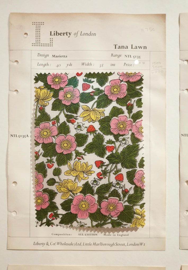
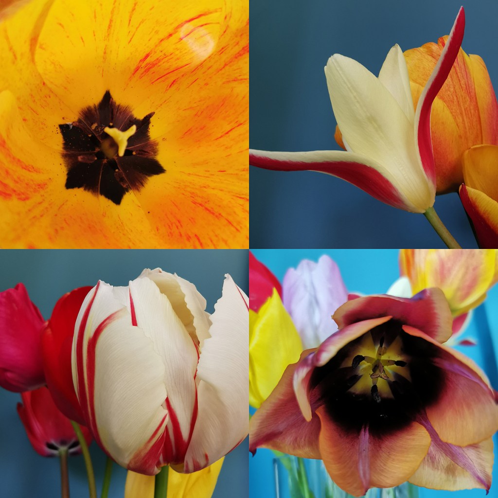
Having visited the Women in Print, 150 years of Liberty textiles at the William Morris Gallery, I headed to Liberty to see the latest fabrics and bought myself a Merchant & Mills pattern and Liberty Tana Lawn printed fabric as a holiday project, which I can proudly share I have completed and am waiting for warmer weather to show it off!
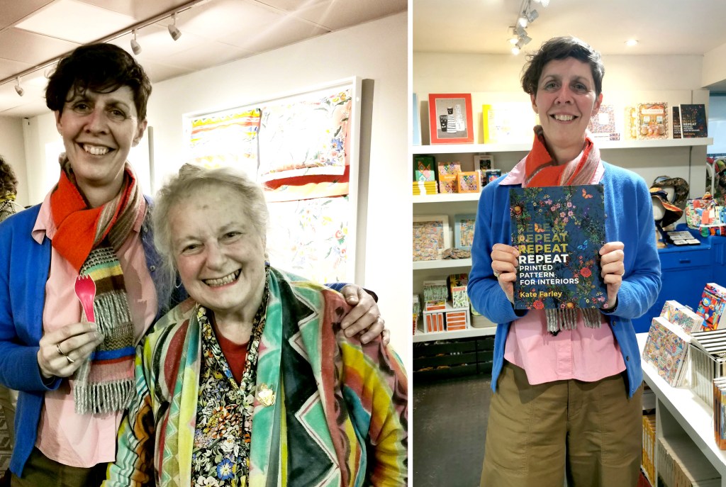
The primary reason for visiting London at the end of last month was to attend the Private View of the exhibition: Paint! Pattern! Print – The Textiles of Susan Collier and Sarah Campbell at the Fashion and Textile Museum, so I headed to Bermondsey, near London Bridge for the evening. Thanks Sarah for the invite! On arrival at the museum we were greeted by Sarah and much to my amusement she presented me with a pink takeaway fork from her pocket – for my fork collection!
I first met Sarah in London about ten years ago, having got in touch with her via Twitter when that was a nice place to be! Someone had the nerve to copy some of Sarah’s work, so I reached out to offer my sympathy and we decided to meet up the next time I was in London. As an academic I was in the capital for New Designers, the graduate showcase at the Business Design Centre, so we arranged to meet. We spent well over an hour putting the world of pattern in its place and we have stayed in touch ever since, with Sarah judging student awards for me, and joining me on an industry panel I was chairing at New Designers in 2023, having been kind enough to allow me to feature her work in my book, Repeat Printed Pattern for Interiors, published by Bloomsbury in 2023. I was delighted to see this book stocked at the Fashion and Textile Museum – thanks to the Liberty team for taking the picture of me and my book!
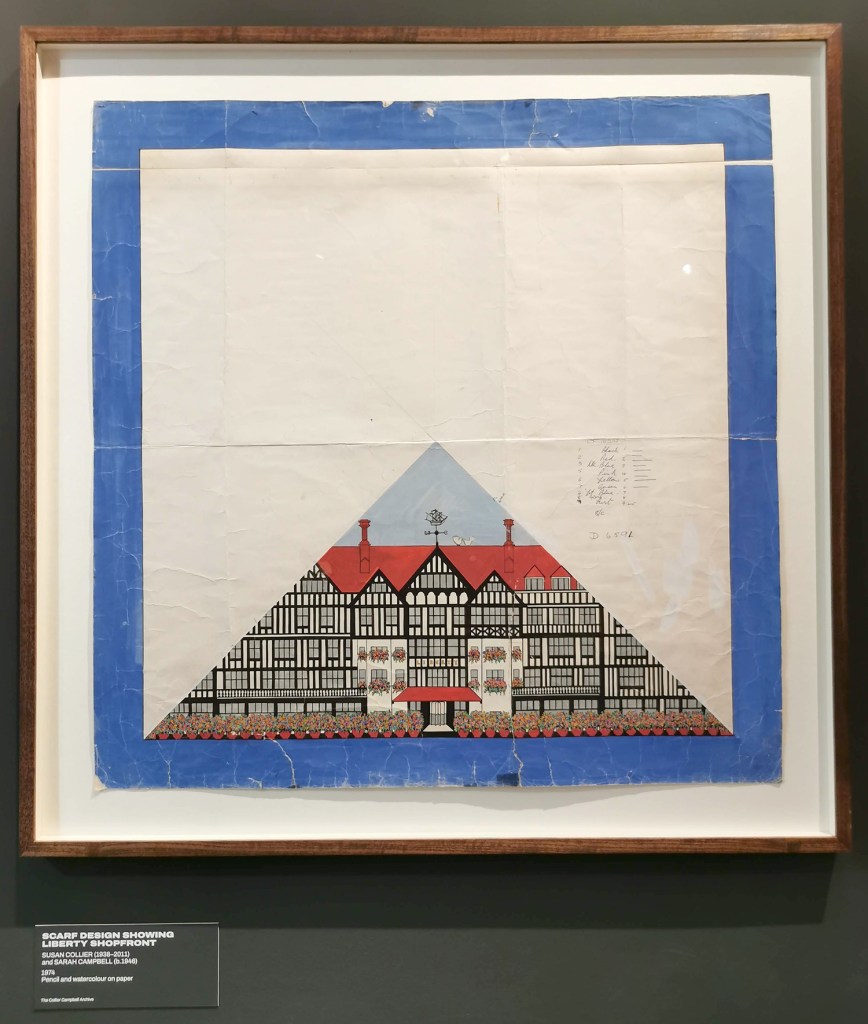
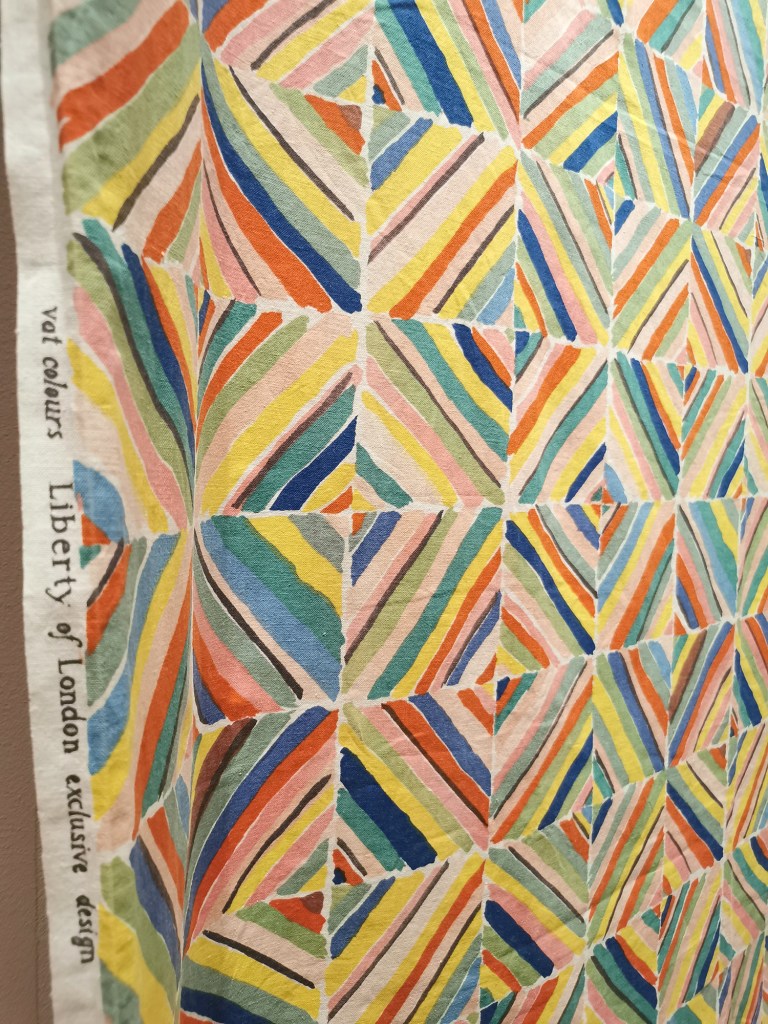
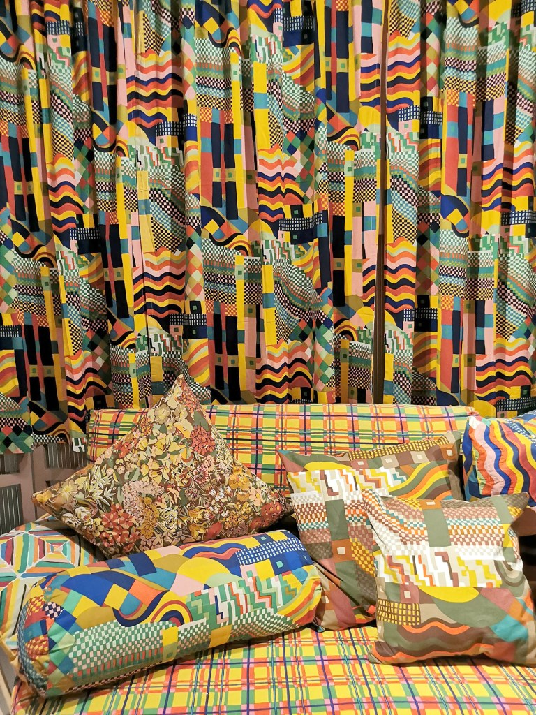
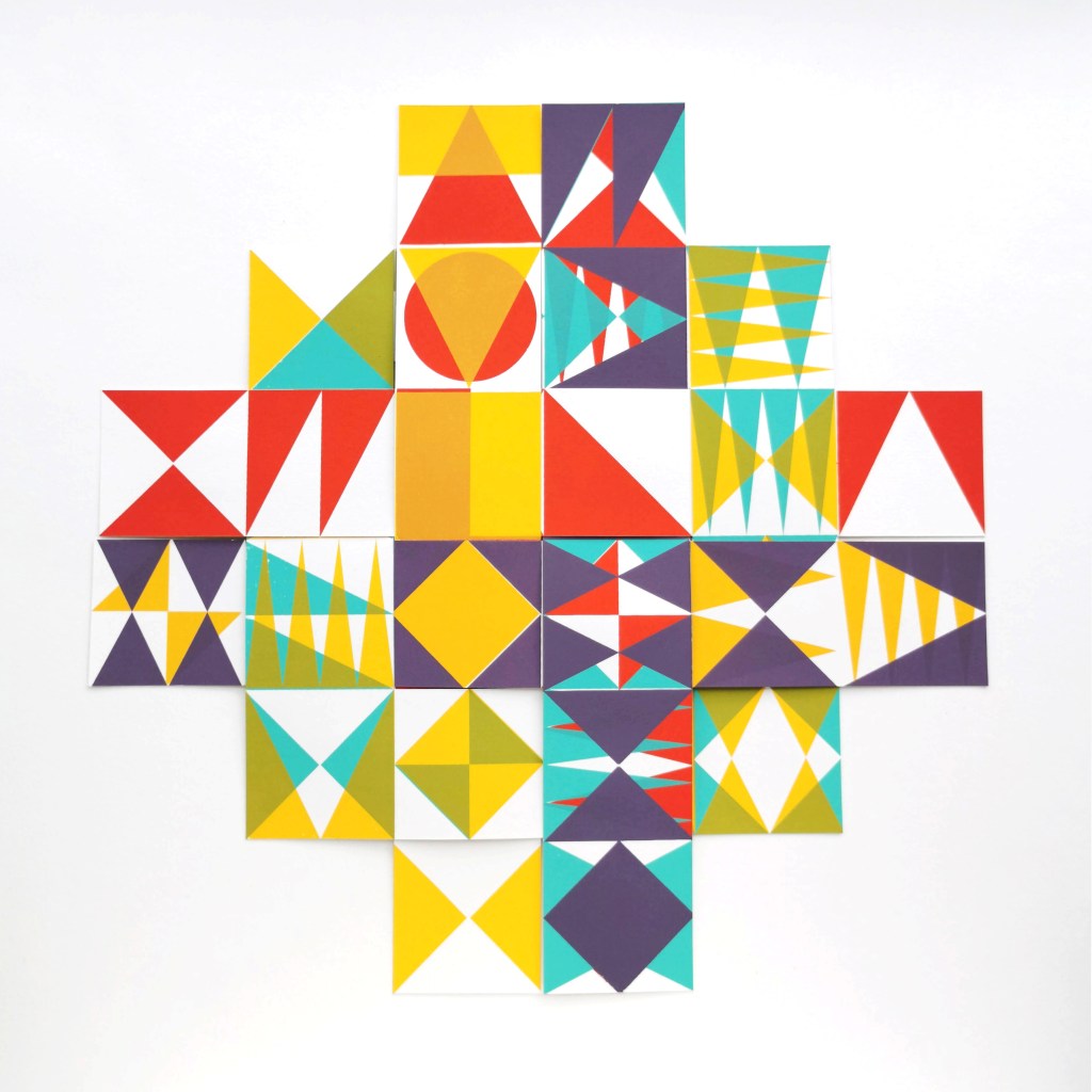
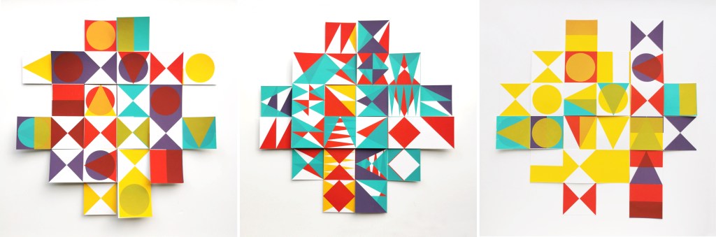
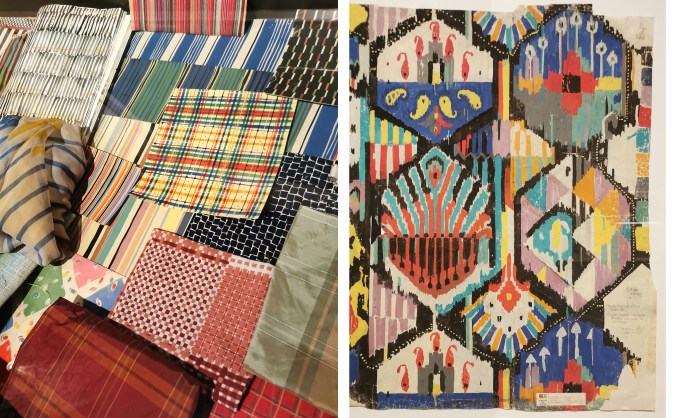
On entering the exhibition it was a complete feast for the eyes … with pattern and colour everywhere, appearing from around corners, up above and room after room. This was a true dive into the archives of Collier Campbell textiles over decades of working together, two sisters and a shared vision for joyous textiles. The exhibition included a wide range of items designed by Susan and Sarah, from the drawing and painting tools, to loose sketches and scaled painted designs on paper to lengths of printed fabrics, interior products and dresses. There were examples of Sarah’s more recent collaborations with Magpie and West Elm, alongside press cuttings featuring both Susan and Sarah at home and wielding paint brushes.
As a child growing up in the 1980s the look of home textiles, if not Laura Ashley, was likely to be Collier Campbell. With bolder and colourful brush marks suggesting the joy of Les Fauves artists, Matisse and Derain, rather than the Victorian Gothic tight sprigs Laura Ashley celebrated. I remember visiting the exhibition at London’s National Theatre in 2011, celebrating fifty years of sisters Susan and Sarah designing in 2011, shortly after Susan died. I recall loving the energy in the painting and bold use of colours.
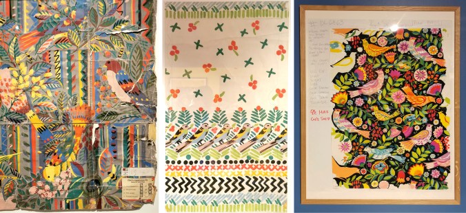
In this current exhibition, as is the legacy of the archives, the patterns are rhythmic in their flow and scale; musical in spirit. Motifs are often geometrics, florals and birds, and famously designs such as Cote d’Azure, evoke summer scenes in Europe as the sisters worked to deadlines only imagining the holiday season. It was wonderful to see the paperwork for this piece, having included it in my book, Repeat … that features an interview with Sarah and images of key pieces by Collier Campbell.
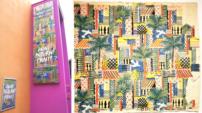
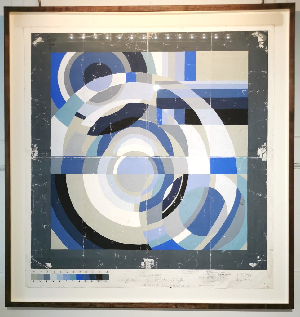
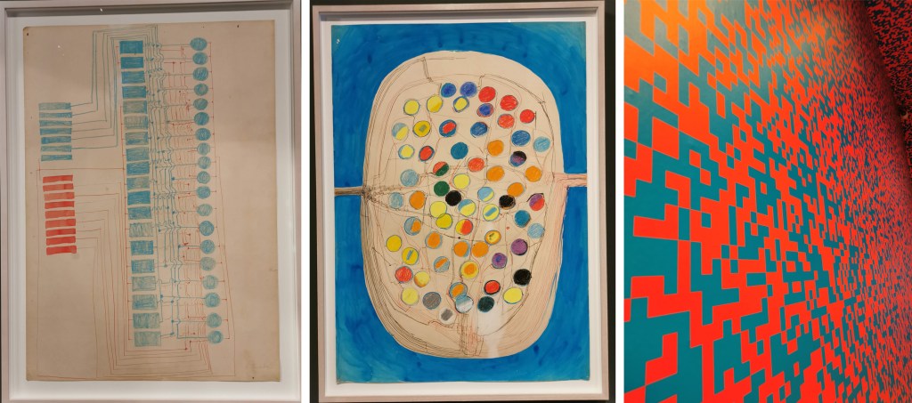
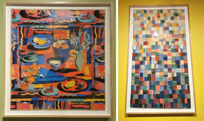
A design new to me that I really enjoyed seeing was Dancing Squares, from 1990 for American company UTICA (Stevens). This huge length of hand printed paper over two and a half metres long features painted squares evolving from dark to light up the design (right hand image below). The design on the left, again one I wasn’t familiar with, was a huge collage of a table of food and drink, in warm reds and oranges complemented by blue and turquoise.
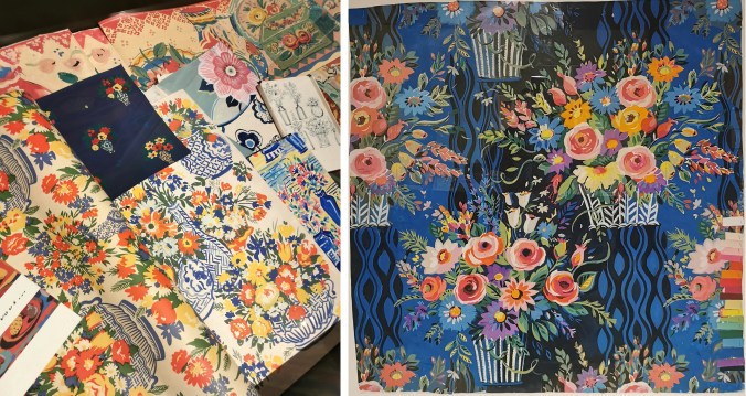
The florals and bird designs were full of life, with painted textures and pattern. It was also good to see the colour chips on the sides of some designs to guide the printers for production, as well as notes for the artworks and printers. The designs have depth as Susan and Sarah played with backgrounds and foregrounds as equal importance. Display cabinets showcased works on paper and coordinating designs alongside their hero prints as large statements on the wall and hanging as lengths.
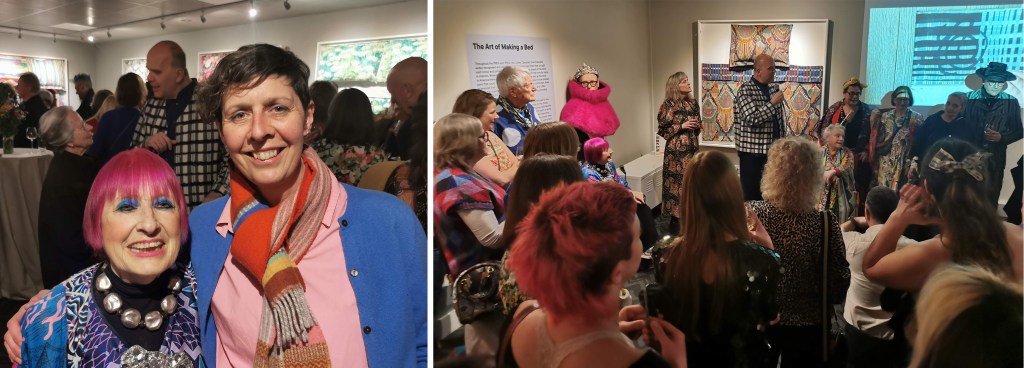
Everyone was friendly. I chatted to several people during the evening as we shared our joy of the work on show and the speeches by the curator as well as Sarah celebrated the pure joy that pattern, colour and creativity can provide. I was excited to have the opportunity to talk to Zandra Rhodes, the founder of the museum, and who continues to inspire us all, including the students I teach at Norwich.
I have only shared some of the many photographs I took on the evening, but I strongly recommend the show to anyone who loves printed pattern. It is the perfect tonic for the times we are living in, and a beautiful reminder of the joy to be found in painted and printed pattern! Congratulations to Sarah and the curatorial team of Teresa Collenette and Dennis Nothdruft at the Fashion and Textile Museum.
I sat on the train back to Norwich with my heart filled with excitement for the world of pattern I belong in, energised to support the next generation of designers I am working with at Norwich over the coming months. It was a day of celebrating Sarah and her sister Susan, having seen so many of their designs in the two exhibitions I visited – what a truly impressive legacy to be inspired by!