PRINT ROTATE REPEAT

I’ve had four of the best weeks of my academic career exhibiting my research at the East Gallery, Norwich University of the Arts. I am incredibly grateful to everyone who visited, left comments in the book, messaged me directly and commented on the social media posts – it is a huge endorsement for my work to receive such positive feedback. I’ve also appreciated messages from further afield from those people unable to visit, responding to the images we’ve posted online. I thought it good to share the exhibition pictures, particularly for those unable to visit, but as a wonderful archive of the exhibition too.

For those who need a reminder, the research explores the potential to design and print pattern with limited artwork – one screen per four-colour design, testing the feasibility of constraints as opportunity to rewrite the design process, placing the designer at the centre of the process, in contrast to the fast-paced evolution of design that is adopting Artificial Intelligence as key creator.

I balance a traditional creative process with new thinking to establish the design language and print production methods. One design, one screen, four colours, four rotations = many configurations of design outcomes and increased efficiency.

East Gallery is the public-facing space of the university, with free entry to the exhibitions. Wide-ranging exhibitions are held here, managed and curated by Claire Allerton. Claire first visited my studio at home well over a year ago when we discussed the potential of a show but it’s been a long journey of designing and printing since then! I thoroughly enjoyed working with Claire to establish the conceptual and contextual direction of the research as well as in developing the narrative for the body of work that has been made over a three-year period alongside my role as Course Leader of BA (Hons) Textile Design. Claire and I worked with art technician Sam Cook to determine the design and installation of the exhibition. Despite a very busy time at the start of the academic year I was very hands-on with the installation of the work, which felt important for me. Decisions of specific placement of lengths evolved as we adjusted to the work in the gallery space.

I shall attempt to describe the exhibition visitor experience, and use beautiful photos from Denisa Ilie to show you environment.

The beautiful blue wall, (Pantone 299U) welcomed viewers to catch a glimpse of the design principles, and see the exhibition film featuring footage of me printing as well as me talking through the research. The exhibition entrance also included a fantastic essay by Claire, outlining the importance of this exhibition at this time.
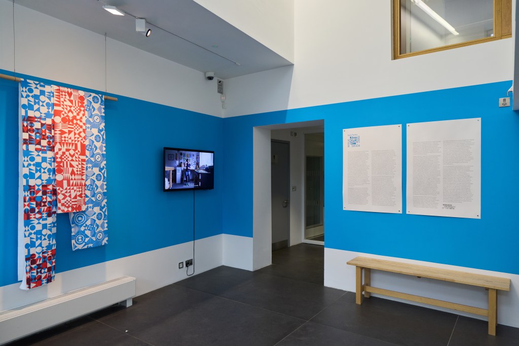
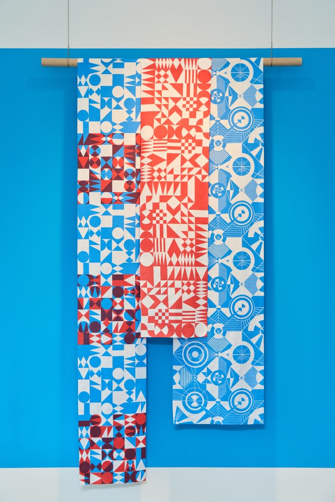
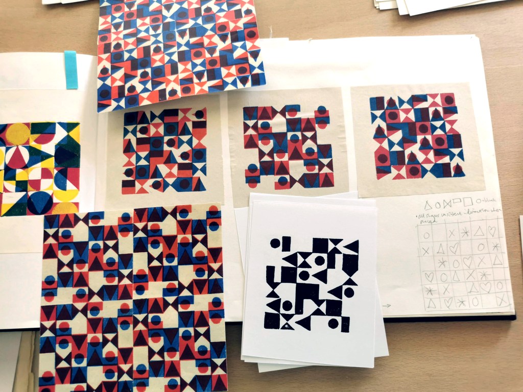
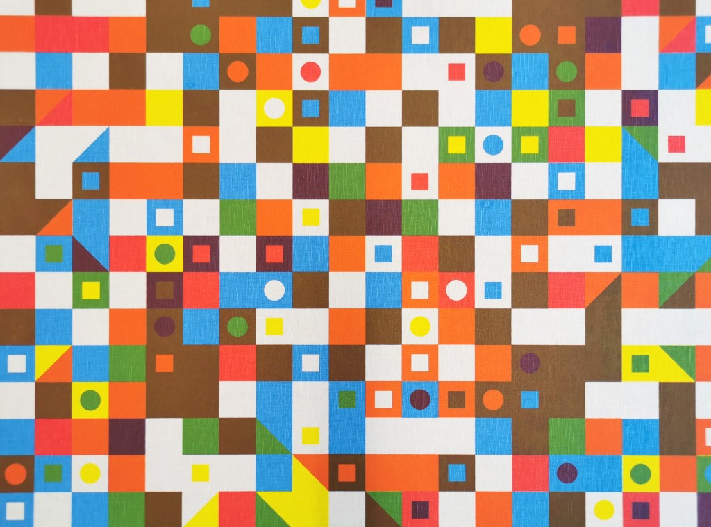
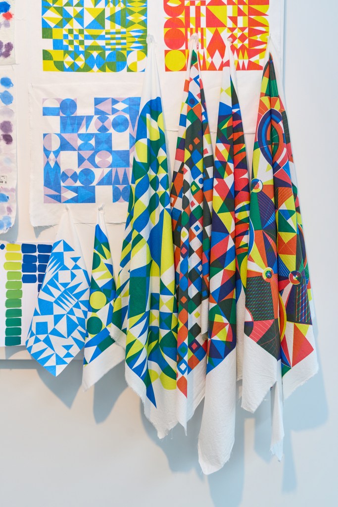
These small hand-printed lengths illustrate the design premise and hinted at where the exhibition was heading. I kept to three primary colours (red, blue and yellow) and three primary geometric shapes (circle, square & triangle) for the design work included in this exhibition although year two of the project saw me testing my approach in relation to floral motifs. I tested design principles established by Lewis Foreman Day in his 1901 book, Pattern Design, and drew inspiration from Sonia Delaunay’s work with colour as shape for rhythmical outcomes.

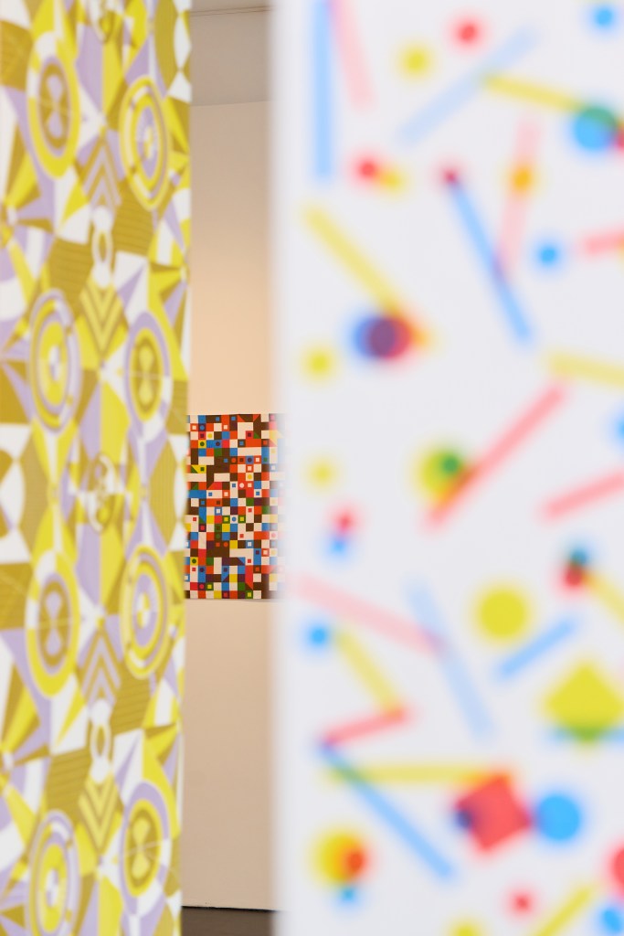
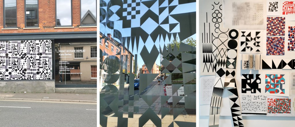
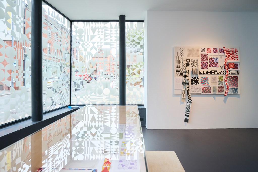
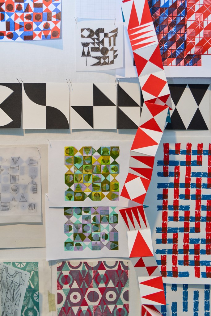
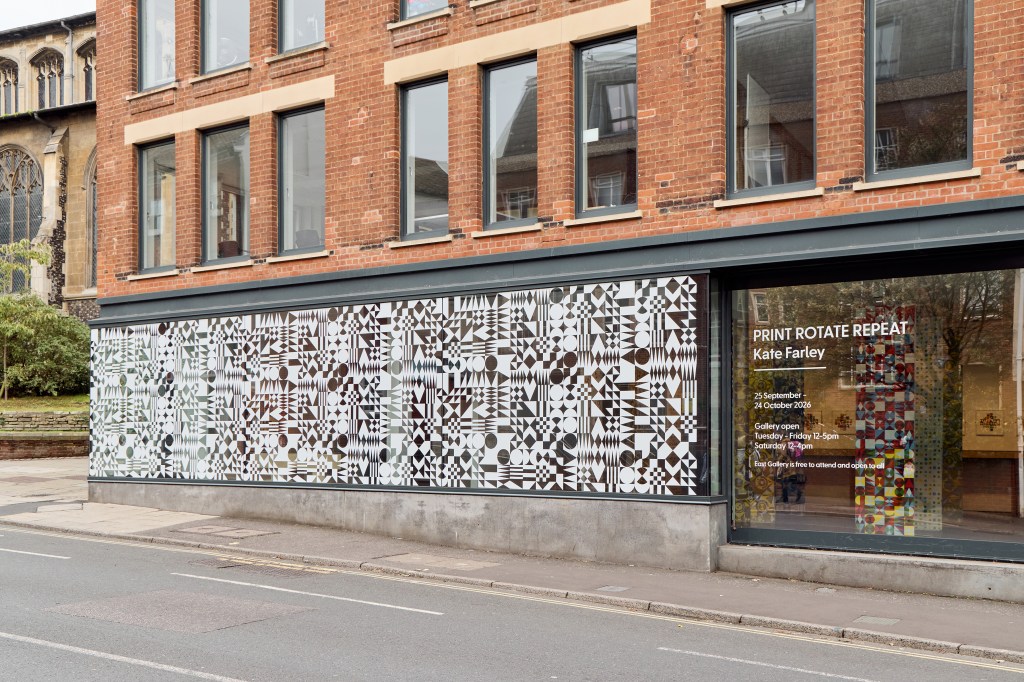
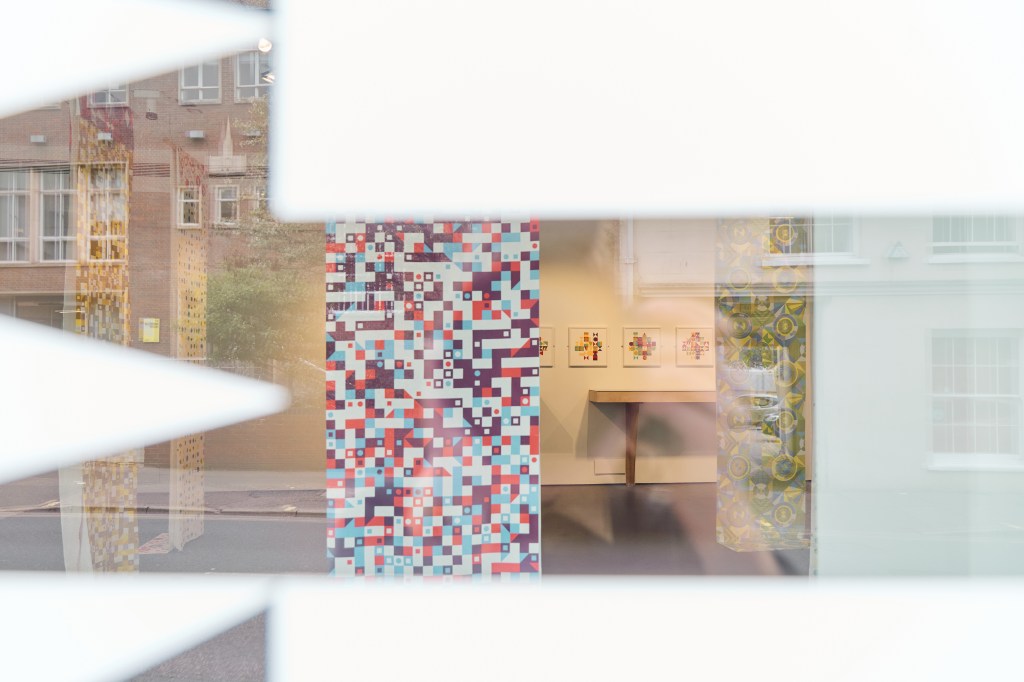
The next space accessed by a short run of steps or a lift presented the work in progress, with design thinking, making, sampling and process displayed. A vitrine showcased a sketchbook, lino blocks and tools, as well as folded structural books that suggest designs in the built environment with small figures for scale. Two wall-mounted boards, one for motif and pattern, and the other colour and material, set the anticipation for the largest gallery space. The window vinyl featuring one of my designs, made an impact in this space, reflecting on surfaces and softening the light, as well as attracting plenty of attention from passers by.
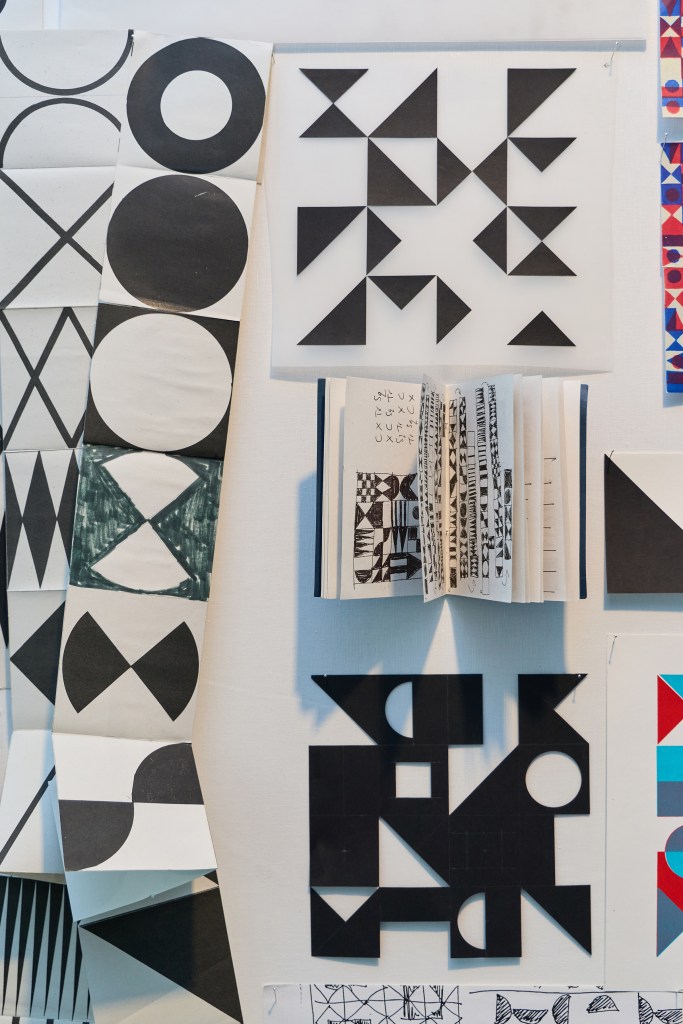
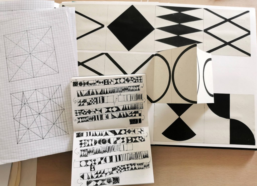
This small book includes sequences of motifs evolving from one shape to another, exploring my previous practice and ongoing interest in visual communication and book arts. These sequences were included in the film as a stop-frame animation I had made at the beginning of the research and remain an important aspect of my design process, as well as the starting point for the design (evolve) featured on the windows.
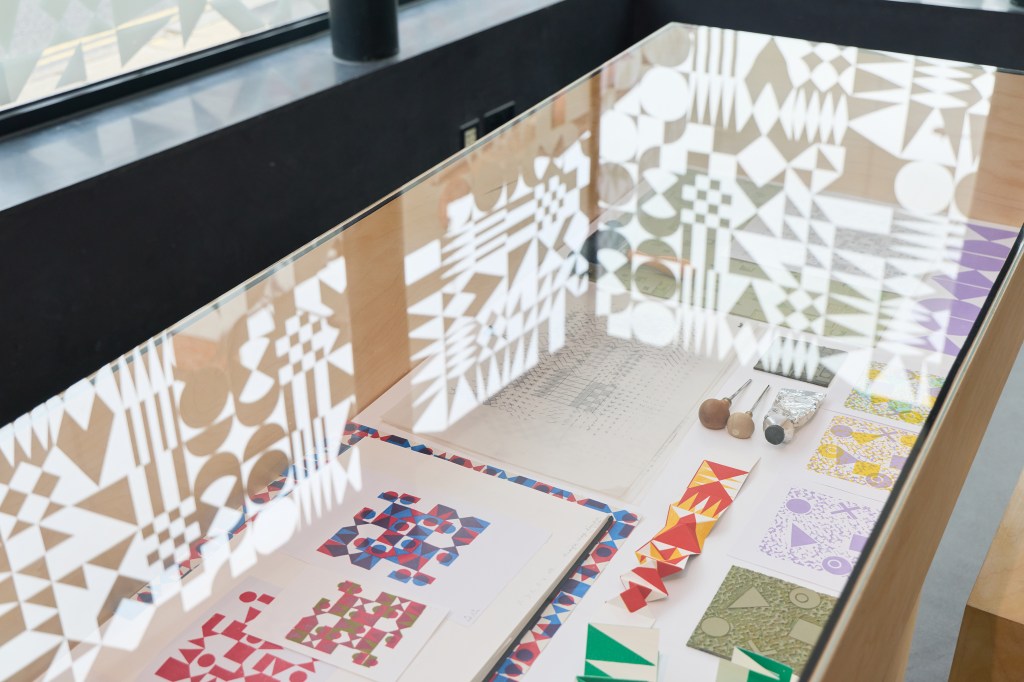
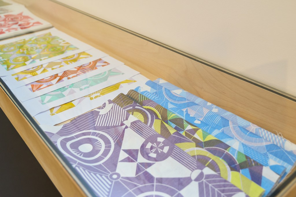
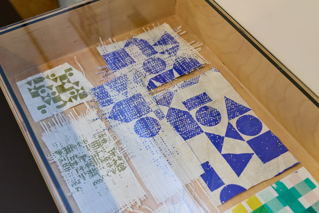
The vitrine included lino blocks and sample printing, sketchbook pages and folded sequences of pattern alongside designs that didn’t push through to the final collection but explored vital aspects of the design process.
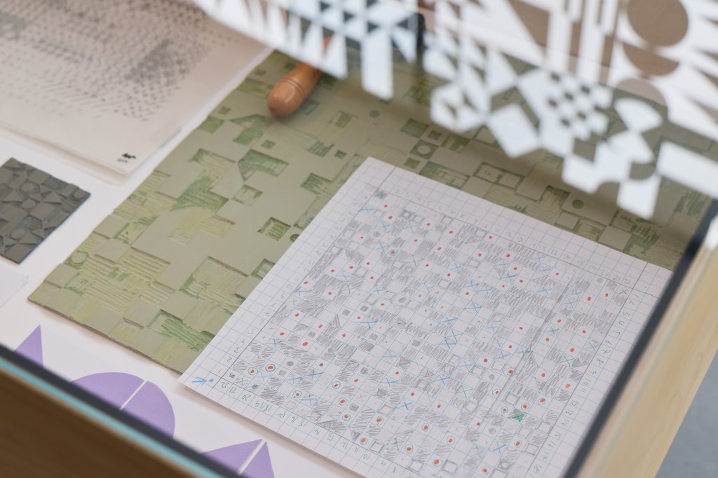
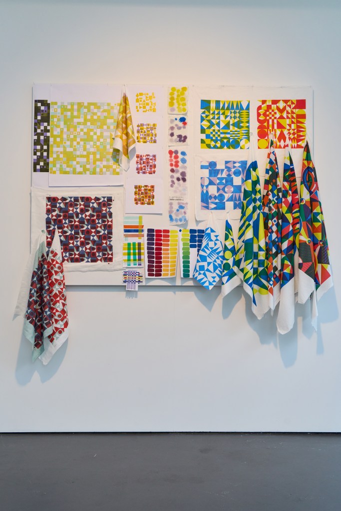
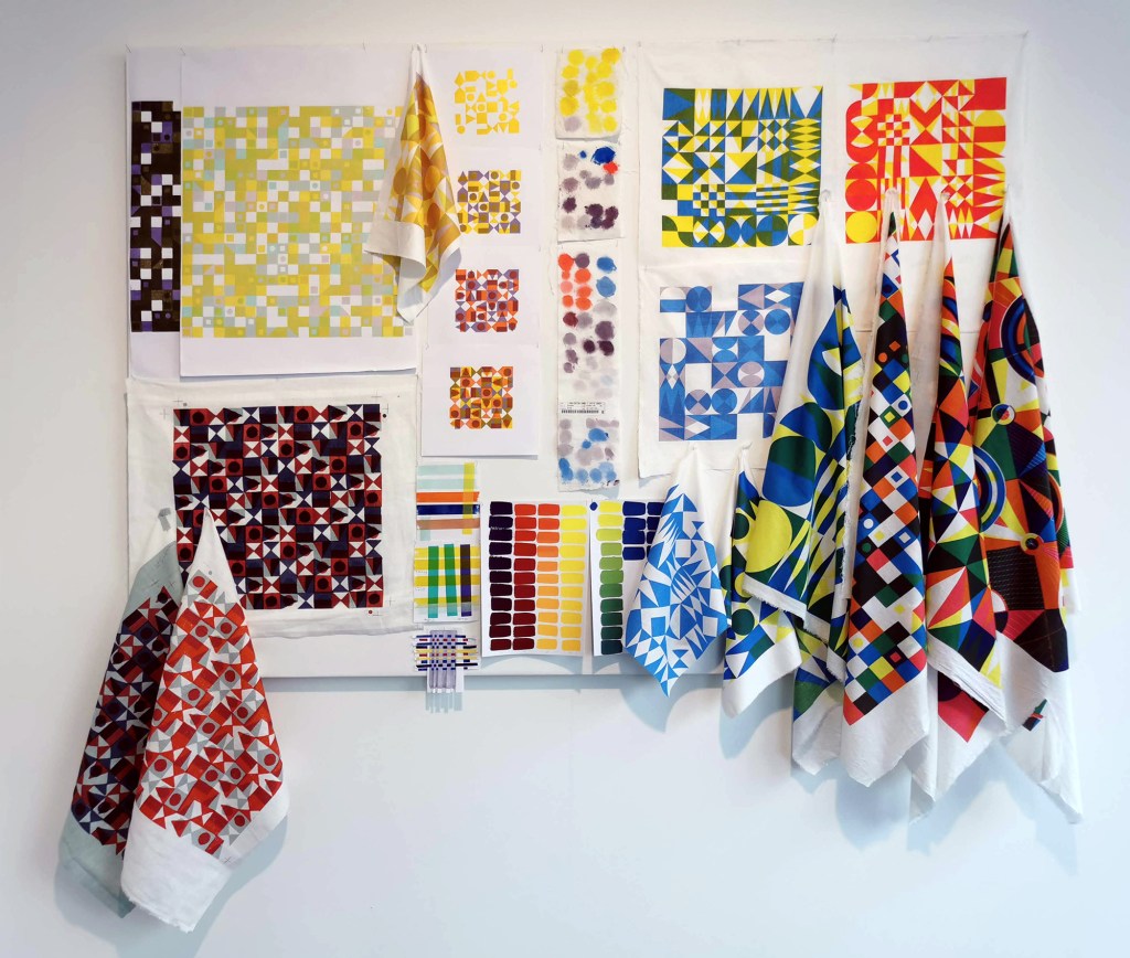
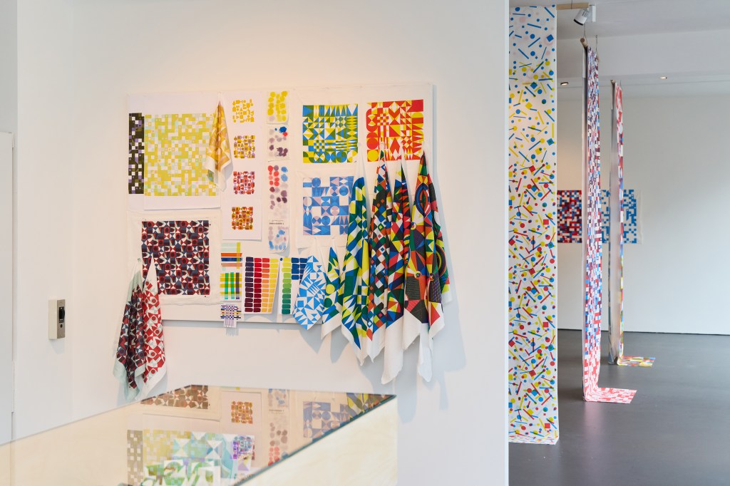
The colour and material board includes samples from my time at Ivo’s with Podge, and large-scale lino blocks that led to one of the final designs. I often play with colour using gouache paints first, so they are included as well as testing with oil-based relief printing inks for the lino printing. I tested pigment inks and dyes in my fabric printing on different cloth, so the colour matching and sampling is also included here. I chose clean graphic shapes in the final artwork for production, as I wanted the design language to be as neutral as possible, without the makers mark, despite initially using drawing and lino cutting in development work that did include those characteristics.
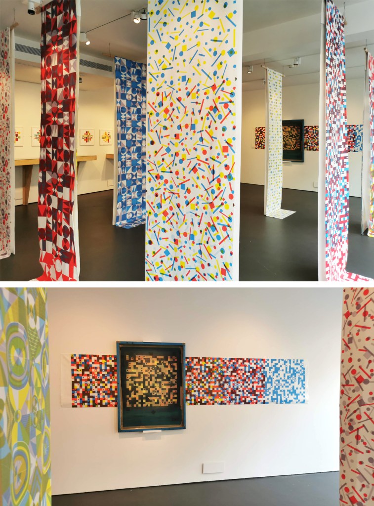
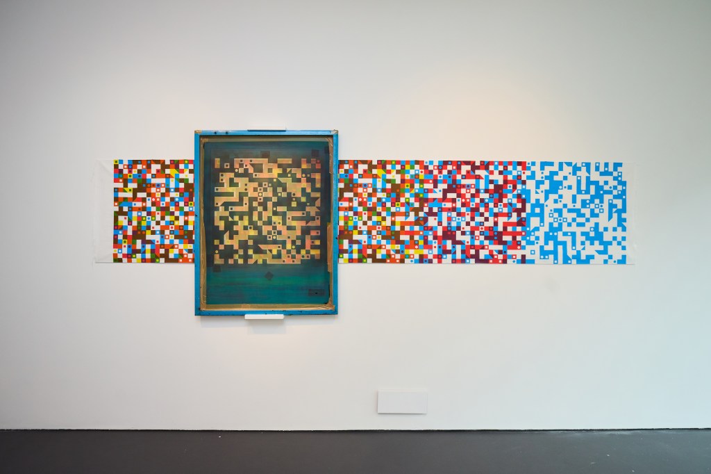
I loved seeing the visitors’ responses as they caught sight of the lengths. Eighteen vertically suspended lengths, hung in pairs, and one horizontally displayed with the screen I used to print it with are the culmination of the research so far. Visitors were able to walk amongst the lengths to view them close-up and be immersed in the pattern, looking through and across the space. I hand screen-printed each length myself and they were three and a half metres long and seventy centimetres wide – the physical experience of printing was very much associated to what I could do without relying on anyone else – it’s a good job I’m tall!

At some point in about February / March we discussed the height of the ceiling in the gallery and how many lengths I may be able print. We agree on between four and six lengths for the exhibition – that somehow evolved to include nineteen, and others I have printed are not included. I’ve printed over one hundred metres of cloth in the last few months.
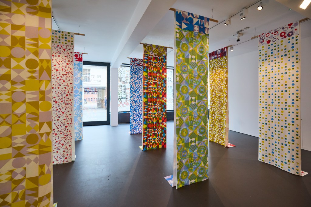
The pairs of screen-printed lengths were hung together and one sat over the other, to connect the individual to the collective statement. We agreed we wanted honesty in the hanging system Sam devised, and I’m pleased with the results. The folded edges along the lengths rather than stitched hems maintained focus on the patterned cloth rather than suggesting a resolved item for interiors, for example. As the viewer walked through the space it was possible to see several iterations of designs represented, as single or multiple-coloured variations on the them of each design. There are seven pattern designs across the nineteen screen-printed heavy-weight linen lengths.

I had to devise my own registration method for some of the design, as I couldn’t rely on traditional registration furniture on the print tables when I rotated the screens. This would not necessarily have been clear to the novice, but the system of quarter circles appeared on three patterns where the motifs appeared to float above the background. All screen registration was carried out by eye. It was fun to discuss the complexities of the design and print process in a very well attended public talk one Wednesday lunch time and hopefully I can share the exhibition film in due course.
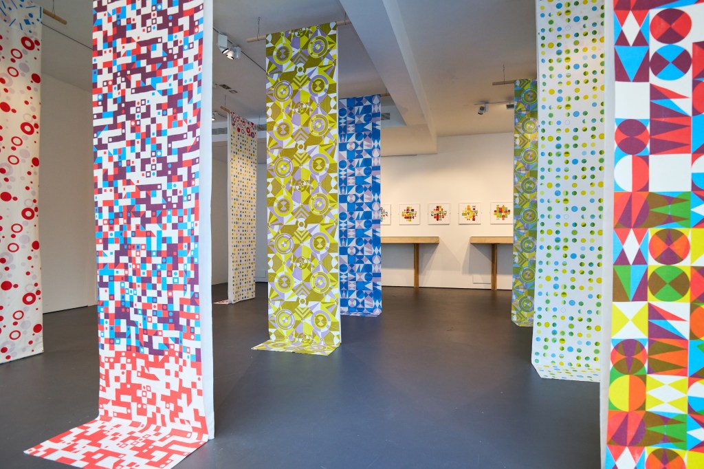
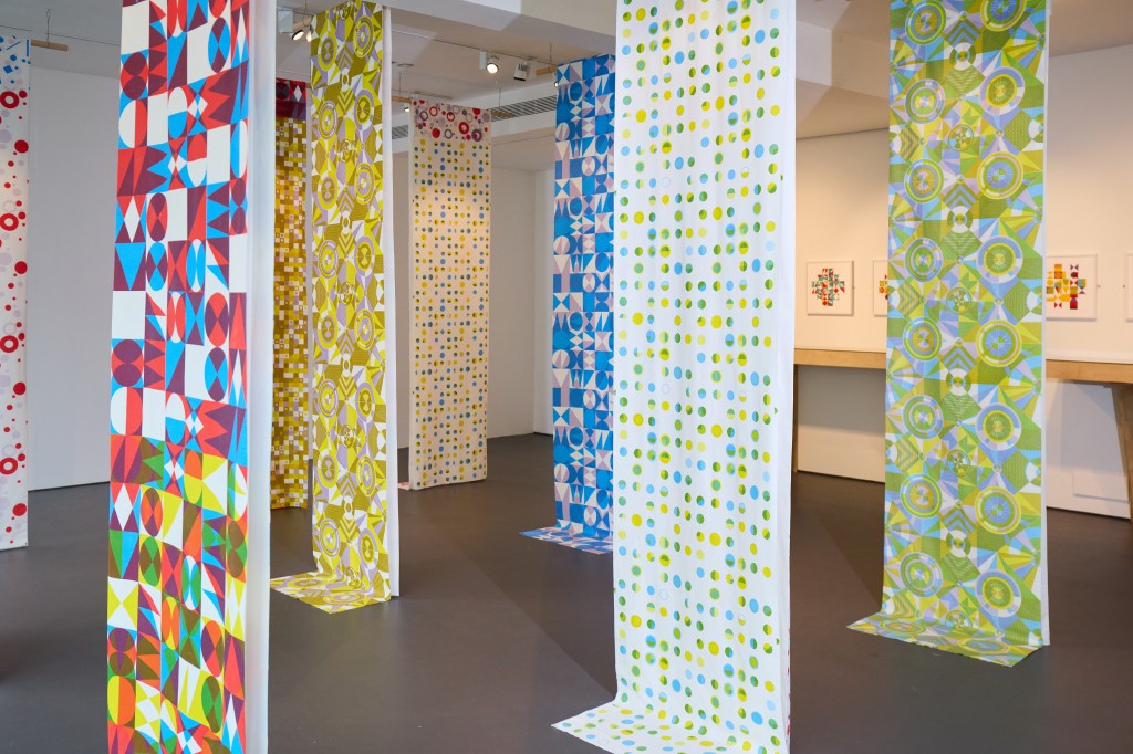
Claire decided it was a good idea to evidence the printing process by including one screen over the length it created, with the step of printing each colour visible. I really liked this idea and it was very well received too. Thanks Sam for sorting the technicalities of the hanging! Glimpses of the design could be seen as we traveled through the space.
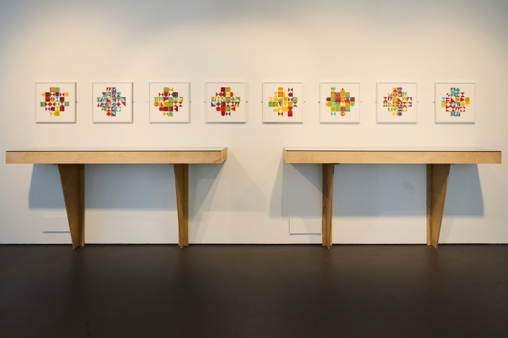
In this main gallery space, we included two more vitrines that build the narrative and transparency of the creative process, again with sketchbook pages and lino, alongside printed samples on paper and cloth. Weaving and the notion of construction and deconstruction of pattern was evidenced not only in the vitrine but also endorsed by the eight framed works on paper, PLAY, see below. These screen-printed and constructed works provide further opportunities for experimentation on the notion of themes and variations in their composition, an idea I return to often.
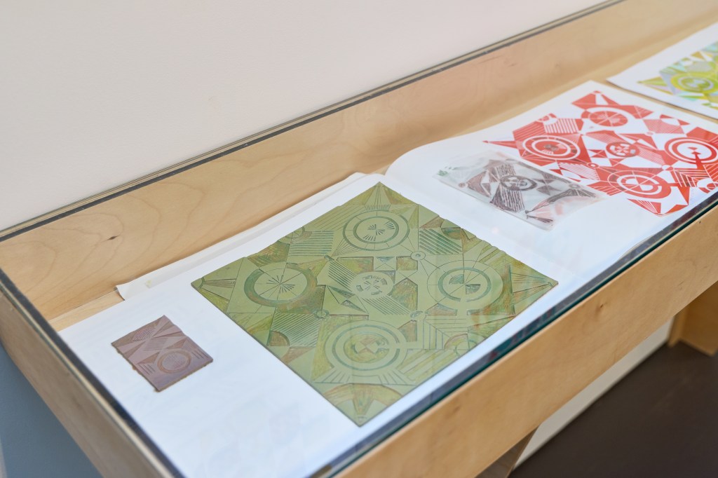
The visitors could see how one lino block informed the next one, and how the design evolved across paper and fabric before resolving as the series of printed lengths.
The vinyl window treatment made an impact, inside and out, with beautiful shadows and reflections throughout the day and night.
I’ve written previously about the publication, with an essay by Victoria Mitchell, another brilliant record of the research and exhibition. It has been so well-received we had to do a mid-show reprint!
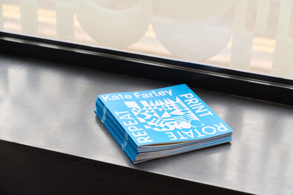
The publication is a beautiful record of the research, designed by Paul Kuzemczak and including an essay by Victoria Mitchell. I’m grateful for this opportunity and the efforts of the immediate exhibition team in making this be the success it has become.

Thank you Claire, Sam, Victoria, Paul and Denisa, and the brilliant textiles technicians Neil, Yasmine, David and Eddie, who have been so incredibly supportive and generous with their time and knowledge throughout!

Image credits: Denisa Ilie
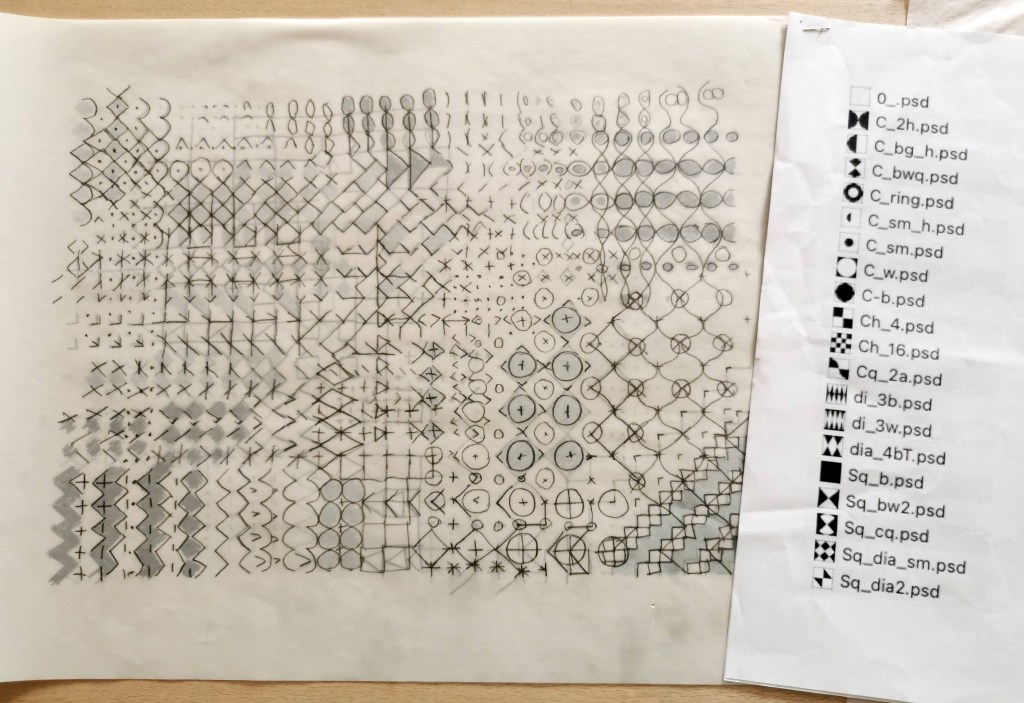
showing the workings

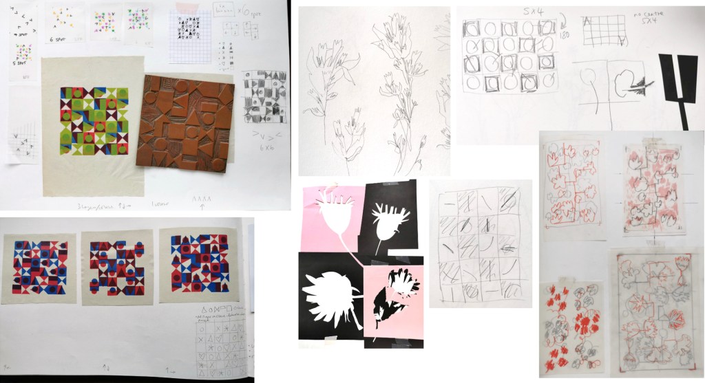
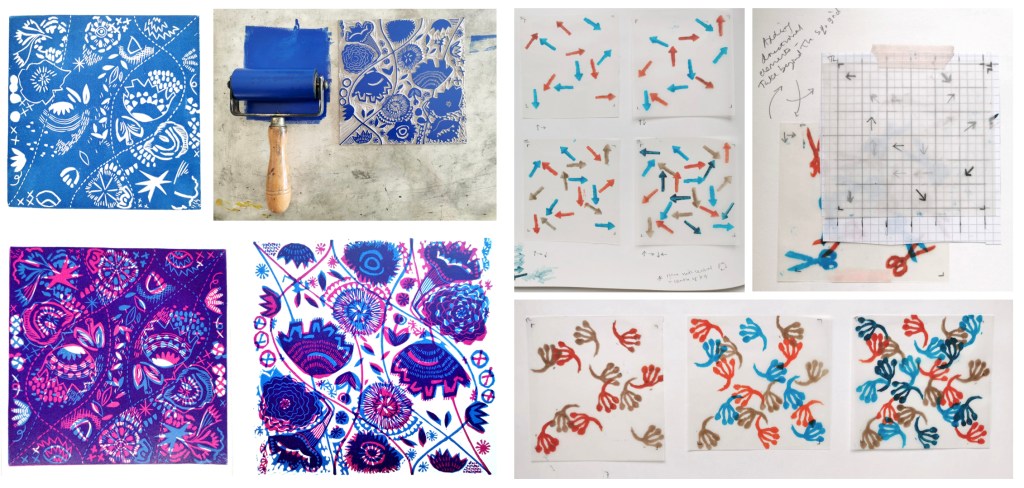
I am so pleased with the feedback from visitors to my solo show Print, Rotate, Repeat, at the East Gallery, Norwich University of the Arts, with particularly strong interest in the design development work and sketchbooks on show, providing the creative and technical journey to the screen printed lengths. For those not able to make it to see the work in situ I thought it nice to share some photographs of the work that is fundamental to this creative and technical research project, with some commentary on my intentions. Tracing paper, pencil and paper as well as lino cutting and printing keep my ideas moving.

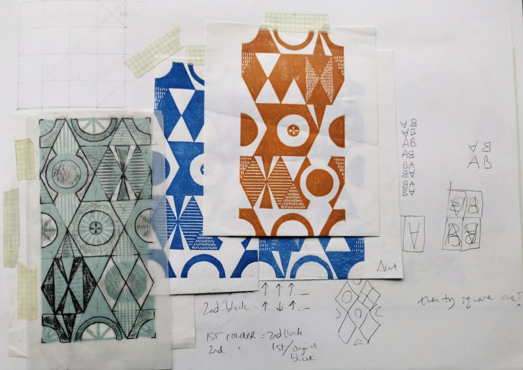
This layered drawing on tracing paper was an early development of an idea of theme and variations, explored in a chapter in the book Pattern and Chaos in Art, Science and Everyday life edited by Victoria Mitchell and Sarah Horton, published by Intellect Books in 2023. I was exploring the potential for pattern evolution, transforming one shape or pattern structure to another.

This notebook records sequences of transitions from one geometric shape to another and was developed in to a short stop-frame animation that has been shared on instagram and is also featured on the film of the research, on show in the gallery.

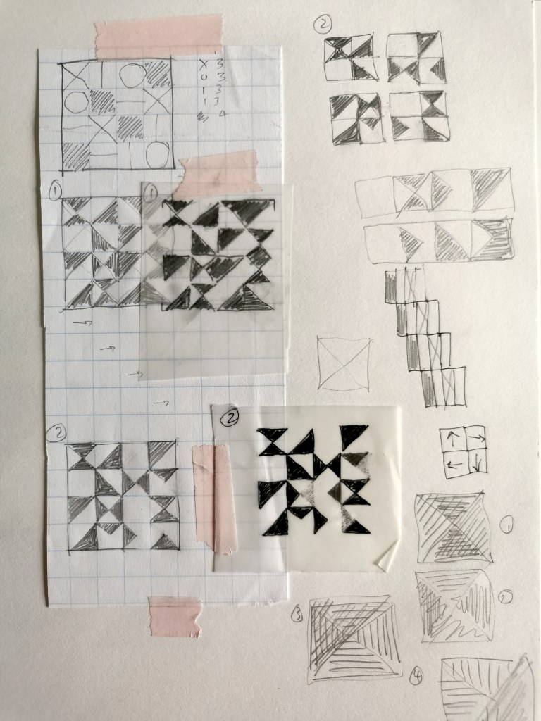
Tracing paper enables me to test the design with layered rotations of the design as part of the development, before I commit to cutting a lino block.

Each design can look quite different depending on how I rotate the subsequent layer, whether it’s a 90 degree turn clockwise, or a 180 degree rotation, for example. This design has explored Lewis Foreman Day’s distribution of elements work from his pattern design book published in 1901. I had to adjust the composition to enable the layered rotations.

Breaking away from the formal grid structure, I tested the diagonal pattern potential with the block rotation principle. As this design is rectangular it can only accommodate one 180-degree rotation. The negative and positive shape in each of the designs I’ve developed are vital elements in the design process, carrying the weight and space of the design, providing rhythm and movement.

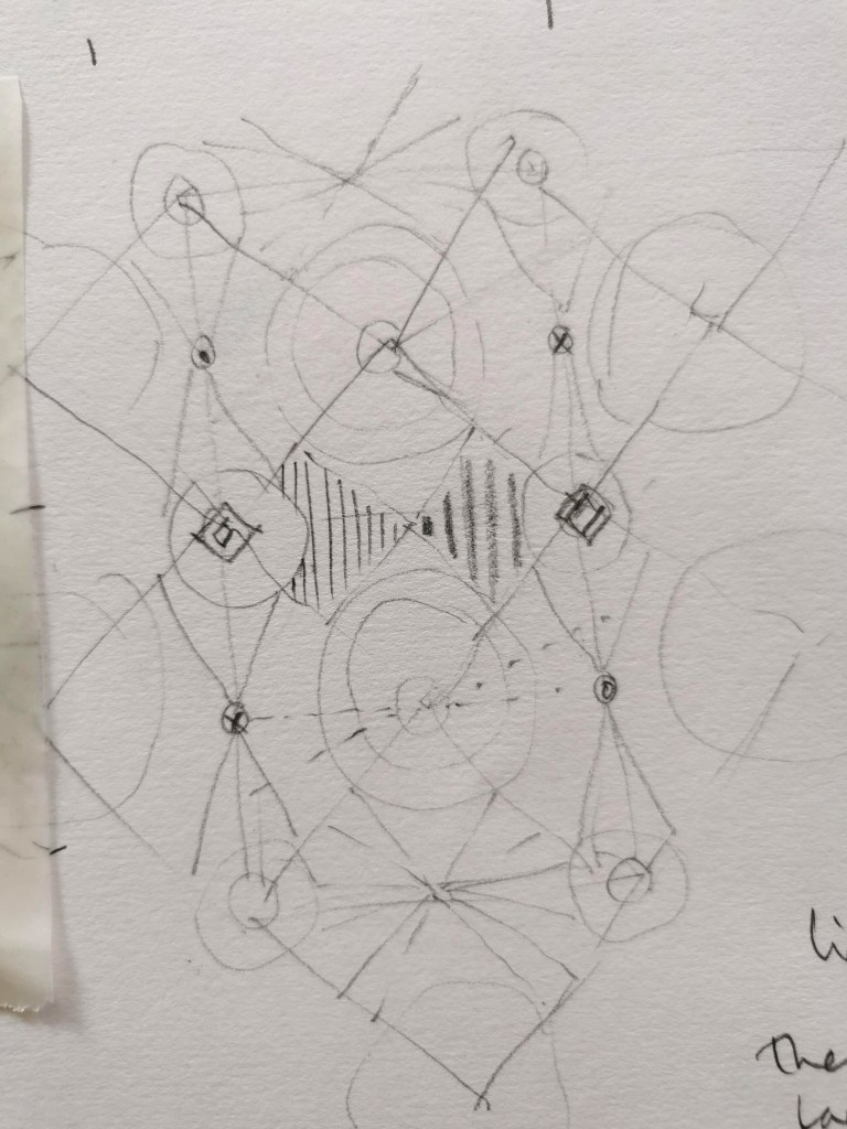
This was the initial drawing for Vortex, one of the most complex designs I have created, developed from the diagonal design shown above this sketch. Getting ideas out of my head makes room for my ideas and enables them to be more tangible. It captures a time in the research and I often return to an idea that was only a fleeting thought some time before. This one was developed into a four-colour length, on exhibition at the East Gallery.

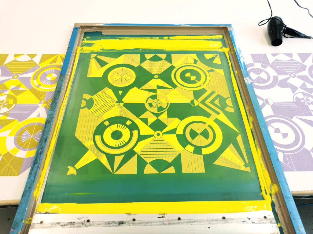
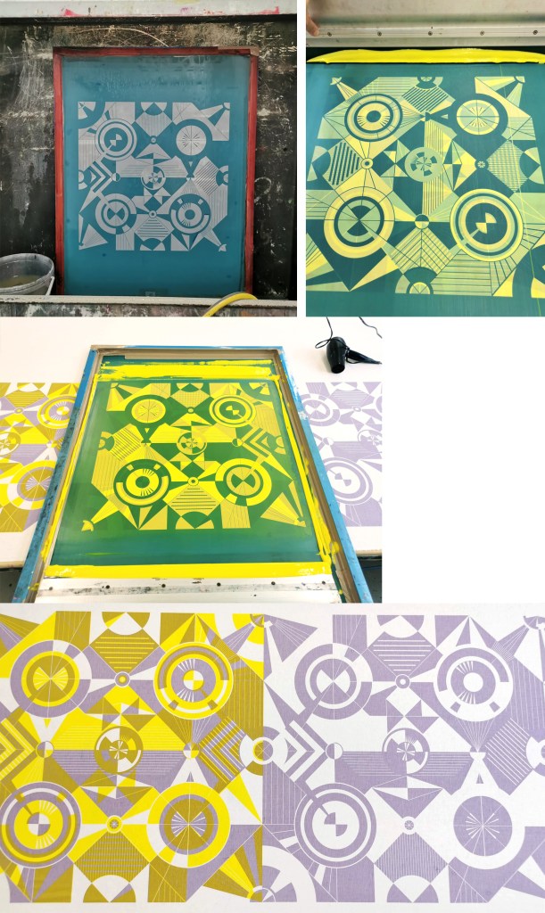
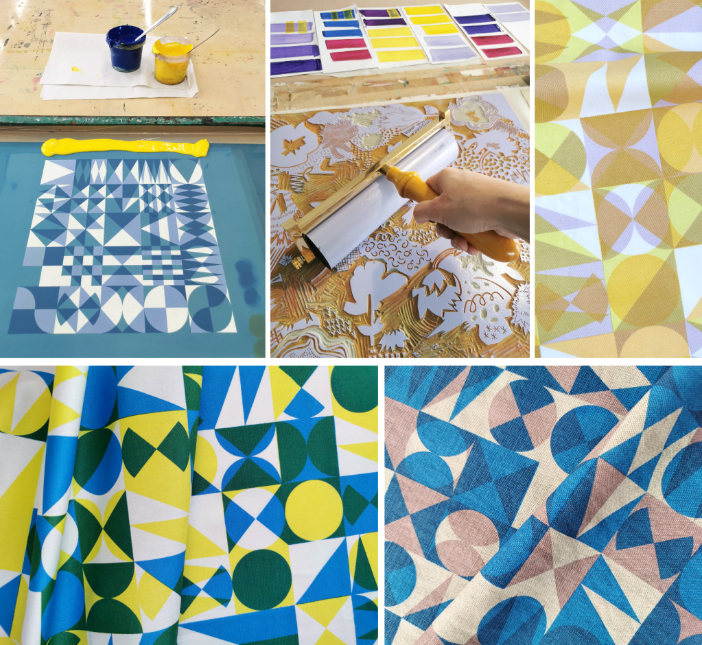
Printing in progress for a two-colour version of Vortex

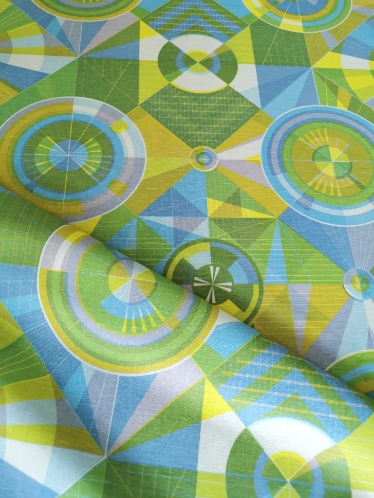
Four-colour print of Vortex, with each layer a rotation of the one screen being used. Screen print on linen cloth.

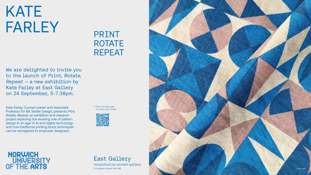
The exhibition is on until the 24th October 2026, open Tuesdays – Saturdays from midday.

Print Rotate Repeat – the show is open!

I’m still buzzing from the opening night of my solo show at the East Gallery, Norwich University of the Arts last Thursday. With nearly two hundred guests the gallery was busy and the feedback brilliant! I didn’t take any photos on the night but here’s a few I’ve taken since.

The white vinyl can be seen from up and down the road and I’ve received lovely comments about it – some not wanting it to go after the exhibition! It throws gorgeous shadows on to the gallery walls and floors which emphasise the power of pattern.
Visitors have commented on how nice it is to see the workings in the sketchbooks as well as the more completed lengths, and although I don’t often show the work in progress it is very important to this exhibition to evidence the planning and workings out!

We have a motif / pattern board and one for colour, which really communicates the testing and development across the three year project, both with paper and cloth.

There are two separate environments for this exhibition, designed by the curator Claire Allerton at the East Gallery, Norwich University of the Arts. She’s done a brilliant job in designing the narrative of this substantial body of work.

The show is on until the 24th October, Tuesdays – Saturdays, midday opening. Look out for the windows – you can’t miss them!

Print Rotate Repeat

As I’ve mentioned on the blog before, I’ve been developing a new relationship with pattern design based on traditional block printing over the last three years. I’m delighted to announce I have a solo show at the East Gallery, at Norwich University of the Arts opening in three weeks time, open for a month. I’ve printed about one hundred metres of fabric over the last few months and I can’t wait to see much of it installed.

exploring Slovenia

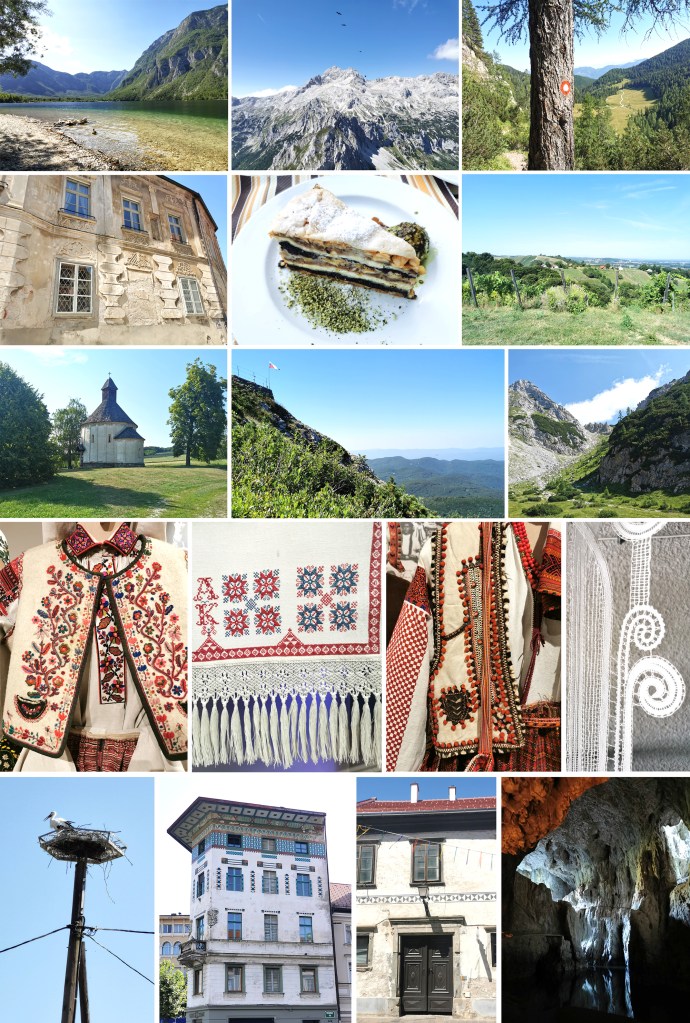
This summer our family holiday took us to Slovenia via rail from Norwich, via London, Brussels on a sleeper train to Salzburg, and our final train to the capital, Ljubljana. Once in the Slovenia we hired a car and spent a few nights in a few different regions to explore what the country had to offer. We ventured from high in the Julian Alps with the mighty Triglav mountain and lakes, to Idrija, famous for lace making and mining mercury, through the Karst region and towards and along the Croatian and Hungarian borders in the south and east.

We walked high in the mountains under blue skies and sometime above the ravens, through hillsides and woods of wild flowers, butterflies and birds. It was good to watch through binoculars from a neighbouring summit as climbers ascended Triglav, the highest mountain in the country and a few days later catch a glimpse across to the Adriatic Sea.

We enjoyed visiting towns including Ptuj, Idrija and Maribor, learning about local industries and histories. Ljubljana was a very manageable city, with walks beside the river and through the parks and gardens, a climb to the castle, wandering through pretty streets and catching site of the parliament building. We ate well throughout the fortnight, sampling national dishes of dumplings and meats, and for puddings the famous Gibanica cake and Bled cream cake. I can thoroughly recommend sampling the wines from across the country too.

Highlights of museums:

National Museum of Contemporary History of Slovenia in Ljubljana Fascinating introduction to Slovenian poet Srečko Kosovel, as well as C20th history or war and peace.

Slovenian Ethnographic Museum There was an excellent exhibition about Ukrainian traditional dress, as well as many rooms of Slovenian crafts, traditional trades and folk artefacts. The textiles was fabulous to see, with lace, embroidery, weaving and printing to admire.

Ptuj Clock Tower The longest wooden pendulum in action in Europe

Idrija for lace and mercury A town with a lace school and fascinating mercury mine and museum.

The weather was hot, above the average for a summer, with temperatures above 35 degrees Celsius for our last few days which was pretty hard going. I loved the Ljubljana weather system – a cold spray of water in the city centre.

We returned home with a sleeper train from Ljubljana to Stuttgart, on to Paris, London and home to Norwich. Here are a few shots of the beautiful country – I can thoroughly recommend it!

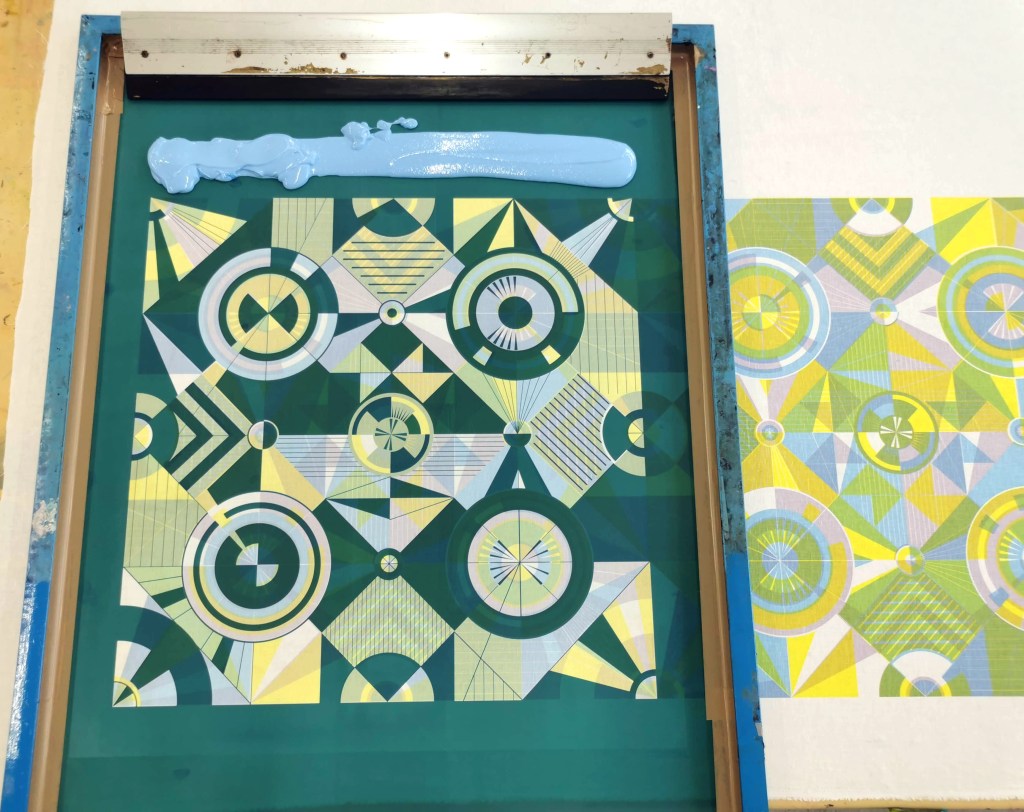
more printing, more rotating pattern

Despite it being a busy few months in academia I’ve been squeezing in time to screen print as I’m working towards a solo show of this research project – more information coming soon!

To build anticipation, here’s some shots of some of the progress in the pattern work …

Athens past and present

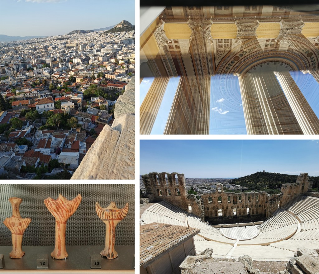
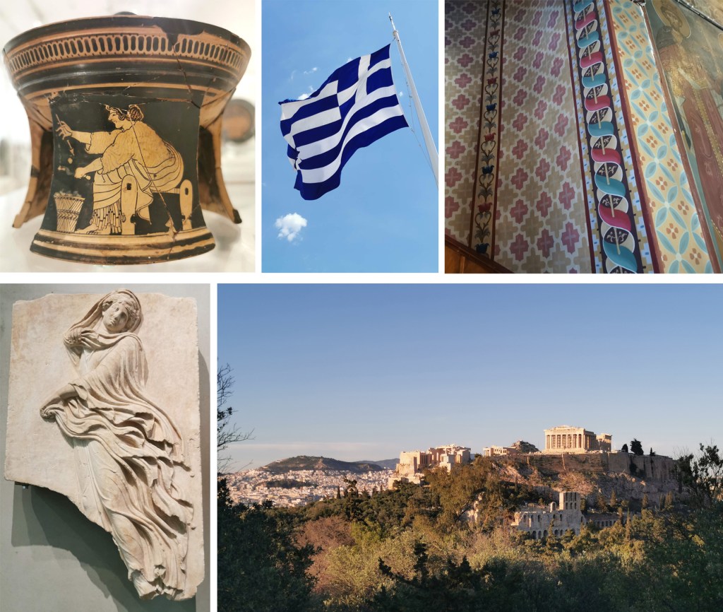
In May I was lucky enough to have a paper accepted at a conference organised by the Netherlands Institute Athens on the subject of Textiles Production and Representation: From Pre- to Postmodernity. It was an incredible three-day event with truly international delegates and it was fascinating to hear about so many aspects of textiles. From spinning to weaving and knitting, from personal narratives to shared histories, from craft practices to industrial production, I learned so much. Everyone was sharing with their research and supportive of each others. I presented my ongoing practical research and received great interest and feedback too. It is a time I won’t forget easily and I’m sure we will cross paths again.

I was able to tag a couple of days of leave on to my trip so there was enough time to explore Athens. I’ve transferred flights over recent years and was last in the city as a young child with memories of intense heat and traffic, but my experience this time was very different. I explored the city on foot, through small alleys and back streets, up and down steps as well as hills. I sat watching sunsets, and took in the sites, including the Acropolis twice! I was completely taken with this city.

I walked miles, visited museums and landmarks, ate wonderful food and took lots of photographs! The dates of some of the artefacts I saw was mind blowing, as was the incredible craftsmanship. I can thoroughly recommend the Benaki museum, the Ghika museum, the Acropolis museum, the Archaeological museum, the stadium, the small squares, the classical ruins, the changing of the guards and botanical gardens, as well as Lycabettus Hill. My photos can only hint at the joyful time I had there – I can’t wait to go back!

London Pattern Day: Paint! Pattern! Print!

Having visited the Women in Print, 150 years of Liberty textiles at the William Morris Gallery, I headed to Liberty to see the latest fabrics and bought myself a Merchant & Mills pattern and Liberty Tana Lawn printed fabric as a holiday project, which I can proudly share I have completed and am waiting for warmer weather to show it off!

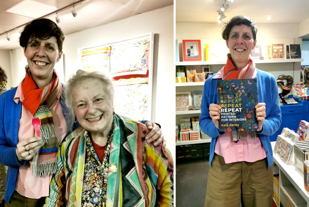
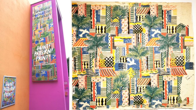
The primary reason for visiting London at the end of last month was to attend the Private View of the exhibition: Paint! Pattern! Print – The Textiles of Susan Collier and Sarah Campbell at the Fashion and Textile Museum, so I headed to Bermondsey, near London Bridge for the evening. Thanks Sarah for the invite! On arrival at the museum we were greeted by Sarah and much to my amusement she presented me with a pink takeaway fork from her pocket – for my fork collection!

I first met Sarah in London about ten years ago, having got in touch with her via Twitter when that was a nice place to be! Someone had the nerve to copy some of Sarah’s work, so I reached out to offer my sympathy and we decided to meet up the next time I was in London. As an academic I was in the capital for New Designers, the graduate showcase at the Business Design Centre, so we arranged to meet. We spent well over an hour putting the world of pattern in its place and we have stayed in touch ever since, with Sarah judging student awards for me, and joining me on an industry panel I was chairing at New Designers in 2023, having been kind enough to allow me to feature her work in my book, Repeat Printed Pattern for Interiors, published by Bloomsbury in 2023. I was delighted to see this book stocked at the Fashion and Textile Museum – thanks to the Liberty team for taking the picture of me and my book!

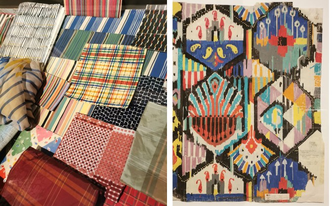
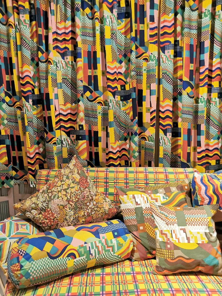
On entering the exhibition it was a complete feast for the eyes … with pattern and colour everywhere, appearing from around corners, up above and room after room. This was a true dive into the archives of Collier Campbell textiles over decades of working together, two sisters and a shared vision for joyous textiles. The exhibition included a wide range of items designed by Susan and Sarah, from the drawing and painting tools, to loose sketches and scaled painted designs on paper to lengths of printed fabrics, interior products and dresses. There were examples of Sarah’s more recent collaborations with Magpie and West Elm, alongside press cuttings featuring both Susan and Sarah at home and wielding paint brushes.

As a child growing up in the 1980s the look of home textiles, if not Laura Ashley, was likely to be Collier Campbell. With bolder and colourful brush marks suggesting the joy of Les Fauves artists, Matisse and Derain, rather than the Victorian Gothic tight sprigs Laura Ashley celebrated. I remember visiting the exhibition at London’s National Theatre in 2011, celebrating fifty years of sisters Susan and Sarah designing in 2011, shortly after Susan died. I recall loving the energy in the painting and bold use of colours.

In this current exhibition, as is the legacy of the archives, the patterns are rhythmic in their flow and scale; musical in spirit. Motifs are often geometrics, florals and birds, and famously designs such as Cote d’Azure, evoke summer scenes in Europe as the sisters worked to deadlines only imagining the holiday season. It was wonderful to see the paperwork for this piece, having included it in my book, Repeat … that features an interview with Sarah and images of key pieces by Collier Campbell.

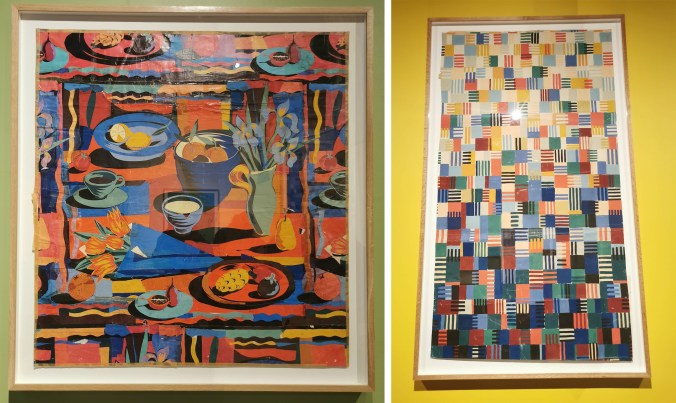
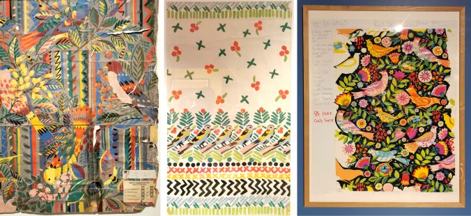
A design new to me that I really enjoyed seeing was Dancing Squares, from 1990 for American company UTICA (Stevens). This huge length of hand printed paper over two and a half metres long features painted squares evolving from dark to light up the design (right hand image below). The design on the left, again one I wasn’t familiar with, was a huge collage of a table of food and drink, in warm reds and oranges complemented by blue and turquoise.

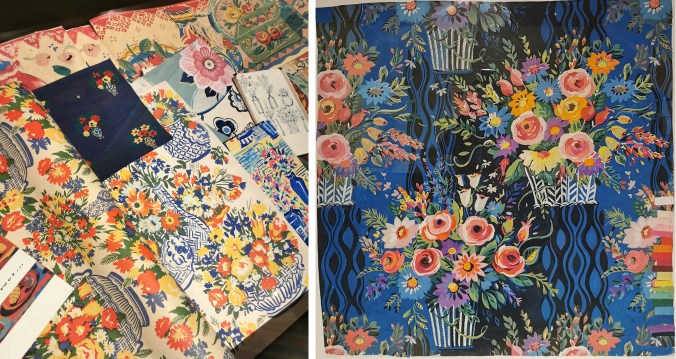
The florals and bird designs were full of life, with painted textures and pattern. It was also good to see the colour chips on the sides of some designs to guide the printers for production, as well as notes for the artworks and printers. The designs have depth as Susan and Sarah played with backgrounds and foregrounds as equal importance. Display cabinets showcased works on paper and coordinating designs alongside their hero prints as large statements on the wall and hanging as lengths.

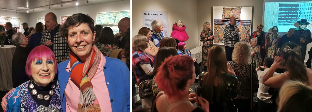
Everyone was friendly. I chatted to several people during the evening as we shared our joy of the work on show and the speeches by the curator as well as Sarah celebrated the pure joy that pattern, colour and creativity can provide. I was excited to have the opportunity to talk to Zandra Rhodes, the founder of the museum, and who continues to inspire us all, including the students I teach at Norwich.

I have only shared some of the many photographs I took on the evening, but I strongly recommend the show to anyone who loves printed pattern. It is the perfect tonic for the times we are living in, and a beautiful reminder of the joy to be found in painted and printed pattern! Congratulations to Sarah and the curatorial team of Teresa Collenette and Dennis  Nothdruft at the Fashion and Textile Museum.

I sat on the train back to Norwich with my heart filled with excitement for the world of pattern I belong in, energised to support the next generation of designers I am working with at Norwich over the coming months. It was a day of celebrating Sarah and her sister Susan, having seen so many of their designs in the two exhibitions I visited – what a truly impressive legacy to be inspired by!

London pattern day: Liberty / Women in Print

I spent a busy day in London this week, with focus on print and pattern. It was fabulous! My first destination was the William Morris Gallery, Walthamstow in east London. I can thoroughly recommend the exhibition, Women in Print: 150 years of Liberty Textiles, on until Sunday 21st June 2026, in conjunction with Liberty Fabrics.

The exhibition spread across two floors of the gallery with a number of rooms and corridors showcasing some old favourites of printed textiles and related works on papers, alongside some lesser known pieces and associated garments.

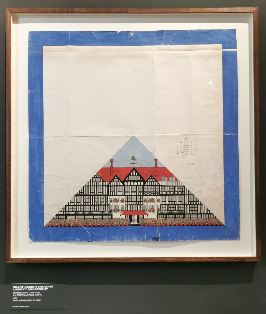
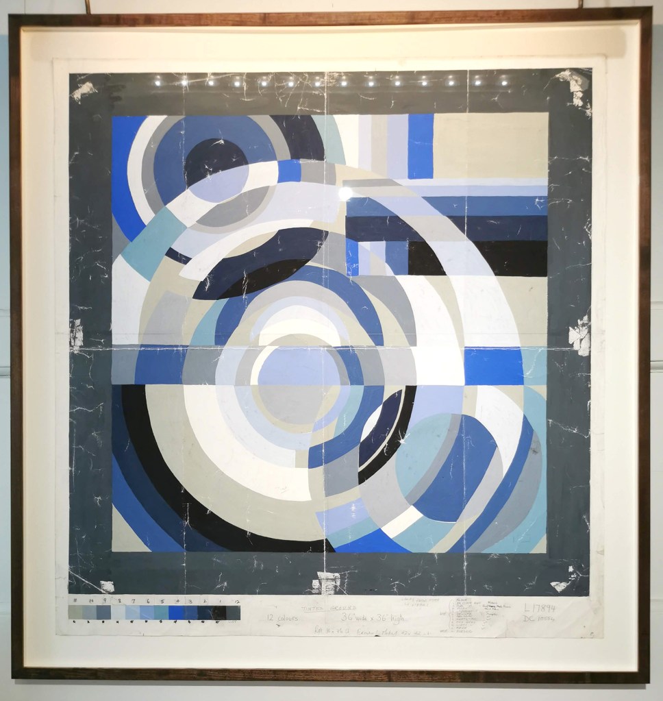
The introductory video for the exhibition gave an insight to the role of women at Liberty with old photographs and recent interviews. I thoroughly enjoyed seeing old favourites throughout the exhibition, with works by Sonia Delaunay, Althea McNish, Jacqueline Groag and Susan Collier & Sarah Campbell as well as being introduced to names I wasn’t aware of, including Mrs Stoneley and Winifred Mold. I hadn’t realised Lucienne Day only designed one design (Fritillary) for Liberty, with it being agreed she would design for Heals while Robert Stewart would design for Liberty!

There was a second video upstairs, filmed in the 1970s that showcased the print and dye work with some rather random models in Liberty clothes wandering in and out of shot, by the print tables and dye vats in swimwear! When I discussed this with Sarah Campbell later that evening she joked it was her and Susan, the design duo behind Collier Campbell – exhibition now on in London’s Fashion and Textile Museum and featured in my next blog post!

The exhibition is free to attend, with donations to the gallery gratefully received.

Congratulations to curators, Rowan Bain and Róisín Inglesby.

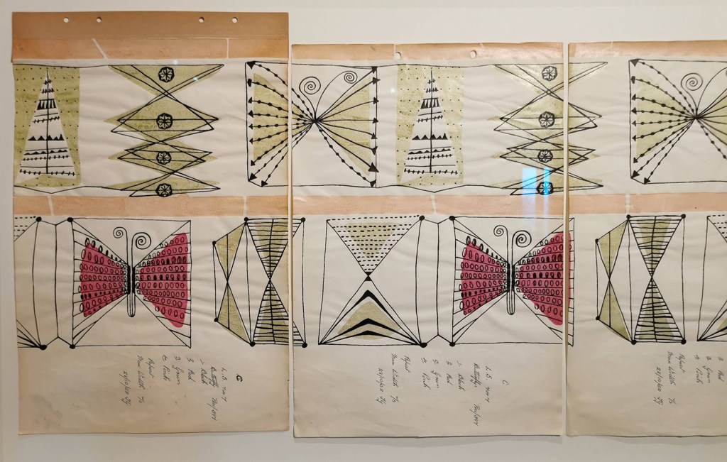
Susan Collier & Sarah Campbell, scarf design featuring the Liberty shopfront

Sonia Delaunay scarf design

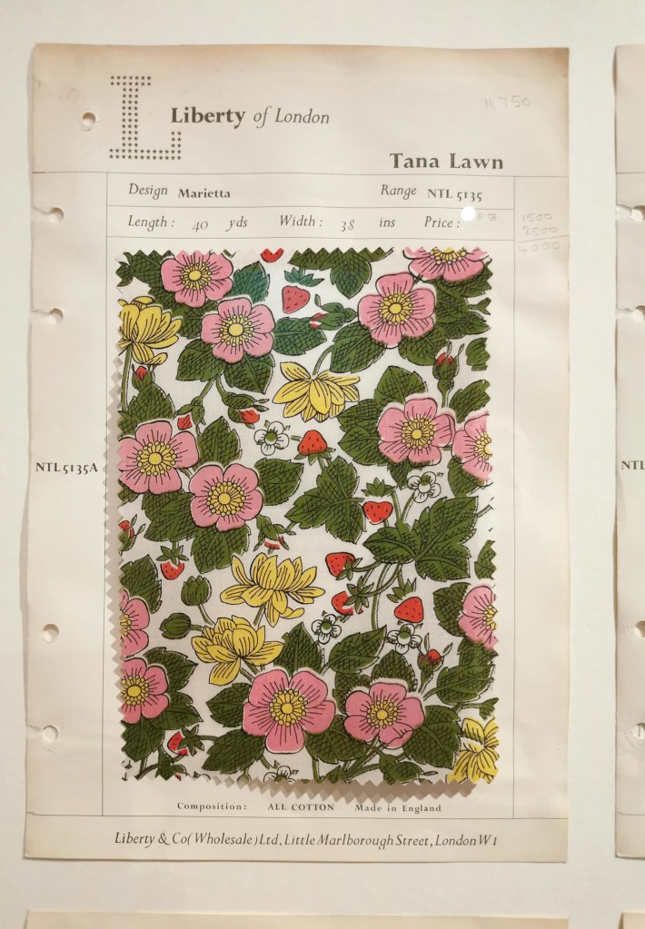
Liberty swatch

Lucienne Day’s ‘Fritillary’, her only design for Liberty

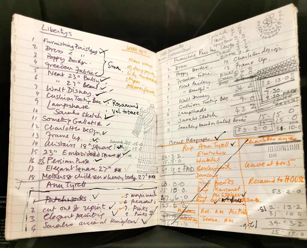
Sarah Campbell’s notebook, double-spread

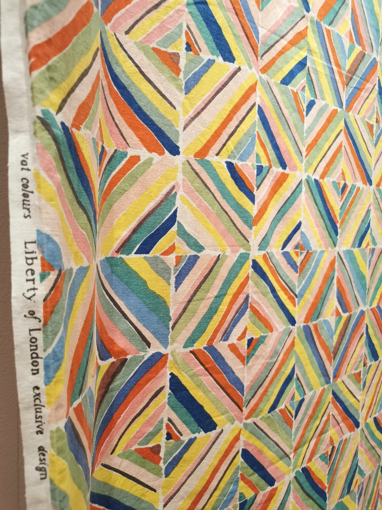
Collier Campbell ‘Kazak’ design

Collier Campbell for Liberty, featuring Bauhaus, inspired by Gunta Stolzl, the weave master at the Bauhaus, Germany

sharing my pattern research

I’ve been busy printing and presenting my ongoing pattern research over the last few months, testing the design and print process, and receiving useful feedback – which may explain the lack of blog posts recently!

Last September I presented my work at the Fashion and Textiles Courses Association conference, Futurescan 6, held at De Montfort University in Leicester, and had a small exhibition of the work in progress during the conference. It was great to formalise my ongoing work at that time, and receive external feedback from the audience. It was useful to consider how I communicate the research, as the principle is simple but the process complex. I have also discussed this research as part of other presentations over the last few months, for colleagues, for undergraduate students as well as the audience of the Costume and Textiles Association’s programme of Heritage Open Week talks at the Forum in Norwich.

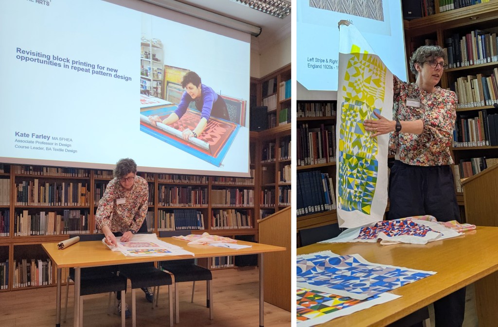
Last week I presented this research to the British Association of Paper Historians as part of their Spring Meeting held at St. Bride Foundation, having been invited to do so by the Wallpaper History Society. My fellow presenters covered wide ranging topics, from paper conservation, Japanese paper as cloth, the College of Arms and the current situation of the paper industry in the global context. It was a fascinating day with lots of common ideas and interests, and I received some very positive feedback to keep me on track.

I have further opportunities to share my research in a couple of months, so more news on that in due course!

I am continuing to develop both lino blocks as well as artwork for screen printing, which enables me to test different colour handling and substrate options, for wallpaper and cloth. Colour is an important element of this research and particularly the transparency of colour in the overprinting, so the palettes will continue to evolve as I continue the exploration of primary and secondary colours.

As I gear up to making larger work for an upcoming showcase opportunity I look forward to sharing more of the work in progress.

sketchbook development
pattern development