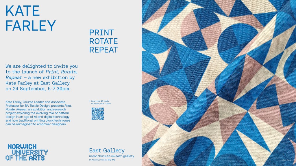
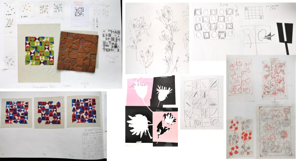
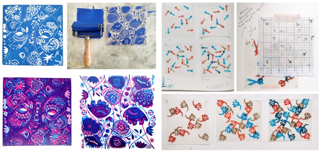
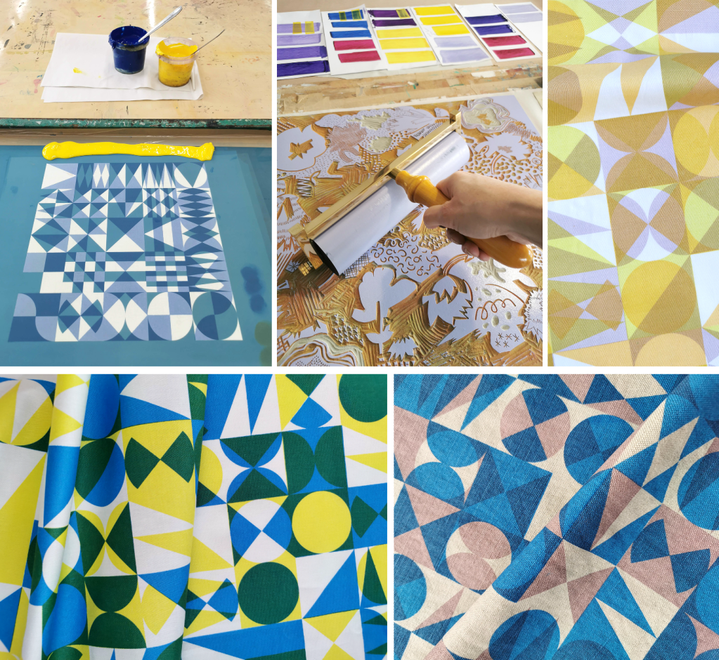
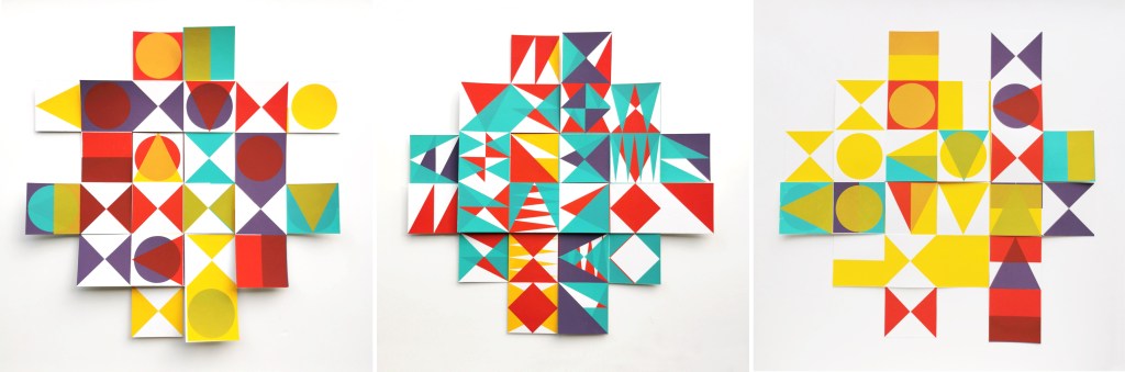
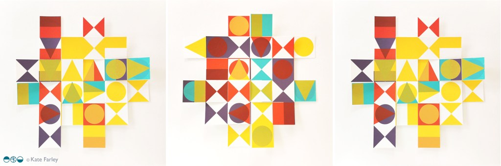
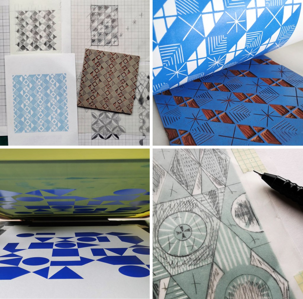
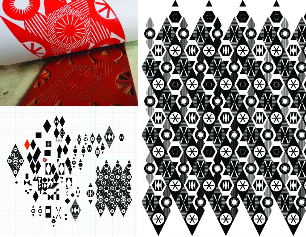
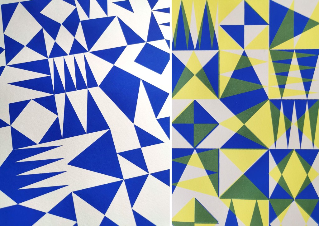
As I’ve mentioned on the blog before, I’ve been developing a new relationship with pattern design based on traditional block printing over the last three years. I’m delighted to announce I have a solo show at the East Gallery, at Norwich University of the Arts opening in three weeks time, open for a month. I’ve printed about one hundred metres of fabric over the last few months and I can’t wait to see much of it installed.
Despite it being a busy few months in academia I’ve been squeezing in time to screen print as I’m working towards a solo show of this research project – more information coming soon!
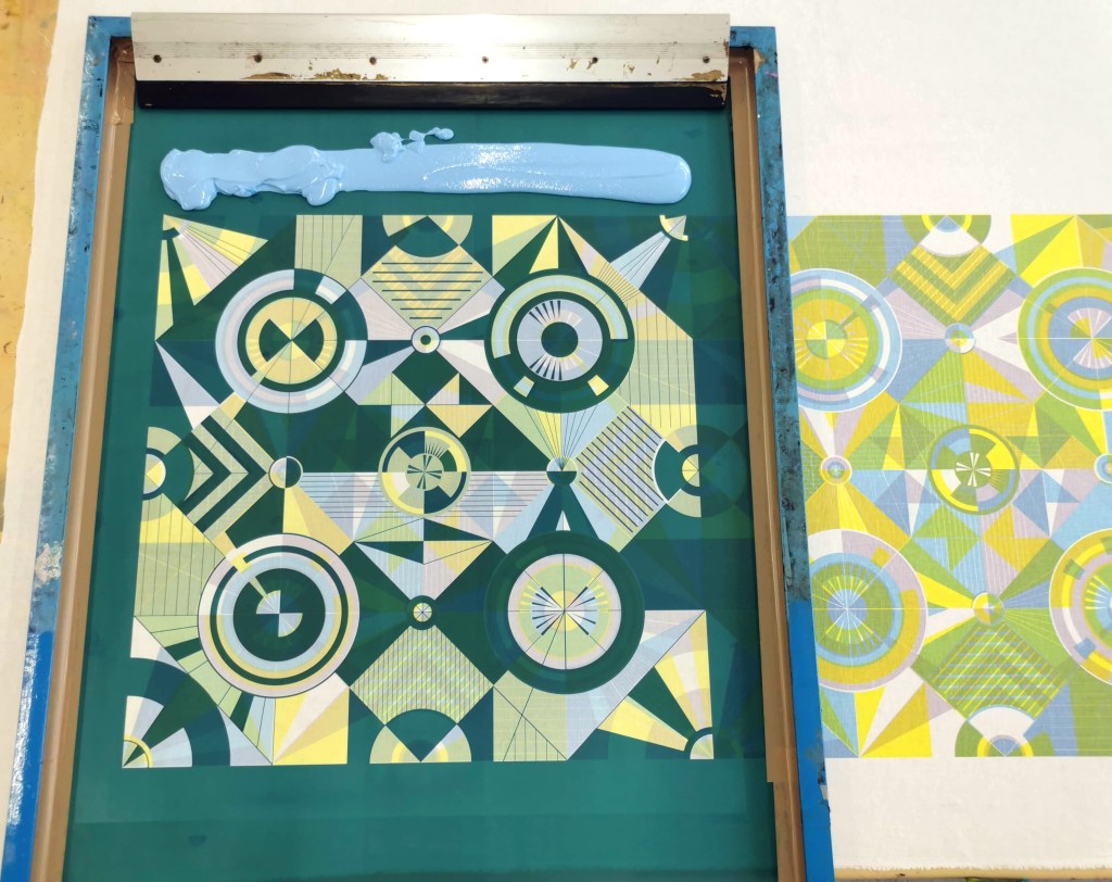
To build anticipation, here’s some shots of some of the progress in the pattern work …
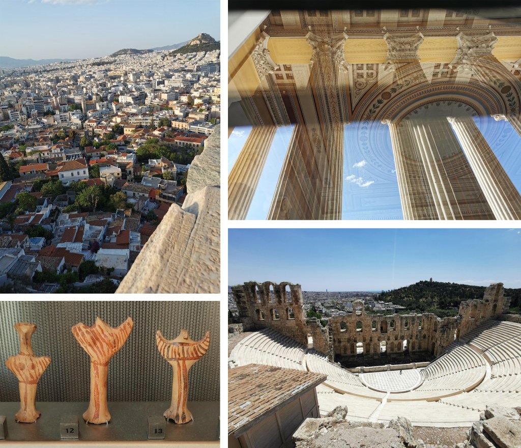
In May I was lucky enough to have a paper accepted at a conference organised by the Netherlands Institute Athens on the subject of Textiles Production and Representation: From Pre- to Postmodernity. It was an incredible three-day event with truly international delegates and it was fascinating to hear about so many aspects of textiles. From spinning to weaving and knitting, from personal narratives to shared histories, from craft practices to industrial production, I learned so much. Everyone was sharing with their research and supportive of each others. I presented my ongoing practical research and received great interest and feedback too. It is a time I won’t forget easily and I’m sure we will cross paths again.
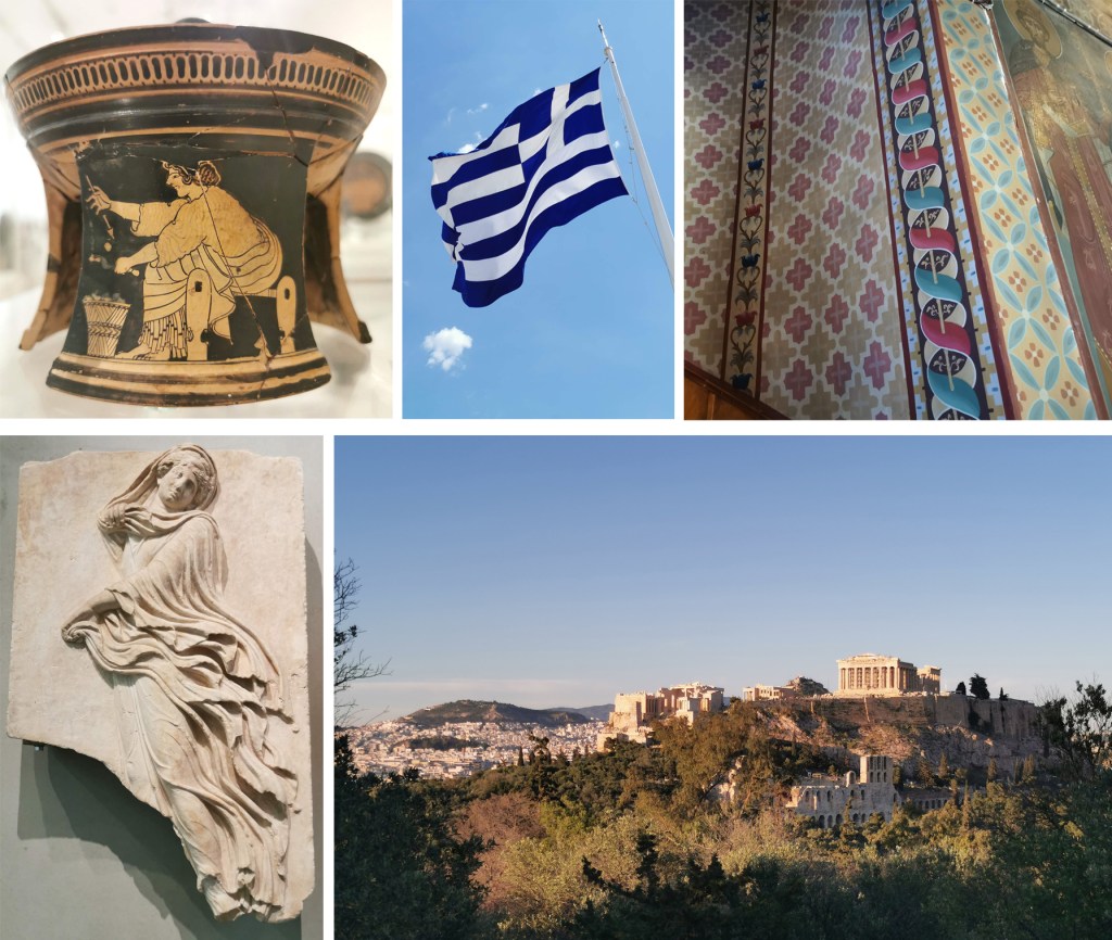
I was able to tag a couple of days of leave on to my trip so there was enough time to explore Athens. I’ve transferred flights over recent years and was last in the city as a young child with memories of intense heat and traffic, but my experience this time was very different. I explored the city on foot, through small alleys and back streets, up and down steps as well as hills. I sat watching sunsets, and took in the sites, including the Acropolis twice! I was completely taken with this city.
I walked miles, visited museums and landmarks, ate wonderful food and took lots of photographs! The dates of some of the artefacts I saw was mind blowing, as was the incredible craftsmanship. I can thoroughly recommend the Benaki museum, the Ghika museum, the Acropolis museum, the Archaeological museum, the stadium, the small squares, the classical ruins, the changing of the guards and botanical gardens, as well as Lycabettus Hill. My photos can only hint at the joyful time I had there – I can’t wait to go back!
I’ve been busy printing and presenting my ongoing pattern research over the last few months, testing the design and print process, and receiving useful feedback – which may explain the lack of blog posts recently!
Last September I presented my work at the Fashion and Textiles Courses Association conference, Futurescan 6, held at De Montfort University in Leicester, and had a small exhibition of the work in progress during the conference. It was great to formalise my ongoing work at that time, and receive external feedback from the audience. It was useful to consider how I communicate the research, as the principle is simple but the process complex. I have also discussed this research as part of other presentations over the last few months, for colleagues, for undergraduate students as well as the audience of the Costume and Textiles Association’s programme of Heritage Open Week talks at the Forum in Norwich.
Last week I presented this research to the British Association of Paper Historians as part of their Spring Meeting held at St. Bride Foundation, having been invited to do so by the Wallpaper History Society. My fellow presenters covered wide ranging topics, from paper conservation, Japanese paper as cloth, the College of Arms and the current situation of the paper industry in the global context. It was a fascinating day with lots of common ideas and interests, and I received some very positive feedback to keep me on track.
I have further opportunities to share my research in a couple of months, so more news on that in due course!
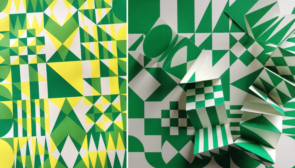
I am continuing to develop both lino blocks as well as artwork for screen printing, which enables me to test different colour handling and substrate options, for wallpaper and cloth. Colour is an important element of this research and particularly the transparency of colour in the overprinting, so the palettes will continue to evolve as I continue the exploration of primary and secondary colours.
As I gear up to making larger work for an upcoming showcase opportunity I look forward to sharing more of the work in progress.
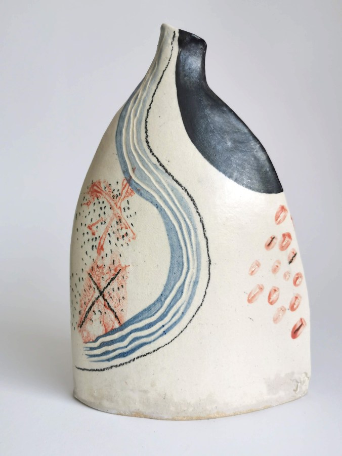
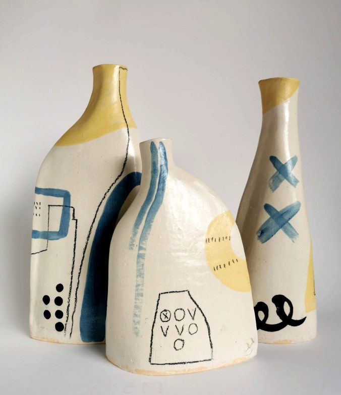
A little over a year ago I started to collaborate with my mum on a very special creative project. My mother has been a potter all of my life and family meals at home would mean eating from hand-thrown stoneware bowls, plates and cups made by her. During the 1970s and early ’80s she exhibited her goods at craft fairs in and around Wymondham, Norfolk and we would hang around watching as mum demonstrated her craft alongside her creative friends. We were lucky enough to have personalised birthday gifts made by mum during our childhood, and when I left home I was given a homemade teapot, cups and bowls that I still have, three decades later! My sister and I used to play at the potter’s wheel and hand build the odd ornament. I vividly remember the smell of burning clay dust on the bar heater and the feeling of dry clay on my hands.
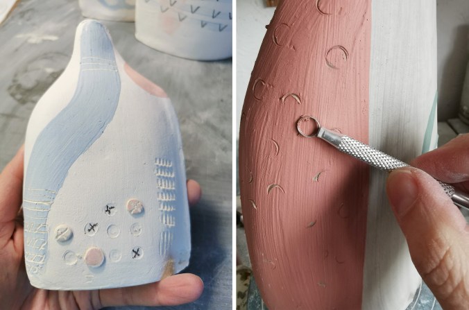
Last winter, as a way to spend time together at a sad time of family loss, I suggested we try collaborating, sharing our skills to see what we could come up with. I made a project sketchbook to outline a few thoughts and approaches to form and visual language, and handed it over for mum to think about what chimed with her. Although I’m a surface pattern designer, I’ve no experience of hand painting on ceramics beyond art school. Mum has switched to hand building her vessels in recent years so this was how we started. After a morning in my studio pressing tools into damp clay, drawing forms and testing colours, the project was underway.
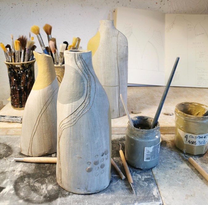
Mum tested a few ways to construct the vessels and I responded to the forms with drawn and painted marks inspired by our mutual appreciation for landscape. I had to learn how to load the brush and use the colour on the clay. I monoprinted texture and marks by painting newspaper with colour then drawing on the back of it on the damp clay. I drew with the ceramics pencil and scratched through shapes of colour with different tools. I’d hold my breath in anticipation as I planned a long line of colour, top to bottom, over the neck and shoulders of the form. We also added buttons as visual and textural interest. We had some gentle discussions about my preference for marks mum was less keen on, and we egged each other on each time we returned to the pottery. I’d receive a message, “Kate darling, I’ve made some more for you!” and soon the weekend arrived and we were nattering away, having our creative fun together again.
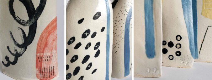
We have learned lots about what we have both wanted with the shapes and surface pattern of the pots, and I’ve tried my best to understand slips, engobes and underglazes. Our techniques have been refined, and standards raised during the year. I’ve definitely got better at drawing on three-dimensional forms – I’m even more in awe of Clarice Cliff! There are three series so far, exploring different forms, colourways and surface decoration, with approximately ten flasks in each.
I’ve thoroughly enjoyed the opportunity to work with mum on this project, it genuinely feels an absolute privilege to be able to work in this way. This collaboration has been one of united adventure, sharing each other’s creative decision making and discipline expertise to guide us, learning to make more than we could individually, sitting beside each other in a conversation between clay form and mark making.
I also think we may not be done yet … we shall see! We are looking at options to exhibit them and would very much like to share them with others.
I’m currently working on some large scale lino blocks to print floral patterns as part of my continuing pattern research. At the same time I’m also teaching our BA2 group how to create repeating printed patterns, so it’s always nice when there is some parallels between what I’m up to and what the students are doing.
I have been returning to my sketchbook of floral drawings I made from my trip to the Italian Alps, and exploring them again with new paper cutouts as I think about overprinting and block rotation. I’ve not proofed the plate yet, but here’s some work in progress images from the studio.
I am really pleased to have had two of my most recent works on paper selected to be included in the Print Cromerexhibition this summer, with the Private View on 19th July. This new body of work has been developed as part of my academic practice at Norwich University of the Arts where I have been exploring pattern structures and repeat blocks. I have explored new pattern iterations by rotating the screens to add additional colours of the same artwork, thereby building greater complexity from limited design information. In an age where digital design and the use of Artificial Intelligence provides limitless opportunities, I want to explore the fundamentals of pattern creation to generate new possibilities that are led by the designer, ensuring the creative path is transparent.
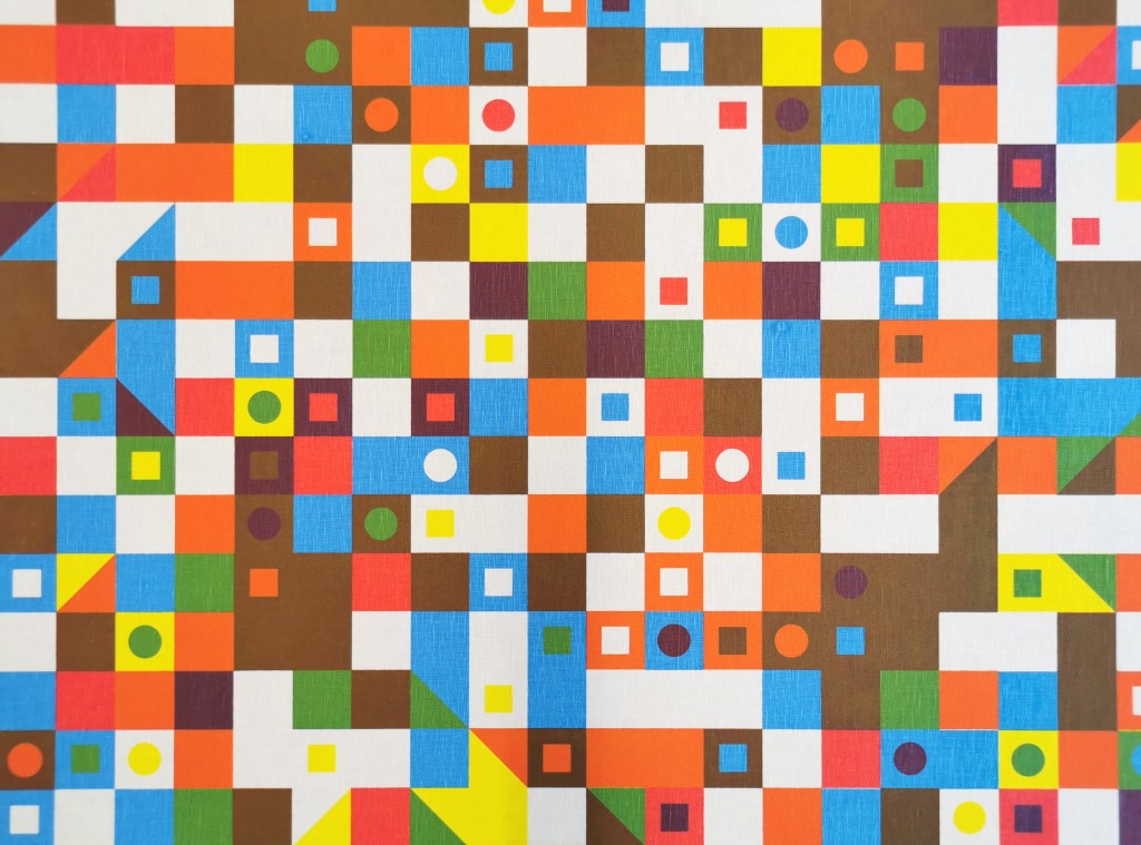
The theme of the exhibition is PLAY, and as a result the palette I created feels full of summer carnivals and fairgrounds. The overprinting of inks with differing levels of transparency provides a building of depth and subtlety of harmonious colour.
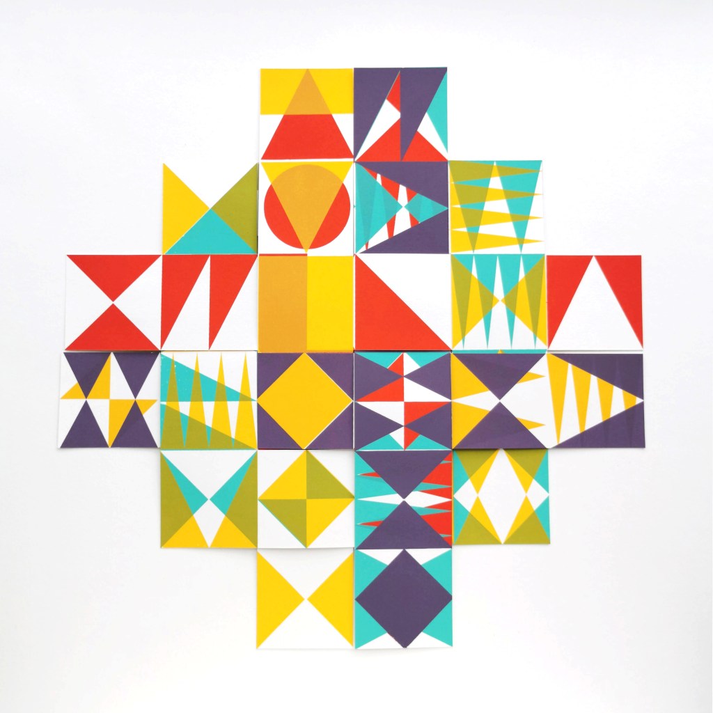
I created a number of one, two, three and four-colour prints initially, that featured the screen rotation in adding the colours. I then cut strips of the prints and with further rotation of the strips, interwove them into one base print that had been sliced to enable the slotting. I enjoyed bringing back an element of paper engineering from my book art practice into these new pieces.
In designing each piece, I considered the placement of motifs and relationships of colour. The collection provides variation within a collective identity and belonging. Some pieces feature only triangular motifs, while most incorporate the circular and rectangular elements too. My research utilises design thinking by Lewis Foreman Day, and his distribution of elements. This approach results in scattered focal motifs that work across repeating patterns. Although this is not a feature of my new work, I recognise the placement considerations are also useful in this work too.
A number of these pieces will be for sale during the show.
I’ve been enjoying some studio time to explore my print research as works on paper with the hope of exhibiting the work. I enjoy paper engineering and construction (that’ll be the book artist in me!) and have previously tested paper manipulation in relation to this current pattern research. I tend to work in this way, creating drawings or prints to exhibit / sell alongside forming pattern ideas, and it has been useful to see the evolution of the sampling in this way here too.
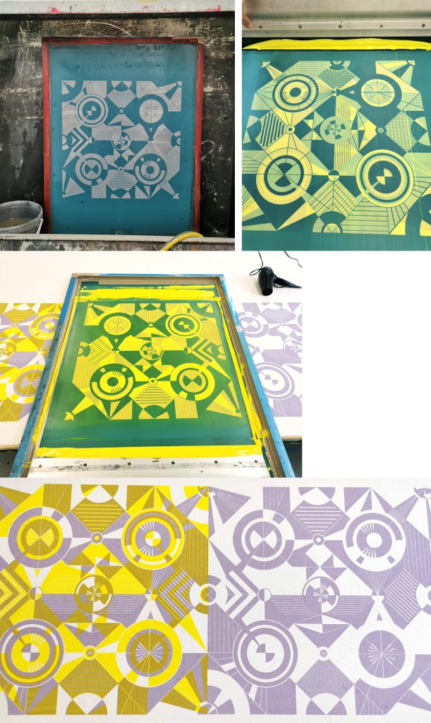
These new artworks utilise my screens of geometric artwork practically exploring research into motif distribution in printed pattern thinking formalised by Lewis Foreman Day in his book Pattern Design, published in 1901. Having printed the artwork in the first colour, I rotate the screen by 90-degrees and print the second colour, turning the artwork / screen up to four times for maximum complexity. To add a further dimension, I’ve been constructing works on paper that utilise several iterations of the prints to build new compositions by weaving and slotting strips of the printed papers in differing combinations of the four colours in the palette, providing the coherency across the series, and an injection of the spirit of summer fairgrounds through the colour and geometric visual language.
There are two screens of artwork used in this collection, therefore two series of original artwork (PLAY – circles and PLAY – triangles) and I shall continue to evolve the body of work over the coming months. I’d love to know your thoughts on this new work!
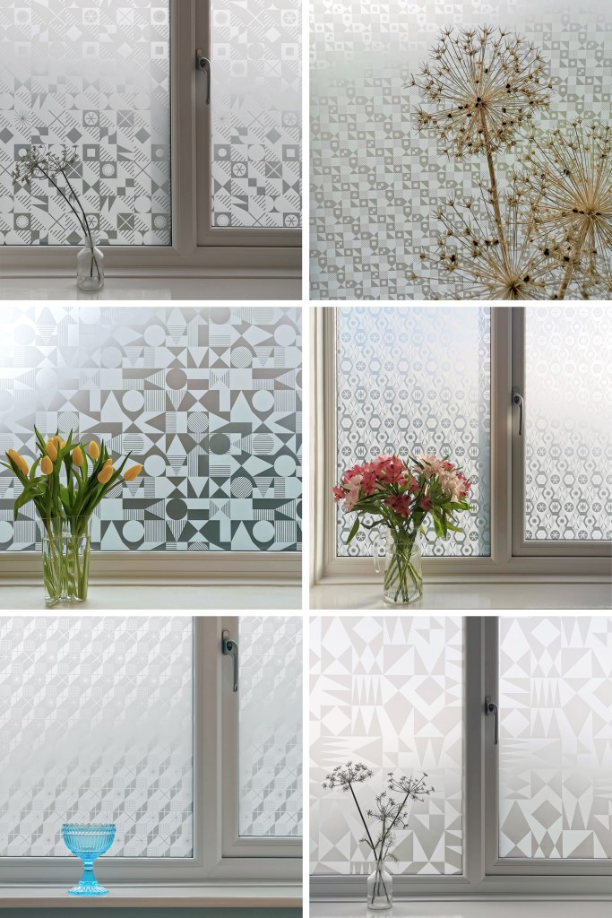
I’m excited to be finally bringing this collection of surface designs to market in collaboration with the Window Film Company. The inspiration for the patterns has stemmed from my fascination with geometric designs, taking the basic ingredients of triangles, circles and squares as my starting point.
I’ve been exploring geometric pattern structures in relation to design principles established by Lewis F. Day at the turn of the Twentieth century, exploring the equal distribution of motifs within a repeating tile to alter the visual rhythm within two-dimensional surface designs. I have also explored expectation and disruption within the repeat tiles. On establishing an apparent small-scale repeat, I play with unexpected shifts in the placement of motifs to disrupt the rhythm, challenging the sense of order. This work belongs to my ongoing practical pattern research as Associate Professor in Design at Norwich University of the Arts.
The six designs each have their own identity and yet belong together like siblings in a family, with shared features of geometric motifs and formal compositions throughout this collection. Some of the designs started their life as self-initiated physiotherapy back in 2020 / 21 following abdominal surgery and my subsequent recovery. The design challenge, to make small-scale lino blocks of repeating patterns to print by hand, provided me with small physical and mental tasks to focus on between the naps. I had hoped some of the designs would one day be leaving my studio, and I’m pleased and proud to share them now.
Designing for window film requires consideration of motif, shape and pattern construction without the aid of colour, requiring an absolute focus on negative and positive shapes. I enjoy working within design limitations in relation to production requirements and technical specifications, believing the challenges become design opportunities. I spent some time testing the various scale of patterns across the collection, including a micro pattern (Step), through to a much larger scaled pattern (Triangulate), considering window sizes in both domestic and commercial spaces in relation to the motif sizes.
I’ve worked with the very patient Steve at the Window Film Company for all my designs available on film, including the large-scale bespoke design for Birmingham Airport back in 2017. Previous designs from my Construct collection available from the Window Film Company won a House Beautiful award in 2018 too!
Steve worked with me to sample some of the early versions of these designs generated as digital scans from lino prints initially, but I didn’t like the visual quality in the translation of the prints. The original artworks for this collection were generated using collage and screen printing alongside the lino prints as I prefer designing with a physical relationship to image creation. After further consideration I opted to create each of the designs as vector-based files for production, providing sharp graphic quality to the patterns.
Mike at Window Film Co. was also fundamental in getting this collection established, off the computer, on to window film and ready for sale. Our conversations focused on understanding my design identity in relation to previous work. He ensured the designs felt authentic to me, while building on the existing designs I already license to the company.
It’s always exciting to receive a delivery of samples, and I’ve had a few of those over the last few months. The final product is very different to a digital file, so it is important to inspect the artwork as film installed on the window, checking the scale of repeat as well as any discrepancies in the artwork – you must have sharp eyes for detail! With final decisions made and sampling approved, as well as the small matter of naming the designs, we have been able to sign off the artwork, and launch the six designs in the collection: Circulate, Diamonds, Shift, Triangulate, Step, Pairings
After the lovely summer I’ve been back printing in the studio, with some lino blocks on the go as well as two new screens I’ve had exposed as part of my pattern research. I’ve been exploring the rotation of the artwork as well as folding the prints to determine visual narratives.
I tend to not worry too much about colour palettes in this sampling phase, particularly as I’m focusing on the pattern building but also considering a range of material substrates for future outcomes. I appreciate this gives me freedom to test colours, some more successfully than others. After several days at the computer screen it can be a complete relief to spend time at another type of screen!