spring brings colourful joy

I feel as if I’ve dragged myself through the grey, wet and cold British winter, without the delight of deep snow to play in, and finally the signs of growth in the garden and country lanes are undeniably taking us in firmly to the middle of spring. The magnolias are blooming, the blossom of blackthorn has been and gone in Norfolk and the yellow of the daffodils is being overtaken by the yellow of the oilseed rape fields.

Almost without warning, as if overnight, the garden has transformed from bare earth to borders full of colour; clusters of yellow, of orange-red, hot pinks and fussy white frills. The tulips are here, and with them comes the idea summer may follow spring. I’m not rushing the time by, I’m just more appreciative of the brighter, warmer months.

With the threat of heavy rain over the weekend I gathered up some of the tulips for the house – bringing the outside in. They’ve brought with them such joy, I really do feel better with the colour around me. I spent a little while drawing them a couple of evenings ago to absorb the colour and form of each one, thanking them for bothering.

Tulips have featured in art and design for centuries, in drawings, paintings and textile design, but my favourite has to be by the Austrian designer, Josef Frank, in Tulpaner, see below, for Svensk Tennn. The different flower heads of the tulips bursting from the dark background as if the colour is jumping out of winter is just how I feel, as the warm spring sun encourages the garden to enable colour to thrive and for us all to spend more time enjoying it.

drawing breath

Drawing has always been an important element of my design practice. It gives me time to refocus, to get away from everything else, to appreciate the beauty in things and keeps my eyes and hand working together in my lifelong investigation of how I look and how I record what I see.

The flowers drawn here were some of the last from the summer borders, consisting of dahlias, sunflowers, hollyhocks and verbena, captured quickly in pen, while I sat by the window, enjoying the warmth of the sun and the shadows that the flowers created while I drew.

colour around the garden

When my children were very young I remember having to occupy them in a park near a hospital and as the time dragged on they were clearly finding the wait too long and boring. I came up with the task of finding colour to entertain them, so they dashed here and there with specs of colour. Sometime later we had little piles of different colour from leaves, petals, grass etc. and we were surprised by how colourful the park was when we first thought it was all green.

Many years on this week I found them doing it again, for fun… as the garden was so full of colour. It was wonderful to see them noticing the extent of some colours such as reds, and difficulties with blue, but with lots of rushing around again they made an impressive rainbow. Me being me I stepped in to organise the colour a little bit more, order some specifics … and then got told off for styling it for social media… oops!

The garden in June

summer colour palettes

Colour inspires me. I love to work with colours; creating pairings and partnerships of colour to build reactions between them, evoking moods and setting a spirit through colour choices. I notice colour relationships every day, and enjoy considering why certain colours thrive alongside others. I love to wear colours too, and like to contrast materials as well as colour to create interesting relationships. I do worry if I find myself in brown trousers and a green top – I don’t want to look like a tree!

Over the last eighteen months I’ve spent time mixing colour using gouache paints, matching colours perfectly with items collected from walks. Little collections of seaweed, shells, catkins, feathers and leaves have sat patiently in the studio while I mix and match. I’m good at matching colours and would be perfectly happy spending hours a week doing just that.

I also enjoy creating colour palettes, sometimes for projects, or my teaching sessions, and sometimes just because what I see around me suggests a perfect palette to explore and create. Our garden has been a bit of a project over the last two years and this summer the new borders are filled with colour that bring such joy to me. My mood is lifted when I see colours working together well. Here are two results from a photograph taken in the garden earlier this month, just because the splashes of colour were pleasing enough to capture.

I like the dominant green that provides the backdrop for the brighter colour accents, and the shapes of the flowers are like splashes of colour dropped in to the soothing green. The pink, red and orange provide the warmth, while the blues are calming and restful. The depths of the border at the bottom of the flower stems are dark, no doubt cool away from the summer sun.

I decided to explore the role proportions of colour play in a palette in the second image. The width of each colour stripe is representative of the area it covers in the image. Back in 1994 this was one of the summer projects I was tasked with as I started my degree in textile design – and all these years on I still enjoy doing it! You can see how the colours perform when dominant, or work as accent colours in thin slithers. There are always main characters and supporting roles in a palette, but it takes all sorts to put on a performance!

When selecting the colours in the image for the palette I worked with the larger areas of colour first, then looked to see how the colours had natural partners to sit next to in the stripe. The accent colours grab the attention of my eyes. Both images reflect the same colour palette, but present themselves quite differently.

passion for passi flora pattern

Many years ago my flatmate was given a passion flower plant and when the flowers came we were both in awe of their splendid form; a thing of beauty in our otherwise less than beautiful flat in Camberwell, south London. I made drawings of the flowers and sometime later developed some patterns from it, screen printing it as repeating designs and placement prints. I created the motifs by deconstructing the elements that constitute the flower head.

More years passed and sometime around 2012 I revisited those screen printed patterns, this time interpreting them as lino cuts as part of my Plot to Plate series of editioned lino prints. Last year I planted two passion flower plants in our new garden and last week we had the first bloom. It took me right back to that first flower in the flat in Camberwell, and was reminded of the pattern again.

passiflora_web

Whenever I look back at old work I’m likely to want to make changes, and this is the case here too, but each design also holds a moment, defines a time, and sometimes that makes it what it is. I’d not imagined I’d connect that flower to my practice almost twenty years later…

This pattern remains available as a set of patterned Plot to Plate greetings cards.

KateFarley_GC5002_blog

Brassica purple, harvest time

Having sown the seeds for purple sprouting last summer it has been the usual long wait until harvest time, but we have been picking it for the last few weeks. It always feels good to pick the brassica because the new season of crops are a while off harvesting.

KFarley_Brassica1a

The purple of the sprouting inspired my colour palette for the Plot to Plate tea towels.

plottoplate_brassica_KF

I can’t resist colour matching, so here we are again …

KFarley_brassica1

Plot 8

This summer has been a funny one for harvest on the allotment. The long period of heat and lack of rain resulted in tiny potatoes and very  late runner beans but somehow despite this, vast marrows! This year of gardening has been rather chaotic, with sparse visits fitted in around our working patterns and family life, but once I’ve made the time and put in the effort to get there I have always really appreciated the head space the plot gives me in a somewhat full-on / stressful academic / design career. An hour of digging is so good for my mind and body, far better than any gym visit. Connecting with nature helps me register the seasons, and home-grown fruit and vegetables are the best!

KateFarley_plotcolours

This year started off like any other: hoping for bumper crops, trying to stay on top of the weeds, while trying to clear old ground for new patches of earth to cultivate. Then an opportunity arrived and we made a big decision that has been in the back of our minds to make for a while, couldn’t work out how to do it, but is now coming true. We are leaving Birmingham and moving to the country – Norfolk to be precise (yes I was born there, no I’m not going home) – where I am taking up a new academic role, and it’s all-change! Anyone with a sense of British geography knows we will be nearer the sea, we will see more sky, and the horizon will be flatter! We are not moving up or down, we are moving across!

This process has been taking shape over the summer months and during this time I’ve had to come to terms with leaving plot 8, in an allotment site in south Birmingham that I’ve worked so hard on, dug intimately and harvested crops from since 2006. My children have slept in their prams in all weathers as I’ve carried on digging, they’ve chewed on runner beans when teething and learned to grow their own plants too – as well as digging large pits to fill with grass seeds, much to my horror! I’ve dug alongside friendly birds, untangled a hedgehog from the bindweed and been startled by a fox; it’s rarely lonely at the site. I’ll never tire of the first scent of sweet peas each year. Here are a few images from over the years:

KateFarley_plotHISTORY

I’ve written many posts here about the plot and the process of growing food, colours, harvests, the community spirit and the way it has inspired my first commercial collection of patterns: Plot to Plate, launched in 2012. I’ve made many editions of prints as a result of mapping the crops growing here. The joys of growing my own food were celebrated in the design featuring tools used on the Plot to Plate title design across tea towels. Without this space – this haven of nature in the big city, I would have struggled far more from living here. As I worked at the allotments I would often think of all the shoppers in the Bullring on a Saturday afternoon, wondering why they made their choice to do so, rather than garden like me.

KateFarley_plot_MAP_1000

This post is written to register the anticipation and excitement of change despite the vast upheaval, both physically and emotionally: saying goodbye to friends and colleagues who have shaped the last 13 years of my life, as well as this plot, that has paid its part in taking care of me. We’ve gathered the tools, taken our last harvest, handed back the keys and now hope that someone else will feel the joy of plot 8 in years to come!

KateFarley_plottoplate_allotment pics_18_100 copy

taking some time from tasks..

It’s the end of the academic year and I’ve got lots of admin tasks to complete and fortunately some trips to prepare for. The life of an academic is no longer one of summer holidays stretching out ahead of us until leaves turn red with plenty of time to catch up with rediscovering the in-tray, or making time for creative practice. Graduate shows, marking retrievals, timetables and planning new modules are only some of the things have been on my list. Many jobs fight for my attention – including the veg plot! Despite the jobs it’s so important to get out and about, see things and make time for oneself! I’ve got a number of projects planned for the next few months and taking stock is always a good start. Here’s to some time to think, and some time to draw, amongst the admin of the summer!

If you want inspiration and have time to see an exhibition I can suggest the Edward Bawden show at the Dulwich Picture Gallery – it’s brilliant. My daughter and I got chatting to two ladies who were enjoying it as much as us; spotting small details and playful touches in the commercial designs including the London Underground roundel as a pigeon’s eye, and several cats lurking! The versatility of processes and visual language, the playfulness, the draughtsmanship and scope of commercial clients is all there to admire. As ever, seeing the old favourites as well as those works new to me, in the flesh is always better than on a screen … Do go if you can – before September 9th!

I was very proud to also see my ‘Gardening with Mr Bawden‘ book published by Design For Today in the exhibition shop. The handling copy was a shadow of its former self, so I did my duty and folded it up properly again. The sales assistant commented on how well they are selling, so I’m grateful to those customers too!

Bawden_bookshop


Gardening with Mr Bawden

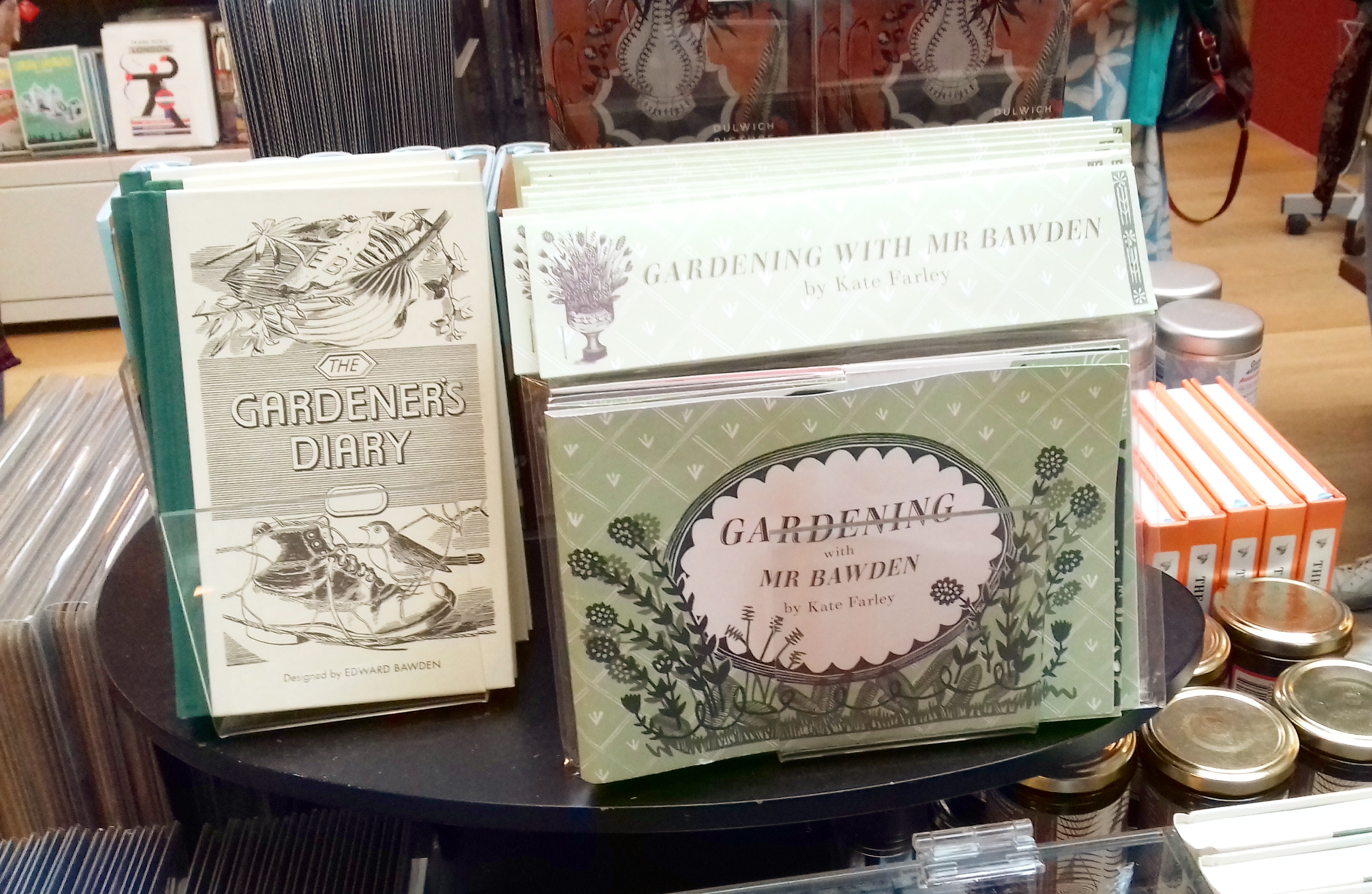
So this is the week my book ‘Gardening with Mr Bawden’ is being published by Design for Today. It’s been many months in the making, so I’m very excited to be able to share the details and for other people to hold the book in their hands.

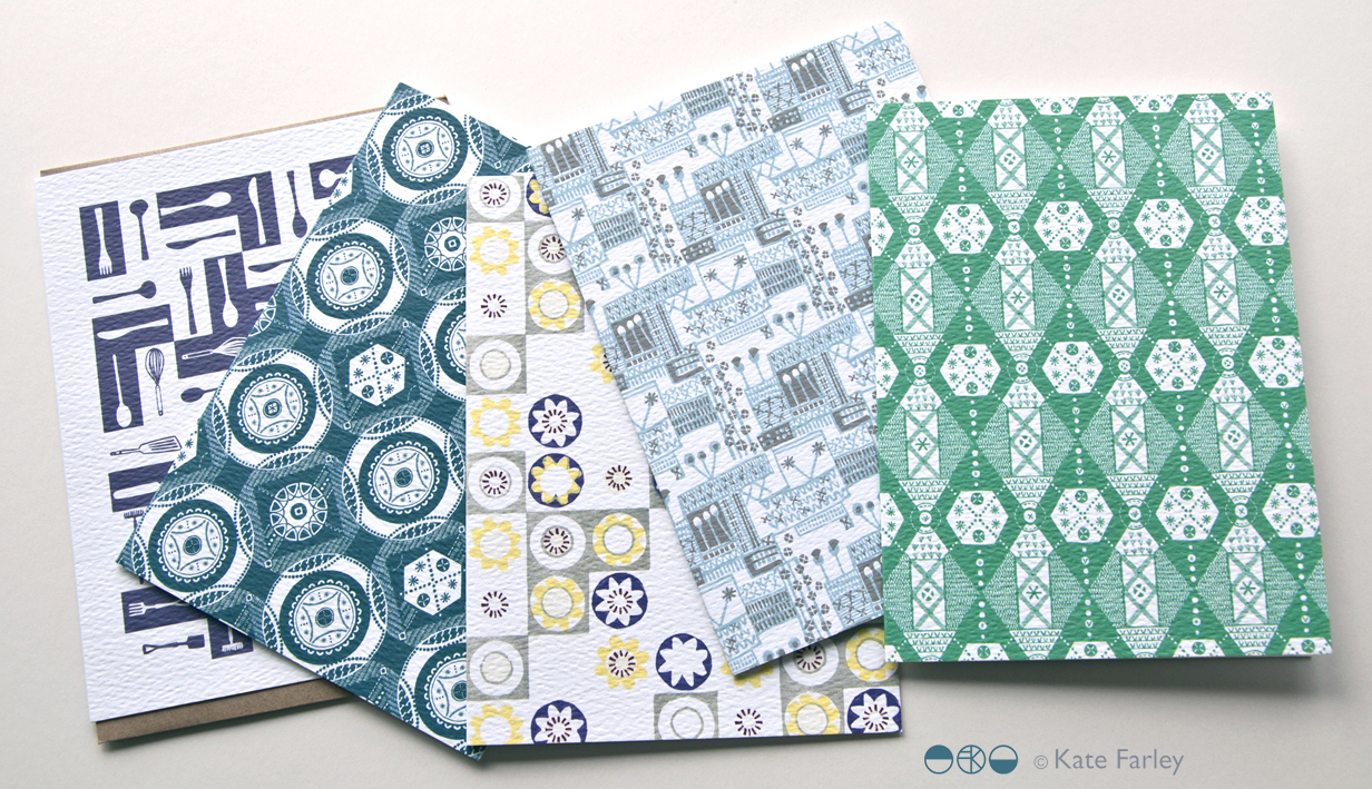
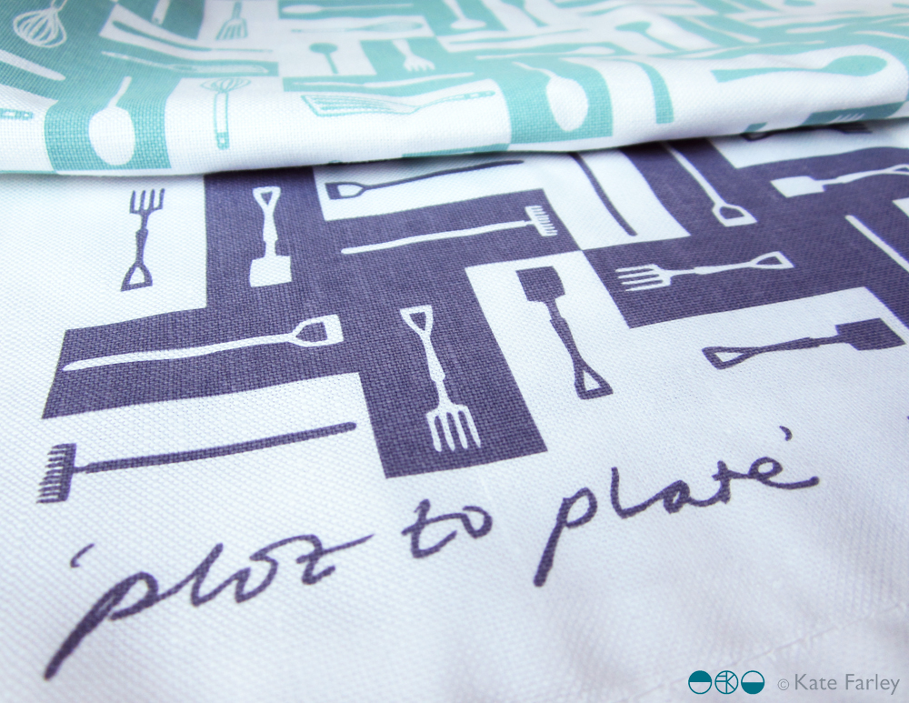
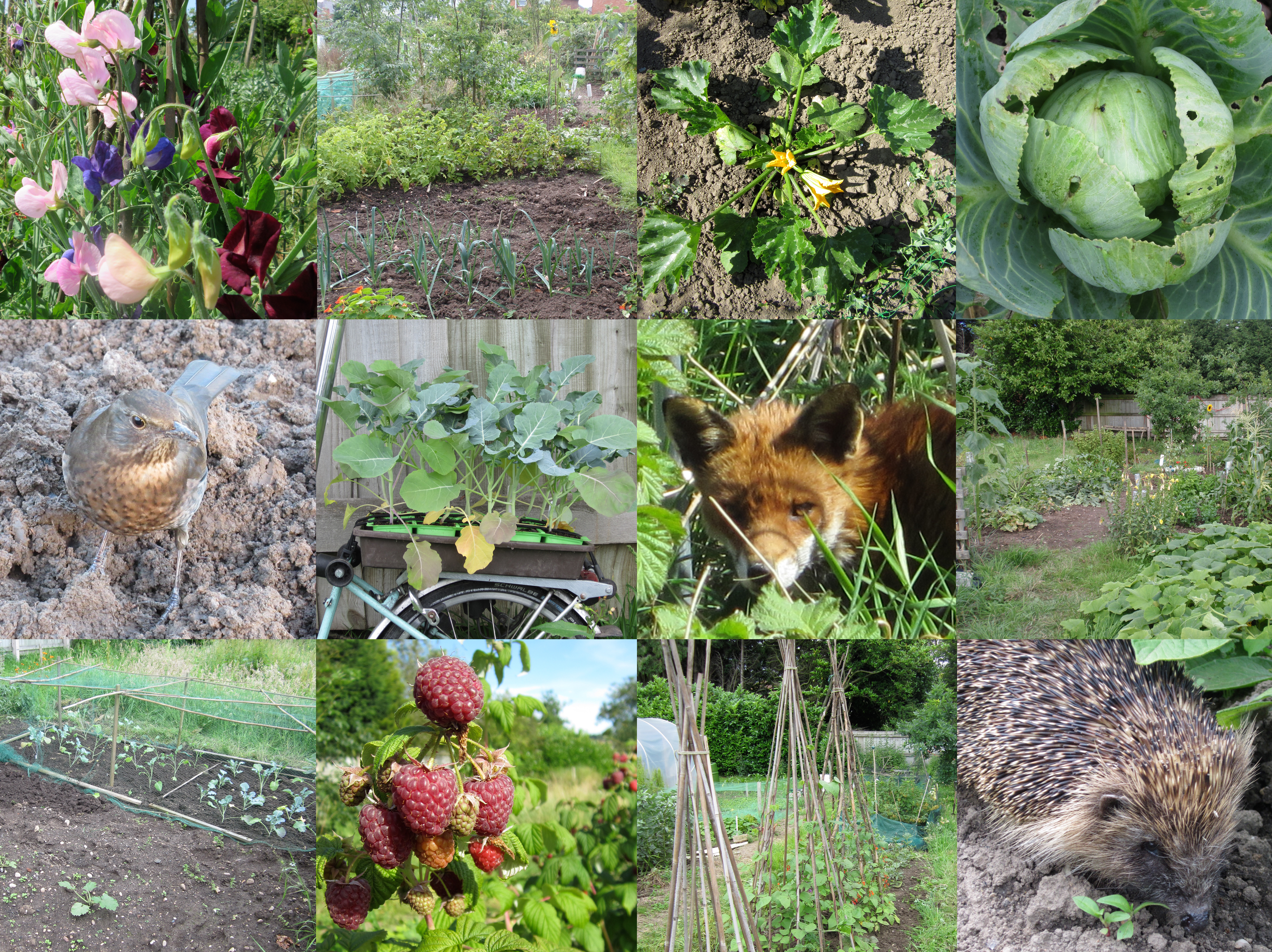
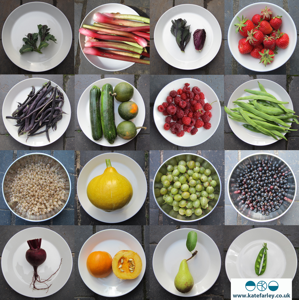
What began as a project brief for a book with interesting folds that celebrates Edward Bawden’s love of gardening has become a project I am very proud of and have thoroughly enjoyed for lots of different reasons, pushing me creatively along the way. I love a design challenge and returning to the subject of gardens has been a pleasure, having launched my garden-inspired Plot to Plate collection back in 2012 and being a keen allotmenteer. I’ve moved away from my usual diagrammatic visual interpretation of gardens, towards a more illustrative manner, following on from my Parks and Gardens commission for posters for London Underground last year. It has also been a joy going back to paper engineering and book art – having made many editions of artists books over the years following an MA in the subject from Camberwell in 1998.

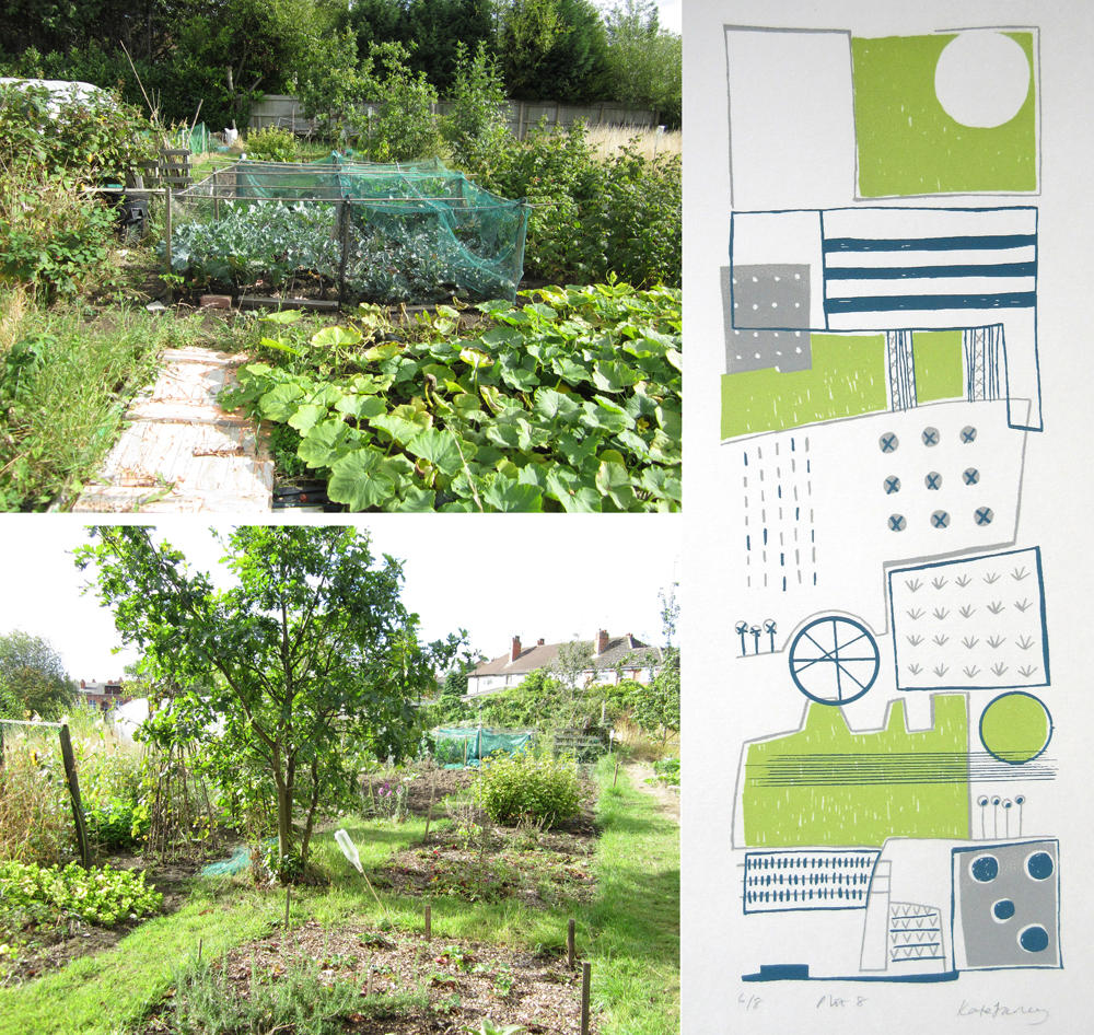
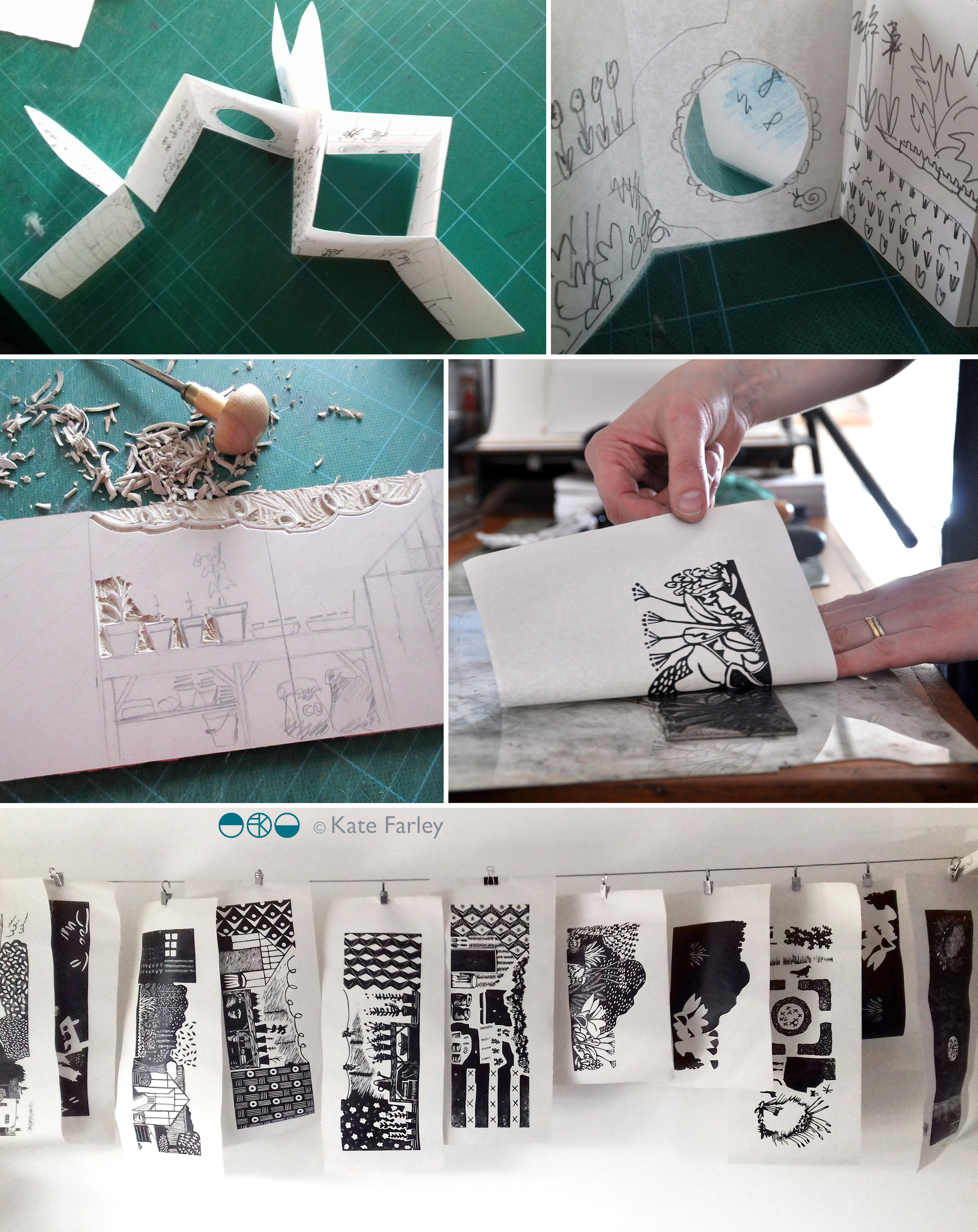
The images below show some design stages of this project with Design for Today. There is an early paper maquette as I worked out the structural narrative in relation to the imagery. Several of these were posted between us to allow for discussion and deliberation. At one point there was a cut-out pond but I was unhappy with how it worked on the back of the page so I left that behind. I cut lots of lino, with each page requiring at least two blocks – one for each colour. Although I had an idea of the key focus and composition for each spread it wasn’t until I was cutting the lino did I tie precise detail down. Only a couple of times I decided to completely abandon a page spread and rework it – and I’m so glad I did! Each block was hand-printed and hung to dry in the studio before being scanned to make a digital file that could be prepared for the lithographic printing process of the final edition at Calverts.

wip_Bawdenbook_flat

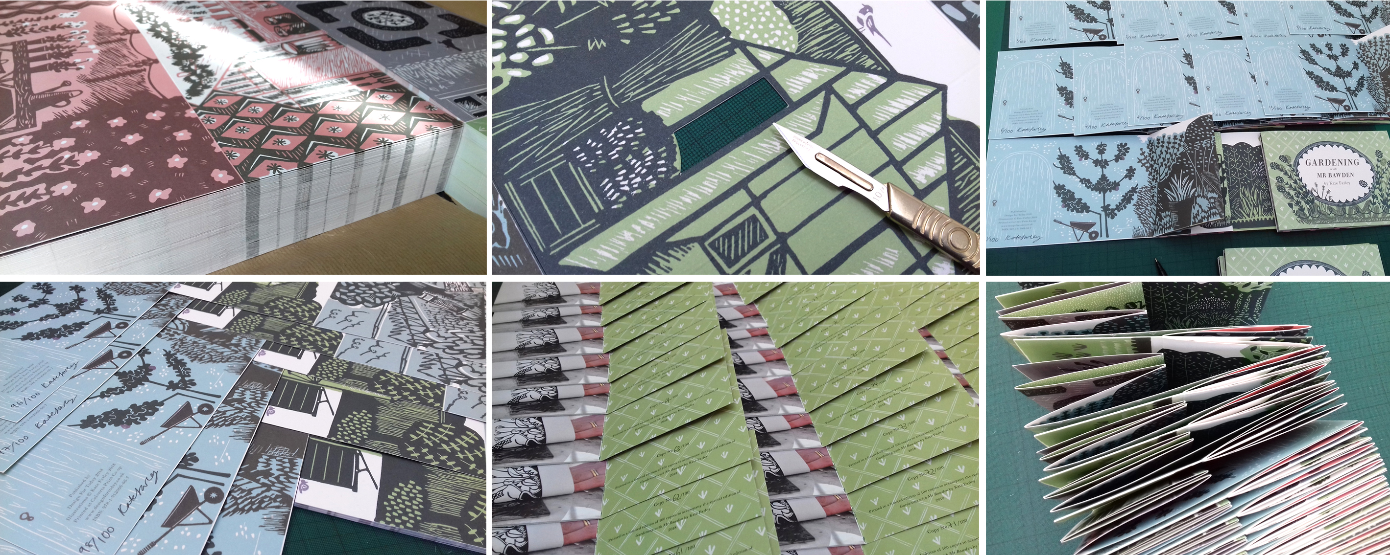
Once the final sheets were litho printed and die-cut / creased we have had to fold them one by one, sign the special edition and pack them up. We even decided to hand-cut out a window pane of the greenhouse in the edition of 100. We are delighted that the Special Edition sold out fast, well before the publishing date – thanks all! Those lucky people will receive the book along with a little booklet of the project and greetings cards, any day now!

signing booksMay18_1

This collaboration with Joe has been a really positive experience as we are both passionate about doing a great job. He was always happy for me to tweak something one last time as we signed off proofs, and understood the reasons why I turned sentences inside out in the booklet, to say exactly what I wanted to. Joe and I have discussed page size, paper weight and the folded structure on several occasions as well as how you take inspiration without copying, and the issue of creating something in relation to, but not derivative of.

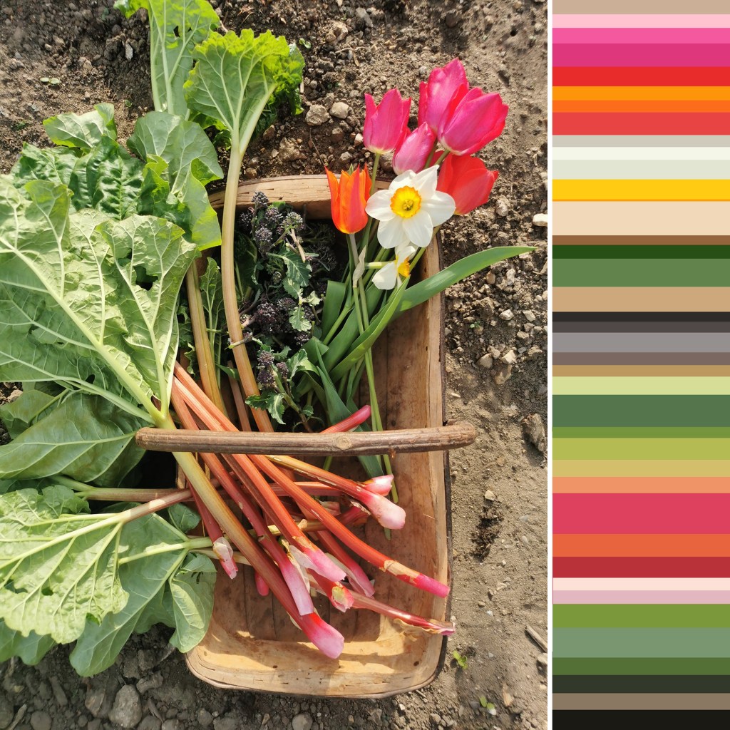
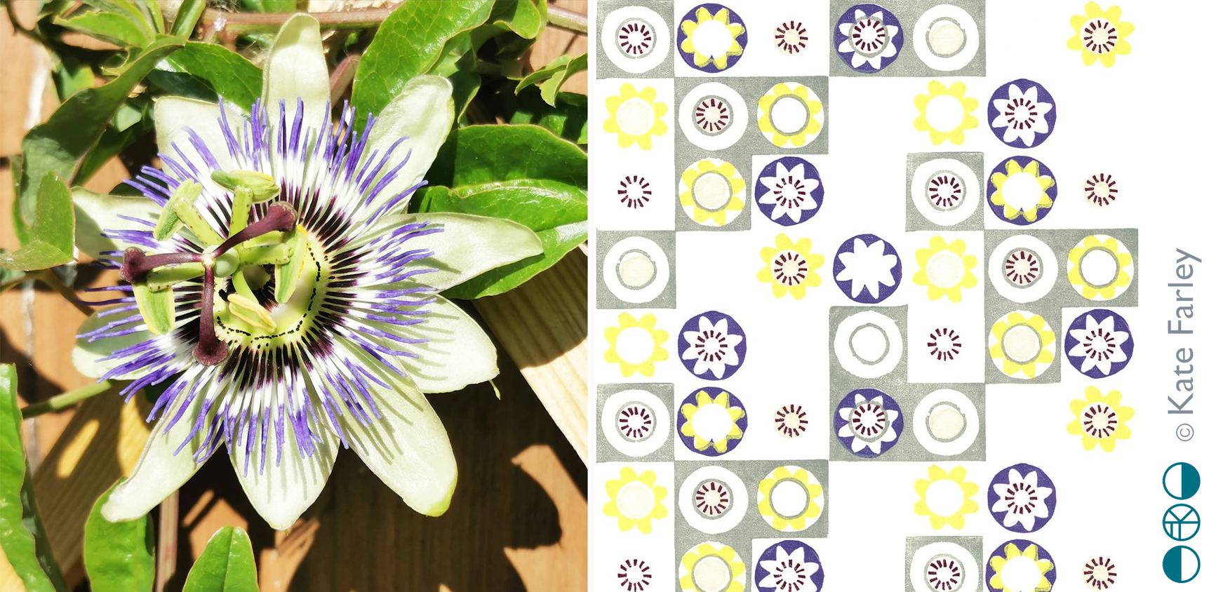
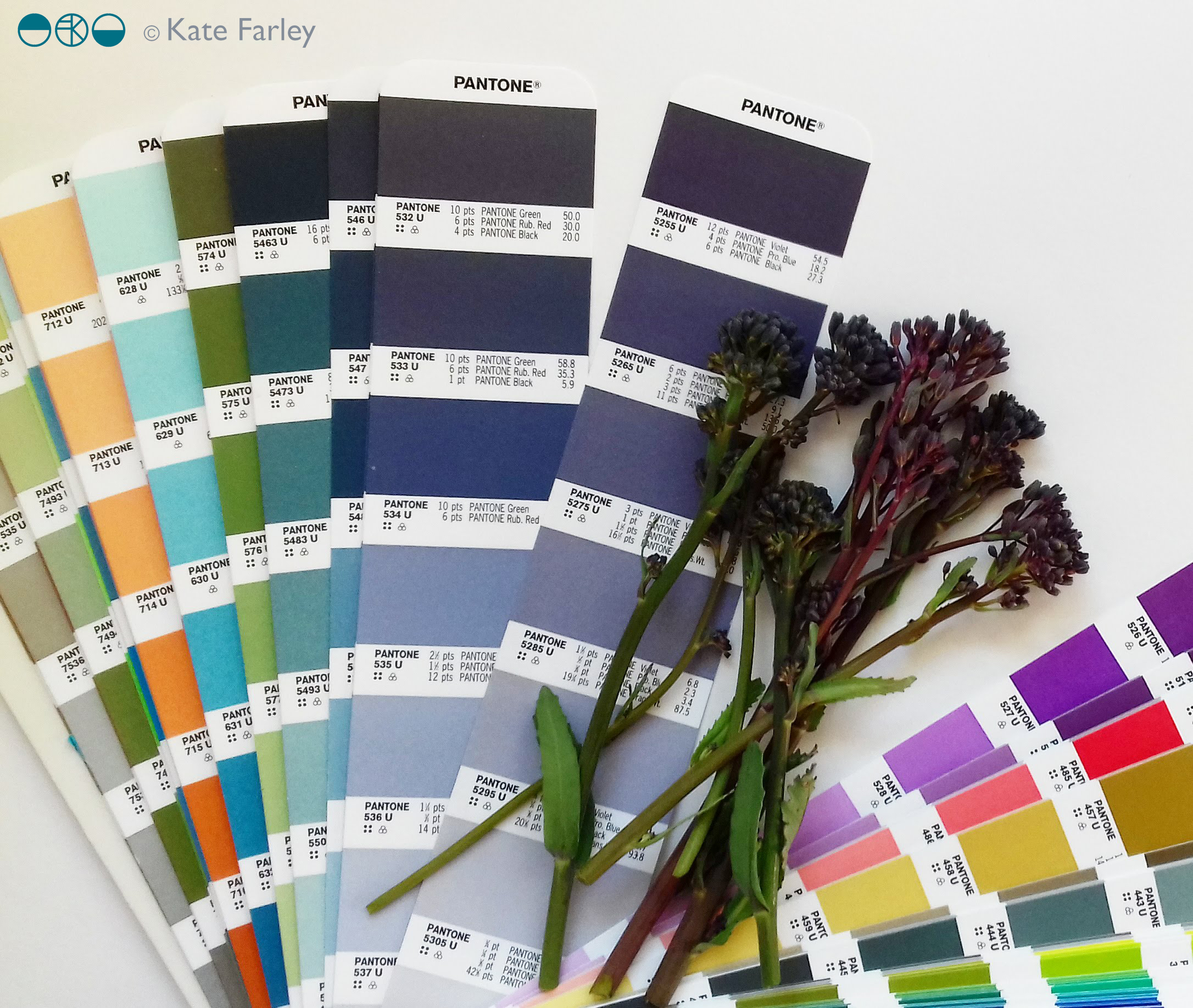
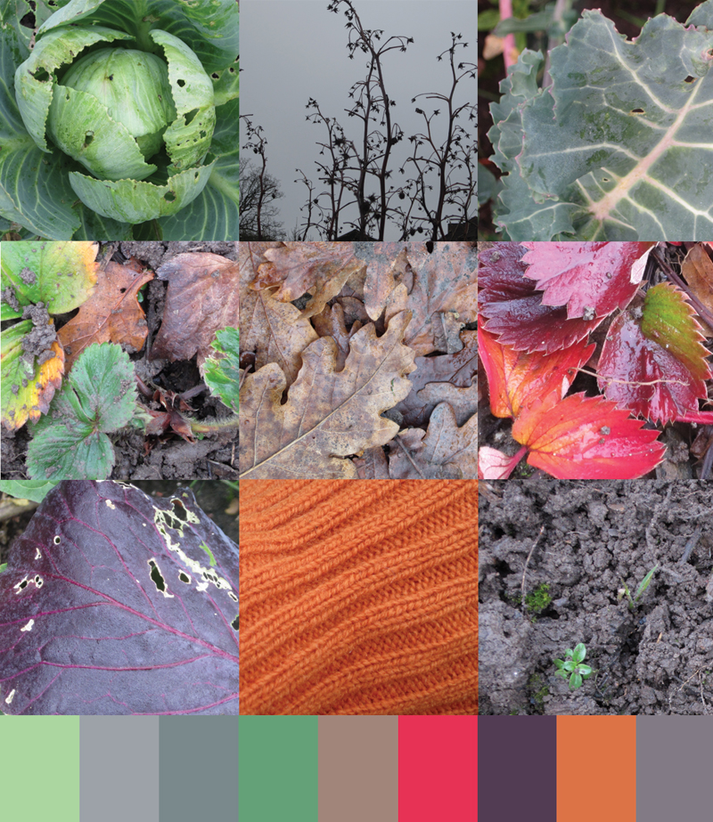
I am sure people who know my work will recognise my style in there, despite it being a little bit more illustrative. Pattern making relates to both Bawden, and myself, so it made sense to include a nod to wallpaper designs too, inside the greenhouse, as pots of plants become floral wallpaper. I wanted to use lino because both Bawden and I have used the printmaking process. I also wanted to create a light-hearted feel to the imagery, that is so often in Bawden’s commercial illustrations. As I wrote before in a previous post, we researched lots of snippets of information to guide the imagery and are grateful for there to be so much writing and research available at the moment, but it was never intending to be a guide to the garden at Brick House, more to express the pleasure Bawden would have got from his garden, as so many of us do. I also wanted to take the reader on a journey through a garden, rather than show you all in one go, so I hope the reader can navigate their way around!

KFarley_GardeningwithMrBawden1

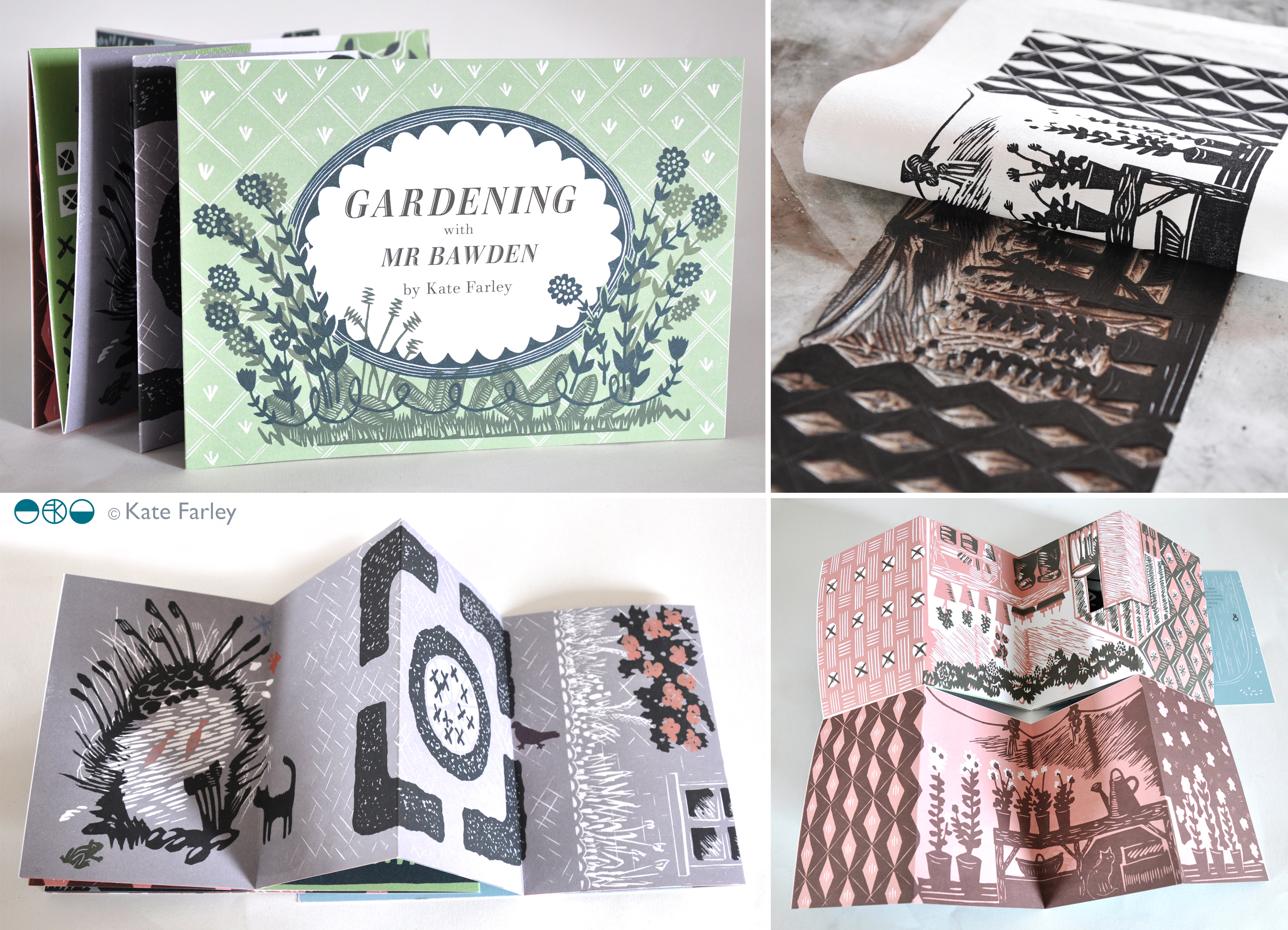
This book is the outcome of a great collaboration. (Thanks Joe!) So as the book is published today we celebrate this journey of designing and making, and can announce it will be stocked by some great places, including the Dulwich Picture Gallery, where a brand new Bawden show opens this week. Check out the social media accounts of Design for Today for updates. Final thanks ought to go to Mr Bawden himself, who has inspired so many of us, and who gave Joe and I cause to make this book.

special edition news!

If you follow me or Design for Today on social media you will have seen updates of the book we have collaborated on celebrating artist / designer Edward Bawden’s love of gardening. The book is titled ‘Gardening with Mr Bawden’. It’s been the perfect project for me as I also love gardening, have a background in making artists books and also love lino-printing.

bawden_printing_1

I’ve designed the book taking inspiration from some of the research I’ve found about Bawden, such as his preference for structural plants, his competitive growing of sunflowers, and the ongoing problems with snails. I’ve also made reference to some of the artwork made by Bawden and his dear friend Eric Ravilious, including the view under the tree with the table and tea things, as well as the bench Bawden designed.

All the motifs are my own but I’ve made reference to the sort of patterns Bawden was designing while living at Brick House, Great Bardfield in Essex. I’ve blended the idea of plants growing in the greenhouse, becoming wallpapers in the house. There is a pull-out greenhouse!

There are limited edition sets available to pre-order now which includes a signed book with four greetings cards and a collectors book explaining the project. Click here to order.

gardening-special