I’ve had four of the best weeks of my academic career exhibiting my research at the East Gallery, Norwich University of the Arts. I am incredibly grateful to everyone who visited, left comments in the book, messaged me directly and commented on the social media posts – it is a huge endorsement for my work to receive such positive feedback. I’ve also appreciated messages from further afield from those people unable to visit, responding to the images we’ve posted online. I thought it good to share the exhibition pictures, particularly for those unable to visit, but as a wonderful archive of the exhibition too.
For those who need a reminder, the research explores the potential to design and print pattern with limited artwork – one screen per four-colour design, testing the feasibility of constraints as opportunity to rewrite the design process, placing the designer at the centre of the process, in contrast to the fast-paced evolution of design that is adopting Artificial Intelligence as key creator.
I balance a traditional creative process with new thinking to establish the design language and print production methods. One design, one screen, four colours, four rotations = many configurations of design outcomes and increased efficiency.
East Gallery is the public-facing space of the university, with free entry to the exhibitions. Wide-ranging exhibitions are held here, managed and curated by Claire Allerton. Claire first visited my studio at home well over a year ago when we discussed the potential of a show but it’s been a long journey of designing and printing since then! I thoroughly enjoyed working with Claire to establish the conceptual and contextual direction of the research as well as in developing the narrative for the body of work that has been made over a three-year period alongside my role as Course Leader of BA (Hons) Textile Design. Claire and I worked with art technician Sam Cook to determine the design and installation of the exhibition. Despite a very busy time at the start of the academic year I was very hands-on with the installation of the work, which felt important for me. Decisions of specific placement of lengths evolved as we adjusted to the work in the gallery space.
I shall attempt to describe the exhibition visitor experience, and use beautiful photos from Denisa Ilie to show you environment.
The beautiful blue wall, (Pantone 299U) welcomed viewers to catch a glimpse of the design principles, and see the exhibition film featuring footage of me printing as well as me talking through the research. The exhibition entrance also included a fantastic essay by Claire, outlining the importance of this exhibition at this time.
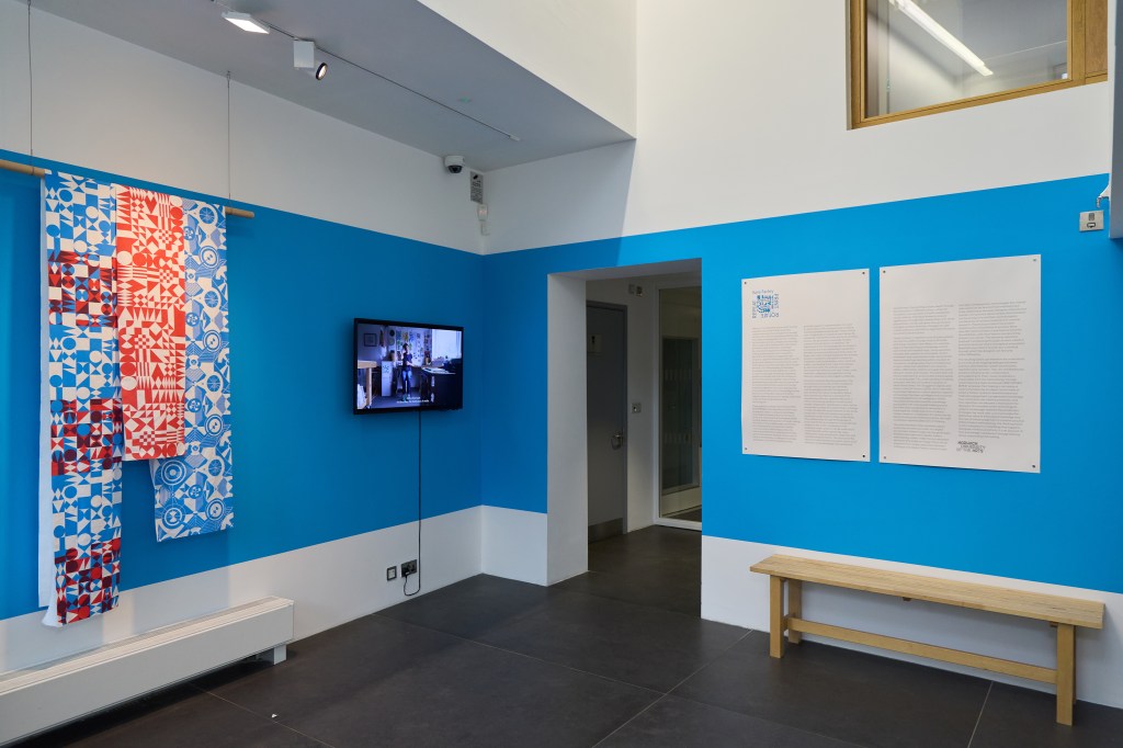
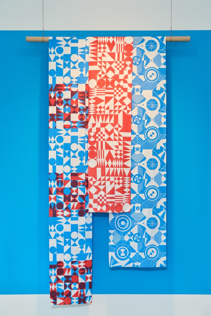
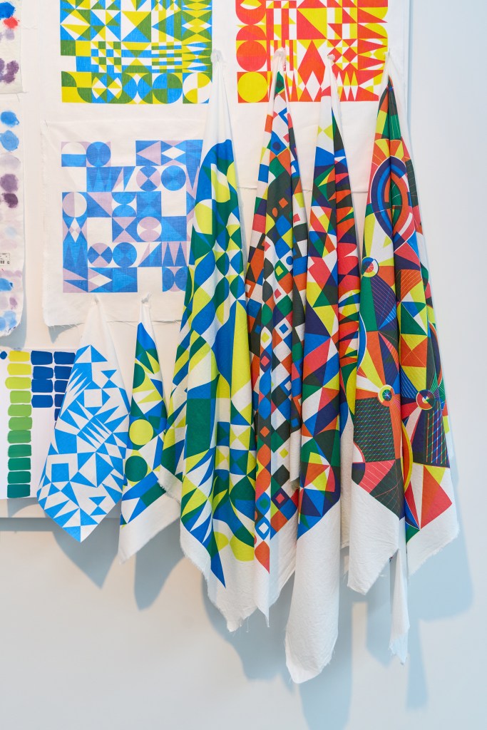
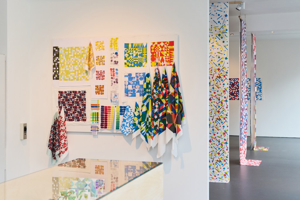
These small hand-printed lengths illustrate the design premise and hinted at where the exhibition was heading. I kept to three primary colours (red, blue and yellow) and three primary geometric shapes (circle, square & triangle) for the design work included in this exhibition although year two of the project saw me testing my approach in relation to floral motifs. I tested design principles established by Lewis Foreman Day in his 1901 book, Pattern Design, and drew inspiration from Sonia Delaunay’s work with colour as shape for rhythmical outcomes.
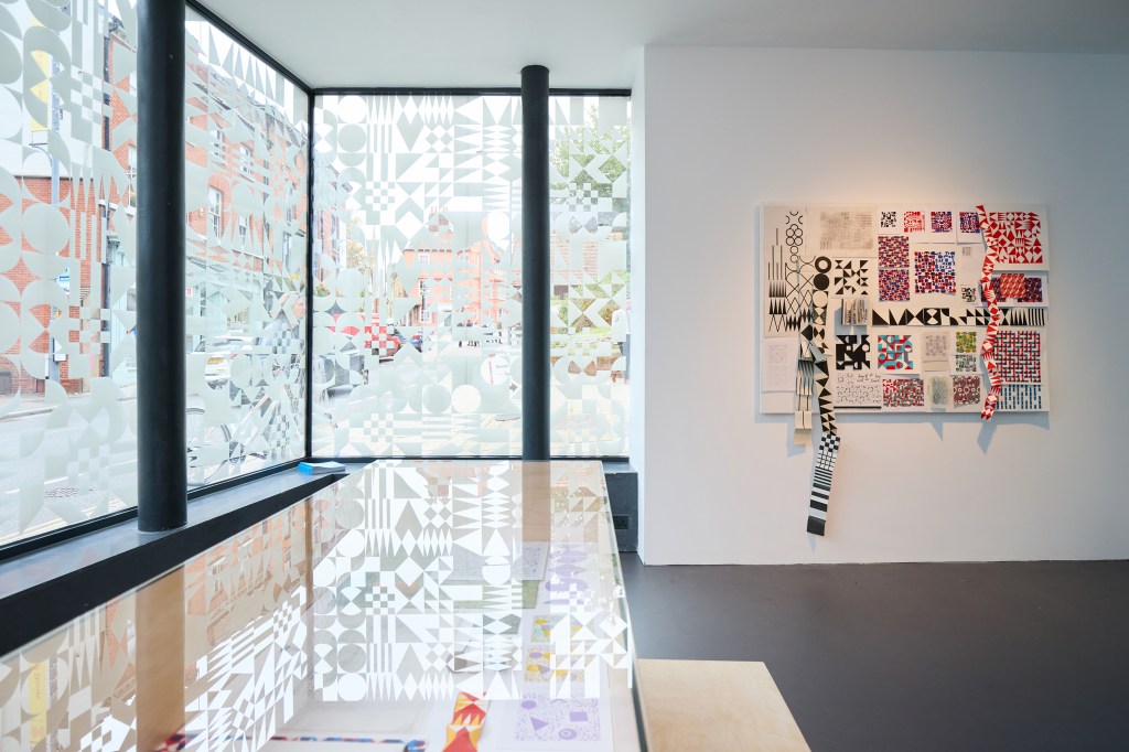
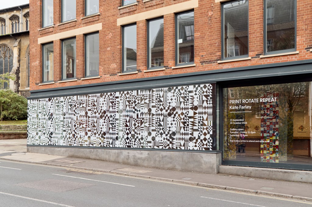
The next space accessed by a short run of steps or a lift presented the work in progress, with design thinking, making, sampling and process displayed. A vitrine showcased a sketchbook, lino blocks and tools, as well as folded structural books that suggest designs in the built environment with small figures for scale. Two wall-mounted boards, one for motif and pattern, and the other colour and material, set the anticipation for the largest gallery space. The window vinyl featuring one of my designs, made an impact in this space, reflecting on surfaces and softening the light, as well as attracting plenty of attention from passers by.
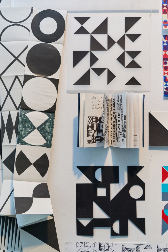
This small book includes sequences of motifs evolving from one shape to another, exploring my previous practice and ongoing interest in visual communication and book arts. These sequences were included in the film as a stop-frame animation I had made at the beginning of the research and remain an important aspect of my design process, as well as the starting point for the design (evolve) featured on the windows.
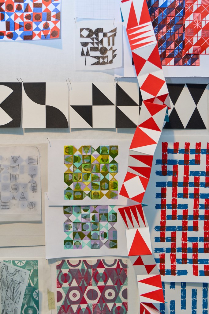
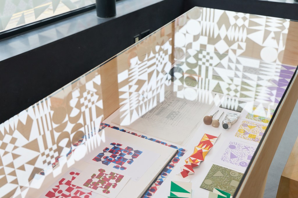
The vitrine included lino blocks and sample printing, sketchbook pages and folded sequences of pattern alongside designs that didn’t push through to the final collection but explored vital aspects of the design process.
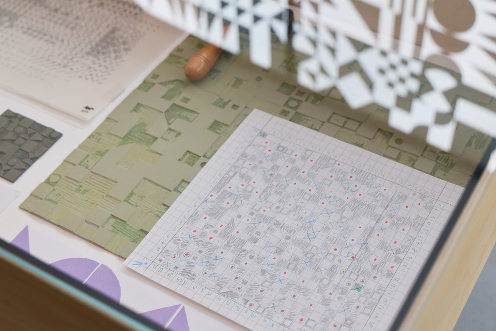
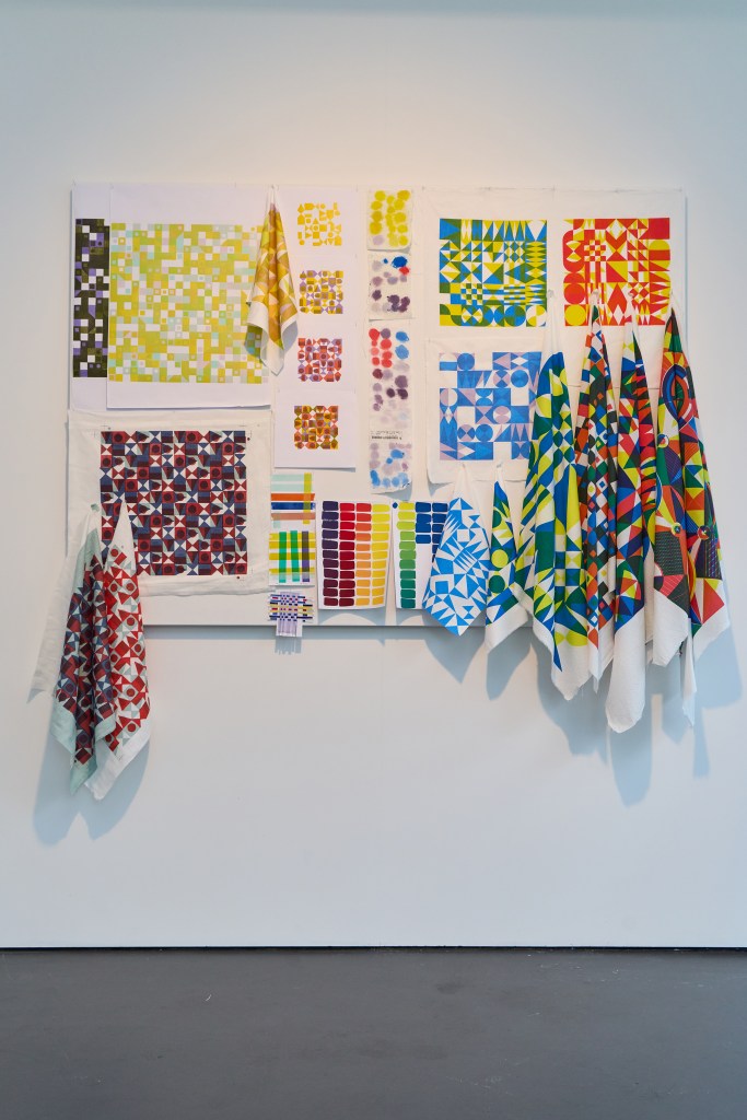
The colour and material board includes samples from my time at Ivo’s with Podge, and large-scale lino blocks that led to one of the final designs. I often play with colour using gouache paints first, so they are included as well as testing with oil-based relief printing inks for the lino printing. I tested pigment inks and dyes in my fabric printing on different cloth, so the colour matching and sampling is also included here. I chose clean graphic shapes in the final artwork for production, as I wanted the design language to be as neutral as possible, without the makers mark, despite initially using drawing and lino cutting in development work that did include those characteristics.
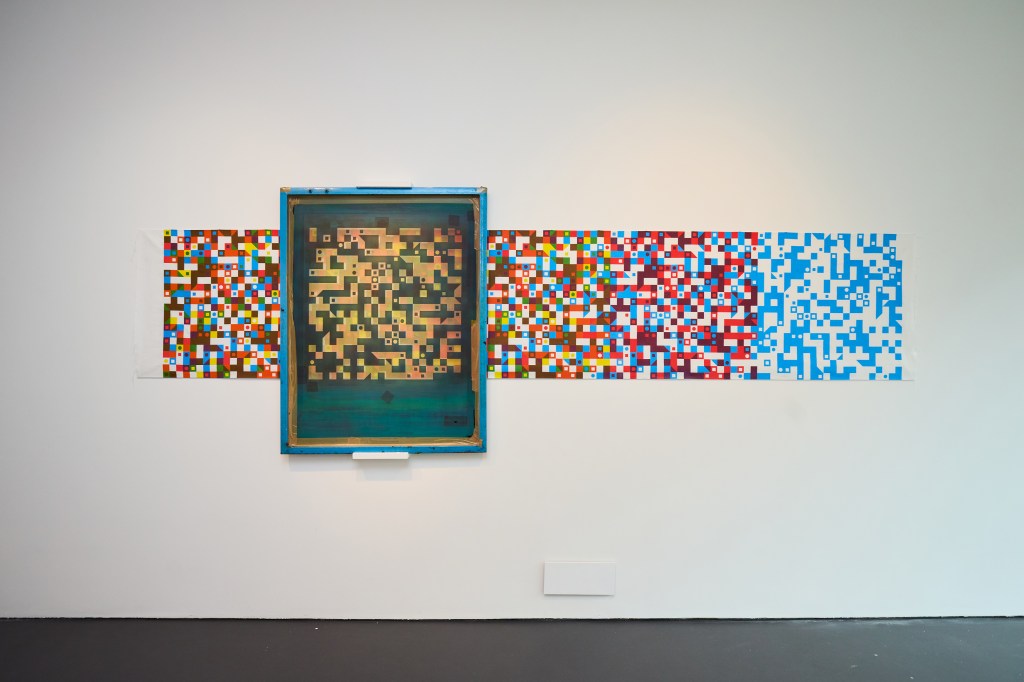
I loved seeing the visitors’ responses as they caught sight of the lengths. Eighteen vertically suspended lengths, hung in pairs, and one horizontally displayed with the screen I used to print it with are the culmination of the research so far. Visitors were able to walk amongst the lengths to view them close-up and be immersed in the pattern, looking through and across the space. I hand screen-printed each length myself and they were three and a half metres long and seventy centimetres wide – the physical experience of printing was very much associated to what I could do without relying on anyone else – it’s a good job I’m tall!
At some point in about February / March we discussed the height of the ceiling in the gallery and how many lengths I may be able print. We agree on between four and six lengths for the exhibition – that somehow evolved to include nineteen, and others I have printed are not included. I’ve printed over one hundred metres of cloth in the last few months.
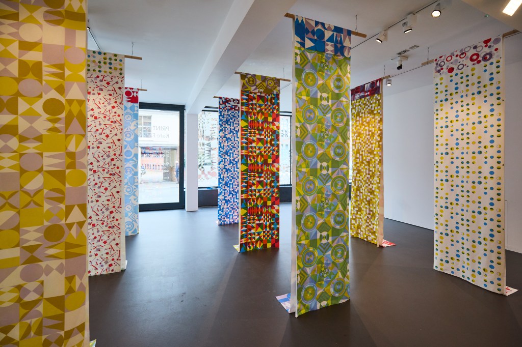
The pairs of screen-printed lengths were hung together and one sat over the other, to connect the individual to the collective statement. We agreed we wanted honesty in the hanging system Sam devised, and I’m pleased with the results. The folded edges along the lengths rather than stitched hems maintained focus on the patterned cloth rather than suggesting a resolved item for interiors, for example. As the viewer walked through the space it was possible to see several iterations of designs represented, as single or multiple-coloured variations on the them of each design. There are seven pattern designs across the nineteen screen-printed heavy-weight linen lengths.
I had to devise my own registration method for some of the design, as I couldn’t rely on traditional registration furniture on the print tables when I rotated the screens. This would not necessarily have been clear to the novice, but the system of quarter circles appeared on three patterns where the motifs appeared to float above the background. All screen registration was carried out by eye. It was fun to discuss the complexities of the design and print process in a very well attended public talk one Wednesday lunch time and hopefully I can share the exhibition film in due course.
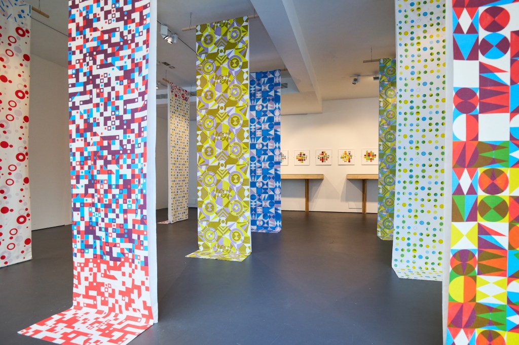
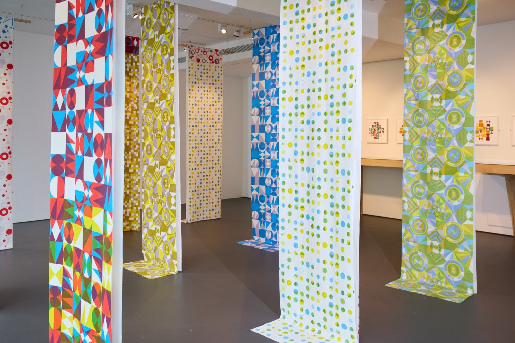
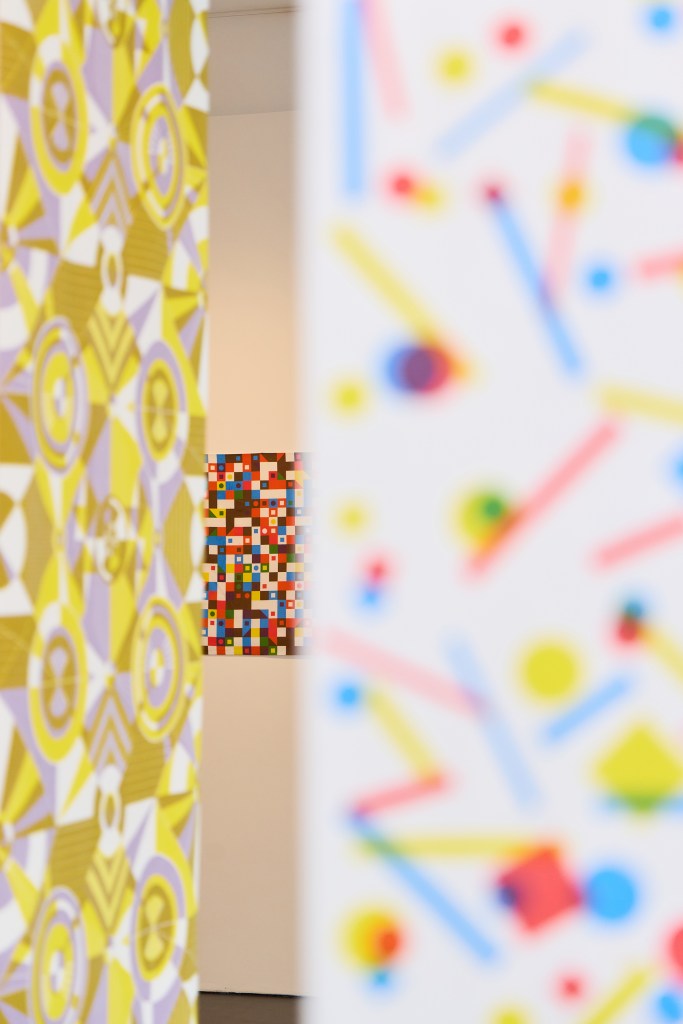
Claire decided it was a good idea to evidence the printing process by including one screen over the length it created, with the step of printing each colour visible. I really liked this idea and it was very well received too. Thanks Sam for sorting the technicalities of the hanging! Glimpses of the design could be seen as we traveled through the space.
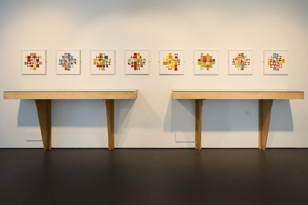
In this main gallery space, we included two more vitrines that build the narrative and transparency of the creative process, again with sketchbook pages and lino, alongside printed samples on paper and cloth. Weaving and the notion of construction and deconstruction of pattern was evidenced not only in the vitrine but also endorsed by the eight framed works on paper, PLAY, see below. These screen-printed and constructed works provide further opportunities for experimentation on the notion of themes and variations in their composition, an idea I return to often.
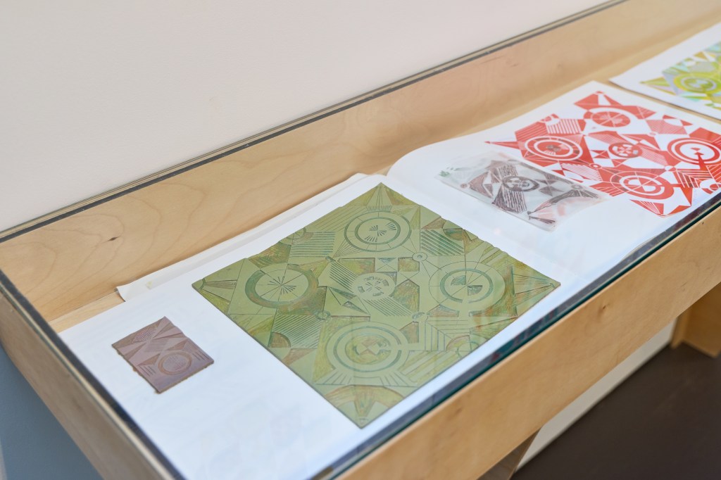
The visitors could see how one lino block informed the next one, and how the design evolved across paper and fabric before resolving as the series of printed lengths.
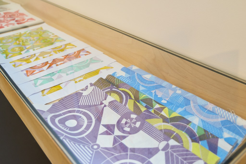
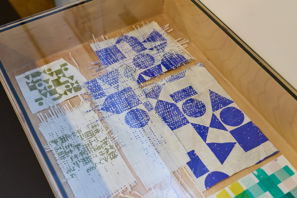
The vinyl window treatment made an impact, inside and out, with beautiful shadows and reflections throughout the day and night.
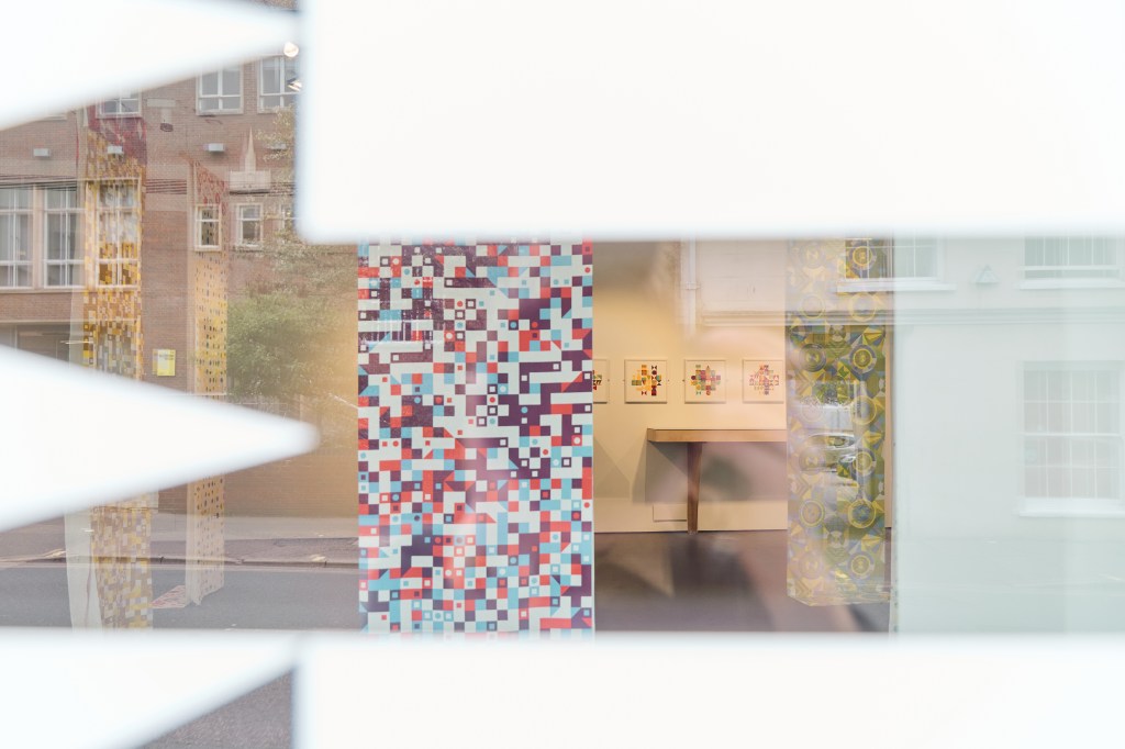
I’ve written previously about the publication, with an essay by Victoria Mitchell, another brilliant record of the research and exhibition. It has been so well-received we had to do a mid-show reprint!
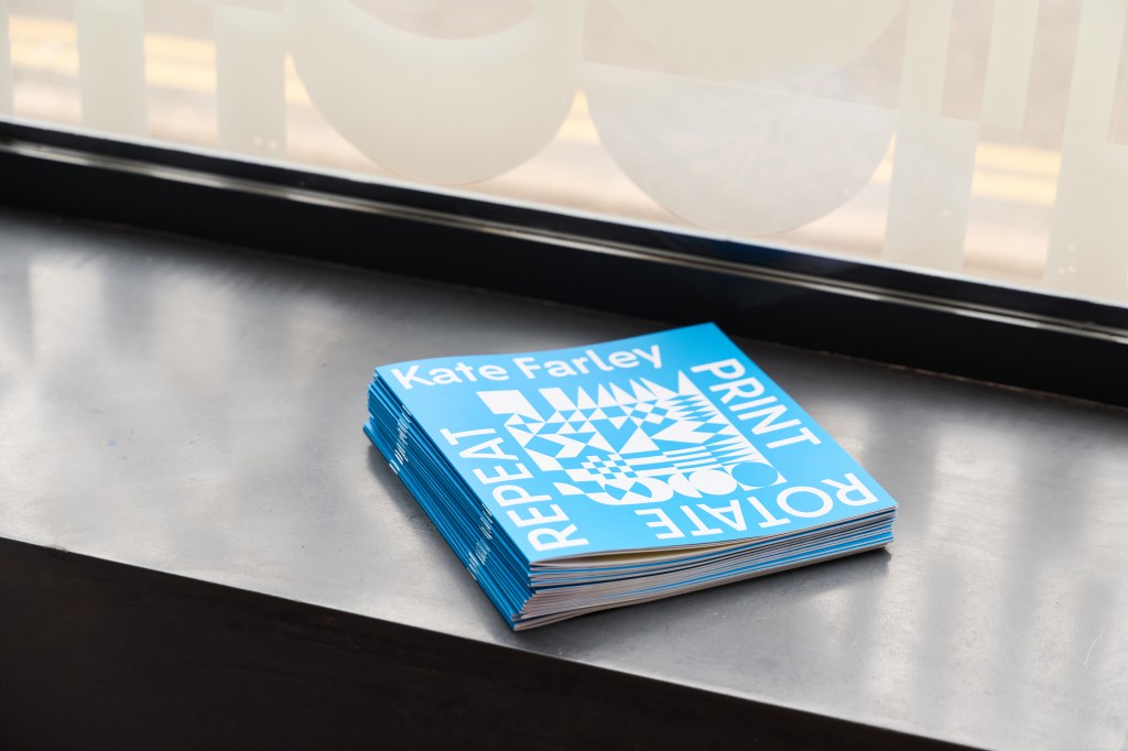
The publication is a beautiful record of the research, designed by Paul Kuzemczak and including an essay by Victoria Mitchell. I’m grateful for this opportunity and the efforts of the immediate exhibition team in making this be the success it has become.
Thank you Claire, Sam, Victoria, Paul and Denisa, and the brilliant textiles technicians Neil, Yasmine, David and Eddie, who have been so incredibly supportive and generous with their time and knowledge throughout!
Image credits: Denisa Ilie

