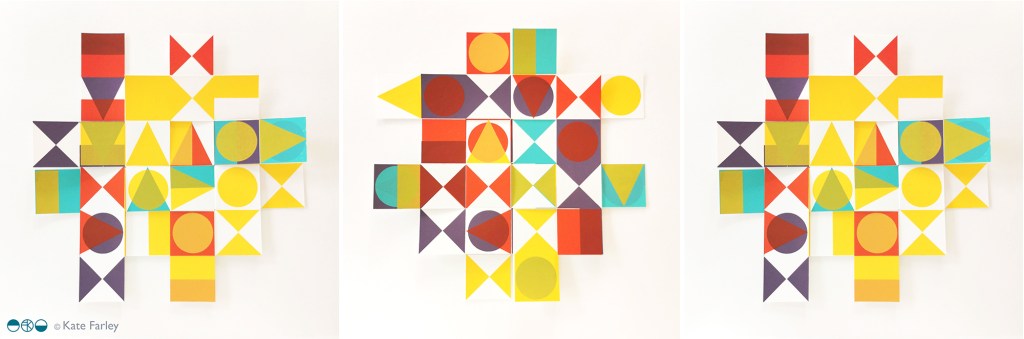
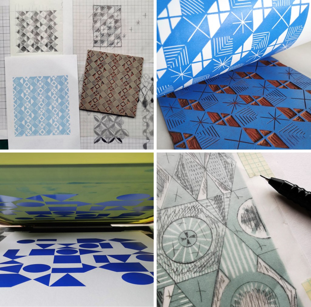
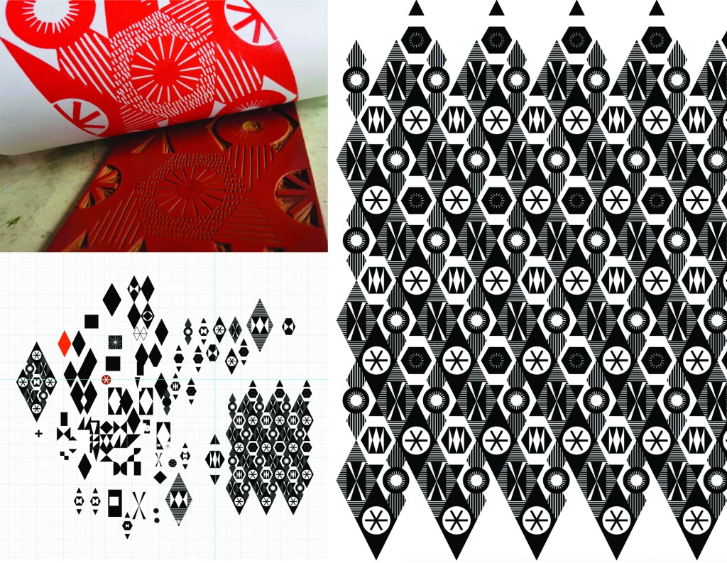
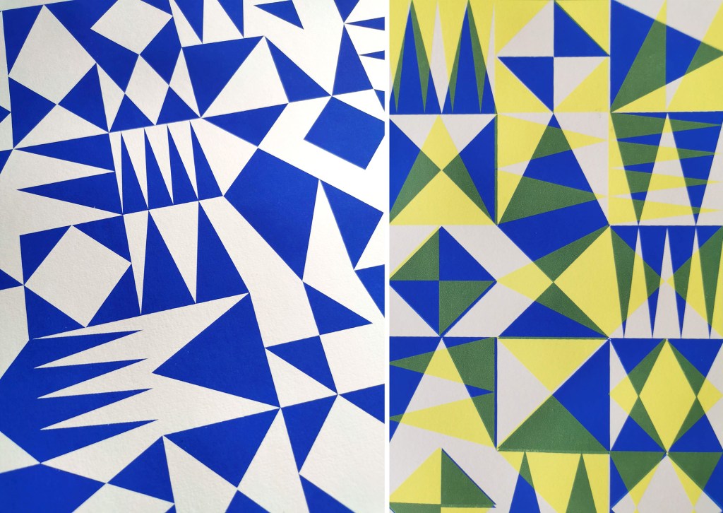
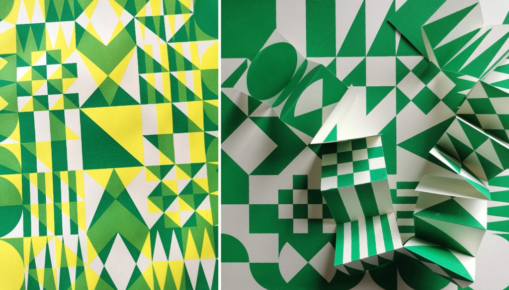
I am really pleased to have had two of my most recent works on paper selected to be included in the Print Cromer exhibition this summer, with the Private View on 19th July. This new body of work has been developed as part of my academic practice at Norwich University of the Arts where I have been exploring pattern structures and repeat blocks. I have explored new pattern iterations by rotating the screens to add additional colours of the same artwork, thereby building greater complexity from limited design information. In an age where digital design and the use of Artificial Intelligence provides limitless opportunities, I want to explore the fundamentals of pattern creation to generate new possibilities that are led by the designer, ensuring the creative path is transparent.
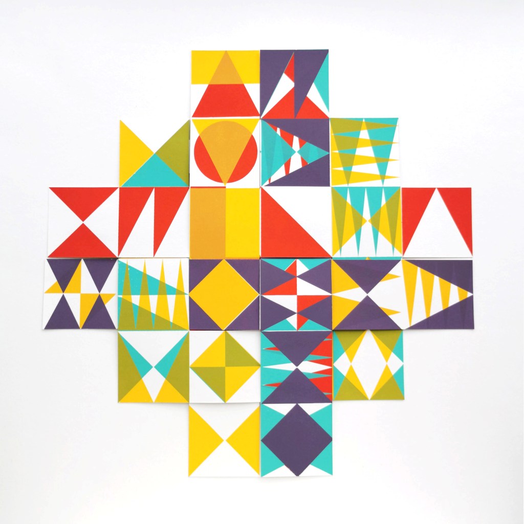
The theme of the exhibition is PLAY, and as a result the palette I created feels full of summer carnivals and fairgrounds. The overprinting of inks with differing levels of transparency provides a building of depth and subtlety of harmonious colour.
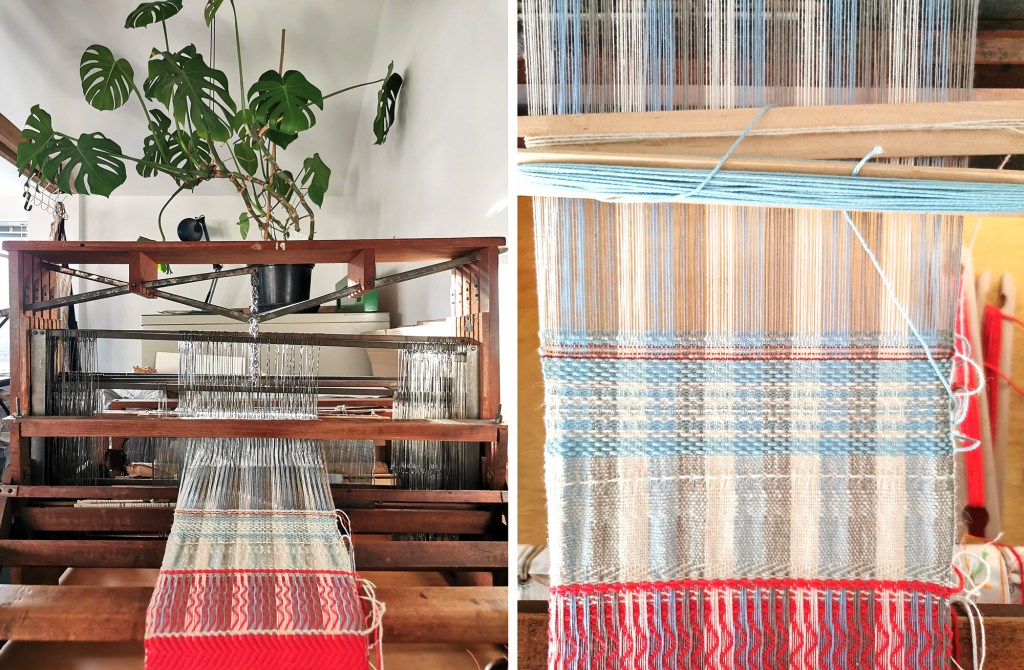
I created a number of one, two, three and four-colour prints initially, that featured the screen rotation in adding the colours. I then cut strips of the prints and with further rotation of the strips, interwove them into one base print that had been sliced to enable the slotting. I enjoyed bringing back an element of paper engineering from my book art practice into these new pieces.
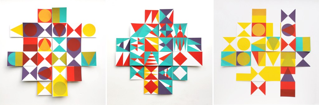
In designing each piece, I considered the placement of motifs and relationships of colour. The collection provides variation within a collective identity and belonging. Some pieces feature only triangular motifs, while most incorporate the circular and rectangular elements too. My research utilises design thinking by Lewis Foreman Day, and his distribution of elements. This approach results in scattered focal motifs that work across repeating patterns. Although this is not a feature of my new work, I recognise the placement considerations are also useful in this work too.
A number of these pieces will be for sale during the show.