publication day: REPEAT printed pattern for interiors

Here we are, the book project is complete with publication in the UK and US today. It’s been a journey!

With the first thoughts of writing a book about pattern back in late 2015, the development of some draft scopes, the contract signed with Bloomsbury in early 2019, a first draft of Chapter 1 delivered in late 2019, a global pandemic from 2020, unscheduled health issues requiring hospitalisation & surgery in 20/21, final manuscript submitted in June 2021, and proofreading / layout until June 2022 I have had to be very focused and patient – and all this while leading two degree courses until this Autumn (I now only lead one!).

Writing a design book had never previously been a consideration of mine, but since I’d been reviewing books a few years ago it got me thinking that this was the perfect place to bring together my design practice experience with my academic role. The idea grew on me. I’ve spent years teaching pattern design and as a result tried and tested hundreds of ways to deliver inspiring and informative design workshops. I spend lots of time analysing pattern to support my lectures, and in my spare time … and so in hindsight maybe it was a natural next step.

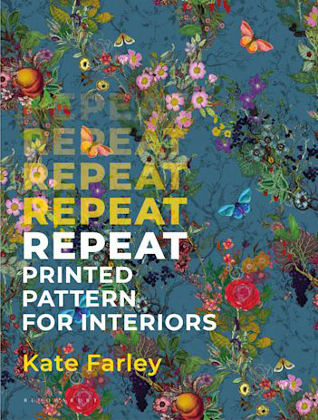
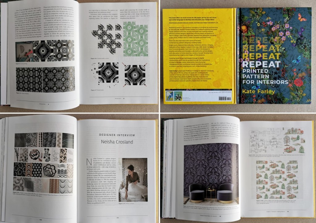
The introduction includes me taking the reader through my journey of designing Hanbury, my wallpaper, as well as my relationship with pattern. The three chapters are very different in nature which helped to focus the research and writing at each stage, and provides the reader with a broad look at the subject of pattern design in relation to history – Chapter 1, how to create pattern – Chapter 2, and how others do, through nine feature interviews in Chapter 3. I have to comment on the cover … I love the cover, so a huge shout out to Paul and Ali of Timorous Beasties and to my publisher Georgia at Bloomsbury who allowed me to have it just as I wanted. In fact I owe so much of this project to Georgia’s belief in me to get this done, and her unwavering support throughout. Who’d be a publisher?
Many years ago a previous boss asked me to take on delivering the design history lectures to first year undergraduates and with panic and fear I embarked on what I can now describe as one of the most overwhelmingly frightening but important career defining undertakings. I was given an opportunity to challenge myself while presenting to a lecture theatre of students on a Friday morning in Birmingham, and the result was empowerment. Without high school History qualifications behind me but a passion and base knowledge of design history I decided to engage students in how history is relevant to us now, what we can learn from, challenge and move on from. I needed it to be immediately relevant to their design projects to help them understand history is important to designers today. It took some years before I felt on top of it, but many years on I comprehend the legacy of those hours of learning in order to teach, and how that substantial investment of time led to the knowledge and experience to write Chapter 1 of this book. I could have written many thousands of words more to cover the history of pattern across the globe, but word limits provided boundaries, and without a deadline I may still be writing!

I enjoy learning. I am hugely grateful to all the students I have had the pleasure to work with over the years, for sharing their creative journeys as we discuss drawing, rhythms, compositions and colour proportions to make the most interesting repeating outcomes. I’ve learned so much along the way, and that’s what keeps me interested and passionate about the discipline of pattern design. Every studio session is an exchanging of ideas, with no single correct answer, but plenty of opportunities – a privilege to be a part of, and the inspiration behind Chapter 2. It explores the practice of repeat pattern making, presenting considerations to build stronger outcomes without stipulating one right answer. I encourage designers to embrace the process of testing variations in pattern construction so the final result has learned from all that has gone before. The designers I include to illustrate the text offer so many styles and approaches and have been so generous in sharing their working practice with me and future readers.

Just as I did with my degree dissertation back in 1996/97 there were times that required drastic measures to get things right in the writing of the book – many sheets of paper were laid out across the floor and I took scissors to the pages, literally cutting and pasting paragraphs in the process of reordering the narrative. Other times I had to diligently input data on a spreadsheet, chase consent forms or simply focus on writing.

Obtaining image permissions was probably the most arduous and stressful process of the project. Keeping to budget while securing the images from archives, individuals, estates and designers I really wished for was difficult, and sometimes I had to admit defeat and find alternatives. My editor and publisher (Faith & Georgia) were both brilliant at talking this over and I’ve been so pleased to include some absolute favourites such as Lucienne Day’s Spectators and Calyx and Josef Frank’s Mirakel – I danced when these came through! It’s also been a pleasure to include a number of works by students I have taught, some in the last five years, but also Emma J Shipley back in 2005/6 – I still remember her tour bus interior for Madonna in BA1 (one of the interviewees in Chapter 3). How time flies!

I’m grateful to all the designers / archivists who have contributed images and details of the patterns throughout the book. Quick check-ins to confirm the number of screens used, or what digital software the designer prefers was all part and parcel of getting details as correct as possible. One memorable highlight on a day of writing was a phone call from the brilliant pattern designer Marthe Armitage to talk through her contributing images for the book. I was so surprised I was rather lost for words initially, but soon we were chatting all things pattern, and I’m delighted to feature her printed wallpaper patterns in the book, as they regularly feature in my teaching presentations. A shout out goes to Sophie at Warner Textile Archive who went above and beyond tolerating last minute requests for photography to get just what I wanted! Much of my clear headed thinking happened late at night as I juggled leading two courses in the day job, and I’m grateful for all who made sense of my communications at this time.

Who knew it took so long and so many people to get a book to be a physical artefact? The proof reader was brilliant as we fired queries and answers to and fro for a frantic few weeks, and then she was gone. Then the layout was taking shape – and I think I must have been a nightmare – sorry Deborah! – I wanted every page to look its best and sent diagrams and descriptions to make that happen. Finally, following last minute queries while I was at New Designers showcase in London with my graduates in late June I had to step away and the book went off for print production.

I’ve been asked several times if there will be a second book, even before I held this one in my hands…! I’m not sure, maybe one day, but today I’m celebrating this one.

I’m grateful to all who have helped make this happen, from my tutors back at art school, to friends and colleagues who have tolerated and supported me in this project. Thanks to the brilliant team and associated individuals from team Bloomsbury and to everyone who buys a copy to share the joy of printed pattern – thank you!

I’d like to dedicate the book to my parents in deepest gratitude for providing an upbringing where experiencing art, design & culture was a given. Thanks to my mum who has survived the ups and downs of raising a creative child, I know it wasn’t always easy. My sorrow remains that I never had the chance to have an adult to adult conversation with my dad about the things we would have no doubt had as common passions, but who inadvertently taught us Farley girls that if you put your mind to something there is no reason why it won’t work out. A lasting legacy & mindset. 

You can order a copy here.

REPEAT: Book publication day coming very soon

On the 12th January 2023 my book for Bloomsbury on the subject of repeat printed pattern for interiors will be published, … finally there’s not long to wait having worked on it for years!

If you want to order a copy at a pre-publication discount you can do that here.

Repeat Printed Pattern for Interiors

The process of writing a book has been a long one for me, but we are a step closer to publication … January 2023. I can’t quite believe I am an author of a book!

I’ve recently received the pre-publication inspection copies and I’m so excited to be able to share the first glimpse. I’ve been really touched by the initial responses from the contributors who have been receiving their copies, who without them, this project wouldn’t have got off the ground.

I’m waiting patiently till the new year, but here it is, the beautiful cover, featuring the pattern Bloomsbury Garden by Timorous Beasties. The book is designed to inspire and inform people about the complexities of designing pattern for interiors, and is an ideal core text for undergraduate studies. I’m delighted to be featuring the work of students I had the pleasure to teach, as well as more well known names including Angie Lewin, Sarah Campbell, Timorous Beasties, Oral Kiely and Neisha Crosland.

You can pre-order your copy here

Me with the book, in front of my Hanbury wallpaper

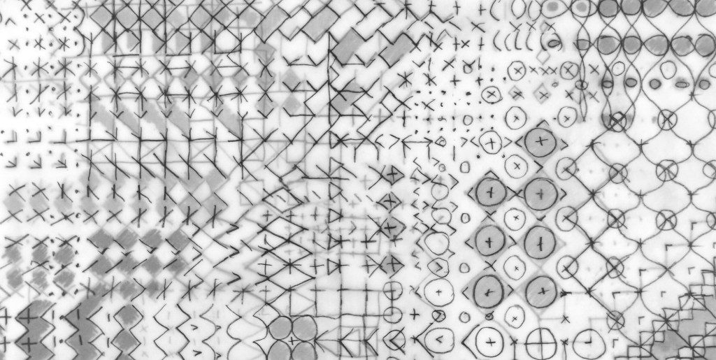
drawn ideas of pattern

My ongoing research practice of drawing and design regularly explores pattern structures within the family of geometrics. I enjoy testing motifs and rhythms that belong to traditional compositions, and deconstruct the scaffolding to look for new iterations.

In this recent work I am looking to the concept of themes and variations in music to drive the visual investigation. Repeat doesn’t feature, but it’s certainly a consideration for the future.

layers of tracing paper with graphite drawing

With a short break between academic years, and the book in production I hope to find some time to take this project forward over the coming few weeks.

REPEAT news

I’m delighted to share the news that after nearly five years in development, we are at the stage of announcing the book I’ve been writing on repeat printed pattern for interiors, with Bloomsbury Publishing is now available for pre-publication order.

The book is a culmination of my design and teaching practice experience over the last two decades and features some historic and contemporary designs and interviews with some leaders in the field including Sarah Campbell, Neisha Crosland, Deborah Bowness and Orla Kiely. It is for anyone who is interested in printed pattern design, including design students. You can read more here.

I’m delighted to be able to feature this beautiful pattern by Timorous Beasties on the cover too.

pattern practice therapy

A year ago I was recovering from stomach surgery and had some time away from my academic role while I mended. Not one to be idle, when I was well enough to wield a lino cutting tool and had the energy to sit up I set myself some simple design challenges to focus my brain and help myself get better. This became my physiotherapy and creative distraction from what was a really hard period of time.

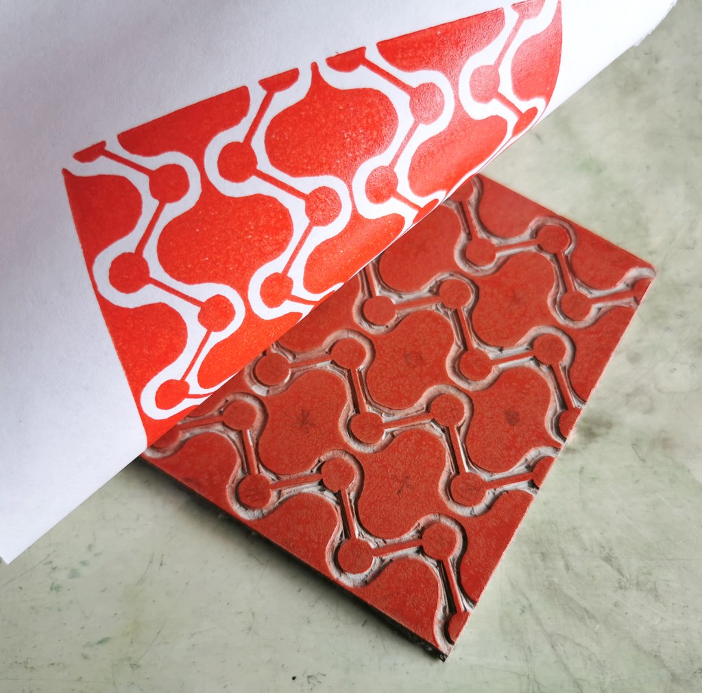
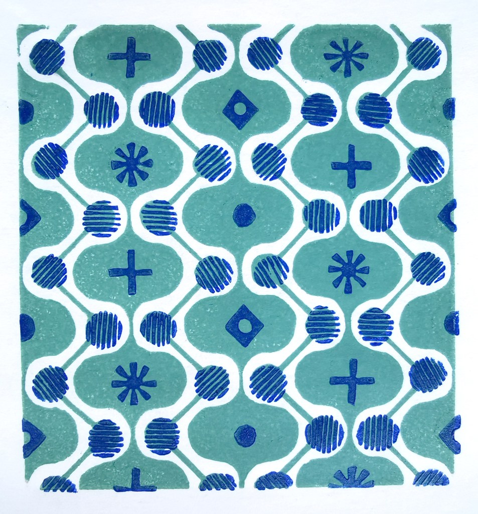
With pattern design as my go-to healer, I decided to explore formal pattern structures, including the ogee, diaper and check, featuring geometric elements. I created lino cut tiles with a small element of repeat pattern, usually but not always in two colours. The lino blocks were small, enabling me to feel as if I was making progress while able to retain focus in short bursts. The printing was another process that tested my physical strength and stamina!

I thought I’d share this one, the ogee structure – one of my favourite pattern structures – I love the play of the negative and positive S-curved forms. I think it is under-represented in contemporary design…

printing the first colour
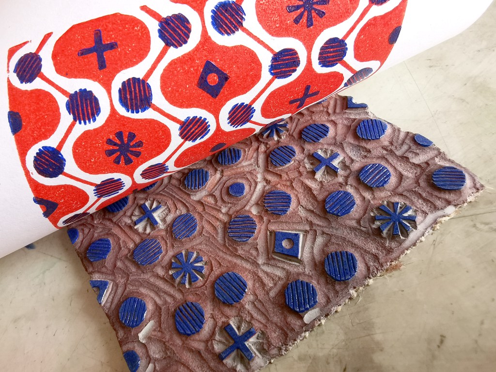
adding the second colour, blue

I often test prints in different colour combinations, as I have done here, below.

alternative colourway

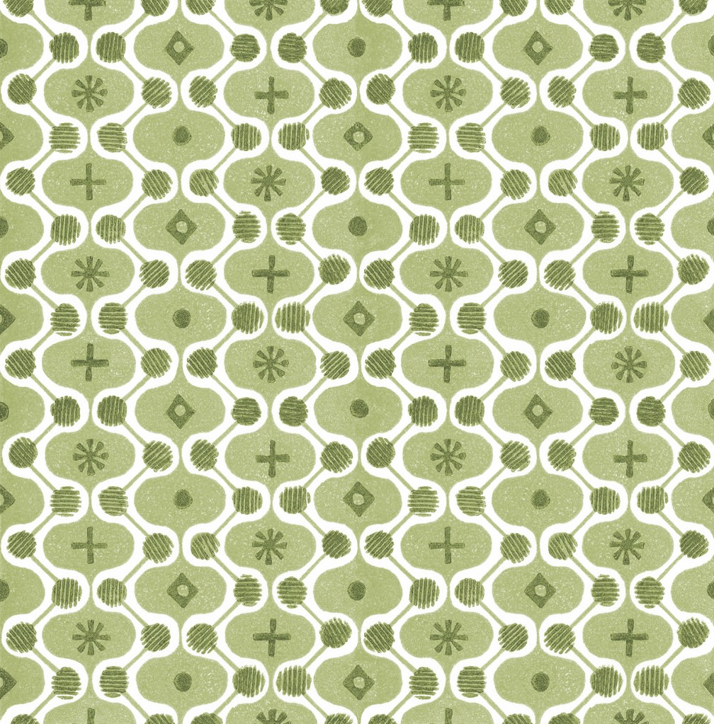
It is a natural desire for a pattern designer to want to test the repeat so you can see a digital outcome below too. I decided to test the two colours as two tones of green for some reason. It has a vague hint of avocado bathrooms of the 1970s now!

digital repeat of the lino printed tile

Unknown to me at that time, I had a further hospital stay and recovery a few months on, and so the collection of patterns grew once more, as my healing and self-prescribed occupational therapy – a career I had once considered!

I’ve had little time to revisit this collection since my recovery but I hope one day soon I will. I’m not sure where this design and its siblings will venture next … any suggestions?

pattern and textiles spotting

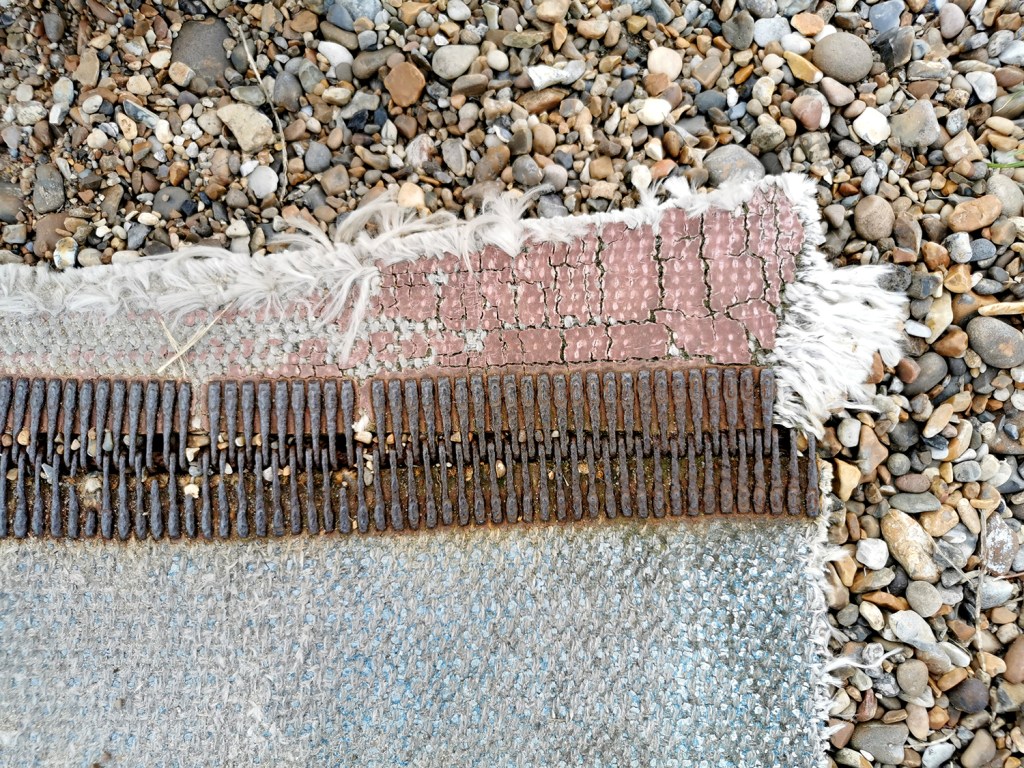
A weekend walk in the search of headspace following a busy week in academia led me to the Suffolk coast and a beautiful 13km walk, down and back, along the beach. Always with an eye on the hunt for pattern, colour and cloth I found all three, relating to the topics of my teaching. Of course I also had a handful of stones and other ‘precious’ detritus.

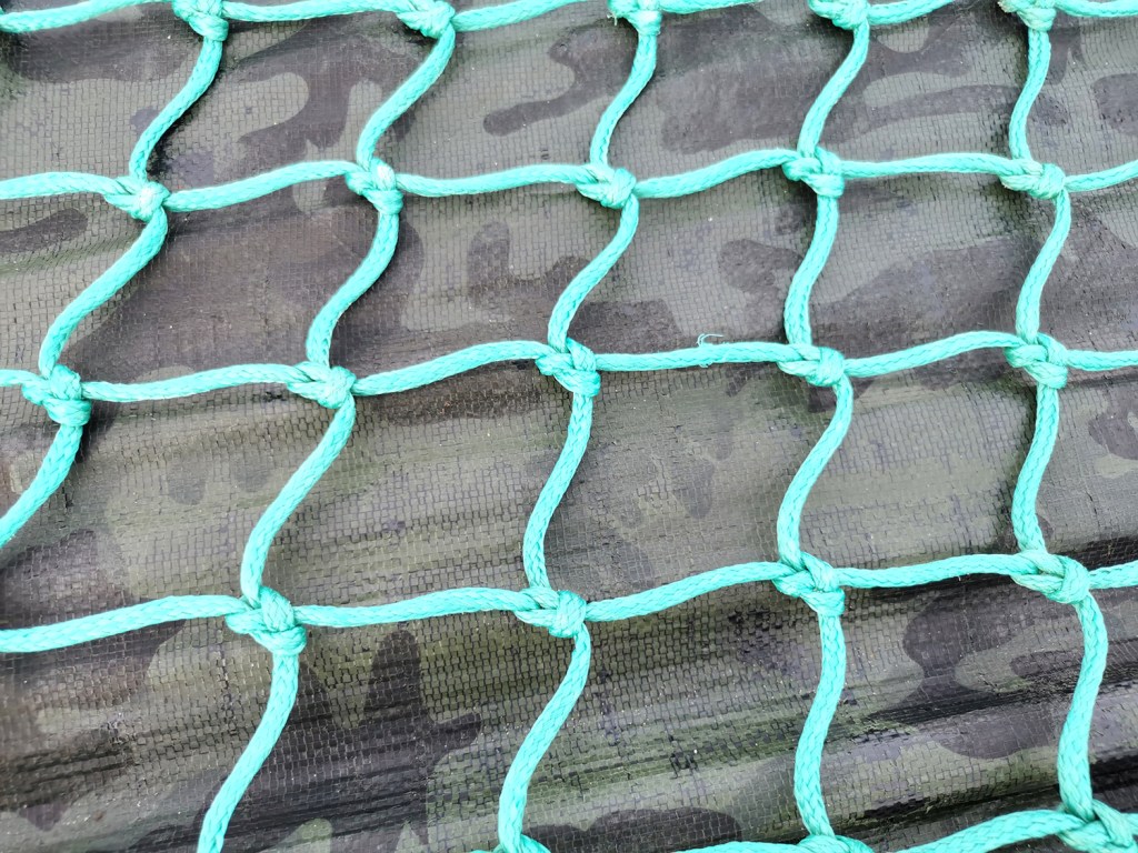
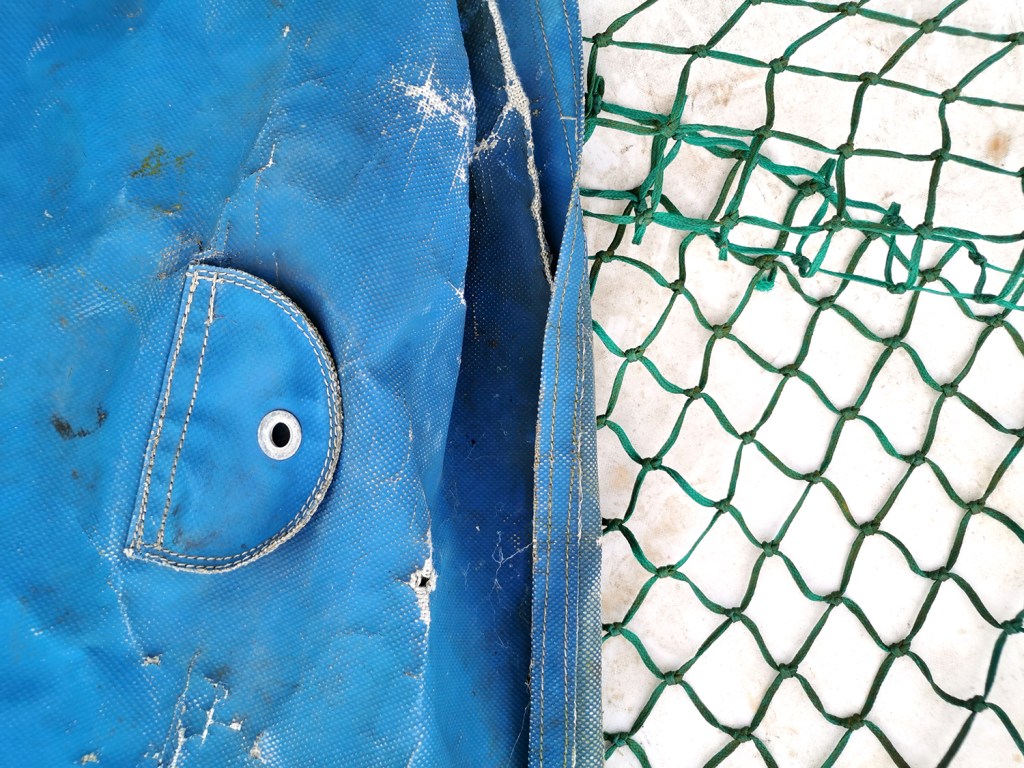
Having spent the week talking textiles, including pattern structures and repeating designs I was amused to connect the patterns on the beach made from the waves running back across the sand being echoed in the fishing nets on the boats higher up the beach.

I have also been discussing with the students the broad application of textiles in the everyday world around us beyond fashion and interior applications and our walk gave me good examples to illustrate my point. We use traditional textile techniques including knitting, crochet, printing or weaving, with the addition of a coating or finish to create materials for practical applications.

prints on plates

One of the aspects of drawing for pattern design that fascinates me is the stylising process; how we see something and process it as an interpretation of the thing we initially saw. I’ve written about this several times on this blog over the last few years. When I start to draw something new I make quick studies to get to know the subject matter, and work out what the key information might be, and how I retain the qualities that make the subject remain visible in some small way – depending on how much I want to hold on to the recognisable elements.

While washing up the other day I saw two of our plates side by side in a way that got me thinking: I saw connections I’d not spotted before despite the visual languages of the plates appearing to be very different.

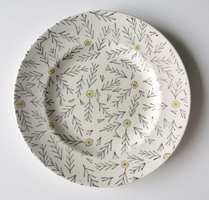
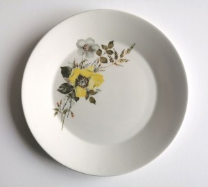
Both plates are decades old, both have seen better days. One is a simple graphic motif, one is a rather nostalgic painted flower posy.

Both plates appear to have floral-inspired printed surface designs. Both designs could be described as featuring yellow flower heads (although one includes other flowers too while the other contains multiple prints of the same motif elements).

One design is pared right back to stylise the flower by only recording a stem and flower head. The style is almost diagrammatic in the simplicity of the motif consisting of black stem and V-shaped lines crossing the stem to suggest leaves. The flower head is a straightforward circle with a dotted outline. Not all stem motifs have heads, there is a randomness in the composition across the plate.

The other plate design features painterly and drawn details, a generous sprig of flowers utilising more colours to express the tones and textures of the flower and leaf details and certainly more expressive in its rendering. The flowers are placed on one side of the plate, as if allowing space for the cake to be placed alongside. The yellow flower head is certainly the attention grabber.

Now I’ve spent a bit more time thinking about these designs I actually believe they make a great pairing, two designs that complement each other in what they offer. I’m not so keen on matching crockery and enjoy using our mix and match plates collected over the years from car boot sales, charity shops, family hand-me-downs and gifts – they all offer reference points and bring something to the collection, and this week I’ve been grateful to appreciate this duo in a new light.

I spy hospital patterns

As a keen lover of patterns I’m always on the look out for interesting examples to add to my consciousness. I do like a good geometric as well as micro (small scale) repeating patterns so despite being immensely annoyed to find myself back in hospital on a ward for a week I did spot the odd pattern of interest…

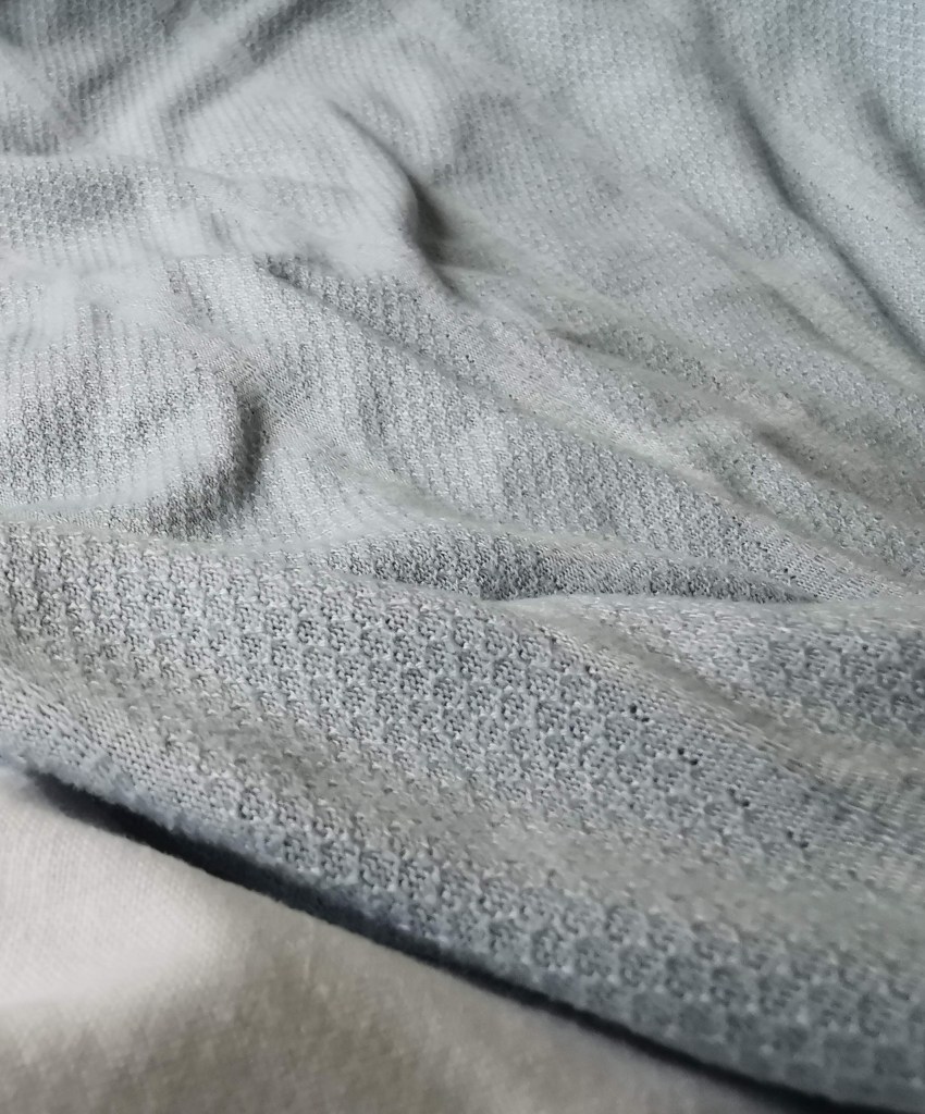
I’m interested in small details that make patterns work, and I spend time in my teaching analysing successes and failures of patterns in relation to motifs, pattern structures and repeats to teach the students how to improve their own designs. These NHS designs, printed on fabric for hospital nighties (left), pyjamas (middle) and the surgical gown (right) do demonstrate merit.

Small details on the pyjamas / nighties, such as the spot actually being a hexagon, the less obvious choice, and the squares making up the bigger square block including smaller squares in the darker colour, means they contrast with the larger mid green colour bring visual interest. If the darker squares were the same size they may well appear too dominant. Interestingly, the pyjamas had the green colourway as vertical stripes, and yet the same design in red was placed as horizonal stripes on the nightie. I wonder why this was. Let’s not talk of the fit of these garments! The surgical gown is more simple, but I appreciate the fact that the cross is made up of broken lines, with a small dot in the middle – so much more interesting that if it had been two lines crossing.

These are tiny details that most people will overlook, I know I was probably not the most typical of inpatients, but if you spend any length of time on a ward, nil by mouth for several days your mind wonders. I found there to be a significant challenge in retaining something of myself as a person beyond the sick patient, with all the focus and attention on your health, or lack of. The pattern spotting was a way of still being me.

As I said at the top, I like micro patterns and have shared my collection of envelope insides on the blog before. I like the smaller scale patterns that provide visual rhythms and noise, that get on with doing their job, in a simple utilitarian manner. These patterns on hospital garments also got me thinking about moquette, the hard-wearing fabrics on transport upholstery, and how those patterns signs are there to conceal dirt and wear, whereas these hospital ones with the white background were doing the opposite.

I hope you don’t find yourselves in hospital to have the chance to analyse patterns on your gown, but if you do, I hope you like the ones you’ve got!

on the mend: thoughts of healthcare settings

I’ve had an interruption to normal services as a result of some general surgery, added complications and time to heal. I’m not one to sit idle so it’s been a challenge to be patient, giving myself time to recover and gain strength. The time in hospital – a week – was an ordeal despite wonderful ward staff, and it gave me time to think about how important our surrounding environments can be, for our wellbeing and sanity.

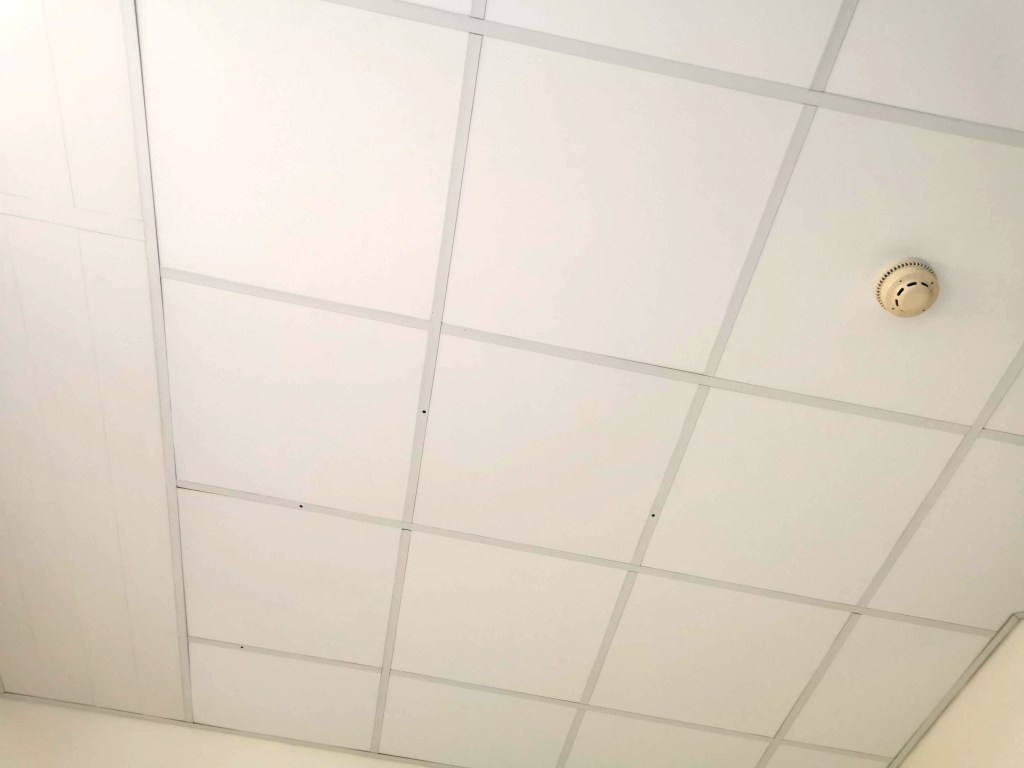
I got to know the walls and particularly the ceiling of the room very well. In my hazy mind I toyed with the grid of ceiling panels being a response to the Dutch De Stijl design by Theo van Doesburg, or a drawing by Agnes Martin. The four holes in the ceiling were also a stark reminder of the surgeon’s cuts. The prints on the curtains were so poor I refused to capture them, but they were insipid, uninspiring, and frankly poor design – I remember analysing their weakness with one of the staff late one night – I think she said I was crazy!

I vividly remember the power of the textiles surrounding me – I had a scarf which was a huge comfort to me – a familiar texture and smell of home. The fresh sheet and hospital blanket were also providing a strange comfort in the utilitarian room.

Twenty years ago I attended Arts in Health lectures including discussions on the subject of hospital environments aiding recovery and wellbeing, and I remember seeing incredibly exciting and positive schemes across the world where designers were embracing colour, nature, pattern and material to drive rehabilitation. I had hoped things had moved on from the institutional walls of hospitals. We now have the interior design buzz word biophilia, using nature for our wellbeing as an integral component in the design solutions, linking humans to other life forms, but it has yet to arrive here. The space in which I coped was bland, institutional and bleak. Such a missed opportunity – and particularly when the hospital ‘art’ is so often shoved out front in the public foyer, and not where the patients spend hours on end, day after day – don’t get me started on public art commissions at hospitals!

The relief to be home, surrounded by colour and pattern – and my family – was intense. Those first breaths of fresh air, the sight of a bright autumn day was incredibly uplifting. I still hold a heightened sense of this awareness of nature, even now a week on, as I recover and appreciate my health returning to business as usual.