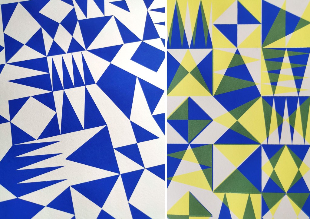
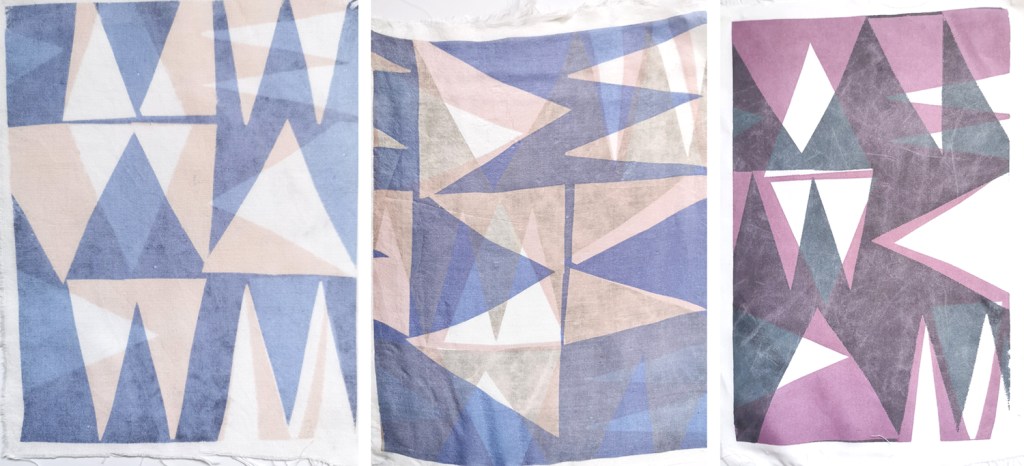
After the lovely summer I’ve been back printing in the studio, with some lino blocks on the go as well as two new screens I’ve had exposed as part of my pattern research. I’ve been exploring the rotation of the artwork as well as folding the prints to determine visual narratives.
I tend to not worry too much about colour palettes in this sampling phase, particularly as I’m focusing on the pattern building but also considering a range of material substrates for future outcomes. I appreciate this gives me freedom to test colours, some more successfully than others. After several days at the computer screen it can be a complete relief to spend time at another type of screen!
I have been fortunate in having my pattern research selected for inclusion in a really exciting exhibition opportunity in Bristol, led by academic Lucy Ward from University of the West of England.
“APERIODIC brings together artists, scientists, musicians and others in an exhibition about pattern. The show presents work that explores ideas relating to the mathematics and science of ‘aperiodic order’: the absence of regular or repetitive patterns. Or, more simply, ‘things that almost repeat, but not quite’. The exhibition is part of the APERIODIC festival of art, science, music and performance taking place this July in Bristol.” official exhibition text(APERIODIC, 3-14 July 2024 at Kit Form Gallery, Bristol)
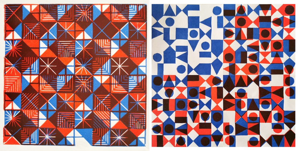
The two pieces I had selected explore block rotation in the over printing of further colour layers, resulting in a building up of a more complex design:
Geo / grid / starLino print
Fields of seemingly reliable compositions of geometric motifs provide the rhythm of assurance through repetition of geometric rhythms but the swapping of small details amongst the motifs unsettles the overall pattern and disrupts the repeating design. The block is rotated before printing of the second colour.
6-spot rotation, multi-direction Lino print
Built upon Lewis F. Days’ principles of distribution of motifs in pattern design (1901), motifs are placed within a tile, 6 x 6 to provide balance and direction when repeated. As the second colour is applied the block has been rotated by 90 degrees in each printing of the tile over the original blue. The repeat is broken and a disorder is established.
One of the highlights of having the work selected for exhibition was the opportunity to have a mathematician review my work aligned to their own interests in pattern. Yotam Smilansky is a Lecturer in Dynamical Systems and Analysis at the University of Manchester, with a special interest in aspects of order and disorder in geometric patterns so I was interested in what they had to say about the work on exhibition.
Yotam Smilansky on Kate Farley, ‘Geo / grid / star’ and ‘6-spot rotation, multi-direction’:
“We notice a certain form, a sense balance, but it might take us a little while before we realise exactly what’s going on. Then we get it: the complicated object before us is made of a single ingredient, copied and superpositioned. It is surprising, even magical, how the unassuming process of layering rotated copies of a single pattern can result in a rich family of objects with a wide range of properties. This is evident, for example, in the moiré patterns of twisted bilayer graphene, where a slight change of angle results in completely different electrical properties, and is beautifully demonstrated in Farley’s mesmerising prints.“
Yotam’s response interested me as I’ve been exploring ways to disrupt and challenge the repeating tiles through transformation and evolution of individual elements within an apparently repeating pattern. I’m certainly keen to continue with this work and am grateful for this opportunity to gain feedback as well as discover the work of other pattern-makers. You can read other reviews of exhibiting artists by mathematicians here.
Thank you Lucy, Yotam and all those supporting the event.
A precious holiday to Greece in the early summer has provided plenty of nourishment for my creativity, as well as excellent down-time, walking and eating. It’s just taken me a long time to get this post together!
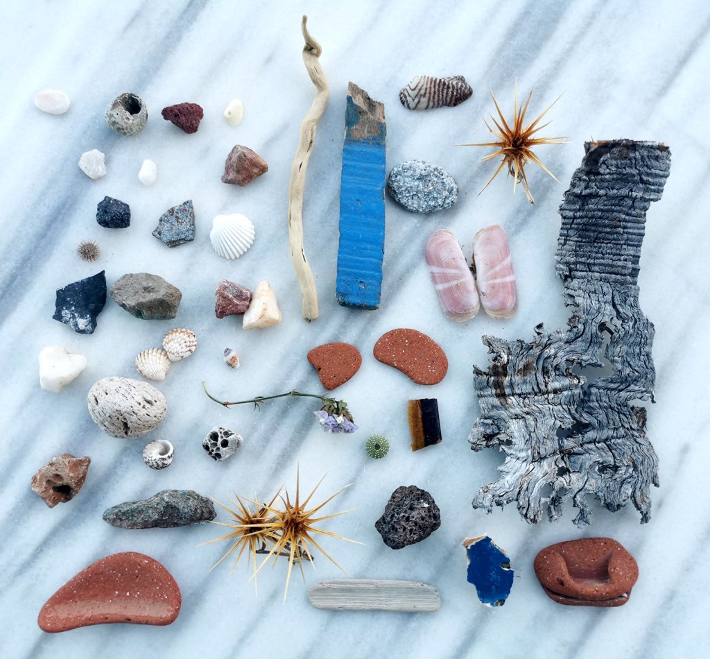
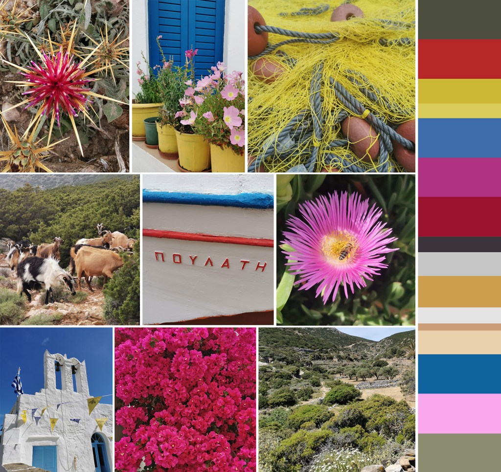
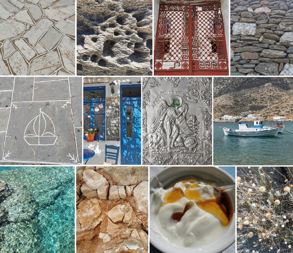
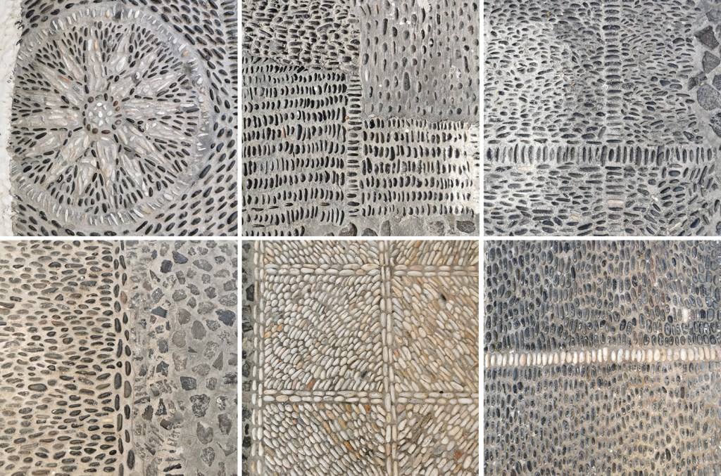
I’ve been creating photographic records of artefacts collected on holidays for some time – a great way of remembering the specifics of a walk without having to bring it all home! I’ve also enjoyed creating composite images to represent experiences over the years, some featured on the posts here, so I’ve done the same for Greece.
We visited the Cyclades, and specifically the islands of Santorini and Sifnos. The night on Santorini was for old-time’s sake, and the stay on Sifnos was to get to know an island we’d not been to before. It is a beautiful island, with lots to explore – I’d love to go back to one day!
Here’s a collection of precious finds from the 70+km of walks across Sifnos on their excellent trails, some very prickly! As marble was everywhere I thought it appropriate to use the marble table by our room as the background surface:
First up with the composite images – colour:
Next up: pattern, material & finish, including Greek yoghurt and honey of course:
As a result of my current pattern research practice, I’ve been keen to get out and discuss print production methods with designers and manufacturers, particularly as I was restricted in doing so while writing my book during the pandemic. A couple of weeks ago I had the opportunity to visit designer Marthe Armitage in her showroom in west London, showing her my sketchbook / design work and discussing each of our design and production processes.
I’m not sure when I first became aware of Marthe’s patterns on wallpaper and cloth, but I’ve used her designs in my university lectures for the last few years to illustrate economic principles of building pattern, using a single block (one colour) to provide flowing and complex patterns, featuring varieties of visual texture within motifs. I bought the book on her life / design career, The Making of Marthe Armitage (published in 2019 by Graphical House) and was impressed by the beautiful drawings that accompany and support the design work I was familiar with. It is a thoughtfully produced book, with some copies available with a hand printed wallpaper wrap cover.
I’ve written before here about the time my ‘phone rang and Marthe was at the other end, ready to discuss her inclusion in my book and we went on to put the process of pattern design to rights. Meeting her more recently and showing her my sketchbook was a wonderful experience. There was straight talking about the current state of patterns available on the market and we agreed with each other about drawing on paper to map out the design on a grid to establish the composition for repeat. She was intrigued by my investigation in to block repeat and rotation of the tile and suggested some of my ideas more fruitful than others – I agree! We were joined by Marthe’s daughter Jo who leads the hand printing and is key to the future direction of the business, as well as Harriet, the Creative Project Manager and Christine, the hand printer who supports Jo in production. I was interested to learn of some new plans in development and gain an understanding of their experiences of print production in the UK.
The showroom in Brentford is a beautifully designed space which includes the printing press for hand printing their wallpapers and plenty of samples to admire, and is open to the public regularly. Tins of ink are displayed alongside samples of designs in progress and colour testing. It was also interesting to see the lino blocks featuring the designs cut by Marthe backed on metal plates ready for the press. Check out the instagram account for up to date news.
As our meeting came to an end, I grabbed the opportunity to ask Marthe for a photograph of her alongside the beautiful designs and to sign the copy of my REPEAT book in which I’m collecting signatures from the contributors. I am very grateful to Marthe and the team for making time to meet with me, thank you!
In the first term of arriving at Norwich University of the Arts I was welcomed as a member of the Pattern and Chaos research group. Colleagues from across the university would meet and discuss individual research practices and shared ambitions relating to the themes of the group. During one of those early meetings the idea of a Reader, a book featuring many contributions on the themes related to the research group, was being discussed. I enjoyed being involved in setting out early ambitions and five years on the book, edited by Sarah Horton and Victoria Mitchell, is a reality, having been published by Intellect Books in late 2023. Congratulations to Sarah & Victoria!
I’m delighted to be a contributor alongside many other researchers and practitioners, some I have the pleasure to know, others I shall get to know through their text and images in the book.
My contribution to the project is chapter ten. In conversation with both Sarah and Victoria several years ago I shared my ideas of pattern evolution, of taking motifs from one to another, an ogee to a diamond for example, through the process of drawing, transforming them from one to another across the sheet of paper. I gave them a quick sketch as part of my proposal and they patiently waited for more as I worked on the larger body of drawings. The link between themes and variations in music was apparent and I played with this idea as I made the drawings, layering tone and form, as a composer would do in building the greater composition.
The chapter explores the practical research process of drawing and evolving the motifs across formal grids structures and across layers of tracing paper. Although the visual language of these drawings are significantly different to my current research the ideas initiated here were the seeds of my current investigation – I’ll share that progress soon!
A huge thank you to Sarah and Victoria for the ongoing support they provide, both to me and my practice. Between the two of them they always ask the pertinent questions and offer sound advice and encouragement.
For a number of years I’ve been aware of the fascinating work of Colorifix, an award winning bacterial dye biotech start-up organisation based in Norwich leading the way for a more sustainable dye practice. Following some planning and support from our technical team I was able to host PhD researcher Ruth Lloyd in partnership with Colorifix to share with us their work and to lead a workshop for our BA3 students. Ruth is carrying out practice-based research “to develop and commercialise bacterial dyes, where she will further explore the capacity of colour producing microorganisms to create human designed patterns”.
We were treated to a insightful presentation by Ruth about the science and development of the colours, before we were able to have a go at printing with the bacterial dye colours. The students and staff tested painting the colour directly on to the fabric as well as painting on the screen then transferring the colour, as well as using paper stencils with the open screens.
The range of colours is limited at the moment, so this is something being worked on by Ruth and the team at Colorifix. The different fibre content of the fabrics printed on can significantly impact on how the colour appears so we were testing natural and synthetic fabrics to build our technical files and our own understanding of colour and textiles. Thanks Ruth and Colorifix!
It’s been a while since posting here, but I’ve been busy enjoying summer adventures and developing exciting pattern research alongside getting the academic year underway. I’ve also moved in to a new studio space so I’ll share that in due course.
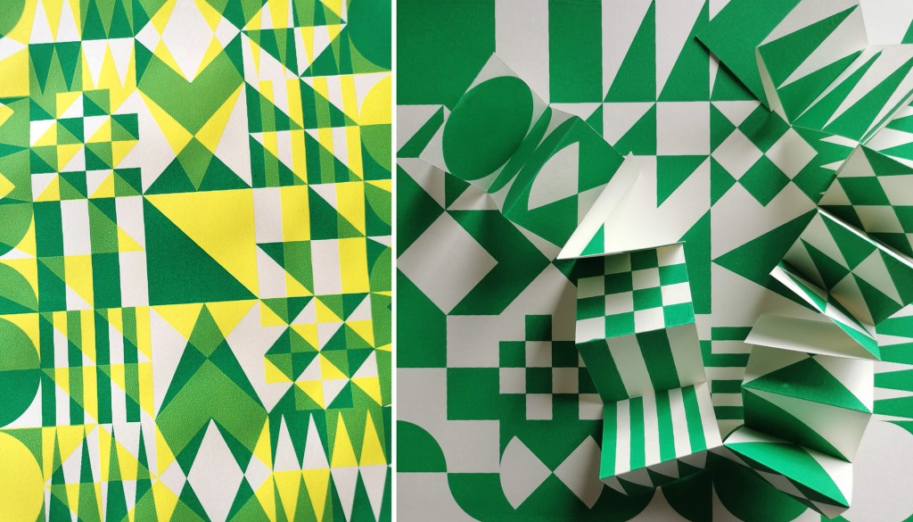
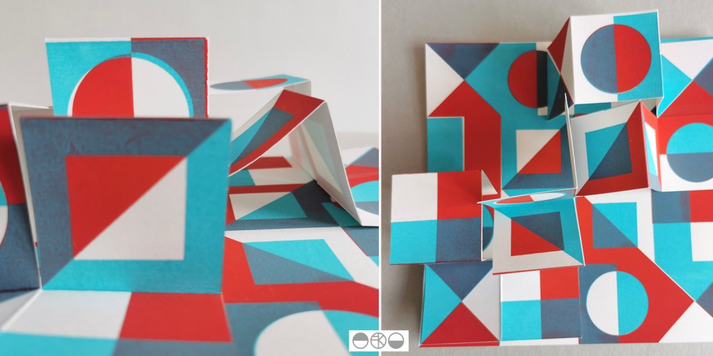
My pattern research focusing on the repeat print block and how it can be used to generate multiple variations to evolve pattern options continues, with sampling with screen and lino printing. I thought I’d share the more structural outcomes here, linking back to my book art practice. I enjoy discovering links that connect the broader practice I’ve developed over the last twenty five years.
As I folded the sheets of printed pattern the forms appeared to suggest a built environment so I explored the idea a little in how I photographed the pieces. Testing scale and contexts is a vital part in developing a pattern, and I enjoy the possibilities.
It’s been a while since I last wrote here – the summer term at university has been very busy, … I’ve hosted an Industry Awards Day, assessed a lot of work, put up a degree show and taken students to the graduate showcase of New Designers in London, to name a few activities, so not much headspace I’m afraid.
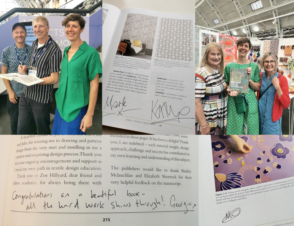
In the middle of all that I agreed to chair a panel at New Designers titled Contemporary Printed Textiles and Surface Design Practice. I had the amazing designers Emma J Shipley, Sarah Campbell and Deborah Bowness as panellists, sharing their expertise – all three designers are interviewees in my REPEAT book. I had some questions up my sleeves to shape the discussions, and despite not having done this sort of thing before I thoroughly enjoyed leading it. To a pretty much packed venue we discussed our individual design processes, clients and customers, how we work through licensing deals, and the decisions behind establishing brand identities. Sarah, Emma and Deborah have decades of experience between them so it was so valuable to share their generous and hard-earned experiences with the attentive audience. We could have carried on for much longer! There was also the highlight of meeting my publisher from Bloomsbury, Georgia, who I’d not met in real life before then, but came along to support me.
I also had another idea in my mind, to ask Sarah, Emma and Deborah to sign my REPEAT book to make it a special keepsake. As New Designers is a textile design industry event I also managed to cross paths with several other contributors and asked them to sign it too, including Mark and Keith of Mini Moderns, Clarissa Hulse, Daniel Heath, Jules of @thepatternsocial fame, as well as past students Tasha, now designer at Habitat and Molly, currently floral print designer at Bay and Brown. It has become a mission to find opportunities to cross paths with the many others included, but this could be a very long task!
The day ended in celebration for my colleague Jill, who retired this month after 38+ years at Norwich University of the Arts. Jill taught me when I was 18 years old, and we’ve worked together over the last five years in Norwich. She came along with Grainne, also one of my tutors, to support our graduates on the stand at the show, so I grabbed a picture with them both and the book. They earned a mention in the acknowledgments as they were hugely supportive of me as a student, introducing me to their love of drawing, colour and pattern that has stood me in the many years since.
It was a really successful few days in London with our graduates doing themselves and us proud, as they jumped with both feet in to this great industry experience, just weeks before I proudly read their names out as they crossed the graduation stage at Norwich City football ground. Now it’s time for some holiday!
I’ve been keen to get back to designing and printing having spent my practice time writing and developing the book for publication over the last few years. I’ve been testing ideas of pattern evolution and pattern construction for some time in a limited way, specifically looking at pattern structure evolution through drawing investigations, but the ideas at the heart of this investigation have themselves evolved over the last couple of years.
With more time and fresh energy I’ve defined a new project brief and research rationale, and I’m excited to have got off to a good start. I’m looking at repeat tiles and construction of pattern formations, so cut shapes and sketches were an obvious way in for idea development. I’m trying not to be too precious with outcomes at this stage, so I’m trusting the process.
I’ve started by testing ideas with geometric shapes as subject matter to keep the aesthetic clean and graphic, focusing on the laying down of colour blocks. I’ve started by working up some ideas for screen printing but anticipate many more drawings, maybe lino prints and certainly digital work will be created over time too. The colour palette will certainly change, but with an exhibition I’m making work for at the same time dictating pieces to be black and one other colour I’ve gone with black and green.
I don’t want to give too much away at this stage, but look forward to discovering the potential over the next few months.
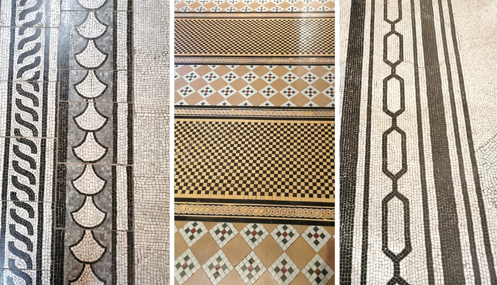
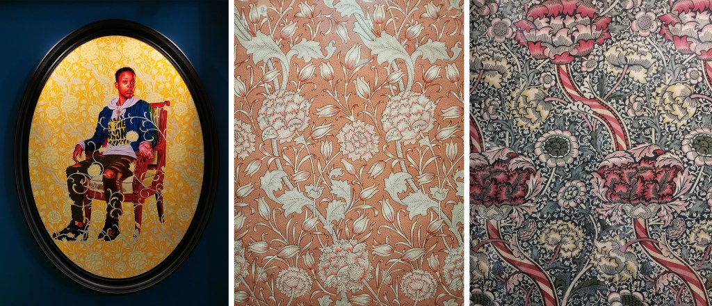
I led a study trip to London with some undergraduate students recently, where I spent several hours in the Victoria and Albert Museum. Having not been there for a while it was fabulous to be back in the company of old friends such as the Arts and Crafts textiles of William Morris and his contemporaries, as well as seeing exhibits new to me. I love the building too and took particular enjoyment in the flooring this time around!
I refer to Arts and Crafts patterns regularly in my teaching and was able to include some fine examples in chapter 1 of the book I’ve written, REPEAT Printed Pattern for Interiors, published by Bloomsbury earlier this year. They tend to show generosity of design, interesting rhythms and motifs working hard with stylised forms that still stand the test of time. Seeing these artefacts in the flesh really made me appreciate how important it is to get off the screen and go to see real things. The scale of the design, the surface and materiality just can’t be appreciated in the same way online. I’d also not seen Portrait of Melissa Thompson, from the series ‘The Yellow Wallpaper’ by Kehinde Wiley. It was stunning and really impactful where it was displayed.
I was there to specifically see the Africa Fashion exhibition which I thoroughly enjoyed. I’ve long known of woven Kente cloth and the Asafo appliquéd flags, but it was wonderful to read and see more of the textiles for fashion, both traditional and new across the exhibition. The textile processes were broad, with fabric manipulation, weaving, printing and embellishments in abundance.
The remaining time I had at the V&A was spent enjoying the international galleries (did I mention the cake break?) where I traveled around the globe by fabric, vessels, garments and objects, enjoying making my own connections between motifs shared by people from centuries and continents apart. To juxtapose a furnishing fabric from 1878 with velvet from Turkey made in 1550, and a tapestry fragment from 400 was rather an enjoyable and fascinating afternoon’s work. I shall try to get back there with less of a lengthy gap next time!
The museum was described by the first Director, Sir Henry Cole as a “a refuge for destitute collections”. I think that’s maybe a little harsh.