Plot 8

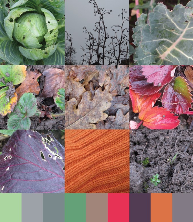
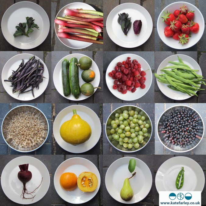
This summer has been a funny one for harvest on the allotment. The long period of heat and lack of rain resulted in tiny potatoes and very  late runner beans but somehow despite this, vast marrows! This year of gardening has been rather chaotic, with sparse visits fitted in around our working patterns and family life, but once I’ve made the time and put in the effort to get there I have always really appreciated the head space the plot gives me in a somewhat full-on / stressful academic / design career. An hour of digging is so good for my mind and body, far better than any gym visit. Connecting with nature helps me register the seasons, and home-grown fruit and vegetables are the best!
KateFarley_plotcolours

This year started off like any other: hoping for bumper crops, trying to stay on top of the weeds, while trying to clear old ground for new patches of earth to cultivate. Then an opportunity arrived and we made a big decision that has been in the back of our minds to make for a while, couldn’t work out how to do it, but is now coming true. We are leaving Birmingham and moving to the country – Norfolk to be precise (yes I was born there, no I’m not going home) – where I am taking up a new academic role, and it’s all-change! Anyone with a sense of British geography knows we will be nearer the sea, we will see more sky, and the horizon will be flatter! We are not moving up or down, we are moving across!

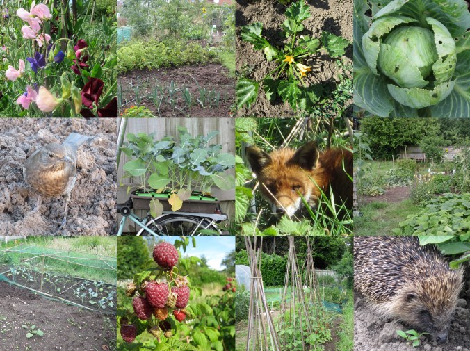
This process has been taking shape over the summer months and during this time I’ve had to come to terms with leaving plot 8, in an allotment site in south Birmingham that I’ve worked so hard on, dug intimately and harvested crops from since 2006. My children have slept in their prams in all weathers as I’ve carried on digging, they’ve chewed on runner beans when teething and learned to grow their own plants too – as well as digging large pits to fill with grass seeds, much to my horror! I’ve dug alongside friendly birds, untangled a hedgehog from the bindweed and been startled by a fox; it’s rarely lonely at the site. I’ll never tire of the first scent of sweet peas each year. Here are a few images from over the years:
KateFarley_plotHISTORY

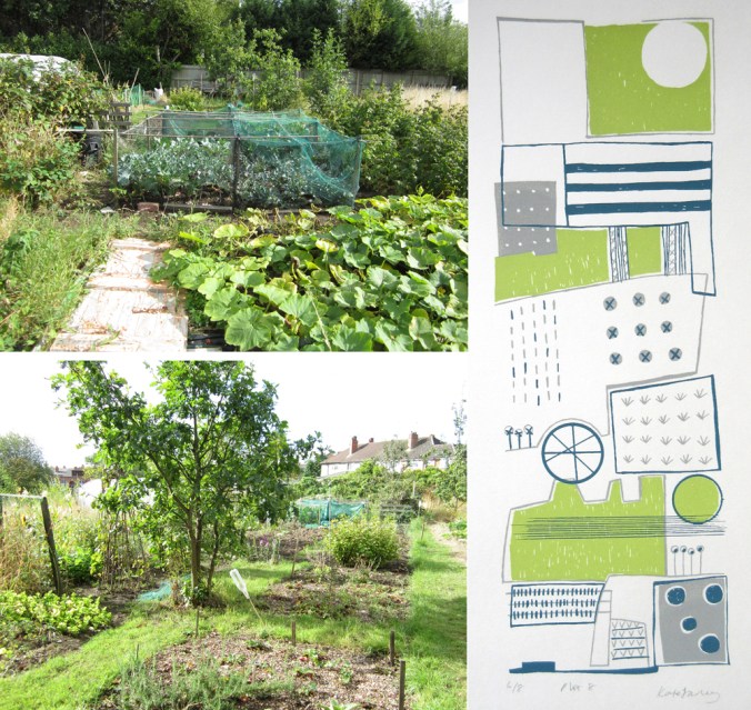
I’ve written many posts here about the plot and the process of growing food, colours, harvests, the community spirit and the way it has inspired my first commercial collection of patterns: Plot to Plate, launched in 2012. I’ve made many editions of prints as a result of mapping the crops growing here. The joys of growing my own food were celebrated in the design featuring tools used on the Plot to Plate title design across tea towels. Without this space – this haven of nature in the big city, I would have struggled far more from living here. As I worked at the allotments I would often think of all the shoppers in the Bullring on a Saturday afternoon, wondering why they made their choice to do so, rather than garden like me.
KateFarley_plot_MAP_1000

This post is written to register the anticipation and excitement of change despite the vast upheaval, both physically and emotionally: saying goodbye to friends and colleagues who have shaped the last 13 years of my life, as well as this plot, that has paid its part in taking care of me. We’ve gathered the tools, taken our last harvest, handed back the keys and now hope that someone else will feel the joy of plot 8 in years to come!
KateFarley_plottoplate_allotment pics_18_100 copy

taking some time from tasks..

It’s the end of the academic year and I’ve got lots of admin tasks to complete and fortunately some trips to prepare for. The life of an academic is no longer one of summer holidays stretching out ahead of us until leaves turn red with plenty of time to catch up with rediscovering the in-tray, or making time for creative practice. Graduate shows, marking retrievals, timetables and planning new modules are only some of the things have been on my list. Many jobs fight for my attention – including the veg plot! Despite the jobs it’s so important to get out and about, see things and make time for oneself! I’ve got a number of projects planned for the next few months and taking stock is always a good start. Here’s to some time to think, and some time to draw, amongst the admin of the summer!

If you want inspiration and have time to see an exhibition I can suggest the Edward Bawden show at the Dulwich Picture Gallery – it’s brilliant. My daughter and I got chatting to two ladies who were enjoying it as much as us; spotting small details and playful touches in the commercial designs including the London Underground roundel as a pigeon’s eye, and several cats lurking! The versatility of processes and visual language, the playfulness, the draughtsmanship and scope of commercial clients is all there to admire. As ever, seeing the old favourites as well as those works new to me, in the flesh is always better than on a screen … Do go if you can – before September 9th!

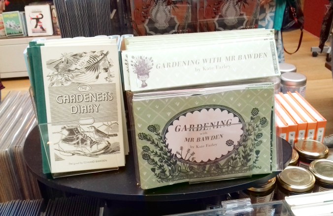
I was very proud to also see my ‘Gardening with Mr Bawden‘ book published by Design For Today in the exhibition shop. The handling copy was a shadow of its former self, so I did my duty and folded it up properly again. The sales assistant commented on how well they are selling, so I’m grateful to those customers too!

Bawden_bookshop


special edition news!

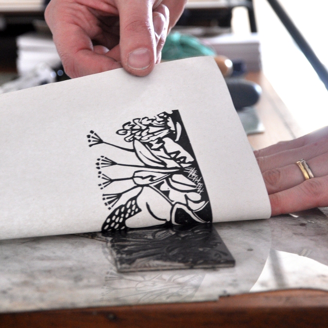
If you follow me or Design for Today on social media you will have seen updates of the book we have collaborated on celebrating artist / designer Edward Bawden’s love of gardening. The book is titled ‘Gardening with Mr Bawden’. It’s been the perfect project for me as I also love gardening, have a background in making artists books and also love lino-printing.

bawden_printing_1

I’ve designed the book taking inspiration from some of the research I’ve found about Bawden, such as his preference for structural plants, his competitive growing of sunflowers, and the ongoing problems with snails. I’ve also made reference to some of the artwork made by Bawden and his dear friend Eric Ravilious, including the view under the tree with the table and tea things, as well as the bench Bawden designed.

All the motifs are my own but I’ve made reference to the sort of patterns Bawden was designing while living at Brick House, Great Bardfield in Essex. I’ve blended the idea of plants growing in the greenhouse, becoming wallpapers in the house. There is a pull-out greenhouse!

There are limited edition sets available to pre-order now which includes a signed book with four greetings cards and a collectors book explaining the project. Click here to order.

gardening-special

woven landscape

It seems right to me that as someone keen to draw images I chose print as my medium of design rather than weave but I do think there is a strong sense of the spirit of woven cloth in how I see things, and for that I thank my upbringing in Norfolk. The strong horizontal line of the sky meeting the fields interrupted by vertical fence posts or reeds creating visual rhythms can leave me feeling utterly complete. Back in Norfolk this Easter, once again I breathed in the space, the horizontal and vertical of Horsey; one of the most perfect places.

I removed colour from this image as I wanted to clearly show the structure of the stripes, but colour is much of the joy in this landscape – the purples, greens, yellows, varying from minute to minute in the ever-changing light. I add them below. One day I will weave again.

Horseyreeds_weave130

KFarley_Horsey_palette

garden cuttings

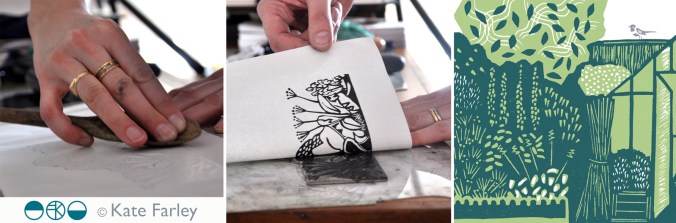
I’ve been working away in the studio on a wonderful project with Joe Pearson of publishing company Design for Today for a while and time has come for us to begin to share the results. It is a book inspired by Edward Bawden and his love of gardening. The content of the book has been informed by my research into his garden at Brick House, Great Bardfield in Essex. Bawden was a very keen gardener and I have researched and worked with anecdotes and visual references to build a picture of what his garden may well have been like and designed the artwork of the fold book with lino prints, a process he used many, many times.

revealingprint_200jpg

Keep an eye on social media for more updates as we lead up to the official launch in May.

evolution in practice

I’m thinking about different aspects of marketing and promoting businesses in textiles for a lecture tomorrow and I came across this image which got me thinking about how my practice has evolved and my priorities have changed since I took this picture only a few years ago. I’m so grateful for the opportunity to shape and alter the practice I have, to take on projects that suit me at the time. Hooray for portfolio careers! Right, what’s next?…

KFARLEY_cropped_tags140


telling stories

Each project I create is part of a longer narrative of my practice and as I look back over the years it is easy for me to see common aspects and joined up thinking spanning those projects. As I teach this year’s final year students on the BA programme I lead I am reminded of my own journey starting out in design, and the questioning I did to work out what sort of work I wanted to be represented by in my step beyond graduation. The challenge of the Final Major Project!

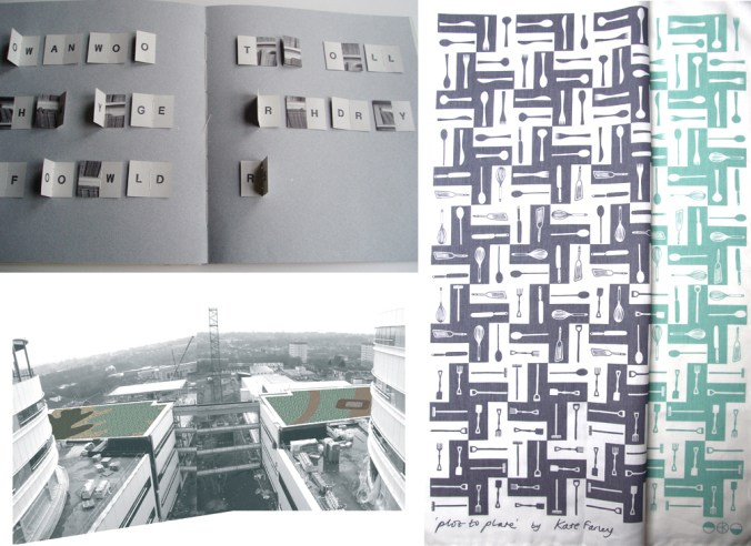
I understand the battle and pressure to work out your own style, the look or handwriting to be yourself, but funnily enough I don’t think that is the thing that holds my practice together anymore – you may disagree, and I’d be interested to know! What has become the common thread holding so many of my projects together has been the story, the narrative within each project. I could never have imagined this all those years ago, even though I was making books! I’ve made many artists books that contain single narratives, but I’ve also worked on large-scale projects that involve public toilet doors that act as pages of the book with a story across them. This is also true for the Queen Elizabeth Hospital in Birmingham where my designs are laid out in gravel across three huge roof-scapes. I’ve also been challenging how to place pattern within single designs, such as in my Plot to Plate tea towel design, telling the tale of growing, cooking and eating food. I’ve made series of prints, and a set of posters, all held together by a narrative. The more I look the more examples I can see.

If only the graduate me back then could have told me that the key aspects of my practice would work themselves out I would have worried less, but then again, it is the search for these answers that take you on the creative journey in the first place. Some people like to know what they are going to design, design it, then be pleased it looks as they planned. As for me, I like learning as I go, push myself that little bit more, find a bit of creative strength to step out of my comfort zone, and then be pleased I got somewhere I didn’t know existed. The creative process is a difficult thing to explain, but it’s all the more interesting for being that way.

KateFarley_narrative_blog

Top left: artists book in collaboration with Wes White for Sherborne House, Dorset, 2004

Bottom left: visualisation for the roof-scape at Queen Elizabeth University Hospital, Birmingham, 2009

Right: Plot to Plate tea towels, 2014

Squared collection

It is no surprise to many that I collect things, some of those collections have even been featured here on the blog. When a colleague asked me last week if I had squared paper I was happy to delve in to my ‘squared paper’ drawer in the studio and share. This small act led me to rediscover this collection that features paper dated from the 1980s up to the present day, of grids, checks, plaids … of beauty. Printed in grey, blue, green, red or other, two-sided sheets, pages of books, tracing paper; the collection is also international in its reach. I’ve posted several on my instagram feed @katefarleyprint but here are some to get you excited!

Screenshot_2018-01-29-18-45-53-2-1


my motifs in design

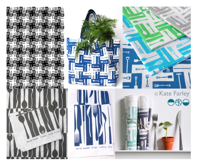
I consider everyday design to be important in shaping our lives for the better or worse, and that includes cutlery design. For regular followers of this blog you will know I like cutlery. My special relation with cutlery started as a child, I collect forks, particularly disposable ones and now as an educator I use cutlery to teach design thinking despite my subject being textile design. I’ve also designed several pattern designs using motifs of cutlery including a collaboration with David Mellor Design.

The first time I made a formal design using cutlery I won a prize! I entered Formica’s Design-a-laminate competition in 2005 and won the Retro category for producing “a skillful houndstooth pattern using knives and forks, a reference to Formica’s conventional use if Fifties’ diners and kitchens”, (Blueprint magazine, April 2005). (top left pattern – made by a rubber stamp – see my instagram feed)

cutleryprojectsKF

Many years later, in 2012, I launched a new variation of this pattern on gift and home-ware products including a tea towel, and moved the dogtooth check pattern on by incorporating a visual narrative into the design. At the bottom of the graphic I had garden tools such as spades and a rake, then in the middle I incorporated kitchen utensils such as whisks, wooden spoons and fish slice, before topping the design with cutlery – therefore illustrating the journey of plot to plate, (garden, kitchen, dining) using the tools that we use. This has been really well received and I sell through my website and have shown the design at several trade shows and exhibitions. Subsequently I updated the colours to Brassica green and Brassica purple in 2014.

Continuing my design journey of cutlery I approached Corin Mellor to suggest we collaborate on a design to celebrate his Chelsea cutlery in 2013, inspired by the production method of making cutlery and the beautiful shapes of the salad servers. Following the success of this I was asked to create a second design in 2015 inspired by his father’s winning cutlery design ‘Pride’. Both designs of tea towels sell incredibly well both online and their three shops and I’m delighted with the responses I receive – from as far away as Japan!

So why do I remind you of when I designed these patterns…?

With my pattern designs of cutlery out in the public domain since 2005 I received a message from someone I know telling me they had seen my cutlery design on a surface I hadn’t applied it to…., was it new?… alarm bells! I haven’t designed this product! The feeling of being cheated, of being violated, ripped through me leaving anger and frustration at the lack of other people’s respect to a fellow designer – that’s putting it mildly. Don’t get me wrong, I’m grateful for being told, it just took my day in a different direction from my plans. My afternoon was spent searching online to find examples of this product, and there it was… I am offended!

I could take to social media and rant, name and shame and get it off my chest – that’s one way but I’m in a difficult position if I can’t prove someone has copied my work. If I’m not careful I can find myself being accused of slander – hence I’m not telling you the product the design is applied to, but you can see my designs here which gives a clue. You can do your own searches and draw your own conclusions, but please understand why I’m not making wild and angry claims. In the world of design law this is something of a challenge to prove, and having already gone through this with a dear design friend, know it’s a nightmare that is part and parcel of our design careers. The thing is we need to promote our work and get it seen by people. I can’t have a design career while hiding everything.

The internet enables us to share our design stories but also leaves a trail – and at this time I’m grateful my designs are well documented. I pride myself on originality, and for creating high quality designs. The pattern that I believe is too close to mine for comfort lacks any sort of rigour, consideration and refinement compared to mine. If I was going to copy I’d at least make mine better than the original! Why record a cover-version that doesn’t compete with the quality of the first song?

It is always a worry that someone looks at your work and thinks they can ‘take inspiration’ from it. I’m not saying I should be the only textile designer using cutlery as motifs – no way! Both as a designer and academic I take the issue of imitation very seriously, stressing the importance of originality to my undergraduate students to a point they  clearly know my thoughts on intellectual property. If anything, I drive a very wide path clear of anything that can be seen as similar, knowing how damaging it can be to a designer of being accused of copying… there are enough case studies out there! My reputation matters to me.

How can imitation be flattery, as we are told in primary school, if it makes me feel so angry and violated? I’m having to think about what to do next, and also I am rather in need of some time away from a very busy last few months… but I shall seek advice and work out what to do next.

Season’s greetings, and thanks for reading… I’ll let you know next time I design a cutlery pattern! If in doubt, ask…


window film wins gold

In my design practice spanning over almost twenty years I’ve been really keen to test my design skills in relation to different products and this has resulted in me working with some really great companies. I’ve learned lots and have got to test my pattern making skills for the different applications I’m working in relation to, learning from industry partners with their experience and expertise.

I’m really proud of my Construct collection as I set out to combine my interest in constucted cloth (weave in this instance) to inspire a print language, with the final surface designs being applied to hard surfaces. I was inspired by Augustus Pugin’s phrase “truth to materials”, in defiance against fake digitally printed wood-effect interior surfaces and I was interested in presenting a subversive outcome. My designs are not copies or imitations, they are a creative response to the material. I made tools to draw with; forks dipped in ink, relating to the threads of cloth and then manipulated the scans of the drawings in Photoshop to generate the repeat patterns.

KF Construct_blog_p2

When the opportunity came to work with The Window Film Company I was really impressed with their willingness to sample a range of designs and to discuss what worked. We explored the scale of the designs and sampled a number of patterns, resolved the repeating artwork to create the final collection. The products are brilliant, the window film is so easy to install and looks great. The idea of placing the woven textile inspired patterns on the window relates to the idea of hanging curtains. The graphic patterns are soft and calm, and yet provide privacy at the window. I then went on to develop my Threads collection to extend this idea further but employed lino cutting as the visual process, also available at The Window Film Company.

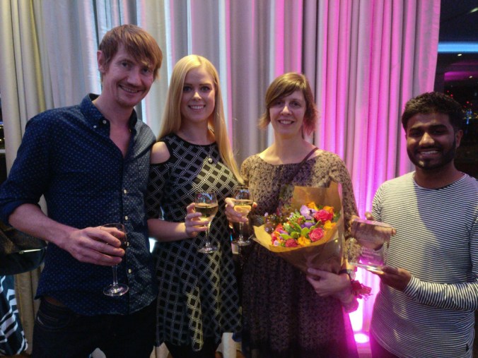
I was delighted to learn back in September that we had been shortlisted in the Best home improvement category at the House Beautiful awards 2017, for both mine, and the designs by Layla Faye, and they were going to be held in central London in November. Last week I went along with some of the The Window Film Company team to the awards and we are delighted to have won gold! It was a complete surprise as the category had some stiff competition, but we are so pleased to have this work recognised.

In the words of Micky Calcott, Director of The Window Film Company, “We’re thrilled to have won gold at such a prestigious and well respected awards ceremony. We work hard to provide customers with products that are practical, but also inspiration and stylish. We’re incredibly proud of our designer ranges and are delighted that our Kate Farley collection has been recognised as delivering something that customers want, enjoy and appreciate.”

My designs have been created with lots of consideration to hand-generated imagery, and in relation to the material it is printed on. The patterns appear straight forward but have involved many decisions along the way, testing the combination of marks and the rhythms that are created, as well as the repeat structures and the positive / negative details. I know the customers don’t have to know the entire creative process to like the designs, but I’m delighted to have the opportunity to reflect on this collection. Winning with this great company is something I’m really proud of. Thank you to Micky and the team, as well as to House Beautiful!WindowFilm_awards17