drawing to see, drawing to notice.

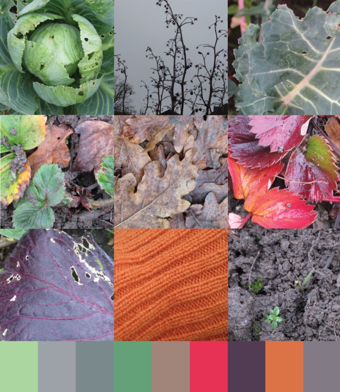
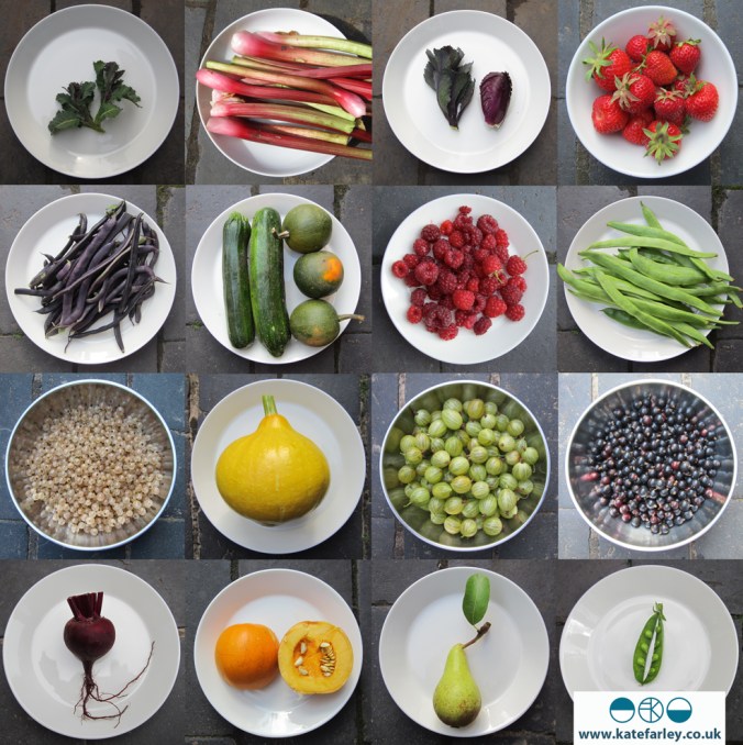
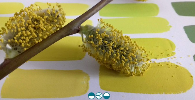
Drawing has always been a great leveller for me and now is no exception. I make drawings to capture something I like the look of even if I haven’t got a clue how it might be useful at that time. Picked grasses, a homegrown tulip or a fragment of fabric all provide challenges that relax me but also creatively inspire my lifetime of looking to draw – it’s not a coincidence there’s a play on words with drawing in my blog name.

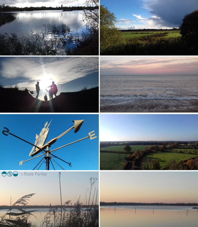
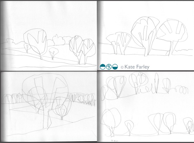
Having some time spare while sat in the car at the local farm shop car park three weeks ago I took a good look around me at the view and with the luxury of time I took out my sketchbook and drew a line. This was a landscape already familiar, but in drawing a subject it is with a closer examination that one can see more.

Firstly I noticed the skyline meeting with the trees in the distance but as I drew that line it was being interrupted by the nearer trees cutting over the fluidity of the horizon. The trees contained strong shapes but not as the summer masses they will hold in full leaf in due course. The branches were clearly defined, but the added haze of smaller branches suggested the fuller form.

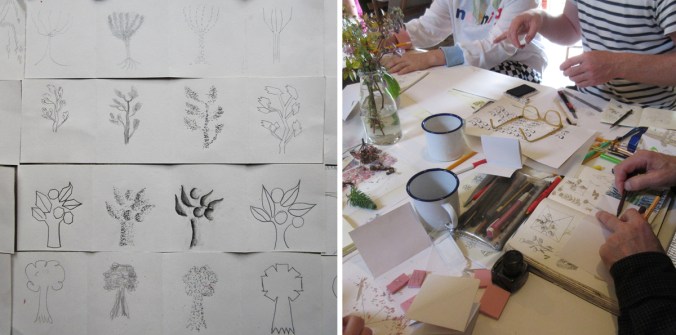
I made reasonably quick sketches of the same view several times, each time starting with a different area as a focus. Sometimes it was the gap between two trees, or a distant field and as I became more familiar with the shapes in front of me I engaged with details of branches to define the structures of the trees. I focused on three clusters of trees that provided different visual qualities but were united by the view.

KFarley_wk1_ALDIS_blog

The process of drawing and re-drawing the same thing is something I love to do – just as Monet would have painted the same cathedral or hay stacks. Where Monet was fascinated with the changing light and what that did to the colour and shadows, for me it is a process of understanding and familiarising in order to stylise and to interpret, usually in line and shape. As I get to know my subject I can edit in and out the information to simplify what I am seeing in working out how to record it.

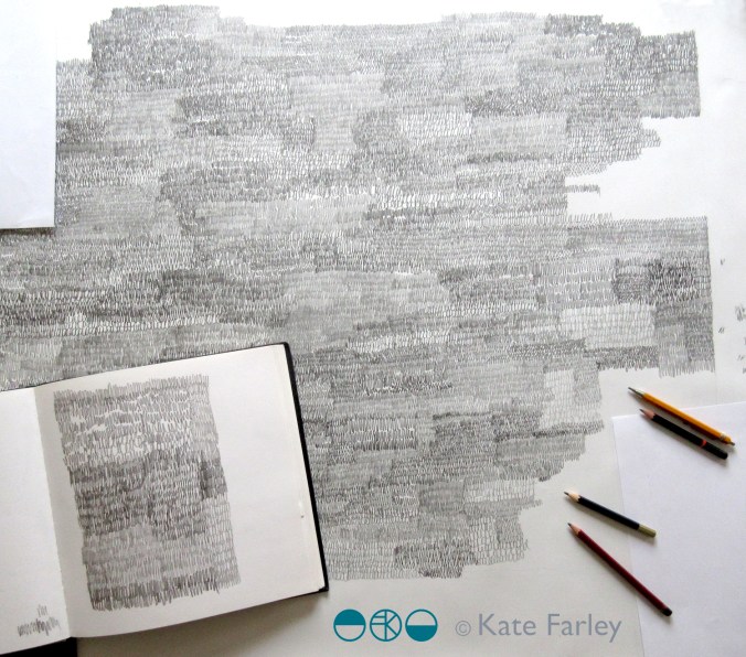
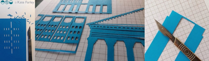
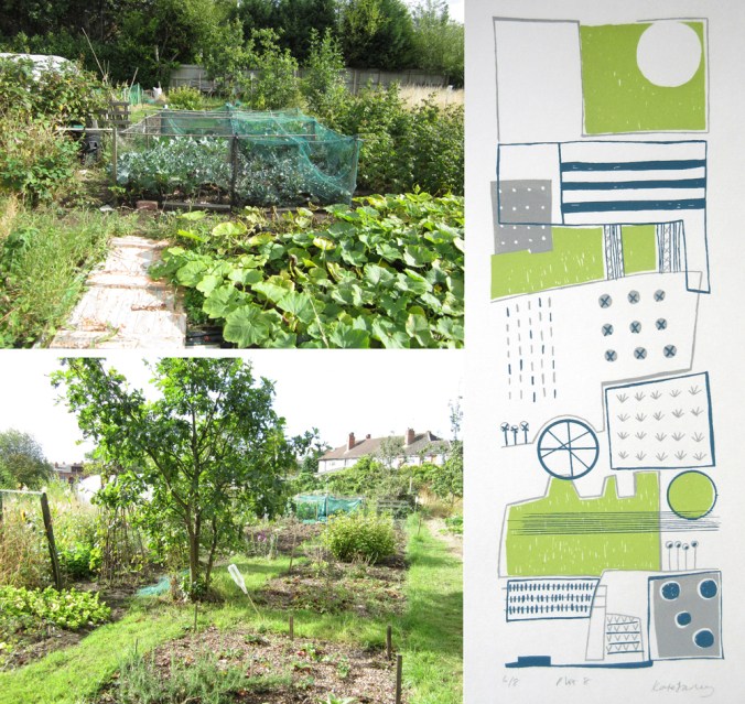
This blog post shows the same landscape being drawn on three different trips to the farm and I think you can see the familiarity allows for more freedom of the information I saw and captured. In week 2 I also took to scissors to cut out the shapes in pieces of white paper, asking myself to identify the positive and negative shapes within the landscape – see the image below. I cut out the same trio of trees several times and they work well layered, as the interpretations of the same subject matter is similar but evolves too.

KFarley_wk2_ALDIS_blog

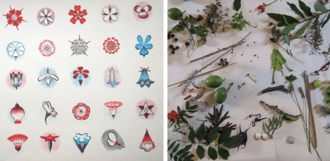
This notion of repetition in order to get to know something is a really key part of my practice as a pattern designer and I’ve evolved this relationship in my drawing over the years. As far back as art school I drew and printed in series of works on paper, with the evolution of seeing in order to pare back being the really important part of my process. I teach drawing as a ‘getting to know you’ strategy too. I suggest a student does not spend the first hour asking the really personal questions of the subject sat in front of them, but to make small talk, get to know the subject superficially first of all, then you can be more up close and personal over time. I think I’ve written about this somewhere on the blog before.

I’m really pleased that within a very short time of drawing I have looked, learned and recorded the view, and once again taken away my way of seeing that landscape overlooked by so many of us in our day to day routines. I’ve returned to this task and now have about twenty drawings from three consecutive visits. The trees are hinting at holding more green but the summer fullness is a while away for now. The buzzard circles and the tractor gets to work, I shall be back again, see below for the drawings in week 3.

KFarley_wk3_ALDIS_blog

evolving colour in the making

A walk in the Spring sunshine gave impetus to a very simple and mindful exercise back in the studio; to make the colour of the landscape. A sprig of willow contains so many different colours. Those colour qualities will alter as the clouds skud across the sky casting shadows, and as the sun ripens the buds.

KFarley_yellow_willow_1500_KF

With paints at the ready I knew it wasn’t about making the one colour, but the narrative of generating colour as my process of journeying from one to the next. I wanted to paint each of the swatches of colour I mixed as I evolved the paint story, observing and recording the subtleties of the change in hues. Selecting a limited number of tubes of gouache to begin made it more interesting. To start I selected the dominant colour I was aiming for, and had a little piece of nature with me as reference. I developed the swatches of colour, selecting one, and then another hue to achieve, step by step, slowly and patiently filling the page.

KFarley_ycolourpalette_1500_KF

Gouache is a beautiful paint and this exercise reminded me of a wonderful morning teaching colour mixing to BA1 Textile Design students earlier this year. Getting the right amount of water, ensuring the colours are cleanly mixed, and then making that one painted line flat and even – it all takes practice.

KFarley_ytubes_colour_1500_KF
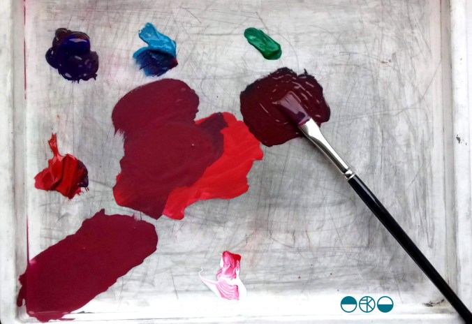
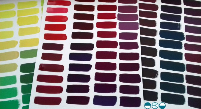
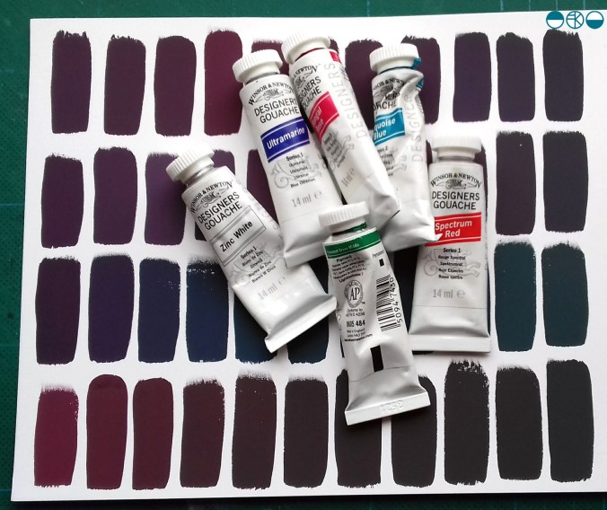
I was lucky enough to have excellent colour teaching during my time at art school and consider myself strong at seeing and achieving the right colour mix. At uni I remembering saying to the print technician “it’s nearly right, I’m happy with it”, and she’d say, “Kate, it’s not what you set out to make, keep going until you get there!” I thank her for teaching me that persistence and these days my students know I’m particular (a preferred word to fussy!) when it comes to colour. Getting the colour right is so important and you may as well enjoy the journey to get it right. Textile products sit alongside fashion and interior items made from other materials, and the colours need to match / coordinate, so quitting before you get the right colour may be a sales / employment disaster too!

Interestingly, some of my current students were discussing my approach to colour recently and one shared that I’m not keen on black outlines around shapes in print designs. Another one commented that they hadn’t heard that, but would keep it in mind. I jumped in to defend the comment I’d originally made – a black outline is too obvious, unquestioning, the default, rather like Times New Roman black typeface when you open Microsoft Word. Too easy. I ask students and designers to think about whether the black line is the best for the design. If you think of all the other colours you can use, I think you may find another and better alternative!

At the end of this colour mixing time I am left with souvenirs of the process, memories of the walk and beautiful colour. This is real colour away from the back lit screen I too often see colour from. I shall do this again.

KFarley_y3xcolourswatches_1500_KF

international pattern collaboration

It all began in an email with the subject line, ‘Hello from Tokyo’ I received in November 2017, letting me know how much my tea towels for David Mellor were admired in a Japanese design company. The email went on to ask if we could discuss a potential collaboration for a capsule fashion collection featuring a print designed by me. Firstly I was excited to think my patterns had made their way to Japan, but secondly, that sounded a great idea, tell me more! A few email exchanges later, and we agreed to meet the next time the company director of Stamps Inc. was in London so I could show him my portfolio to discuss the idea for the new pattern they would like to commission for their fashion collection.

The meeting with Shu and his colleague Yoko in a central London hotel was exciting; I showed my work and it was met with positive discussion. I was also reintroduced to the tea towels that had made it to Japan all the way from my studio, via a David Mellor Design shop! We sat at a large table and I showed them my portfolio, spreading the many sheets out covering the whole surface. Having shown all the other work and following some discussion in Japanese between colleagues, the director chose the very first page he had seen – the cover page! The choice was not what I was expecting but we shared and developed ideas for me to sample: colours, time-lines and garments. We then took some photographs to record the start of the project together, for when we would be able to share our story – and even asked the hotel doorman to take a pictures of the three of us with a London bus behind us.

The selected design was a graphite pattern of pencil scribbles of varying tones and rhythms, later to become the title of the collection: Scribble. There are lots of variables such as scale, rhythm, tone and  overall order in the pattern we had to make decisions before I set about creating the final artwork. I emailed across some small sketches to explain the repeat process for production to check we were understanding each other as we had to ensure we understood the terminology that each of us used in our different languages.

KateFarley_SCRIBBLEwip_1_1500

I shared several images of new drawings to provide the variations / considerations over email before committing to the final design. The final fabrics were to be screen printed so I planned to draw out the whole design in full repeat by hand (approximately 60 x 90cm), scan it in and transfer it to Japan for screen print production. I started the large final drawing twice as I wasn’t happy with the first one. Initially the marks I drew appeared tense, but I also had to work out how to create the different qualities with the pencils across a vast piece of paper, and how not to smudge the areas I had drawn. I drew the design at 80% scale to make scanning it in possible, meaning I had to take in to account the slight increase in the size of the marks in the final result. I also had to ensure the top of the design matched the bottom, as the edges were to act as a cut-through for the screen printing process of repeating the pattern, fitting like a jigsaw, top to bottom. The design was edge to edge, left to right, fitting the width of the fabric so there was no horizontal pattern-repeat.

KFARLEY_SCRIBBLEwip_1500crop

The final artwork took almost ten hours to draw, and I did that mainly over two long evenings. I had it scanned in at a very high resolution, adapted the size of artwork to 100% and sent the digital file to Japan – with my fingers crossed that the printer could work their magic, including colour separating the graphite tones for the two screens each colourway would require!

There was a wholesale launch in Tokyo so I sent some of my original drawing samples over to feature as framed artwork in the exhibition and I was sent photographs of the lengths of fabric on show. Very exciting! Orders were placed and there was a good response. A further email request came from Japan, to meet again in London to see the fabric. Another exciting moment – also scary – what if I didn’t like the results!? In the stylish interior of the St Pancras Renaissance Hotel lounge there was no need to worry. Great care had been taken to translate my drawing to screen printed cotton lawn fabric, in two colours – referencing the two colours of my David Mellor patterns Chelsea, in grey, and Pride in blue. The fabric felt beautiful and the printing fabulous. It was a special meeting.

I was able to see the marketing material including my name alongside Japanese text I couldn’t decipher, describing our meeting and the collaboration. I have had to be patient while the wholesale launch orders were being produced before we can promote the project I’ve had to keep under wraps for well over a year … until now!

It has been an absolute pleasure working with Shu and Yoko, learning about the company and their pride in who they work with including the products they develop. It has been a highly successful collaboration from my perspective in that we have discussed all the aspects of the process and trusted each other to do the best for it, each learning about the other and having good communication throughout. We have shared news of the differing seasons and national events over the course of the project, and they’ve watched via instagram as I’ve moved homes and jobs. I’ve loved having this connection with people in another corner of our world, created as a result of some tea towels I designed over five years ago!

mellor_scribble_1500_banner

Save

Creative downtime in Devon

The summer is over and I reflect on one special week away last month that gave me lots of time to think and be creative.

My family and I were invited to participate in a creative field school at Ashridge in Devon, and despite not knowing much about what was in store, we took the very long and scenic route to Devon, down some scary narrow and steep lanes, the car full to the brim, and arrived many hours later, at the most beautiful hidden-away gem of a farm where we settled in for what became a week to remember (Devon via Stonehenge is a long way from Norfolk).

Over the first few hours we met the other intrepid creatives joining us for the time. We were all tasked with delivering one workshop during the week that everyone else, no matter what age, could attend. There were to be some communal meals, talks and evening events including a cabaret – less said about our contribution the better! There was even a printed book we all received ahead of the holiday with a schedule and other useful information in it but once in Ashridge the blackboard outside the studio became our go-to schedule, with times slipping as we relaxed in to the pace of the place. The one clear day from workshops saw us all explore in different directions, and rather unscheduled but special all the same was how we all chose to reconnect with the group when we returned home, back to the studio that evening to share our findings and keep creating.

ashridgehouse1200.jpg

We learned different skills: from making natural rope using brambles and nettles, we made constructions to share with the group, we made zoopraxinoscopes (animations), boodie-ware picassiettes (mosaic plates), monoprints, ceramic pictographs with rubber stamps, printed aquariums, masks and sashes …

ashridge1

My workshop was called Patterns of Ashridge and I started off by discussing how to draw and stylise natural forms to create patterns, inspired by illustrator Gwen White’s book, A World of Pattern, (left-hand image below) first published in 1957. Everyone committed to the exercise of drawing trees to illustrate a point about stylising through drawing, and then set about gathering things to study for their individual pattern ideas. There were some really successful outcomes completed as folded books, and lots of interesting conversations about what else could be done next.

GW_nature1200

styliseAshridge1200

What felt so special was the shared time; the learning through the workshops and the time available for informal social gatherings. Coffee time at 11am, or afternoon tea was spent clutching the sewing project or nettle cordage as we embraced the new craft skills and helped each other remember what our workshop leader had told us. Having only met a few of the other people before this week, we all took the time to share the experience. We found common grounds; the shared networks including academics in common.

We all appreciated the lack of internet connection and took pleasure in the secluded and peaceful environment of Ashridge. We swam in the sea, explored in the river, picked blackberries and generally appreciated the natural world around us, including newts and owls – it all felt many worlds away from the everyday routines we find ourselves launching back in to as the Autumn comes.

We send a huge thanks to Des and family for such a wonderful and generous experience!

I shall be talking about Gwen White and her books at the Women in Print symposium at the House of Illustration on the 16th September.

nature_ashridge1200

The church kneeler above was from Modbury Church, Devon – there’ll be another post about those in due course!

Save

bespoke pattern for Birmingham BHX

Designing bespoke pattern for clients is something that I have made a key professional design interest. Communicating a sense of place, historic reference or activity as pattern is what I really enjoy and over the years I’ve been on many site-visits to interesting places to learn about what the client would like or definitely not like. This visit was no different. I love the anticipation of finding out more, a new project to get to grips with, and all my design experience to apply to the challenge …

Some of my previous design work was used as a reference for context images by the original architects, proposing my patterns and stating my details – note – never send artwork without your contact details attached! Phone calls were made, samples were sent, bids were accepted and then a call-up. Please come to the airport for a meeting. There’s a tight deadline, a budget, and something the client knows they want. In a nutshell the brief: Celebrate Birmingham’s buildings in a one colour, repeating pattern that works close up in detail and from a distance as a visual rhythm. Buildings need to be identifiable.

katefarley_bhx_brumpic2_100

With any project I carry out research, ask the client lots of questions and evolve a design approach subject to the answers to my questions. Production methods, fabricators, material choices, colours, budgets, time-scales and of course client ambition for the project shape the design language and development of the project. I set off to take photographs of central Birmingham and climbed tall landmarks to get good views. I took photographs, made sketches as well as notes. I had some buildings in my mind I knew needed to be included but I also wanted to use others , less iconic ones, as visual rhythms to play with negative and positive shapes across the composition.

katefarley_bhxairport1_100

Back in the studio I chose paper cut-outs as a clear graphic way to create the buildings, as I have done for several commissions including for the Barbican and TfL posters. Once the individual buildings were cut out I scanned in the artwork and spent many hours moving everything around in Adobe Illustrator. I was testing rhythms in and out of repeat and shifting scale, proportions and pairings. This can send me back to re-cut something or add new details. To some people those hours of making subtle tweaks and changes wouldn’t even be noticed but to me it’s so important that every inch of the design works the best it can and it can be time-consuming – but it will be worth it. I can’t stress this enough to students embarking on their Final Major Projects at the moment! When you know what scale the final artwork will be produced at you need to check the correct level of detail as working at a computer screen can be very misleading for artwork several metres long!

A concept sheet and initial design piece was sent to the client for approval and at this point I had to label the buildings I’d included. Once approved I was able to continue building the full repeat, adding further buildings, and make test prints with the help of the team at the Window Film Company – who I already have award-winning work with! They really know their stuff and several phone calls later to check small details regarding file specifications and production issues resulted in the excitement of samples to sign off, both by me and the client. A couple more proofs for colour matching and scale of design was checked and then we were good to go. Quality is everything when it as your name on it, and making sure that everything about the design is right BEFORE it gets installed is rather important. Sleepless nights before installation of projects has been known!

katefarley_bhx_3

This project originally came my way almost a year ago with some scoping phone calls and emails, and now I’m able to share photographs with you. I’ve had people let me know they’ve seen work that looks like mine at the airport – hoping I hadn’t been copied – but no, this time it is mine! When Birmingham Airport tweeted the pictures last week I was delighted that I can now share images of this project from 2018 – when I was Birmingham-based as it states, and now it feels rather a fine farewell to the place I called home since 2005.

katefarley_bhx_official1

(onsite pictures – official photographs from Birmingham Airport)

Yes it is by the toilets, yes I have already worked on two commissions for public toilets (Colchester / Dedham many moons ago), and I can’t promise this will be my last!

Save

weaver extraordinaire: Anni Albers

If you are interested in textiles and haven’t heard about the Anni Albers show now on at Tate Modern in London, then a.) where have you been? and b.) get there fast if you can!

This has been a much anticipated show for me. Having been enjoying many other people’s pictures via Instagram since the exhibition opened I was most excited to get to the show and I’m so glad I did – I went round it several times and breathed in the history I had learned as an art student myself; typewriter patterns from Bauhaus lessons, the infamous diploma piece with sounds absorbing properties in the yarn, and those classic Bauhaus photographs, but there was so much more. Colour, cloth, pattern, rhythms, photographs, works on paper, products … The woven structures and yarns drew everyone in for a closer look – so much so that the alarms kept being set off and the guilty took a sheepish step back! There was a fascinating display of the research of historical textiles from Albers’ own collection that made perfect sense in how she interpreted and worked with the process of weaving.

annialbers_s

Experimental, commercial commissions, religious pieces and jewellery are some of the aspects of this considerable show. As with most well-received shows, the audience conversations themselves were fascinating; lots of discussions about experiences of weaving, hours at the loom as well as working out what she must have done.

It has been the architects, the painters and the product designers, usually men, who have become far more well known from the Bauhaus, including Anni’s husband Josef Albers. The avant-garde German art school’s first director Walter Gropius stated there were equal opportunities for all when it was established in 1919 and yet women were generally encouraged towards the textiles workshop, a place and craft deemed more suitable. Anni never let this distract from her focus despite wanting to be a painter. Her creative output of a lifetime, as edited in this exhibition, goes a long way to demonstrate her will to explore both the context of design and the development of art. She will have no doubt inspired many who have been introduced to her as a result of the show and her legacy will continue to influence far beyond the context of textiles as a craft for women. I came away with many notes and a head filled textile excitement – happy weaving everyone!

Exhibition ends: 27th January 2019

New / old horizons

It’s been a while since I’ve written here, and it’s been a life-changing couple of months. Resigning from my academic role at Birmingham City University and relocating the family to Norfolk was a huge decision for us all, but we are out the other side, living in Norfolk, settling in and enjoying the change of scene. I’ve taken up a new role as Course Leader for both the BA Textile Design course and the BA Fashion course at Norwich University of the Arts, and I’ve received a warm welcome. I’m enjoying spending time back in central Norwich too and the campus is made up of some fabulous buildings, see below.

KateFarley_Norwich1

I knew the change in environment was going to be for the better but I’d underestimated quite how good it would be. Commuting to work on a bus rattling along the country lanes is a world away from the streets and railway tracks of Birmingham. We are making sure we are out in the landscape as much as possible and visiting new and old places to find our feet including Rockland St. Mary, Ranworth and Winterton. I feel as if I can breathe more deeply, and yes, their will be more photographs of reeds and the drawings may well feature horizontal lines!

KateFarley_Norfolk18_1


Plot 8

This summer has been a funny one for harvest on the allotment. The long period of heat and lack of rain resulted in tiny potatoes and very  late runner beans but somehow despite this, vast marrows! This year of gardening has been rather chaotic, with sparse visits fitted in around our working patterns and family life, but once I’ve made the time and put in the effort to get there I have always really appreciated the head space the plot gives me in a somewhat full-on / stressful academic / design career. An hour of digging is so good for my mind and body, far better than any gym visit. Connecting with nature helps me register the seasons, and home-grown fruit and vegetables are the best!

KateFarley_plotcolours

This year started off like any other: hoping for bumper crops, trying to stay on top of the weeds, while trying to clear old ground for new patches of earth to cultivate. Then an opportunity arrived and we made a big decision that has been in the back of our minds to make for a while, couldn’t work out how to do it, but is now coming true. We are leaving Birmingham and moving to the country – Norfolk to be precise (yes I was born there, no I’m not going home) – where I am taking up a new academic role, and it’s all-change! Anyone with a sense of British geography knows we will be nearer the sea, we will see more sky, and the horizon will be flatter! We are not moving up or down, we are moving across!

This process has been taking shape over the summer months and during this time I’ve had to come to terms with leaving plot 8, in an allotment site in south Birmingham that I’ve worked so hard on, dug intimately and harvested crops from since 2006. My children have slept in their prams in all weathers as I’ve carried on digging, they’ve chewed on runner beans when teething and learned to grow their own plants too – as well as digging large pits to fill with grass seeds, much to my horror! I’ve dug alongside friendly birds, untangled a hedgehog from the bindweed and been startled by a fox; it’s rarely lonely at the site. I’ll never tire of the first scent of sweet peas each year. Here are a few images from over the years:

KateFarley_plotHISTORY

I’ve written many posts here about the plot and the process of growing food, colours, harvests, the community spirit and the way it has inspired my first commercial collection of patterns: Plot to Plate, launched in 2012. I’ve made many editions of prints as a result of mapping the crops growing here. The joys of growing my own food were celebrated in the design featuring tools used on the Plot to Plate title design across tea towels. Without this space – this haven of nature in the big city, I would have struggled far more from living here. As I worked at the allotments I would often think of all the shoppers in the Bullring on a Saturday afternoon, wondering why they made their choice to do so, rather than garden like me.

KateFarley_plot_MAP_1000

This post is written to register the anticipation and excitement of change despite the vast upheaval, both physically and emotionally: saying goodbye to friends and colleagues who have shaped the last 13 years of my life, as well as this plot, that has paid its part in taking care of me. We’ve gathered the tools, taken our last harvest, handed back the keys and now hope that someone else will feel the joy of plot 8 in years to come!

KateFarley_plottoplate_allotment pics_18_100 copy

taking some time from tasks..

It’s the end of the academic year and I’ve got lots of admin tasks to complete and fortunately some trips to prepare for. The life of an academic is no longer one of summer holidays stretching out ahead of us until leaves turn red with plenty of time to catch up with rediscovering the in-tray, or making time for creative practice. Graduate shows, marking retrievals, timetables and planning new modules are only some of the things have been on my list. Many jobs fight for my attention – including the veg plot! Despite the jobs it’s so important to get out and about, see things and make time for oneself! I’ve got a number of projects planned for the next few months and taking stock is always a good start. Here’s to some time to think, and some time to draw, amongst the admin of the summer!

If you want inspiration and have time to see an exhibition I can suggest the Edward Bawden show at the Dulwich Picture Gallery – it’s brilliant. My daughter and I got chatting to two ladies who were enjoying it as much as us; spotting small details and playful touches in the commercial designs including the London Underground roundel as a pigeon’s eye, and several cats lurking! The versatility of processes and visual language, the playfulness, the draughtsmanship and scope of commercial clients is all there to admire. As ever, seeing the old favourites as well as those works new to me, in the flesh is always better than on a screen … Do go if you can – before September 9th!

I was very proud to also see my ‘Gardening with Mr Bawden‘ book published by Design For Today in the exhibition shop. The handling copy was a shadow of its former self, so I did my duty and folded it up properly again. The sales assistant commented on how well they are selling, so I’m grateful to those customers too!

Bawden_bookshop


special edition news!

If you follow me or Design for Today on social media you will have seen updates of the book we have collaborated on celebrating artist / designer Edward Bawden’s love of gardening. The book is titled ‘Gardening with Mr Bawden’. It’s been the perfect project for me as I also love gardening, have a background in making artists books and also love lino-printing.

bawden_printing_1

I’ve designed the book taking inspiration from some of the research I’ve found about Bawden, such as his preference for structural plants, his competitive growing of sunflowers, and the ongoing problems with snails. I’ve also made reference to some of the artwork made by Bawden and his dear friend Eric Ravilious, including the view under the tree with the table and tea things, as well as the bench Bawden designed.

All the motifs are my own but I’ve made reference to the sort of patterns Bawden was designing while living at Brick House, Great Bardfield in Essex. I’ve blended the idea of plants growing in the greenhouse, becoming wallpapers in the house. There is a pull-out greenhouse!

There are limited edition sets available to pre-order now which includes a signed book with four greetings cards and a collectors book explaining the project. Click here to order.

gardening-special