Several weeks ago I started, with no other intention other than to pass the time, making drawings of the trees across the fields I could see as we waited our turn at the farm shop. This was simply about making time for me to clear my head of all the other stuff and pressures of this new routine we find ourselves in. Drawing is such a key part of what makes me tick, whether it’s for rest or work.
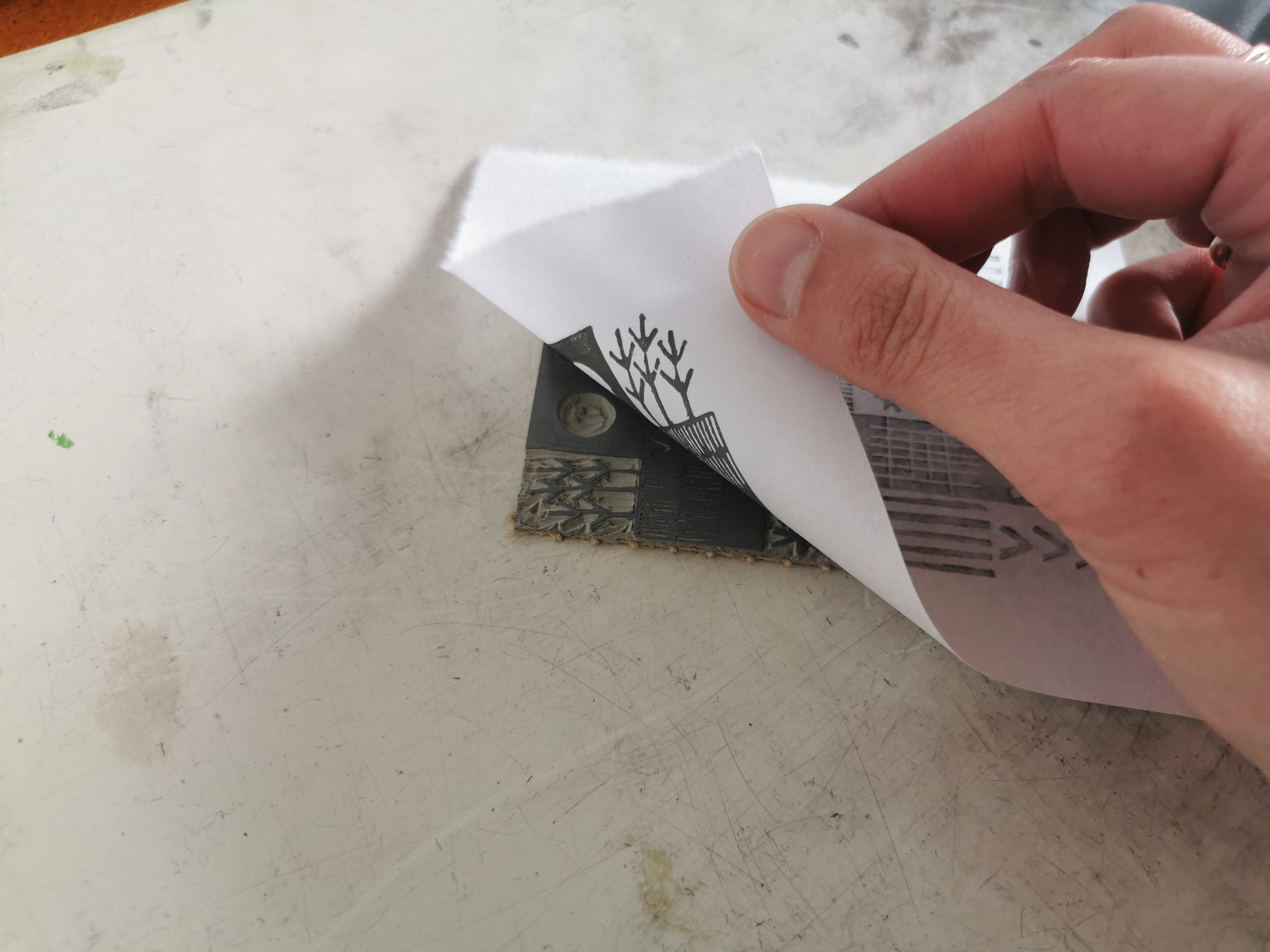
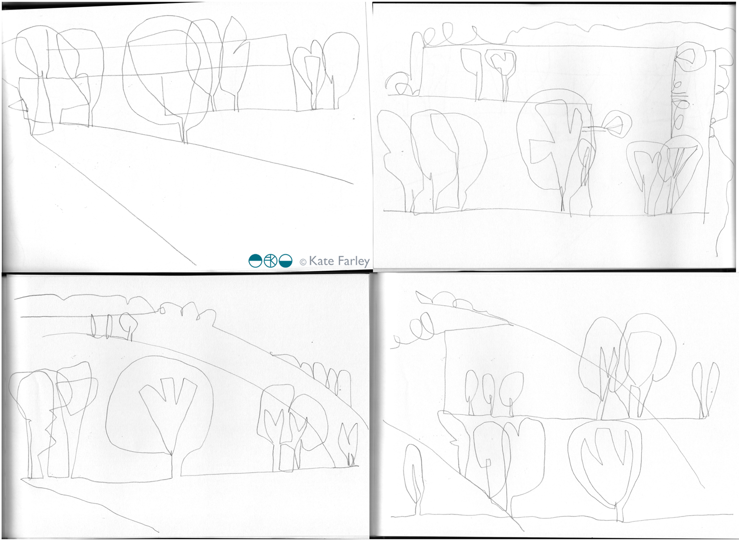
Week 2 came so I took my sketchbook and made new drawings that naturally evolved from the first week’s observations. In the second week I also took scissors to capture the shapes as paper cutouts in contrast to the lines I had focussed on in pencil. Each week I’ve made these drawings and over time I’ve noticed the growth of leaves, making it harder to focus on the tree structures, but I’ve also moved the drawing on as a familiarity of my subject is developing. I wrote a blog post on those first weeks here.
I’ve spent the last quarter century drawing landscapes with trees and remember a significant moment as a student of design, when I discovered the water colours by Crome and Cotman in the gallery in Leeds – particularly strange given they were from the Norwich School and I’d left Norwich to study in Yorkshire, but maybe that was the initial pull. I studied the way they divided the landscape with brushed areas of paint and they helped me to see that I too could explore ways to stylise the way I saw the landscape.
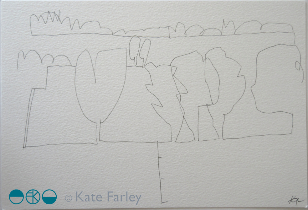
The drawings included in this post are all from week 5. I’ve added hints of fields containing the trees and those lines of containment are the edges holding the paths of trees. I’ve used the horizons from both a vertical and horizontal viewpoint and continued to stylise the tree forms throughout the five weeks. It’s getting harder as the trees flesh out their forms and we lost the details of the branches. I’m also suggesting depth of field with the scale of the trees near and far although I’m pulling the composition down to stretch out and extend the foreshortened landscape.
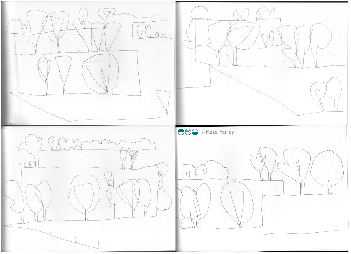
Throughout my career I’ve toyed with ways to map the perspective of landscape and use diagrammatic language, perspective and distorted elevations to represent viewpoints of 3D in 2D. The intention of the arcs was to suggest the sweeping viewpoint but in fact I think it hints at hillsides, and that really isn’t the case here in Norfolk. An undulating landscape maybe, but certainly not rolling hills – still, we can’t get it all right!
I’ve thoroughly enjoyed this drawing exercise so far and look forward to week 6 and what the drawings will discover next time. I’m also, rather naturally I suppose thinking about pattern evolution and how these may become design work. I have lots of ideas to mull over and be excited by … but there’s no rush.
Having posted some of the drawings on instagram over the weeks I’ve received lovely comments and messages from people enjoying the drawings and I’m so grateful for the votes of confidence in what I am doing, I really appreciate that. Many thanks, I hope you continue to enjoy the drawing! ….
Save


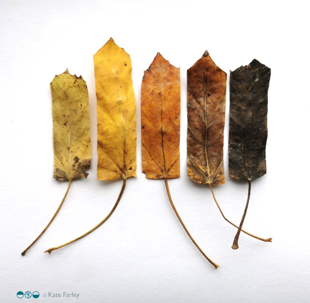
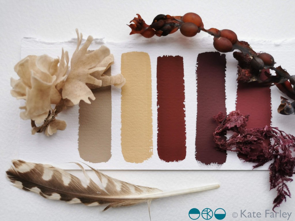
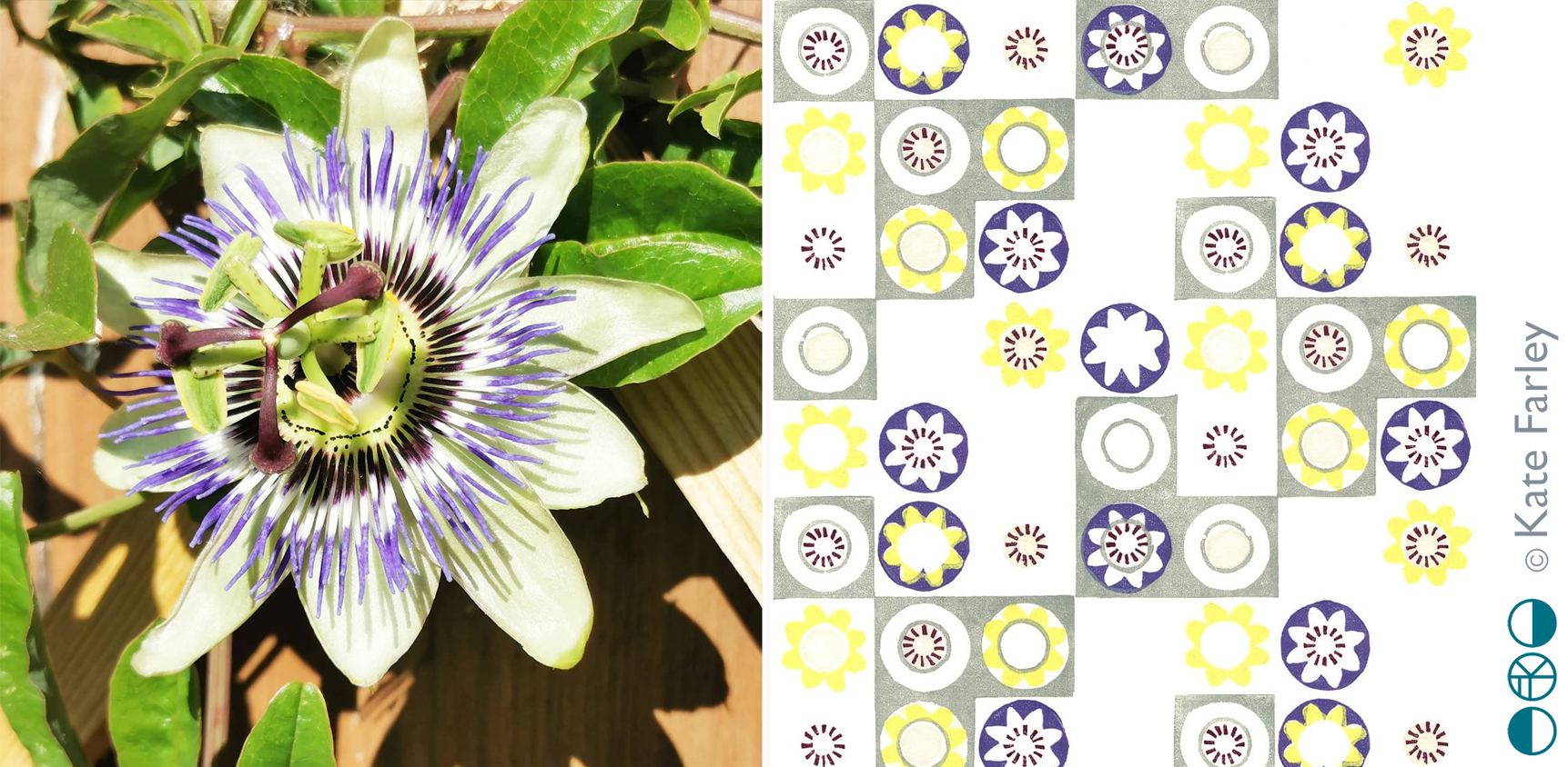
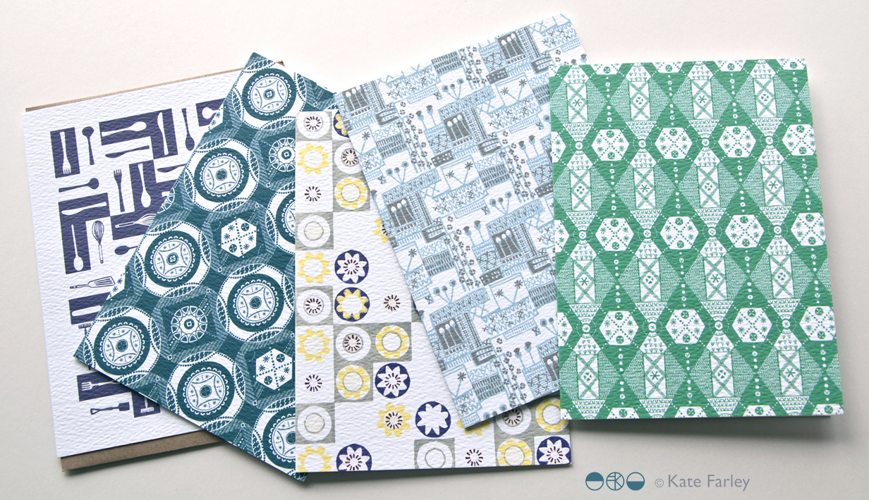
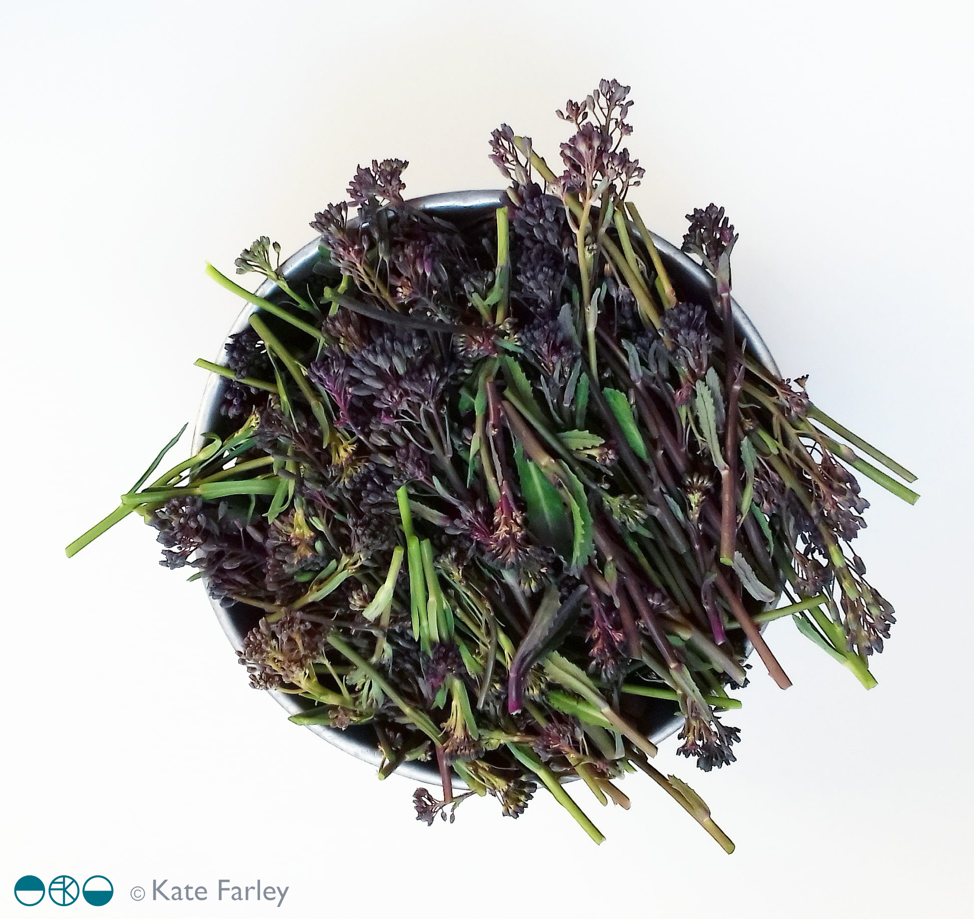
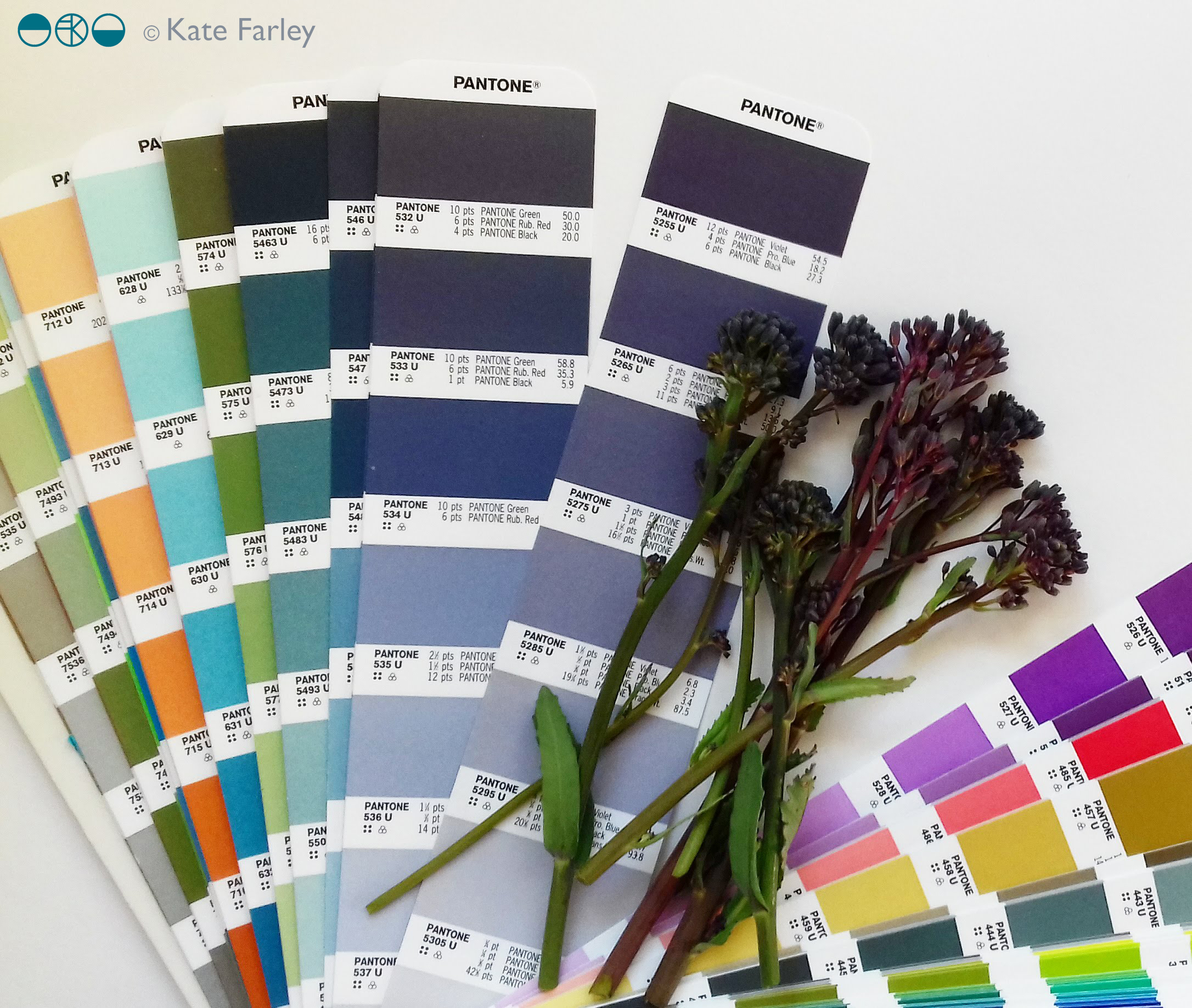
 I’ve continued to gather pieces from nature on the walks I’ve been on this summer and have continued with the process of mixing colour and so I thought I’d share some here.
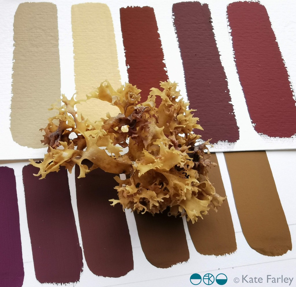