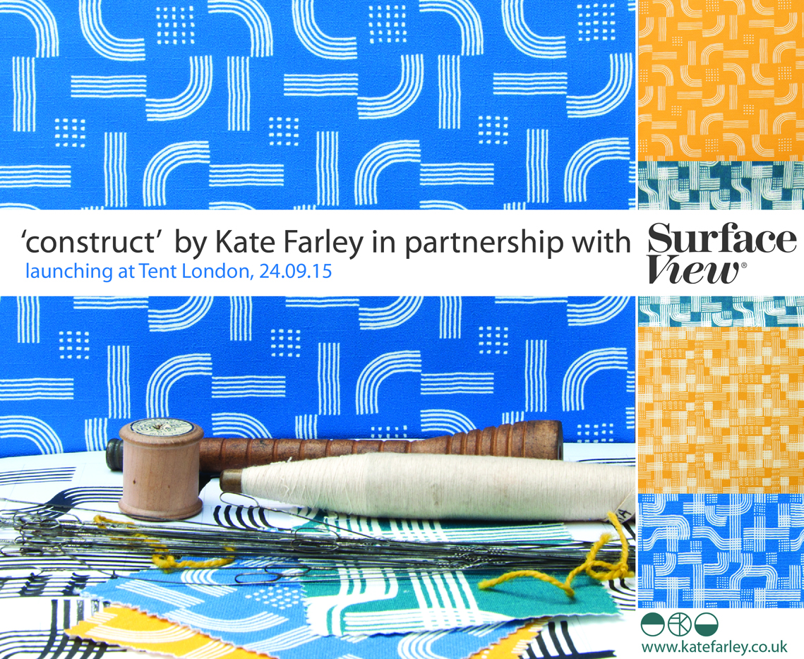
Launching the pattern collection: ‘construct’

I’ve always started designing by picking up some sort of drawing tool, and exploring ideas that will have been developing in my head for some time. Concepts of pattern and purpose as well as communicating an idea using pattern is what really inspires me, this is no different for ‘construct’. A stunning image of lace in a book I was looking at while researching for one of my textile lectures on historical design caught my eye and an idea joined with other ideas of print looking like weave, as many people commented that my Plot to Plate VVV design did (left hand side of first image), when I was at Tent London in 2014. The seeds were sown.

KateFarley_startingLine

I’ve never hidden my loathing for faux surface / material effect pattern such as printed wood effect flooring. Why do we have to lie, why can’t there be another stunning and suitable design alternative?! With this is mind I’ve played with the idea of taking textiles as a starting point for this collection with the intention of subversively adding textile-derived pattern to other surfaces but in an evocative statement rather than a digital print of textiles. This is not a collection that copies textiles, rather that textiles suggests a way to draw; provides a set of rules to begin playing with. The title ‘construct’ is a reference to constructed textiles such as weave, knit and lace but also refers to the putting together of a new way of thinking about pattern for surface, building a collection that has been designed to cross material specifications and provide bespoke solutions.

Having been working on my Plot to Plate collection and related prints for the last five years it was a big challenge to start from scratch and move away from the safety of a kitchen garden, but I was also excited about the challenge. I’d been working on some other pattern commissions and revisited drawing processes that had got me thinking. I didn’t rush to get somewhere; I designated studio days to play with thread, ink and paper. I created a sketchbook of so many ideas and directions but eventually I began to formalise ideas and work out which direction felt right for the collection. Some of the other directions have already been moved on to commercial projects, and the others I’ll revisit over the years as and when.
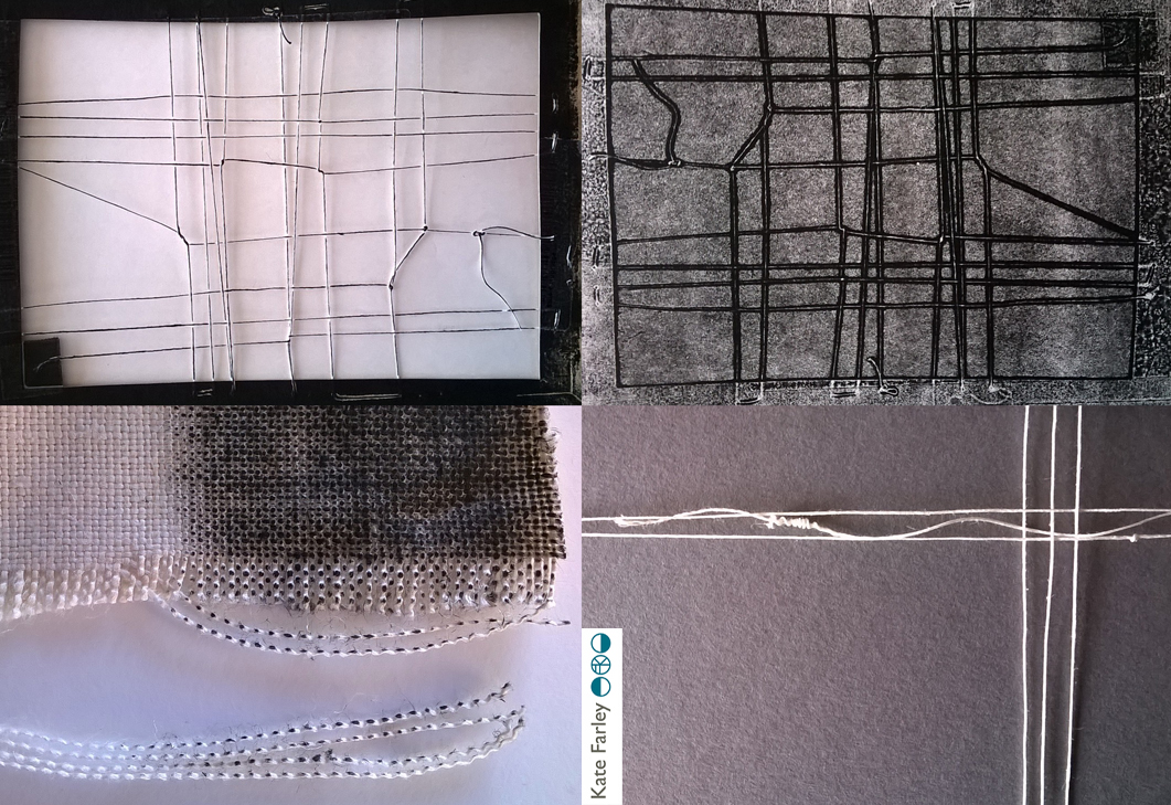
construct_blog_p1

I usually sample patterns in black and white so I’m not swayed by colour rather than the success of the pattern. Having said that I was really adamant that blue was going to feature. Right from the beginning I was thinking of the strong Mediterranean blue of Greek churches, and the Blue Nude series by Matisse. Strong colour has been making a presence in interiors for a while, influenced by key exhibitions and trends. I knew I wanted to stay well away from Memphis colour palette and the reworking of 1980s colours. Sonia Delaunay has also inspired many designers and retailers thanks to the striking show at Tate Modern. I’m aware of trends, I have to be as an academic who teaches textile design, but I’ve never been inspired to follow them. I have my own creative path I’m on and I also would like my patterns to exist well beyond a season or two. Having said that one has to be aware of what drives buyers in retail to spend their money and for some it is likely to be informed by trends.

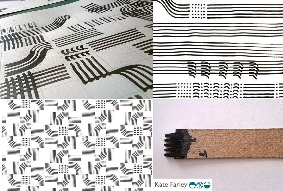
As those of you who have read more than this post might know, I like cutlery, and I can’t help laugh that the drawing tool that I’ve come to love is a sort of handmade fork! I’ve made many for this collection and they are so simple and inexpensive but all made by me to create exactly the right sized marks and the right sort of line. I’ve definitely got better at them. Weeks of testing many design structures and resulting rhythms left me with pages of patterns and the need to edit. Further weeks and I decided to test some screen printing on to fabric. Although I knew this collection was going to explore alternative surfaces I wanted it to work on fabric too. The weave of some of the fabrics was too dominant, and the scale of some of the patterns was less successful. Really valuable sampling!
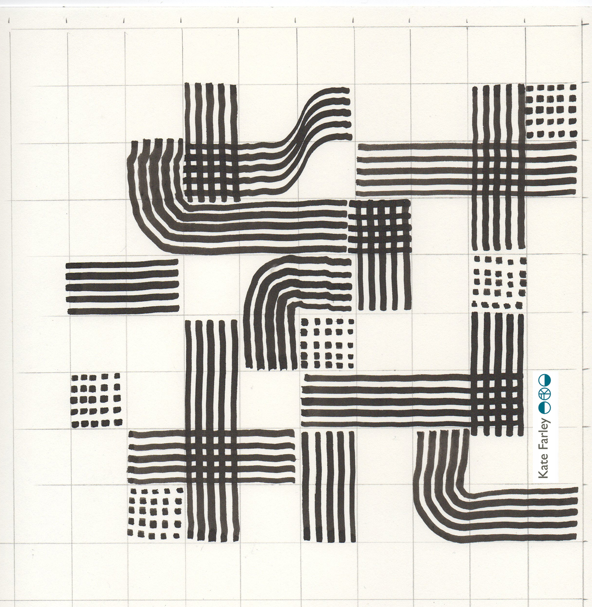
construct_drawinggrid_101_blog

KF Construct_blog_p2

I’d contacted and discussed collaborations with choice companies relating to my ambitions for the collection and it was very exciting to sample on a range of substrates. I really wanted to embrace the ‘bespoke’ capacity that several manufacturers in Britain offer as a way to provide interior designers and architects for example, a choice for their clients. Choosing from off-the-shelf surfaces is not always exciting – there are exceptions! I wanted this to be a collection of pattern in anticipation of the product. Ten years ago I was a winner in the Formica ‘design a laminate’ competition and it felt good to be in discussions with a company with such a strong heritage for pattern. Surface View also demonstrate a contemporary approach to wallcoverings and surface pattern, enabling me to discuss my intentions for the collection and the concept of bespoke production and it being met by expertise and clarity. Having carried out several public art commissions over the years I’ve become used to discussing colour systems and file types, tweaking of production elements to manage the different industry requirements. It’s good to have that experience behind me.
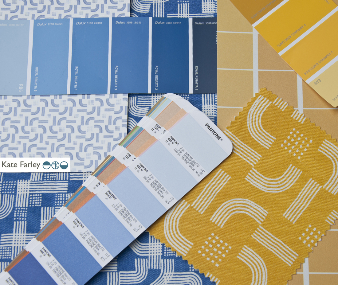
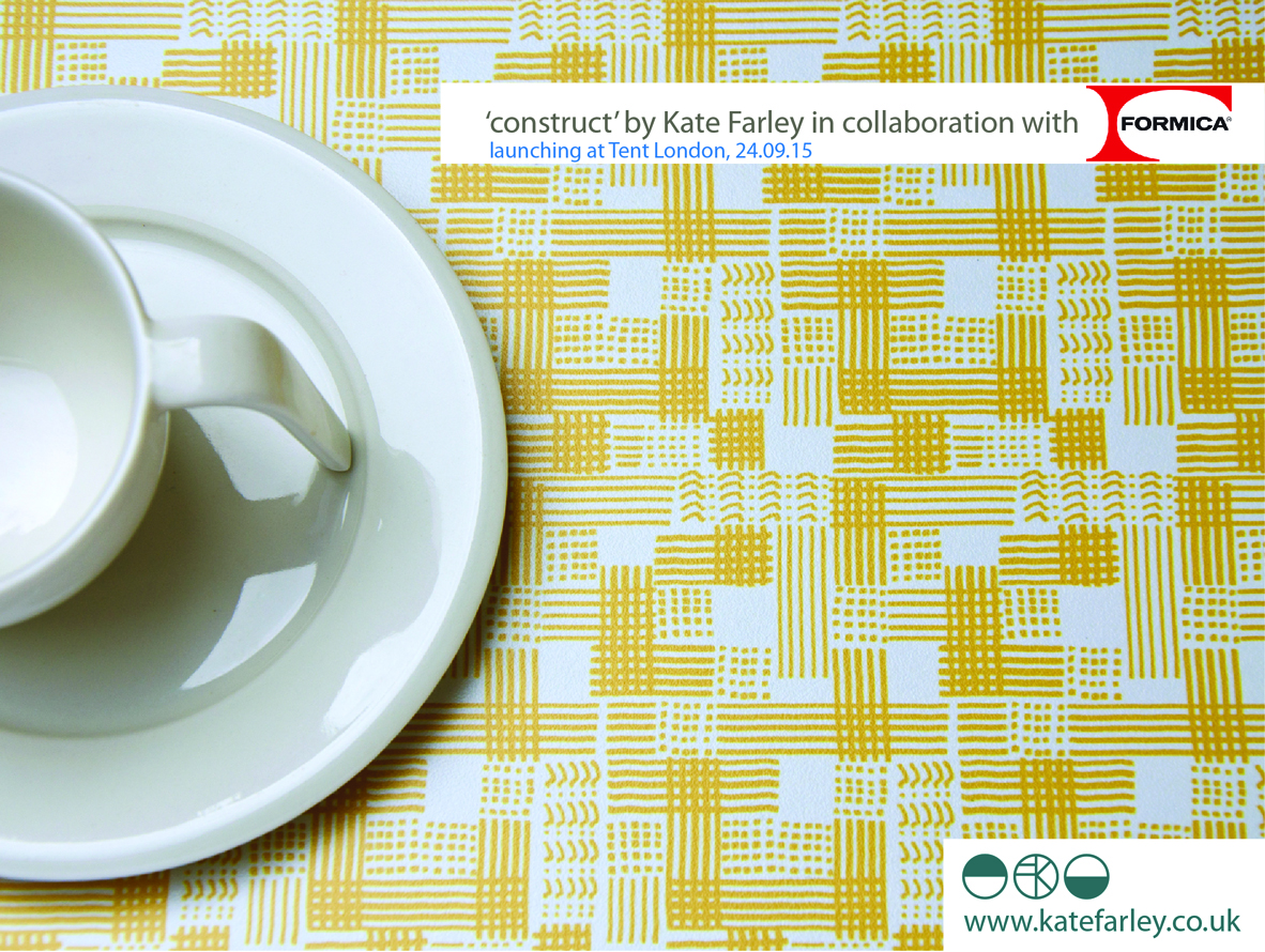
KFarley_construct_colour2_150PrintPrint

So here I am as Tent London is underway and I am extremely proud of the patterns that have made it to the final collection. There are repeat designs, small and larger scaled rhythms and placement patterns featured across the collection including a particular Tent London tote bag competition…. There are hand printed cushions ready for shop shelves or customers’ sofas and contemporary bespoke pattern for those wanting a graphic pattern rather than printed granite in their lives. The patterns can be licensed and collaborations can be discussed. Alongside all of this in order to fully convey the concept of the collection I’ve learned the skill of latch-hook rug making and committed many hours to mastering the skill of constructing pattern in yarn – not natural for me as a printer! I’ve sampled laser cutting and etching to varying degrees of success, I’ve made a dress for the show featuring ‘flow’ AND I’ve screen printed two limited editions of prints for launch day.

I’m interested to find out how it is received after so many solo months of nurturing, worrying and wondering. It’s time to let the pattern do the communicating…. do let me know what you think!
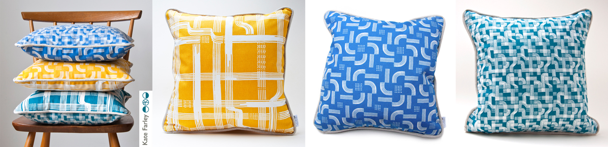
KateFarley_construct_cushions

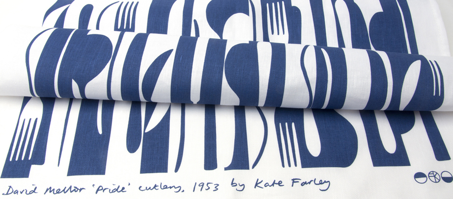
pride in the pattern of Pride cutlery

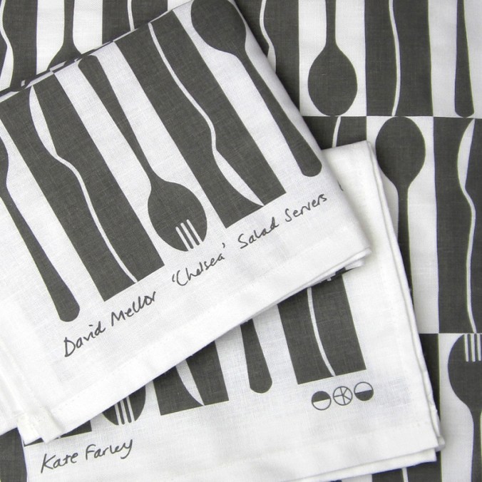
Two years ago I produced a bespoke pattern design for David Mellor Design celebrating the ‘Chelsea‘ salad servers that Creative Director Corin Mellor, (David’s son) had designed. The pattern was screen printed on to tea towels, being a highly appropriate product for the cutlery, and they continue to sell very well through the David Mellor shops and their online store. I took inspiration from the Hathersage factory and the production methods used for the making of the cutlery pieces. I like the fact that Corin sees and appreciates the relevance of the design to his company. Although I can create pattern for pattern’s sake, I am really interested in pattern that belongs to particular brands, to communicate a belonging, of distinctiveness.

This summer I was delighted to be contacted again by Corin as the buying team were keen to add a new pattern. Starting any new commission is exciting as the conversations about the intentions of the artwork, the concepts that need building on, the production methods, colour and material choices, expectations and of course… deadlines!

With all of that taken care of I received a beautiful box of cutlery to draw from. Corin had decided he wanted to celebrate his father’s first cutlery, Pride, designed in 1953. It is so elegant, beautiful to hold, and a joy to draw from let alone to eat from! I worked the same way I had done before, developing sketches and informal compositions, working up motifs and rhythms in a sketchbook first before generating final drawings and paper cut outs to scan to digital artwork.

KF_drawingMELLOR_100dpi

I work across a number of software packages depending on what is required, and always bearing in mind the final artwork requirements for production. It matters right from the beginning whether the production method is traditional printing or digital as I will design accordingly, limiting numbers of colours in the design if required, and using colour in the most appropriate way. This summer with several design projects on the go I’ve worked with Pantone references, RAL, NCS, pigment ink swatches and CMYK values. For this project we used British Standard colour relating it to other products that are stocked by David Mellor Design but I had to convert it to modern day language!

Having completed a few different designs I sent them through to Corin and his buying team and was of course really pleased when they got back to me with the same choice as me. I’ve learned never to send anything I’m not quite happy with or proud of, as that will be the one the buyer picks! Sampling and production were the next steps as well as designing the new swing tag to suit both the “Chelsea’ and the Pride tea towels. I screen print these in my studio on to beautiful G.F. Smith paper.

I’ve worked with the same fabulous British company to screen print textile products several times before and it’s always a delight to take a further project to production with them. They understand that it’s not that I’m fussy, but rather ‘particular’ about details, and we work together well. Signing off proofs, forwarding woven designer logo tags to be sewn in and waiting for the order delivery sees the weeks go past, and very soon there will be two patterns of cutlery.

KFarley_mellorPride_tt_roll_150dpi

I’m a cutlery fan any day of the week, and this really has been a fabulous commission to work on. To create a pattern for a client where the design relates to the product it is destined for, and its job is to visually communicate the heritage, culture and ethos of the company is a very fine challenge to take on. Proud of Pride!

Keep an eye out for ‘Pride’ in the David Mellor shops next month…

Plot to Plate printed pattern at Pulse 2015

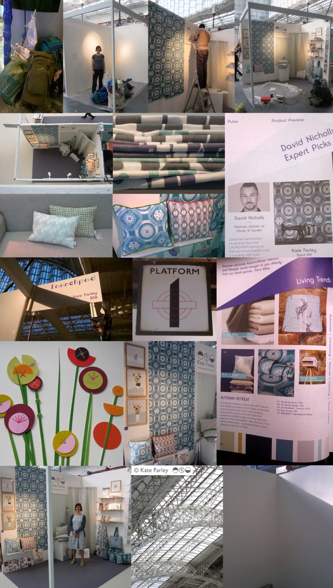
It always takes far longer to prepare for a trade show than it does to be there but I thought I’d show a bit of the journey of my show. Rather substantial worries kicked in the night before when we feared the contents of my stand were not able to be carried by two human beings, and more worryingly, not allowed on the train to London. Somehow we managed what felt like a physical endurance test, in fact it was… and began to make it my home for the next few days. Olympia is a stunning building to spend time in and we got the show up in a few hours, ready for the off… and there was still time to admire the London Underground graphics at Earls Court.

The Plot to Plate collection has grown substantially since its first trip to Olympia when I was showing in the Spotted section, at Top Drawer back in 2012. I am delighted that the new Hanbury and Parterre cushions have been well received by visitors to the show. These are hand screen printed and then sewn in Birmingham by social enterprise Textiles by St. Annes. The patterns are inspired by National Trust’s Hanbury Hall and Gardens, near Bromsgrove. The Hanbury wallpaper was also popular with interior designers visiting the show and Plot to Plate VVV was the most admired of my fabrics. My ‘parterre’ show dress was also much commented upon, with orders keen to be placed!

I was pleased to be an ‘expert pick’ by David Nicholls of House and Garden in the Pulse Preview and also chosen by Trend Bible in the trend section of the show catalogue.

It was also a pleasure to meet ex students of mine, graduating from the Textile Design degree at Birmingham City University, as visitors to the show in their industry roles, and I could still remember their names! How nice of them to say hello and make time to find out what I was up to.

The new friends made of the exhibitors beside me was really special. Such a supportive group of people, helping out, freely sharing trade insights, generally lovely people really helping the show be a great experience. The end of the show, although a welcome relief to the hours of standing (I really couldn’t carry a chair on the train!) was almost a sad time, as we stripped the walls bare, packed up our belongings, said our farewells and left, with the most ridiculous load I ever plan to carry. Maybe I’ll start making paper thimbles!

Thanks to all who visited and thanks to all who helped along the way! Here are the images which represent in some small way the few days at Kensington Olympia, May 2015.

`KFarley_pulse15

the colours of 2014

Back in 2012 I started a colour project on Twitter, using Pantone references ( @pantone ) that represent particular colours of the season, place or activity of the day alongside photographs that I have taken. The words relate to the language of colour, seasons and the activities so often word-play is used, particularly in relation to Coated, Uncoated or Process, as used in the Pantone system of colour. Having kept this going for over two years I decided to look back to see the colour swatches of 2014, a record of colour of my year, having recorded pattern of 2014 in my previous post. In chronological order under the swatches are the Tweets to tell you about the images, they read from top L to R, along each row ending with the hyacinth, bottom R.

From this point on we can look forward to 2015…. Happy New Year…

KFarley_colourof2014

Kate Farley @katefarleyprint  ·  Jan 27

ORANGES! A new breakfast treat, from @pantone180 solid to process = marmalade

Kate Farley @katefarleyprint  ·  Feb 12

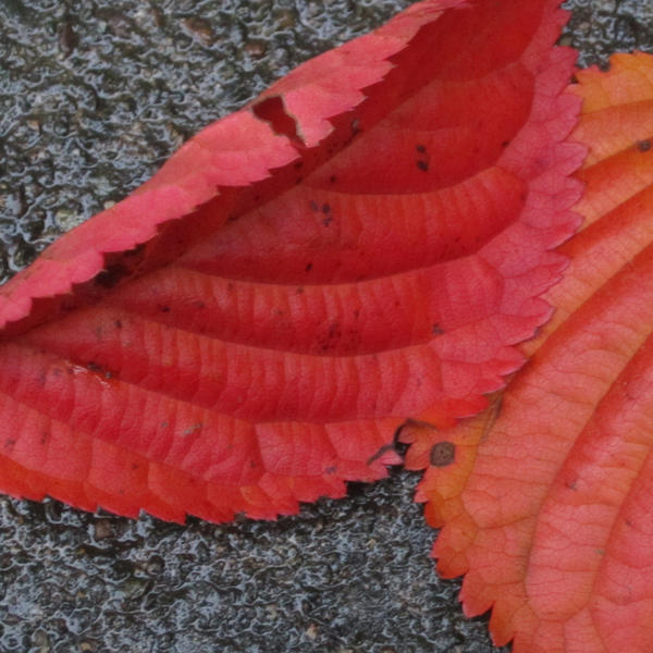
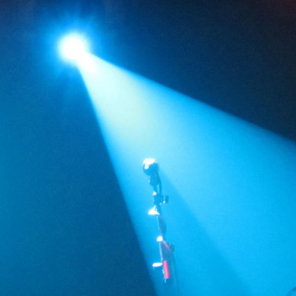
Brilliant @pantone Red DS 75-1Uncoated; a gig of captured whispers & exploding electric noise @annacalvi Outstanding!

Kate Farley @katefarleyprint  ·  Mar 2

Yesterday: @pantone DS 290-1 Coated, sights of fresh green but otherwise muddy underfoot – Spring has sprung

Kate Farley @katefarleyprint  ·  Mar 9

Crocus delights: @pantone process, heading home, 49-1Uncoated, Spring sun

Kate Farley @katefarleyprint  ·  Mar 15

Malvern moss green @pantone DS 312-1U = process walking & uncoated. A beautiful spring day #Herefordshire

Kate Farley @katefarleyprint  ·  Mar 29

Spring green @pantone 389 Uncoated, on the eve of BST. Euphorbia at its best!

Kate Farley @katefarleyprint  ·  Apr 11

Bored of blossom? Beautiful @pantone 684 PC – Solid optimism to Process – the Spring growing season.

Kate Farley @katefarleyprint  ·  May 21

Okay so it’s not #RHSChelsea but stunning @pantone 806 Solid pink Uncoated. Sadly rain due to spoil it tonight!

Kate Farley @katefarleyprint  ·  Jun 27

A lot of @pantone 207 PC with @tiborreich on behalf of @textilesBCU Every colour under the sun and rain. #textiles

Kate Farley @katefarleyprint  ·  Jul 10

Today = A sunny @pantone yellow 604 Uncoated and optimistic on all fronts! #colour

Kate Farley @katefarleyprint  ·  Jul 21

A stunning yellow @pantone 386 Uncoated, hot & with plants growing in the wrong place across the plot. #weeds

Kate Farley @katefarleyprint  ·  Jul 25

A stunning, loud and proud @pantone Red hot 032 Uncoated and attracting the insects today. #dahlia #colour

Kate Farley @katefarleyprint  ·  Aug 1

RED! Harvest time with these @pantone 200 Coated at the moment crab apples, soon to become jelly! #colour #harvest

Kate Farley @katefarleyprint  ·  Aug 11

Pink @pantone 679 Uncoated, wild and fresh from #Dartmoor #heather #colour

Kate Farley @katefarleyprint  ·  Sep 3

Blooming special rose @pantone 7417 Uncoated & without an umbrella – let’s hope for no rain! #colour #rose #weather

Kate Farley @katefarleyprint  ·  Sep 8

A stunning @pantone 611 Solid Process flower but I’m waiting for the squash! #colour #PlottoPlate #runningoutoftime

Kate Farley @katefarleyprint  ·  Oct 6

It was sunny yesterday, Uncoated with @pantone orange 021 nasturtiums. #colour #autumn #allotment

Kate Farley @katefarleyprint  ·  Oct 20

Happy to receive @pantone Coated 201 red windfall apples from the allotment at the weekend. #harvest #sharing

Kate Farley @katefarleyprint  ·  Dec 7

A stunning @pantone Solid 158 watching me dig at the plot today, Coated of course #colour #allotment #digging #robin

Kate Farley @katefarleyprint  ·  Dec 30

Blooming! We are enjoying the seasonal @pantone 226 Uncoated and indoors #hyacinth

A new design: working it all out

I’ve created more designs than I can remember since I began ‘formal’ pattern making back in 1992. Some aren’t worth worrying about, some I’m still extremely proud of and some are still waiting for the right time to make their debut… (I can’t wait to show you some very special ones next year but I’m sworn to secrecy.)

Some designs work themselves out for themselves; I vividly remember shutting my eyes to get some sleep right in the middle of my final major project on my degree, when suddenly my mind spun in to action, and there in my mind was a design, colour separated and waiting to be drawn out for screen the very next day. Other designs I battle for days on, and eventually win through demonstrating more stubbornness than the design itself.  I don’t give up easily.

In all my designing, however hard or easy it was in the making, I aim for them to appear strikingly straightforward, as if they did just happen on their own. I was accused by a tutor for being lazy – he didn’t understand minimalism – when in actual fact, it’s far harder to let the negative space be as important as the motifs we can sometimes throw at a design like pennies to a pond. Space can be beautiful.

I’ve taken a slightly different direction to making the most recent patterns; some would argue they are more traditional, more formal, more fussy even. I’ve certainly battled with the minutiae. I thought it nice to share the journey a little, but do bear in mind, every dot, line AND space have been considered, reconfigured, tested, discussed and revised more times than I’m counting (and that’s before I even think about colour). I hope you like the results. The design will feature in my new work to launch at TentLondon in September, so watch this space.

KF_workings_1000web

The image shows: initial sketch / proportions of the motif, repeat / rhythm testing of the drawing before the lino block is cut, the lino block being printed, and the final digital artwork. The inspiration is a mix of kitchen gardens and formal gardens of the National Trust.


Communicating Colour

Evocative, technical, predictive, informative, for matching, mixing, ordering, cataloguing, of materials, surfaces, finishes, whims and traditions…

Working across the fields of surface design, textiles, public art and fine art I have come across many ways to represent colour in order to communicate qualities. Whether it be for perfecting a match for production, or generating an evocative palette for a client, each niche within the industry has its way of doing things. Black for the Northern Line, double yellow for no parking, gold for the winner, and red for wrong. From Global Color, to Farrow & Ball, Pantone to Berisfords the language of colour is key. Some give codes, other names, sometimes a swatch, others a smudge, universal, local, a science and an art!

Seductive, formal, in a book, or on a card, each help to create the colours in the world around us, and while the skills of the individuals choosing, producing and matching will no doubt be overlooked by most, may the colours continue to sing, calm, provoke and much more.

I’ve brought some of the various forms of colour I work with together to brighten up this grey, wet Monday in February.

communicating-colour_web

‘Chelsea’ drawings to design for David Mellor Design

Many months ago I had the go-ahead from Corin Mellor to design a bespoke pattern to celebrate the fabulous ‘Chelsea’ salad servers that he designed for David Mellor Design. When I first saw the cutlery I immediately really liked the look of them and when I received the servers they were amazing to hold – they still are. Impressive in weight and size, the shape is simple yet stunning, and they inspired me to set about drawing. With a number of design options I provided Corin Mellor, Creative Director and his retail team, they discussed and advised, and before long we agreed on this design that is now printed on to linen union tea towels and sold on my website, David Mellor shops in Hathersage and London as well as Museums Sheffield.

With the tea towel now listed in the ‘Special Products’ section of the David Mellor catalogue I thought it time to show some of the images I have of the process. I took inspiration from my visit to the factory in Hathersage where they make and display the cutlery production process as well as the objects themselves.

I’ve had great feedback and sales, we are having another print-run and they’ve received press in the form of Elle Decoration!

Thanks also to Patternbooth and Design Hunter:

drawing_mellor1webprintedMellorTags_webmellor_square_web

elledeco_Mellor_dec13_web

Hanbury Hall delights

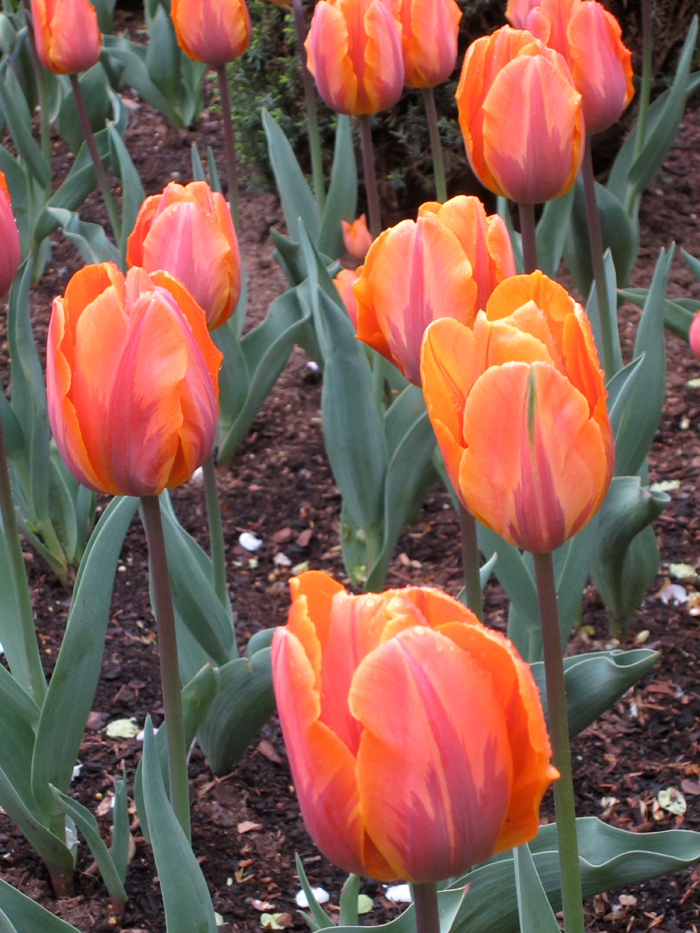
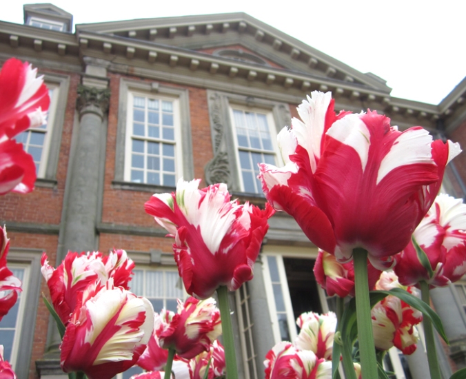
My creative practice has been inspired by National Trust gardens for the last few years and as a result I’ve had a number of people suggest I visit Hanbury Hall – finally I got round to it at the weekend. Despite the poor weather it was a delight to discover all the pockets of gardens, each carefully considered, and demonstrating the wide variety of formal and informal planting the National Trust excels at.

ImageImageImageImageImageblossom_webImageImageImageImage

Armed with my sketchbook and camera I gathered plenty of inspiration for new prints and will definitely be back later in the season.

Image

Its also a fantastic building inside and out. I dashed around the inside and a particular wallpaper caught my attention.

Image

All in all, I left feeling excited about making new work again having spent so long preparing for my solo show at Tinsmiths, opening later this month… now where did I put that lino?

tulipsHH_web

Art for all – good design for all

My design ethos is one of quality and appropriateness for the place. Good design should be all around us, big and small, the dot on the i, the cushion on the sofa, the roof on the building – no excuses. Why settle for second best, why copy others if you can be original? It is so sad to read of big companies risking reputations, not buying the best but producing poor quality copies – stealing designs. My students tolerate my monologues on the subject!

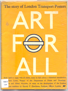
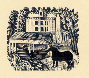
This blog entry celebrates some examples of quality design – because that’s what we should all aim for when making but also when buying. I have come across a great book called ‘Art for All’, telling the story of London Transport Posters. The book has black and white reproductions as well as colour, but the real charm is in the illustrations from original engravings of birds by Clare Leighton, printed in a salmon pink, as well as illustrations by Eric Ravilious (see below).

Image

Image Image

(Art for All – London Transport Posters 1908 – 1949, Art and Technics Ltd. London, 1949)

The quality of design in these images is inspiring, with a great sense of detail without being fussy, and such skill in creating these images in only one colour while containing so much information of texture and pattern. I admire these artists but also the people who commissioned the pieces and enabled these images to be ‘Art for All’. As an aside, Both Leighton and Ravilious produced stunning designs for Wedgwood too.

It makes me think of my own practice and how I generate imagery using drawing and printmaking to create the visual language. Yes, the computer plays a large part in ‘tweaking’ for final output / reproduction these days but it’s the marks and textures, the print quality, a smudge of graphite, that cannot be created by computer. It might be quicker creating the whole image on the computer but it wont be as good as I want it to be. Having said that, it is also the creative process of working out, testing and feeling the work resolve on paper that I most enjoy. Was the design process meant to be easy? Its the struggle and questioning that keeps me doing what I do – I’m enjoying the journey. When so much time as part of having a design practice can be spent on the computer it is important to remember to turn it off and walk away to DO the creative things…and to get better at it…

Having fun with colour

I thought I ought to explain the project…

On Twitter I am exploring my interaction with colour in my everyday life using the Pantone references of colour – the coated and uncoated has become the play on words. Here’s the first few to give you an idea of how things may be going.

the next colour is @pantone 2985 U – of course uncoated, while we waited for @therealjohncale @hmvinstitute last night. pic.twitter.com/g097anMj

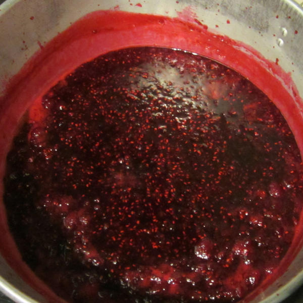
I was uncoated and really should have been wearing the apron! @pantone 200 U – coping with excess raspberry harvest pic.twitter.com/84rE5rSX

Wet! @pantone 427U certainly coated AND with waterproof trousers on. pic.twitter.com/9Rl0ABUj

What a Brum blue sky day to be in the office! @pantone 284U – definitely uncoated, and sandals! Hooray for the weekend. pic.twitter.com/HiHUzTQV