Pattern appreciation at the Whitworth

The Barbara Brown exhibition at the Whitworth in Manchester is really worth catching, especially if you like patterns.
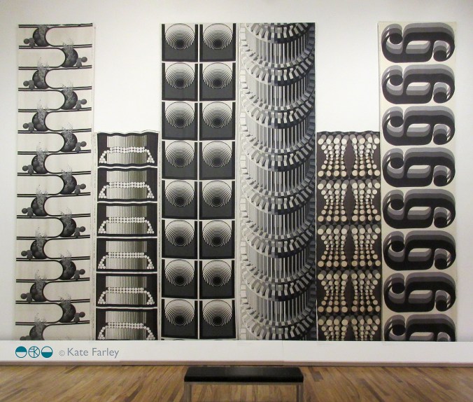
The layout of the gallery enables an overview; the broad visual statement of the textiles designed by Barbara Brown during the 1960s and 1970s, to be seen straight away and makes for a striking sight. Large-scale pattern in different colour-ways jostle for attention and yet the small gatherings of textile designs within the gallery also create more local dialogue for consideration. The repeats are large, not in the Marimekko sense but larger than we often see, taking the full width of the fabric to do the talking. Seeing the textile lengths on exhibition really shows off the bold rhythms of each pattern.
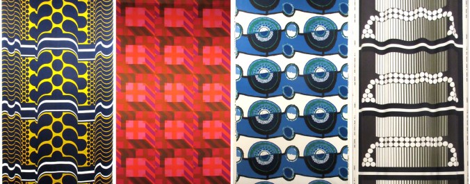
BarbaraBrown_prints

The designs on show demonstrate a variety of motif units across the fabric, some halved, some quartered, others full width. The corner of the gallery most impressive in my opinion was the monochrome series that really pushed her design prowess forward. Although strong graphic statements, these are far from flat patterns. The curves in Ikebana (below left) and Automation (below, third from right), both from 1970, differ in how they control and divide the space, toying with depth and dimensions. There is a sense of sci-fi and computer generated environments across this mono-chrome series. Escher should also get a mention as the optical illusions on the architectural scale appear to pay homage to him too.
BarbaraBrown_mono1_120

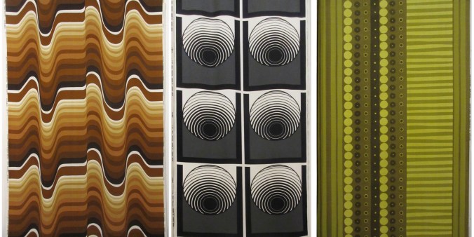
I have my favourites, but I really want to highlight the breadth of pattern compositions here. The design statements include many geometrics with cubes, columns and dots. There are stripes, spots, architectural themes and florals. I see more than a hint of Op Art, Psychedelia and modernism across the printed fabrics, some more than others, but the designs appear experts at communicating the populist aesthetic of those years.
BarbaraBrown_3

As a teaching aid for textile design, this exhibition does rather well. Design students can understand the potential to grow large repeats rather than stop at small ‘plonk – plonk’ designs we see far too much of – maybe a result of designing on computer screens. Designers need to understand that even domestic interiors can cope with so much more than a motif 10cm in diameter. Brown’s shapes are also not always contained by outlines, and this presents bold, solid shapes that hold their own. Colour statements include monochrome and full-on colour including oranges and blues. There is a sense of the colour palette dating the patterns but the combinations communicate bravery. The monochrome designs have a very formal spirit, and although different in style do remind me of some of the black and white, large classical columns Timney Fowler print designs of the 1980s.
BarbaraBrown_textiles

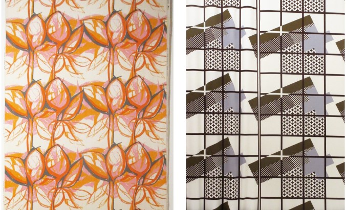
Barbara Brown was working in a very different time, and artwork was not created in Adobe Illustrator or Photoshop. Hand drawing full-scale repeats gives you a very different relationship with pattern compositions. Some designs appear not to show signs of drawing, but others do, almost standing out for doing so – particularly Sweet Briar, 1959 (above left).

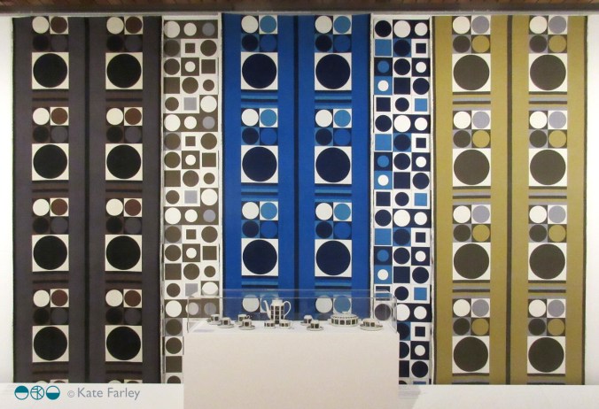
The exhibition was dominated by the printed fabric lengths but a couple of later knitted pieces offered an insight in to the designer’s creative career progression, and reminded me of the direction Lucienne Day took with her silk mosaics, making a clear distinction away from the commercial print designs. The juxtaposition of some small ceramic pieces next to fabric lengths offered an interesting pause for thought too. Would you have matching china and curtains? Maybe not, but the patterns held their own at both scales and on the different surfaces.
BarbaraBrown_dots_120

This is one of those examples of why you need to see exhibitions in the flesh, and not rely on the computer or phone screen to do the job. Seeing Barbara Browns patterns are eye-catching on a small screen, but they are far more impressive in this setting.

The exhibition is on show until January 2018 (and they always have several interesting things on at the same time – and I can recommend the cafe!) NOW EXTENDED UNTIL MARCH 2018

http://www.whitworth.manchester.ac.uk/whats-on/exhibitions/currentexhibitions/barbarabrown/
patterns: printed or not

My go-to process is print, therefore the majority of my commercial projects have included print outcomes, whether that is a commissioned limited edition print, wallpaper or my patterns available on Formica’s laminate. I design as a printer; thinking of layers of colour / texture / pattern, that build in stages.

I knew early on that paint brushes are not really my friends, not unless they have to be, not compared to a print roller. When I was introduced to printing I vividly remember learning mono-printing in particular. I fell in love with the excitement of the hidden surface. I love the detachment, the indirect nature of printmaking, whether it be a lino block or litho plate, they offer a space away from the actual mark making that creates the image.

I’ve been spending the last few weeks writing lots of words with my academic hat on about my design practice in relation to my teaching practice, and this has made me think about how I learn, as well as how I teach. My design practice experience is so integrated in my teaching practice, they work so well together. I can be in a business meeting learning about an industrial print consideration I didn’t know about for a specific product and immediately I’m thinking of how I can feed that knowledge in to a module on the BA programme I lead. In my mind it makes perfect sense for academics to be practitioners too, albeit with lots of juggling!

I love to learn, whether a process, a way to see in order to draw, or a new context to place work, I am excited about finding things out. It was this mindset that got me making rugs, to challenge my skills, and to test myself with another process that works with pattern, but with very different thinking. There has been much written about the need to play, but as designers it is so important that we take time to explore, to develop our thinking. This keeps ideas moving, and the sense of creativity at the forefront. I’m also fascinated how my patterns work across surfaces / materials, requiring consideration of colour matching, scale of motifs, line weight etc. and this expertise is learned as I work with manufacturers of different materials and products, and visit trade shows across the design sectors. Don’t get me started on brands that just print their patterns on every surface that sits still for long enough… my students hear this rant often enough!

I shall continue to explore, learn, design and teach… just after I’ve finished writing this next batch of academic words…

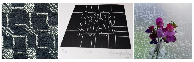
KFmaterialsBLOGpic120

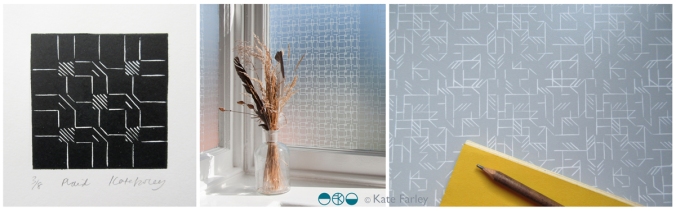
Images from my ‘Threads’ collection (L-R:) Latch-hook rug, original lino print: Twill, and the same design on window film from The Window Film Company.

time and sketchbook time

At the moment I’m juggling lots of different projects; one has been years (really!) in the making, another much quicker, straightforward and some more ‘surprise’ projects. They all have different requirements of my time, and in each week there may be a telephone call to a manufacturer to discuss things with, an email exchange between a client and myself to clarify details of a brief, or a call to a stylist / marketing team to plan a scheme for the future with, and the usual trade show sales team call! This all takes time, and different skills to manage.

A different skill altogether is to maintain a practice that, at the heart of it, seeks to challenge, engage and inspire the creative self that was the reason I set off in this direction at the start, twenty years ago. The sketchbook is the place I go back to, the safe place I can explore those ideas in, old and new, that keeps the journey going, the continuum that is my creative practice. Ideas do evolve over time, and the sketchbooks are testaments to the ongoing inquiry that may lend itself to something commercial in due course, but is not the reason I do the drawing in the first place.

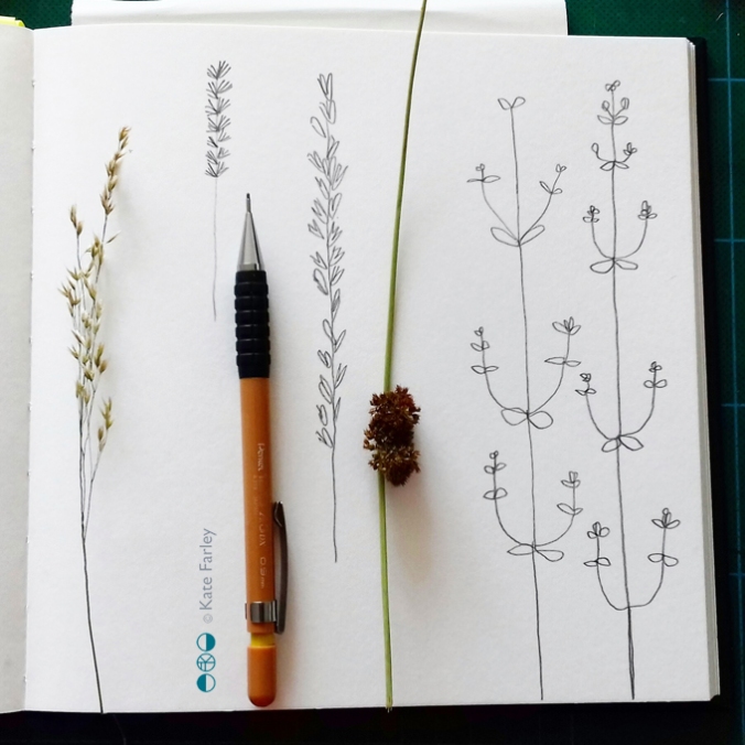
In my role of design lecturer I regularly explain the uses of a sketchbook, the hows and whys a designer may approach the mental and physical task of working in a sketchbook. Retro-filling the pages that have post-its in saying ‘research’ needing to be completed the day before a hand-in lacks rigour and purpose, a scrap-book mentality is not necessarily the best use of printer credits unless you really do look and reflect on the relationship between your work and someone else’s. Dare I say it, I enjoy the task of working on a new white page, and see the potential, not the fear. I don’t often share pages of my sketchbooks, but here’s one page from this week in the studio, having gathered new ‘material’ at the weekend, furthering my ideas for my Grasslines print series…

I say let’s celebrate the sketchbook, the real one with paper pages that doesn’t require likes, favourites of retweets to be justified, the one you do for you. Why / how do you use your sketchbook?

sketchbook_grasslines

yellows

I’ve always enjoyed working with colour; choosing combinations, mixing inks and matching colour. I am interested in how we relate colour to brands, how colour suggests quality, market levels, football teams, trends, and this week in particular political parties. Sometimes people say they do not really like colour – but what they often really mean is that they don’t like strong and vibrant colours, but in my mind bright colours are no more important than the whites on white; equally powerful if used well, just not so extrovert.

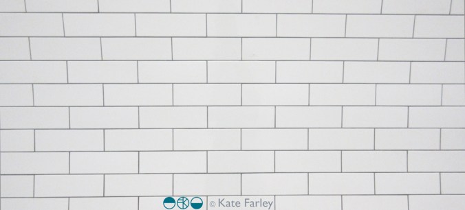
KFarley_TfL_tiles100

I like seeing the way an inky grey sky makes fields of corn glow golden, and how the crepuscular blue sings out before the night sky takes over. Relationships that colours have can bring connotations, evoke distant memories and create moods. I remember a bag of hand-me-down clothes was excitedly torn open by my twin sister and I, hoping for fabulous new items to wear – in the eighties, when what was actually presented was everything brown and purple – from the previous decade. So disappointing!

Getting the right colour isn’t about a broad brush of red, it’s about seeing the nuances. You’ve only got to see a sale-rail to see the buyer got the shade of mustard a bit too green, or the pink too candy, and not blush. Any colour can vary hugely, our personal perception of colour not only is affected by the technicalities of sight, but also our own relationships with colour, built on past experiences. It took me a while to wear navy, having had to endure it for school for several years.

A friend described my ‘black’ screen prints for the Barbican, and I had to explain it was actually dark grey – it makes a considerable difference to the final result, but if both examples are not shown side by side most people would be none the wiser that the designer made a conscious decision to make a grey look not quite a black.

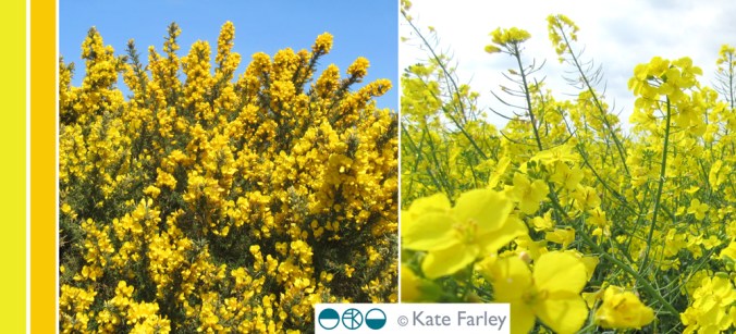
So here’s some yellow, photographed in Norfolk a few weeks ago. Enjoy, what ever it means to you!

KFarley_yellow_norfolk100

learning with archives

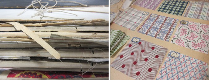
Recently I have been sharing joys from the fabulous archive of textile samples belonging to Birmingham City University’s library, some dating back from 1901. Myself and a colleague have been showing these treasures to our students, helping them to see their own learning as part of a history of design practices. In an age of the digital file it’s been fabulous to see how much interest these portfolios have generated with our students. It’s a tough call as we worry for the protection of these fragile items, and yet value being able to see and interact with them.

bcu_textiles1901_1

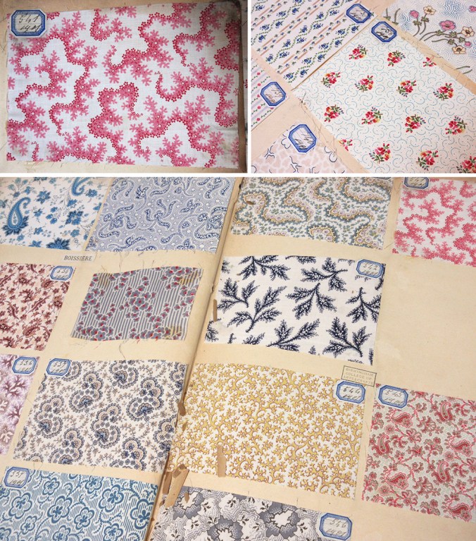
Being able to turn the pages, and reveal the hundreds of printed swatches is really an exciting journey and the students really engaged with the quality and preciousness of the items. The fact that all the samples are beautifully hand mounted and labelled adds to the beauty and experience. The range of design compositions is considerable, and the detail stunning. Tiny little flecks of print; an anchor, a petal of a flower, or coral texture printed on fine cloth demonstrate quality of the day. We noted the generosity of many designs, and discussed commercial appeal and production methods available before screen printing and digital printing possibilities. Of course this is pertinent at this time of financial cuts in the support to local and national libraries and associated archives, and with arts and culture being sold to the nation as a rather nice hobby we just can’t afford at the moment.

Seeing things with our own eyes helps to engage with the subject, making things real, and adding value to the experience. I spent an extremely insightful day at London College of Communication’s Learning Through Objects event #UALOBL last month discussing this subject with fellow academics, researchers and archivists. Yes it’s easier to deliver another ppt to a large group of students, but sessions with objects and physical activity are the ones that are likely to make far more impression, and make the difference to learning we are aiming for.

bcu_textiles1901_2

threads of an idea

It’s perfectly normal for me to begin a project by looking back at work I have made but not quite resolved. I keep sketchbooks of ideas and samples of constructions that will never see the light of day but somewhere among the pages there will be inklings of ideas that appear to connect and weave in to something right for now.

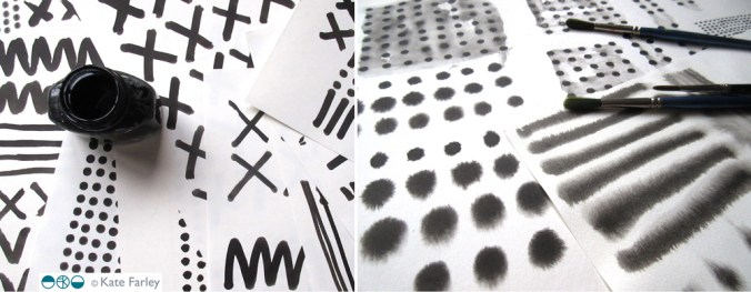
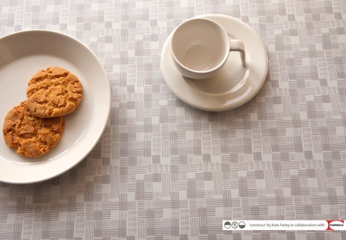
I wanted to get back to printing so I took the opportunity to explore a number of processes, including mono printing and lino printing to explore line qualities I’d sampled before, and soon I was back on the idea of woven yarns, linking my construct collection launched in 2015. This was a collection inspired by woven cloth, with drawings using hand-made tools dipped in ink that were used to create a series of repeating patterns I went on to collaborate with Formica with. I wanted to challenge the abundance of ‘faux’ material surfaces on the market, digitally printed wood-effect pattern, for example. Ideas were still left open…

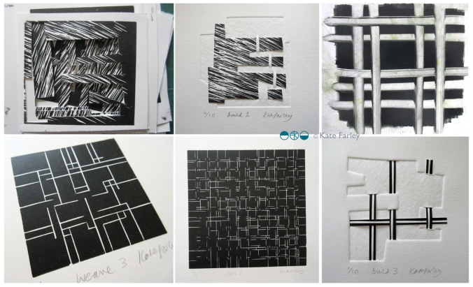
Running in parallel to this has been a long term paper project I have been toying with since about 2002; paper constructions that explore the depth of space beyond the page, a sculpture, but also a book. The build series grew to explore woven space of over and under. You can see some of the pieces below.

threads_devpaper1200
I see the threads collection as an extension to construct, but is equally quite able to stand on it’s own. I have produced several editions of prints and paper constructions that led to where I have come and I enjoyed printing in Payne’s Grey to not be distracted by colour.  All of a sudden I’m working with clear, colourless window film – it all makes sense. I am delighted to have worked with The Window Film Company to develop the patterns for windows. They have been an amazing company to work with. Cheerful, prompt, generous and supportive in all aspects of working with the team – a big thanks to you guys!

I was also pleased to return to laminate and Formica to enable bespoke production and am delighted with the results. I’m enjoying working on designs for harder surfaces but I still can’t help but sample other materials, so the collection I shall show at London Design Festival includes a new rug sample, screen printed cloth, and hand-made notebooks featuring patterns from the collection as well as vinyl and laminate.
If you are visiting London Design Festival I hope you will come and say hello at Tent at London Design Fair. Hall T1 stand G18

threads_products_blog1200

Modernist patterns in the making

Over the last few months, actually for most of this year, I’ve been working on a commission with the Barbican Centre London to create bespoke patterns for products in their newly developed retail space, ready to launch in the Autumn. It’s been a fabulous project as I’ve developed the designs with plenty of dialogue with Head of Retail, Adam Thow, to-ing & fro-ing by email. The brief has altered only slightly since the beginning and I feel really proud of what we’ve produced. There’s a more detailed interview about the project over on their blog.

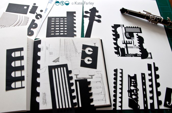
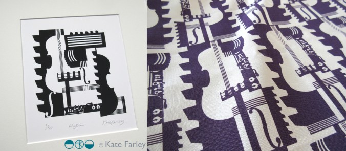
The idea was to explore the Barbican Centre, famous for its architecture, but to also include its activities as a cultural centre of music and performance. I explored lots of ideas and pattern compositions but settled on the idea of a sheet of music, and ended bottom right with the bold double bar lines. Within the patterns I referred to musical notation, and made links between the architectural features and those of instruments, including a violin and oboe, to create a sense of narrative, playing with strong negative and positive shapes. Each of the motifs were hand cut in paper, scanned in, and combined using Adobe Photoshop.

KF_Barbican_print_paperBLOG

Last week we shared the first images of the design work so I thought I’d share here too. The images here show my developmental design work above, and the final limited edition screen print and pattern for products. Visit @barbicancentre on instagram for more final product shots.

KateFarley_BarbicanPRINTPATTERN1200


Save

patterned walls and windows

They have been a while in the making, with lots of drawing, designing, discussions and sampling over the last ten months but my designs for Tektura Wallcoverings have been launched, and I’m delighted to be able to share them here. There are five in total so do visit the Tektura website to see them all. The images of the drawings are mine, the product shots are courtesy of Tektura.

I was working on the designs at the same time that I was developing my ‘construct’ collection and Tektura really liked the look and potential of those designs but I needed to build two distinct looks to avoid a conflict of interest. You will see similarities but I utilised different drawing tools and pattern systems to explore a variety of options in my markmaking. I created many sheets of paper full of inky motifs that eventually, after a lot of design development over several weeks both on paper and at the computer screen, became digital artwork to hand-over for production. At Tektura the colours and scale of pattern were sampled and marketing / sales information was created for the launch. One thing I find hard is naming the designs, and this was no exception. The thesaurus was called upon, as was Google to check existing references, and a colleague at BCU also contributed – thanks Clare! In the end the names pretty much describe the pattern. I won’t be a poet anytime soon!

KFarley_TekturaDrawings_blog

My past experiences of working on large interior / public art projects enabled me to work with the scale of the potential interior environments that Tektura provide for in my mind the whole time. These designs for Tektura can be customised and applied to wall and glass surfaces and so as I designed I maintained modular components that can be re-coloured or omitted for each client’s specifications. This is a wonder that digital production can provide; enabling bespoke solutions.

KFarley_point_tektura_blog

For me this project highlights key values in my practice: the importance of drawing and hands on image-making, knowledge and understanding of digital production and product context, and the value of working relationships and good communication. Each client I’ve had the pleasure of working with over the last fifteen years or more, whether it’s the design director, art officer or buyer can really shape the design process they are commissioning. From outlining the brief, to negotiating the design direction as well as final sign off, these things make a big difference to the designer, often working far beyond the hours intended in order to allow sufficient time to reflect on the design process and outcomes. Digital communication allows artwork and thoughts to be shared and discussed in minutes, and decisions can be made together.

The great thing about working with companies such as Formica and Tektura is that they are industry experts with fabulous products, trusted by the market. By working with this expertise I learn more and get to understand the design world from their standpoint. Who would have thought my patterns would be on such a stunning shiny surface as Glint (below)! Working with Tektura Wallcoverings has been a pleasure and I’m proud to show the designs off. Thanks to Angela and the team!

KFarley_splodgeTektura_Blog

looks are deceiving: truth in pattern

As a student at art college I was taught the principles and beliefs of great artists, designers and theorists such as William Morris and John Ruskin, and mantras of the founders of De Stijl and the Bauhaus. As a designer myself I haven’t set out to follow any particular philosophy or approach but have developed my ethos over the last two decades as I experience diverse design contexts, clients, markets, technology and changing industry. Also, in my role as an academic at Birmingham City University delivering lectures on wide ranging art and design contexts in relation to textile design, social change and global influences I have learned considerably more and this has led to me further considering my own approach and philosophy as a designer.

My ‘construct‘ collection was developed as a response to my loathing of ‘fake’ surfaces, and the ever-growing interiors market of printed patterns of wood, stone and other natural materials, copied at ever-higher resolutions on a vast array of substrates. Is it possible to have printed stone effect on wood yet? Why would I want a copy, an imitation rather than the real thing, and would it be right to desire marble in an Edwardian semi in the Midlands of England? In my new ‘construct’ collection I’ve played with this idea by making printed pattern inspired by constructed cloth, not copying directly from the woven threads but evoking a sense of them.

As a pattern designer I spend time considering potential surfaces and contexts that pattern may exist and this leads me to the conclusion that if we stopped using copies of materials as pattern on surfaces we could find space for far more inventive, creative and exciting patterns in our world. I believe that if the material you have is not wood, why don’t you consider alternative patterns, entirely suitable, without relying on copying natural materials. I can’t decide who is providing for who here. Do consumers want fake, or do they have to buy fake because there is little else out there? (btw: If you need laminate with beautiful patterns don’t forget to consider my ‘construct’ range in collaboration with Formica!)

KFarley_construct_grid_logosWEB

The approach to honesty and truth to materials was one of many key philosophies for Augustus Pugin, known for his commitment to the Gothic revival in the 19th century and his design work on the Palace of Westminster as well as St.Chads Cathedral in Birmingham. He considered the neoclassical fashion for painting any surface to look like marble as deceitful, and wholly incorrect. He favoured flat, stylised pattern too, so as not to deceive the viewer,  designing many patterns for tiles, wallpapers and textiles for the buildings he also designed.

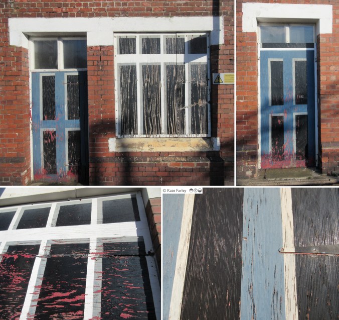
This week I was up in the Potteries for a meeting, and as with hourly trains, I’d just missed one so I spent 50+ minutes waiting in very low temperatures at Longport station near Stoke on Trent. Noticing my surroundings I was tickled to identify the ‘mock’ nature of the station building. All the doors and windows on the platform side have been boarded up and painted to look like… doors and windows. I assume this is some sort of security measure. As the paint has started to peel it revealed the deceit below. This sight is the cause of this blog post. I wonder what Pugin would have thought?

longport_kfweb

print pattern show up and down… at Tent London

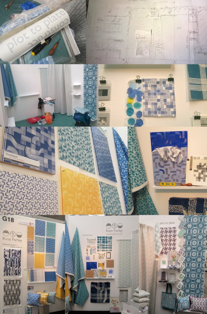
After months of planning, designing, making, printing, promoting and talking about the show… the time finally came… TENT LONDON! With very heavy bags, a display diagram, carefully planned tool kits, shelves, fabrics rolled, and so much more we set off to Brick Lane, London to put the show up. Our lives with small children are full of logistics, and this day tested us! Trains, tardy paint, luggage & childcare kept us busy and in relay between London and Birmingham so the show could take shape. By the end of the first day the majority of display items were on the right walls, fixed securely, and I headed home to the midlands.

The next day…. I set off again with ANOTHER heavy bag (these things don’t always get mentioned in trade show prep talks!) and completed the stand dressing, including the mood board for ‘construct’. It always takes longer than you think… I attached the vinyl, tidied up and left for a good nights sleep before the LONG first day of 10am – 11pm!

KF_tentstand1_G18_15web

The first day of a launch / show is always exiting and scary. Will people understand the new work, and will they like it? This particular morning was not helped by being stuck in a lift across town with my dear sister and only what sounded like a fax machine to talk to. Eventually after 20 minutes we were told the lift engineer couldn’t get the door open, “you are in a precarious position”!!! I’m not sure what customer care training he had received about talking to distressed people stuck in a lift. For anyone in this job, do not use the word ‘precarious’! We got out after nearly half an hour…

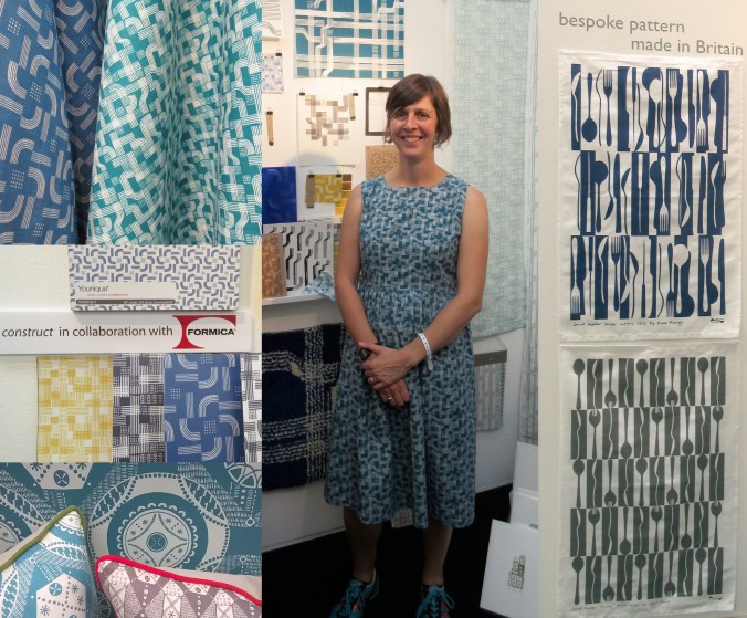
For the rest of the day I felt half an hour behind, but I launched my new collection with free limited edition screen prints which appeared to be gladly received by visitors. The collaboration with Formica Group was a really popular element to my new collection, and the mood board featuring my drawing tools as preliminary artwork inspired lots of really interesting conversations. Being a solo designer can be a very lonely, self-reflective existence so it’s great to get feedback from those you design the work for. Architects, interior designers, specifiers, stylists, press, retailers and many more visitors invested time to talk about all elements of my work, and for that I’m grateful. ‘Plot to Plate’ was launched in 2012 and has evolved over time to be a ready to buy interior and gift collection but ‘construct’ works differently. Only the cushions are available for immediate sale, and the rest is printed to order to allow for the distinctive element of the collection, the bespoke production. By working with Formica Group and Surface View my designs have been printed on a range of surfaces for the residential and contract markets.

When designing the stand I had to consider what I wanted to communicate and who I wanted to relate to. Over the years I’ve refined the ideas of what I want to do and the contexts in which I thrive creatively and this design show gave me the opportunity to put that understanding across. It was important to explain that I have lots of experience of creating bespoke pattern for clients and having just designed a new pattern for David Mellor celebrating the ‘Pride’ cutlery this was a great thing to show. It was really well received and orders have already been dispatched!

KF_tentstand2_G18_15web

It is very hard work minding a stand of your own, by yourself for several days. Every show I’ve done has been helped by the wonderful community of fellow stand holders nearby and this year at Tent London was no different. I met kind and sharing exhibitors I hope to stay in touch with, and I will certainly watch and support their practices on social media with interest. Thanks to you!

I’ve written this previously too, but as ever, I was visited by past students of mine from both my CSM teaching days as well as BCU Textile Design graduates, some visiting to inform their practices, others in their roles in industry. It makes me proud! I am also pretty good at spotting students and as long as they don’t just grab the postcards I support their efforts and questions as they are being proactive and engaging with the industry. London Design Festival offers something for any creative so it’s good to support the next generation.

Last year I made a dress using one of my new prints, and I did the same this year, much to the delight of the Tent London ladies! It was a great way to demonstrate the flexibility of my print designs, and a good way to make conversations; it became my uniform.

I also won a design competition for tote bags at the show to be printed with a ‘construct’ placement print, so some lucky people have a very limited edition screen printed bag!

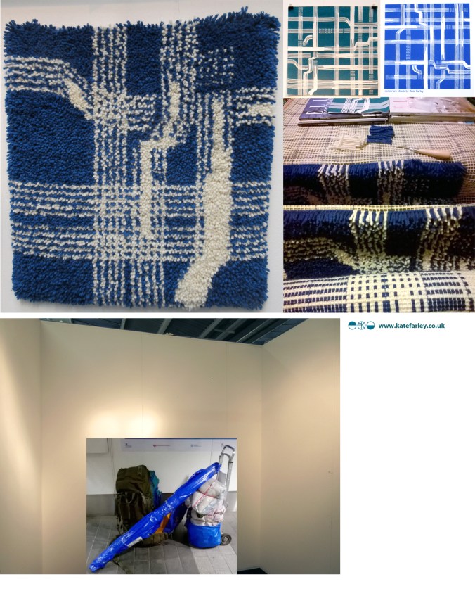
The end of the show has mixed blessings. After a long few days and months of preparation it’s great to have achieved a strong show – many kind people commented on how good my stand looked, but it also means the adventure is over, and it’s sad taking the show down, packing it up and saying farewells. Even in a few days routines are created. We struggled back on the trains with what we measured later as being 59Kgs of exhibition and assorted support luggage between two of us, ready to follow up the contacts made…. and to sit down!

So what have I learned?

  • I learned that I really am making the work that I want to make, and did manage to communicate that with the right people.
  • I’m really proud of both collections, and am delighted at the reception that ‘construct’ received
  • and latch hook rug making! I learned how to make a rug and now know why they cost so much… but really enjoyed making it… with British wool!
  • I learned how important it is to take risks, to put work out there to be judged… to keep learning

Thanks to all those involved: family helpers, the Tent team, Formica Group, Surface View, fellow exhibitors and for everyone who came to visit.

KF_tentstand3a_G18_15web