black, white and a hint of chocolate

I remember my father turning our bathroom in to a photographic darkroom, not really understanding what was happening, and not being allowed in. A few years later it was my turn to stand in the dark bathroom to transfer the film from the camera to the spool ready for developing the images, eyes wide open – as if that would help! At art college the group of us headed to the beach with the college stock of Pentax K1000s to photograph the fairground, and then returned to fumble our way through the same process. I loved the wet developing; watching the first signs of imagery appear, and then head to the corridor, blinking to the light, to check the exposure required for the ‘portfolio’ piece. I also enjoyed the more experimental side of printing. Photograms, multiple exposures and liquid emulsion kept me captivated during my college days and holidays back home-home meant the use of that bathroom darkroom.

pinhole_flora_web

Years later at the turn of this century I became Print and Photomedia Technician at Central Saint Martins, and then Lecturer in Visual Communication, with the territory of a darkroom. I lost count of how many students I introduced the idea of experimental photography too but one of my tricks was the Pin-hole camera. The students and I turned empty hot-chocolate tins from sweet smelling rubbish to state of the art cameras, and captured the sites of the Back Hill campus. The wonderment experienced by the students, mixed with the realisation that they had made a photograph without using a ‘camera’ was priceless. But why was the photograph upside-down? Why was it a negative?…. Some students took this far further than I had and became rather good at controlling the timings and light readings.

I spent hours leaning out of the window of my flat in Camberwell clutching my hot chocolate tins, photographing the street. It became clear I had attracted attention of the guy opposite who wondered what on earth I was doing! I had to save the exposed papers to develop in the middle of the night so as not to disturb my flatmate, and so the house was dark. At this time I was also experimenting with photograms, and I made a book titled ‘Totality’ about the solar and lunar eclipse that had occurred, and realising that by using light, and obstructing light to make the book, the very concept I was exploring was creating the book. Apart from ‘sun prints’ in the garden with my own children I haven’t had time to use a darkroom, ready-made or not, for a number of years. pinhole_SE5img022web

I was reminded of the joy and simple elements of photography a few days ago. I was in bed, on holiday and happened to look up to find we had our very own camera obscura! Through the smallest gap in the blind was sufficient light to project the curve of distortion and the negative image of the view of the houses, window frames and all, at the end of the garden, on to the ceiling above us, in colour. The magic and the science of seeing was right there. Trying then to capture that image using a digital camera felt rather wrong. Where did I put that collection of drinking chocolate tins?

cameraobscuraKent_web


Pattern design, outdoors and in…

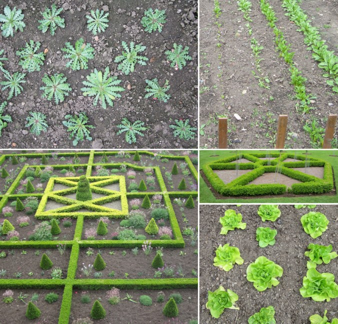
If you are a regular reader of this blog you will already know that for the last few years my personal design practice has been inspired by garden design, and most specifically allotments and kitchen gardens in my ‘Plot to Plate‘ collection, launched in 2012. I have spent many hours walking, almost patrolling, up and down rows of National Trust cabbages and onions, armed with my sketchbook, annotating the patterns, translating them to motifs, documenting the small irregularities, the planting plans, the labeling – fruit and vegetables up and down the country, as well as our allotment, plot 8 in Birmingham. Upton, Packwood, Baddesley Clinton, Blickling, Felbrigg, to name a few National Trust gardens I have surveyed and taken inspiration from. Hanbury is my current favourite garden and I have been working on a number of patterns inspired by this property that will one day be complete, to launch at Tent London this September.

It is with this in mind that I write my thoughts. There are so many similarities between garden design and textile design they seem perfect companions in my practice. Long before Mr W. Morris picked up a pencil the natural world of flora has been a dominant subject of inspiration for pattern in the home. Rather than the bouquets and sprigs, posies and trellis it is the formal gardens, the parterres and kitchen gardens that hold the structure and compositional language that we textile designers and design educators regularly refer to…

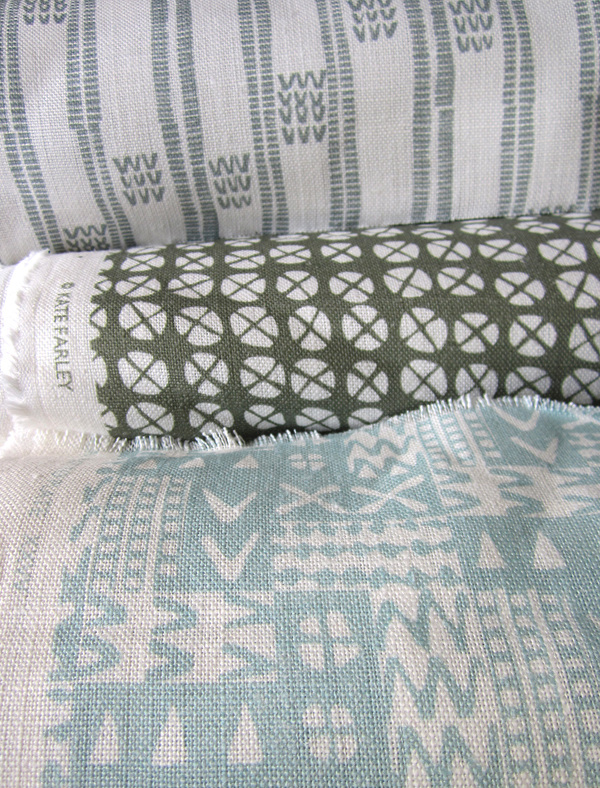
Stripes, spot repeats, all-overs and multi-directionals, geometric grids and diamonds, checks and plaids are all to see. And so it is, that it makes sense that I really have brought two things that I do enjoy together in my creative practice. It’s too early to share artwork for my new ‘Hanbury’ designs but I will share some garden pattern from Hanbury, and my ‘new’ fabrics by the metre, available very soon, in anticipation…

garden_textiles_hanbury_web  fabricrolls1_web

Communicating Colour

Evocative, technical, predictive, informative, for matching, mixing, ordering, cataloguing, of materials, surfaces, finishes, whims and traditions…

Working across the fields of surface design, textiles, public art and fine art I have come across many ways to represent colour in order to communicate qualities. Whether it be for perfecting a match for production, or generating an evocative palette for a client, each niche within the industry has its way of doing things. Black for the Northern Line, double yellow for no parking, gold for the winner, and red for wrong. From Global Color, to Farrow & Ball, Pantone to Berisfords the language of colour is key. Some give codes, other names, sometimes a swatch, others a smudge, universal, local, a science and an art!

Seductive, formal, in a book, or on a card, each help to create the colours in the world around us, and while the skills of the individuals choosing, producing and matching will no doubt be overlooked by most, may the colours continue to sing, calm, provoke and much more.

I’ve brought some of the various forms of colour I work with together to brighten up this grey, wet Monday in February.

communicating-colour_web

micro florals

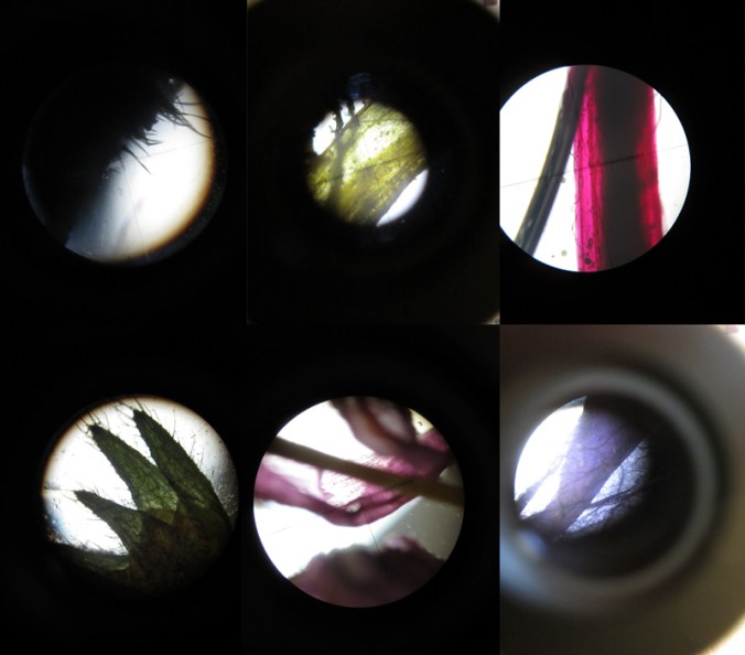
I’m used to gathering flowers and then drawing them over and over in order to learn more about their colours, shapes, forms and structures in order to develop imagery for prints and textile designs. At home this weekend we looked at flowers in a different way. We investigated last years plants that my daughter had pressed safely, and looked at them under the microscope that my son had become rather too keen on discovering inside the utilitarian wooden box it lives in.

We had great excitement as some rather plain plants revealed stunning patterns and textures and were disappointed when something beautiful at full-scale looked rather scary close-up. On trying to capture these images on camera the results were reminiscent of Len Lye animations and got me thinking about other ideas. Here’s a few images to share…

micro_6_web

noticing Nottingham

Having had such a great ‘destination’ review from Cara of Patternbooth blog fame via Helen’s blog DesignHunter we chose Nottingham for a last minute weekend get-a-way. I had last visited the city as a student in about 1997 and this time we set off looking for a completely different experience from the cider-drinking ‘DM boot wearing’ art student of yesteryear.

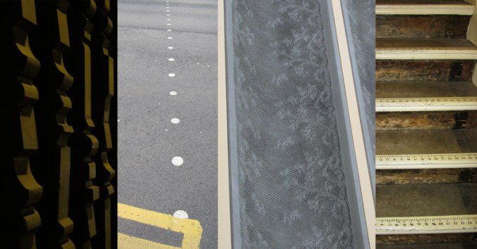
We visited lots of independent cafes and restaurants, watched a great art-film in the Lounge at the Broadway Cinema, shopped in vintage shops & design shops and yes, we did find time to sup ale at Ye Olde Trip to Jerusalem. It is a city with a great variety of interesting buildings embracing a myriad of architectural styles; almost a timeline of the design history lectures I give to my Textile Design students. The lace trade is still visible in many ways, and contemporised on the exterior surface on Nottingham Contemporary.

We had a thoroughly great time and returned home with rounder tummies and fuller bags than when we left Brum on Friday night! Thanks Cara, Helen and Nottingham!

images L-R: exterior facade of a car park, dots on a crossing, Nottingham Contemporary exterior, stair detail from the Paul Smith shop

NG_stripe_web

Norfolk lines

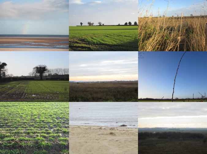
I’m naturally biased when it comes to the Norfolk landscape but seeing as it has shaped my aesthetic, colour preferences and my approach to drawing I am happy to consider it to be inspirational. I don’t spend enough of my time in Norfolk these days but every time I visit I take deep breaths, and big eye-fulls of the vast expanse of open landscape, the ever-changing light qualities and the endless colours of the land, sea and sky. Here’s a medley of Norfolk from this Christmas including sights of seals at Horsey Gap, a rainbow & the beach at Wells-next-the-Sea, and fields near Cawston and Alysham.

Norfolklines_web

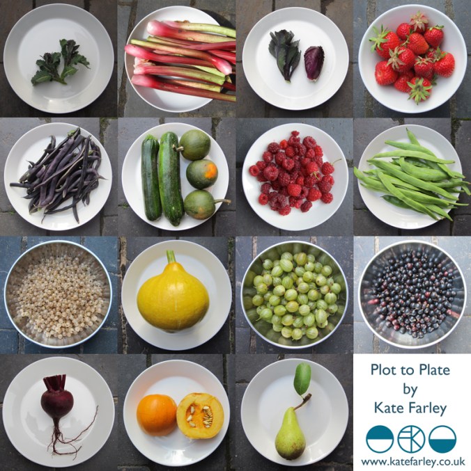
the true Plot to Plate harvest of 2013

Today I picked the final handful of beans, harvested the last of the squash in case we are surprised by a frost, and noted the pace had slowed on the rain-battered raspberries. We still have courgettes and the last row or two of potatoes, plenty of beetroot, celery… and parsnips – and for those we wait for positive news of the frost before they accompany our Sunday roasts.

I’ve often returned home from the plot to capture in photographs the success of the allotment on our plates and bowls, capturing the beauty of shape and colour of our fruit and veg. Today I thought it appropriate to put together the photos as the harvest comes to a close. I realise its incomplete; no sweetcorn, no cucumbers, no carrots or peas no blackberries or swede. No disrespect – some were a success, some disappointing – but there’s always next year to make amends.

I have to thank this lot for providing me with constant inspiration for my design collection of the same name – and this really is an example of Plot to Plate.

plottoplate_2013

box of colour

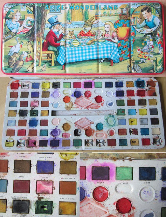
I was shown this wonderful Alice in Wonderland paint box that has been looked after for many years. It is so much nicer than much of the branded, TV themed products of today. I especially like the labeling of the names of the colours. Is sap really that green? I would have been a very happy child to have received a box of such size and potential. Note: Made in England!

alice_paintbox_web


Words of Walberswick, Suffolk

For some reason my first visit to Walberswick has been etched on my mind as a perfect summer holiday, long in length, filled with sunny days on the bridge crabbing, playing in the dunes, and on one day, huddling round a small, borrowed tv set to watch ‘The Royal Wedding’. This was in 1981, with memory’s thick rose-tinted spectacles on. I gather we stayed for a weekend!

Fast forward a few years and we have spent a fabulous week back in the small Suffolk, coastal village this summer, showing the next generation how to crab, and to play in the dunes, with no royal wedding to distract us.

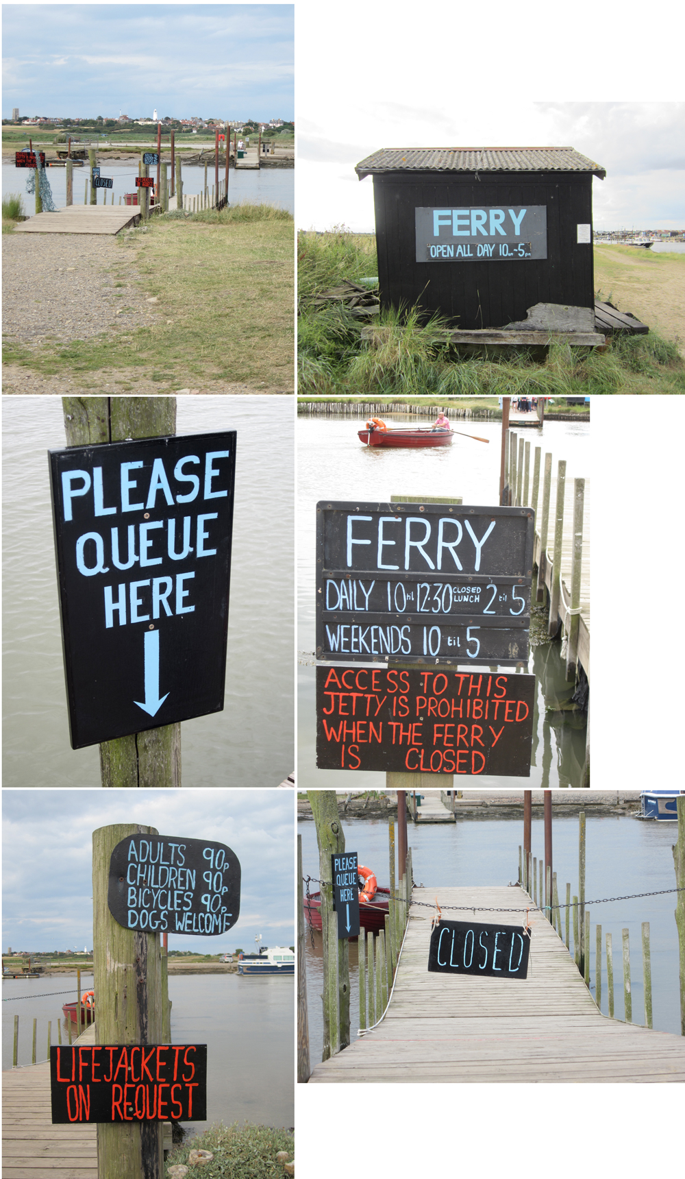
One vivid memory I have of our 1981 visit was of the ferry, the ferryman and his dog. We were confused quite why he seemed to make heavy weather of it, not rowing straight across – which seemed sensible, but instead rowing high up stream, before steering for the jetty on the Southwold bank. It was a real delight to be back on the ferry this time, with knowledge of the tidal waters, and for the small fee of 90 pence, taken across the water. There is pleasure in this simple transaction. If there was a queue, you waited. If it was only you, and not the maximum cargo, he rowed for you. Now that is service!

Image

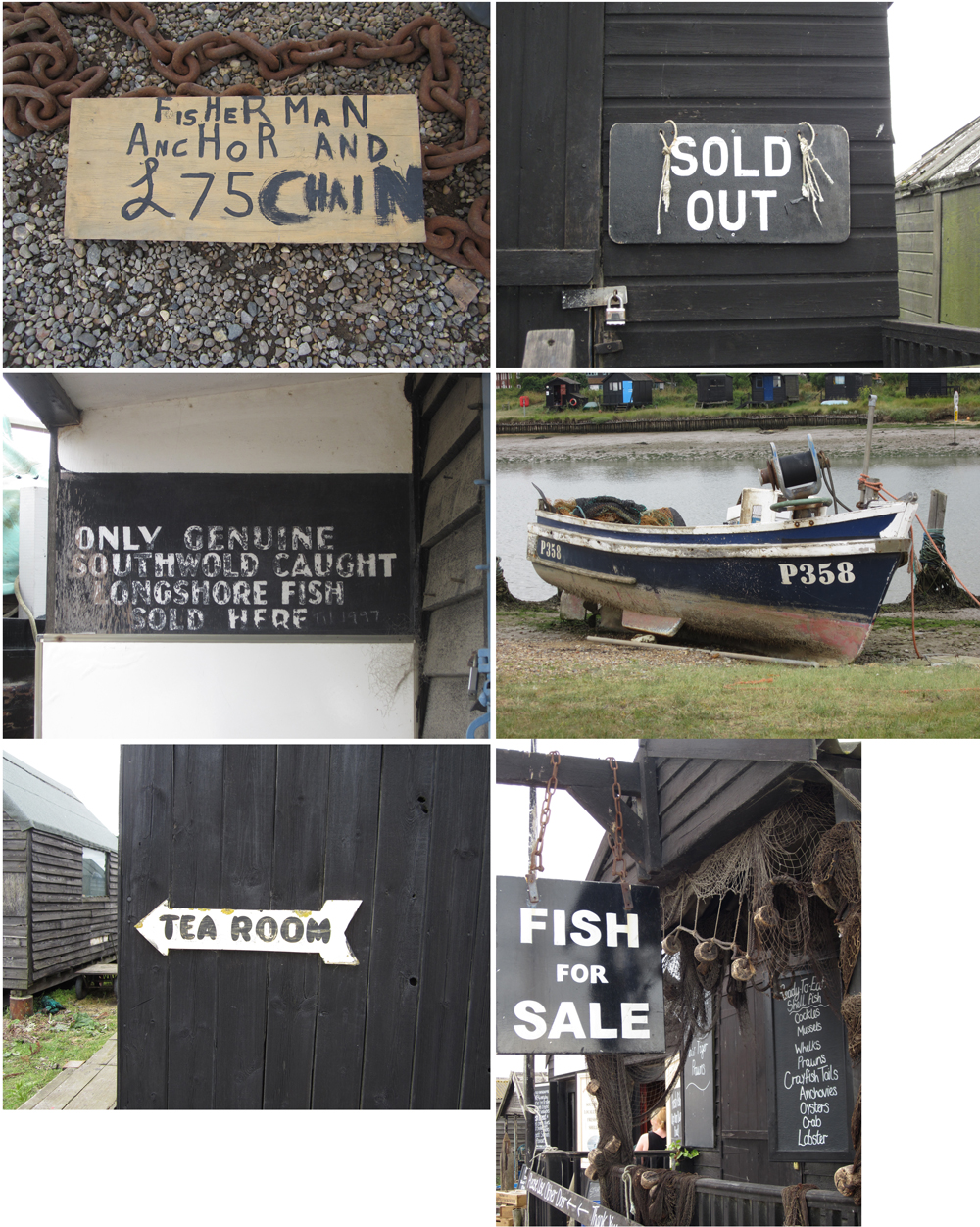
I doubt the signage originated from the 80s but I really liked the straight forward communications around the jetties. Around the banks of the Blyth the boats and black wooden huts featured many hand-rendered signs, some more formal than others, so I’m sharing them here, hopefully for your pleasure.

Image

a textile archive of a different kind

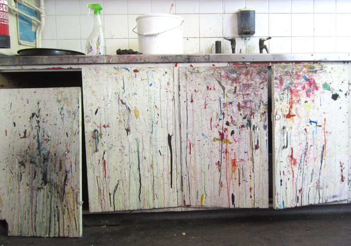
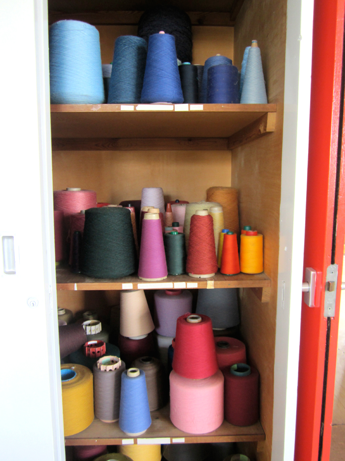
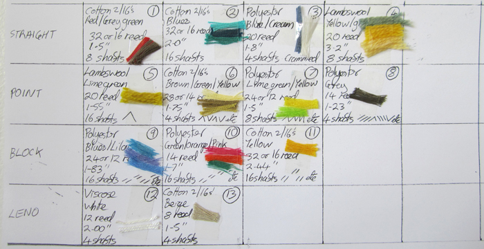
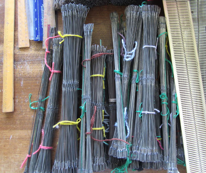
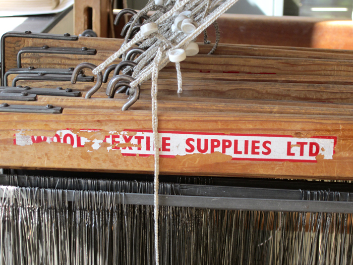
Having worked at Birmingham Institute of Art and Design, BCU at the Gosta Green site for the last few years we are moving to a brand new campus next week. There has been plenty to do packing up the workshops and studios, and during this process the course team have reflected on and recorded the space that has been home to this textile design degree for many years.

There are so many signs of demonstrations given, lectures delivered, course-work carried out and with the heavy use of the workshops comes a fabulous visual archive of the textile careers that we have helped to initiate and support along the way. We are nostalgic in many ways, but excited by the new and very clean slate that we are about to start writing history on at the Parkside building.

ImageImageImageImageImageImageImageImage