Plot to Plate printed pattern at Pulse 2015

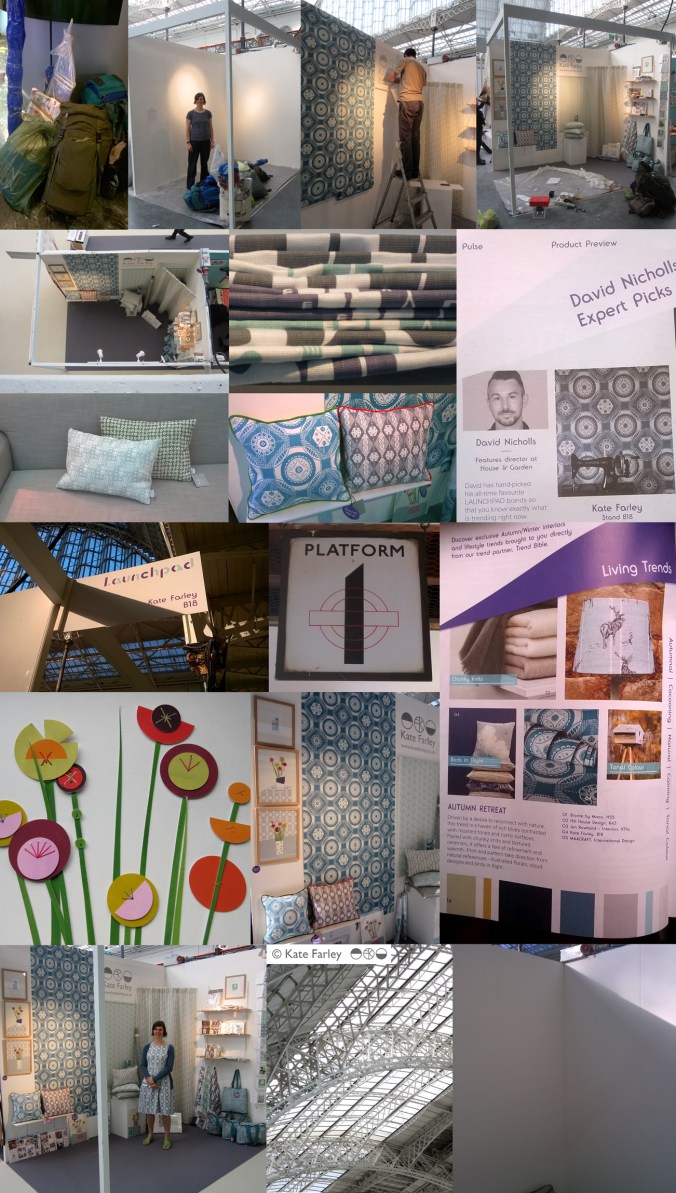
It always takes far longer to prepare for a trade show than it does to be there but I thought I’d show a bit of the journey of my show. Rather substantial worries kicked in the night before when we feared the contents of my stand were not able to be carried by two human beings, and more worryingly, not allowed on the train to London. Somehow we managed what felt like a physical endurance test, in fact it was… and began to make it my home for the next few days. Olympia is a stunning building to spend time in and we got the show up in a few hours, ready for the off… and there was still time to admire the London Underground graphics at Earls Court.

The Plot to Plate collection has grown substantially since its first trip to Olympia when I was showing in the Spotted section, at Top Drawer back in 2012. I am delighted that the new Hanbury and Parterre cushions have been well received by visitors to the show. These are hand screen printed and then sewn in Birmingham by social enterprise Textiles by St. Annes. The patterns are inspired by National Trust’s Hanbury Hall and Gardens, near Bromsgrove. The Hanbury wallpaper was also popular with interior designers visiting the show and Plot to Plate VVV was the most admired of my fabrics. My ‘parterre’ show dress was also much commented upon, with orders keen to be placed!

I was pleased to be an ‘expert pick’ by David Nicholls of House and Garden in the Pulse Preview and also chosen by Trend Bible in the trend section of the show catalogue.

It was also a pleasure to meet ex students of mine, graduating from the Textile Design degree at Birmingham City University, as visitors to the show in their industry roles, and I could still remember their names! How nice of them to say hello and make time to find out what I was up to.

The new friends made of the exhibitors beside me was really special. Such a supportive group of people, helping out, freely sharing trade insights, generally lovely people really helping the show be a great experience. The end of the show, although a welcome relief to the hours of standing (I really couldn’t carry a chair on the train!) was almost a sad time, as we stripped the walls bare, packed up our belongings, said our farewells and left, with the most ridiculous load I ever plan to carry. Maybe I’ll start making paper thimbles!

Thanks to all who visited and thanks to all who helped along the way! Here are the images which represent in some small way the few days at Kensington Olympia, May 2015.
`KFarley_pulse15

floral inspiration for textile patterns

One of the reasons I love to teach students drawing for textile design is the journey of enlightenment when introducing someone to the world of not only looking, but also of seeing. There are many ways to see when drawing and I’m really interested in the journey from reality to abstraction, whether its a state of mind, a way of transforming or whether it’s a methodical process applied to something in order to arrive at a motif for pattern.

My drawing process has evolved over years of practice but the way that I see is not so different to two decades ago. I remember reading the book ‘Drawing with the Right Side of your Brain’ by Betty Edwards and realising that I already did that and it all made sense. I enjoy playing with perspective, elevation, mapping of whatever it is I’m drawing, whether it’s a landscape or twig. Turning the three-dimensional thing in front of my eyes in to a two-dimensional drawing is always exciting, and challenging, but that’s half the fun. I think the process of printmaking that I further translate my drawings to really suit the clarity of motif dissection, separating colours or specific details on separate blocks or screens for printing for either a limited edition print or commercial textile design.

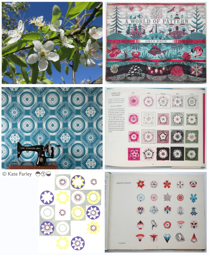
Each year the pear blossom at the allotment arrives and each year I’m reminded of how perfect they are in all ways. The beautiful petals and the bits I don’t know the names of, all there, waiting to be celebrated in drawing. No doubt Charles Rennie Mackintosh would have made an exquisite watercolour and graphite study. The flowers also remind me of drawings and prints I have made in the past, and not only of blossom, but of flowers that I make diagrammatic in a way to understand and explain the ingredients of the flower. When I discovered the work of Gwen White, and particularly the book ‘A World of Pattern’ I was excited to see someone else communicating what I see and how I translate form to pattern. This method doesn’t suite everybody and it would be a dull world if we all made drawings that looked the same, but every now and then it’s nice to know that my creative brain works like someone else’s brain and that my eyes see what others have seen before me.

KFarley_drawing_blossom_blog

Pear blossom, photograph, Kate Farley

‘Hanbury’ wallpaper, Kate Farley

Passiflora, lino print, Kate Farley

illustrations from Gwen White’s ‘A World of Pattern’ (RH column)


Design inspirations 3: winning games

I have always felt that one’s upbringing has a huge influence over the aesthetics of that designer. The house, the landscape, the products and fabrics that are present in the early years; everyday things, that at the time may not have been seen as important then can be blamed or celebrated in the later career of artists and designers. No doubt plenty of people would disagree with me, that’s not the point. I can clearly see a link between my own aesthetic, and my upbringing, and I’ve written about it in the past- read here  &  read here

On a trip back to the family home in Norfolk I came across the old games we used to play and was mentally transported back years before, simply by seeing the beautiful graphic qualities, clean lines and visual communication that I hold dear in my own practice. My visual language doesn’t necessarily mimic those designs but it’s more of an approach, a set of values & expectations that I set myself. We can expect things to be very different in the future with such digital aesthetics taking firm hold of so much of every day lives for my children and those of tomorrow. From how we create art and design, to how we view it on screen as well as on fabrics and surfaces much is very different. It is not necessarily a criticism of today, but more an appreciation of the inspiration I had and continue to thrive by. I sincerely hope that there will be art and design education in place over the next few years which will inspire the future textile designers, setting the benchmark for beyond that.

Here’s some of the graphic wonders. Red is a very popular box colour and it’s worth noting that many of the games proudly state they were made in England. Pieces were metal, wooden, proper card, nicely printed and beautifully boxed… there, a bit of nostalgia too! It also might be worth noting that in the ‘careers’ game The Arts was kept firmly in the box while ecology, sports, politics and big business made it on to the cover of the box!

KateFarley_games_blog


The season of textile design portfolios

As a student traveling up and down the country for interviews for a place on a degree course back in the mid 1990s I had little idea of what I would do on the degree course, let alone beyond the eternity of three years studying. My A1 black portfolio demonstrated my love of drawing, printmaking, pattern and ‘potential’. Now, in my role of lecturer at Birmingham City University each year I participate in the rounds of interviews to select the new members of our textile community and each year as I help them open the black A1 folio it reminds me of the journey I started all those year ago. The industry has changed, the world has changed, technology is utterly different and yet those nerves belonging to those individuals are as real as ever, and I remember that feeling so clearly. The unknown, the untrodden path I stumbled along; the Norfolk girl living in Leeds to turn drawings in to designs.

I’ve questioned most decisions I’ve made along the way, worrying about whether I should study art or design, printmaking or illustration, book art or textiles and yet somehow I seem to have all of those elements in my everyday practice, and that suits me fine. I remember the challenging task of confirming a description of myself and practice for my graduation show and degree postcard. (I opted for Artist / Designer, in case you wonder.) I couldn’t get the wording right, and really thought it mattered.

KF_degree_blog(images from degree study)

Having spent last Saturday interviewing students, on introduction I described myself to the visitors as a Printed Textile Designer, which in so many ways completely fails to describe what I do, but somehow seemed right to say at the time. Now I ask myself why it doesn’t fit and maybe I conclude that the term feels too predictable, so tidy, so comprehensive, and yet the thing I am most proud of in my career to date is the breadth of art and design experience I have gained, the materials I’ve designed for, the clients I’ve had, and the lessons I’ve learned, despite as a student, no idea that all that was possible on graduation.

Many times through the day I spoke with interviewees about their art and design experiences and came to realise that their own understanding of art and design had more to do with the educational delivery they were currently receiving and far less about how they defined themselves. An interesting conundrum, and after all that, does it really matter? What made me most excited about being part of the interview process was that all the students were starting out on their own journeys, some of which I hope I shall be involved in, and with the potential of a great course to guide them through, inspiring staff and great facilities they really can do all they understand they want, and so much more than that. Daunting, and exhilarating, and I wish them all good luck!

I didn’t know it at the time but the work I was creating all those years ago as a student still holds such relevance to me now, and it doesn’t matter what label I give myself, it’s all about the creative process, and I don’t worry about boundaries there…

the colours of 2014

Back in 2012 I started a colour project on Twitter, using Pantone references ( @pantone ) that represent particular colours of the season, place or activity of the day alongside photographs that I have taken. The words relate to the language of colour, seasons and the activities so often word-play is used, particularly in relation to Coated, Uncoated or Process, as used in the Pantone system of colour. Having kept this going for over two years I decided to look back to see the colour swatches of 2014, a record of colour of my year, having recorded pattern of 2014 in my previous post. In chronological order under the swatches are the Tweets to tell you about the images, they read from top L to R, along each row ending with the hyacinth, bottom R.

From this point on we can look forward to 2015…. Happy New Year…

KFarley_colourof2014

Kate Farley @katefarleyprint  ·  Jan 27

ORANGES! A new breakfast treat, from @pantone180 solid to process = marmalade

Kate Farley @katefarleyprint  ·  Feb 12

Brilliant @pantone Red DS 75-1Uncoated; a gig of captured whispers & exploding electric noise @annacalvi Outstanding!

Kate Farley @katefarleyprint  ·  Mar 2

Yesterday: @pantone DS 290-1 Coated, sights of fresh green but otherwise muddy underfoot – Spring has sprung

Kate Farley @katefarleyprint  ·  Mar 9

Crocus delights: @pantone process, heading home, 49-1Uncoated, Spring sun

Kate Farley @katefarleyprint  ·  Mar 15

Malvern moss green @pantone DS 312-1U = process walking & uncoated. A beautiful spring day #Herefordshire

Kate Farley @katefarleyprint  ·  Mar 29

Spring green @pantone 389 Uncoated, on the eve of BST. Euphorbia at its best!

Kate Farley @katefarleyprint  ·  Apr 11

Bored of blossom? Beautiful @pantone 684 PC – Solid optimism to Process – the Spring growing season.

Kate Farley @katefarleyprint  ·  May 21

Okay so it’s not #RHSChelsea but stunning @pantone 806 Solid pink Uncoated. Sadly rain due to spoil it tonight!

Kate Farley @katefarleyprint  ·  Jun 27

A lot of @pantone 207 PC with @tiborreich on behalf of @textilesBCU Every colour under the sun and rain. #textiles

Kate Farley @katefarleyprint  ·  Jul 10

Today = A sunny @pantone yellow 604 Uncoated and optimistic on all fronts! #colour

Kate Farley @katefarleyprint  ·  Jul 21

A stunning yellow @pantone 386 Uncoated, hot & with plants growing in the wrong place across the plot. #weeds

Kate Farley @katefarleyprint  ·  Jul 25

A stunning, loud and proud @pantone Red hot 032 Uncoated and attracting the insects today. #dahlia #colour

Kate Farley @katefarleyprint  ·  Aug 1

RED! Harvest time with these @pantone 200 Coated at the moment crab apples, soon to become jelly! #colour #harvest

Kate Farley @katefarleyprint  ·  Aug 11

Pink @pantone 679 Uncoated, wild and fresh from #Dartmoor #heather #colour

Kate Farley @katefarleyprint  ·  Sep 3

Blooming special rose @pantone 7417 Uncoated & without an umbrella – let’s hope for no rain! #colour #rose #weather

Kate Farley @katefarleyprint  ·  Sep 8

A stunning @pantone 611 Solid Process flower but I’m waiting for the squash! #colour #PlottoPlate #runningoutoftime

Kate Farley @katefarleyprint  ·  Oct 6

It was sunny yesterday, Uncoated with @pantone orange 021 nasturtiums. #colour #autumn #allotment

Kate Farley @katefarleyprint  ·  Oct 20

Happy to receive @pantone Coated 201 red windfall apples from the allotment at the weekend. #harvest #sharing

Kate Farley @katefarleyprint  ·  Dec 7

A stunning @pantone Solid 158 watching me dig at the plot today, Coated of course #colour #allotment #digging #robin

Kate Farley @katefarleyprint  ·  Dec 30

Blooming! We are enjoying the seasonal @pantone 226 Uncoated and indoors #hyacinth

the patterns of 2014

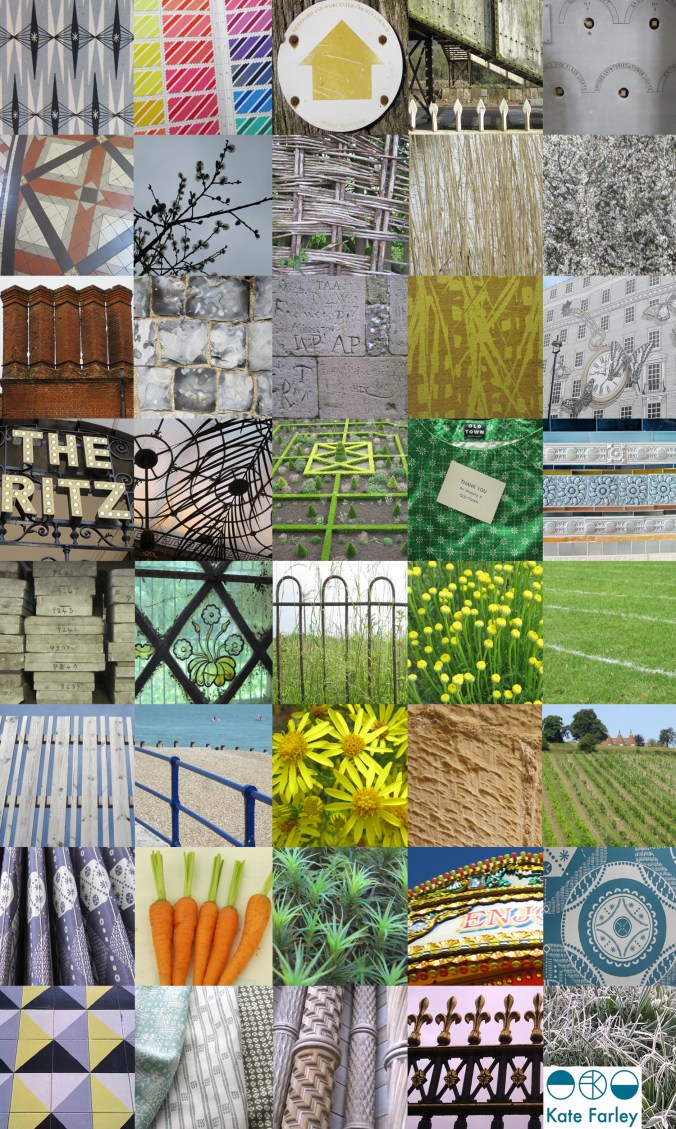
It’s been one of the years I shall remember as particularly busy, continuing to juggle the commitments of family life, my roles as artist, designer, lecturer and of course allotmenteer, and the small matter of a big Birthday. All the time spent doing any one of those things provided opportunities to spy inspiration, food for thought and visual stimuli for me so having looked back over the last twelve months I have enjoyed creating a record of the patterns I’ve seen. The record includes family holidays, research trips, and days out; from the school sports day track, Birthday celebrations, to the rivets in the railway bridge, the stately home and the walk to work, it’s a record of some of what I saw in 2014.

Key themes appear: geometry, stripes and railings and although in a chronological order, there are some great pairings in terms of colours, textures and pattern.

2014tiles_blog

a new starting line

I’ve spent more than two years developing designs and products in the ‘Plot to Plate‘ collection and was incredibly proud to show the collection, with the new ‘Hanbury’ wallpaper at TentLondon in the London Design Festival in September to a great reception. Allotments and kitchen gardens inspired the limited edition prints which inspired the patterns, British manufacturers make the products and I’ve documented much of this process here in the blog.

During this time I’ve also been working on really exciting projects that are at stages too early to share here, and I’ve created commercial print designs for clients in both interior and fashion sectors. Each of these briefs have been creative, with a variety of factors to balance, and most importantly with a client at the end of it. I enjoy juggling a range of projects, each one fulfilling my design drive, alongside my role as lecturer.

Now is the time to take stock of my own research practice again and take issue with ideas that have been germinating in the hinterland of my mind in relation to principle concerns in my design practice, which sit in harmony with my artistic and creative journey. It’s amazing how many threads of research and practice, when brought together make perfect sense, and reveal their value to me. Some discussions I had with visitors at TentLondon were opportunities to hear myself testing these notions, and so it is, back in the studio, with ink on a brush, ink on a roller and ink in the printer, I have started a new chapter, a new sketchbook and a new head-space.

It’s exciting, very daunting, and what drives me… I look forward to sharing this journey in the coming months, for now there is a glimpse…

KateFarley_startingLine

Plot to Plate archaeology

When I was a small child there was a time when I wanted to be an archaeologist. Having been lucky enough to have visited several Greek archaeological sites and been inspired by the possible finds underground I was convinced I had the patience and where-with-all to try. That particular career plan didn’t last long but something of the magic of unearthing lost treasures, and working through the soil of past generations has most certainly been re-awakened through my adult years of gardening – and beach-combing come to think of it!

Over the last few years I’ve represented this process of working with the soil and bearing witness to nature’s materials in many drawings and prints, working to represent layers of gardening, as if strata of dinner preparations. I like the continuum of being a gardener, as the current occupier and protector of a long line of gardeners, each winning and losing the battles of nature and harvests for generations.

As I have dug the plot for nearly a decade I’ve discovered many broken bits of pottery, and some I’ve kept and others I’ve turned back to the earth to be found again at a different time. With no rationale to what I have kept but having created little gatherings; pieces turned out from my gardening trouser pockets, I have realised I’ve started another collection. (check out www.obsessionistas.co.uk for two more of my collections)

I like to see the different surfaces, the whites, the blues, and the hints of familiar patterns. Why do people plant their broken plates? It’s certainly a different narrative to my Plot to Plate collection…

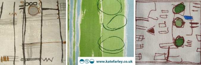
KFarleyplotPotsdrawing100ahttp://www.katefarley.co.uk


knowledge of books

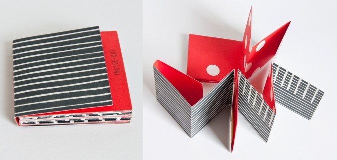
I have taught hundreds of people how to make books. Folded, stitched, and even stuck books have been made under my guidance in school rooms, art college studios, village halls, hospital rehab. suites, commercial company meeting rooms, and at dining room tables, at the very least. Every time I teach a bookbinding workshop there is a sense of wonderment from the participants, a proud moment when they hold the completed book for the first time, and realise what they have made. It’s a good feeling being the facilitator of that experience. Books are one of those objects that carries so much potential; an object that can contain private thoughts, or public rule, but is portable and very cheap to make using very few tools. We bond with books.

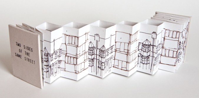
I was first taught about Book Art by Les Bicknell of ‘bookness’ fame. He made a studio full of Norfolk kids studying textiles question our preconceived ideas of what a book can be, and I was unique in that group – I saw a future of work that I wanted to make. On my degree course I was taught more practical bookbinding skills, and eventually wrote a 12000 word dissertation on the subject, researching in key collections at the V&A and Manchester Met. as well as interviewing some leading figures of the genre. Books for me at that time fulfilled learning requirements on my design degree while becoming vessels to explore my ‘fine art’ ideas, and this eventually led me to study for the MA in Book Art at Camberwell College of Arts, London. I spent the year investigating a ‘sense of place’ of south London, driven to create a more personal map of my London in contrast to the A-Z map, exploring cinematic flip books, and architecturally inspired structures.

KF_2sides_web

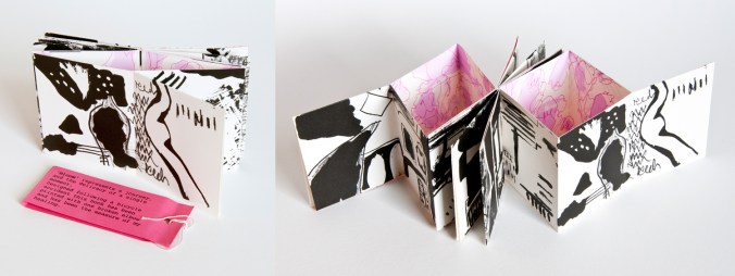
There are tools and skills that are beneficial to know; I was taught by the old boys at London College of Printing, as it was then, how to stitch with curved needles, cover the boards, and press the blocks. More useful to me though was the challenging of how we ‘read’ the book form, how one can be directed by the designer to progress through both visual and structural narratives across pages and along folds. I’ve explored these ideas in many of my limited editions of books I made and exhibited between 1998 and 2008. I’m very proud of this body of work, and I know many people appreciated the pieces. I have work in the Tate collection, the British Library, Manchester Met. to name a few, as well as overseas in collection in America, France and Ireland and within the small world of artists books I became known for the structural book forms I created. Many of my books were inspired by journeys and places I experienced, or events and mindsets I found myself in. A broken elbow falling off a bicycle really did inspire ‘Bloom’ which I describe as the ‘measure of my healing’, as I challenged myself each week to cope with the physical tasks required of printing the book. I have always taken on and enjoyed the challenge of transforming a two-dimensional sheet of paper in to a three-dimensional book structure appropriate for its narrative.

KF_Bloom_web

Sadly not many people make a living selling artists books. It frustrated me that I could sell a print for £80 but once I had folded and stitched it in to a complex structure I couldn’t sell it for £20. So strong is our association with art, that if it can be framed and put on a wall it had greater value. I also got fed up with the ‘I can see how she’s made it’ statements as visitors to shows photographed my work without the courtesy to ask, as if I was a learning resource centre, having paid for the pleasure myself. I see now an increase in awareness of book art and hope things have changed in these regards.

KF_insideout_web

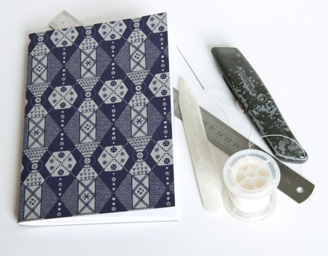
I have continued to use the practical and conceptual skills in my public art commissions, with large-scale visual narratives explored as if pages held in my hand. The sequence of toilet doors in a central Colchester public convenience was just that, a story of passing time. My current design practice benefits from my bookbinding skills and visual communication knowledge, as well as my book art thinking in the design of my marketing material, and sample books. I also continue to produce hand printed and stitched notebooks featuring my patterns – Parterre is the latest.

KF_parterre_toolkit_web

As I pack up my box of tricks ready to teach another fifty students the basics of books let’s hope some of that joy and creative potential is passed on to the next generation, for whatever context they want to think about books in.

Useful links:

http://www.tate.org.uk/research/library/artists-books
http://www.bookarts.uwe.ac.uk/about.htm
http://www.specialcollections.mmu.ac.uk/artists.php
http://www.katefarley.co.uk/gallery/bookworks2.htm

If you haven’t seen the new IKEA video about the book book, check it out: http://www.youtube.com/watch?v=MOXQo7nURs0


Wallpaper in the creating…

The process of designing my first commercially available wallpaper has been a long & highly considered journey and one I thought would be interesting to share.

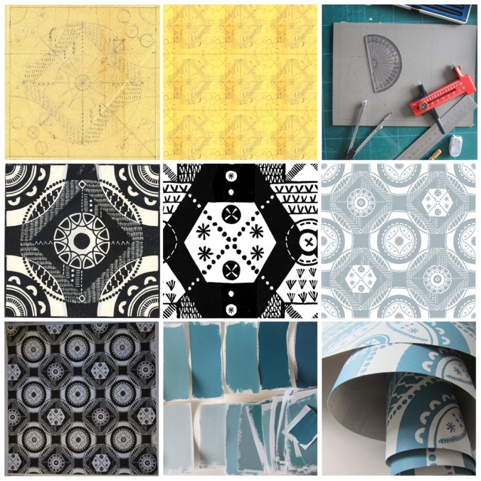
Research: I first made drawings in my sketchbook last summer when I visited the National Trust property Hanbury Hall & Gardens in Worcestershire. I really liked the formal parterre and saw a really close link between garden design and textile design – I wrote about this in a previous blog post: https://katefarley.wordpress.com/2014/05/11/pattern-design-outdoors-and-in/

Composition: Sketches became drawings that became more detailed designs, that were then tested in repeat by scanning them in to the computer and using Photoshop. Edge details, scale of motifs, pattern and textural rhythm all needed to be considered.

Cutting the block: I measured and cut the lino block before taking a really clean print in order to scan the print in to work digitally with the repeat tile.

Editing: Further refinements, several print outs and more alterations took place over several weeks as I got used to seeing and living with the design. Additional lino blocks were cut in order to add different motifs to the design. Additional variations across the larger repeat file create visual interests and a play on the traditional repeat expectations. Some tweaks were so minimal that people unfamiliar to the design wouldn’t be able to spot the changes without having them pointed out, but it’s so important that every dot, dash and space has been considered before the production process is underway, saving time and lots of money.

Production: The digital artwork was sent off to the manufacturers of the roller in order for the design to be printed, and a technical proof was sent back for my approval – exciting and scary times!

Colours: Much thought, research, trying and testing went in to the colour combinations and I painted lots of colour chips using gouache in order to communicate the choice to the printer.

Printing: After signing off the colour proof provided by the printer, the wallpaper went in to production, labels were designed and printed, rolls created.

Results: I’m delighted with the results, the efforts by all those involved with the production process, and look forward to launching this at TENT London very soon.

hanbury_BLOGtile1000rolls_100_DSC_0227