bacterial colour workshop

For a number of years I’ve been aware of the fascinating work of Colorifix, an award winning bacterial dye biotech start-up organisation based in Norwich leading the way for a more sustainable dye practice. Following some planning and support from our technical team I was able to host PhD researcher Ruth Lloyd in partnership with Colorifix to share with us their work and to lead a workshop for our BA3 students. Ruth is carrying out practice-based research “to develop and commercialise bacterial dyes, where she will further explore the capacity of colour producing microorganisms to create human designed patterns”.

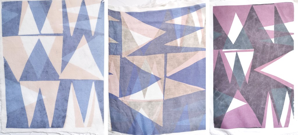
We were treated to a insightful presentation by Ruth about the science and development of the colours, before we were able to have a go at printing with the bacterial dye colours. The students and staff tested painting the colour directly on to the fabric as well as painting on the screen then transferring the colour, as well as using paper stencils with the open screens.

The range of colours is limited at the moment, so this is something being worked on by Ruth and the team at Colorifix. The different fibre content of the fabrics printed on can significantly impact on how the colour appears so we were testing natural and synthetic fabrics to build our technical files and our own understanding of colour and textiles. Thanks Ruth and Colorifix!

spring brings colourful joy

I feel as if I’ve dragged myself through the grey, wet and cold British winter, without the delight of deep snow to play in, and finally the signs of growth in the garden and country lanes are undeniably taking us in firmly to the middle of spring. The magnolias are blooming, the blossom of blackthorn has been and gone in Norfolk and the yellow of the daffodils is being overtaken by the yellow of the oilseed rape fields.

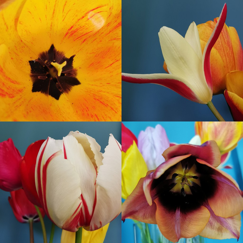
Almost without warning, as if overnight, the garden has transformed from bare earth to borders full of colour; clusters of yellow, of orange-red, hot pinks and fussy white frills. The tulips are here, and with them comes the idea summer may follow spring. I’m not rushing the time by, I’m just more appreciative of the brighter, warmer months.

With the threat of heavy rain over the weekend I gathered up some of the tulips for the house – bringing the outside in. They’ve brought with them such joy, I really do feel better with the colour around me. I spent a little while drawing them a couple of evenings ago to absorb the colour and form of each one, thanking them for bothering.

Tulips have featured in art and design for centuries, in drawings, paintings and textile design, but my favourite has to be by the Austrian designer, Josef Frank, in Tulpaner, see below, for Svensk Tennn. The different flower heads of the tulips bursting from the dark background as if the colour is jumping out of winter is just how I feel, as the warm spring sun encourages the garden to enable colour to thrive and for us all to spend more time enjoying it.

pattern project potential

I’ve been keen to get back to designing and printing having spent my practice time writing and developing the book for publication over the last few years. I’ve been testing ideas of pattern evolution and pattern construction for some time in a limited way, specifically looking at pattern structure evolution through drawing investigations, but the ideas at the heart of this investigation have themselves evolved over the last couple of years.

With more time and fresh energy I’ve defined a new project brief and research rationale, and I’m excited to have got off to a good start. I’m looking at repeat tiles and construction of pattern formations, so cut shapes and sketches were an obvious way in for idea development. I’m trying not to be too precious with outcomes at this stage, so I’m trusting the process.

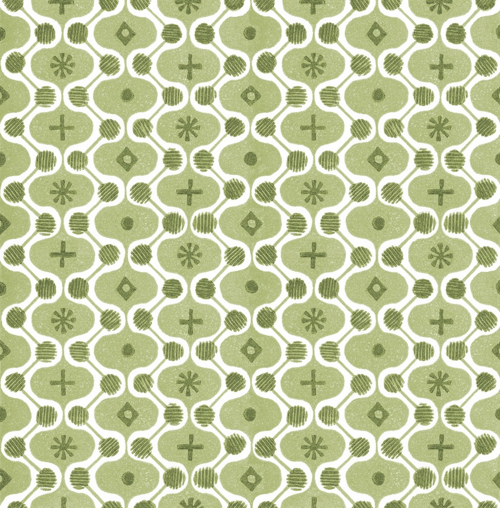
I’ve started by testing ideas with geometric shapes as subject matter to keep the aesthetic clean and graphic, focusing on the laying down of colour blocks. I’ve started by working up some ideas for screen printing but anticipate many more drawings, maybe lino prints and certainly digital work will be created over time too. The colour palette will certainly change, but with an exhibition I’m making work for at the same time dictating pieces to be black and one other colour I’ve gone with black and green.

I don’t want to give too much away at this stage, but look forward to discovering the potential over the next few months.

REPEAT: Book publication day coming very soon

On the 12th January 2023 my book for Bloomsbury on the subject of repeat printed pattern for interiors will be published, … finally there’s not long to wait having worked on it for years!

If you want to order a copy at a pre-publication discount you can do that here.

November colour palette, on the water

I love creating seasonal colour palettes, so here’s one from today, with our Mirror dinghy on the Norfolk Broads. The distinctive red sails stood against the neutral greys and greens of the November day. It’s not entirely proportionally correct but the red grabs the attention so I believe it’s okay to give it some extra width in the palette at the expense of more pale grey!

colour around the garden

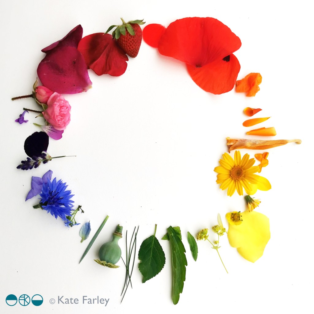
When my children were very young I remember having to occupy them in a park near a hospital and as the time dragged on they were clearly finding the wait too long and boring. I came up with the task of finding colour to entertain them, so they dashed here and there with specs of colour. Sometime later we had little piles of different colour from leaves, petals, grass etc. and we were surprised by how colourful the park was when we first thought it was all green.

Many years on this week I found them doing it again, for fun… as the garden was so full of colour. It was wonderful to see them noticing the extent of some colours such as reds, and difficulties with blue, but with lots of rushing around again they made an impressive rainbow. Me being me I stepped in to organise the colour a little bit more, order some specifics … and then got told off for styling it for social media… oops!

The garden in June

nature: holiday inspiration for the sketchbook

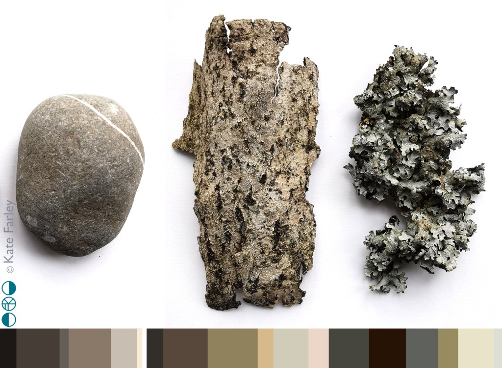
This holiday time has provided an opportunity to go to new places, see new things and return to the sketchbook just for fun. A week at Ilkley Moor enabled lots of time for walking and seeking out inspiration from the natural world, with distinct differences to the landscape I’m used to day to day. Up hill and down dale saw me amongst mosses and lichens, pebbles and boulders, grouse, larch trees, heathers and bogs … and even a fragment of pottery.

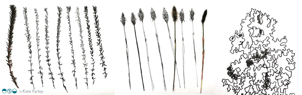
Rucksack pockets were filled with samples of treasure ready to investigate later. The process of drawing enables me to get to know an object, and by making several studies of each item I enjoy developing a stylised representation. I hope never to tire of the getting-to-know-you drawing process I have practised for thirty years.

By looking closely and seeing through drawing I can work out the essential elements of surface, form and texture to record, but also I love to play with the appearance of elevation and structure of three dimensional objects, such as the pebbles, to explore their new form as they appear on the page, as flat motifs.

The textures and colours of the items I gathered provide macro evidence of the vast landscape I walked through and connected with. As this was springtime there were pockets of fresh green bursting through winter foliage, demonstrating the natural cycle awakes again. The geology of Yorkshire provided variety in coloured greys and texture under hand and foot as we bouldered, scrambled and hiked, notable in contrast to the soft wet bogs and spongy moss beds amongst the heather.

Without going all John Ruskin about it, the natural world really is amazing, and full of inspiration for anyone inclined to notice. Anyway, back to the rather flatter fields of Norfolk …

pattern practice therapy

A year ago I was recovering from stomach surgery and had some time away from my academic role while I mended. Not one to be idle, when I was well enough to wield a lino cutting tool and had the energy to sit up I set myself some simple design challenges to focus my brain and help myself get better. This became my physiotherapy and creative distraction from what was a really hard period of time.

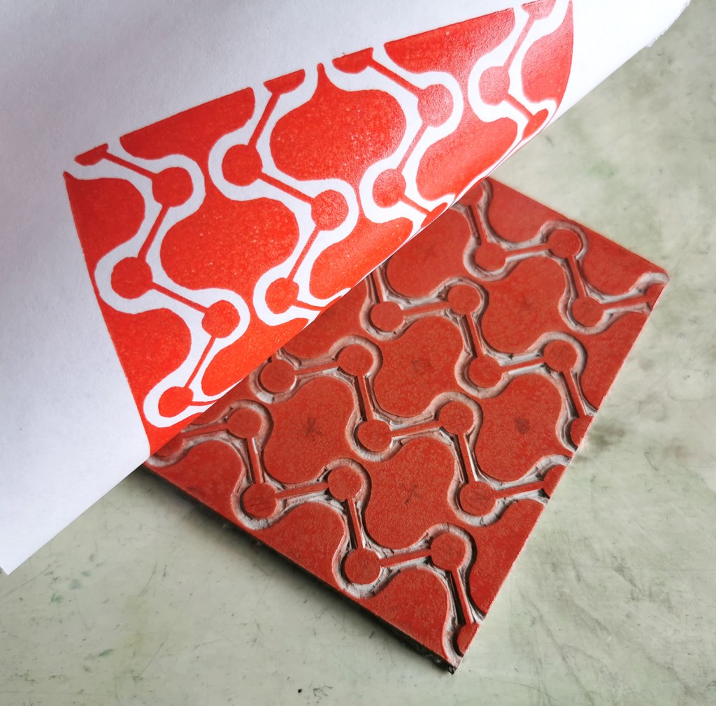
With pattern design as my go-to healer, I decided to explore formal pattern structures, including the ogee, diaper and check, featuring geometric elements. I created lino cut tiles with a small element of repeat pattern, usually but not always in two colours. The lino blocks were small, enabling me to feel as if I was making progress while able to retain focus in short bursts. The printing was another process that tested my physical strength and stamina!

I thought I’d share this one, the ogee structure – one of my favourite pattern structures – I love the play of the negative and positive S-curved forms. I think it is under-represented in contemporary design…

printing the first colour
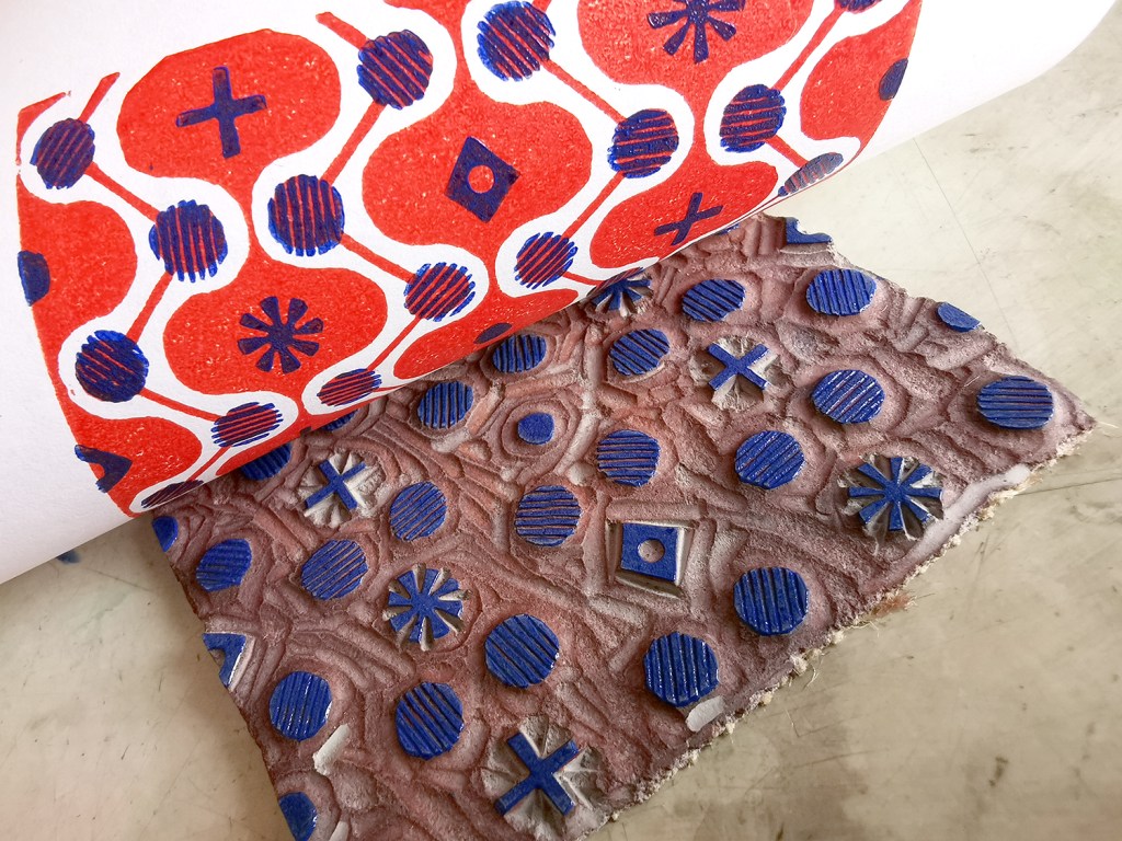
adding the second colour, blue

I often test prints in different colour combinations, as I have done here, below.

alternative colourway

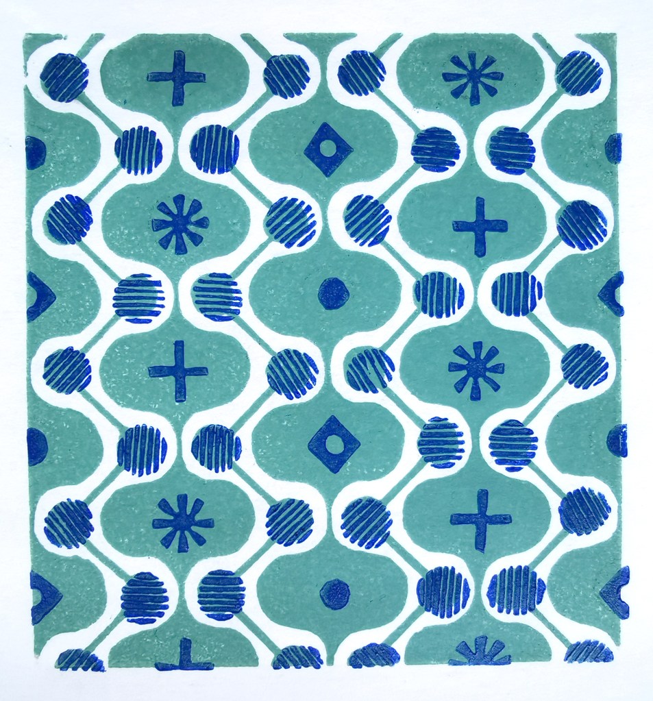
It is a natural desire for a pattern designer to want to test the repeat so you can see a digital outcome below too. I decided to test the two colours as two tones of green for some reason. It has a vague hint of avocado bathrooms of the 1970s now!

digital repeat of the lino printed tile

Unknown to me at that time, I had a further hospital stay and recovery a few months on, and so the collection of patterns grew once more, as my healing and self-prescribed occupational therapy – a career I had once considered!

I’ve had little time to revisit this collection since my recovery but I hope one day soon I will. I’m not sure where this design and its siblings will venture next … any suggestions?

summer colour palettes

Colour inspires me. I love to work with colours; creating pairings and partnerships of colour to build reactions between them, evoking moods and setting a spirit through colour choices. I notice colour relationships every day, and enjoy considering why certain colours thrive alongside others. I love to wear colours too, and like to contrast materials as well as colour to create interesting relationships. I do worry if I find myself in brown trousers and a green top – I don’t want to look like a tree!

Over the last eighteen months I’ve spent time mixing colour using gouache paints, matching colours perfectly with items collected from walks. Little collections of seaweed, shells, catkins, feathers and leaves have sat patiently in the studio while I mix and match. I’m good at matching colours and would be perfectly happy spending hours a week doing just that.

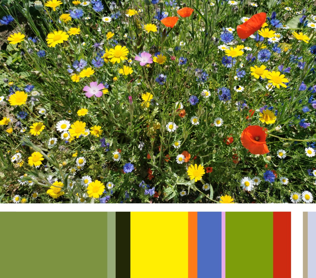
I also enjoy creating colour palettes, sometimes for projects, or my teaching sessions, and sometimes just because what I see around me suggests a perfect palette to explore and create. Our garden has been a bit of a project over the last two years and this summer the new borders are filled with colour that bring such joy to me. My mood is lifted when I see colours working together well. Here are two results from a photograph taken in the garden earlier this month, just because the splashes of colour were pleasing enough to capture.

I like the dominant green that provides the backdrop for the brighter colour accents, and the shapes of the flowers are like splashes of colour dropped in to the soothing green. The pink, red and orange provide the warmth, while the blues are calming and restful. The depths of the border at the bottom of the flower stems are dark, no doubt cool away from the summer sun.

I decided to explore the role proportions of colour play in a palette in the second image. The width of each colour stripe is representative of the area it covers in the image. Back in 1994 this was one of the summer projects I was tasked with as I started my degree in textile design – and all these years on I still enjoy doing it! You can see how the colours perform when dominant, or work as accent colours in thin slithers. There are always main characters and supporting roles in a palette, but it takes all sorts to put on a performance!

When selecting the colours in the image for the palette I worked with the larger areas of colour first, then looked to see how the colours had natural partners to sit next to in the stripe. The accent colours grab the attention of my eyes. Both images reflect the same colour palette, but present themselves quite differently.

drawing on the landscape

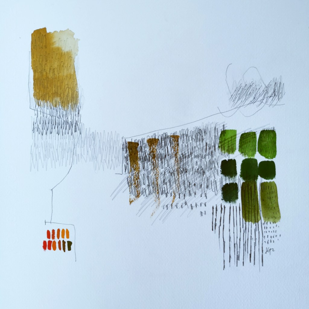
I’m sure I’ve written about it before, but I’m often intrigued how an idea can rattle about in my head for years, exist as drawings or collages, but not quite feel right… then manifest in a way that makes those years of waiting make sense. I’ve recently created a sequence of three drawings that appear to have done just that.

Drawing is a key creative process for me. I don’t always find as much time as I’d like but I draw to capture the beauty of a flower, or the shape of a field, and often have no planned use for the image; the drawing exists for itself. Over the years I can see drawings are linked by a longer-term inquiry, and these single elements collectively define the aesthetic of my practice.

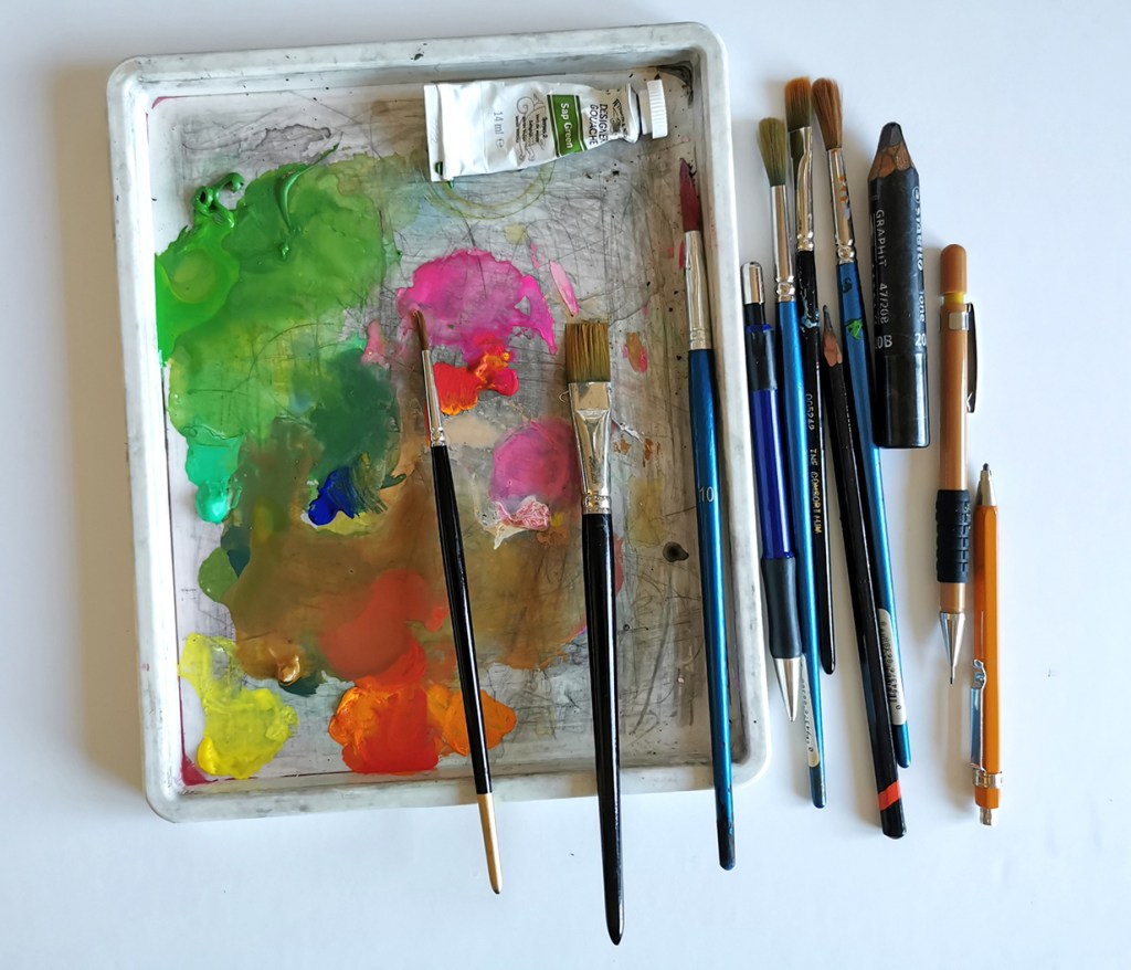
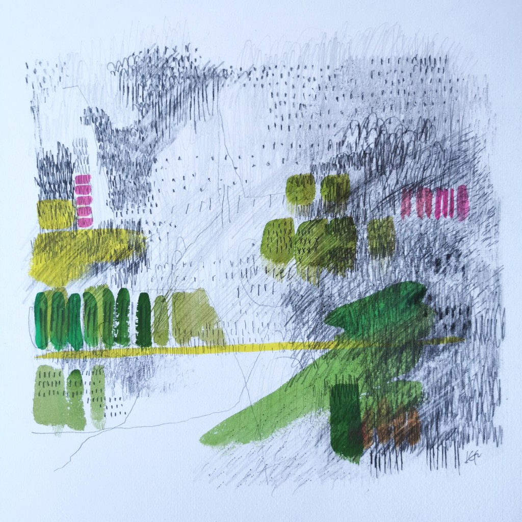
I’ve been working on some new landscape-inspired drawings, bringing together some colour mixing and the monochrome marks, rhythms and textures relating to the Norfolk landscape. I began with a journey through the drawers of my plan chest to pull together a dictionary of visual language to guide me, and following a cycle ride in the landscape I took pencil in hand, and began to draw. Painting features very little in my practice, really only for colour-mixing but this time it felt right to capture the colour in gouache and apply directly with brushes on to the paper, layered up with the graphite of the drawing.

These drawings are part of the ongoing journey, but I do think it’s important to stop and notice when something feels right, like a good fitting piece of jigsaw in the puzzle.