posted pattern

As those nearest to me know too well I am something of a collector, and regular readers of this blog will have been rewarded for their time, by being lucky enough to read of some of those precious collections.

As printed pattern is my thing it’s not a surprise this collection is all about pattern, but I also have a thing for post, and stationery, and graphic / lined paper, so this collection is really a celebration of many things.
kfarley_envelopeinsides1

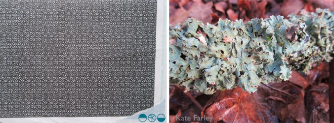
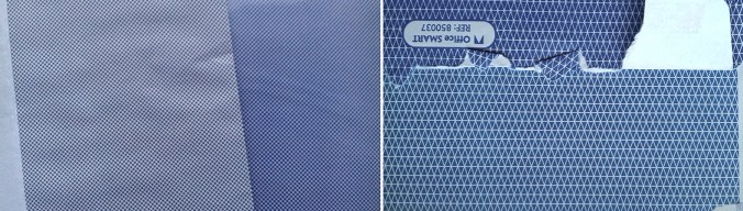
So when did it become a collection? I remember collecting – I’m not so keen on the word hoarding! – when I was an undergrad textile design student as I made lots of collages using the inside of envelopes as visual noise. I also read something about Matisse saying that drawn and printed patterns were rhythms, as if textures in his work – I think in relation to his Jazz collages, and I completely agreed, sat there on the college library floor making sense of what I had been doing in my sketchbook and being excited at the verification. I worked for Royal Mail in the sorting office in both Norwich and Leeds during my college holidays and I was fascinated by the thousands of envelopes I saw each night shift, making their way across the world, from the sorting frames we sat at. I still have a fairly impressive memory for postcodes as a result of this time twenty years ago! I also realised at that time that if you didn’t pay your BT bill on time they sent the red reminder, and that envelope had the same criss-cross pattern but printed in red – I have a few of those. So this collection started two decades ago!

What is it about the envelope insides? I like the idea that the feature is hidden; a discreet treasure tucked away rather like an exciting lining in a suit pocket. Some of these patterns are busy performing a task that may go unnoticed. Particularly with pay-slips with number-related graphic rhythms, the patterns act in a similar way to patterns of the dazzle ships: distorting, obstructing or distracting from reality.

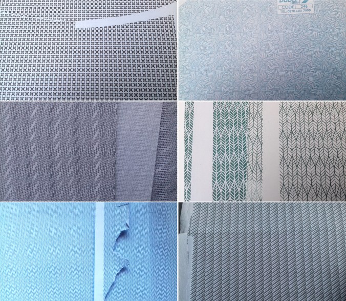
The inside of envelopes are not the most popular context designers dream of but despite the inconspicuous nature of the envelope interior, even if it’s lucky enough to have a window, I like the fact that someone somewhere was commissioned to design a pattern for the humble envelope. Some of the patterns are fabulous examples of micro prints and I can be partial to those tightly repeating and often graphic rhythms. The colours are rather limited to blue, a rather institutional hue, but there are greys, greens and of course the red of the debt reminder.

Having moved boxes of this archive around the country to various addresses I have lived at I formalised the collection in to sections in lever-arch files, including variations of colour and scale, with another box I’m prepared to sacrifice to collage. Over the last few years, and with a clearer idea of what design, and specifically pattern interests me I’m really proud of the collection. Brick patterns feature, as well as checks, the ones with numbers and the few flowing, more organic ones. Some feature company logos, there are envelope graphics and the beautiful and no-messing dots. Some people still send me ones to add to the collection, and I do still keep an eye out, but sadly there are fewer new ones being added. These days I can appreciate a beautiful pattern but if I have some already (note: obviously I need more than one sample of each!) I can even get them in to the recycling bag! … only to be discovered by the next generation of collage makers in the family, and it comes back out as treasure to someone else. Oh well!

If you want to see more, or share your envelope treasures head to instagram and use #envelopeinsides
kfarley_envelopeinsides2


threads of an idea

It’s perfectly normal for me to begin a project by looking back at work I have made but not quite resolved. I keep sketchbooks of ideas and samples of constructions that will never see the light of day but somewhere among the pages there will be inklings of ideas that appear to connect and weave in to something right for now.

I wanted to get back to printing so I took the opportunity to explore a number of processes, including mono printing and lino printing to explore line qualities I’d sampled before, and soon I was back on the idea of woven yarns, linking my construct collection launched in 2015. This was a collection inspired by woven cloth, with drawings using hand-made tools dipped in ink that were used to create a series of repeating patterns I went on to collaborate with Formica with. I wanted to challenge the abundance of ‘faux’ material surfaces on the market, digitally printed wood-effect pattern, for example. Ideas were still left open…

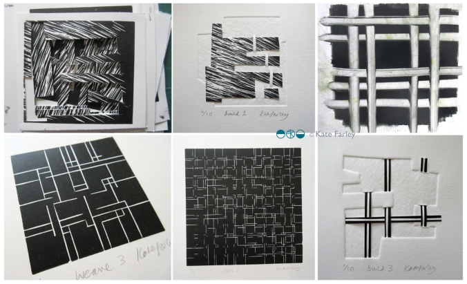
Running in parallel to this has been a long term paper project I have been toying with since about 2002; paper constructions that explore the depth of space beyond the page, a sculpture, but also a book. The build series grew to explore woven space of over and under. You can see some of the pieces below.

threads_devpaper1200
I see the threads collection as an extension to construct, but is equally quite able to stand on it’s own. I have produced several editions of prints and paper constructions that led to where I have come and I enjoyed printing in Payne’s Grey to not be distracted by colour.  All of a sudden I’m working with clear, colourless window film – it all makes sense. I am delighted to have worked with The Window Film Company to develop the patterns for windows. They have been an amazing company to work with. Cheerful, prompt, generous and supportive in all aspects of working with the team – a big thanks to you guys!

I was also pleased to return to laminate and Formica to enable bespoke production and am delighted with the results. I’m enjoying working on designs for harder surfaces but I still can’t help but sample other materials, so the collection I shall show at London Design Festival includes a new rug sample, screen printed cloth, and hand-made notebooks featuring patterns from the collection as well as vinyl and laminate.
If you are visiting London Design Festival I hope you will come and say hello at Tent at London Design Fair. Hall T1 stand G18

threads_products_blog1200

Modernist patterns in the making

Over the last few months, actually for most of this year, I’ve been working on a commission with the Barbican Centre London to create bespoke patterns for products in their newly developed retail space, ready to launch in the Autumn. It’s been a fabulous project as I’ve developed the designs with plenty of dialogue with Head of Retail, Adam Thow, to-ing & fro-ing by email. The brief has altered only slightly since the beginning and I feel really proud of what we’ve produced. There’s a more detailed interview about the project over on their blog.

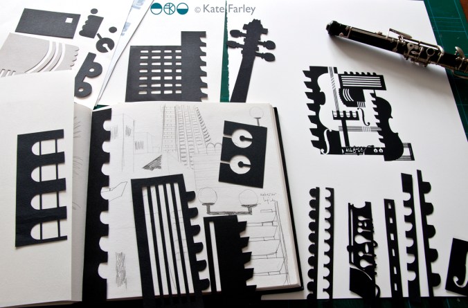
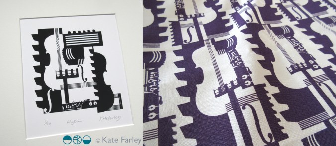
The idea was to explore the Barbican Centre, famous for its architecture, but to also include its activities as a cultural centre of music and performance. I explored lots of ideas and pattern compositions but settled on the idea of a sheet of music, and ended bottom right with the bold double bar lines. Within the patterns I referred to musical notation, and made links between the architectural features and those of instruments, including a violin and oboe, to create a sense of narrative, playing with strong negative and positive shapes. Each of the motifs were hand cut in paper, scanned in, and combined using Adobe Photoshop.

KF_Barbican_print_paperBLOG

Last week we shared the first images of the design work so I thought I’d share here too. The images here show my developmental design work above, and the final limited edition screen print and pattern for products. Visit @barbicancentre on instagram for more final product shots.

KateFarley_BarbicanPRINTPATTERN1200


Save

pattern prints

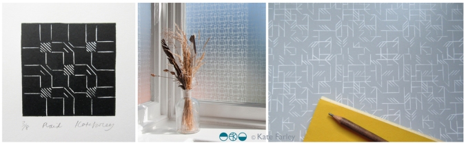
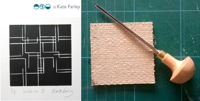
I’ve been working behind the scenes, offline at least, making new prints, mainly lino prints, and developing repeat patterns with them. I’ve not wanted to show the progress until I’ve worked out where I’m going with them, but finally I’ve decided to go public, in a small way, revealing one of the new prints, hinting at the direction my new patterns are going in…

KateFarley_weave2

I’m exhibiting at TentLondon again in September so between now and then I’ll show more on instagram, Twitter, Facebook and here on my blog.

seeing things

I’ve been giving a lot of thought to the idea of looking and seeing, and particularly how we evidence what we have seen. I have boxes of photographic prints of things I’ve seen: cracks in pavements, postboxes around the country, vapour trails in the sky, flowers I’ve grown and plants I wish I’d grown – and much more. When the world turned digital I stopped filling real boxes and filled virtual boxes, and some I look back at, but rarely do I touch the surface of the sights I have collected.

The engagement in social media, and the sharing of pictures begs me to think again about why we take pictures, and why we share them. As I spend most of my time in some sort of real or virtual context of people in the creative industries my Twitter and Instagram feeds are heavily laden with considerately photographed shadows of railings, colour combinations of socks on patterned tiles, recently obtained vintage finds, and dare I say it, beautiful breakfasts! Not only are we collecting imagery, we are proving that we are seeing and experiencing interesting / beautiful / different things and places, judged by us and hopefully ‘liked’ by others. Yes it’s marketing; a branding tool to evidence our aesthetic judgements.

KateFarley_seeing things_detail

Some questions then, are we seeing more? Do we notice more, and appreciate more?

It does seem as if there have always been people who see faces in clouds, and beauty in peeling paint, but I wonder if social media is driving us to become a load of aesthetes. In my world it may seem that way.

As a pattern maker I’m always on the lookout for eye-candy, and usually of the ‘just happened to be there’ kind of pattern, rather than a designed pattern – having said that, I’m equally likely to be stopped in my tracks by a well-designed wallpaper. There have been many books over the years, and more recently blogs that feature the beauty in the overlooked, or the ugly, or the mundane. The desire to collate / curate these sights are no more in evidence than in the world of Patternity a design-savyy duo with a manifesto about pattern! Their stunning website and book and interesting collaborations are clearly tapping in to this moment of ‘seeing’. Check them out if you are so far unaware.

KateFarley_seeing things_stripes

Pattern really is everywhere, formally and informally and that’s the pleasure. I remember the day I was taught the mysteries of repeat pattern making, and that evening in a pub in Great Yarmouth, Norfolk, I took great pride in identifying the repeat ’tiles’ in the carpet, wallpaper and curtains of the glorious / hideous 1990s pub decor.

I had the pleasure to spend time with the fabulous Sarah Campbell last month, and much of our conversation, as we were at New Designers, was about pattern making; why we do it, how we do it, and getting people to pay for us to do it. During the conversation Sarah spotted a lady beside us in a polka dot blouse, and we noted that pattern-makers never really switch off from pattern spotting (pun intended!), pattern making, and pattern appreciating. When we departed we both commented that we look forward to reading each others next blog post – well here you are, this one is for you Sarah – it was a pleasure to see pattern with you!

textile fragments

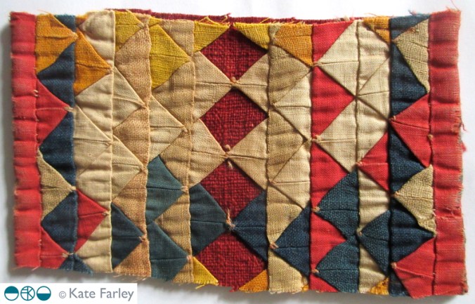
I have this textile ‘fragment’ that I think is beautiful in so many ways; the richness of colour, the manipulated folds of cloth as well as the resulting patterns of the geometric shapes of both the positive and negative folds of the fabric. There is aside to this, so much more connecting me to this old piece of cloth I acquired over twenty years ago, and when I see it, those thoughts come back to me in an instant. This is the power such materials and objects have over us.

I studied at art school, and although the main campus was in Norwich, I was at an outpost in Great Yarmouth. I loved being by the sea, and it was my first time away from home so it was a huge learning curve and time of growing up. I was learning textile and drawing skills and I have fond memories of it all. One day we had a visitor, a lady who had traveled the world collecting textiles, and she brought some of these to show us at the college. I had been interested in the Ghanaian flags of the Asafo, as well as Indian applique so I was fascinated to hear her talk and see the textiles from far-off lands.

KFarley_horsestrap_textile_web

Sadly excitement became upset as the textile pieces were laid out in front of us. I wonder now if I was the only one thinking what I was. When I saw the exquisite fabrics cut in to pieces and crudely stapled to paper with pencil written details of where they had come from I felt so concerned for the apparent brutal way they were being separated from the original whole, their link to their heritage and provenance. It occurred to me then that other nations were losing the heritage that they owned, as the fabrics became souvenirs for others. Had someone chosen to sell them; were they ‘acquired’?

That day holds further sad memories in actual fact. My dear Grandma had died that weekend, and I really wasn’t coping too well away from home, but I got through the day and decided to buy a piece of cloth from the lady as a way of treating my sorry self. I felt torn by the decision to buy it. Would my purchase make sure it was kept safe, or encourage more sourcing of cloth from across the globe? My piece states ‘fragment’ in its description and yet is has clearly been cut from a larger cloth. ‘Fragment’ suggests to me a museum piece, a fragment of history, a clue of a larger object salvaged from ruin rather than proactively separated from its other parts to form the sum – a folded patchwork Kathiawari horse strap from India.

The colours have altered over the years since its time of making no doubt, and the fabric has become worn too. I removed the rusty staples in an act of care and conservation. I also taught myself how to create the folds and layers of fabrics to understand, through making, the construction process. The piece inspired a fabric manipulation project during my time in Great Yarmouth – mostly lost to history and probably for the best! My fabric samples are nothing in comparison to my ‘original’ fragment. The pieces I made lack the authenticity, the ageing, the integrity of originality, but they too serve to remind me of the value of heritage, of belonging and remembering.

With so much talk in the media at the moment of cultural looting across the world both past and present, I am again reminded of this piece of cloth, its heritage and place in the world. The fabric also distinctively reminds me of the loss of my grandma at that time, and yet isn’t it strange that a piece of Kathiawari cloth – not any piece, ONLY this piece, can act as a token of a memory of my Grandma who as far as I know, had no connections with India?!

passing on pattern passion

In my role of academic as well as a designer I am regularly required to enthuse about print and pattern, and to be honest that’s fine, as I love designing and teaching pattern for print. This last week has seen me out and about to pass on my passion for pattern, firstly to Wolverhampton Embroiderers’ Guild where I was invited to talk about my practice. It’s always interesting having to consider what bit of the last twenty years to focus on, requiring reflection and evaluation, and how to tell the most relevant story without missing the bits that might be the most informative to others even if they didn’t seem so to me when living them. The audience were really generous with praise, and were really interested in my creative process, so sharing my sketchbooks, and anecdotes felt very easy to such an interested group of makers.

Tuesday saw me overseeing a morning of filming at Birmingham City University (BCU) with Laurence Llewelyn-Bowen and TV crew, working with our third years and our fabulous Print Technician. It was a morning of celebrating the Arts and Crafts legacy, William Morris in particular, and the importance of understanding the value of drawing to the process of pattern making. It was a pleasure promoting our talented third years, in the closing stages of their time with us.

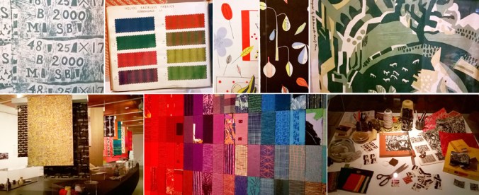
This leads me to yesterday when I and a colleague took a coach of second year Textile Design degree students to Manchester, specifically the Whitworth Art Gallery to see several exhibitions. On walking in to the first gallery and the exhibition ‘Revolutionary Textiles 1910-1939′ I noticed a number of pieces that I had featured in my Historical Textiles lectures when I had taught this group of students as first years, including Barron & Larcher, Josef Hillebrand and Omega Workshops. It was fabulous to see the students’ excitement on recognising patterns and names of designers that had, until then remained theoretical, and not ‘actually real’. Their knowledge meant something tangible, and I think was empowering to them. It was an honour to share that excitement of learning, and understanding.

Having worked on the Tibor Reich show at BCU it was great to be reunited with the collection, also on show at the Whitworth, and to see the different emphasis this exhibition made to an amazing and extensive archive owned by the family. The students really responded to the way Tibor worked to create pattern, and explored pattern through drawing with layers of colour and line. I couldn’t help but point out Tibor’s excellent use of a sketchbook to explore ideas.

Image below: top row from Revolutionary Textiles, bottom row Tibor Reich

KFarley_whitworth_May16_100

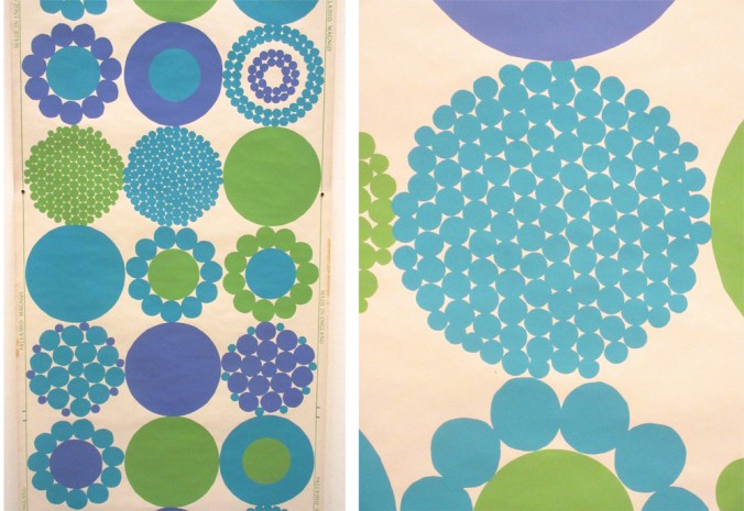
The room that wowed me most was the wallpaper gallery upstairs, and again, this exhibition was exciting and inspiring to the students, leading to some really interesting conversations. There is of course no comparison between seeing metres of wallpaper stretching skywards, to a small screen of Google images. We talked about print production, the scale of motifs useful to a domestic space rather than in relation to a sketchbook page, and why thinking big should be embraced. We admired the Lucienne Day patterns that are so familiar to us, alongside new discoveries, and that is why a curated exhibition, unlike an online search can be so beneficial; the selection provides context. I encouraged the students to question how they would make the marks, the shapes and patterns without computers, and why the variation of hand-made can offer something that digital software excludes. I include an example below to illustrate my point – beauty in the irregular.

KFarley_PalladioMagnus_blog

We did have time to enjoy the beautiful surroundings of the cafe but also took in a quick trip to see the newly opened Fashion & Freedom exhibition at Manchester City Art Gallery, one I really do recommend too.

So, more pattern inspiration for me, and hopefully some more people inspired by pattern too…

building / constructing / space / paper

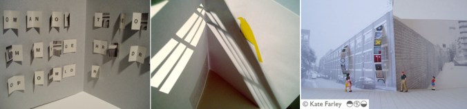
I’ve been working on a new series of works on paper that have evolved from paper cutouts and manipulations I first created over ten years ago. Back then I was experimenting with sculptural paper engineering that aimed to convey meaning through the structural content as well as the printed image. This may sound very much like ‘bookart’ talk, and it is really, as I moved from artists book maker to something different, including public artist and surface pattern designer, see below.

KFpaper_structure1000blog

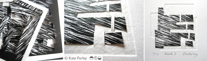
It’s a strange thing when ideas that had seemed so disparate appear to come together to form a ‘whole’ different idea – and feels right. I’m sharing the first of many new prints evolving along these lines here.

As a result of my design collection ‘construct’ I launched last year I’ve explored the idea of woven threads and constructed surfaces. This led me to explore the space and environment of a page, a sheet of paper, and what could constitute the printed page. I used embossing to create a sense of space and depth, and slotted the ‘print’ to the paper as if floating. I am keeping the ink a neutral Payne’s grey so it doesn’t conflict or distract from the structure. I explored several different printed patterns too, and this, a lino print provided me with sufficient visual noise, but allows the embossing to be seen too.

KF_build_blog1000

So, what do you think? Does it make sense? I’m looking forward to exploring this further over the next few months.

How will these pieces link to the work I shall make in another ten years?

looks are deceiving: truth in pattern

As a student at art college I was taught the principles and beliefs of great artists, designers and theorists such as William Morris and John Ruskin, and mantras of the founders of De Stijl and the Bauhaus. As a designer myself I haven’t set out to follow any particular philosophy or approach but have developed my ethos over the last two decades as I experience diverse design contexts, clients, markets, technology and changing industry. Also, in my role as an academic at Birmingham City University delivering lectures on wide ranging art and design contexts in relation to textile design, social change and global influences I have learned considerably more and this has led to me further considering my own approach and philosophy as a designer.

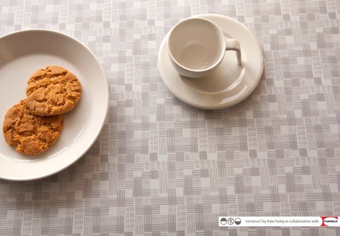
My ‘construct‘ collection was developed as a response to my loathing of ‘fake’ surfaces, and the ever-growing interiors market of printed patterns of wood, stone and other natural materials, copied at ever-higher resolutions on a vast array of substrates. Is it possible to have printed stone effect on wood yet? Why would I want a copy, an imitation rather than the real thing, and would it be right to desire marble in an Edwardian semi in the Midlands of England? In my new ‘construct’ collection I’ve played with this idea by making printed pattern inspired by constructed cloth, not copying directly from the woven threads but evoking a sense of them.

As a pattern designer I spend time considering potential surfaces and contexts that pattern may exist and this leads me to the conclusion that if we stopped using copies of materials as pattern on surfaces we could find space for far more inventive, creative and exciting patterns in our world. I believe that if the material you have is not wood, why don’t you consider alternative patterns, entirely suitable, without relying on copying natural materials. I can’t decide who is providing for who here. Do consumers want fake, or do they have to buy fake because there is little else out there? (btw: If you need laminate with beautiful patterns don’t forget to consider my ‘construct’ range in collaboration with Formica!)

KFarley_construct_grid_logosWEB

The approach to honesty and truth to materials was one of many key philosophies for Augustus Pugin, known for his commitment to the Gothic revival in the 19th century and his design work on the Palace of Westminster as well as St.Chads Cathedral in Birmingham. He considered the neoclassical fashion for painting any surface to look like marble as deceitful, and wholly incorrect. He favoured flat, stylised pattern too, so as not to deceive the viewer,  designing many patterns for tiles, wallpapers and textiles for the buildings he also designed.

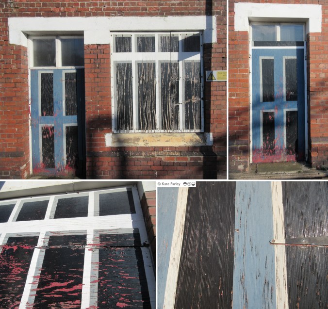
This week I was up in the Potteries for a meeting, and as with hourly trains, I’d just missed one so I spent 50+ minutes waiting in very low temperatures at Longport station near Stoke on Trent. Noticing my surroundings I was tickled to identify the ‘mock’ nature of the station building. All the doors and windows on the platform side have been boarded up and painted to look like… doors and windows. I assume this is some sort of security measure. As the paint has started to peel it revealed the deceit below. This sight is the cause of this blog post. I wonder what Pugin would have thought?

longport_kfweb

Visual proverbs – in Ghana and Cheltenham!

As a young student in the 1990s I became aware of the amazing Asafo flags of the Fante, from Ghana. I’d seen an article in a magazine in the college library about an exhibition on at the time, and unable to afford the trip to London I telephoned Peter Adler, curator of the exhibition, as his number was listed in the article, to share my enthusiasm. I’m not sure what I thought I’d achieve but we did have a conversation and I was inspired to find out more about the colourful appliqued flags.

asafo_flags_croc100

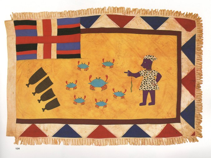
What struck me about the flags was the bold shapes of animals and people that were communicating warnings to other units of warriors of the Fante people. Proverbs such as ‘The crab is feared for its claws’, or ‘Fish grow fat for the benefit of the crocodile’ attempt to ridicule the rival warrior groups and set a tone of fear, as if toying with opponents. With influence from the European flags they had seen as adventurers explored West African coastlines and from international trading ships the flags also featured elements of geometric borders and the Union Jack. I like the stylised imagery, but particularly the visual communication of a story in one textile image. I remember I wrote an essay on the subject for a Contextual Studies assignment and I went to great lengths to dye fabric and create my own textile illustrations and book cover – I still have it somewhere.

I’ve shared images of the flags with many groups of students over the years, but as I write a research paper on the subject of visual communication in pattern I am once again reminded of these beauties, and back I go, to the wonderful book: Asafo! African Flags of the Fante, written by Peter Adler and Nicholas Barnard in 1992, published by Thames and Hudson. I recommend this really informative book.

asafo_bookcover100

asafoflags_crabs100

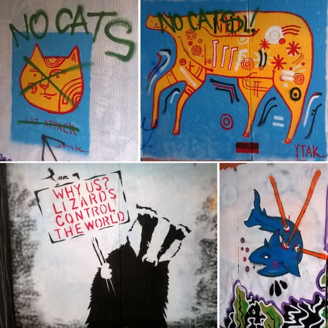
When walking from Cheltenham railway station to the town the other week along the off-road path I came across some graffiti in an underpass that reminded me of the flags, and particularly in the way the animals were used to goad. The images felt as if they were provoking and taunting rival groups by showing off their prowess in the way the artwork of the Asafo flags did. I could imagine the jibes represented in the images of the cats, and in the way the badger is attempting to deflect the attention away from his kind, to the lizards, maybe another urban tribe. I’ll share the images here.

CheltenhamGraffiti150images:

Asafo flags, scans of the pages from the book by Peter Adler & Nicholas Barnard, referenced in the text

Cheltenham graffiti, photograph by Kate Farley