A change of background colour

It’s the holiday season and we’ve been taking part. A camping trip to the Lake District offered a dramatic difference to the usual scenery we live within here in the Midlands, and it was refreshing change for being so. Everywhere seemed so green, really really green, not just the local park green but intense, vivid greens that lush meadows could offer. Naturally with that comes rain, but even then the colours were vibrant. Lichen was glowing, moss saturated, even the sheep were blue! Some colours took me back to studio projects, Pantone references, British Standard colours and colour choices, others offered a welcome diversion.The strange thing is, that when I compiled the image to include with this post the images looked really grey, but it really wasn’t like that through my eyes!

This change of scene is just what the mind needed after an intense workload juggling several design projects and at the end of a hectic academic year. I like what the seasons do to us, make us adapt and notice the time passing. This time of year feels like a celebration, as harvests ripen in the sun (ummm..) and we prepare for a new season of productive design work, education and research.

I shall remember the vivid greens, the birds circling overhead in the sky of blue; the vast views that some people get to enjoy day in day out. I shall remember the feeling of change, and rest, and stopping just for a short while, as a warm memory in the depths of winter when working in the studio. I am bound by the academic year, as well as the seasons on the allotment, the trade show calendar, and birthdays, as so many people are. It’s good to recognise the rhythms and differences brought on by change. Hooray for holidays!
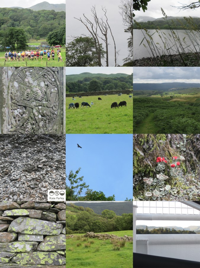
KFarley_lakes_blogpics_web

redesigning the ‘brand’ self

I’ve been out in the ‘real world’ so to speak for nearly twenty years, and while I found that such a scary idea during my time at art college, having little idea of what I really wanted to do, now I realise it’s okay.  I look back and remember so many exciting things that I’ve been up to and so many great people I’ve worked with that I am grateful for living the portfolio career in art and design.

I made the choice to lead an academic career alongside my own practice and both really support each other. I am sharing and honest in my own learning experiences from industry working across art and design contexts. The students’ creative journeys also inspire the creative investigation in me. We talk of ‘branding’ and ‘professional identities’ in the Second year that I am currently leading in the Textile Design degree course at Birmingham City University, and consider how we and others see us and what we can control and what others interpret. I’m not a corporation or multinational company and yet the word ‘brand’ is commonly used for the self-employed too. Language used in promotional material as well as social media build a story, whether we like the tale or not. Does my design integrity come across? what about my inspiration? is the market level clear?…

I’ve been redesigning my website over the last few months. This is always an opportunity to ask myself more questions, and to reflect on where I’ve come from, where I’ve been and where I plan to go within the world of design, and specifically pattern. I’ve been excited by the process. I’ve chosen headings / page titles that more accurately reflect my current practice and edited substantial information relating to projects of years gone by. I’ve made it more image-based and updated text, again to reflect the shift in my design practice interests. With social media being a really key part of building a ‘brand’ these days this process has been happening as I go, but I’ve finally embraced instagram, having enjoyed Twitter over the last three years.

So, for all the bookbinding workshops I’ve led, the public consultation exercises I’ve participated in, the colours and materials I’ve sourced, the flowers I’ve drawn and the prints that I’ve pulled, this is where I’m at now…

katefarley.co.uk

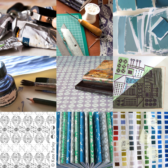
KFarley_making_blogcut

pattern at the pitch, up and down

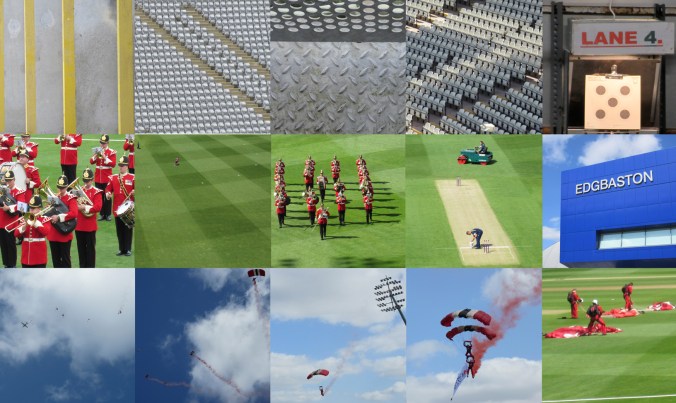
Despite having lived in Headingley, Oval and near Edgbaston I’m not a great fan of cricket but today I spent a number of hours at Edgbaston, the home of Warwickshire County Cricket Club as they hosted a charity community day. The highlight for me was the arrival of the Red Devils, from the skies in the most fantastic spectacle, bringing the ball for the 20-20 match. The marching band looked fabulous in red to the complimentary green of the grass and I also discovered I have a skill in rifle shooting, so there you go, a surprising day.

I gathered lots of images of patterns too. Here’s the day in grey, green & blue pictures…

edgbaston_com_day_100riflecard_100

floral inspiration for textile patterns

One of the reasons I love to teach students drawing for textile design is the journey of enlightenment when introducing someone to the world of not only looking, but also of seeing. There are many ways to see when drawing and I’m really interested in the journey from reality to abstraction, whether its a state of mind, a way of transforming or whether it’s a methodical process applied to something in order to arrive at a motif for pattern.

My drawing process has evolved over years of practice but the way that I see is not so different to two decades ago. I remember reading the book ‘Drawing with the Right Side of your Brain’ by Betty Edwards and realising that I already did that and it all made sense. I enjoy playing with perspective, elevation, mapping of whatever it is I’m drawing, whether it’s a landscape or twig. Turning the three-dimensional thing in front of my eyes in to a two-dimensional drawing is always exciting, and challenging, but that’s half the fun. I think the process of printmaking that I further translate my drawings to really suit the clarity of motif dissection, separating colours or specific details on separate blocks or screens for printing for either a limited edition print or commercial textile design.

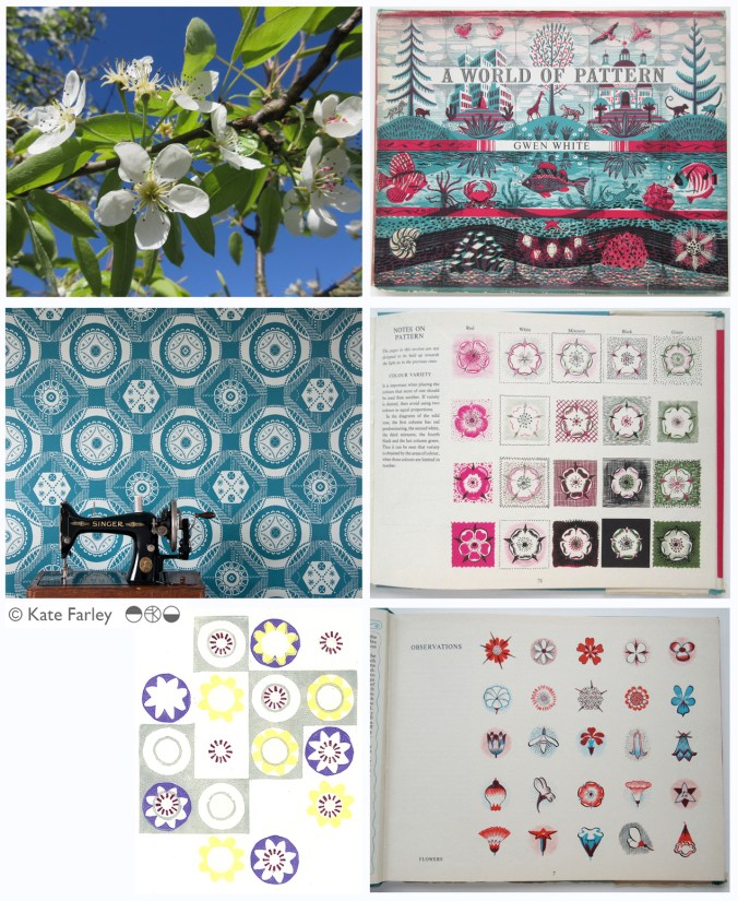
Each year the pear blossom at the allotment arrives and each year I’m reminded of how perfect they are in all ways. The beautiful petals and the bits I don’t know the names of, all there, waiting to be celebrated in drawing. No doubt Charles Rennie Mackintosh would have made an exquisite watercolour and graphite study. The flowers also remind me of drawings and prints I have made in the past, and not only of blossom, but of flowers that I make diagrammatic in a way to understand and explain the ingredients of the flower. When I discovered the work of Gwen White, and particularly the book ‘A World of Pattern’ I was excited to see someone else communicating what I see and how I translate form to pattern. This method doesn’t suite everybody and it would be a dull world if we all made drawings that looked the same, but every now and then it’s nice to know that my creative brain works like someone else’s brain and that my eyes see what others have seen before me.

KFarley_drawing_blossom_blog

Pear blossom, photograph, Kate Farley

‘Hanbury’ wallpaper, Kate Farley

Passiflora, lino print, Kate Farley

illustrations from Gwen White’s ‘A World of Pattern’ (RH column)


Design inspirations 3: winning games

I have always felt that one’s upbringing has a huge influence over the aesthetics of that designer. The house, the landscape, the products and fabrics that are present in the early years; everyday things, that at the time may not have been seen as important then can be blamed or celebrated in the later career of artists and designers. No doubt plenty of people would disagree with me, that’s not the point. I can clearly see a link between my own aesthetic, and my upbringing, and I’ve written about it in the past- read here  &  read here

On a trip back to the family home in Norfolk I came across the old games we used to play and was mentally transported back years before, simply by seeing the beautiful graphic qualities, clean lines and visual communication that I hold dear in my own practice. My visual language doesn’t necessarily mimic those designs but it’s more of an approach, a set of values & expectations that I set myself. We can expect things to be very different in the future with such digital aesthetics taking firm hold of so much of every day lives for my children and those of tomorrow. From how we create art and design, to how we view it on screen as well as on fabrics and surfaces much is very different. It is not necessarily a criticism of today, but more an appreciation of the inspiration I had and continue to thrive by. I sincerely hope that there will be art and design education in place over the next few years which will inspire the future textile designers, setting the benchmark for beyond that.

Here’s some of the graphic wonders. Red is a very popular box colour and it’s worth noting that many of the games proudly state they were made in England. Pieces were metal, wooden, proper card, nicely printed and beautifully boxed… there, a bit of nostalgia too! It also might be worth noting that in the ‘careers’ game The Arts was kept firmly in the box while ecology, sports, politics and big business made it on to the cover of the box!

KateFarley_games_blog


light and dark, total eclipse

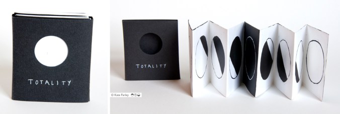
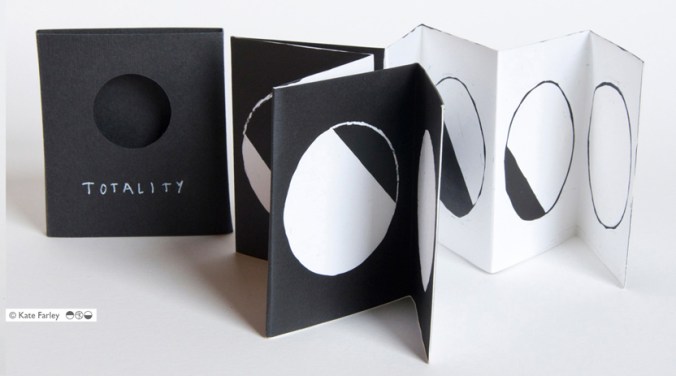
With the eclipse taking place this week, and the process of archiving lots of my old work also underway I’ve been reminded of an artists book I made to celebrate the solar eclipse that took place in 1999 as well as the total lunar eclipse that took place not long after. ‘Totality’ was made as a photogram, a photographic process blocking out areas of the light from an enlarger, on to a piece of light-sensitive paper. I made drawings of the stages of the eclipses as diagrams on to acetate using a chino-graph pencil that sat on top of a Kentmere photographic paper because it was able to fold without tearing or splitting the coating. It’s a great paper.

The process of the making of the images was completely in line with the concept of the book, blocking out light and revealing light. Light was the subject and medium – I like that simplicity. I had to work in the bathroom of my flat in Camberwell in the middle of the night hoping that the neighbour wouldn’t turn a light on which would shine in to the room and ruin the exposure of each sheet of paper. To make an edition of these books it was a production line of carefully timed stages, as I had to fold the sheets of photographic paper when damp for the cleanest fold in to the concertina structure. This was a project of problem solving but I really enjoyed it. The lunar eclipse is on one side and the solar eclipse is on the other. The slipcase included a cut-out circle in order for the reader to create the image of an eclipse when taking the book from the case. The book is pocket sized, as if it is a useful guide.

I have uncovered the last remaining few so get in touch if you are interested in buying one, £20 each, let me know by email in the first instance: kate@katefarley.co.uk

Enjoy the eclipse on Friday – don’t stare at the sun! I’ll be using a pinhole in paper and hoping for a cloudless day…

KateFarley_TOTALITY

KateFarley_Totality1

photographic memories and a bit of a political rant…

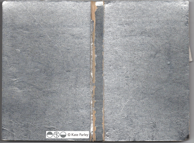
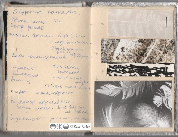
I’ve had rather a large sort through my creative archives in the last few days and I’ve been rediscovering drawings and designs from the last twenty years and more. I’ll share some of those finds another time. Amongst the formal sketchbook projects and portfolio sheets from art college days I found an old handmade notebook I used to record my photographic experiments and darkroom technical details / testing in. With it’s silver cover I chose to use, especially fitting with photographic techniques, I was reminded so distinctly of the days I spent in the dark room at Leeds College of Art and Design testing ways to create images and pattern – I could almost feel my Doc Martin boots on my feet!

silver photogrpahybookLCAD

The book reminds me of the hours I ‘played’ with creative and technical processes, with no sense of employ-ability issues burning, and I can’t really remember many project deadlines or talk of Learning Outcomes but assume there must have been. Those hours helped me to work out what I wanted to do, what sort of design language I would develop, and how my designs fit in the real world. Even now I can look back to that book and see creative sparks being established that have continue with me and what focuses my practice today. I feel lucky.

silverphotobookLCAD

It’s having this time to experiment and nurture creative ideas that all students at all stages of education need to have access to in order to understand the possibilities of aesthetics, innovation and design. This can’t be rushed and won’t be replaced if lost. It’s not just the artists and designers that lose out, its everyone! Maybe politicians who lack the understanding and foresight to retain sufficient art and design in formal education ought to consider how their material worlds came to be. It certainly isn’t all about money, even if it is beautifully designed and printed money!

This isn’t meant to be a rant, but somehow this luxury of creative time I remember having shouldn’t be considered a luxury, it’s a necessity, and my small silver notebook reminds me of the importance of learning time. We all need things designed and made, from the fork you eat with, to the car you might drive, and wouldn’t it be good if those things could be the best they could possibly be, and beautiful too, given half the chance! It’s no surprise to me that brilliant artists and designers don’t wake up one day, fully formed and ready for the off… It would be like a politician having had no time to live and work in the real world before becoming an expert on how to run the country for the rest of us.

the patterns of 2014

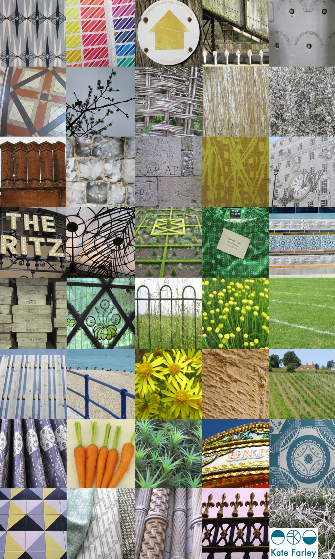
It’s been one of the years I shall remember as particularly busy, continuing to juggle the commitments of family life, my roles as artist, designer, lecturer and of course allotmenteer, and the small matter of a big Birthday. All the time spent doing any one of those things provided opportunities to spy inspiration, food for thought and visual stimuli for me so having looked back over the last twelve months I have enjoyed creating a record of the patterns I’ve seen. The record includes family holidays, research trips, and days out; from the school sports day track, Birthday celebrations, to the rivets in the railway bridge, the stately home and the walk to work, it’s a record of some of what I saw in 2014.

Key themes appear: geometry, stripes and railings and although in a chronological order, there are some great pairings in terms of colours, textures and pattern.

2014tiles_blog

a new starting line

I’ve spent more than two years developing designs and products in the ‘Plot to Plate‘ collection and was incredibly proud to show the collection, with the new ‘Hanbury’ wallpaper at TentLondon in the London Design Festival in September to a great reception. Allotments and kitchen gardens inspired the limited edition prints which inspired the patterns, British manufacturers make the products and I’ve documented much of this process here in the blog.

During this time I’ve also been working on really exciting projects that are at stages too early to share here, and I’ve created commercial print designs for clients in both interior and fashion sectors. Each of these briefs have been creative, with a variety of factors to balance, and most importantly with a client at the end of it. I enjoy juggling a range of projects, each one fulfilling my design drive, alongside my role as lecturer.

Now is the time to take stock of my own research practice again and take issue with ideas that have been germinating in the hinterland of my mind in relation to principle concerns in my design practice, which sit in harmony with my artistic and creative journey. It’s amazing how many threads of research and practice, when brought together make perfect sense, and reveal their value to me. Some discussions I had with visitors at TentLondon were opportunities to hear myself testing these notions, and so it is, back in the studio, with ink on a brush, ink on a roller and ink in the printer, I have started a new chapter, a new sketchbook and a new head-space.

It’s exciting, very daunting, and what drives me… I look forward to sharing this journey in the coming months, for now there is a glimpse…

KateFarley_startingLine

Plot to Plate archaeology

When I was a small child there was a time when I wanted to be an archaeologist. Having been lucky enough to have visited several Greek archaeological sites and been inspired by the possible finds underground I was convinced I had the patience and where-with-all to try. That particular career plan didn’t last long but something of the magic of unearthing lost treasures, and working through the soil of past generations has most certainly been re-awakened through my adult years of gardening – and beach-combing come to think of it!

Over the last few years I’ve represented this process of working with the soil and bearing witness to nature’s materials in many drawings and prints, working to represent layers of gardening, as if strata of dinner preparations. I like the continuum of being a gardener, as the current occupier and protector of a long line of gardeners, each winning and losing the battles of nature and harvests for generations.

As I have dug the plot for nearly a decade I’ve discovered many broken bits of pottery, and some I’ve kept and others I’ve turned back to the earth to be found again at a different time. With no rationale to what I have kept but having created little gatherings; pieces turned out from my gardening trouser pockets, I have realised I’ve started another collection. (check out www.obsessionistas.co.uk for two more of my collections)

I like to see the different surfaces, the whites, the blues, and the hints of familiar patterns. Why do people plant their broken plates? It’s certainly a different narrative to my Plot to Plate collection…

KFarleyplotPotsdrawing100ahttp://www.katefarley.co.uk