box of colour

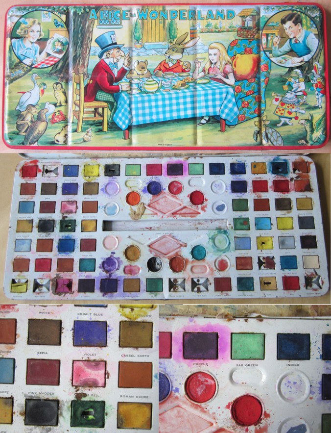
I was shown this wonderful Alice in Wonderland paint box that has been looked after for many years. It is so much nicer than much of the branded, TV themed products of today. I especially like the labeling of the names of the colours. Is sap really that green? I would have been a very happy child to have received a box of such size and potential. Note: Made in England!

alice_paintbox_web


Design inspirations 2: the natural world

Second in the series of ‘Design Inspirations’ blog entries…

The natural world has long been an inspiration for textile designers. Many years on from William Morris celebrating the natural world of flora and fauna as decoration for textiles we have had Laura Ashley, Marimekko and Orla Kiely, to only name three companies, who have interpreted the natural world and created stylised patterns and imagery which continue to inspire design students of today.

At times the worst thing as a lecturer of design we can hear from a student is that their project will be “about shells” and we dread the worst examples of static and bland studies which do little to explore the beauty and wonder of the natural world’s creations of form, structure, surface, pattern, colour and more, before approaching the bountiful concepts and metaphors in the ‘dot to dot’ of design processing hidden around the shell!

In my drawings I often aim to distil and to simplify a plant structure or shape of a flower in order to create motifs for prints and surface patterns, exploring perspective, diagrammatic language and relationships with place / context. I have a huge archive of drawings made on locations as well as boxes and bags of samples including plants, stones & leaves and one day they may well feature in designs. You never now what you might need! Going anywhere new, even for a holiday means that I keep my eyes open and often pockets filled as a result of finding new things.

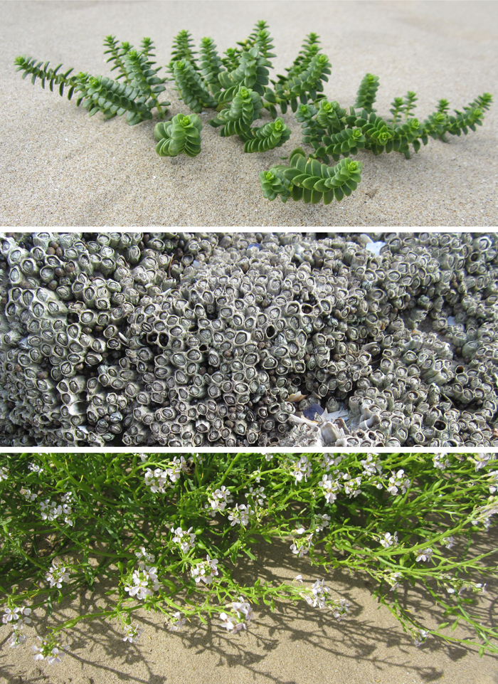
Having visited the Gower peninsula for one last summer camping trip I came across these examples of natural forms, which could and would create different visual interpretations in the hands of each creative prepared for the job. That is one reason why I like to play a part in design education; to facilitate the looking, seeing and interpreting, and it is certainly why I like to keep on collecting, and keep on drawing.


Image

Words of Walberswick, Suffolk

For some reason my first visit to Walberswick has been etched on my mind as a perfect summer holiday, long in length, filled with sunny days on the bridge crabbing, playing in the dunes, and on one day, huddling round a small, borrowed tv set to watch ‘The Royal Wedding’. This was in 1981, with memory’s thick rose-tinted spectacles on. I gather we stayed for a weekend!

Fast forward a few years and we have spent a fabulous week back in the small Suffolk, coastal village this summer, showing the next generation how to crab, and to play in the dunes, with no royal wedding to distract us.

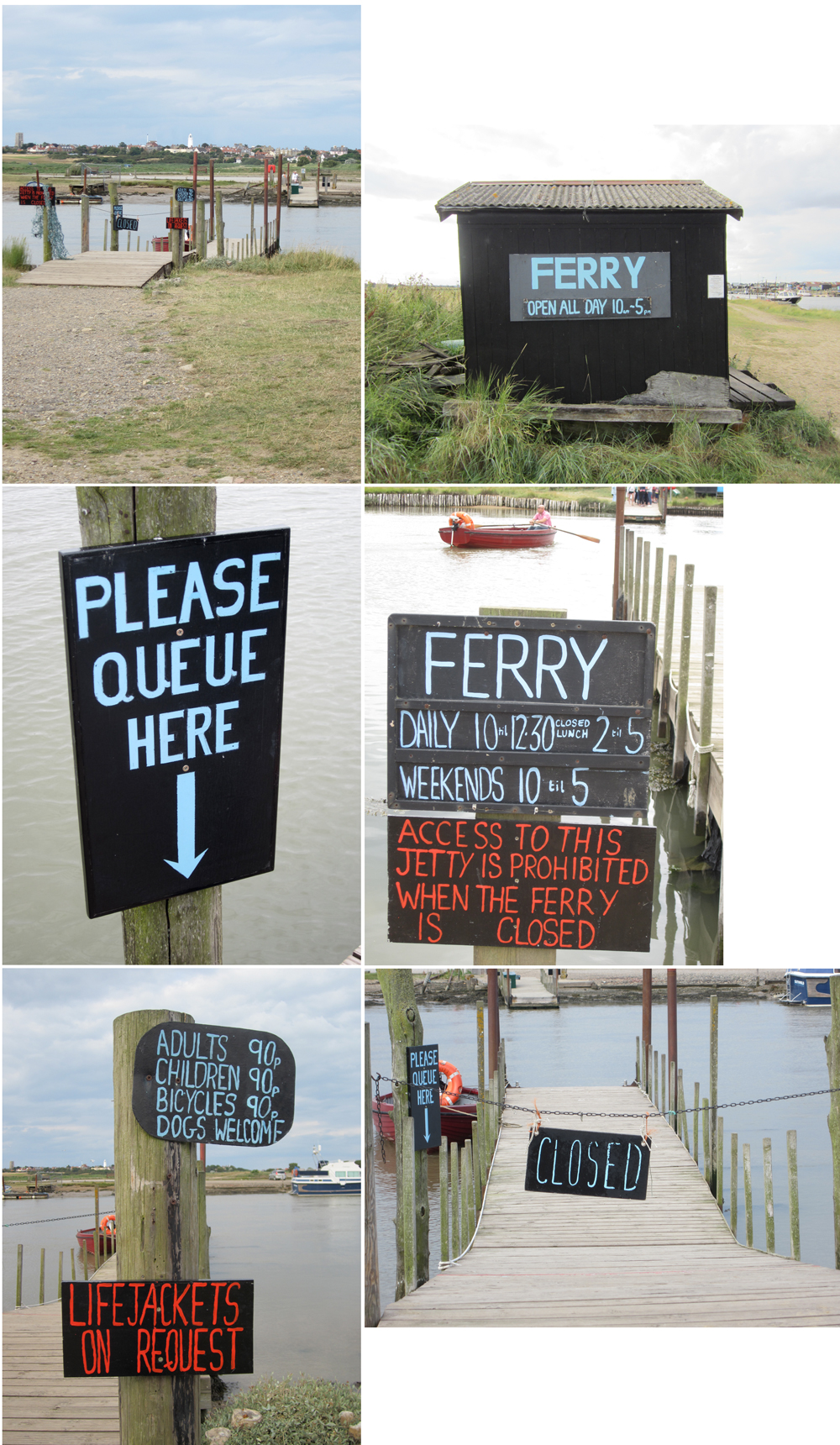
One vivid memory I have of our 1981 visit was of the ferry, the ferryman and his dog. We were confused quite why he seemed to make heavy weather of it, not rowing straight across – which seemed sensible, but instead rowing high up stream, before steering for the jetty on the Southwold bank. It was a real delight to be back on the ferry this time, with knowledge of the tidal waters, and for the small fee of 90 pence, taken across the water. There is pleasure in this simple transaction. If there was a queue, you waited. If it was only you, and not the maximum cargo, he rowed for you. Now that is service!

Image

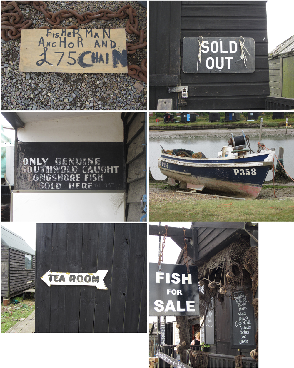
I doubt the signage originated from the 80s but I really liked the straight forward communications around the jetties. Around the banks of the Blyth the boats and black wooden huts featured many hand-rendered signs, some more formal than others, so I’m sharing them here, hopefully for your pleasure.

Image

Kate Farley – Plotting Prints at Tinsmiths

It is a very exciting time for me. It has been about two years in the planning and preparation stages and now we are a week in to my show at Tinsmiths. For those of you unfamiliar with Tinsmiths, it is a beautiful textile and lighting shop in the lovely Herefordshire market town of Ledbury. It is a beautifully considered shop, owned by Phoebe Clive, selling a wide range of fabrics as well as home wares, crafted pieces and artists prints.

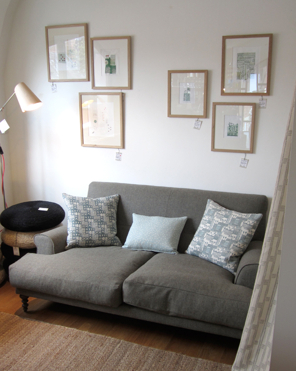
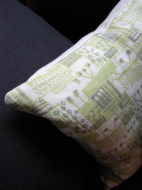
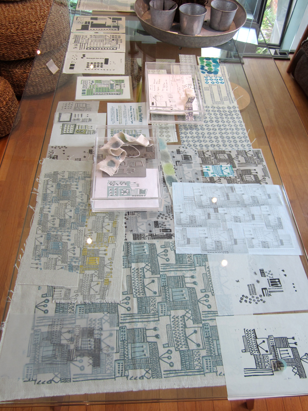
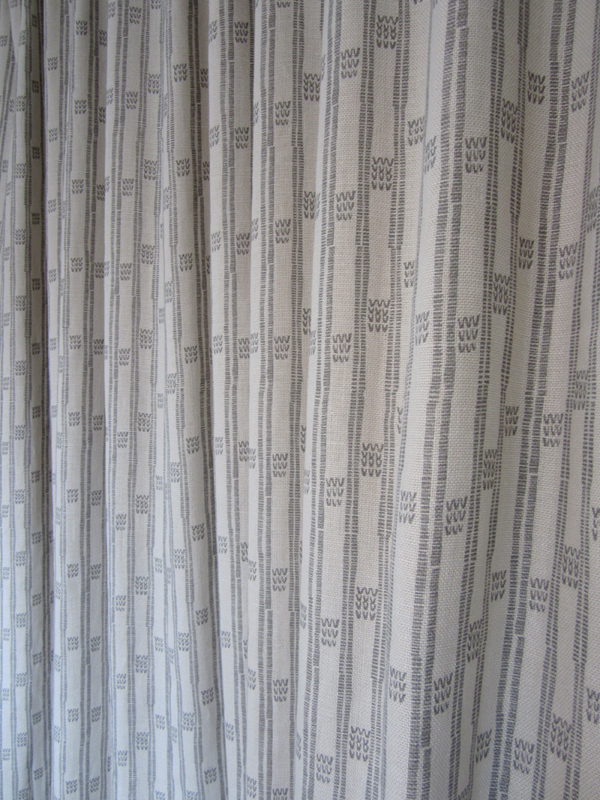
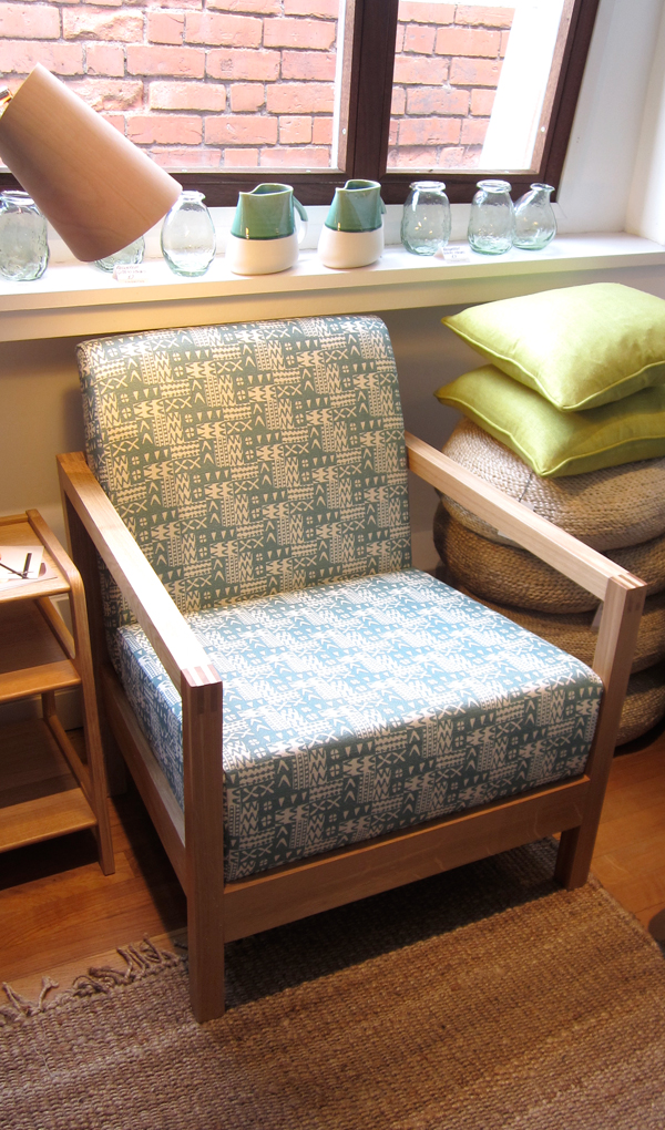
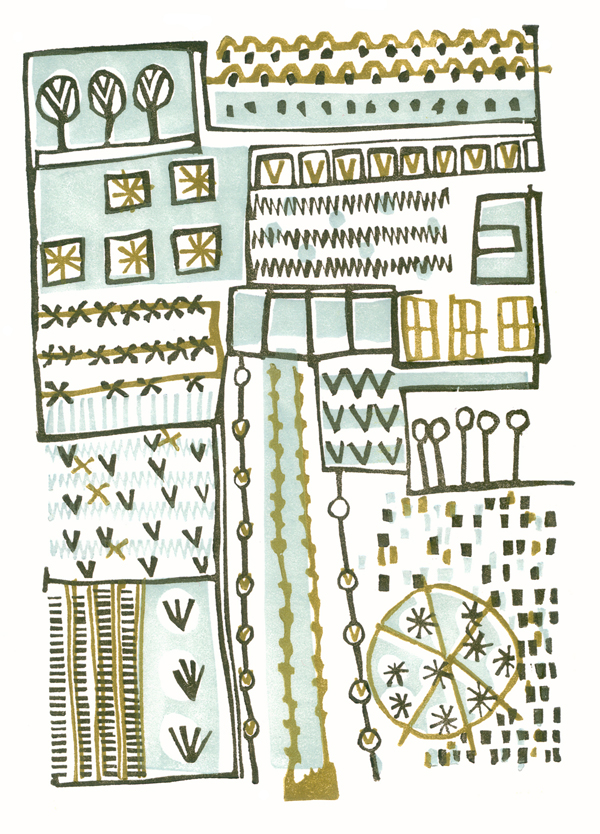
I have worked closely with Phoebe to translate my lino printed designs inspired by allotments, to become a collection of heavy weight linen, hand screen printed textiles available to buy as cushions. We have also created larger showroom pieces as curtains and upholstered chairs in preparation for selling some of the designs by the metre later in the year.

Phoebe and the team have styled my products throughout the top floor of the premises in such a way as to create a clean and fresh interior space, working with the other products and furniture pieces in the shop. My prints and drawings are set amongst other exciting colour statements in the form of ceramics & lighting with an understated aesthetic. With plenty of positive feedback at the PV as well as sales throughout the first week it’s a really exciting reward for the long journey to this point.

Tinsmithssofa_web

cushion2_tinsmiths_web

glassdisplayTinsmiths_web


cushionsTinsmiths1web curtain_tinsmiths_webchair_tinsmiths_web

the end of one season and the start of the new.

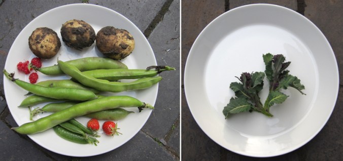
At the start of the harvest time last year I shared with you our first crops of the season. Today I cleared the brassicas that have been under attack from pigeons all winter – much to my distress, and planted in their place the potatoes for the coming year. It was a sign of handing over the baton to another year of potential, involving the weather, our effort, opportunities for head-space and the reward in what we get to eat.

Each year we start with a revised planting plan, more back ache, a new set of gloves and opportunities for me to draw and record the plants to provide further inspiration for my art and design work. As I have also spent the last few days designing, cutting and printing new lino blocks, the creative process of doing so reminds me very much of being a gardener; working with the elements and using knowledge, intuition, skill, time and desire to create something from small beginnings.

I remain positive about the growing season ahead, surely there cant be as many slugs and pigeons this year… can there? And as for cutting lino, I’m in it for the long haul.

plotplates_web

allotments2_web600

holding on to the details…

This photo was taken at Birmingham’s old science museum in its last days before demolition as I was carrying out research for subsequent commissions inspired by the site. It goes some way to sum up how things are in the studio at the moment with many lists and scraps of precious information as I am very busy with making new prints & promoting my upcoming show at Tinsmiths, Ledbury next month as well as coordinating suppliers and working on exciting new design work. All this in the break between Spring and Summer terms of my lecturing job…

staples_web

Design inspirations 1: horizon lines

For a while now I’ve been thinking about what has shaped my visual language and informed my art and design tastes. As a result I have planned a few blog entries in which I will evidence some of my thoughts in terms of influence and my art / design practice.

In some recent press interviews I’ve been asked about my inspiration and I tend to consider the formative years as pretty vital in this regard. It makes sense that we develop strong feelings and bonds to what we experience as children, either to reject them or embrace them – either way I believe those early years help to form our adult judgements.

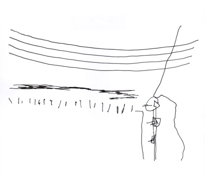
Looking beyond the windows of the house in rural Norfolk where I was brought up is what I consider one of the greatest inspirations to my work. The open fields, the clear horizon lines and sparse distractions across the farmland of Norfolk have stayed with me in relation to my way of seeing, composition and economy of information in much of my work. Why draw ten lines when I can say it with one? I had a particularly horrid visiting tutor in the beginning of my training who felt that I was lazy in my designing, when actually it was he who struggled with some of the simplicity I was aiming for.

Looking back over some of the works I have made in the last fifteen years there are a few key pieces that explain that relationship with the horizon.

‘Nine Perspectives’, a linocut is made up of diagrams where I explore the land, sea and sky in a variety of ways. I consider the horizon in two-dimensional form, in plan view, elevations and diagrammatic perspectives in order to gain a sense of order.
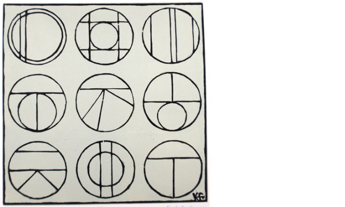
9perspectives_web

‘Meadows (France)’ is a drawing of a beautifully simple valley near Gourdon. It gave me a perfect view to explore further skewed interpretations of perspectives seen in the landscape. I worked with a sense of the view working round a set square, with two horizons, as I looked in front and to the side of me.
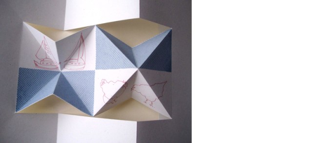
stgermain_webThe final image is from a screen printed artist’s book I made several years ago exploring the idea of ‘half full’ as a state of mind, but also from each side of the horizon line. I have used the blue areas as either half full of water (the Norfolk Broads specifically) or half full of sky above the chickens. The folded structure implies a view through the use of perspective, looking in to the distance or reflecting on oneself.
kf_half-full_web

These three works are very old as far as I’m concerned. I have new creative concerns now but they have helped me to test and explore principles in the way that I see and draw that have been important along the way.
lines in the snow

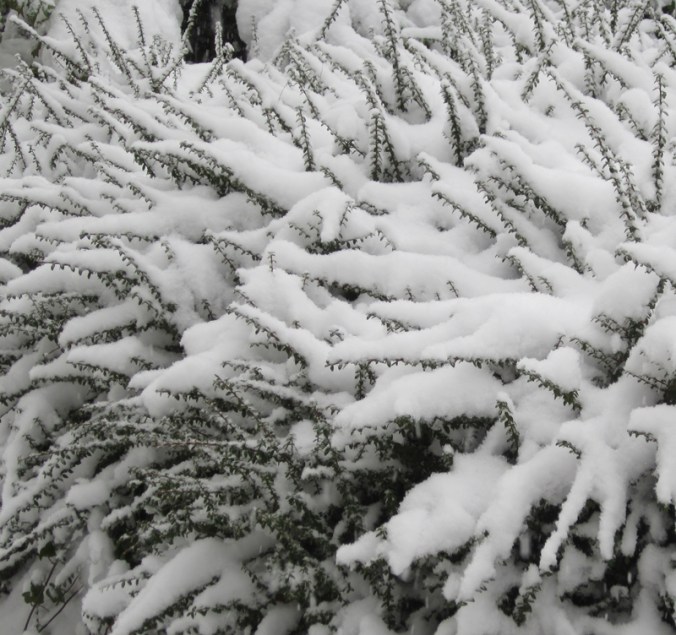
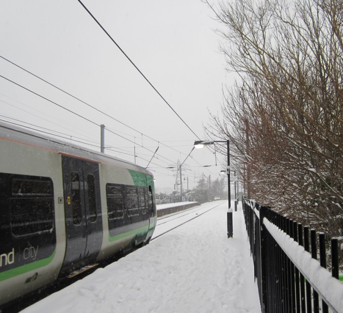
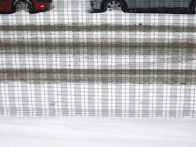
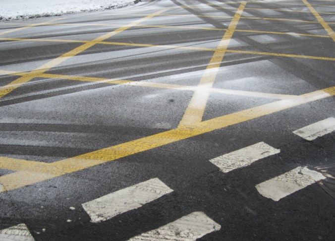
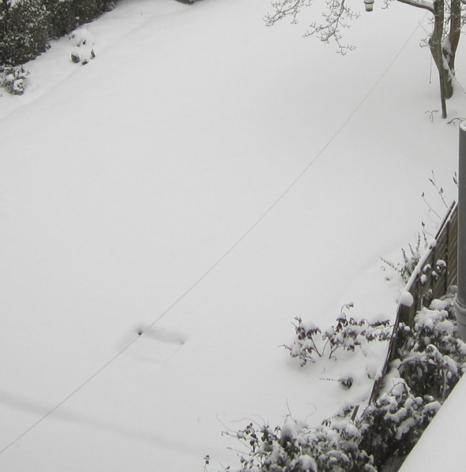
I took these photographs on my way home from Birmingham yesterday and like the way they show the different interpretations of lines and stripes in the snow I recorded. My last blog post was about colour, and so I like the fact that it is almost absent this time around. I’m sure there can be some design inspiration from these.

branchlines_snow
trainline_snowgrid_snowyellowlines_snow1washingline-snow

a colour survey of the plot

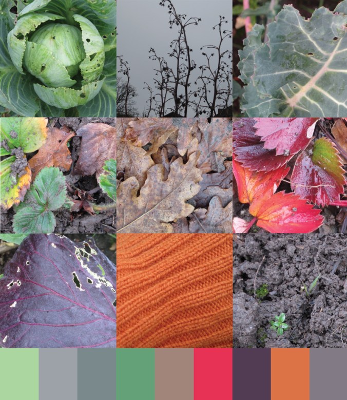
Today was my first plot visit of the year and I set about digging over the strawberry patch – an important job given the lousy harvest of last year. I also took time to survey the rather heartless cabbages we have managed to grow and this inspired me to record the beautiful colours of the season from all round the plot. This reminded me of my Autumn survey some months ago, recorded on this blog. No doubt these colours will inspire my drawings and prints of the year to come. Sadly I didn’t get a picture of the robin who hopped about glad of the worms I uncovered but he made me smile all the same.

firstplotvisit2013

drawing anywhere and everywhere

The last few weeks have been rather busy so I close the year with a brief blog entry which will lead on to a new post in the new year about how we draw what we see… I’m still working it out in my mind but watch this space!

In the meantime I will share with you a drawing made by my daughter this summer, then four years old, of a lady. She made this while on the beach at Cromer, Norfolk. I love the way she started to build up a patterned dress using pebbles and placing sea weed for hair. I hope she never loses her love of drawing – she is a great source of inspiration to my design work and also in my teaching of design.

sandgirl_2012