REPEAT panel and contributor book signing

It’s been a while since I last wrote here – the summer term at university has been very busy, … I’ve hosted an Industry Awards Day, assessed a lot of work, put up a degree show and taken students to the graduate showcase of New Designers in London, to name a few activities, so not much headspace I’m afraid.

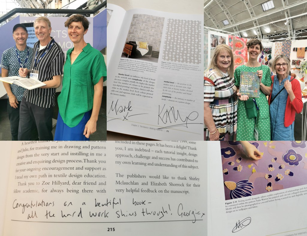
In the middle of all that I agreed to chair a panel at New Designers titled Contemporary Printed Textiles and Surface Design Practice. I had the amazing designers Emma J Shipley, Sarah Campbell and Deborah Bowness as panellists, sharing their expertise – all three designers are interviewees in my REPEAT book. I had some questions up my sleeves to shape the discussions, and despite not having done this sort of thing before I thoroughly enjoyed leading it. To a pretty much packed venue we discussed our individual design processes, clients and customers, how we work through licensing deals, and the decisions behind establishing brand identities. Sarah, Emma and Deborah have decades of experience between them so it was so valuable to share their generous and hard-earned experiences with the attentive audience. We could have carried on for much longer! There was also the highlight of meeting my publisher from Bloomsbury, Georgia, who I’d not met in real life before then, but came along to support me.

I also had another idea in my mind, to ask Sarah, Emma and Deborah to sign my REPEAT book to make it a special keepsake. As New Designers is a textile design industry event I also managed to cross paths with several other contributors and asked them to sign it too, including Mark and Keith of Mini Moderns, Clarissa Hulse, Daniel Heath, Jules of @thepatternsocial fame, as well as past students Tasha, now designer at Habitat and Molly, currently floral print designer at Bay and Brown. It has become a mission to find opportunities to cross paths with the many others included, but this could be a very long task!

The day ended in celebration for my colleague Jill, who retired this month after 38+ years at Norwich University of the Arts. Jill taught me when I was 18 years old, and we’ve worked together over the last five years in Norwich. She came along with Grainne, also one of my tutors, to support our graduates on the stand at the show, so I grabbed a picture with them both and the book. They earned a mention in the acknowledgments as they were hugely supportive of me as a student, introducing me to their love of drawing, colour and pattern that has stood me in the many years since.
It was a really successful few days in London with our graduates doing themselves and us proud, as they jumped with both feet in to this great industry experience, just weeks before I proudly read their names out as they crossed the graduation stage at Norwich City football ground. Now it’s time for some holiday!

pattern project potential

I’ve been keen to get back to designing and printing having spent my practice time writing and developing the book for publication over the last few years. I’ve been testing ideas of pattern evolution and pattern construction for some time in a limited way, specifically looking at pattern structure evolution through drawing investigations, but the ideas at the heart of this investigation have themselves evolved over the last couple of years.

With more time and fresh energy I’ve defined a new project brief and research rationale, and I’m excited to have got off to a good start. I’m looking at repeat tiles and construction of pattern formations, so cut shapes and sketches were an obvious way in for idea development. I’m trying not to be too precious with outcomes at this stage, so I’m trusting the process.

I’ve started by testing ideas with geometric shapes as subject matter to keep the aesthetic clean and graphic, focusing on the laying down of colour blocks. I’ve started by working up some ideas for screen printing but anticipate many more drawings, maybe lino prints and certainly digital work will be created over time too. The colour palette will certainly change, but with an exhibition I’m making work for at the same time dictating pieces to be black and one other colour I’ve gone with black and green.

I don’t want to give too much away at this stage, but look forward to discovering the potential over the next few months.

REPEAT: Book publication day coming very soon

On the 12th January 2023 my book for Bloomsbury on the subject of repeat printed pattern for interiors will be published, … finally there’s not long to wait having worked on it for years!

If you want to order a copy at a pre-publication discount you can do that here.

pattern practice therapy

A year ago I was recovering from stomach surgery and had some time away from my academic role while I mended. Not one to be idle, when I was well enough to wield a lino cutting tool and had the energy to sit up I set myself some simple design challenges to focus my brain and help myself get better. This became my physiotherapy and creative distraction from what was a really hard period of time.

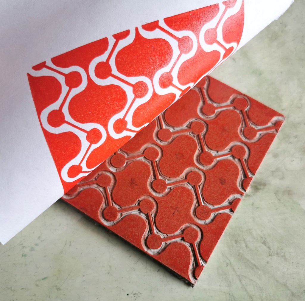
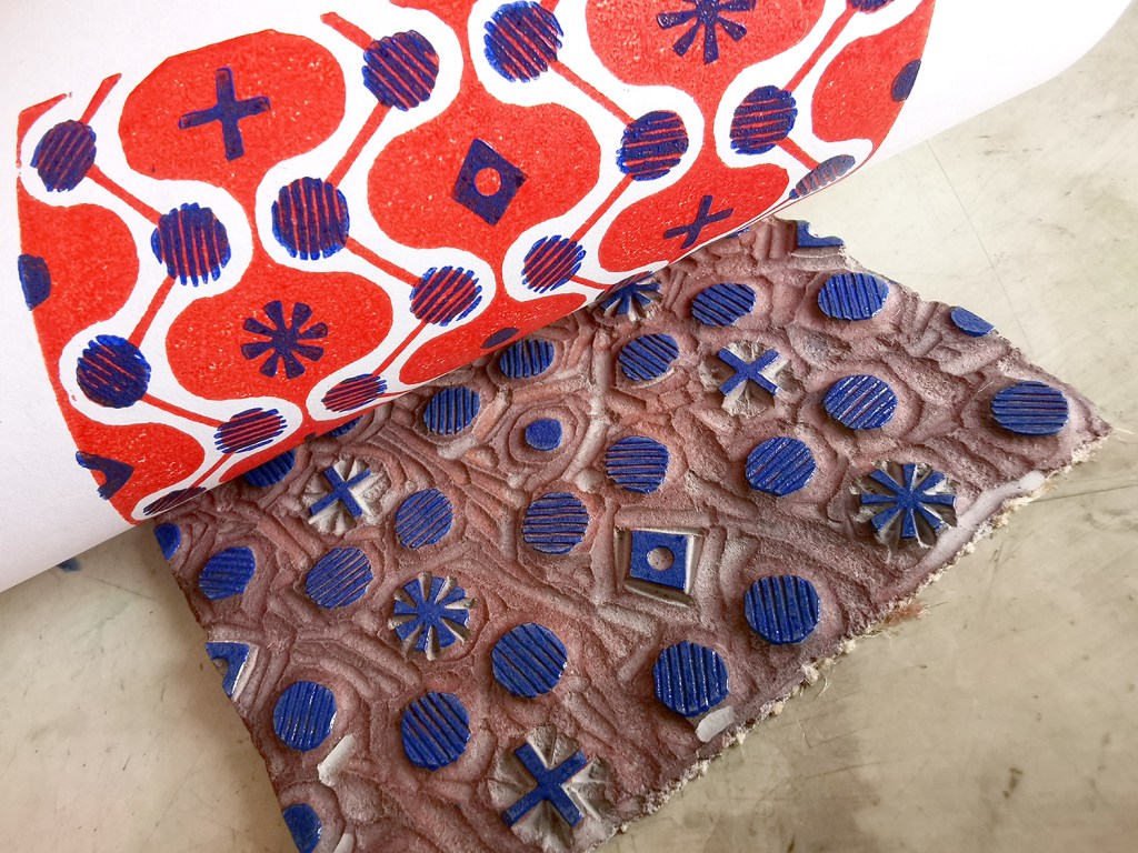
With pattern design as my go-to healer, I decided to explore formal pattern structures, including the ogee, diaper and check, featuring geometric elements. I created lino cut tiles with a small element of repeat pattern, usually but not always in two colours. The lino blocks were small, enabling me to feel as if I was making progress while able to retain focus in short bursts. The printing was another process that tested my physical strength and stamina!

I thought I’d share this one, the ogee structure – one of my favourite pattern structures – I love the play of the negative and positive S-curved forms. I think it is under-represented in contemporary design…

printing the first colour
adding the second colour, blue

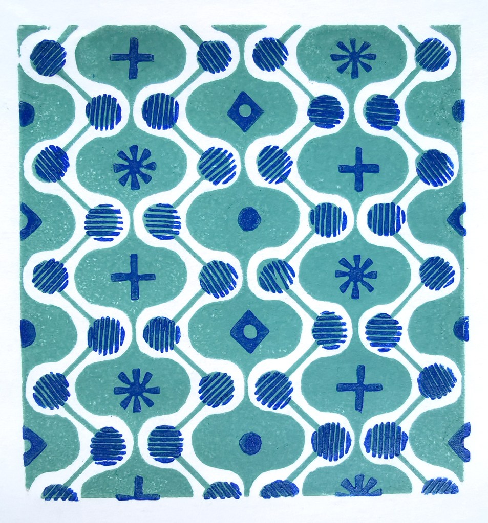
I often test prints in different colour combinations, as I have done here, below.

alternative colourway

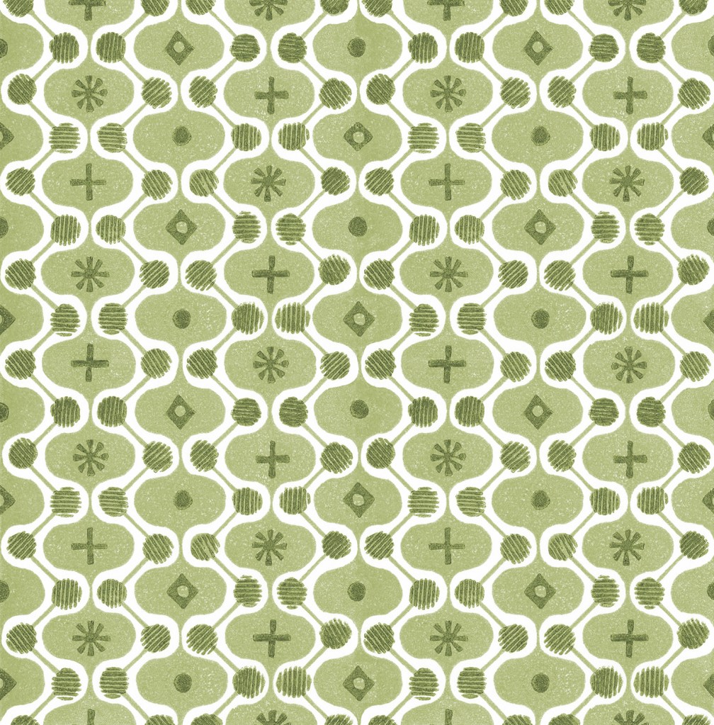
It is a natural desire for a pattern designer to want to test the repeat so you can see a digital outcome below too. I decided to test the two colours as two tones of green for some reason. It has a vague hint of avocado bathrooms of the 1970s now!

digital repeat of the lino printed tile

Unknown to me at that time, I had a further hospital stay and recovery a few months on, and so the collection of patterns grew once more, as my healing and self-prescribed occupational therapy – a career I had once considered!

I’ve had little time to revisit this collection since my recovery but I hope one day soon I will. I’m not sure where this design and its siblings will venture next … any suggestions?

Academic acknowledgement: thoughts

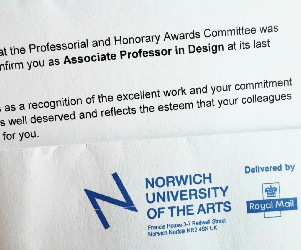
I’ve already shared the news via my other social media channels, but I’m delighted to announce here too I have been confirmed Associate Professor in Design at Norwich University of the Arts. This makes me extremely proud and at the same time reflective about the career I’ve had so far.

At eighteen years old I had very little idea what I wanted to do as a job or career, and considered widely contrasting options of occupational therapy, sports psychology, the army, teaching … something creative …. having grown out of the idea of being a bagpipe player, aged 4, and archeologist, aged 8. There are skills involved in roles across some of these that are required in my current post in academia but equally some a disastrous fit, at least to the me I am now.

Going through art school and university, even the post grad. masters course, I was petrified of the ‘real world’ of work, despite having Saturday and holiday jobs from a young age. I can clearly remember the months I earned nothing as a freelance designer, the humiliation of the job centre line and housing benefit application process, the years of no holidays unless they were working holidays to get free board, and watching peers become adults in an adult world, as I tried to work out what I wanted to do while keeping expenses low and resourcefulness high. The turning point was my first role as Print and Photomedia technician at Central Saint Martins, London, where I met people like me, dividing their weeks with practice and educational roles – this could be my real world too!

Today I can look back over a twenty-plus year academic career and so much makes sense; the joy of hindsight. Since school I have taught at play schemes, Sure Start projects, NHS trust projects, community projects, adult education workshops, school outreach, FE & HE courses. Every project taught me something that informs the educator I am today, and clarified my preferred environment for teaching and learning. For over twenty five years I’ve led a creative practice that has evolved substantially from the one I led in my studio / bedroom in south London, making books at a tiny desk, using the bathroom as a darkroom in the middle of the night, and the print room at CSM when the students had left. Artwork on the London underground network, designs on a huge hospital roof, in an airport, selling products to Japan and America … Projects happen but it’s easy to forget they were all unimaginable to the eighteen year old self. At art school I learned the value of drawing, of playing with the design process, of dedication to make something the best it could be and commitment to colour mixing. Those tutors shaped my rigorous approach to my practice today. Incidentally, my minimalist aesthetic was defined lazy by one visiting tutor I had the displeasure to be taught by – he missed the point I remember thinking, I knew he had got me wrong.

As an academic I’ve learned to continue to learn, continually … One instance: I was thrown in to the deep end to deliver design history lectures to undergraduates many years ago, with no GCSE in basic history, and only faint memories of my own design history education for support – that was a particularly low point. Hundreds of hours investment, much reading and learning, and a fair amount adrenaline got me through those early years. Some students have told me since then, that those lectures were among their highlights, and I feel pleased – retrospectively I can’t help feel grateful to my then boss for not giving me the get-out option. This skill and knowledge is now something I hugely enjoy and benefit from. I love to share my passion for design history – who would have thought? Not the eighteen year old me!

In running my design practice in parallel with my academic career I am busy. It would be easier if I was content to focus on one rather than juggling my headspace and waking hours. I’m not alone in wondering why I maintain both, but it is simple – they need each other, and I need each of them. My teaching is filled with current industry experience, my design practice feeds the lectures, workshops and tutorials I deliver. The design experience feeds my research and my practice validates my teaching. My own creative struggles and insecurities support my understanding and empathy for the students I teach and nurture to be brave soles, out in the real world, like I had to be and continue to be. I love to learn, and if I can share what I learn and understand, I can help others to enjoy the design industry too.

I’ve stood at trade shows, on my stand for 12-hour days, promoting my new collections while checking my uni emails on my phone, to make sure things are running okay in my absence. I’ve spoken to industry partners interested in my work, while at the same time my head is working out how I can link the students to the opportunities they may hold too. I’ve formed relationships with wonderful industry friends who now form a network of support for the graduates I’ve taught. The important thing to learn is that we are all in this, learning together, helping others and together making the world a better place to be. The response to me achieving this recognition has been overwhelming. Colleagues past and present, students and graduates, manufacturers and past collaborators, and so many more people have got in touch – reminding me of many precious moments along the way.

I’m grateful to have this recognition from the university. The contribution I’ve made to both the design industry and academia is acknowledged as valuable to others, and united in potential – and that’s a good starting point for the next twenty years!

prints on plates

One of the aspects of drawing for pattern design that fascinates me is the stylising process; how we see something and process it as an interpretation of the thing we initially saw. I’ve written about this several times on this blog over the last few years. When I start to draw something new I make quick studies to get to know the subject matter, and work out what the key information might be, and how I retain the qualities that make the subject remain visible in some small way – depending on how much I want to hold on to the recognisable elements.

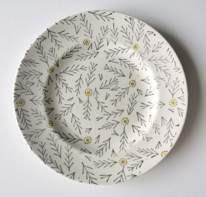
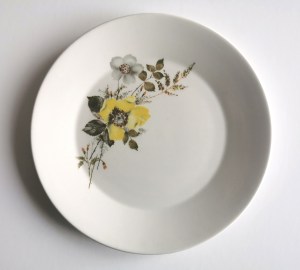
While washing up the other day I saw two of our plates side by side in a way that got me thinking: I saw connections I’d not spotted before despite the visual languages of the plates appearing to be very different.

Both plates are decades old, both have seen better days. One is a simple graphic motif, one is a rather nostalgic painted flower posy.

Both plates appear to have floral-inspired printed surface designs. Both designs could be described as featuring yellow flower heads (although one includes other flowers too while the other contains multiple prints of the same motif elements).

One design is pared right back to stylise the flower by only recording a stem and flower head. The style is almost diagrammatic in the simplicity of the motif consisting of black stem and V-shaped lines crossing the stem to suggest leaves. The flower head is a straightforward circle with a dotted outline. Not all stem motifs have heads, there is a randomness in the composition across the plate.

The other plate design features painterly and drawn details, a generous sprig of flowers utilising more colours to express the tones and textures of the flower and leaf details and certainly more expressive in its rendering. The flowers are placed on one side of the plate, as if allowing space for the cake to be placed alongside. The yellow flower head is certainly the attention grabber.

Now I’ve spent a bit more time thinking about these designs I actually believe they make a great pairing, two designs that complement each other in what they offer. I’m not so keen on matching crockery and enjoy using our mix and match plates collected over the years from car boot sales, charity shops, family hand-me-downs and gifts – they all offer reference points and bring something to the collection, and this week I’ve been grateful to appreciate this duo in a new light.

I spy hospital patterns

As a keen lover of patterns I’m always on the look out for interesting examples to add to my consciousness. I do like a good geometric as well as micro (small scale) repeating patterns so despite being immensely annoyed to find myself back in hospital on a ward for a week I did spot the odd pattern of interest…

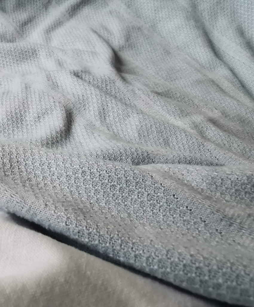
I’m interested in small details that make patterns work, and I spend time in my teaching analysing successes and failures of patterns in relation to motifs, pattern structures and repeats to teach the students how to improve their own designs. These NHS designs, printed on fabric for hospital nighties (left), pyjamas (middle) and the surgical gown (right) do demonstrate merit.

Small details on the pyjamas / nighties, such as the spot actually being a hexagon, the less obvious choice, and the squares making up the bigger square block including smaller squares in the darker colour, means they contrast with the larger mid green colour bring visual interest. If the darker squares were the same size they may well appear too dominant. Interestingly, the pyjamas had the green colourway as vertical stripes, and yet the same design in red was placed as horizonal stripes on the nightie. I wonder why this was. Let’s not talk of the fit of these garments! The surgical gown is more simple, but I appreciate the fact that the cross is made up of broken lines, with a small dot in the middle – so much more interesting that if it had been two lines crossing.

These are tiny details that most people will overlook, I know I was probably not the most typical of inpatients, but if you spend any length of time on a ward, nil by mouth for several days your mind wonders. I found there to be a significant challenge in retaining something of myself as a person beyond the sick patient, with all the focus and attention on your health, or lack of. The pattern spotting was a way of still being me.

As I said at the top, I like micro patterns and have shared my collection of envelope insides on the blog before. I like the smaller scale patterns that provide visual rhythms and noise, that get on with doing their job, in a simple utilitarian manner. These patterns on hospital garments also got me thinking about moquette, the hard-wearing fabrics on transport upholstery, and how those patterns signs are there to conceal dirt and wear, whereas these hospital ones with the white background were doing the opposite.

I hope you don’t find yourselves in hospital to have the chance to analyse patterns on your gown, but if you do, I hope you like the ones you’ve got!

on the mend: thoughts of healthcare settings

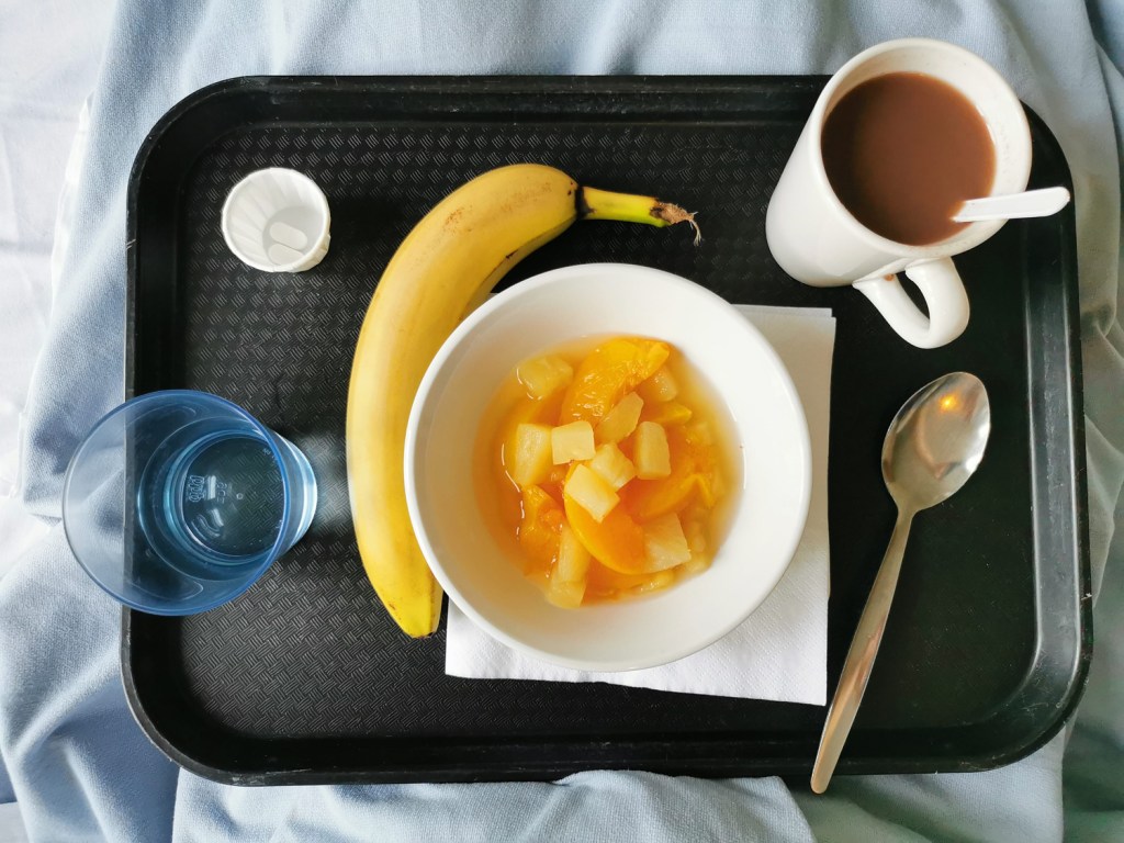
I’ve had an interruption to normal services as a result of some general surgery, added complications and time to heal. I’m not one to sit idle so it’s been a challenge to be patient, giving myself time to recover and gain strength. The time in hospital – a week – was an ordeal despite wonderful ward staff, and it gave me time to think about how important our surrounding environments can be, for our wellbeing and sanity.

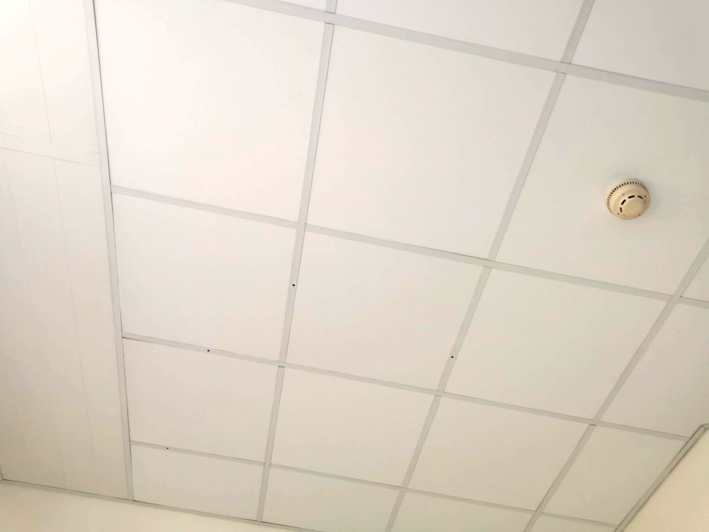
I got to know the walls and particularly the ceiling of the room very well. In my hazy mind I toyed with the grid of ceiling panels being a response to the Dutch De Stijl design by Theo van Doesburg, or a drawing by Agnes Martin. The four holes in the ceiling were also a stark reminder of the surgeon’s cuts. The prints on the curtains were so poor I refused to capture them, but they were insipid, uninspiring, and frankly poor design – I remember analysing their weakness with one of the staff late one night – I think she said I was crazy!

I vividly remember the power of the textiles surrounding me – I had a scarf which was a huge comfort to me – a familiar texture and smell of home. The fresh sheet and hospital blanket were also providing a strange comfort in the utilitarian room.

Twenty years ago I attended Arts in Health lectures including discussions on the subject of hospital environments aiding recovery and wellbeing, and I remember seeing incredibly exciting and positive schemes across the world where designers were embracing colour, nature, pattern and material to drive rehabilitation. I had hoped things had moved on from the institutional walls of hospitals. We now have the interior design buzz word biophilia, using nature for our wellbeing as an integral component in the design solutions, linking humans to other life forms, but it has yet to arrive here. The space in which I coped was bland, institutional and bleak. Such a missed opportunity – and particularly when the hospital ‘art’ is so often shoved out front in the public foyer, and not where the patients spend hours on end, day after day – don’t get me started on public art commissions at hospitals!

The relief to be home, surrounded by colour and pattern – and my family – was intense. Those first breaths of fresh air, the sight of a bright autumn day was incredibly uplifting. I still hold a heightened sense of this awareness of nature, even now a week on, as I recover and appreciate my health returning to business as usual.

passion for passi flora pattern

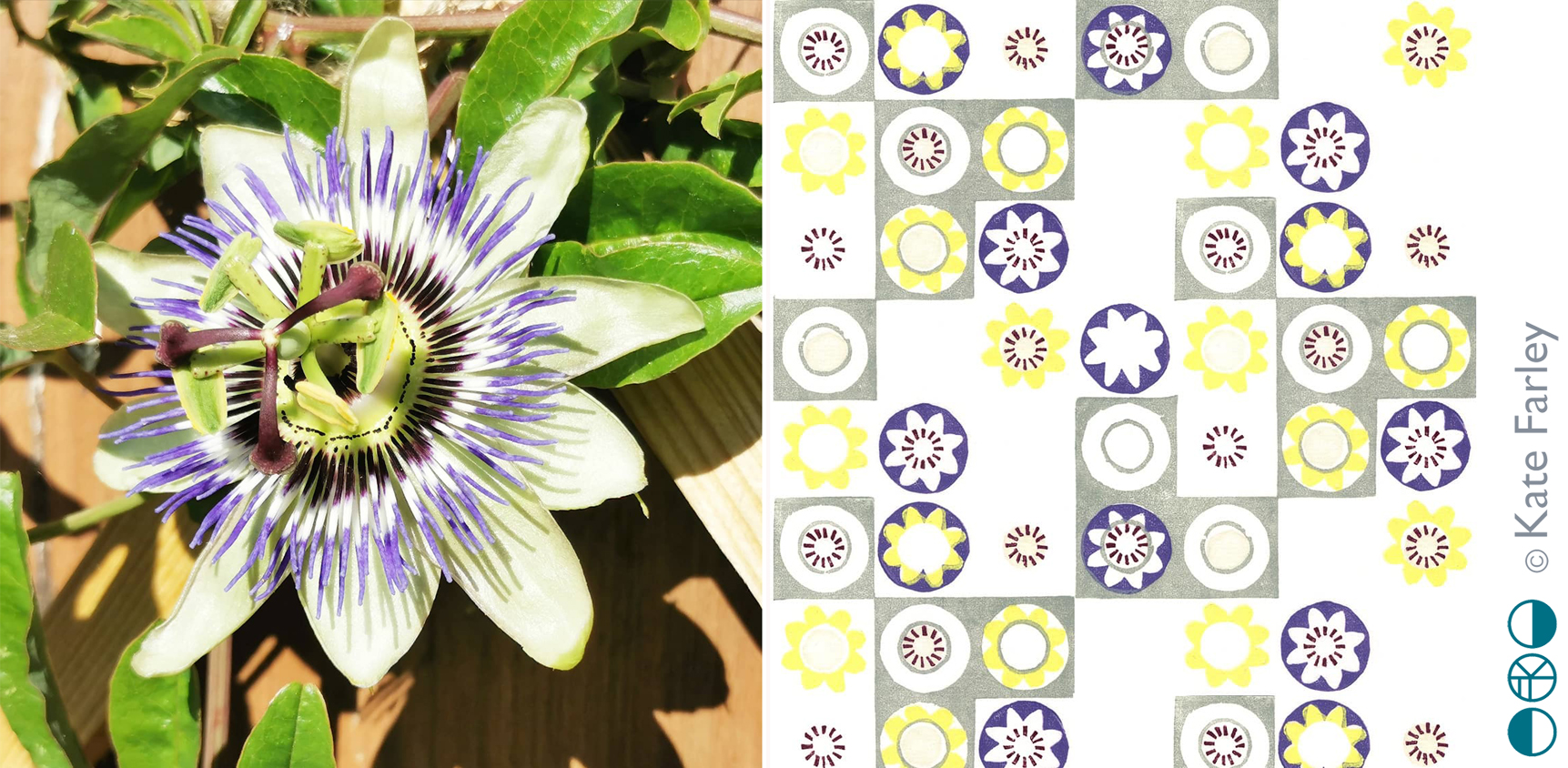
Many years ago my flatmate was given a passion flower plant and when the flowers came we were both in awe of their splendid form; a thing of beauty in our otherwise less than beautiful flat in Camberwell, south London. I made drawings of the flowers and sometime later developed some patterns from it, screen printing it as repeating designs and placement prints. I created the motifs by deconstructing the elements that constitute the flower head.

More years passed and sometime around 2012 I revisited those screen printed patterns, this time interpreting them as lino cuts as part of my Plot to Plate series of editioned lino prints. Last year I planted two passion flower plants in our new garden and last week we had the first bloom. It took me right back to that first flower in the flat in Camberwell, and was reminded of the pattern again.

passiflora_web

Whenever I look back at old work I’m likely to want to make changes, and this is the case here too, but each design also holds a moment, defines a time, and sometimes that makes it what it is. I’d not imagined I’d connect that flower to my practice almost twenty years later…

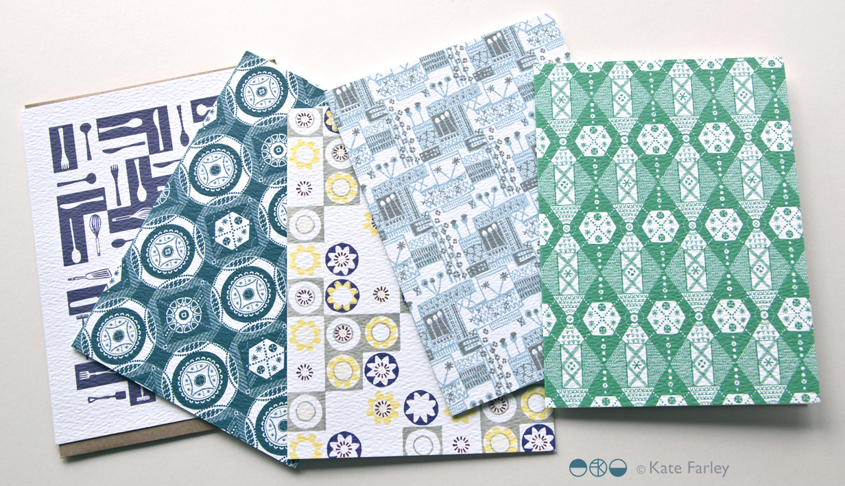
This pattern remains available as a set of patterned Plot to Plate greetings cards.

KateFarley_GC5002_blog

international pattern collaboration

It all began in an email with the subject line, ‘Hello from Tokyo’ I received in November 2017, letting me know how much my tea towels for David Mellor were admired in a Japanese design company. The email went on to ask if we could discuss a potential collaboration for a capsule fashion collection featuring a print designed by me. Firstly I was excited to think my patterns had made their way to Japan, but secondly, that sounded a great idea, tell me more! A few email exchanges later, and we agreed to meet the next time the company director of Stamps Inc. was in London so I could show him my portfolio to discuss the idea for the new pattern they would like to commission for their fashion collection.

The meeting with Shu and his colleague Yoko in a central London hotel was exciting; I showed my work and it was met with positive discussion. I was also reintroduced to the tea towels that had made it to Japan all the way from my studio, via a David Mellor Design shop! We sat at a large table and I showed them my portfolio, spreading the many sheets out covering the whole surface. Having shown all the other work and following some discussion in Japanese between colleagues, the director chose the very first page he had seen – the cover page! The choice was not what I was expecting but we shared and developed ideas for me to sample: colours, time-lines and garments. We then took some photographs to record the start of the project together, for when we would be able to share our story – and even asked the hotel doorman to take a pictures of the three of us with a London bus behind us.

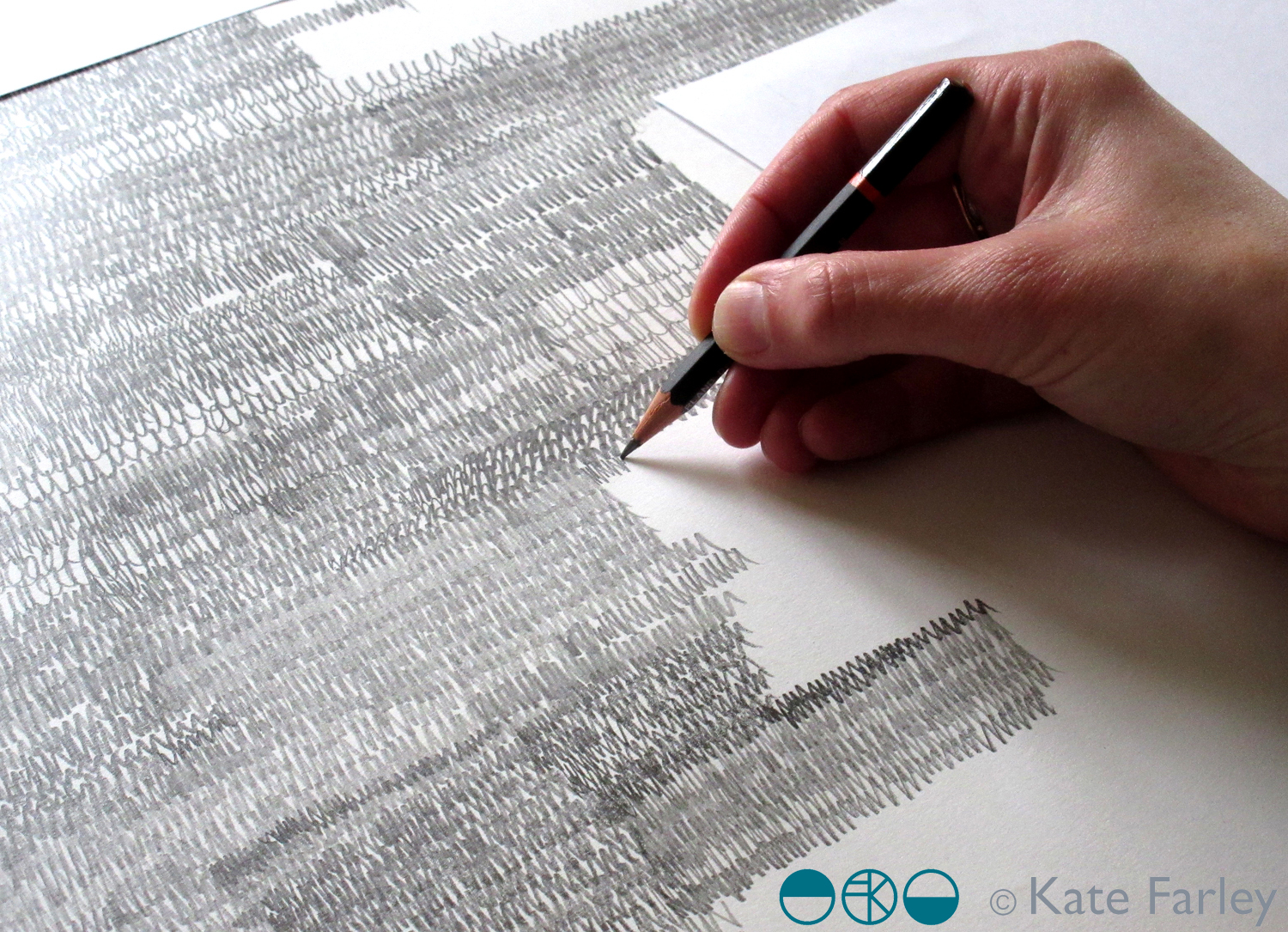
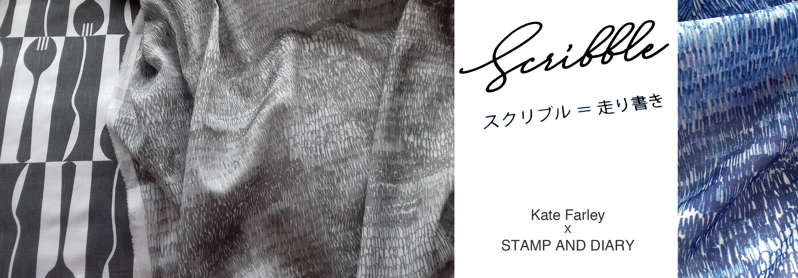
The selected design was a graphite pattern of pencil scribbles of varying tones and rhythms, later to become the title of the collection: Scribble. There are lots of variables such as scale, rhythm, tone and  overall order in the pattern we had to make decisions before I set about creating the final artwork. I emailed across some small sketches to explain the repeat process for production to check we were understanding each other as we had to ensure we understood the terminology that each of us used in our different languages.

KateFarley_SCRIBBLEwip_1_1500

I shared several images of new drawings to provide the variations / considerations over email before committing to the final design. The final fabrics were to be screen printed so I planned to draw out the whole design in full repeat by hand (approximately 60 x 90cm), scan it in and transfer it to Japan for screen print production. I started the large final drawing twice as I wasn’t happy with the first one. Initially the marks I drew appeared tense, but I also had to work out how to create the different qualities with the pencils across a vast piece of paper, and how not to smudge the areas I had drawn. I drew the design at 80% scale to make scanning it in possible, meaning I had to take in to account the slight increase in the size of the marks in the final result. I also had to ensure the top of the design matched the bottom, as the edges were to act as a cut-through for the screen printing process of repeating the pattern, fitting like a jigsaw, top to bottom. The design was edge to edge, left to right, fitting the width of the fabric so there was no horizontal pattern-repeat.

KFARLEY_SCRIBBLEwip_1500crop

The final artwork took almost ten hours to draw, and I did that mainly over two long evenings. I had it scanned in at a very high resolution, adapted the size of artwork to 100% and sent the digital file to Japan – with my fingers crossed that the printer could work their magic, including colour separating the graphite tones for the two screens each colourway would require!

There was a wholesale launch in Tokyo so I sent some of my original drawing samples over to feature as framed artwork in the exhibition and I was sent photographs of the lengths of fabric on show. Very exciting! Orders were placed and there was a good response. A further email request came from Japan, to meet again in London to see the fabric. Another exciting moment – also scary – what if I didn’t like the results!? In the stylish interior of the St Pancras Renaissance Hotel lounge there was no need to worry. Great care had been taken to translate my drawing to screen printed cotton lawn fabric, in two colours – referencing the two colours of my David Mellor patterns Chelsea, in grey, and Pride in blue. The fabric felt beautiful and the printing fabulous. It was a special meeting.

I was able to see the marketing material including my name alongside Japanese text I couldn’t decipher, describing our meeting and the collaboration. I have had to be patient while the wholesale launch orders were being produced before we can promote the project I’ve had to keep under wraps for well over a year … until now!

It has been an absolute pleasure working with Shu and Yoko, learning about the company and their pride in who they work with including the products they develop. It has been a highly successful collaboration from my perspective in that we have discussed all the aspects of the process and trusted each other to do the best for it, each learning about the other and having good communication throughout. We have shared news of the differing seasons and national events over the course of the project, and they’ve watched via instagram as I’ve moved homes and jobs. I’ve loved having this connection with people in another corner of our world, created as a result of some tea towels I designed over five years ago!

mellor_scribble_1500_banner

Save