showing the workings

I am so pleased with the feedback from visitors to my solo show Print, Rotate, Repeat, at the East Gallery, Norwich University of the Arts, with particularly strong interest in the design development work and sketchbooks on show, providing the creative and technical journey to the screen printed lengths. For those not able to make it to see the work in situ I thought it nice to share some photographs of the work that is fundamental to this creative and technical research project, with some commentary on my intentions. Tracing paper, pencil and paper as well as lino cutting and printing keep my ideas moving.
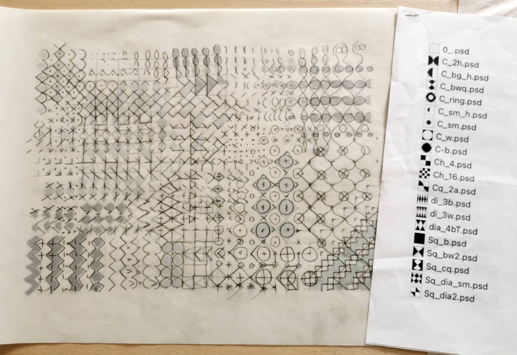
This layered drawing on tracing paper was an early development of an idea of theme and variations, explored in a chapter in the book Pattern and Chaos in Art, Science and Everyday life edited by Victoria Mitchell and Sarah Horton, published by Intellect Books in 2023. I was exploring the potential for pattern evolution, transforming one shape or pattern structure to another.
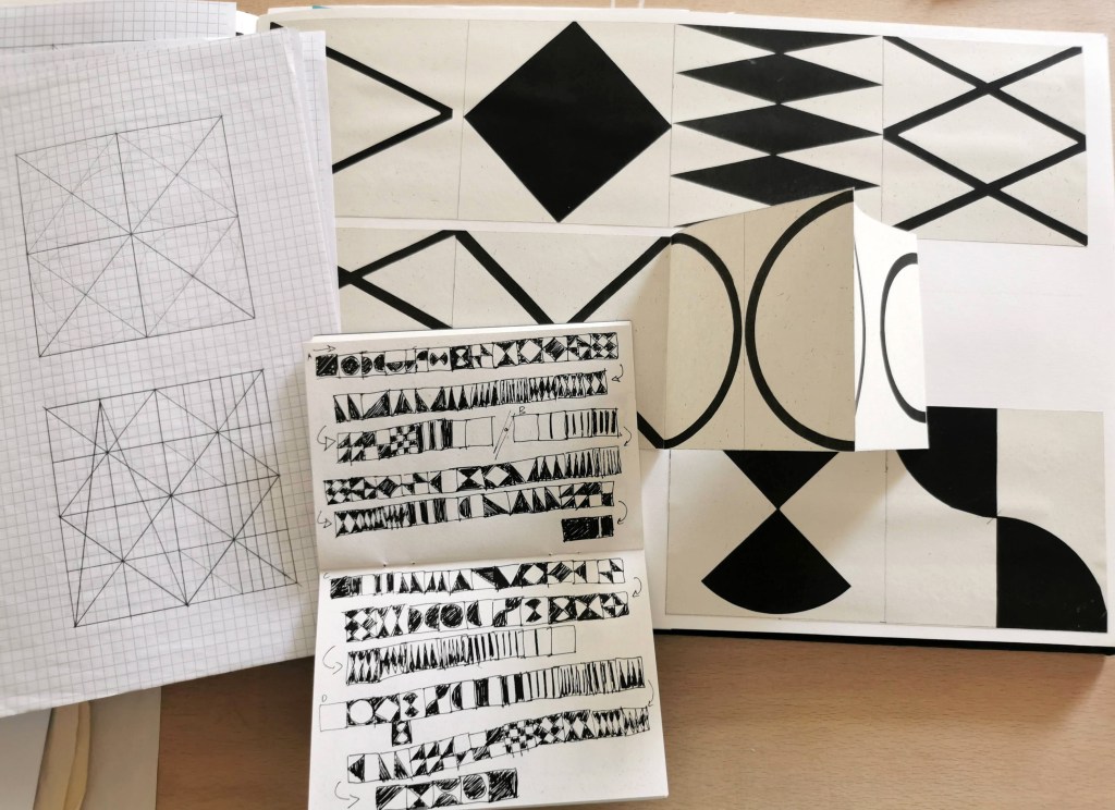
This notebook records sequences of transitions from one geometric shape to another and was developed in to a short stop-frame animation that has been shared on instagram and is also featured on the film of the research, on show in the gallery.
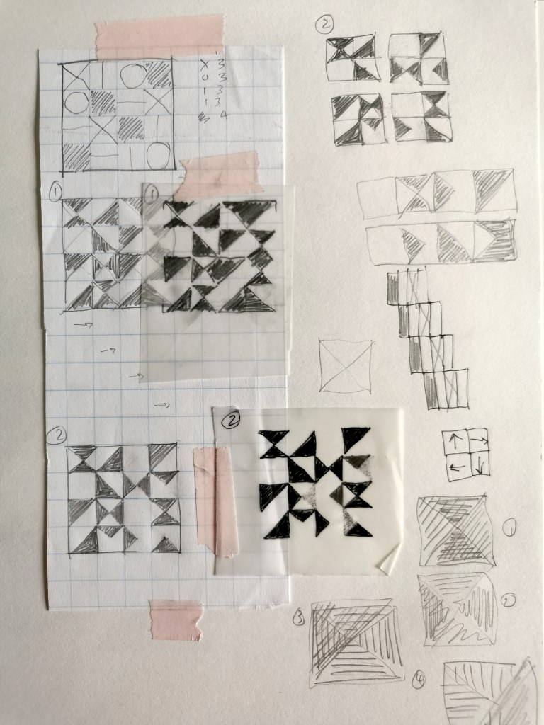
Tracing paper enables me to test the design with layered rotations of the design as part of the development, before I commit to cutting a lino block.
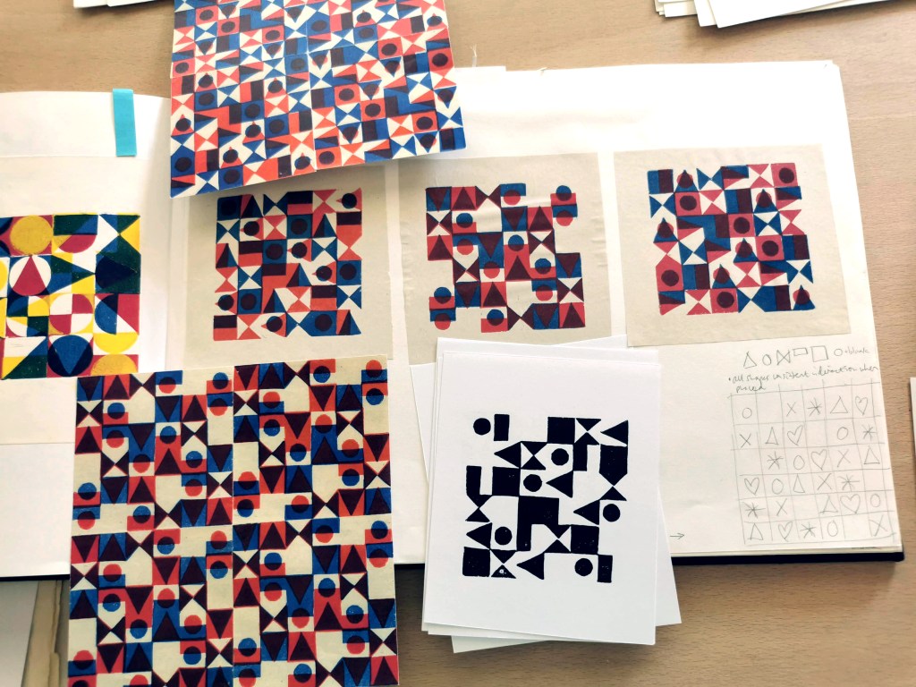
Each design can look quite different depending on how I rotate the subsequent layer, whether it’s a 90 degree turn clockwise, or a 180 degree rotation, for example. This design has explored Lewis Foreman Day’s distribution of elements work from his pattern design book published in 1901. I had to adjust the composition to enable the layered rotations.
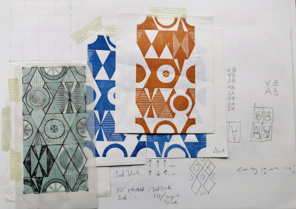
Breaking away from the formal grid structure, I tested the diagonal pattern potential with the block rotation principle. As this design is rectangular it can only accommodate one 180-degree rotation. The negative and positive shape in each of the designs I’ve developed are vital elements in the design process, carrying the weight and space of the design, providing rhythm and movement.
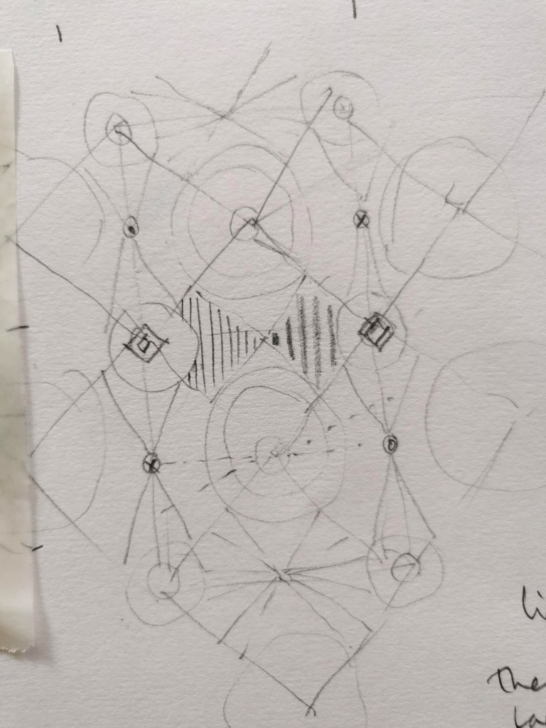
This was the initial drawing for Vortex, one of the most complex designs I have created, developed from the diagonal design shown above this sketch. Getting ideas out of my head makes room for my ideas and enables them to be more tangible. It captures a time in the research and I often return to an idea that was only a fleeting thought some time before. This one was developed into a four-colour length, on exhibition at the East Gallery.
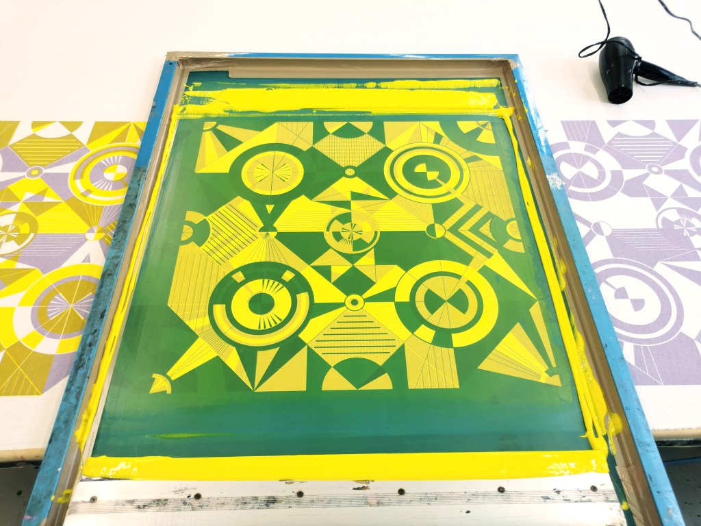
Printing in progress for a two-colour version of Vortex
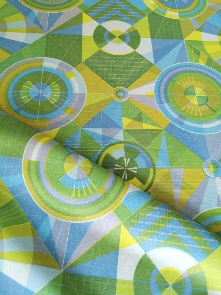
Four-colour print of Vortex, with each layer a rotation of the one screen being used. Screen print on linen cloth.

The exhibition is on until the 24th October 2026, open Tuesdays – Saturdays from midday.
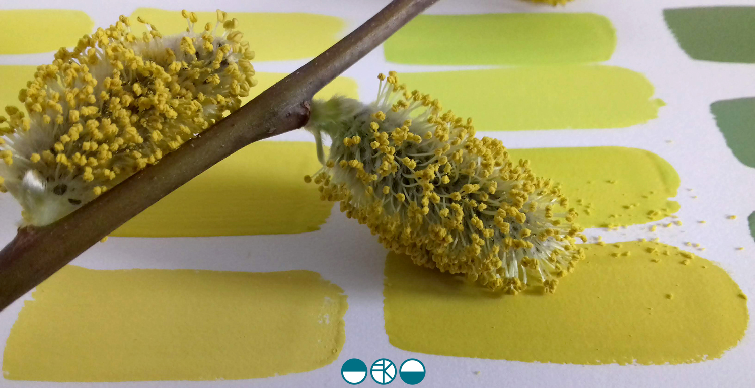
evolving colour in the making

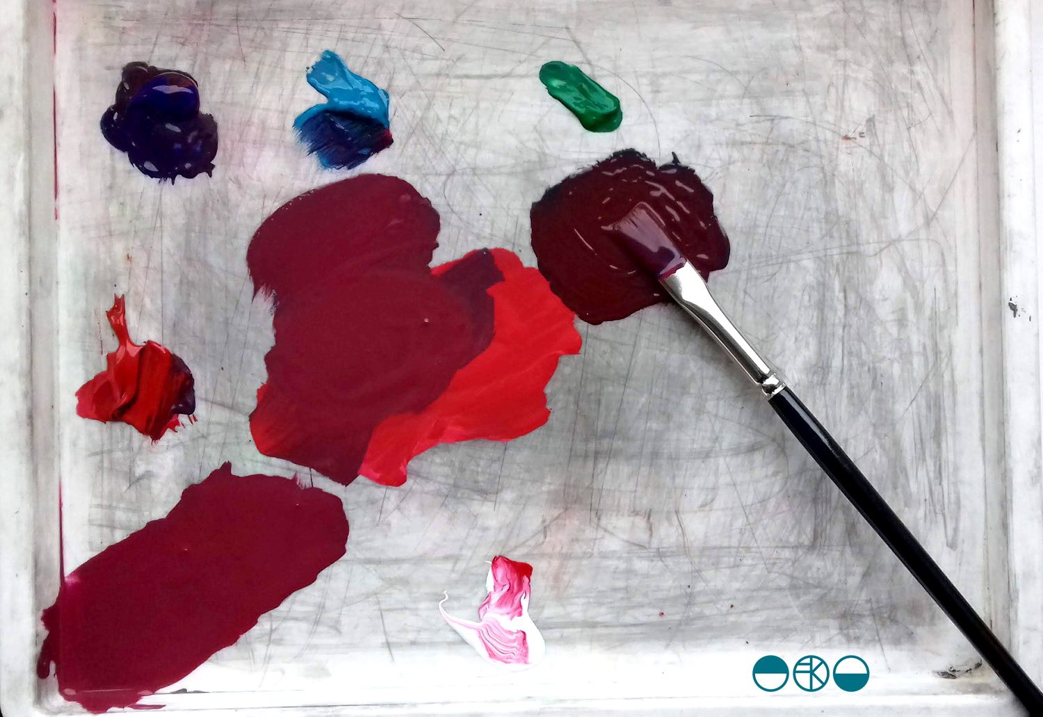
A walk in the Spring sunshine gave impetus to a very simple and mindful exercise back in the studio; to make the colour of the landscape. A sprig of willow contains so many different colours. Those colour qualities will alter as the clouds skud across the sky casting shadows, and as the sun ripens the buds.

KFarley_yellow_willow_1500_KF

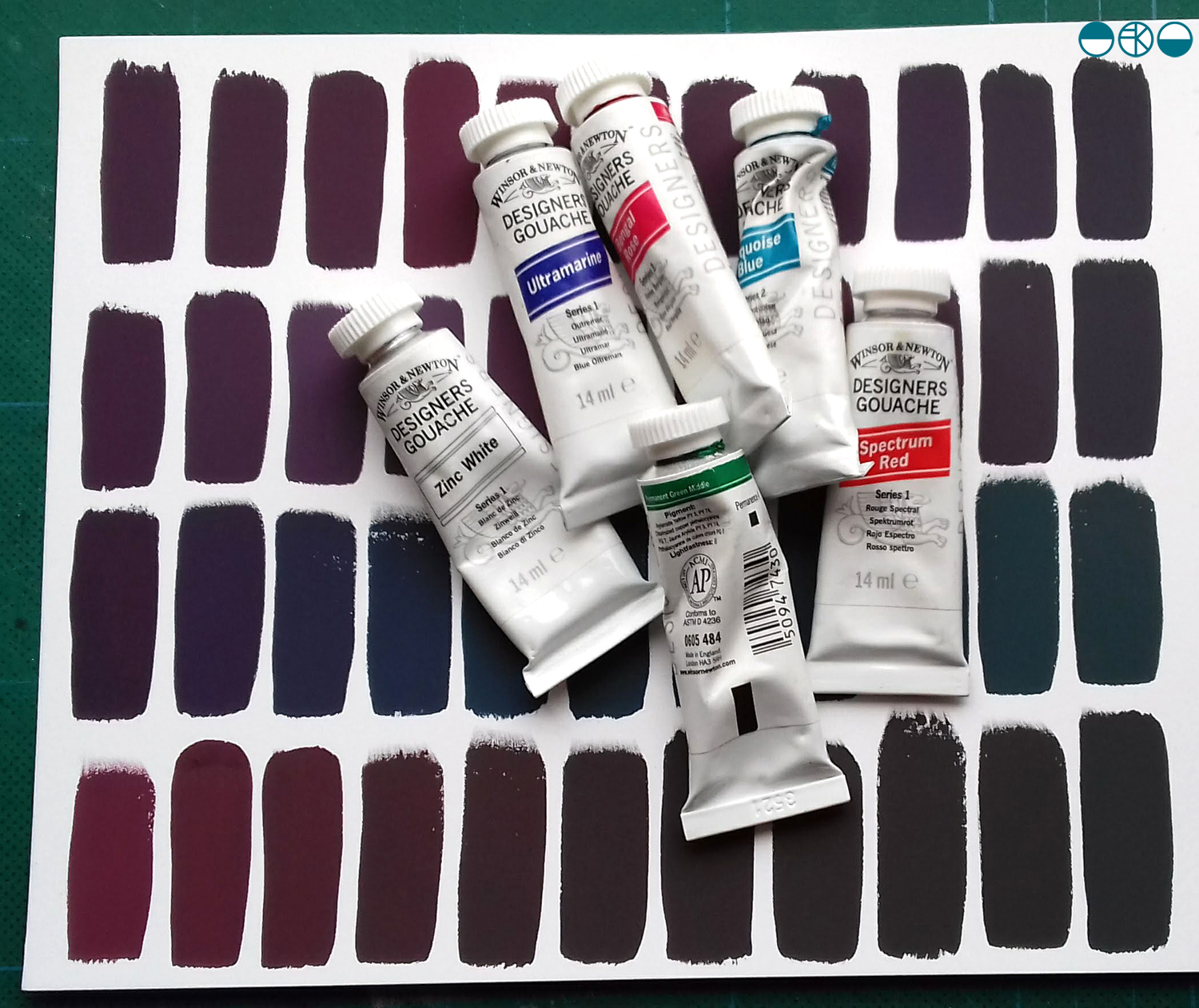
With paints at the ready I knew it wasn’t about making the one colour, but the narrative of generating colour as my process of journeying from one to the next. I wanted to paint each of the swatches of colour I mixed as I evolved the paint story, observing and recording the subtleties of the change in hues. Selecting a limited number of tubes of gouache to begin made it more interesting. To start I selected the dominant colour I was aiming for, and had a little piece of nature with me as reference. I developed the swatches of colour, selecting one, and then another hue to achieve, step by step, slowly and patiently filling the page.

KFarley_ycolourpalette_1500_KF

Gouache is a beautiful paint and this exercise reminded me of a wonderful morning teaching colour mixing to BA1 Textile Design students earlier this year. Getting the right amount of water, ensuring the colours are cleanly mixed, and then making that one painted line flat and even – it all takes practice.

KFarley_ytubes_colour_1500_KFI was lucky enough to have excellent colour teaching during my time at art school and consider myself strong at seeing and achieving the right colour mix. At uni I remembering saying to the print technician “it’s nearly right, I’m happy with it”, and she’d say, “Kate, it’s not what you set out to make, keep going until you get there!” I thank her for teaching me that persistence and these days my students know I’m particular (a preferred word to fussy!) when it comes to colour. Getting the colour right is so important and you may as well enjoy the journey to get it right. Textile products sit alongside fashion and interior items made from other materials, and the colours need to match / coordinate, so quitting before you get the right colour may be a sales / employment disaster too!
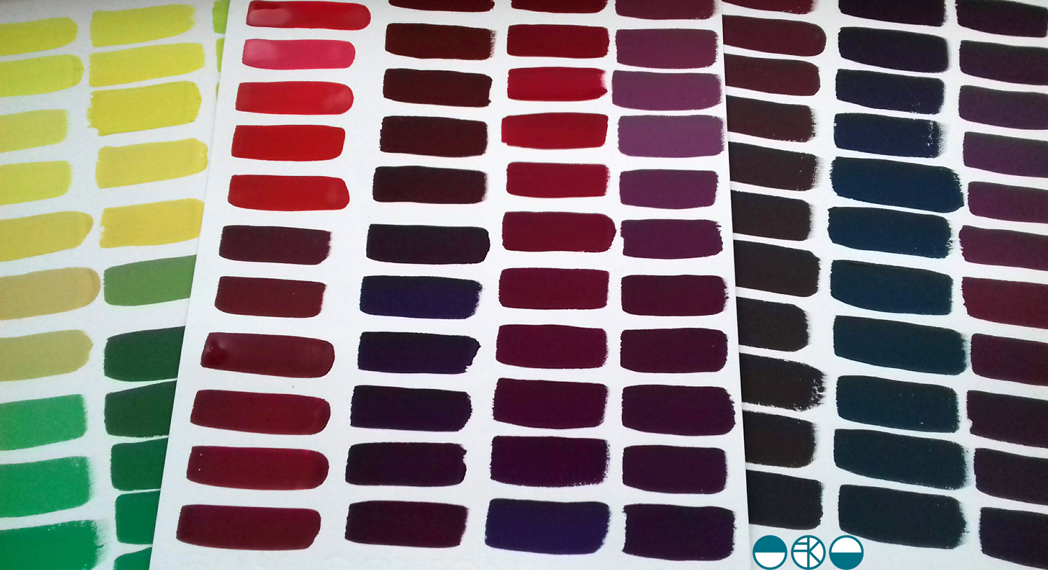
Interestingly, some of my current students were discussing my approach to colour recently and one shared that I’m not keen on black outlines around shapes in print designs. Another one commented that they hadn’t heard that, but would keep it in mind. I jumped in to defend the comment I’d originally made – a black outline is too obvious, unquestioning, the default, rather like Times New Roman black typeface when you open Microsoft Word. Too easy. I ask students and designers to think about whether the black line is the best for the design. If you think of all the other colours you can use, I think you may find another and better alternative!

At the end of this colour mixing time I am left with souvenirs of the process, memories of the walk and beautiful colour. This is real colour away from the back lit screen I too often see colour from. I shall do this again.

KFarley_y3xcolourswatches_1500_KF

Creative downtime in Devon

The summer is over and I reflect on one special week away last month that gave me lots of time to think and be creative.

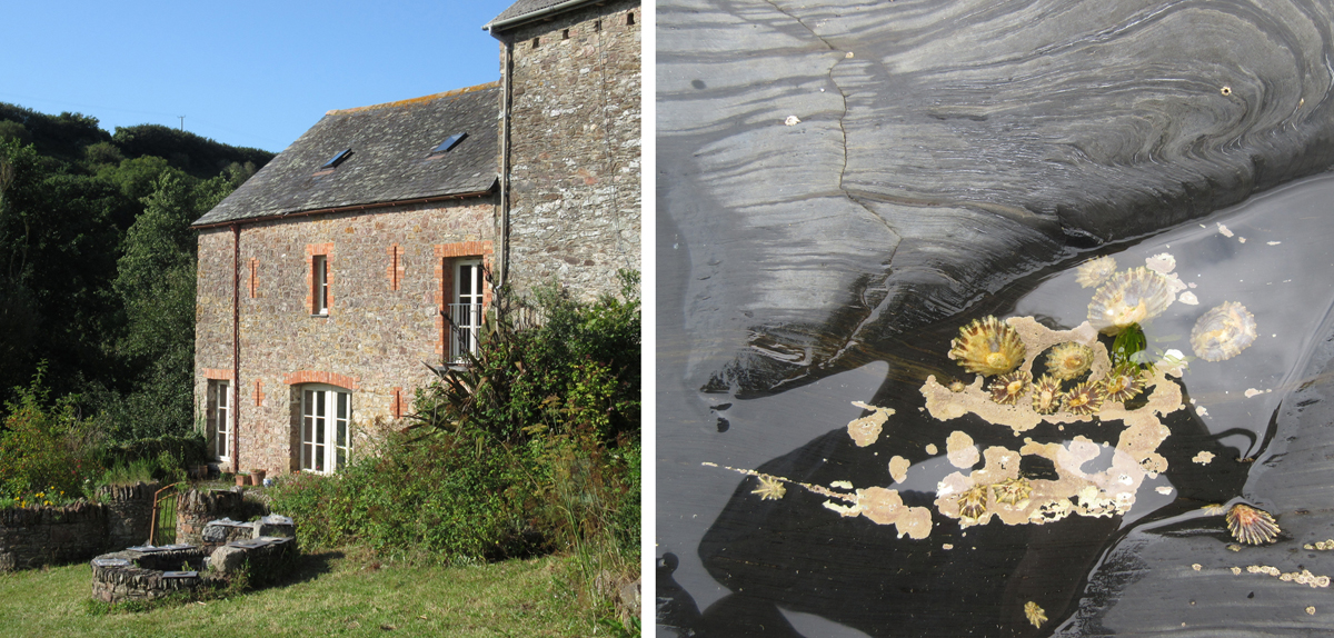
My family and I were invited to participate in a creative field school at Ashridge in Devon, and despite not knowing much about what was in store, we took the very long and scenic route to Devon, down some scary narrow and steep lanes, the car full to the brim, and arrived many hours later, at the most beautiful hidden-away gem of a farm where we settled in for what became a week to remember (Devon via Stonehenge is a long way from Norfolk).

Over the first few hours we met the other intrepid creatives joining us for the time. We were all tasked with delivering one workshop during the week that everyone else, no matter what age, could attend. There were to be some communal meals, talks and evening events including a cabaret – less said about our contribution the better! There was even a printed book we all received ahead of the holiday with a schedule and other useful information in it but once in Ashridge the blackboard outside the studio became our go-to schedule, with times slipping as we relaxed in to the pace of the place. The one clear day from workshops saw us all explore in different directions, and rather unscheduled but special all the same was how we all chose to reconnect with the group when we returned home, back to the studio that evening to share our findings and keep creating.

ashridgehouse1200.jpg

We learned different skills: from making natural rope using brambles and nettles, we made constructions to share with the group, we made zoopraxinoscopes (animations), boodie-ware picassiettes (mosaic plates), monoprints, ceramic pictographs with rubber stamps, printed aquariums, masks and sashes …

ashridge1

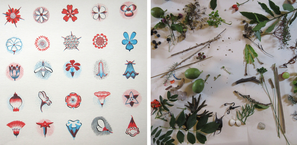
My workshop was called Patterns of Ashridge and I started off by discussing how to draw and stylise natural forms to create patterns, inspired by illustrator Gwen White’s book, A World of Pattern, (left-hand image below) first published in 1957. Everyone committed to the exercise of drawing trees to illustrate a point about stylising through drawing, and then set about gathering things to study for their individual pattern ideas. There were some really successful outcomes completed as folded books, and lots of interesting conversations about what else could be done next.

GW_nature1200

styliseAshridge1200

What felt so special was the shared time; the learning through the workshops and the time available for informal social gatherings. Coffee time at 11am, or afternoon tea was spent clutching the sewing project or nettle cordage as we embraced the new craft skills and helped each other remember what our workshop leader had told us. Having only met a few of the other people before this week, we all took the time to share the experience. We found common grounds; the shared networks including academics in common.

We all appreciated the lack of internet connection and took pleasure in the secluded and peaceful environment of Ashridge. We swam in the sea, explored in the river, picked blackberries and generally appreciated the natural world around us, including newts and owls – it all felt many worlds away from the everyday routines we find ourselves launching back in to as the Autumn comes.

We send a huge thanks to Des and family for such a wonderful and generous experience!

I shall be talking about Gwen White and her books at the Women in Print symposium at the House of Illustration on the 16th September.

nature_ashridge1200

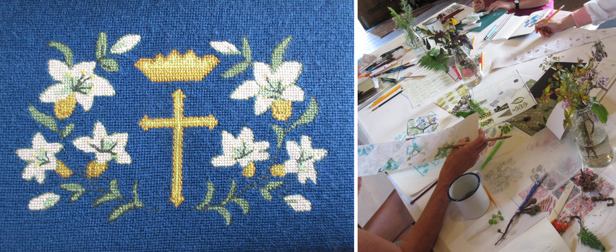
The church kneeler above was from Modbury Church, Devon – there’ll be another post about those in due course!

Save