construct – first glimpse…

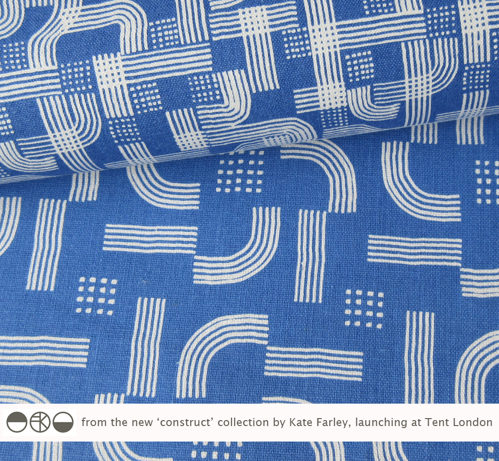
I’ve spent many months working on a new pattern collection and will be launching it at Tent London at London Design Festival this September. I’ve kept any signs of the design development away from social media until now, but here’s a couple of the patterns from the ‘construct’ collection. I shall write more about the ideas behind the collection in due course.

KateFarley_CONSTRUCTblue

floral inspiration for textile patterns

One of the reasons I love to teach students drawing for textile design is the journey of enlightenment when introducing someone to the world of not only looking, but also of seeing. There are many ways to see when drawing and I’m really interested in the journey from reality to abstraction, whether its a state of mind, a way of transforming or whether it’s a methodical process applied to something in order to arrive at a motif for pattern.

My drawing process has evolved over years of practice but the way that I see is not so different to two decades ago. I remember reading the book ‘Drawing with the Right Side of your Brain’ by Betty Edwards and realising that I already did that and it all made sense. I enjoy playing with perspective, elevation, mapping of whatever it is I’m drawing, whether it’s a landscape or twig. Turning the three-dimensional thing in front of my eyes in to a two-dimensional drawing is always exciting, and challenging, but that’s half the fun. I think the process of printmaking that I further translate my drawings to really suit the clarity of motif dissection, separating colours or specific details on separate blocks or screens for printing for either a limited edition print or commercial textile design.

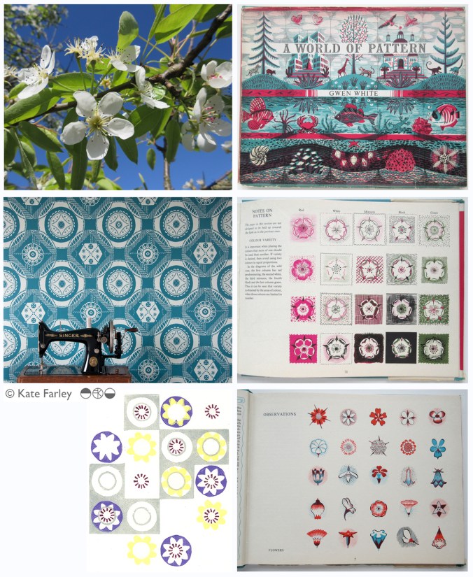
Each year the pear blossom at the allotment arrives and each year I’m reminded of how perfect they are in all ways. The beautiful petals and the bits I don’t know the names of, all there, waiting to be celebrated in drawing. No doubt Charles Rennie Mackintosh would have made an exquisite watercolour and graphite study. The flowers also remind me of drawings and prints I have made in the past, and not only of blossom, but of flowers that I make diagrammatic in a way to understand and explain the ingredients of the flower. When I discovered the work of Gwen White, and particularly the book ‘A World of Pattern’ I was excited to see someone else communicating what I see and how I translate form to pattern. This method doesn’t suite everybody and it would be a dull world if we all made drawings that looked the same, but every now and then it’s nice to know that my creative brain works like someone else’s brain and that my eyes see what others have seen before me.

KFarley_drawing_blossom_blog

Pear blossom, photograph, Kate Farley

‘Hanbury’ wallpaper, Kate Farley

Passiflora, lino print, Kate Farley

illustrations from Gwen White’s ‘A World of Pattern’ (RH column)


The season of textile design portfolios

As a student traveling up and down the country for interviews for a place on a degree course back in the mid 1990s I had little idea of what I would do on the degree course, let alone beyond the eternity of three years studying. My A1 black portfolio demonstrated my love of drawing, printmaking, pattern and ‘potential’. Now, in my role of lecturer at Birmingham City University each year I participate in the rounds of interviews to select the new members of our textile community and each year as I help them open the black A1 folio it reminds me of the journey I started all those year ago. The industry has changed, the world has changed, technology is utterly different and yet those nerves belonging to those individuals are as real as ever, and I remember that feeling so clearly. The unknown, the untrodden path I stumbled along; the Norfolk girl living in Leeds to turn drawings in to designs.

I’ve questioned most decisions I’ve made along the way, worrying about whether I should study art or design, printmaking or illustration, book art or textiles and yet somehow I seem to have all of those elements in my everyday practice, and that suits me fine. I remember the challenging task of confirming a description of myself and practice for my graduation show and degree postcard. (I opted for Artist / Designer, in case you wonder.) I couldn’t get the wording right, and really thought it mattered.
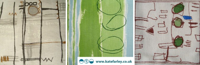
KF_degree_blog(images from degree study)

Having spent last Saturday interviewing students, on introduction I described myself to the visitors as a Printed Textile Designer, which in so many ways completely fails to describe what I do, but somehow seemed right to say at the time. Now I ask myself why it doesn’t fit and maybe I conclude that the term feels too predictable, so tidy, so comprehensive, and yet the thing I am most proud of in my career to date is the breadth of art and design experience I have gained, the materials I’ve designed for, the clients I’ve had, and the lessons I’ve learned, despite as a student, no idea that all that was possible on graduation.

Many times through the day I spoke with interviewees about their art and design experiences and came to realise that their own understanding of art and design had more to do with the educational delivery they were currently receiving and far less about how they defined themselves. An interesting conundrum, and after all that, does it really matter? What made me most excited about being part of the interview process was that all the students were starting out on their own journeys, some of which I hope I shall be involved in, and with the potential of a great course to guide them through, inspiring staff and great facilities they really can do all they understand they want, and so much more than that. Daunting, and exhilarating, and I wish them all good luck!

I didn’t know it at the time but the work I was creating all those years ago as a student still holds such relevance to me now, and it doesn’t matter what label I give myself, it’s all about the creative process, and I don’t worry about boundaries there…
Plot to Plate prints and patterns at Tent London

What a week! Several trips to London, lots of bubble-wrap, the wearing of a particular dress and stamina, all in the name of Tent London as part of London Design Festival 2014.

The preparation has taken months, alongside the development of patterns and printing I have worked on marketing & promotion, stand design, costings and sales. I’m delighted that my first commercially available wallpaper called ‘Hanbury’ (see previous blog post) has been really well received by interior designers, the public and the press and I look forward to working with really great people who have shown support.

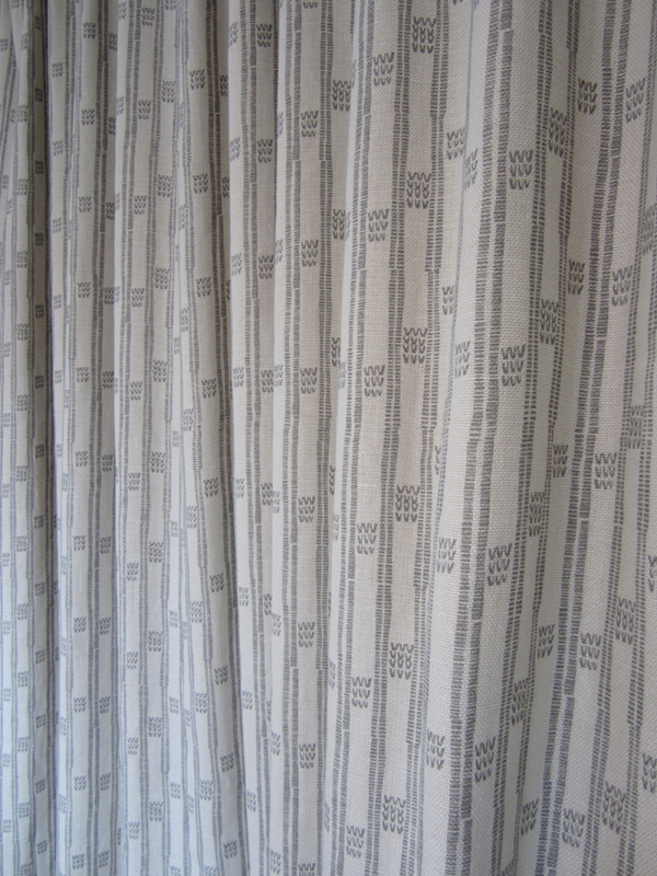
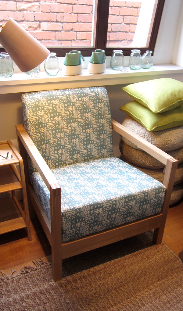
The fabrics have been fairly consistently described as ‘restful’ and ‘calming’ with the muted colour palette being appreciated and described as ‘mid-century’ and ‘modernist’. Its difficult to know sometimes how much people want to know about the generation of pattern designs, but when I described the inspiration and showed the drawings and limited editions of prints of allotments that helped to generate the motifs there was a sense of pleasure and understanding, especially amongst the gardeners! The linens have been popular, especially the Plot to Plate VVV stripe design. I look forward to seeing these fabrics on chairs and hung as curtains in due course.

After months working away in the studio it’s been a great opportunity to have conversations and feedback, meeting like minded people and making the first steps to some fabulous opportunities and working relationships. Thanks to all who came by to meet me, I really value the feedback and support!

A huge thanks go to all of my sisters who played their significant part in keeping me upright, getting me and my work to where we needed to be, and keeping the children going. Thanks to Gavin, as well as Helen for living in the right place, and huge thanks to Stuart for being a great ‘intern’ – above and beyond!

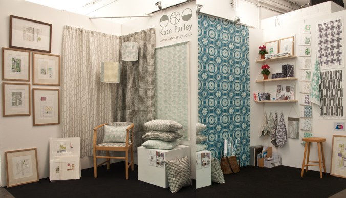
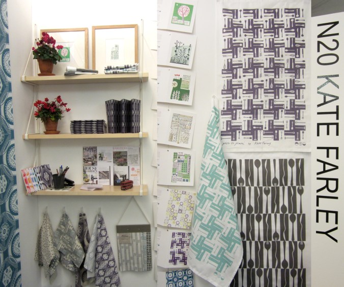
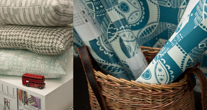
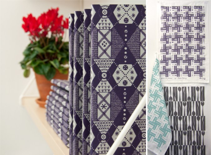
If you didn’t get a chance to visit my stand here’s what it looked like…

KateFarley_Tent_N20_webKateFarley_stand_details1_1500web KateFarley_stand_details2_1500_web KateFarley_N20standdetail3_1500web

A new design: working it all out

I’ve created more designs than I can remember since I began ‘formal’ pattern making back in 1992. Some aren’t worth worrying about, some I’m still extremely proud of and some are still waiting for the right time to make their debut… (I can’t wait to show you some very special ones next year but I’m sworn to secrecy.)

Some designs work themselves out for themselves; I vividly remember shutting my eyes to get some sleep right in the middle of my final major project on my degree, when suddenly my mind spun in to action, and there in my mind was a design, colour separated and waiting to be drawn out for screen the very next day. Other designs I battle for days on, and eventually win through demonstrating more stubbornness than the design itself.  I don’t give up easily.

In all my designing, however hard or easy it was in the making, I aim for them to appear strikingly straightforward, as if they did just happen on their own. I was accused by a tutor for being lazy – he didn’t understand minimalism – when in actual fact, it’s far harder to let the negative space be as important as the motifs we can sometimes throw at a design like pennies to a pond. Space can be beautiful.

I’ve taken a slightly different direction to making the most recent patterns; some would argue they are more traditional, more formal, more fussy even. I’ve certainly battled with the minutiae. I thought it nice to share the journey a little, but do bear in mind, every dot, line AND space have been considered, reconfigured, tested, discussed and revised more times than I’m counting (and that’s before I even think about colour). I hope you like the results. The design will feature in my new work to launch at TentLondon in September, so watch this space.

KF_workings_1000web

The image shows: initial sketch / proportions of the motif, repeat / rhythm testing of the drawing before the lino block is cut, the lino block being printed, and the final digital artwork. The inspiration is a mix of kitchen gardens and formal gardens of the National Trust.


Pattern design, outdoors and in…

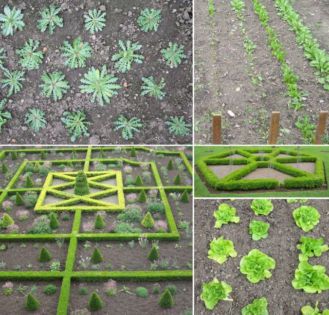
If you are a regular reader of this blog you will already know that for the last few years my personal design practice has been inspired by garden design, and most specifically allotments and kitchen gardens in my ‘Plot to Plate‘ collection, launched in 2012. I have spent many hours walking, almost patrolling, up and down rows of National Trust cabbages and onions, armed with my sketchbook, annotating the patterns, translating them to motifs, documenting the small irregularities, the planting plans, the labeling – fruit and vegetables up and down the country, as well as our allotment, plot 8 in Birmingham. Upton, Packwood, Baddesley Clinton, Blickling, Felbrigg, to name a few National Trust gardens I have surveyed and taken inspiration from. Hanbury is my current favourite garden and I have been working on a number of patterns inspired by this property that will one day be complete, to launch at Tent London this September.

It is with this in mind that I write my thoughts. There are so many similarities between garden design and textile design they seem perfect companions in my practice. Long before Mr W. Morris picked up a pencil the natural world of flora has been a dominant subject of inspiration for pattern in the home. Rather than the bouquets and sprigs, posies and trellis it is the formal gardens, the parterres and kitchen gardens that hold the structure and compositional language that we textile designers and design educators regularly refer to…

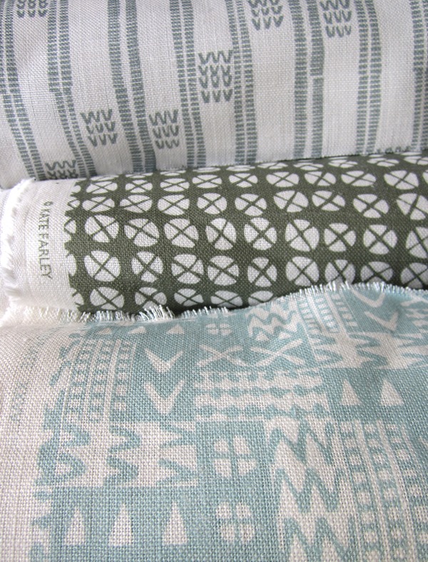
Stripes, spot repeats, all-overs and multi-directionals, geometric grids and diamonds, checks and plaids are all to see. And so it is, that it makes sense that I really have brought two things that I do enjoy together in my creative practice. It’s too early to share artwork for my new ‘Hanbury’ designs but I will share some garden pattern from Hanbury, and my ‘new’ fabrics by the metre, available very soon, in anticipation…

garden_textiles_hanbury_web  fabricrolls1_web

‘Chelsea’ drawings to design for David Mellor Design

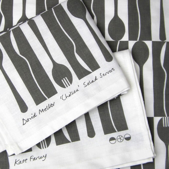
Many months ago I had the go-ahead from Corin Mellor to design a bespoke pattern to celebrate the fabulous ‘Chelsea’ salad servers that he designed for David Mellor Design. When I first saw the cutlery I immediately really liked the look of them and when I received the servers they were amazing to hold – they still are. Impressive in weight and size, the shape is simple yet stunning, and they inspired me to set about drawing. With a number of design options I provided Corin Mellor, Creative Director and his retail team, they discussed and advised, and before long we agreed on this design that is now printed on to linen union tea towels and sold on my website, David Mellor shops in Hathersage and London as well as Museums Sheffield.

With the tea towel now listed in the ‘Special Products’ section of the David Mellor catalogue I thought it time to show some of the images I have of the process. I took inspiration from my visit to the factory in Hathersage where they make and display the cutlery production process as well as the objects themselves.

I’ve had great feedback and sales, we are having another print-run and they’ve received press in the form of Elle Decoration!

Thanks also to Patternbooth and Design Hunter:

drawing_mellor1webprintedMellorTags_webmellor_square_web

elledeco_Mellor_dec13_web

Design inspirations 2: the natural world

Second in the series of ‘Design Inspirations’ blog entries…

The natural world has long been an inspiration for textile designers. Many years on from William Morris celebrating the natural world of flora and fauna as decoration for textiles we have had Laura Ashley, Marimekko and Orla Kiely, to only name three companies, who have interpreted the natural world and created stylised patterns and imagery which continue to inspire design students of today.

At times the worst thing as a lecturer of design we can hear from a student is that their project will be “about shells” and we dread the worst examples of static and bland studies which do little to explore the beauty and wonder of the natural world’s creations of form, structure, surface, pattern, colour and more, before approaching the bountiful concepts and metaphors in the ‘dot to dot’ of design processing hidden around the shell!

In my drawings I often aim to distil and to simplify a plant structure or shape of a flower in order to create motifs for prints and surface patterns, exploring perspective, diagrammatic language and relationships with place / context. I have a huge archive of drawings made on locations as well as boxes and bags of samples including plants, stones & leaves and one day they may well feature in designs. You never now what you might need! Going anywhere new, even for a holiday means that I keep my eyes open and often pockets filled as a result of finding new things.

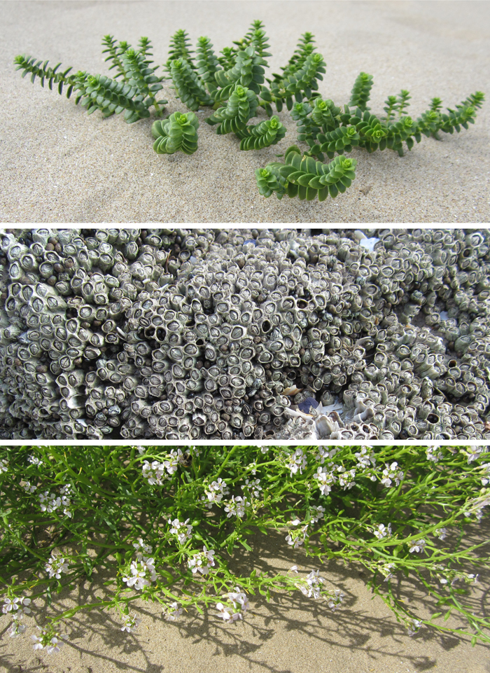
Having visited the Gower peninsula for one last summer camping trip I came across these examples of natural forms, which could and would create different visual interpretations in the hands of each creative prepared for the job. That is one reason why I like to play a part in design education; to facilitate the looking, seeing and interpreting, and it is certainly why I like to keep on collecting, and keep on drawing.


Image

a textile archive of a different kind

Having worked at Birmingham Institute of Art and Design, BCU at the Gosta Green site for the last few years we are moving to a brand new campus next week. There has been plenty to do packing up the workshops and studios, and during this process the course team have reflected on and recorded the space that has been home to this textile design degree for many years.

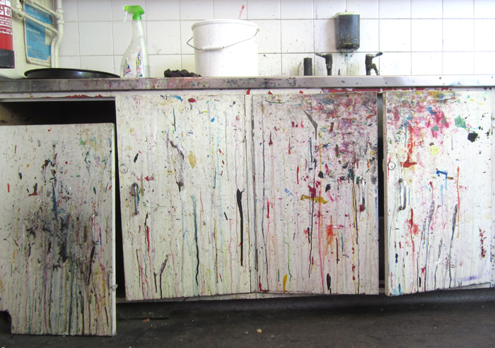
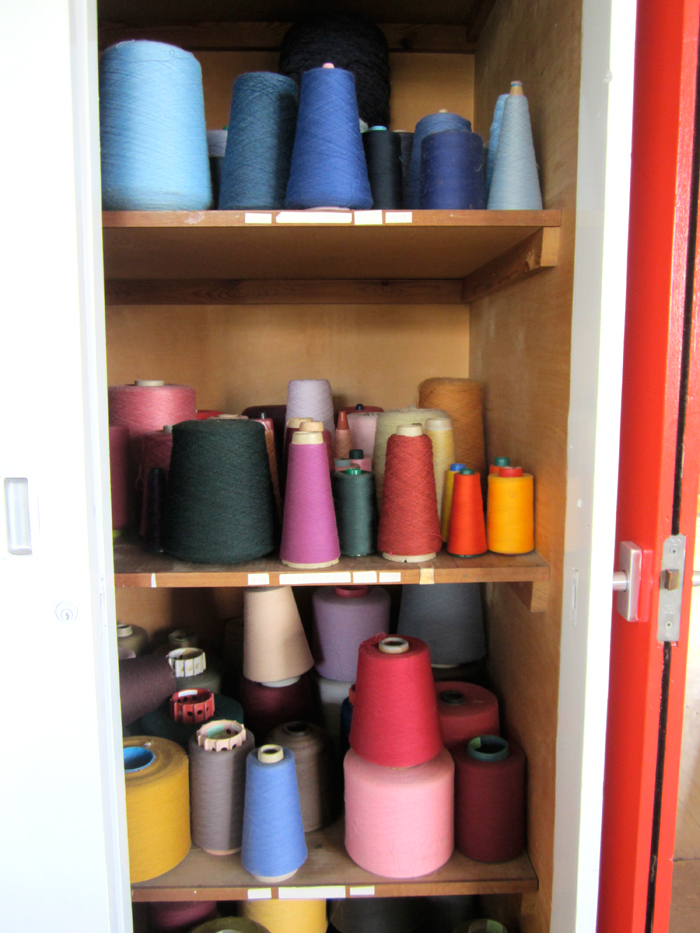
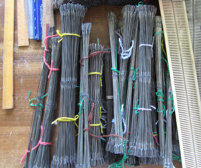
There are so many signs of demonstrations given, lectures delivered, course-work carried out and with the heavy use of the workshops comes a fabulous visual archive of the textile careers that we have helped to initiate and support along the way. We are nostalgic in many ways, but excited by the new and very clean slate that we are about to start writing history on at the Parkside building.

ImageImageImageImageImageImageImageImage

Kate Farley – Plotting Prints at Tinsmiths

It is a very exciting time for me. It has been about two years in the planning and preparation stages and now we are a week in to my show at Tinsmiths. For those of you unfamiliar with Tinsmiths, it is a beautiful textile and lighting shop in the lovely Herefordshire market town of Ledbury. It is a beautifully considered shop, owned by Phoebe Clive, selling a wide range of fabrics as well as home wares, crafted pieces and artists prints.

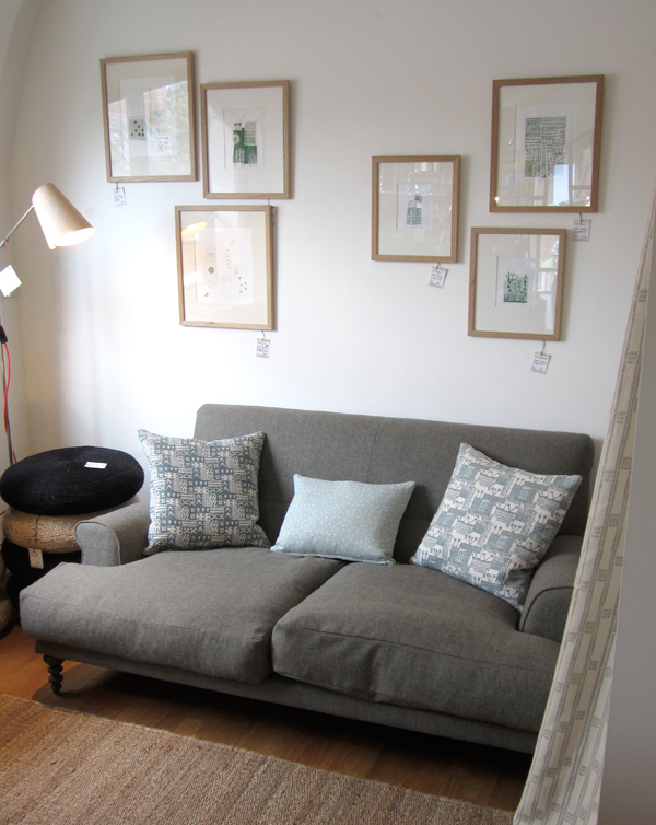
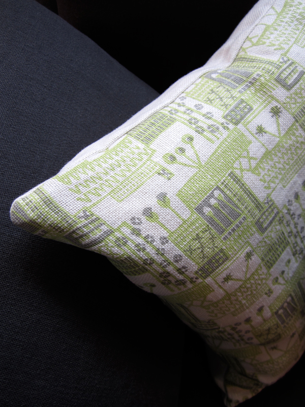
I have worked closely with Phoebe to translate my lino printed designs inspired by allotments, to become a collection of heavy weight linen, hand screen printed textiles available to buy as cushions. We have also created larger showroom pieces as curtains and upholstered chairs in preparation for selling some of the designs by the metre later in the year.

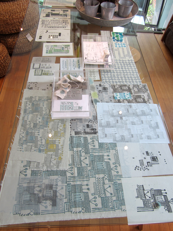
Phoebe and the team have styled my products throughout the top floor of the premises in such a way as to create a clean and fresh interior space, working with the other products and furniture pieces in the shop. My prints and drawings are set amongst other exciting colour statements in the form of ceramics & lighting with an understated aesthetic. With plenty of positive feedback at the PV as well as sales throughout the first week it’s a really exciting reward for the long journey to this point.

Tinsmithssofa_web

cushion2_tinsmiths_web

glassdisplayTinsmiths_web


cushionsTinsmiths1web curtain_tinsmiths_webchair_tinsmiths_web