The process of writing a book has been a long one for me, but we are a step closer to publication … January 2023. I can’t quite believe I am an author of a book!
I’ve recently received the pre-publication inspection copies and I’m so excited to be able to share the first glimpse. I’ve been really touched by the initial responses from the contributors who have been receiving their copies, who without them, this project wouldn’t have got off the ground.
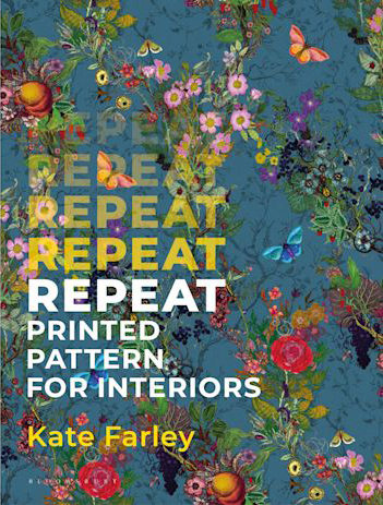
I’m waiting patiently till the new year, but here it is, the beautiful cover, featuring the pattern Bloomsbury Garden by Timorous Beasties. The book is designed to inspire and inform people about the complexities of designing pattern for interiors, and is an ideal core text for undergraduate studies. I’m delighted to be featuring the work of students I had the pleasure to teach, as well as more well known names including Angie Lewin, Sarah Campbell, Timorous Beasties, Oral Kiely and Neisha Crosland.
A while ago I received a message from a friend over in America, and knowing of my career and personal interest in textiles, she was writing to see if I’d like to receive some old but special textiles she had spare that made her think of me… I was intrigued what might arrive in the post… How could I refuse!? A few days later two beautiful squares of cloth arrived, one with a woman and the other a man stitched in to the cloth across one corner, with gently ornate decorative edges and corner details.
[details: one piece features a woman, the other a man]
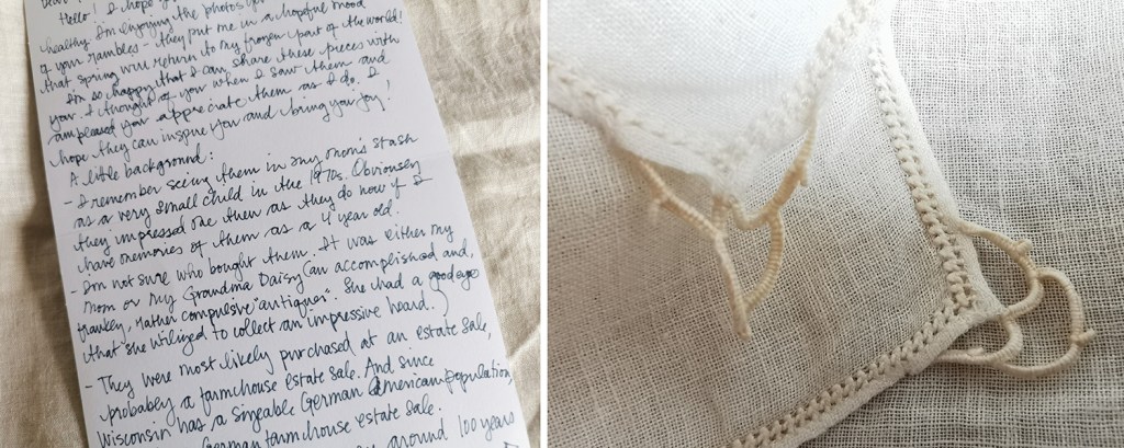
She thinks they are napkins, they are very light weight cloth. Accompanying the two pieces was a note sharing what she knew of the provenance, and how she had acquired them to share with me. Emily remembers them in her mother’s ‘stash’ of things in the 1970s, when she must have been only about 4 years old, so they made an impression on her.
They were possibly bought by her Grandma Daisy (an accomplished and frankly, rather compulsive ‘antiquer’), at an estate sale, maybe a farmhouse estate sale. She had a good eye and built an impressive hoard! Emily told me there is a sizeable German-American population in Wisconsin, so this might be part of the story too.
[the letter and edge details of the pieces]
I’ve consulted my panel of experts as I’m no embroidery expert myself, and they’ve been a great help (thanks particularly to Grainne & Liss) … I think it’s safe to say it’s a combination of techniques, including cut work and stump work. One of my experts suggests stump work is the overarching technique, particularly to create the woven style stitches of the figures. Often more three-dimensional than these examples, stump work can be highly ornate with raised areas, but these squares appear rather low in relief.
We can also see whitework embroidery, a broad term including a number of different techniques, working with white thread, often linen, pulling the warp and weft threads to form motifs. Pulled or drawn thread work are examples of whitework where no cuts are made. Cutwork is a form of whitework where areas of woven cloth are cut away and stitched in new configurations. These samples include cutwork featuring buttonhole stitch & buttonhole bars with detached needlelace. I hope I’ve got all this down correctly!
There is an amazing online Royal School of Needlework resource here for more stitch information – you might be lost for hours!
A detail to note is that the figures have been created on the bias of the cloth, set diagonally on the weave near the corners, rather than the straight line of the weave. This may be a specific approach preferred by a particular maker, region or process, so might help identify the provenance.
The figures are wonderfully stylised as a result of the stitching process, naive and full of character. They remind me of folk art examples I’ve seen before and historic world textile samples at the Pitt Rivers collection in Oxford only a week or so ago. Also the characters are not dissimilar to the figures on the Asafo flags of the Asante in Ghana I’ve written about before. Once again, the process of stylising and representing imagery as motifs is shown to be one of my favourite subjects!
Textiles, although fragile, can survive in the right conditions for centuries, and can hint at stories of society, status, lifestyle and identity. The textile skills required to make these pieces are likely to be far more commonplace at the time these pieces were made too. Lightweight, portable and often with specific uses, textiles have been transported all over the world with people travelling for all manner of reasons. These two pieces have their own history I’d love to know more about, not only to understand where they were made and by whom, but also to understand the journey they have been on since their creation.
Despite not knowing more I shall continue to enjoy them, and in the process of writing this post I’ve learned a bit more about embroidery too… I am grateful to have been sent them to care for. Thanks Emily!
I’m delighted to share the news that after nearly five years in development, we are at the stage of announcing the book I’ve been writing on repeat printed pattern for interiors, with Bloomsbury Publishing is now available for pre-publication order.
The book is a culmination of my design and teaching practice experience over the last two decades and features some historic and contemporary designs and interviews with some leaders in the field including Sarah Campbell, Neisha Crosland, Deborah Bowness and Orla Kiely. It is for anyone who is interested in printed pattern design, including design students. You can read more here.
I’m delighted to be able to feature this beautiful pattern by Timorous Beasties on the cover too.
Thirty years ago I began my art school experience studying a diploma in Surface Pattern, a little unsure of what was meant by the course title, but keen to find out more as it involved drawing, printmaking, pattern and textiles. I thrived at art school, building practical skills and theoretical knowledge, growing in confidence in my ability, encouraged to experiment and play with ideas and processes. When I think back to what I understood of careers in textile design at this time, I have little memory of career planning, or job role research. This was the era of the Yellow Pages; I couldn’t Google it! I made decisions about my degree course based on the fact my tutors suggested I was more of a printer than a knitter or weaver.
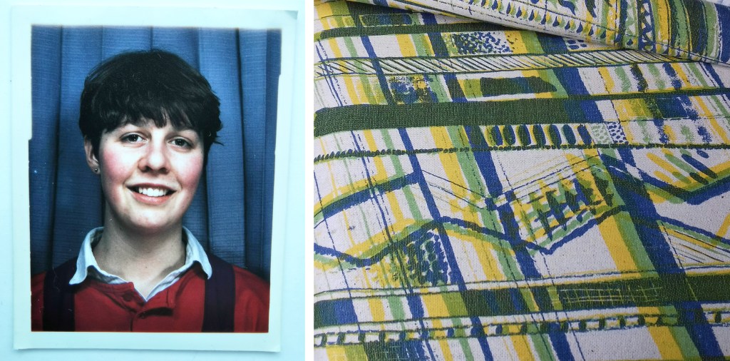
The art school student and the first screen printed pattern
During my degree I undertook a floral print project in the first year and hated it so much I nearly threw it in for fine art printmaking, but then I gave myself a talking to, and realised I wanted to frame my practice in design, to apply my thinking to scenarios, and to problem solve. This has stood me in good stead, both as a designer and academic. I believe the context in which we work is as important as the role we undertake.
I think back to those days and see a very different textile industry to the one we are experiencing now. I graduated at the dawn of digital design, without the range of composite surface materials for interior applications, or bespoke digital production that enabled me to collaborate with Formica when launching my collections in the mid 20-teens. As a freelance designer in the late 1990s I was posting hand painted textile designs in large cardboard tubes across the country to my agent and sending my portfolio out as slides (transparencies) for exhibition applications, hoping they would be returned to save me money and hassle – they rarely were! Thank goodness for the digital cloud of today, allowing files to be accessed around the globe in an instant. Laser cutting and 3D printing have become the norm (even in schools) since then, and expertise in digital software is a basic requirement in graduate jobs. It is easy to take these developments for granted – but our line of work is transformed.
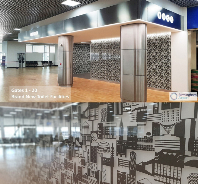
Over the years since that time, I’ve built a career embracing many different opportunities as a designer, artist and designer maker: launching my own brand collections, undertaking illustration or pattern commissions, exhibiting, designing public art (including three large gravel roofscapes and three public toilets!) as well as leading residencies in healthcare settings. I have enjoyed the variety of projects I have completed, building my understanding of several sectors of the industry. Ensuring I remain up to date with industry developments has been key to the relevance I maintain in my academic position.
Birmingham Airport commission, fabricated by The Window Film Company
In the last twenty years we have seen the development of ‘smart’ textiles for medical applications, interactive electronic textiles for military and domestic use, bio-materials and colour developed from bacteria and new design opportunities in the digital realm within the simulated environment – the metaverse, an emerging international arena. At the same time, during a global pandemic we see a resurgence in low-tech craft with textile processes such as crochet and knit identified as beneficial activities for our wellbeing, and a fightback against the consumer culture.
The breadth of opportunity available across the discipline of textile design today is exciting, and fast evolving. Revisiting craft practices for contemporary markets is not new. The Arts and Crafts movement spearheaded by William Morris, advocating for handicrafts and naturally dyed yarn and cloth, was an attempt to battle against technological innovation and the resulting cheap and poor-quality products flooding the market. The current growth of interest in craft practices again connects us to the heritage of making and the close relationship with material and process that nurtures us. Sustainable solutions compete with mass produced problems. Customers are easily overwhelmed by choice and price-points, single use versus something for life – future heirlooms, or landfill. Digital design provides solutions by reducing fabric waste in the fashion industry using 3D digital rendering to identify and fix issues, where previously each garment in each size or colourway would be produced and discarded as products were developed. Craft and technology are not mutually exclusive.
The creative industries we have today were unimaginable to me as a student, and now, I think about the relationship today’s students have with the industry and how far into the future they can imagine. As head of the discipline at my institution I am required to consider the future of textile design, to design an educational experience to not only equip the students and graduates for roles that we know about, but also provide them with the curiosity and creativity to shape the roles we can’t quite define. Ambitious ideas need to be partnered with strong realisation skills, traditional craft and making skills paired with digital competence. Let’s see where the next thirty years takes us!
Construct collection by Kate Farley, in collaboration with Formica
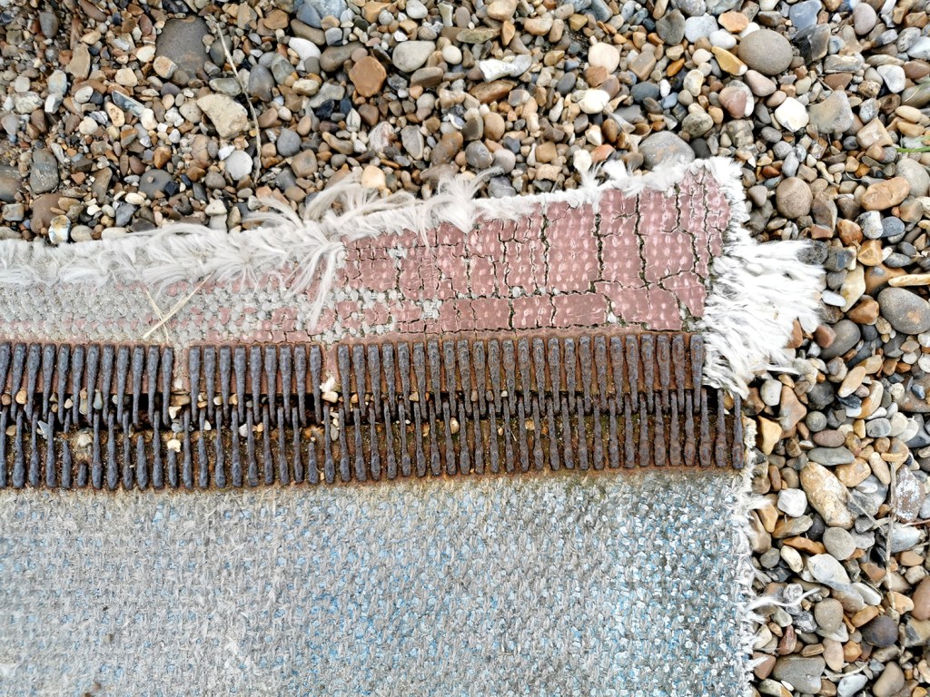
A weekend walk in the search of headspace following a busy week in academia led me to the Suffolk coast and a beautiful 13km walk, down and back, along the beach. Always with an eye on the hunt for pattern, colour and cloth I found all three, relating to the topics of my teaching. Of course I also had a handful of stones and other ‘precious’ detritus.
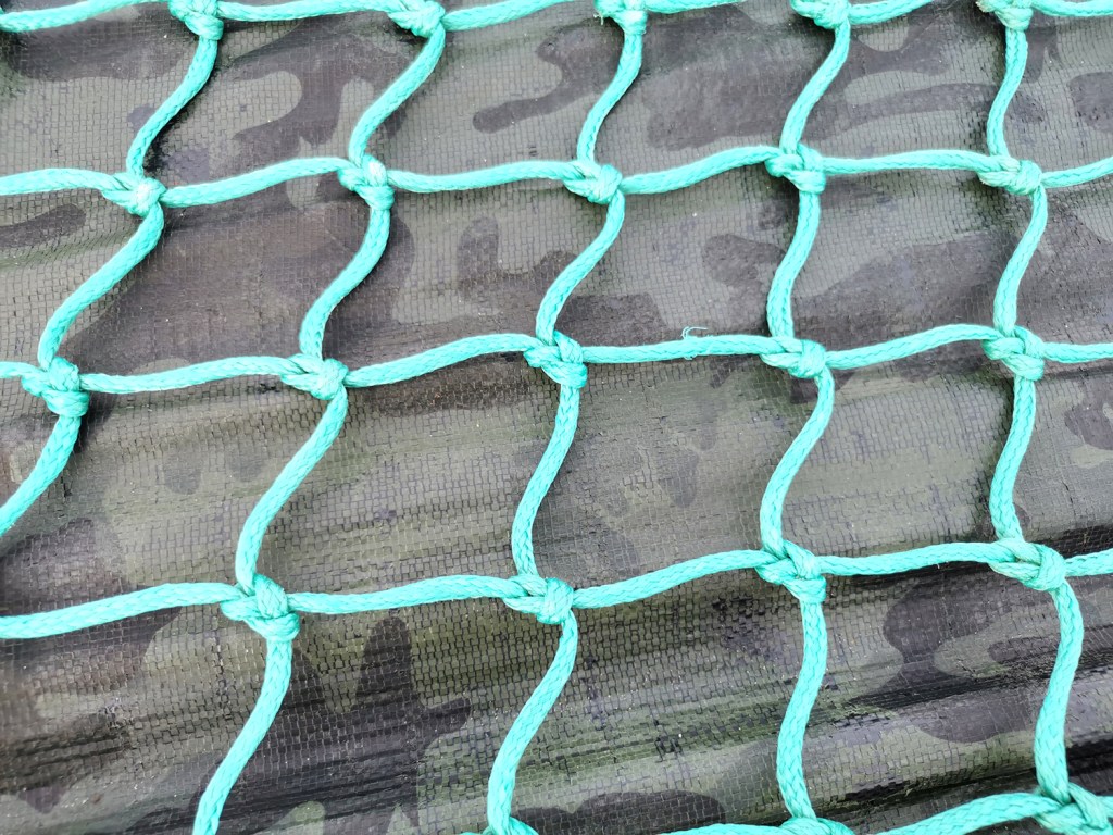
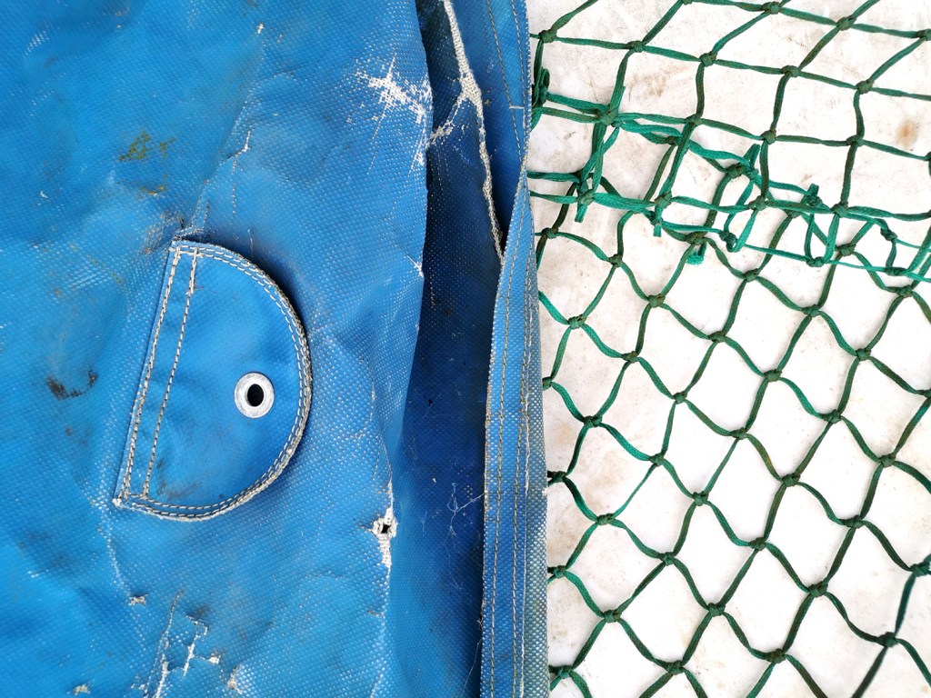
Having spent the week talking textiles, including pattern structures and repeating designs I was amused to connect the patterns on the beach made from the waves running back across the sand being echoed in the fishing nets on the boats higher up the beach.
I have also been discussing with the students the broad application of textiles in the everyday world around us beyond fashion and interior applications and our walk gave me good examples to illustrate my point. We use traditional textile techniques including knitting, crochet, printing or weaving, with the addition of a coating or finish to create materials for practical applications.
As a keen lover of patterns I’m always on the look out for interesting examples to add to my consciousness. I do like a good geometric as well as micro (small scale) repeating patterns so despite being immensely annoyed to find myself back in hospital on a ward for a week I did spot the odd pattern of interest…
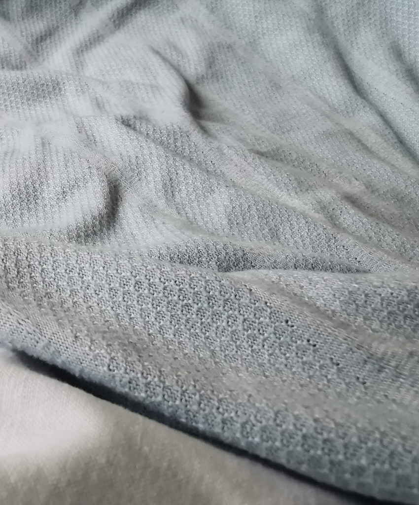
I’m interested in small details that make patterns work, and I spend time in my teaching analysing successes and failures of patterns in relation to motifs, pattern structures and repeats to teach the students how to improve their own designs. These NHS designs, printed on fabric for hospital nighties (left), pyjamas (middle) and the surgical gown (right) do demonstrate merit.
Small details on the pyjamas / nighties, such as the spot actually being a hexagon, the less obvious choice, and the squares making up the bigger square block including smaller squares in the darker colour, means they contrast with the larger mid green colour bring visual interest. If the darker squares were the same size they may well appear too dominant. Interestingly, the pyjamas had the green colourway as vertical stripes, and yet the same design in red was placed as horizonal stripes on the nightie. I wonder why this was. Let’s not talk of the fit of these garments! The surgical gown is more simple, but I appreciate the fact that the cross is made up of broken lines, with a small dot in the middle – so much more interesting that if it had been two lines crossing.
These are tiny details that most people will overlook, I know I was probably not the most typical of inpatients, but if you spend any length of time on a ward, nil by mouth for several days your mind wonders. I found there to be a significant challenge in retaining something of myself as a person beyond the sick patient, with all the focus and attention on your health, or lack of. The pattern spotting was a way of still being me.
As I said at the top, I like micro patterns and have shared my collection of envelope insides on the blog before. I like the smaller scale patterns that provide visual rhythms and noise, that get on with doing their job, in a simple utilitarian manner. These patterns on hospital garments also got me thinking about moquette, the hard-wearing fabrics on transport upholstery, and how those patterns signs are there to conceal dirt and wear, whereas these hospital ones with the white background were doing the opposite.
I hope you don’t find yourselves in hospital to have the chance to analyse patterns on your gown, but if you do, I hope you like the ones you’ve got!
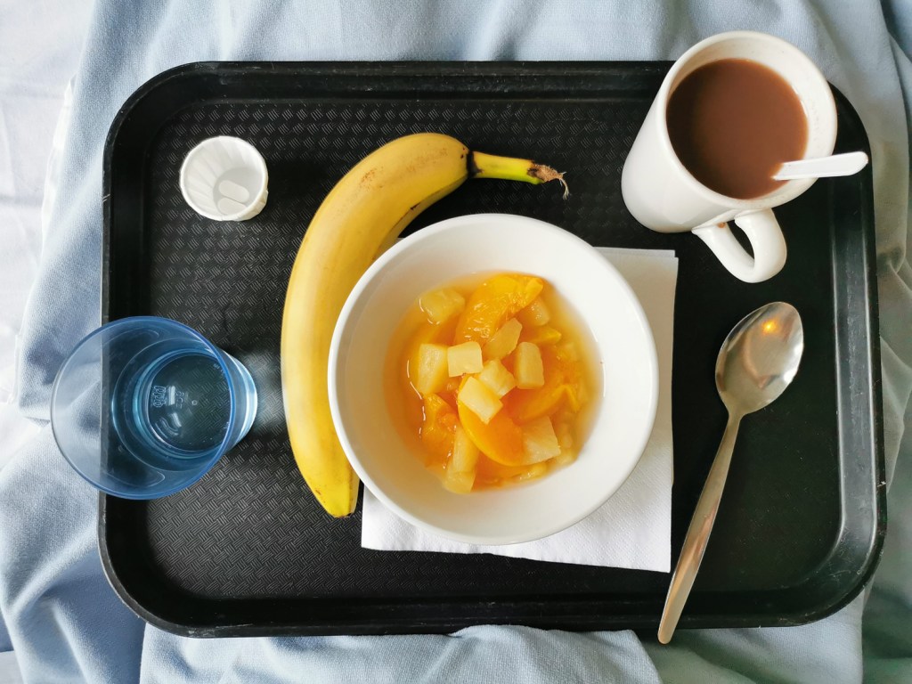
I’ve had an interruption to normal services as a result of some general surgery, added complications and time to heal. I’m not one to sit idle so it’s been a challenge to be patient, giving myself time to recover and gain strength. The time in hospital – a week – was an ordeal despite wonderful ward staff, and it gave me time to think about how important our surrounding environments can be, for our wellbeing and sanity.
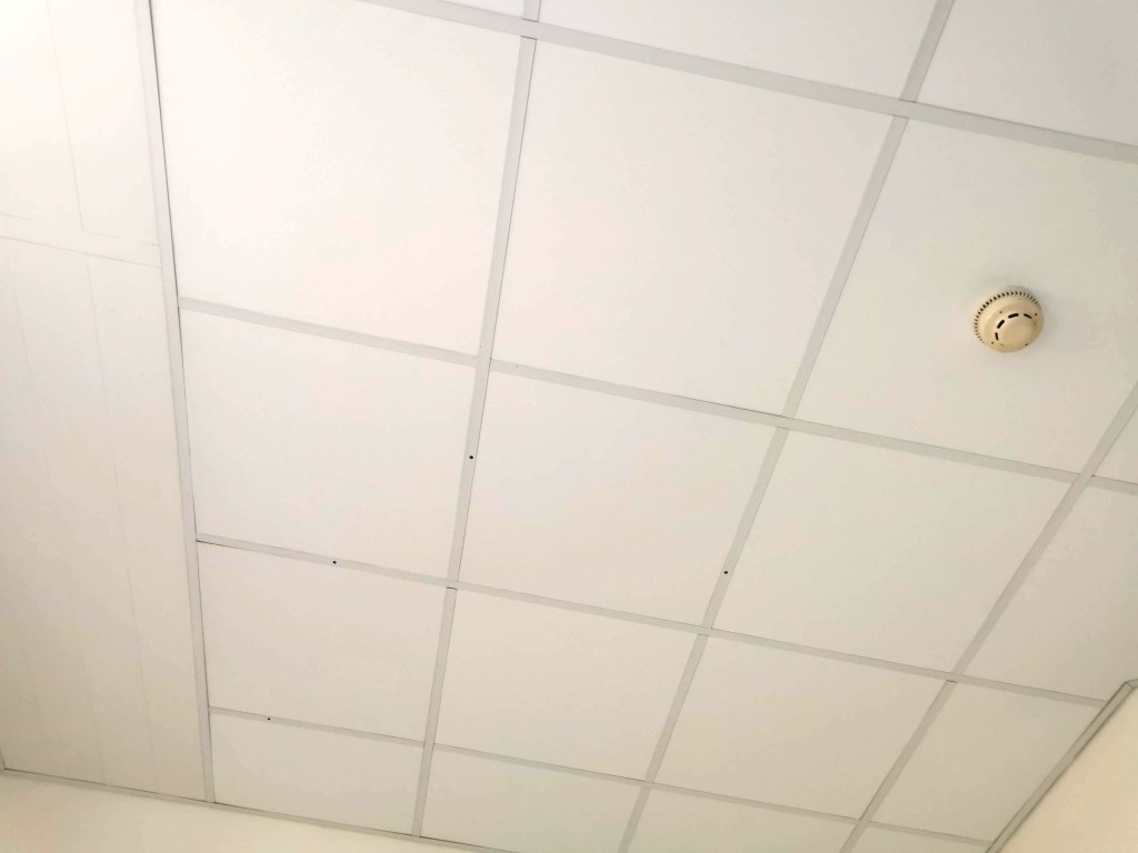
I got to know the walls and particularly the ceiling of the room very well. In my hazy mind I toyed with the grid of ceiling panels being a response to the Dutch De Stijl design by Theo van Doesburg, or a drawing by Agnes Martin. The four holes in the ceiling were also a stark reminder of the surgeon’s cuts. The prints on the curtains were so poor I refused to capture them, but they were insipid, uninspiring, and frankly poor design – I remember analysing their weakness with one of the staff late one night – I think she said I was crazy!
I vividly remember the power of the textiles surrounding me – I had a scarf which was a huge comfort to me – a familiar texture and smell of home. The fresh sheet and hospital blanket were also providing a strange comfort in the utilitarian room.
Twenty years ago I attended Arts in Health lectures including discussions on the subject of hospital environments aiding recovery and wellbeing, and I remember seeing incredibly exciting and positive schemes across the world where designers were embracing colour, nature, pattern and material to drive rehabilitation. I had hoped things had moved on from the institutional walls of hospitals. We now have the interior design buzz word biophilia, using nature for our wellbeing as an integral component in the design solutions, linking humans to other life forms, but it has yet to arrive here. The space in which I coped was bland, institutional and bleak. Such a missed opportunity – and particularly when the hospital ‘art’ is so often shoved out front in the public foyer, and not where the patients spend hours on end, day after day – don’t get me started on public art commissions at hospitals!
The relief to be home, surrounded by colour and pattern – and my family – was intense. Those first breaths of fresh air, the sight of a bright autumn day was incredibly uplifting. I still hold a heightened sense of this awareness of nature, even now a week on, as I recover and appreciate my health returning to business as usual.
It all began in an email with the subject line, ‘Hello from Tokyo’ I received in November 2017, letting me know how much my tea towels for David Mellor were admired in a Japanese design company. The email went on to ask if we could discuss a potential collaboration for a capsule fashion collection featuring a print designed by me. Firstly I was excited to think my patterns had made their way to Japan, but secondly, that sounded a great idea, tell me more! A few email exchanges later, and we agreed to meet the next time the company director of Stamps Inc. was in London so I could show him my portfolio to discuss the idea for the new pattern they would like to commission for their fashion collection.
The meeting with Shu and his colleague Yoko in a central London hotel was exciting; I showed my work and it was met with positive discussion. I was also reintroduced to the tea towels that had made it to Japan all the way from my studio, via a David Mellor Design shop! We sat at a large table and I showed them my portfolio, spreading the many sheets out covering the whole surface. Having shown all the other work and following some discussion in Japanese between colleagues, the director chose the very first page he had seen – the cover page! The choice was not what I was expecting but we shared and developed ideas for me to sample: colours, time-lines and garments. We then took some photographs to record the start of the project together, for when we would be able to share our story – and even asked the hotel doorman to take a pictures of the three of us with a London bus behind us.
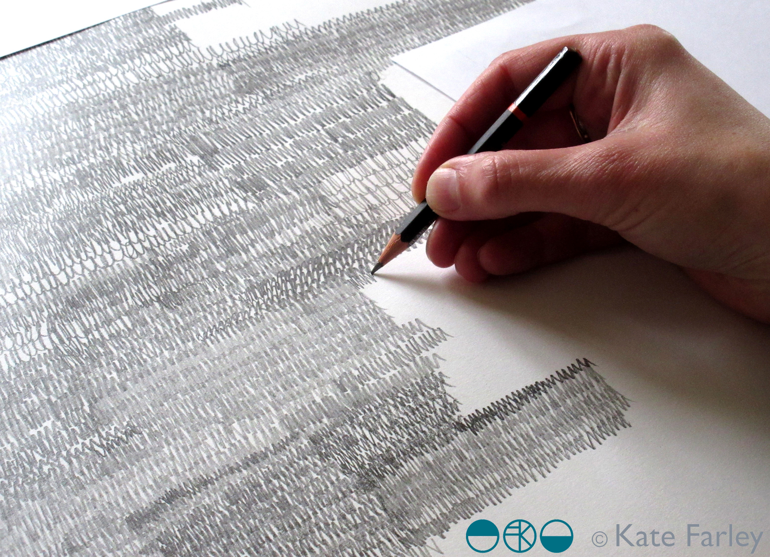
The selected design was a graphite pattern of pencil scribbles of varying tones and rhythms, later to become the title of the collection: Scribble. There are lots of variables such as scale, rhythm, tone and overall order in the pattern we had to make decisions before I set about creating the final artwork. I emailed across some small sketches to explain the repeat process for production to check we were understanding each other as we had to ensure we understood the terminology that each of us used in our different languages.
I shared several images of new drawings to provide the variations / considerations over email before committing to the final design. The final fabrics were to be screen printed so I planned to draw out the whole design in full repeat by hand (approximately 60 x 90cm), scan it in and transfer it to Japan for screen print production. I started the large final drawing twice as I wasn’t happy with the first one. Initially the marks I drew appeared tense, but I also had to work out how to create the different qualities with the pencils across a vast piece of paper, and how not to smudge the areas I had drawn. I drew the design at 80% scale to make scanning it in possible, meaning I had to take in to account the slight increase in the size of the marks in the final result. I also had to ensure the top of the design matched the bottom, as the edges were to act as a cut-through for the screen printing process of repeating the pattern, fitting like a jigsaw, top to bottom. The design was edge to edge, left to right, fitting the width of the fabric so there was no horizontal pattern-repeat.
The final artwork took almost ten hours to draw, and I did that mainly over two long evenings. I had it scanned in at a very high resolution, adapted the size of artwork to 100% and sent the digital file to Japan – with my fingers crossed that the printer could work their magic, including colour separating the graphite tones for the two screens each colourway would require!
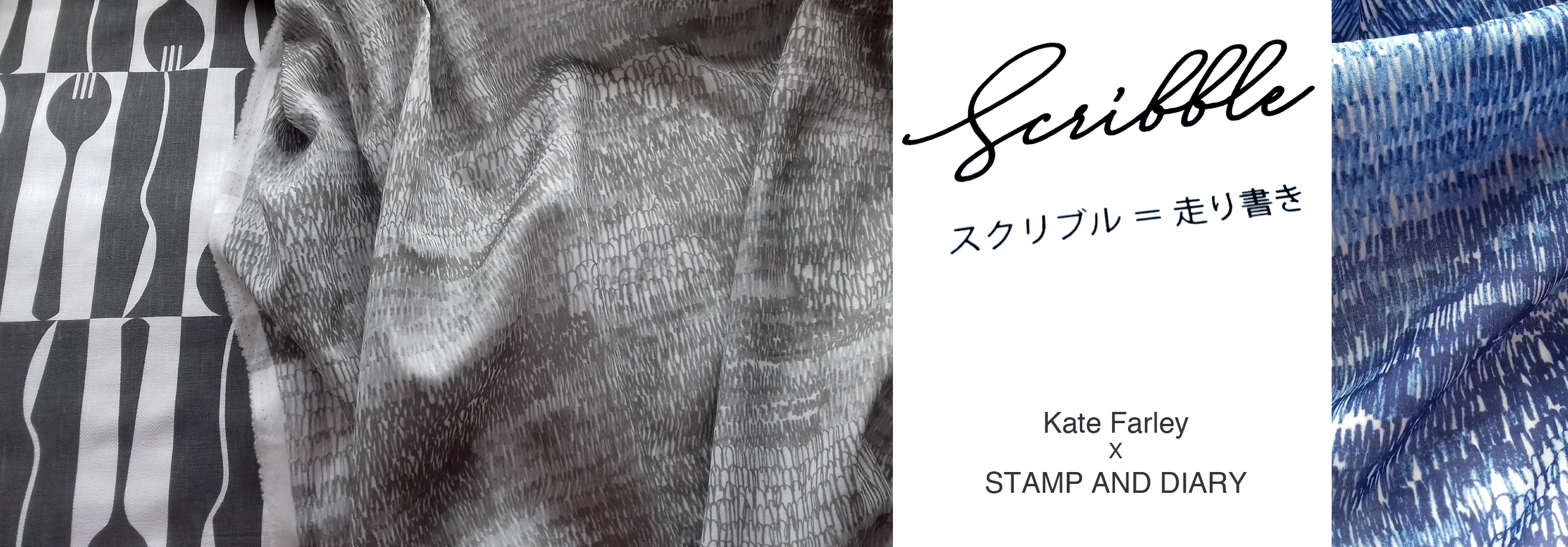
There was a wholesale launch in Tokyo so I sent some of my original drawing samples over to feature as framed artwork in the exhibition and I was sent photographs of the lengths of fabric on show. Very exciting! Orders were placed and there was a good response. A further email request came from Japan, to meet again in London to see the fabric. Another exciting moment – also scary – what if I didn’t like the results!? In the stylish interior of the St Pancras Renaissance Hotel lounge there was no need to worry. Great care had been taken to translate my drawing to screen printed cotton lawn fabric, in two colours – referencing the two colours of my David Mellor patterns Chelsea, in grey, and Pride in blue. The fabric felt beautiful and the printing fabulous. It was a special meeting.
I was able to see the marketing material including my name alongside Japanese text I couldn’t decipher, describing our meeting and the collaboration. I have had to be patient while the wholesale launch orders were being produced before we can promote the project I’ve had to keep under wraps for well over a year … until now!
It has been an absolute pleasure working with Shu and Yoko, learning about the company and their pride in who they work with including the products they develop. It has been a highly successful collaboration from my perspective in that we have discussed all the aspects of the process and trusted each other to do the best for it, each learning about the other and having good communication throughout. We have shared news of the differing seasons and national events over the course of the project, and they’ve watched via instagram as I’ve moved homes and jobs. I’ve loved having this connection with people in another corner of our world, created as a result of some tea towels I designed over five years ago!
Tomorrow I shall be presenting a keynote paper at a symposium about Motifs at Nottingham Trent University. I’m looking forward to lots of discussions and sharing my own practice-based research including projects with David Mellor Design and Barbican.
Finding a couple of hours to spare in London last month I took the decision to head across the river to the Fashion and Textile Museum, and specifically, the Zandra Rhodes: 50 years of Fabulous exhibition. It proved to be a perfect visit for where my head was at; juggling fashion and textile design in both a design commission and my academic life.
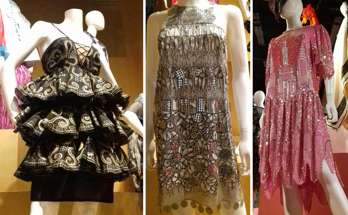
Zandra Rhodes is first and foremost a textile designer although it is her fashion designs that carry the printed and embroidered pattern she is famous for. The silhouettes of the garments, constructed often from multi layered draping fabrics are guided in their execution, in fact dictated by, the pattern design of Zandra’s strong handwriting or pattern, and executed using print processes and surface manipulation.
I’ve included plenty of images of these outfits in university design lectures over the years, discussing how the designer maintains the focused design style and aesthetic but also manages to evolve the work through the decades.
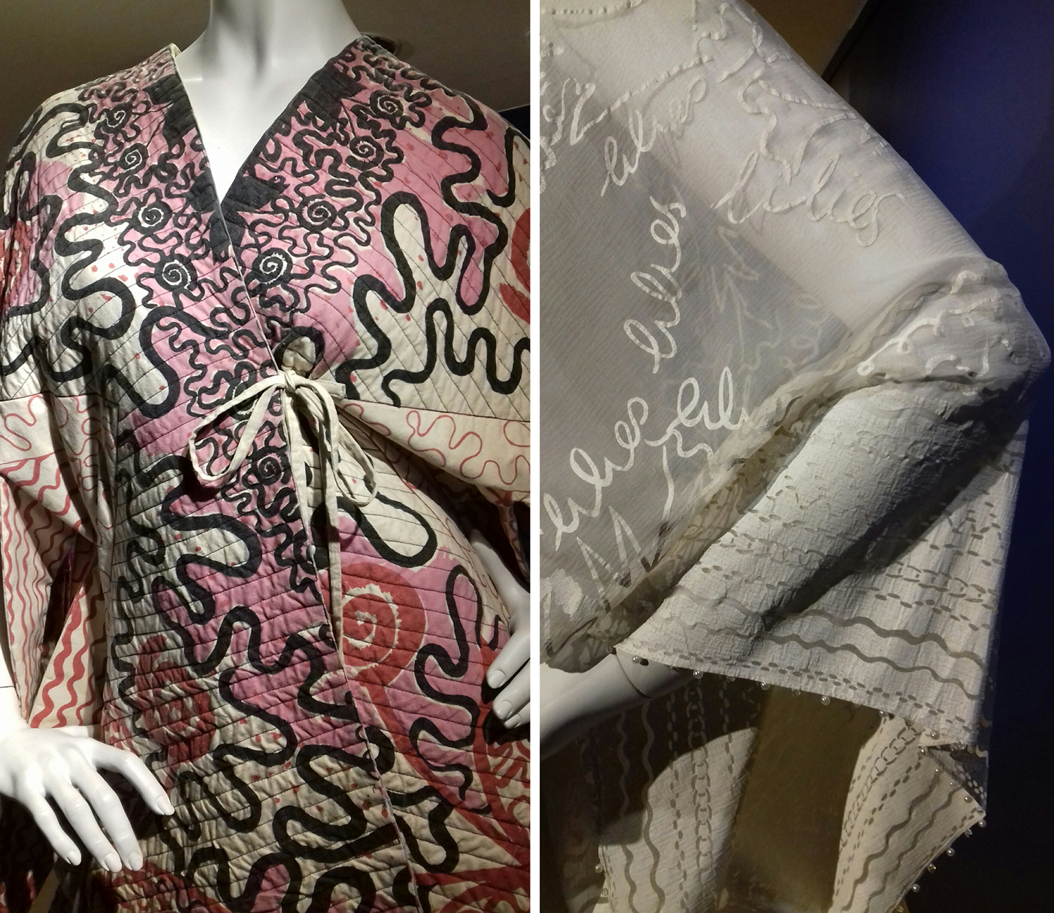
As ever it is very different when you get the chance to see the fabrics in real life. The white printed pigment on chiffon from the ‘Lovely Lilies’ collection (below right) and the quilting over screen printing of her signature swirling motifs as borders and placement prints provides the evidence that Zandra Rhodes is first and foremost exploring fabrics to lead garment design.
The variety of fabric manipulation and surface embellishments was fascinating to see, some rather crude and some pieces held their own more than others. The ease in which the textiles worked as one with the garment design is certainly demonstrated throughout the exhibition, and it was useful to see the screens for printing to see the composition of the designs later on in the exhibition.
The theatricality of Zandra Rhodes’ work was a perfect match for opera costumes, and upstairs in the gallery a number of interesting examples were showcased. I also enjoyed seeing original sketchbooks alongside a film of the designer talking about how important drawing is to her. I hope many textile design students visit the show and take her advice.
There is a significant body of work on exhibition here and it is important to view it as a considerable output of a single designer with a thirst for carnival. Her practice spans fifty years, hence the exhibition title and although her style is not for everyone, her contribution of bravery, exuberance and fabric play should inspire others to take creative risks and find a way to make the work they want to make.
I would also recommend the small showcase of company overview and embroidery work by Norman Hartnell as you enter the gallery – stunning pieces from a different era.