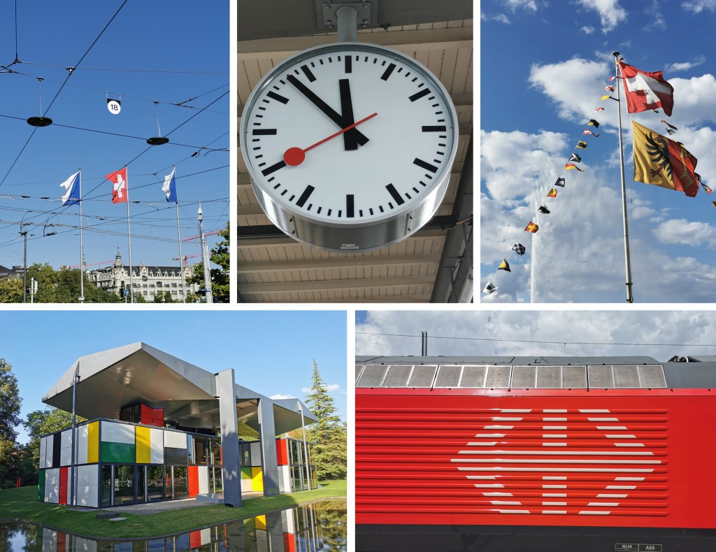
A very overdue post – and while the summer is very definitely behind us, I’m still remembering the hot summer and the family adventures we went on, as the days grow shorter and I reach for the jumper.
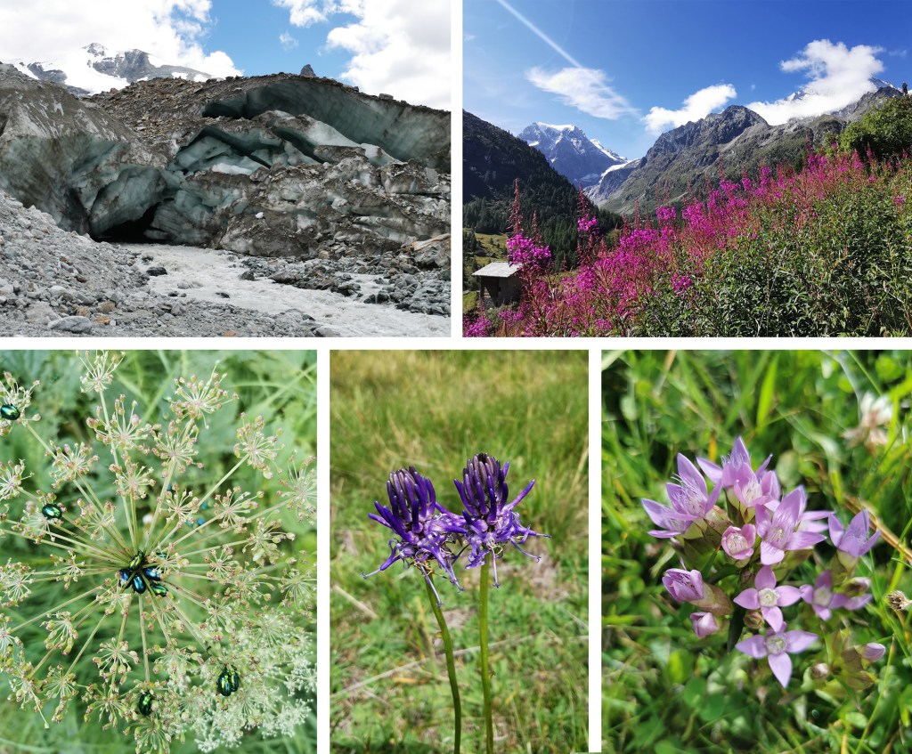
This summer we travelled overland to Switzerland, firstly to Geneva, then up into the mountains from Sion to a little village called Arolla where we explored the mountains and glaciers as well as the flower-filled meadows – precipitous paths and all! Back down from the mountains to Sion via the post bus, we then journeyed into Italy and up to a Swiss hilltop village above Locarno, called Intragna. I remember excellent fig ice-cream and cakes from the brilliant bakery and an early morning swim in the river. We ended the trip with a couple of nights in Zurich exploring the city and found time to swim in the lake too, before getting the train back home via Paris.
Switzerland tested my language skills, particularly as we travelled through French speaking Geneva, Italian speaking Locarno and German speaking Zurich, but we did our best. The food was fairly heavy on cheese and potatoes, and I can recommend the Swiss wine that apparently tends to stay in the country rather than being exported. Of course we sampled the chocolate too!
The landscape was beautiful and varied during our holiday, from vineyards to pastures, wide glacial rivers to narrow streets of Geneva. It is sobering to see the pace at which the glaciers are retreating, with dates marked on rocks along the walk up the valley to meet the ice of years gone by. The flowers were stunning and in abundance lower down the mountain passes. We were fortunate with good weather during our time in the mountains so on one day we were able to climb to nearly 3000 metres and lunch at a refuge hut before a rather long decent including steep drops, rickety bridges and large staples to hold on to – via ferrata – some rather scary!
We enjoyed some excellent galleries and museums during our trip including:
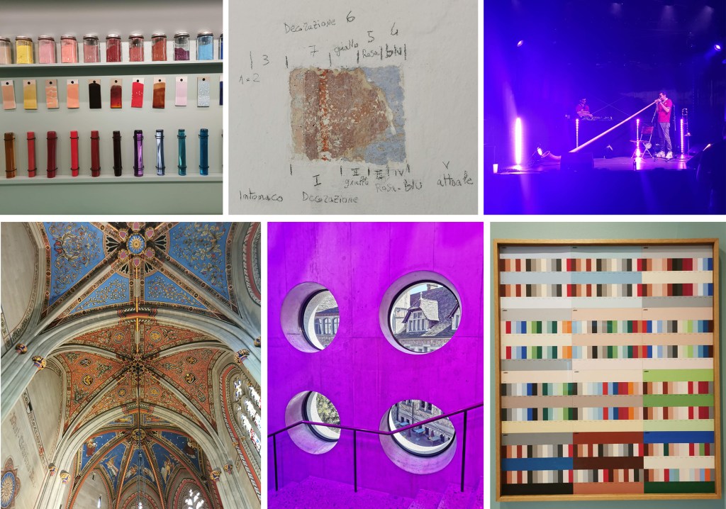
Musée Ariana – the Swiss museum for ceramics and glass in Geneva
The Regional Museum for the Centovalli and Terre di Pedemonte in Intragna which also included a climb of the bell tower
Landesmuseum (Swiss National Museum) Zürich – which housed an exhibition on all things Techno, as well as a sizeable collection of Swiss art and design through the ages and an incredible collection of rings of all shapes and sizes
The Pavillon Le Corbusier, also in Zurich, nestled in a park by the lake
A surprise cultural highlight was a festival in Geneva on Swiss National Day (1st August), where we were treated to a performance by Alpenhorn Sound System, as we watched fireworks over Lake Geneva – amazing!
A great holiday, lots of good memories and plenty of inspiration!
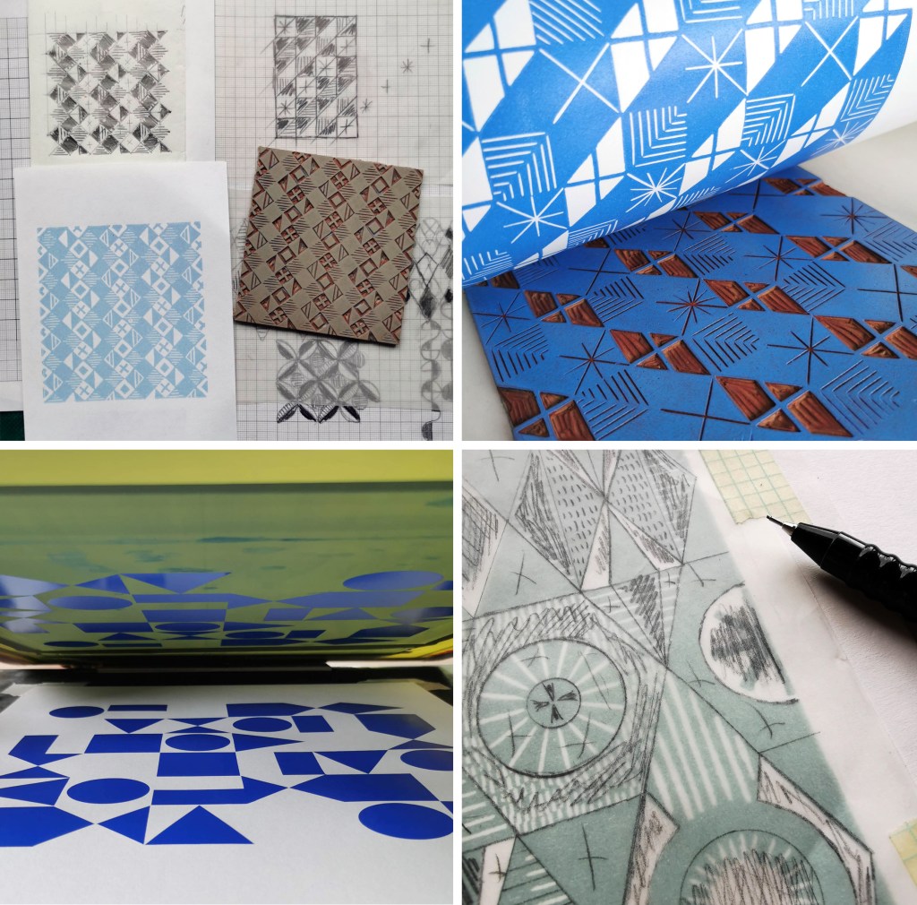
After a long academic term leading the Textile Degree at Norwich University of the Arts I finally found some time to get in to the workshop and sample some designs on fabrics. I developed the patterns rather a while ago. I love the process of screen printing, from mixing the colours, exposing the screens, pulling the squeegee and of course lifting the screen to see the new print. I even enjoy washing the screens ready for the next time!
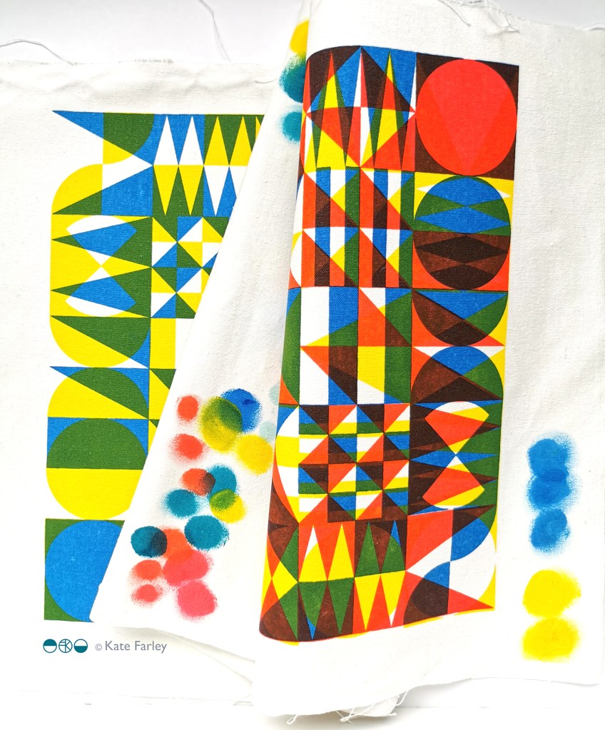
I’m not going to share all the outcomes at this point, but here’s a taster of the colours and a glimpse of one of the designs. I was working with transparencies in the pigment and binder to create the extra colours… and I’m really excited about the results!
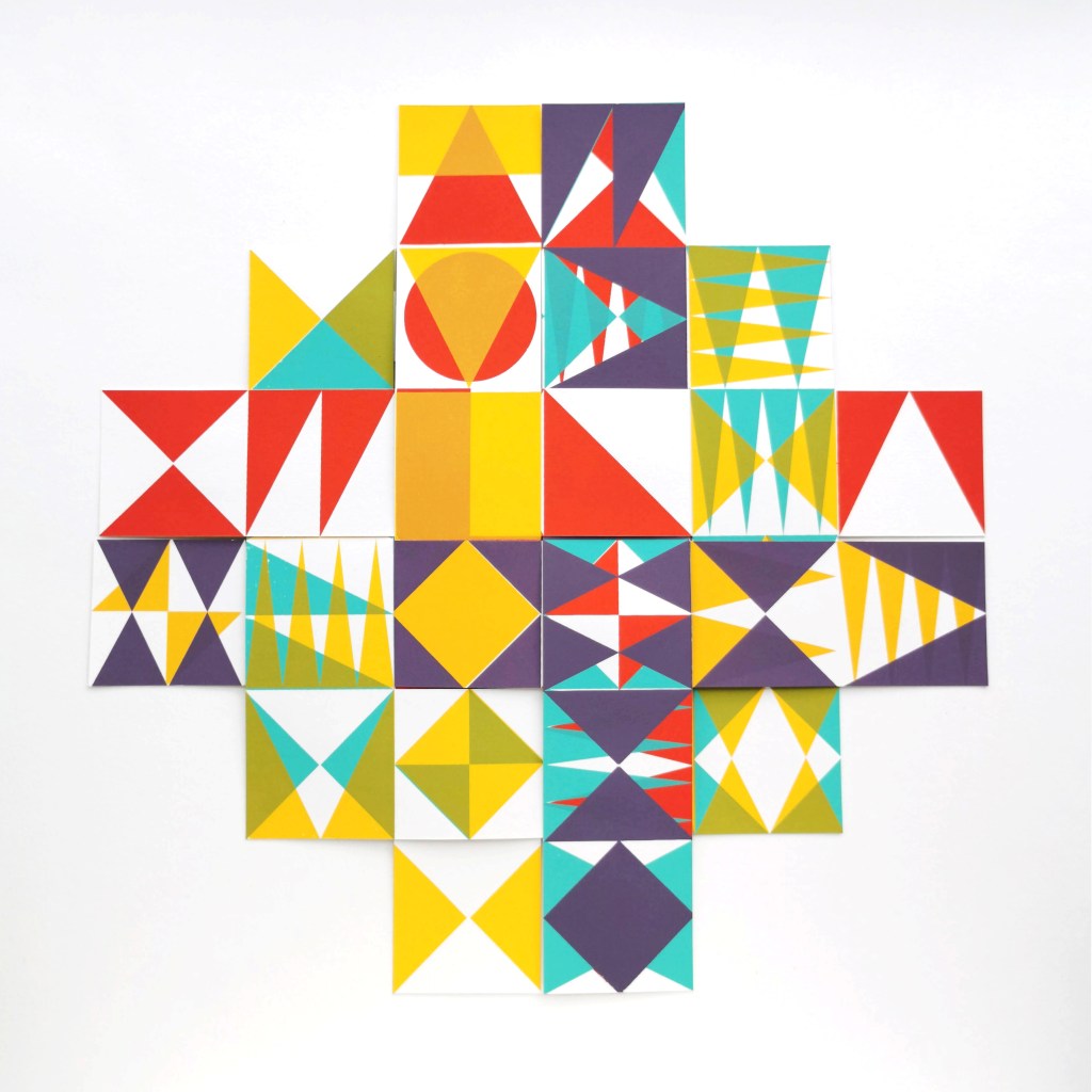
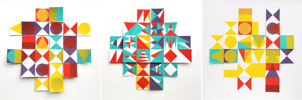
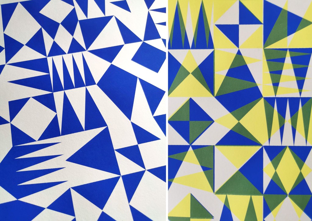
I am really pleased to have had two of my most recent works on paper selected to be included in the Print Cromerexhibition this summer, with the Private View on 19th July. This new body of work has been developed as part of my academic practice at Norwich University of the Arts where I have been exploring pattern structures and repeat blocks. I have explored new pattern iterations by rotating the screens to add additional colours of the same artwork, thereby building greater complexity from limited design information. In an age where digital design and the use of Artificial Intelligence provides limitless opportunities, I want to explore the fundamentals of pattern creation to generate new possibilities that are led by the designer, ensuring the creative path is transparent.
The theme of the exhibition is PLAY, and as a result the palette I created feels full of summer carnivals and fairgrounds. The overprinting of inks with differing levels of transparency provides a building of depth and subtlety of harmonious colour.
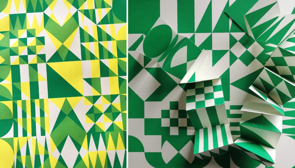
I created a number of one, two, three and four-colour prints initially, that featured the screen rotation in adding the colours. I then cut strips of the prints and with further rotation of the strips, interwove them into one base print that had been sliced to enable the slotting. I enjoyed bringing back an element of paper engineering from my book art practice into these new pieces.
In designing each piece, I considered the placement of motifs and relationships of colour. The collection provides variation within a collective identity and belonging. Some pieces feature only triangular motifs, while most incorporate the circular and rectangular elements too. My research utilises design thinking by Lewis Foreman Day, and his distribution of elements. This approach results in scattered focal motifs that work across repeating patterns. Although this is not a feature of my new work, I recognise the placement considerations are also useful in this work too.
A number of these pieces will be for sale during the show.
I’ve been enjoying some studio time to explore my print research as works on paper with the hope of exhibiting the work. I enjoy paper engineering and construction (that’ll be the book artist in me!) and have previously tested paper manipulation in relation to this current pattern research. I tend to work in this way, creating drawings or prints to exhibit / sell alongside forming pattern ideas, and it has been useful to see the evolution of the sampling in this way here too.
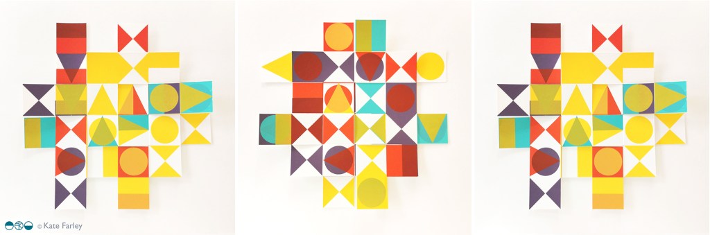
These new artworks utilise my screens of geometric artwork practically exploring research into motif distribution in printed pattern thinking formalised by Lewis Foreman Day in his book Pattern Design, published in 1901. Having printed the artwork in the first colour, I rotate the screen by 90-degrees and print the second colour, turning the artwork / screen up to four times for maximum complexity. To add a further dimension, I’ve been constructing works on paper that utilise several iterations of the prints to build new compositions by weaving and slotting strips of the printed papers in differing combinations of the four colours in the palette, providing the coherency across the series, and an injection of the spirit of summer fairgrounds through the colour and geometric visual language.
There are two screens of artwork used in this collection, therefore two series of original artwork (PLAY – circles and PLAY – triangles) and I shall continue to evolve the body of work over the coming months. I’d love to know your thoughts on this new work!
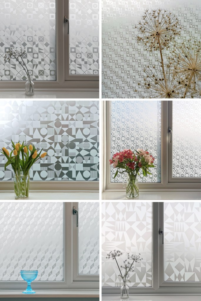
I’m excited to be finally bringing this collection of surface designs to market in collaboration with the Window Film Company. The inspiration for the patterns has stemmed from my fascination with geometric designs, taking the basic ingredients of triangles, circles and squares as my starting point.
I’ve been exploring geometric pattern structures in relation to design principles established by Lewis F. Day at the turn of the Twentieth century, exploring the equal distribution of motifs within a repeating tile to alter the visual rhythm within two-dimensional surface designs. I have also explored expectation and disruption within the repeat tiles. On establishing an apparent small-scale repeat, I play with unexpected shifts in the placement of motifs to disrupt the rhythm, challenging the sense of order. This work belongs to my ongoing practical pattern research as Associate Professor in Design at Norwich University of the Arts.
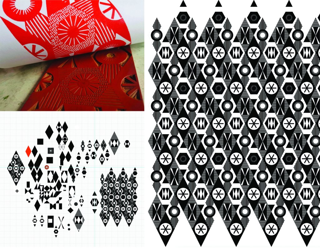
The six designs each have their own identity and yet belong together like siblings in a family, with shared features of geometric motifs and formal compositions throughout this collection. Some of the designs started their life as self-initiated physiotherapy back in 2020 / 21 following abdominal surgery and my subsequent recovery. The design challenge, to make small-scale lino blocks of repeating patterns to print by hand, provided me with small physical and mental tasks to focus on between the naps. I had hoped some of the designs would one day be leaving my studio, and I’m pleased and proud to share them now.
Designing for window film requires consideration of motif, shape and pattern construction without the aid of colour, requiring an absolute focus on negative and positive shapes. I enjoy working within design limitations in relation to production requirements and technical specifications, believing the challenges become design opportunities. I spent some time testing the various scale of patterns across the collection, including a micro pattern (Step), through to a much larger scaled pattern (Triangulate), considering window sizes in both domestic and commercial spaces in relation to the motif sizes.
I’ve worked with the very patient Steve at the Window Film Company for all my designs available on film, including the large-scale bespoke design for Birmingham Airport back in 2017. Previous designs from my Construct collection available from the Window Film Company won a House Beautiful award in 2018 too!
Steve worked with me to sample some of the early versions of these designs generated as digital scans from lino prints initially, but I didn’t like the visual quality in the translation of the prints. The original artworks for this collection were generated using collage and screen printing alongside the lino prints as I prefer designing with a physical relationship to image creation. After further consideration I opted to create each of the designs as vector-based files for production, providing sharp graphic quality to the patterns.
Mike at Window Film Co. was also fundamental in getting this collection established, off the computer, on to window film and ready for sale. Our conversations focused on understanding my design identity in relation to previous work. He ensured the designs felt authentic to me, while building on the existing designs I already license to the company.
It’s always exciting to receive a delivery of samples, and I’ve had a few of those over the last few months. The final product is very different to a digital file, so it is important to inspect the artwork as film installed on the window, checking the scale of repeat as well as any discrepancies in the artwork – you must have sharp eyes for detail! With final decisions made and sampling approved, as well as the small matter of naming the designs, we have been able to sign off the artwork, and launch the six designs in the collection: Circulate, Diamonds, Shift, Triangulate, Step, Pairings
After the lovely summer I’ve been back printing in the studio, with some lino blocks on the go as well as two new screens I’ve had exposed as part of my pattern research. I’ve been exploring the rotation of the artwork as well as folding the prints to determine visual narratives.
I tend to not worry too much about colour palettes in this sampling phase, particularly as I’m focusing on the pattern building but also considering a range of material substrates for future outcomes. I appreciate this gives me freedom to test colours, some more successfully than others. After several days at the computer screen it can be a complete relief to spend time at another type of screen!
I have been fortunate in having my pattern research selected for inclusion in a really exciting exhibition opportunity in Bristol, led by academic Lucy Ward from University of the West of England.
“APERIODIC brings together artists, scientists, musicians and others in an exhibition about pattern. The show presents work that explores ideas relating to the mathematics and science of ‘aperiodic order’: the absence of regular or repetitive patterns. Or, more simply, ‘things that almost repeat, but not quite’. The exhibition is part of the APERIODIC festival of art, science, music and performance taking place this July in Bristol.” official exhibition text(APERIODIC, 3-14 July 2024 at Kit Form Gallery, Bristol)
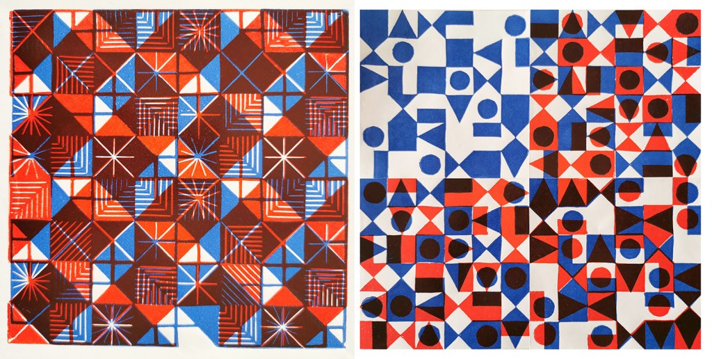
The two pieces I had selected explore block rotation in the over printing of further colour layers, resulting in a building up of a more complex design:
Geo / grid / starLino print
Fields of seemingly reliable compositions of geometric motifs provide the rhythm of assurance through repetition of geometric rhythms but the swapping of small details amongst the motifs unsettles the overall pattern and disrupts the repeating design. The block is rotated before printing of the second colour.
6-spot rotation, multi-direction Lino print
Built upon Lewis F. Days’ principles of distribution of motifs in pattern design (1901), motifs are placed within a tile, 6 x 6 to provide balance and direction when repeated. As the second colour is applied the block has been rotated by 90 degrees in each printing of the tile over the original blue. The repeat is broken and a disorder is established.
One of the highlights of having the work selected for exhibition was the opportunity to have a mathematician review my work aligned to their own interests in pattern. Yotam Smilansky is a Lecturer in Dynamical Systems and Analysis at the University of Manchester, with a special interest in aspects of order and disorder in geometric patterns so I was interested in what they had to say about the work on exhibition.
Yotam Smilansky on Kate Farley, ‘Geo / grid / star’ and ‘6-spot rotation, multi-direction’:
“We notice a certain form, a sense balance, but it might take us a little while before we realise exactly what’s going on. Then we get it: the complicated object before us is made of a single ingredient, copied and superpositioned. It is surprising, even magical, how the unassuming process of layering rotated copies of a single pattern can result in a rich family of objects with a wide range of properties. This is evident, for example, in the moiré patterns of twisted bilayer graphene, where a slight change of angle results in completely different electrical properties, and is beautifully demonstrated in Farley’s mesmerising prints.“
Yotam’s response interested me as I’ve been exploring ways to disrupt and challenge the repeating tiles through transformation and evolution of individual elements within an apparently repeating pattern. I’m certainly keen to continue with this work and am grateful for this opportunity to gain feedback as well as discover the work of other pattern-makers. You can read other reviews of exhibiting artists by mathematicians here.
Thank you Lucy, Yotam and all those supporting the event.
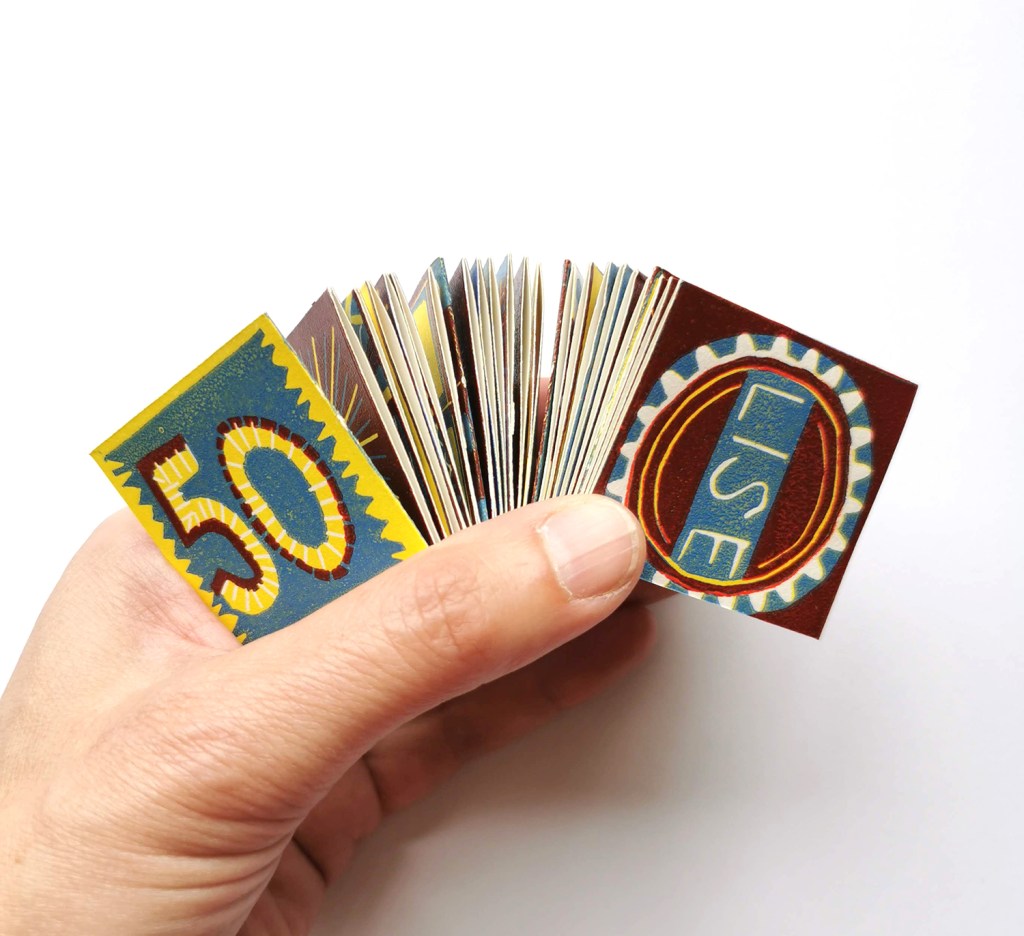
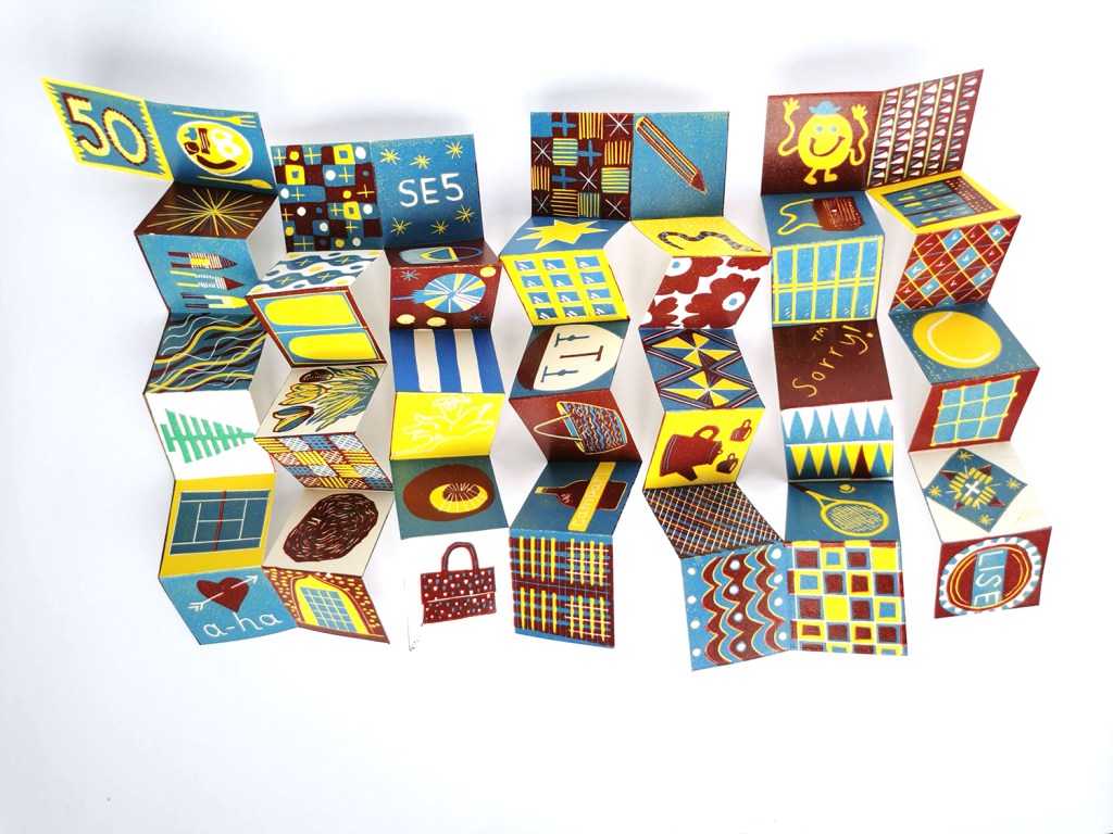
A dear old school friend of mine has turned 50 and to celebrate her birthday I designed and printed a small book to celebrate some of the many memories we have shared over the years. The book had 50 pages that referenced everything from an all day breakfast, to a game of Sorry, to her love of the band A-Ha! I also included some references to design classics I knew she’d love, including Mr Tickle, Marimekko’s Unikko design, andAlexander Girard doll and a Barbara Hepworth sculpture. She’s an architect so there are building details and she’s a lover of handbags so there are a few of those, and plenty of printed pattern!
It was suggested to me by my wise husband that I use the reduction lino-cutting technique – I hadn’t used it for some years, so it took a while to get my head around what I needed to keep and what I needed to cut away after each layer. I opted for three layers: yellow, blue then red, but also customised a square to be green for a Lego tree, and a specific blue for the Cornishware pottery – I made the extra effort – she’s a special friend!
Although it was a very tricky project carried out across the busiest few weeks of this year I really enjoyed the challenge of the reduction lino and am sure I’ll go back to the process in the not too distant future.
A precious holiday to Greece in the early summer has provided plenty of nourishment for my creativity, as well as excellent down-time, walking and eating. It’s just taken me a long time to get this post together!
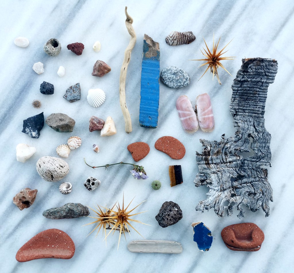
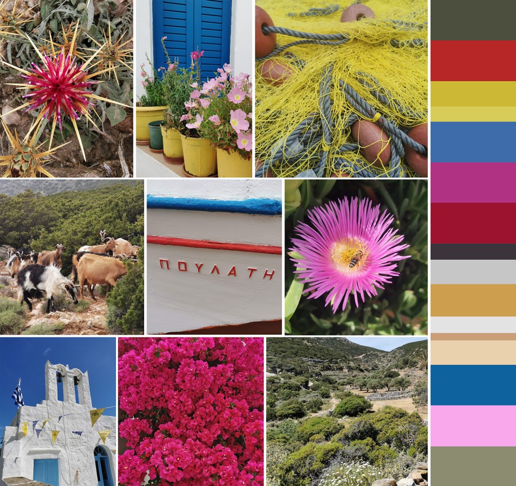
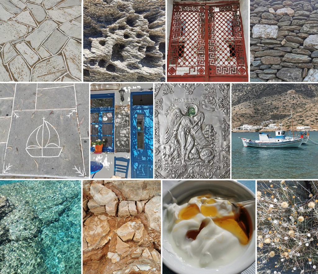
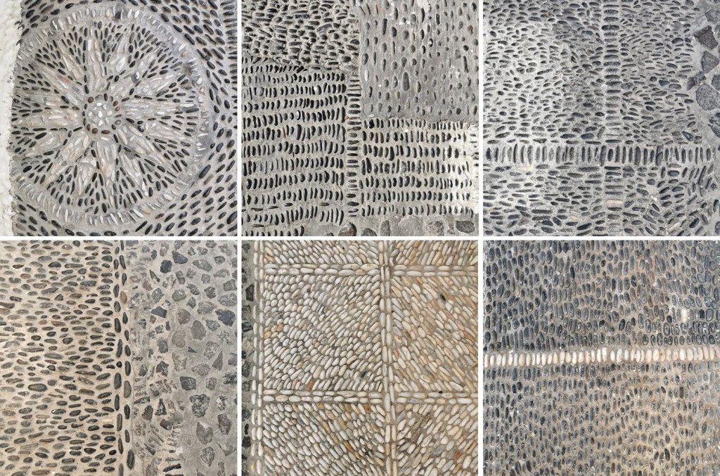
I’ve been creating photographic records of artefacts collected on holidays for some time – a great way of remembering the specifics of a walk without having to bring it all home! I’ve also enjoyed creating composite images to represent experiences over the years, some featured on the posts here, so I’ve done the same for Greece.
We visited the Cyclades, and specifically the islands of Santorini and Sifnos. The night on Santorini was for old-time’s sake, and the stay on Sifnos was to get to know an island we’d not been to before. It is a beautiful island, with lots to explore – I’d love to go back to one day!
Here’s a collection of precious finds from the 70+km of walks across Sifnos on their excellent trails, some very prickly! As marble was everywhere I thought it appropriate to use the marble table by our room as the background surface:
First up with the composite images – colour:
Next up: pattern, material & finish, including Greek yoghurt and honey of course:
Part of my academic role at Norwich University of the Arts is dedicated to my research practice, exploring new knowledge in pattern and print design. Following on from the publication of my book I’ve been keen to get out in to industry and expand my practical experience of print production methods that could enable new ways of designing repeating patterns for paper and cloth. These visits also provide excellent opportunities for me to develop ideas for curriculum changes in the undergraduate course I lead, BA (Hons) Textile Design at Norwich University of the Arts, to ensure our graduates are competitive in securing roles on graduation.
A couple of years ago I spoke to Director of Ivo Textiles Limited, Suzie Zatka-Haas following her visit to our stand at New Designers, a graduate showcase held annually in London. She was keen to understand the best way to promote opportunities in the company to graduates and we discussed the right terms and definitions to ensure textiles students were attracted to the roles. We also discussed the skills they value at Ivo’s and how we can ensure students understand the potential roles open to them, (we have had a Norwich graduate work at Ivo’s for the last few years). We are both passionate about printed cloth and Suzie invited me to visit the factory when I could fit it in around my teaching schedule.
Fast-forward two years and I managed to secure some funding to spend two days onsite at Ivo’s to understand more about the technical constraints of the different printing processes they offer to clients. Suzie was brilliant in making this happen, being open to allowing me in to the factory to learn more. This felt very exciting but I wasn’t fully sure what I’d be able to help with although I offered to assist with anything. I was armed with my printing apron and old clothes—following advice from Suzie!—as well as my sketchbook of design ideas for my current research project in case I had time to talk it through with anyone.
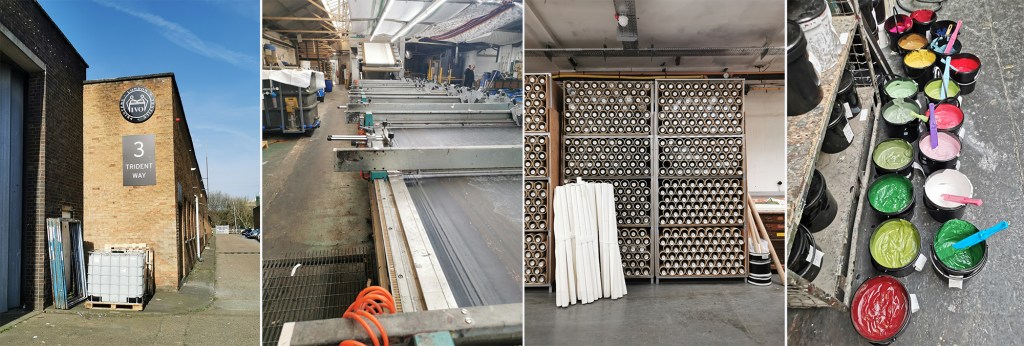
The day before my visit I’d spent the afternoon with Marthe Armitage (blog post here) in her much smaller set-up so I knew this was going to be a contrast. Walking on to a large industrial estate in west London with huge lorries thundering by, the only clue of what was going on inside number 3 were some screen frames leaning up against the outside wall awaiting collection. I was greeted at Reception and my name had made it on to the board for the day.
Once the health and safety briefing was over I was led through the factory, trying to take it all in: sights, sounds and smells, and I was re-introduced to Maisie, one of Ivo’s designers that I’d met at New Designers last year. She was to be my host for my stay and ensure I didn’t do anything silly, like wander off and put my hands in the machines. I’m incredibly grateful to Maisie for her time and interest in what I am doing. We discussed university training, the Ivo design studio set-up and then I shared with her my project. It is so useful to talk it through with different people as they all bring ways of looking and new questions.
A full tour of the factory was next. There is a vast supply of cloth and screens in every space imaginable, alongside huge machines, some in action and some not, as the job list requires. The colouration department was a room of inks and colour swatches, and the colourist making and matching colour for all the processes. The colourist has been working for considerable time at Ivo’s, like so many there, they are absolute experts in what they do.
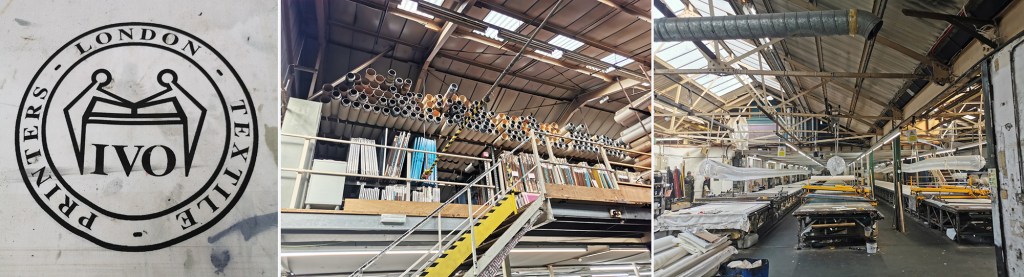
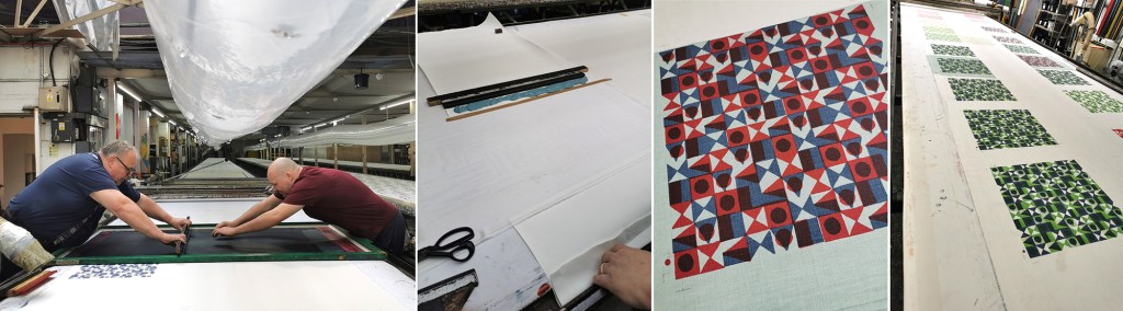
I saw the Flatbed printer working on my first day. Large flat screens raise and lower mechanically and the fabric is on the belt below, which moves along after every print is made for each colour to be printed with the subsequent screens. The belt is very long, with many metres passing by before all the colours are printed and the fabric heads off to be baked for the colour to be set at the far end of the table. I was busy taking notes and asking questions. That day a client was onsite to quality-control the printing before signing it off for production.
There is a large archive of artwork from decades ago, spanning the thousands of jobs that have been made here. Original acetates and drawings are rolled up in drawers holding the stories of design. I wasn’t able to photograph the examples – client confidentiality is important here, but it was exciting to see some key players of the 1960s featured. Maisie told me the incredible story of how Ivo’s came to be, and I met Michael, who’s family story it is, leading the company with Suzie.
Gali printing is a further printing process used at Ivo’s (the two tables with yellow frames in the picture above, right). The print tables are fifty metres long! The screens are set up in frames and are mechanically moved up and down, with a mechanised squeegee passing over the inked screen, before lifting up and moving down to the next place to print. It is carefully operated and requires skill and a keen eye to ensure everything is happening correctly with good quality each time. The screens are then changed for each colour and the same processes run again – the gali print operator will walk several miles in creating a ten colour design!
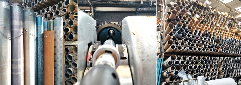
The process I was most intrigued to see was the Rotary printer. Unlike the flat screens, the artwork is prepared on a mesh that is on a cylinder (image below left). The circumference of the cylinder is the repeat size, creating a seamless repeat with fast production. A different cylinder is required for each colour, just as a flat screen per colour is required, but unlike flat bed / gali and hand printing, the squeegee sits inside the cylinder, and with the use of a magnet is pulled down to apply the pressure and add ink to the cloth through the mesh as it turns. Seeing these machines printing many colours at once is fascinating, unfortunately I couldn’t take pictures as it was printing for a client.
On my first day at Ivo’s I also saw a length being hand screen printed, but again, no pictures. It was a very slick operation that is clearly well-rehearsed!
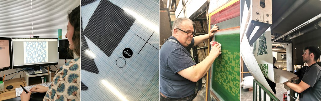
Following the tour we returned to the design studio and I was introduced to some of the different design tasks the designers are involved in. A new graduate had recently started, Caris, so it was good to see her settling in well and enjoying her first professional experience, guided by Maisie. Putting original artwork in to repeat can take several weeks with meticulous digital design work using AVA software. Maisie upped the excitement by suggesting we could work on one of my designs that afternoon and have a day printing with Podge the Printer, a legend for those in the know – wow! Maisie prepped the artwork, with me taking notes and soon the screen positives were ready to be exposed.
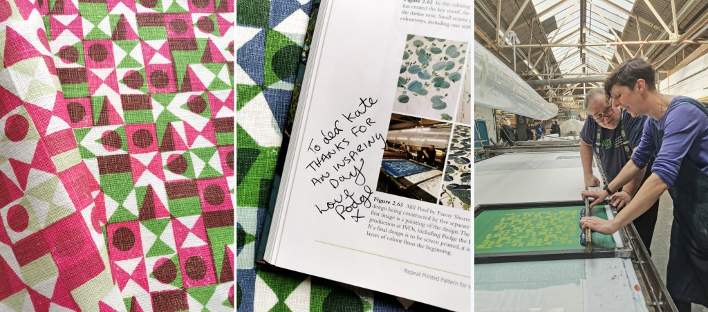
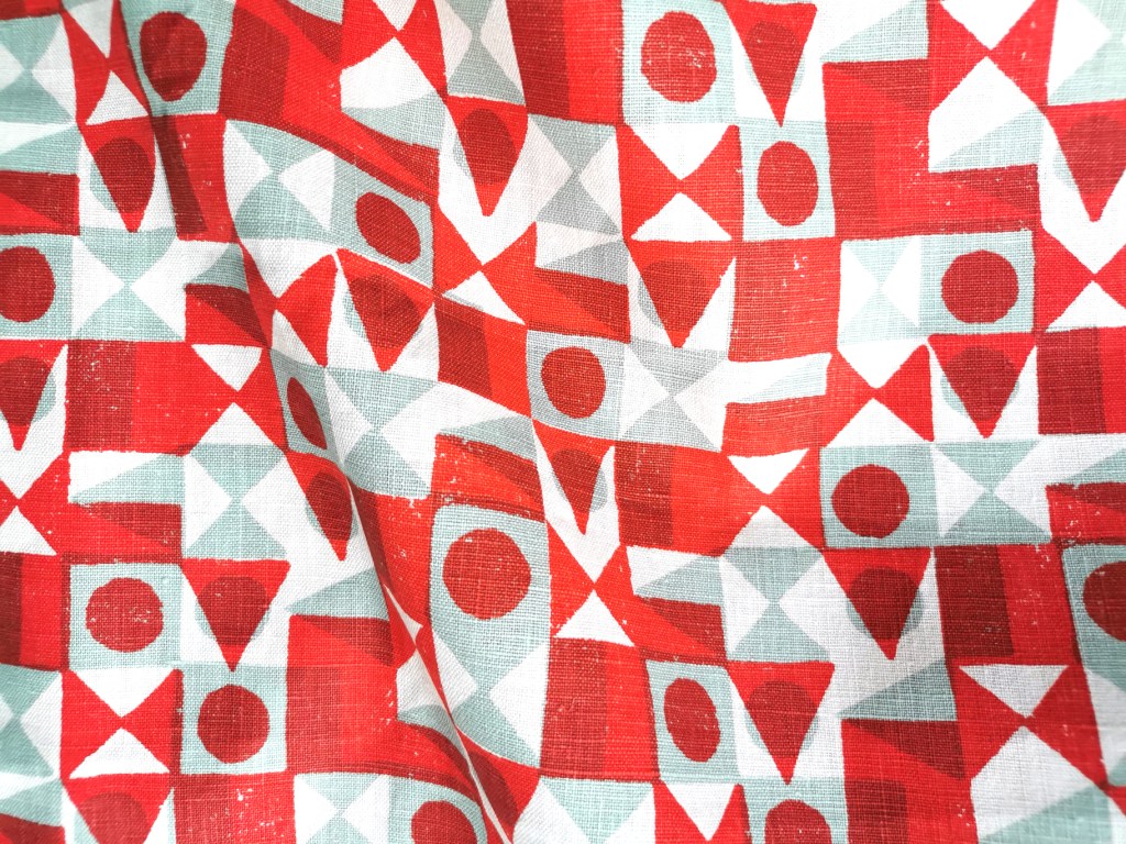
Arriving on the second day, my screens were ready, Podge had prepped the table laying lots of fabric down for me to print on to. Podge is a character – we hit it off! At first he wasn’t quite sure what my research was about, but soon he was getting in to the spirit of it and suggesting options. He said it made a change to have someone exploring options rather than simply being in production mode. We chose some large screens from the archive to add a few tricks he had up his sleeve. Buckets of colour were mine to use. I had a lesson in printing the Podge way and he made sure I held the squeegee at the correct angle with hands over the top – he kept monitoring me so I had to stay on it! He also showed me the S-blade method of printing flat colour without the screen – surprisingly satisfying.
Factory lunch is a set 30 minutes and soon we were back in action. Each time I wanted to change colour, the screen was taken away to be washed / dried ready. I’m not used to having such (any) great service and support when I print in my own studio! It was a really productive day with many metres of fabric printed with several layers of colour, testing my research ideas. Podge’s son who spends lots of time on the Gali came to lend a hand at printing the larger screens, enabling me to try other prints over the top.
With the deadline to get my fabric set we had to stop printing, I watched as the fabric went through the baker and it came out very hot, but ready for home. I was exhausted, it was hot in the factory and I’d been busy on my feet since 8am. One of the last jobs was to ask Podge to write in the special copy of my book on pattern, as he was included in an image supplied by Fanny Shorter who prints here.
At the end of the day I caught back up with Suzie and thanked her for the opportunity she enabled me to have at Ivo’s. The factory has to run smoothly, meeting industry deadlines and costings for clients so to be open for me to learn from them and explore my research with their expertise was an absolute privilege – they were very generous. I headed home with a bag full of printed cloth and I ached all over from such a physical day, but with a head full of the experience I won’t forget in a hurry … Thank you all at Ivo’s!