Gardening with Mr Bawden

So this is the week my book ‘Gardening with Mr Bawden’ is being published by Design for Today. It’s been many months in the making, so I’m very excited to be able to share the details and for other people to hold the book in their hands.

What began as a project brief for a book with interesting folds that celebrates Edward Bawden’s love of gardening has become a project I am very proud of and have thoroughly enjoyed for lots of different reasons, pushing me creatively along the way. I love a design challenge and returning to the subject of gardens has been a pleasure, having launched my garden-inspired Plot to Plate collection back in 2012 and being a keen allotmenteer. I’ve moved away from my usual diagrammatic visual interpretation of gardens, towards a more illustrative manner, following on from my Parks and Gardens commission for posters for London Underground last year. It has also been a joy going back to paper engineering and book art – having made many editions of artists books over the years following an MA in the subject from Camberwell in 1998.

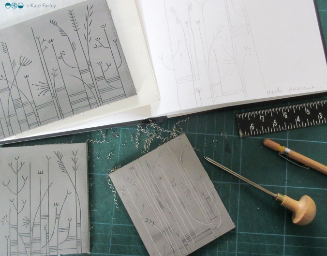
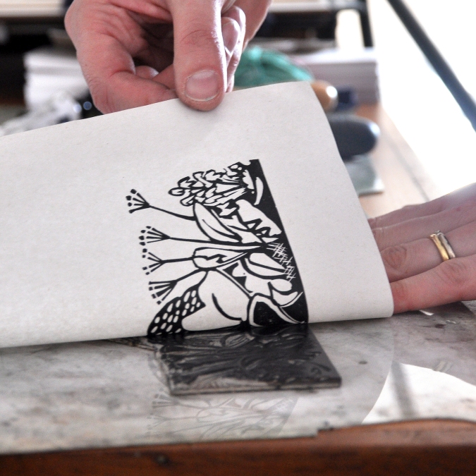
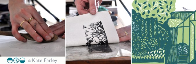
The images below show some design stages of this project with Design for Today. There is an early paper maquette as I worked out the structural narrative in relation to the imagery. Several of these were posted between us to allow for discussion and deliberation. At one point there was a cut-out pond but I was unhappy with how it worked on the back of the page so I left that behind. I cut lots of lino, with each page requiring at least two blocks – one for each colour. Although I had an idea of the key focus and composition for each spread it wasn’t until I was cutting the lino did I tie precise detail down. Only a couple of times I decided to completely abandon a page spread and rework it – and I’m so glad I did! Each block was hand-printed and hung to dry in the studio before being scanned to make a digital file that could be prepared for the lithographic printing process of the final edition at Calverts.
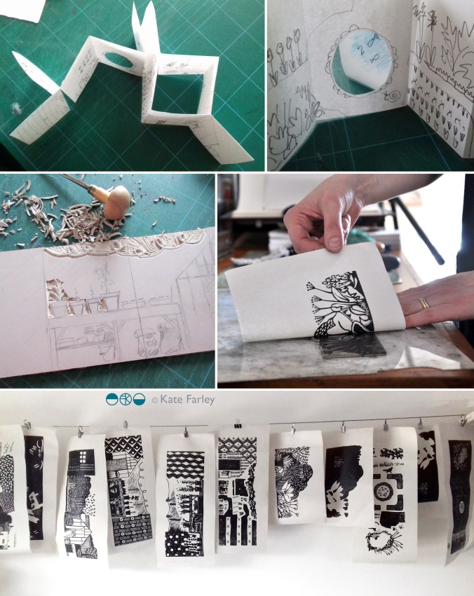
wip_Bawdenbook_flat

Once the final sheets were litho printed and die-cut / creased we have had to fold them one by one, sign the special edition and pack them up. We even decided to hand-cut out a window pane of the greenhouse in the edition of 100. We are delighted that the Special Edition sold out fast, well before the publishing date – thanks all! Those lucky people will receive the book along with a little booklet of the project and greetings cards, any day now!

signing booksMay18_1

This collaboration with Joe has been a really positive experience as we are both passionate about doing a great job. He was always happy for me to tweak something one last time as we signed off proofs, and understood the reasons why I turned sentences inside out in the booklet, to say exactly what I wanted to. Joe and I have discussed page size, paper weight and the folded structure on several occasions as well as how you take inspiration without copying, and the issue of creating something in relation to, but not derivative of.

I am sure people who know my work will recognise my style in there, despite it being a little bit more illustrative. Pattern making relates to both Bawden, and myself, so it made sense to include a nod to wallpaper designs too, inside the greenhouse, as pots of plants become floral wallpaper. I wanted to use lino because both Bawden and I have used the printmaking process. I also wanted to create a light-hearted feel to the imagery, that is so often in Bawden’s commercial illustrations. As I wrote before in a previous post, we researched lots of snippets of information to guide the imagery and are grateful for there to be so much writing and research available at the moment, but it was never intending to be a guide to the garden at Brick House, more to express the pleasure Bawden would have got from his garden, as so many of us do. I also wanted to take the reader on a journey through a garden, rather than show you all in one go, so I hope the reader can navigate their way around!
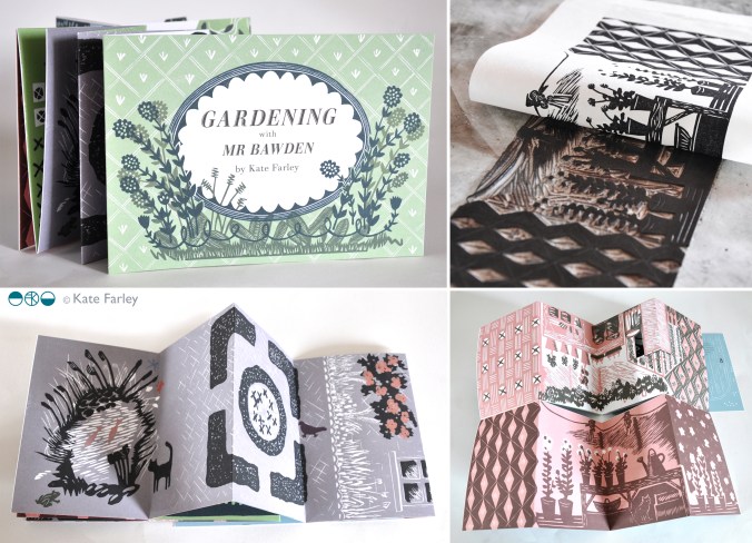
KFarley_GardeningwithMrBawden1

This book is the outcome of a great collaboration. (Thanks Joe!) So as the book is published today we celebrate this journey of designing and making, and can announce it will be stocked by some great places, including the Dulwich Picture Gallery, where a brand new Bawden show opens this week. Check out the social media accounts of Design for Today for updates. Final thanks ought to go to Mr Bawden himself, who has inspired so many of us, and who gave Joe and I cause to make this book.
special edition news!

If you follow me or Design for Today on social media you will have seen updates of the book we have collaborated on celebrating artist / designer Edward Bawden’s love of gardening. The book is titled ‘Gardening with Mr Bawden’. It’s been the perfect project for me as I also love gardening, have a background in making artists books and also love lino-printing.

bawden_printing_1

I’ve designed the book taking inspiration from some of the research I’ve found about Bawden, such as his preference for structural plants, his competitive growing of sunflowers, and the ongoing problems with snails. I’ve also made reference to some of the artwork made by Bawden and his dear friend Eric Ravilious, including the view under the tree with the table and tea things, as well as the bench Bawden designed.

All the motifs are my own but I’ve made reference to the sort of patterns Bawden was designing while living at Brick House, Great Bardfield in Essex. I’ve blended the idea of plants growing in the greenhouse, becoming wallpapers in the house. There is a pull-out greenhouse!

There are limited edition sets available to pre-order now which includes a signed book with four greetings cards and a collectors book explaining the project. Click here to order.

gardening-special

woven landscape

It seems right to me that as someone keen to draw images I chose print as my medium of design rather than weave but I do think there is a strong sense of the spirit of woven cloth in how I see things, and for that I thank my upbringing in Norfolk. The strong horizontal line of the sky meeting the fields interrupted by vertical fence posts or reeds creating visual rhythms can leave me feeling utterly complete. Back in Norfolk this Easter, once again I breathed in the space, the horizontal and vertical of Horsey; one of the most perfect places.

I removed colour from this image as I wanted to clearly show the structure of the stripes, but colour is much of the joy in this landscape – the purples, greens, yellows, varying from minute to minute in the ever-changing light. I add them below. One day I will weave again.

Horseyreeds_weave130

KFarley_Horsey_palette

talking to myself through teaching

I’ve spent many hours over the last couple of years reflecting on my teaching career that stands at about 18 years, give or take a bit. In order to apply for Senior Fellow of the Higher Education Academy I had to write thousands of words that explain and reflect on the impact I have made on not only the students I have taught but the colleagues and peers across the industry I relate to in my professional practice. It has been a big ask to fit my diverse experiences in to the word count along with the cross referencing required, but I’m delighted to say my hard work over the ‘holidays’ and the work of my colleagues in writing supporting references has meant I achieved Senior Fellow and I’m rather relieved / proud. (I was however disappointed to discover that rather than receiving a fine water-marked, embossed and foil blocked certificate I had to download it! … I digress.)

I’ve written many times about how important it is for me to combine my design practice with my academic career and although it doesn’t make my life easier, it certainly makes it more fulfilling. They really are mutually supportive. The reason I am so driven to support the students in reaching their goals is because I know how rewarding a career in design can be. From having the confidence to draw in a different way, to picking up the phone to a new client, to realising your dream of seeing designs commercially available…, to be paid to do what you love doing… why would I not want to help others to do those things?

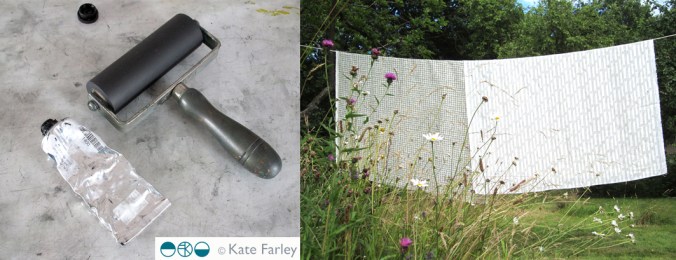
roller_fabric_blog

It’s also important to hear myself saying these things to students. It’s as if I am telling myself as well as the students! Yes I must chase that lead, make sure I’m paid a fair rate or keep my website up to date! Each creative has different ideas about how and where to move forward with their ambitions and the art of teaching is to work out how to nurture, support, push and challenge positively. Being creative is not easy. You put your sensitivities on the line to be judged, sometimes by those with less creativity than yourself, but who holds the budget. There are certainly pages in my sketchbook I wouldn’t choose to share at a group tutorial, but the process of knowing you are not alone in learning the creative process is so valuable. It’s also the case that it’s often easier to critique someone else other than yourself! Would you listen? Maybe one mis-perception is that once you graduate you stop learning – I plan to keep learning forever! Each project I work on is an excuse to learn more, not only about myself as a creative, but new practical or technical skills to take on board for me, as well as sharing with colleagues and students.

I’m very aware the reality behind social media may be far different than the stories being told online. I make sure students are made to think about that, – use the benefits of social media while considering the stories they read and the stories they create. While I like the way we can find out so much more about what’s going on, and who we need to know (can you imagine only having the yellow pages?!) there are complications with so many aspects of our practice being shared. Copying, audience expectation, peer competition versus mutual support, networking and peer validation are ups and downs of today’s design world. I approach my teaching very much like my designing. Honesty, integrity, and fulfillment…. support, encouragement and creative ambition! Even writing this is like giving myself a tutorial! What’s my homework?

KateFarley_grasslines_WIP_blog


garden cuttings

I’ve been working away in the studio on a wonderful project with Joe Pearson of publishing company Design for Today for a while and time has come for us to begin to share the results. It is a book inspired by Edward Bawden and his love of gardening. The content of the book has been informed by my research into his garden at Brick House, Great Bardfield in Essex. Bawden was a very keen gardener and I have researched and worked with anecdotes and visual references to build a picture of what his garden may well have been like and designed the artwork of the fold book with lino prints, a process he used many, many times.

revealingprint_200jpg

Keep an eye on social media for more updates as we lead up to the official launch in May.

evolution in practice

I’m thinking about different aspects of marketing and promoting businesses in textiles for a lecture tomorrow and I came across this image which got me thinking about how my practice has evolved and my priorities have changed since I took this picture only a few years ago. I’m so grateful for the opportunity to shape and alter the practice I have, to take on projects that suit me at the time. Hooray for portfolio careers! Right, what’s next?…

KFARLEY_cropped_tags140


Squared collection

It is no surprise to many that I collect things, some of those collections have even been featured here on the blog. When a colleague asked me last week if I had squared paper I was happy to delve in to my ‘squared paper’ drawer in the studio and share. This small act led me to rediscover this collection that features paper dated from the 1980s up to the present day, of grids, checks, plaids … of beauty. Printed in grey, blue, green, red or other, two-sided sheets, pages of books, tracing paper; the collection is also international in its reach. I’ve posted several on my instagram feed @katefarleyprint but here are some to get you excited!

Screenshot_2018-01-29-18-45-53-2-1


my motifs in design

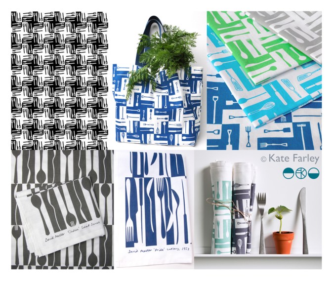
I consider everyday design to be important in shaping our lives for the better or worse, and that includes cutlery design. For regular followers of this blog you will know I like cutlery. My special relation with cutlery started as a child, I collect forks, particularly disposable ones and now as an educator I use cutlery to teach design thinking despite my subject being textile design. I’ve also designed several pattern designs using motifs of cutlery including a collaboration with David Mellor Design.

The first time I made a formal design using cutlery I won a prize! I entered Formica’s Design-a-laminate competition in 2005 and won the Retro category for producing “a skillful houndstooth pattern using knives and forks, a reference to Formica’s conventional use if Fifties’ diners and kitchens”, (Blueprint magazine, April 2005). (top left pattern – made by a rubber stamp – see my instagram feed)

cutleryprojectsKF

Many years later, in 2012, I launched a new variation of this pattern on gift and home-ware products including a tea towel, and moved the dogtooth check pattern on by incorporating a visual narrative into the design. At the bottom of the graphic I had garden tools such as spades and a rake, then in the middle I incorporated kitchen utensils such as whisks, wooden spoons and fish slice, before topping the design with cutlery – therefore illustrating the journey of plot to plate, (garden, kitchen, dining) using the tools that we use. This has been really well received and I sell through my website and have shown the design at several trade shows and exhibitions. Subsequently I updated the colours to Brassica green and Brassica purple in 2014.

Continuing my design journey of cutlery I approached Corin Mellor to suggest we collaborate on a design to celebrate his Chelsea cutlery in 2013, inspired by the production method of making cutlery and the beautiful shapes of the salad servers. Following the success of this I was asked to create a second design in 2015 inspired by his father’s winning cutlery design ‘Pride’. Both designs of tea towels sell incredibly well both online and their three shops and I’m delighted with the responses I receive – from as far away as Japan!

So why do I remind you of when I designed these patterns…?

With my pattern designs of cutlery out in the public domain since 2005 I received a message from someone I know telling me they had seen my cutlery design on a surface I hadn’t applied it to…., was it new?… alarm bells! I haven’t designed this product! The feeling of being cheated, of being violated, ripped through me leaving anger and frustration at the lack of other people’s respect to a fellow designer – that’s putting it mildly. Don’t get me wrong, I’m grateful for being told, it just took my day in a different direction from my plans. My afternoon was spent searching online to find examples of this product, and there it was… I am offended!

I could take to social media and rant, name and shame and get it off my chest – that’s one way but I’m in a difficult position if I can’t prove someone has copied my work. If I’m not careful I can find myself being accused of slander – hence I’m not telling you the product the design is applied to, but you can see my designs here which gives a clue. You can do your own searches and draw your own conclusions, but please understand why I’m not making wild and angry claims. In the world of design law this is something of a challenge to prove, and having already gone through this with a dear design friend, know it’s a nightmare that is part and parcel of our design careers. The thing is we need to promote our work and get it seen by people. I can’t have a design career while hiding everything.

The internet enables us to share our design stories but also leaves a trail – and at this time I’m grateful my designs are well documented. I pride myself on originality, and for creating high quality designs. The pattern that I believe is too close to mine for comfort lacks any sort of rigour, consideration and refinement compared to mine. If I was going to copy I’d at least make mine better than the original! Why record a cover-version that doesn’t compete with the quality of the first song?

It is always a worry that someone looks at your work and thinks they can ‘take inspiration’ from it. I’m not saying I should be the only textile designer using cutlery as motifs – no way! Both as a designer and academic I take the issue of imitation very seriously, stressing the importance of originality to my undergraduate students to a point they  clearly know my thoughts on intellectual property. If anything, I drive a very wide path clear of anything that can be seen as similar, knowing how damaging it can be to a designer of being accused of copying… there are enough case studies out there! My reputation matters to me.

How can imitation be flattery, as we are told in primary school, if it makes me feel so angry and violated? I’m having to think about what to do next, and also I am rather in need of some time away from a very busy last few months… but I shall seek advice and work out what to do next.

Season’s greetings, and thanks for reading… I’ll let you know next time I design a cutlery pattern! If in doubt, ask…


limited edition prints from posters

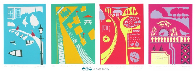
Following the success of my four posters for London Transport Museum, currently on the network of London underground stations, I have been asked by Michael, the commissioner, to edition the designs as screen prints. I jumped at the opportunity, and embraced the task!

This has been an interesting challenge because although the artwork for the posters was made using paper cutouts, one great joy of digital print production means you don’t have to separate each colour to print; CMYK does it’s thing. However, screen printing requires far more consideration of separate colour on each of the layers as well as registration – the accuracy of each colour layer when printing. Overprinting can result in muddy colours if not fully considered. For the editions of prints I made some artwork adjustments on Adobe Illustrator enabling me to create the positive artwork for each of the four colours in each print, ready to expose photographically on the screens. You can see in my composite image, top right, the black print on acetates which are the screen positives, that I used to expose the images.

poster_print_processlayers100dpi

I love mixing colours to match my references and I take pride in not using colours straight from the pot, but to always see the nuance of hues. I make colours darker using purples and greens, rarely black. I used the final posters to get the right colours, and daylight is always essential. Ink and paper surfaces always give different qualities to contend with too. The final colours are certainly rather bright! Screen printing on paper is also very different to screen printing on fabric, so you have to get your head around the differences including remembering to flood your screen (pulling a layer of ink across) between each print, and using the vacuum on the print bed (to hold the paper firm).

However tired I am, when I am printing I am absorbed in the process – rarely noticing hours passing, and missing the need to feed. This is a good thing as my week as been ridiculously busy on all sides. Printing requires systematic thinking, and at least one clean hand. Preparing screens, mixing colours and registering each colour on the acetate first all needs to be organised. I love it when I’m in the rhythm of editioning.

A deadline to hand the first print from each edition to the commissioner this weekend focused the mind, and when trimmed, signed and wrapped I was really proud of the prints. I was even more pleased when I met up with Michael to give them to him. He appeared to be joyfully moved by the results – holding one print up to the fellow coffee drinkers in pride… phew! They are off to be framed and auctioned at a London Transport Museum event at the Victoria and Albert Museum later this week.

This whole project has taken so many months (years) to come good, but throughout the process I have felt trusted by Michael to do what I do best. He has great confidence in his choice of designers spanning the years, and allows us to get on with the job without interfering with the outcome. His twenty plus years of commissioning poster designers has led him to influence the direction of graphic artwork on London underground, creating the archive for the future through the choice of creative hands and minds, but not by telling the designers what to do. It takes trust and judgement on his part, but in turn I think I’ve created my best work yet. In the many conversations over these years I’ve had with Michael he listens, he wants to hear my opinion on things; we have good discussions – he knows about a lot of things. He also often gets carried away with future ideas and possibilities – I like that, we should all get excited by ideas. Thanks Michael!

LTM_poster_prints2017_1_150


poster proud

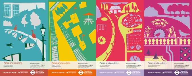
Every designer is likely to have a goal or two, a particular ambition to aim for. Last week I reached one of mine… I have designed posters for London Underground. They are up on the system as I write. I’ve been bursting to share the prospect that this may happen for several years, and now it’s real!

The underground poster archive at London Transport Museum is full of great examples of graphic design, with work by my heroes such as Edward McKnight Kauffer and Abram Games. These designers have inspired me in my quest to explore visual communication through print and pattern for as long as I can remember and now my design work is on the network hopefully catching the eyes of commuters in London, as theirs did.

I was pleased to be given the brief of ‘Parks and Gardens’ and was keen to move the visual qualities on from my Plot to Plate collection of kitchen gardens and parterres, although you may recognise in poster 3, ‘Community Gardens’ some of my motifs from that time. I have continued to play with elevations and perspective, while giving a polite nod to one of the other poster giants, Tom Purvis, whose poster I’ve had on a wall in our home for more than a decade, enjoying it every day. His series for LNER, ‘East Coast Joys’ appears to be made from cut out paper, the picture is made from flat colour in bold shapes. Having used this method for my commission for the Barbican last year I was keen to explore this again. You can see in my first cutout sequence I did begin to connect each poster to the next, as Tom Purvis had in his 6 LNER posters but I found this limited the scope for each poster composition in this instance.

KateFarley_ParksGardens_book_100

I began by gathering lots of imagery by making drawings and taking photographs and considered four different approaches to parks in London, one for each of the posters, from traditional activities such as rowing, to pitch & putt and the formal model boating lake. I wanted to create nostalgic content combined with a contemporary aesthetic. I remembered a hot day rowing on the Serpentine with a friend, I thought of many visits to Brockwell Park and all the different aspects of the ‘rooms’ it has within it. Greenwich was also an obvious one, Clapham Common and Hampstead Heath too. The posters represent lots of different aspects of parks, not four specific ones, and only one suggests a particular skyline looking across at the city.

Once the initial ideas were set I began to cut out the posters as general compositions, as well as single details / motifs to add. I combine both traditional drawing skills and digital manipulation in my practice, and this is how I worked here, scanning in paper drawings (cutouts) and subsequently working in Adobe Illustrator for final compositions / print artwork. I was able to make changes as required, including colour and motif placement options.

KateFarley_papercutouts_LTM17

As a designer I’ve always loved working across different surfaces and products, working with the industry experts in order to learn the best approaches and pitfalls of each context. Posters are large, but someone may look at it for less than a second… it needs to grab attention without being noisy. Large areas of pale colour might encourage graffiti… edges are as important as the centre, and so on. For people who have known my work for many years the look of the posters might not surprise, but my more recent work has been much more graphic, and understated so maybe some of you may not see these as so clearly of my handwriting. Let me know what you think!

Once I was told the posters were going up I had to go and find one. Luckily I was in London for the Design Festival so with wide-open eyes I took to the system and eventually found my first one at Embankment. I’m not sure I can put in to words what that felt like – I wanted to point and shout they were mine! The ticket barrier chap kindly took a picture of me alongside ‘playing a round’. Later that day I came across two more at Euston, and friends have let me know their sightings too!

KateFarley_ontheunderground_pics100

Design projects can take a long time to get to fruition, it is not unusual for years to pass. This can be frustrating when you want to shout out and tell everyone what you’ve been doing in the studio each week. I am always mindful of what I can share on social media, respecting my clients who might want to have control over a specific product launch. Now the posters are up I’m delighted and proud to shout about it… let me know if you see one on your travels!

parksandgardensPOSTERSseries100

You can also buy them from the London Transport Museum shop.