pride in the pattern of Pride cutlery

Two years ago I produced a bespoke pattern design for David Mellor Design celebrating the ‘Chelsea‘ salad servers that Creative Director Corin Mellor, (David’s son) had designed. The pattern was screen printed on to tea towels, being a highly appropriate product for the cutlery, and they continue to sell very well through the David Mellor shops and their online store. I took inspiration from the Hathersage factory and the production methods used for the making of the cutlery pieces. I like the fact that Corin sees and appreciates the relevance of the design to his company. Although I can create pattern for pattern’s sake, I am really interested in pattern that belongs to particular brands, to communicate a belonging, of distinctiveness.

This summer I was delighted to be contacted again by Corin as the buying team were keen to add a new pattern. Starting any new commission is exciting as the conversations about the intentions of the artwork, the concepts that need building on, the production methods, colour and material choices, expectations and of course… deadlines!

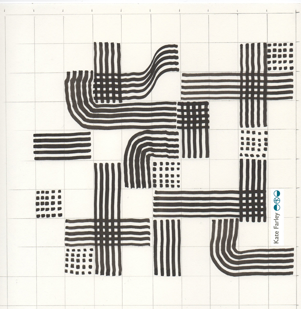
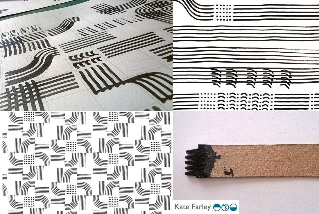
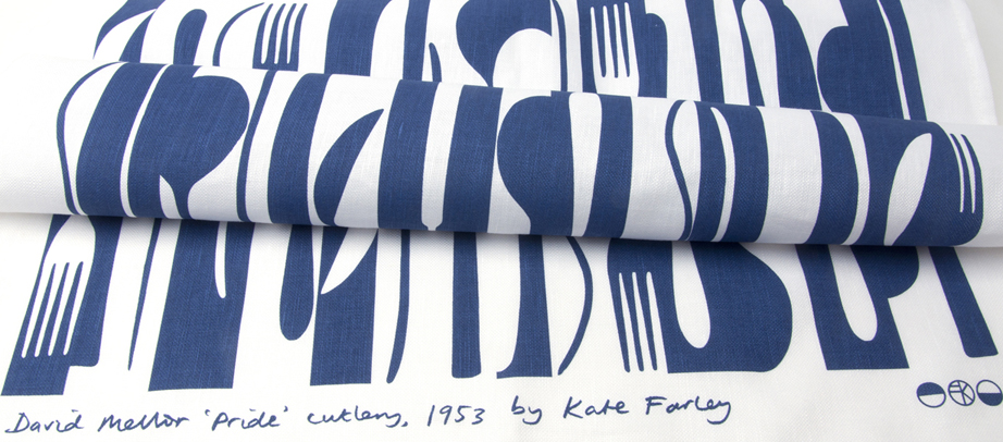
With all of that taken care of I received a beautiful box of cutlery to draw from. Corin had decided he wanted to celebrate his father’s first cutlery, Pride, designed in 1953. It is so elegant, beautiful to hold, and a joy to draw from let alone to eat from! I worked the same way I had done before, developing sketches and informal compositions, working up motifs and rhythms in a sketchbook first before generating final drawings and paper cut outs to scan to digital artwork.

KF_drawingMELLOR_100dpi

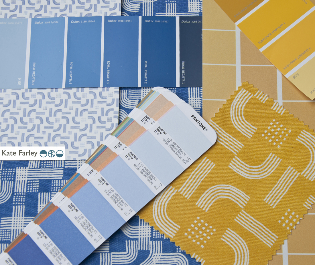
I work across a number of software packages depending on what is required, and always bearing in mind the final artwork requirements for production. It matters right from the beginning whether the production method is traditional printing or digital as I will design accordingly, limiting numbers of colours in the design if required, and using colour in the most appropriate way. This summer with several design projects on the go I’ve worked with Pantone references, RAL, NCS, pigment ink swatches and CMYK values. For this project we used British Standard colour relating it to other products that are stocked by David Mellor Design but I had to convert it to modern day language!

Having completed a few different designs I sent them through to Corin and his buying team and was of course really pleased when they got back to me with the same choice as me. I’ve learned never to send anything I’m not quite happy with or proud of, as that will be the one the buyer picks! Sampling and production were the next steps as well as designing the new swing tag to suit both the “Chelsea’ and the Pride tea towels. I screen print these in my studio on to beautiful G.F. Smith paper.

I’ve worked with the same fabulous British company to screen print textile products several times before and it’s always a delight to take a further project to production with them. They understand that it’s not that I’m fussy, but rather ‘particular’ about details, and we work together well. Signing off proofs, forwarding woven designer logo tags to be sewn in and waiting for the order delivery sees the weeks go past, and very soon there will be two patterns of cutlery.

KFarley_mellorPride_tt_roll_150dpi

I’m a cutlery fan any day of the week, and this really has been a fabulous commission to work on. To create a pattern for a client where the design relates to the product it is destined for, and its job is to visually communicate the heritage, culture and ethos of the company is a very fine challenge to take on. Proud of Pride!

Keep an eye out for ‘Pride’ in the David Mellor shops next month…

teaching for them and for us

I’ve combined my academic career with my art and design practice since the late 1990s and I’ve felt that each informs the other. Some weeks I’ve wished there were more hours for one than the other, but the two occupations are, for me, valuable and complementary to each other.

My art and design practice is one of learning, journeying and discovering new ways to look, to draw, to interpret the world about me in a visual, drawn or printed language. I feel as if I’m on a really long adventure that won’t stop until I get put in a box. Each commission, or self-established project offers a small experience that builds the bigger lesson that takes me further along that creative path to who knows where. Facilitating the discovery of this excitement in creative exploration is what drives me to teach students in Higher Education.

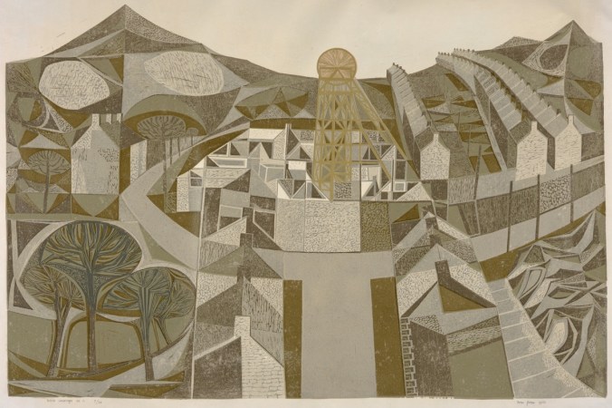
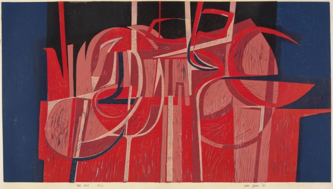
I have recently visited the excellent Peter Green exhibition: Sixty years of printmaking, at Mascalls Gallery, Kent (the exhibition has just finished I’m afraid), which got me thinking…  It was made clear in the design and content of the show (St. Judes and Emma Mason Gallery with Mascalls Gallery) that Peter combined his printmaking career with an academic one, and a high achieving one at that.

Printmaking is such a physical experience, and although simple in principle, the intricacies of a process and resulting prints can be hard earned. The exhibition of Peter Green’s work really demonstrated the pleasure of investigation, of material, colour and surface quality, not as passing ideas, but as a sustained dialogue between practitioner and process, and between ink and paper. The exhibition showed the drawings, the printing plates, the tools, the sampling and final resolutions. Peter’s vast experience and significant creative journey was evident; and through the exhibition I felt as if he is teaching us to learn from him, not for the technique, but for the commitment and value of doing and pursuing something. I believe that this is fundamental in teaching, whether in formal education or not.

Simon_Lewin_56

It was interesting to read in the catalogue that accompanies the exhibition that he said, “knowledge is about common ownership […] we should learn from each other.” This is how I feel about my relationship with education. We should not be masters to preach the skills and experience, but instead we could share in the experience of learning together. That’s not to deny that someone needs the skills and experience in the first place, but the attitude of someone like Peter who clearly enjoys the creative journey will inspire those a step or two behind him. I think it’s important that those who teach are also those who do.

Simon_Lewin_02

I strongly believe that there are no short cuts, or right answers along the path of art and design. There is no ‘one’ way of doing things. Sadly, so many students come through school thinking they are looking for the tick in the box, the correct result. We try at degree level study to nurture in them the understanding that you learn far more by investigating, questioning and journeying, rather than heading straight for one destination. This is again echoed in Peter’s investigative approach to printmaking – the finding out along the way is as important as the final state.

I read in the catalogue that Peter had moved away from wood engraving as a process as it required a more calculated journey and pre-determined images. I think I work like this too, looking to uncover the solution rather than to execute the obvious, not with wood but as a designer. This makes me think of new or less experienced teachers over-planning and worrying about the outcome of a session; what the students will achieve at the end, as a tangible result. Those with more experience and confidence in their teaching and the learning experience can take risks with that journey of learning and therefore participate rather than dictate. This sounds comparative to Peter’s more recent prints that evolve over time without the planning, but with an open-ended investigation. The exhibition celebrates sixty years of Peter printmaking [today in collaboration with wife Linda], so with such a busy and extensive journey the prints are an exciting archive of process and investigation, with common themes, colour relationships and familiar motifs in evidence during this time, as well as textile designs more recently in collaboration with St. Judes.

No doubt those of us who live with creative practices do so for many reasons, and those of us who teach will each tell of reasons why we do too. The combination of a creative practice and a teaching role is, in my mind, a really good combination, a two-sided relationship, where hopefully the give and the take work themselves out for the benefit of all! Thanks to Peter for reminding me of that good partnership as we embark on another academic year…

Simon_Lewin_36

Thanks to Simon Lewin of St. Judes for permission and access to the images of Peter Green’s prints:

top: Welsh Landscape No.1 1960

middle: Red Night 1963

bottom: Evening Estuary 2013

Useful links:

http://www.mascallsgallery.org

http://www.stjudesprints.co.uk

http://www.emmamason.co.uk

A change of background colour

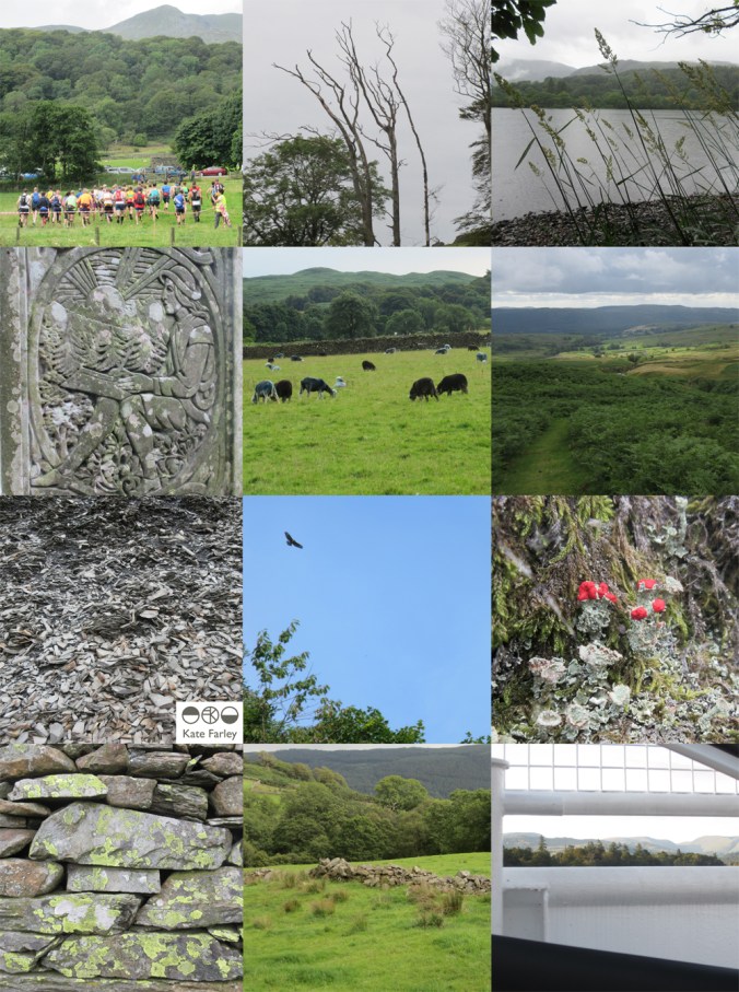
It’s the holiday season and we’ve been taking part. A camping trip to the Lake District offered a dramatic difference to the usual scenery we live within here in the Midlands, and it was refreshing change for being so. Everywhere seemed so green, really really green, not just the local park green but intense, vivid greens that lush meadows could offer. Naturally with that comes rain, but even then the colours were vibrant. Lichen was glowing, moss saturated, even the sheep were blue! Some colours took me back to studio projects, Pantone references, British Standard colours and colour choices, others offered a welcome diversion.The strange thing is, that when I compiled the image to include with this post the images looked really grey, but it really wasn’t like that through my eyes!

This change of scene is just what the mind needed after an intense workload juggling several design projects and at the end of a hectic academic year. I like what the seasons do to us, make us adapt and notice the time passing. This time of year feels like a celebration, as harvests ripen in the sun (ummm..) and we prepare for a new season of productive design work, education and research.

I shall remember the vivid greens, the birds circling overhead in the sky of blue; the vast views that some people get to enjoy day in day out. I shall remember the feeling of change, and rest, and stopping just for a short while, as a warm memory in the depths of winter when working in the studio. I am bound by the academic year, as well as the seasons on the allotment, the trade show calendar, and birthdays, as so many people are. It’s good to recognise the rhythms and differences brought on by change. Hooray for holidays!

KFarley_lakes_blogpics_web

spinning plates in the portfolio

It’s the holiday season but that’s a tricky thing when it comes to being freelance. Yes I have leave from being an academic at this time of year but the design jobs seem to know when it might be good to take a holiday, then the projects pile up, each with a deadline that results in juggling. I’ve made lists of lists, with schedules and then more lists. Each task gets ticked off, only to be joined by a further task, only to discover that some of the industry does take a holiday and instigate factory shutdowns – good on them! I like their style…

I’m not complaining, it’s just always the way of things, and I actually like times like this. This is the portfolio career that I wanted and imagined. Over the last two weeks I’ve lost count of the number of designs I’ve completed, the different colourways, the scale testing, the rhythms, repeats and patterns I’ve honed. In each project the client has been very different, with highly specialised requirements, and again, that’s really exciting.

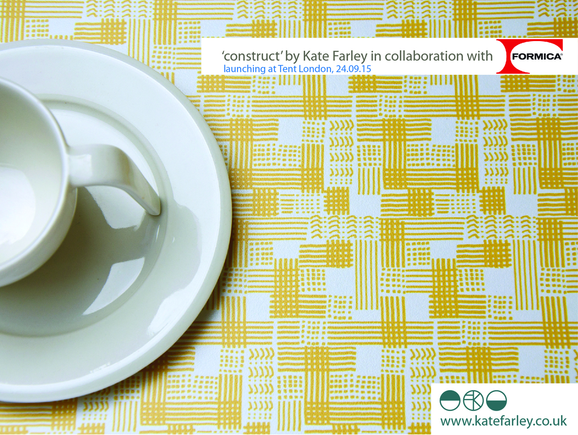
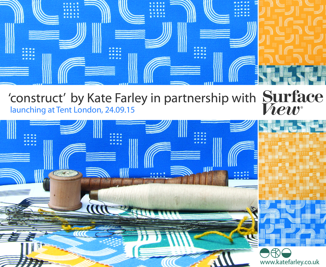
Alongside all of this I am also preparing to launch my ‘construct’ collection, and as I can’t share the other design projects yet I thought I’d share one of the images I’ve prepared for the press release. The project has been months in the making, and has been growing in so many exciting directions I’m really looking forward to setting up my stand at Tent London in September. If you think you might visit the show as a trade visitor don’t forget to register for a ticket: http://www.tentlondon.co.uk/trade-registration

Do check back and see more of the collection

TENTflyer15_crop800

Sissinghurst in full bloom

We had a great day out at National Trust’s Sissinghurst gardens in Kent last week even though the weather gave us several seasons in one day. It has been a number of years since my last visit and I’ve spent those years becoming more of a gardener, and launched my Plot to Plate collection of garden inspired patterns in that time so my reasons for observing, taking photographs and drawings have changed. The planting was fantastic; the combinations of colours and textures in particular were stunning. Here’s a few examples:

KFarley_sissinghurst_blogweb

construct – first glimpse…

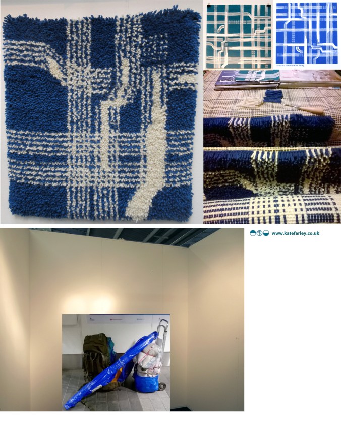
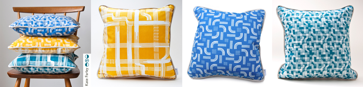
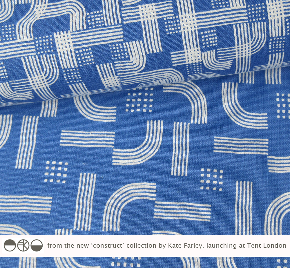
I’ve spent many months working on a new pattern collection and will be launching it at Tent London at London Design Festival this September. I’ve kept any signs of the design development away from social media until now, but here’s a couple of the patterns from the ‘construct’ collection. I shall write more about the ideas behind the collection in due course.

KateFarley_CONSTRUCTblue

redesigning the ‘brand’ self

I’ve been out in the ‘real world’ so to speak for nearly twenty years, and while I found that such a scary idea during my time at art college, having little idea of what I really wanted to do, now I realise it’s okay.  I look back and remember so many exciting things that I’ve been up to and so many great people I’ve worked with that I am grateful for living the portfolio career in art and design.

I made the choice to lead an academic career alongside my own practice and both really support each other. I am sharing and honest in my own learning experiences from industry working across art and design contexts. The students’ creative journeys also inspire the creative investigation in me. We talk of ‘branding’ and ‘professional identities’ in the Second year that I am currently leading in the Textile Design degree course at Birmingham City University, and consider how we and others see us and what we can control and what others interpret. I’m not a corporation or multinational company and yet the word ‘brand’ is commonly used for the self-employed too. Language used in promotional material as well as social media build a story, whether we like the tale or not. Does my design integrity come across? what about my inspiration? is the market level clear?…

I’ve been redesigning my website over the last few months. This is always an opportunity to ask myself more questions, and to reflect on where I’ve come from, where I’ve been and where I plan to go within the world of design, and specifically pattern. I’ve been excited by the process. I’ve chosen headings / page titles that more accurately reflect my current practice and edited substantial information relating to projects of years gone by. I’ve made it more image-based and updated text, again to reflect the shift in my design practice interests. With social media being a really key part of building a ‘brand’ these days this process has been happening as I go, but I’ve finally embraced instagram, having enjoyed Twitter over the last three years.

So, for all the bookbinding workshops I’ve led, the public consultation exercises I’ve participated in, the colours and materials I’ve sourced, the flowers I’ve drawn and the prints that I’ve pulled, this is where I’m at now…

katefarley.co.uk

KFarley_making_blogcut

pattern at the pitch, up and down

Despite having lived in Headingley, Oval and near Edgbaston I’m not a great fan of cricket but today I spent a number of hours at Edgbaston, the home of Warwickshire County Cricket Club as they hosted a charity community day. The highlight for me was the arrival of the Red Devils, from the skies in the most fantastic spectacle, bringing the ball for the 20-20 match. The marching band looked fabulous in red to the complimentary green of the grass and I also discovered I have a skill in rifle shooting, so there you go, a surprising day.

I gathered lots of images of patterns too. Here’s the day in grey, green & blue pictures…

edgbaston_com_day_100riflecard_100

Plot to Plate printed pattern at Pulse 2015

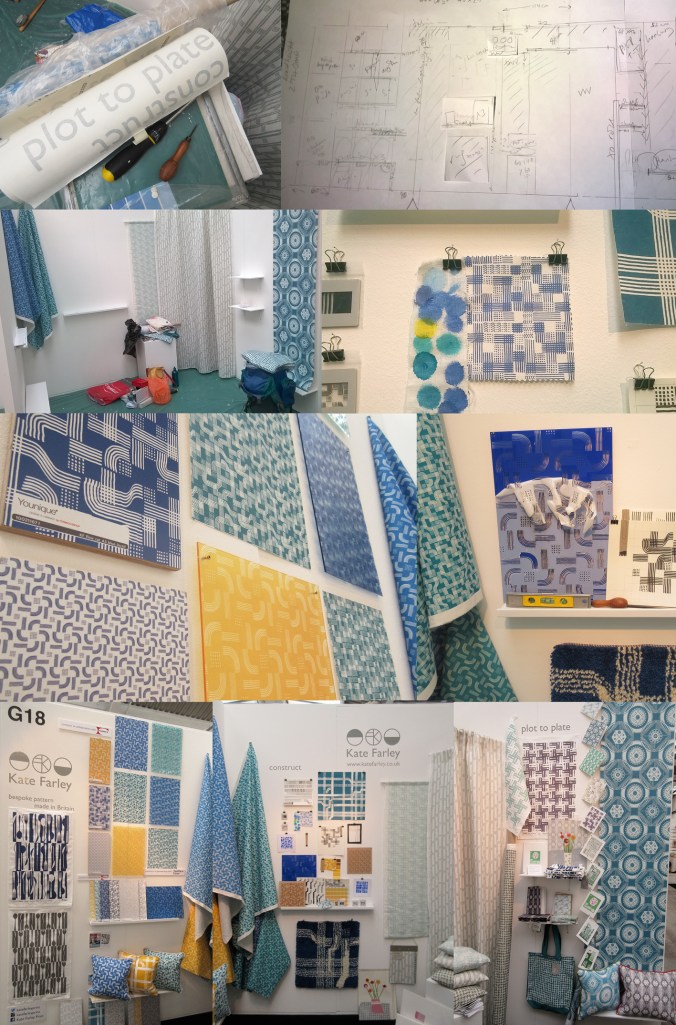
It always takes far longer to prepare for a trade show than it does to be there but I thought I’d show a bit of the journey of my show. Rather substantial worries kicked in the night before when we feared the contents of my stand were not able to be carried by two human beings, and more worryingly, not allowed on the train to London. Somehow we managed what felt like a physical endurance test, in fact it was… and began to make it my home for the next few days. Olympia is a stunning building to spend time in and we got the show up in a few hours, ready for the off… and there was still time to admire the London Underground graphics at Earls Court.

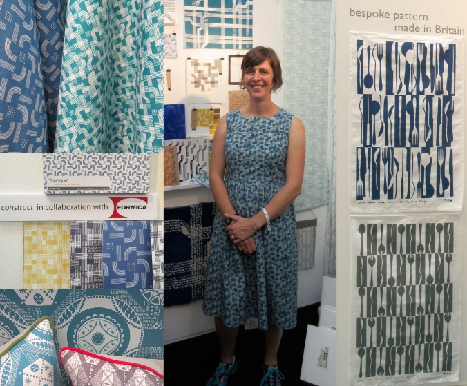
The Plot to Plate collection has grown substantially since its first trip to Olympia when I was showing in the Spotted section, at Top Drawer back in 2012. I am delighted that the new Hanbury and Parterre cushions have been well received by visitors to the show. These are hand screen printed and then sewn in Birmingham by social enterprise Textiles by St. Annes. The patterns are inspired by National Trust’s Hanbury Hall and Gardens, near Bromsgrove. The Hanbury wallpaper was also popular with interior designers visiting the show and Plot to Plate VVV was the most admired of my fabrics. My ‘parterre’ show dress was also much commented upon, with orders keen to be placed!

I was pleased to be an ‘expert pick’ by David Nicholls of House and Garden in the Pulse Preview and also chosen by Trend Bible in the trend section of the show catalogue.

It was also a pleasure to meet ex students of mine, graduating from the Textile Design degree at Birmingham City University, as visitors to the show in their industry roles, and I could still remember their names! How nice of them to say hello and make time to find out what I was up to.

The new friends made of the exhibitors beside me was really special. Such a supportive group of people, helping out, freely sharing trade insights, generally lovely people really helping the show be a great experience. The end of the show, although a welcome relief to the hours of standing (I really couldn’t carry a chair on the train!) was almost a sad time, as we stripped the walls bare, packed up our belongings, said our farewells and left, with the most ridiculous load I ever plan to carry. Maybe I’ll start making paper thimbles!

Thanks to all who visited and thanks to all who helped along the way! Here are the images which represent in some small way the few days at Kensington Olympia, May 2015.

`KFarley_pulse15

floral inspiration for textile patterns

One of the reasons I love to teach students drawing for textile design is the journey of enlightenment when introducing someone to the world of not only looking, but also of seeing. There are many ways to see when drawing and I’m really interested in the journey from reality to abstraction, whether its a state of mind, a way of transforming or whether it’s a methodical process applied to something in order to arrive at a motif for pattern.

My drawing process has evolved over years of practice but the way that I see is not so different to two decades ago. I remember reading the book ‘Drawing with the Right Side of your Brain’ by Betty Edwards and realising that I already did that and it all made sense. I enjoy playing with perspective, elevation, mapping of whatever it is I’m drawing, whether it’s a landscape or twig. Turning the three-dimensional thing in front of my eyes in to a two-dimensional drawing is always exciting, and challenging, but that’s half the fun. I think the process of printmaking that I further translate my drawings to really suit the clarity of motif dissection, separating colours or specific details on separate blocks or screens for printing for either a limited edition print or commercial textile design.

Each year the pear blossom at the allotment arrives and each year I’m reminded of how perfect they are in all ways. The beautiful petals and the bits I don’t know the names of, all there, waiting to be celebrated in drawing. No doubt Charles Rennie Mackintosh would have made an exquisite watercolour and graphite study. The flowers also remind me of drawings and prints I have made in the past, and not only of blossom, but of flowers that I make diagrammatic in a way to understand and explain the ingredients of the flower. When I discovered the work of Gwen White, and particularly the book ‘A World of Pattern’ I was excited to see someone else communicating what I see and how I translate form to pattern. This method doesn’t suite everybody and it would be a dull world if we all made drawings that looked the same, but every now and then it’s nice to know that my creative brain works like someone else’s brain and that my eyes see what others have seen before me.

KFarley_drawing_blossom_blog

Pear blossom, photograph, Kate Farley

‘Hanbury’ wallpaper, Kate Farley

Passiflora, lino print, Kate Farley

illustrations from Gwen White’s ‘A World of Pattern’ (RH column)