passing on pattern passion

In my role of academic as well as a designer I am regularly required to enthuse about print and pattern, and to be honest that’s fine, as I love designing and teaching pattern for print. This last week has seen me out and about to pass on my passion for pattern, firstly to Wolverhampton Embroiderers’ Guild where I was invited to talk about my practice. It’s always interesting having to consider what bit of the last twenty years to focus on, requiring reflection and evaluation, and how to tell the most relevant story without missing the bits that might be the most informative to others even if they didn’t seem so to me when living them. The audience were really generous with praise, and were really interested in my creative process, so sharing my sketchbooks, and anecdotes felt very easy to such an interested group of makers.

Tuesday saw me overseeing a morning of filming at Birmingham City University (BCU) with Laurence Llewelyn-Bowen and TV crew, working with our third years and our fabulous Print Technician. It was a morning of celebrating the Arts and Crafts legacy, William Morris in particular, and the importance of understanding the value of drawing to the process of pattern making. It was a pleasure promoting our talented third years, in the closing stages of their time with us.

This leads me to yesterday when I and a colleague took a coach of second year Textile Design degree students to Manchester, specifically the Whitworth Art Gallery to see several exhibitions. On walking in to the first gallery and the exhibition ‘Revolutionary Textiles 1910-1939′ I noticed a number of pieces that I had featured in my Historical Textiles lectures when I had taught this group of students as first years, including Barron & Larcher, Josef Hillebrand and Omega Workshops. It was fabulous to see the students’ excitement on recognising patterns and names of designers that had, until then remained theoretical, and not ‘actually real’. Their knowledge meant something tangible, and I think was empowering to them. It was an honour to share that excitement of learning, and understanding.

Having worked on the Tibor Reich show at BCU it was great to be reunited with the collection, also on show at the Whitworth, and to see the different emphasis this exhibition made to an amazing and extensive archive owned by the family. The students really responded to the way Tibor worked to create pattern, and explored pattern through drawing with layers of colour and line. I couldn’t help but point out Tibor’s excellent use of a sketchbook to explore ideas.

Image below: top row from Revolutionary Textiles, bottom row Tibor Reich

KFarley_whitworth_May16_100

The room that wowed me most was the wallpaper gallery upstairs, and again, this exhibition was exciting and inspiring to the students, leading to some really interesting conversations. There is of course no comparison between seeing metres of wallpaper stretching skywards, to a small screen of Google images. We talked about print production, the scale of motifs useful to a domestic space rather than in relation to a sketchbook page, and why thinking big should be embraced. We admired the Lucienne Day patterns that are so familiar to us, alongside new discoveries, and that is why a curated exhibition, unlike an online search can be so beneficial; the selection provides context. I encouraged the students to question how they would make the marks, the shapes and patterns without computers, and why the variation of hand-made can offer something that digital software excludes. I include an example below to illustrate my point – beauty in the irregular.

KFarley_PalladioMagnus_blog

We did have time to enjoy the beautiful surroundings of the cafe but also took in a quick trip to see the newly opened Fashion & Freedom exhibition at Manchester City Art Gallery, one I really do recommend too.

So, more pattern inspiration for me, and hopefully some more people inspired by pattern too…

print progress

Recently I have been really busy with a variety of academic duties in Birmingham and further afield, taking me away from studio time, my freelance design practice, and of course blog writing. Also, in my teaching of Textile Design at Birmingham City University I have been leading a module of professional practice, assisting the students in learning about the life of a freelance designer. It’s definitely a double-edged sword, as the discussions between students and staff illustrated: It’s great to be your own boss, but you take all the blame when things don’t work out! You can get up when you want, but nobody pays you for just waking up!

The rhythm of freelance work is varied. Somehow it’s often the way of things that several deadlines coincide, and when you have a schedule to stick to, an urgent press request comes in. On the day you have time to make calls, those people are out of the office, and obviously you don’t get paid when you take a holiday. Yes there can be tough times, but I really like the variety of the weeks’ activities that freelancing gives me, certainly set in tandem with the academic life of very different demands. Each practice informs the other. Obviously there are freelance tasks I prefer and other ones I procrastinate over, lists are created, social media is checked and Radio 4 is listened too!

KFarley_knit1_blog.jpg

With so much to-ing and fro-ing on trains this last month or two and with several commercial projects on slow-cook I decided to give myself time to make, test and resolve some ideas that I have been exploring, with paper and print. The activity of printmaking is a fabulous discipline to work with. I love the excitement of planning a new print, and composing the plate, often taking me back to sketchbooks and previous ideas. The physical process of cutting the block can also be absorbing, and therapeutic and I have to decide the paper stock, the ink colour, and edition size too. It is important to maintain an experimental, inquiring practice and my prints and drawings are the evidence of ideas that have sustained my creative practice for the last twenty years. Between the commercial constraints of projects shaped by clients, costs and repeat patterns, printmaking can seem so free from limitations. This is why I make sure I keep printing – the creative sort, not just the invoices!

both prints featured here are available to buy, at £46 each unframed.

Knit 1, edition of 15, lino print, 9.5 x 9.5 cm print size

Meadow Grass, edition of 12, lino print, 9.5 x 9.5 cm print size

KFarley_meadowgrass_print_blog


Visual proverbs – in Ghana and Cheltenham!

As a young student in the 1990s I became aware of the amazing Asafo flags of the Fante, from Ghana. I’d seen an article in a magazine in the college library about an exhibition on at the time, and unable to afford the trip to London I telephoned Peter Adler, curator of the exhibition, as his number was listed in the article, to share my enthusiasm. I’m not sure what I thought I’d achieve but we did have a conversation and I was inspired to find out more about the colourful appliqued flags.

asafo_flags_croc100

What struck me about the flags was the bold shapes of animals and people that were communicating warnings to other units of warriors of the Fante people. Proverbs such as ‘The crab is feared for its claws’, or ‘Fish grow fat for the benefit of the crocodile’ attempt to ridicule the rival warrior groups and set a tone of fear, as if toying with opponents. With influence from the European flags they had seen as adventurers explored West African coastlines and from international trading ships the flags also featured elements of geometric borders and the Union Jack. I like the stylised imagery, but particularly the visual communication of a story in one textile image. I remember I wrote an essay on the subject for a Contextual Studies assignment and I went to great lengths to dye fabric and create my own textile illustrations and book cover – I still have it somewhere.

I’ve shared images of the flags with many groups of students over the years, but as I write a research paper on the subject of visual communication in pattern I am once again reminded of these beauties, and back I go, to the wonderful book: Asafo! African Flags of the Fante, written by Peter Adler and Nicholas Barnard in 1992, published by Thames and Hudson. I recommend this really informative book.

asafo_bookcover100

asafoflags_crabs100

When walking from Cheltenham railway station to the town the other week along the off-road path I came across some graffiti in an underpass that reminded me of the flags, and particularly in the way the animals were used to goad. The images felt as if they were provoking and taunting rival groups by showing off their prowess in the way the artwork of the Asafo flags did. I could imagine the jibes represented in the images of the cats, and in the way the badger is attempting to deflect the attention away from his kind, to the lizards, maybe another urban tribe. I’ll share the images here.

CheltenhamGraffiti150images:

Asafo flags, scans of the pages from the book by Peter Adler & Nicholas Barnard, referenced in the text

Cheltenham graffiti, photograph by Kate Farley

Launching the pattern collection: ‘construct’

I’ve always started designing by picking up some sort of drawing tool, and exploring ideas that will have been developing in my head for some time. Concepts of pattern and purpose as well as communicating an idea using pattern is what really inspires me, this is no different for ‘construct’. A stunning image of lace in a book I was looking at while researching for one of my textile lectures on historical design caught my eye and an idea joined with other ideas of print looking like weave, as many people commented that my Plot to Plate VVV design did (left hand side of first image), when I was at Tent London in 2014. The seeds were sown.

KateFarley_startingLine

I’ve never hidden my loathing for faux surface / material effect pattern such as printed wood effect flooring. Why do we have to lie, why can’t there be another stunning and suitable design alternative?! With this is mind I’ve played with the idea of taking textiles as a starting point for this collection with the intention of subversively adding textile-derived pattern to other surfaces but in an evocative statement rather than a digital print of textiles. This is not a collection that copies textiles, rather that textiles suggests a way to draw; provides a set of rules to begin playing with. The title ‘construct’ is a reference to constructed textiles such as weave, knit and lace but also refers to the putting together of a new way of thinking about pattern for surface, building a collection that has been designed to cross material specifications and provide bespoke solutions.

Having been working on my Plot to Plate collection and related prints for the last five years it was a big challenge to start from scratch and move away from the safety of a kitchen garden, but I was also excited about the challenge. I’d been working on some other pattern commissions and revisited drawing processes that had got me thinking. I didn’t rush to get somewhere; I designated studio days to play with thread, ink and paper. I created a sketchbook of so many ideas and directions but eventually I began to formalise ideas and work out which direction felt right for the collection. Some of the other directions have already been moved on to commercial projects, and the others I’ll revisit over the years as and when.

construct_blog_p1

I usually sample patterns in black and white so I’m not swayed by colour rather than the success of the pattern. Having said that I was really adamant that blue was going to feature. Right from the beginning I was thinking of the strong Mediterranean blue of Greek churches, and the Blue Nude series by Matisse. Strong colour has been making a presence in interiors for a while, influenced by key exhibitions and trends. I knew I wanted to stay well away from Memphis colour palette and the reworking of 1980s colours. Sonia Delaunay has also inspired many designers and retailers thanks to the striking show at Tate Modern. I’m aware of trends, I have to be as an academic who teaches textile design, but I’ve never been inspired to follow them. I have my own creative path I’m on and I also would like my patterns to exist well beyond a season or two. Having said that one has to be aware of what drives buyers in retail to spend their money and for some it is likely to be informed by trends.

As those of you who have read more than this post might know, I like cutlery, and I can’t help laugh that the drawing tool that I’ve come to love is a sort of handmade fork! I’ve made many for this collection and they are so simple and inexpensive but all made by me to create exactly the right sized marks and the right sort of line. I’ve definitely got better at them. Weeks of testing many design structures and resulting rhythms left me with pages of patterns and the need to edit. Further weeks and I decided to test some screen printing on to fabric. Although I knew this collection was going to explore alternative surfaces I wanted it to work on fabric too. The weave of some of the fabrics was too dominant, and the scale of some of the patterns was less successful. Really valuable sampling!

construct_drawinggrid_101_blog

KF Construct_blog_p2

I’d contacted and discussed collaborations with choice companies relating to my ambitions for the collection and it was very exciting to sample on a range of substrates. I really wanted to embrace the ‘bespoke’ capacity that several manufacturers in Britain offer as a way to provide interior designers and architects for example, a choice for their clients. Choosing from off-the-shelf surfaces is not always exciting – there are exceptions! I wanted this to be a collection of pattern in anticipation of the product. Ten years ago I was a winner in the Formica ‘design a laminate’ competition and it felt good to be in discussions with a company with such a strong heritage for pattern. Surface View also demonstrate a contemporary approach to wallcoverings and surface pattern, enabling me to discuss my intentions for the collection and the concept of bespoke production and it being met by expertise and clarity. Having carried out several public art commissions over the years I’ve become used to discussing colour systems and file types, tweaking of production elements to manage the different industry requirements. It’s good to have that experience behind me.

KFarley_construct_colour2_150PrintPrint

So here I am as Tent London is underway and I am extremely proud of the patterns that have made it to the final collection. There are repeat designs, small and larger scaled rhythms and placement patterns featured across the collection including a particular Tent London tote bag competition…. There are hand printed cushions ready for shop shelves or customers’ sofas and contemporary bespoke pattern for those wanting a graphic pattern rather than printed granite in their lives. The patterns can be licensed and collaborations can be discussed. Alongside all of this in order to fully convey the concept of the collection I’ve learned the skill of latch-hook rug making and committed many hours to mastering the skill of constructing pattern in yarn – not natural for me as a printer! I’ve sampled laser cutting and etching to varying degrees of success, I’ve made a dress for the show featuring ‘flow’ AND I’ve screen printed two limited editions of prints for launch day.

I’m interested to find out how it is received after so many solo months of nurturing, worrying and wondering. It’s time to let the pattern do the communicating…. do let me know what you think!

KateFarley_construct_cushions

pride in the pattern of Pride cutlery

Two years ago I produced a bespoke pattern design for David Mellor Design celebrating the ‘Chelsea‘ salad servers that Creative Director Corin Mellor, (David’s son) had designed. The pattern was screen printed on to tea towels, being a highly appropriate product for the cutlery, and they continue to sell very well through the David Mellor shops and their online store. I took inspiration from the Hathersage factory and the production methods used for the making of the cutlery pieces. I like the fact that Corin sees and appreciates the relevance of the design to his company. Although I can create pattern for pattern’s sake, I am really interested in pattern that belongs to particular brands, to communicate a belonging, of distinctiveness.

This summer I was delighted to be contacted again by Corin as the buying team were keen to add a new pattern. Starting any new commission is exciting as the conversations about the intentions of the artwork, the concepts that need building on, the production methods, colour and material choices, expectations and of course… deadlines!

With all of that taken care of I received a beautiful box of cutlery to draw from. Corin had decided he wanted to celebrate his father’s first cutlery, Pride, designed in 1953. It is so elegant, beautiful to hold, and a joy to draw from let alone to eat from! I worked the same way I had done before, developing sketches and informal compositions, working up motifs and rhythms in a sketchbook first before generating final drawings and paper cut outs to scan to digital artwork.

KF_drawingMELLOR_100dpi

I work across a number of software packages depending on what is required, and always bearing in mind the final artwork requirements for production. It matters right from the beginning whether the production method is traditional printing or digital as I will design accordingly, limiting numbers of colours in the design if required, and using colour in the most appropriate way. This summer with several design projects on the go I’ve worked with Pantone references, RAL, NCS, pigment ink swatches and CMYK values. For this project we used British Standard colour relating it to other products that are stocked by David Mellor Design but I had to convert it to modern day language!

Having completed a few different designs I sent them through to Corin and his buying team and was of course really pleased when they got back to me with the same choice as me. I’ve learned never to send anything I’m not quite happy with or proud of, as that will be the one the buyer picks! Sampling and production were the next steps as well as designing the new swing tag to suit both the “Chelsea’ and the Pride tea towels. I screen print these in my studio on to beautiful G.F. Smith paper.

I’ve worked with the same fabulous British company to screen print textile products several times before and it’s always a delight to take a further project to production with them. They understand that it’s not that I’m fussy, but rather ‘particular’ about details, and we work together well. Signing off proofs, forwarding woven designer logo tags to be sewn in and waiting for the order delivery sees the weeks go past, and very soon there will be two patterns of cutlery.

KFarley_mellorPride_tt_roll_150dpi

I’m a cutlery fan any day of the week, and this really has been a fabulous commission to work on. To create a pattern for a client where the design relates to the product it is destined for, and its job is to visually communicate the heritage, culture and ethos of the company is a very fine challenge to take on. Proud of Pride!

Keep an eye out for ‘Pride’ in the David Mellor shops next month…

teaching for them and for us

I’ve combined my academic career with my art and design practice since the late 1990s and I’ve felt that each informs the other. Some weeks I’ve wished there were more hours for one than the other, but the two occupations are, for me, valuable and complementary to each other.

My art and design practice is one of learning, journeying and discovering new ways to look, to draw, to interpret the world about me in a visual, drawn or printed language. I feel as if I’m on a really long adventure that won’t stop until I get put in a box. Each commission, or self-established project offers a small experience that builds the bigger lesson that takes me further along that creative path to who knows where. Facilitating the discovery of this excitement in creative exploration is what drives me to teach students in Higher Education.

I have recently visited the excellent Peter Green exhibition: Sixty years of printmaking, at Mascalls Gallery, Kent (the exhibition has just finished I’m afraid), which got me thinking…  It was made clear in the design and content of the show (St. Judes and Emma Mason Gallery with Mascalls Gallery) that Peter combined his printmaking career with an academic one, and a high achieving one at that.

Printmaking is such a physical experience, and although simple in principle, the intricacies of a process and resulting prints can be hard earned. The exhibition of Peter Green’s work really demonstrated the pleasure of investigation, of material, colour and surface quality, not as passing ideas, but as a sustained dialogue between practitioner and process, and between ink and paper. The exhibition showed the drawings, the printing plates, the tools, the sampling and final resolutions. Peter’s vast experience and significant creative journey was evident; and through the exhibition I felt as if he is teaching us to learn from him, not for the technique, but for the commitment and value of doing and pursuing something. I believe that this is fundamental in teaching, whether in formal education or not.

Simon_Lewin_56

It was interesting to read in the catalogue that accompanies the exhibition that he said, “knowledge is about common ownership […] we should learn from each other.” This is how I feel about my relationship with education. We should not be masters to preach the skills and experience, but instead we could share in the experience of learning together. That’s not to deny that someone needs the skills and experience in the first place, but the attitude of someone like Peter who clearly enjoys the creative journey will inspire those a step or two behind him. I think it’s important that those who teach are also those who do.

Simon_Lewin_02

I strongly believe that there are no short cuts, or right answers along the path of art and design. There is no ‘one’ way of doing things. Sadly, so many students come through school thinking they are looking for the tick in the box, the correct result. We try at degree level study to nurture in them the understanding that you learn far more by investigating, questioning and journeying, rather than heading straight for one destination. This is again echoed in Peter’s investigative approach to printmaking – the finding out along the way is as important as the final state.

I read in the catalogue that Peter had moved away from wood engraving as a process as it required a more calculated journey and pre-determined images. I think I work like this too, looking to uncover the solution rather than to execute the obvious, not with wood but as a designer. This makes me think of new or less experienced teachers over-planning and worrying about the outcome of a session; what the students will achieve at the end, as a tangible result. Those with more experience and confidence in their teaching and the learning experience can take risks with that journey of learning and therefore participate rather than dictate. This sounds comparative to Peter’s more recent prints that evolve over time without the planning, but with an open-ended investigation. The exhibition celebrates sixty years of Peter printmaking [today in collaboration with wife Linda], so with such a busy and extensive journey the prints are an exciting archive of process and investigation, with common themes, colour relationships and familiar motifs in evidence during this time, as well as textile designs more recently in collaboration with St. Judes.

No doubt those of us who live with creative practices do so for many reasons, and those of us who teach will each tell of reasons why we do too. The combination of a creative practice and a teaching role is, in my mind, a really good combination, a two-sided relationship, where hopefully the give and the take work themselves out for the benefit of all! Thanks to Peter for reminding me of that good partnership as we embark on another academic year…

Simon_Lewin_36

Thanks to Simon Lewin of St. Judes for permission and access to the images of Peter Green’s prints:

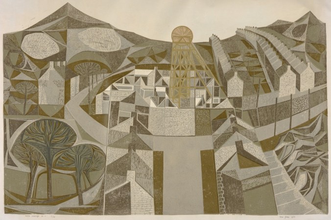
top: Welsh Landscape No.1 1960

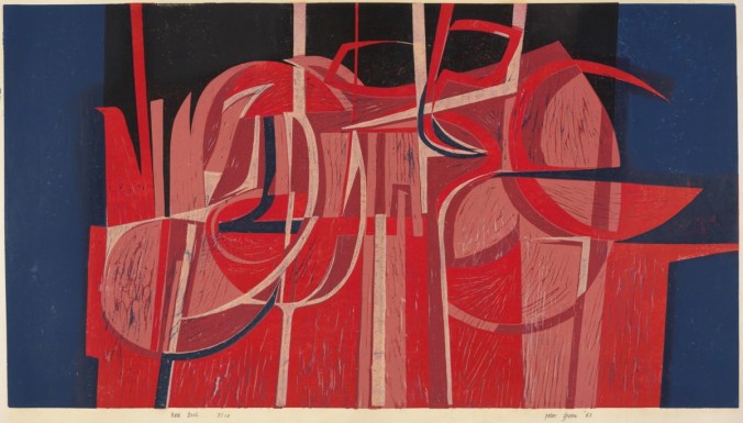
middle: Red Night 1963

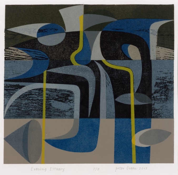
bottom: Evening Estuary 2013

Useful links:

http://www.mascallsgallery.org

http://www.stjudesprints.co.uk

http://www.emmamason.co.uk

floral inspiration for textile patterns

One of the reasons I love to teach students drawing for textile design is the journey of enlightenment when introducing someone to the world of not only looking, but also of seeing. There are many ways to see when drawing and I’m really interested in the journey from reality to abstraction, whether its a state of mind, a way of transforming or whether it’s a methodical process applied to something in order to arrive at a motif for pattern.

My drawing process has evolved over years of practice but the way that I see is not so different to two decades ago. I remember reading the book ‘Drawing with the Right Side of your Brain’ by Betty Edwards and realising that I already did that and it all made sense. I enjoy playing with perspective, elevation, mapping of whatever it is I’m drawing, whether it’s a landscape or twig. Turning the three-dimensional thing in front of my eyes in to a two-dimensional drawing is always exciting, and challenging, but that’s half the fun. I think the process of printmaking that I further translate my drawings to really suit the clarity of motif dissection, separating colours or specific details on separate blocks or screens for printing for either a limited edition print or commercial textile design.

Each year the pear blossom at the allotment arrives and each year I’m reminded of how perfect they are in all ways. The beautiful petals and the bits I don’t know the names of, all there, waiting to be celebrated in drawing. No doubt Charles Rennie Mackintosh would have made an exquisite watercolour and graphite study. The flowers also remind me of drawings and prints I have made in the past, and not only of blossom, but of flowers that I make diagrammatic in a way to understand and explain the ingredients of the flower. When I discovered the work of Gwen White, and particularly the book ‘A World of Pattern’ I was excited to see someone else communicating what I see and how I translate form to pattern. This method doesn’t suite everybody and it would be a dull world if we all made drawings that looked the same, but every now and then it’s nice to know that my creative brain works like someone else’s brain and that my eyes see what others have seen before me.

KFarley_drawing_blossom_blog

Pear blossom, photograph, Kate Farley

‘Hanbury’ wallpaper, Kate Farley

Passiflora, lino print, Kate Farley

illustrations from Gwen White’s ‘A World of Pattern’ (RH column)


Design inspirations 3: winning games

I have always felt that one’s upbringing has a huge influence over the aesthetics of that designer. The house, the landscape, the products and fabrics that are present in the early years; everyday things, that at the time may not have been seen as important then can be blamed or celebrated in the later career of artists and designers. No doubt plenty of people would disagree with me, that’s not the point. I can clearly see a link between my own aesthetic, and my upbringing, and I’ve written about it in the past- read here  &  read here

On a trip back to the family home in Norfolk I came across the old games we used to play and was mentally transported back years before, simply by seeing the beautiful graphic qualities, clean lines and visual communication that I hold dear in my own practice. My visual language doesn’t necessarily mimic those designs but it’s more of an approach, a set of values & expectations that I set myself. We can expect things to be very different in the future with such digital aesthetics taking firm hold of so much of every day lives for my children and those of tomorrow. From how we create art and design, to how we view it on screen as well as on fabrics and surfaces much is very different. It is not necessarily a criticism of today, but more an appreciation of the inspiration I had and continue to thrive by. I sincerely hope that there will be art and design education in place over the next few years which will inspire the future textile designers, setting the benchmark for beyond that.

Here’s some of the graphic wonders. Red is a very popular box colour and it’s worth noting that many of the games proudly state they were made in England. Pieces were metal, wooden, proper card, nicely printed and beautifully boxed… there, a bit of nostalgia too! It also might be worth noting that in the ‘careers’ game The Arts was kept firmly in the box while ecology, sports, politics and big business made it on to the cover of the box!

KateFarley_games_blog


photographic memories and a bit of a political rant…

I’ve had rather a large sort through my creative archives in the last few days and I’ve been rediscovering drawings and designs from the last twenty years and more. I’ll share some of those finds another time. Amongst the formal sketchbook projects and portfolio sheets from art college days I found an old handmade notebook I used to record my photographic experiments and darkroom technical details / testing in. With it’s silver cover I chose to use, especially fitting with photographic techniques, I was reminded so distinctly of the days I spent in the dark room at Leeds College of Art and Design testing ways to create images and pattern – I could almost feel my Doc Martin boots on my feet!

silver photogrpahybookLCAD

The book reminds me of the hours I ‘played’ with creative and technical processes, with no sense of employ-ability issues burning, and I can’t really remember many project deadlines or talk of Learning Outcomes but assume there must have been. Those hours helped me to work out what I wanted to do, what sort of design language I would develop, and how my designs fit in the real world. Even now I can look back to that book and see creative sparks being established that have continue with me and what focuses my practice today. I feel lucky.

silverphotobookLCAD

It’s having this time to experiment and nurture creative ideas that all students at all stages of education need to have access to in order to understand the possibilities of aesthetics, innovation and design. This can’t be rushed and won’t be replaced if lost. It’s not just the artists and designers that lose out, its everyone! Maybe politicians who lack the understanding and foresight to retain sufficient art and design in formal education ought to consider how their material worlds came to be. It certainly isn’t all about money, even if it is beautifully designed and printed money!

This isn’t meant to be a rant, but somehow this luxury of creative time I remember having shouldn’t be considered a luxury, it’s a necessity, and my small silver notebook reminds me of the importance of learning time. We all need things designed and made, from the fork you eat with, to the car you might drive, and wouldn’t it be good if those things could be the best they could possibly be, and beautiful too, given half the chance! It’s no surprise to me that brilliant artists and designers don’t wake up one day, fully formed and ready for the off… It would be like a politician having had no time to live and work in the real world before becoming an expert on how to run the country for the rest of us.

The season of textile design portfolios

As a student traveling up and down the country for interviews for a place on a degree course back in the mid 1990s I had little idea of what I would do on the degree course, let alone beyond the eternity of three years studying. My A1 black portfolio demonstrated my love of drawing, printmaking, pattern and ‘potential’. Now, in my role of lecturer at Birmingham City University each year I participate in the rounds of interviews to select the new members of our textile community and each year as I help them open the black A1 folio it reminds me of the journey I started all those year ago. The industry has changed, the world has changed, technology is utterly different and yet those nerves belonging to those individuals are as real as ever, and I remember that feeling so clearly. The unknown, the untrodden path I stumbled along; the Norfolk girl living in Leeds to turn drawings in to designs.

I’ve questioned most decisions I’ve made along the way, worrying about whether I should study art or design, printmaking or illustration, book art or textiles and yet somehow I seem to have all of those elements in my everyday practice, and that suits me fine. I remember the challenging task of confirming a description of myself and practice for my graduation show and degree postcard. (I opted for Artist / Designer, in case you wonder.) I couldn’t get the wording right, and really thought it mattered.

KF_degree_blog(images from degree study)

Having spent last Saturday interviewing students, on introduction I described myself to the visitors as a Printed Textile Designer, which in so many ways completely fails to describe what I do, but somehow seemed right to say at the time. Now I ask myself why it doesn’t fit and maybe I conclude that the term feels too predictable, so tidy, so comprehensive, and yet the thing I am most proud of in my career to date is the breadth of art and design experience I have gained, the materials I’ve designed for, the clients I’ve had, and the lessons I’ve learned, despite as a student, no idea that all that was possible on graduation.

Many times through the day I spoke with interviewees about their art and design experiences and came to realise that their own understanding of art and design had more to do with the educational delivery they were currently receiving and far less about how they defined themselves. An interesting conundrum, and after all that, does it really matter? What made me most excited about being part of the interview process was that all the students were starting out on their own journeys, some of which I hope I shall be involved in, and with the potential of a great course to guide them through, inspiring staff and great facilities they really can do all they understand they want, and so much more than that. Daunting, and exhilarating, and I wish them all good luck!

I didn’t know it at the time but the work I was creating all those years ago as a student still holds such relevance to me now, and it doesn’t matter what label I give myself, it’s all about the creative process, and I don’t worry about boundaries there…