floral inspiration for textile patterns

One of the reasons I love to teach students drawing for textile design is the journey of enlightenment when introducing someone to the world of not only looking, but also of seeing. There are many ways to see when drawing and I’m really interested in the journey from reality to abstraction, whether its a state of mind, a way of transforming or whether it’s a methodical process applied to something in order to arrive at a motif for pattern.

My drawing process has evolved over years of practice but the way that I see is not so different to two decades ago. I remember reading the book ‘Drawing with the Right Side of your Brain’ by Betty Edwards and realising that I already did that and it all made sense. I enjoy playing with perspective, elevation, mapping of whatever it is I’m drawing, whether it’s a landscape or twig. Turning the three-dimensional thing in front of my eyes in to a two-dimensional drawing is always exciting, and challenging, but that’s half the fun. I think the process of printmaking that I further translate my drawings to really suit the clarity of motif dissection, separating colours or specific details on separate blocks or screens for printing for either a limited edition print or commercial textile design.

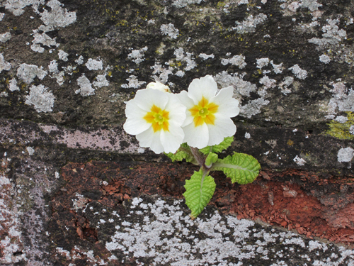
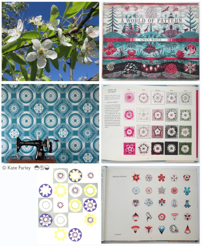
Each year the pear blossom at the allotment arrives and each year I’m reminded of how perfect they are in all ways. The beautiful petals and the bits I don’t know the names of, all there, waiting to be celebrated in drawing. No doubt Charles Rennie Mackintosh would have made an exquisite watercolour and graphite study. The flowers also remind me of drawings and prints I have made in the past, and not only of blossom, but of flowers that I make diagrammatic in a way to understand and explain the ingredients of the flower. When I discovered the work of Gwen White, and particularly the book ‘A World of Pattern’ I was excited to see someone else communicating what I see and how I translate form to pattern. This method doesn’t suite everybody and it would be a dull world if we all made drawings that looked the same, but every now and then it’s nice to know that my creative brain works like someone else’s brain and that my eyes see what others have seen before me.

KFarley_drawing_blossom_blog

Pear blossom, photograph, Kate Farley

‘Hanbury’ wallpaper, Kate Farley

Passiflora, lino print, Kate Farley

illustrations from Gwen White’s ‘A World of Pattern’ (RH column)


Design inspirations 3: winning games

I have always felt that one’s upbringing has a huge influence over the aesthetics of that designer. The house, the landscape, the products and fabrics that are present in the early years; everyday things, that at the time may not have been seen as important then can be blamed or celebrated in the later career of artists and designers. No doubt plenty of people would disagree with me, that’s not the point. I can clearly see a link between my own aesthetic, and my upbringing, and I’ve written about it in the past- read here  &  read here

On a trip back to the family home in Norfolk I came across the old games we used to play and was mentally transported back years before, simply by seeing the beautiful graphic qualities, clean lines and visual communication that I hold dear in my own practice. My visual language doesn’t necessarily mimic those designs but it’s more of an approach, a set of values & expectations that I set myself. We can expect things to be very different in the future with such digital aesthetics taking firm hold of so much of every day lives for my children and those of tomorrow. From how we create art and design, to how we view it on screen as well as on fabrics and surfaces much is very different. It is not necessarily a criticism of today, but more an appreciation of the inspiration I had and continue to thrive by. I sincerely hope that there will be art and design education in place over the next few years which will inspire the future textile designers, setting the benchmark for beyond that.

Here’s some of the graphic wonders. Red is a very popular box colour and it’s worth noting that many of the games proudly state they were made in England. Pieces were metal, wooden, proper card, nicely printed and beautifully boxed… there, a bit of nostalgia too! It also might be worth noting that in the ‘careers’ game The Arts was kept firmly in the box while ecology, sports, politics and big business made it on to the cover of the box!

KateFarley_games_blog


photographic memories and a bit of a political rant…

I’ve had rather a large sort through my creative archives in the last few days and I’ve been rediscovering drawings and designs from the last twenty years and more. I’ll share some of those finds another time. Amongst the formal sketchbook projects and portfolio sheets from art college days I found an old handmade notebook I used to record my photographic experiments and darkroom technical details / testing in. With it’s silver cover I chose to use, especially fitting with photographic techniques, I was reminded so distinctly of the days I spent in the dark room at Leeds College of Art and Design testing ways to create images and pattern – I could almost feel my Doc Martin boots on my feet!

silver photogrpahybookLCAD

The book reminds me of the hours I ‘played’ with creative and technical processes, with no sense of employ-ability issues burning, and I can’t really remember many project deadlines or talk of Learning Outcomes but assume there must have been. Those hours helped me to work out what I wanted to do, what sort of design language I would develop, and how my designs fit in the real world. Even now I can look back to that book and see creative sparks being established that have continue with me and what focuses my practice today. I feel lucky.

silverphotobookLCAD

It’s having this time to experiment and nurture creative ideas that all students at all stages of education need to have access to in order to understand the possibilities of aesthetics, innovation and design. This can’t be rushed and won’t be replaced if lost. It’s not just the artists and designers that lose out, its everyone! Maybe politicians who lack the understanding and foresight to retain sufficient art and design in formal education ought to consider how their material worlds came to be. It certainly isn’t all about money, even if it is beautifully designed and printed money!

This isn’t meant to be a rant, but somehow this luxury of creative time I remember having shouldn’t be considered a luxury, it’s a necessity, and my small silver notebook reminds me of the importance of learning time. We all need things designed and made, from the fork you eat with, to the car you might drive, and wouldn’t it be good if those things could be the best they could possibly be, and beautiful too, given half the chance! It’s no surprise to me that brilliant artists and designers don’t wake up one day, fully formed and ready for the off… It would be like a politician having had no time to live and work in the real world before becoming an expert on how to run the country for the rest of us.

The season of textile design portfolios

As a student traveling up and down the country for interviews for a place on a degree course back in the mid 1990s I had little idea of what I would do on the degree course, let alone beyond the eternity of three years studying. My A1 black portfolio demonstrated my love of drawing, printmaking, pattern and ‘potential’. Now, in my role of lecturer at Birmingham City University each year I participate in the rounds of interviews to select the new members of our textile community and each year as I help them open the black A1 folio it reminds me of the journey I started all those year ago. The industry has changed, the world has changed, technology is utterly different and yet those nerves belonging to those individuals are as real as ever, and I remember that feeling so clearly. The unknown, the untrodden path I stumbled along; the Norfolk girl living in Leeds to turn drawings in to designs.

I’ve questioned most decisions I’ve made along the way, worrying about whether I should study art or design, printmaking or illustration, book art or textiles and yet somehow I seem to have all of those elements in my everyday practice, and that suits me fine. I remember the challenging task of confirming a description of myself and practice for my graduation show and degree postcard. (I opted for Artist / Designer, in case you wonder.) I couldn’t get the wording right, and really thought it mattered.

KF_degree_blog(images from degree study)

Having spent last Saturday interviewing students, on introduction I described myself to the visitors as a Printed Textile Designer, which in so many ways completely fails to describe what I do, but somehow seemed right to say at the time. Now I ask myself why it doesn’t fit and maybe I conclude that the term feels too predictable, so tidy, so comprehensive, and yet the thing I am most proud of in my career to date is the breadth of art and design experience I have gained, the materials I’ve designed for, the clients I’ve had, and the lessons I’ve learned, despite as a student, no idea that all that was possible on graduation.

Many times through the day I spoke with interviewees about their art and design experiences and came to realise that their own understanding of art and design had more to do with the educational delivery they were currently receiving and far less about how they defined themselves. An interesting conundrum, and after all that, does it really matter? What made me most excited about being part of the interview process was that all the students were starting out on their own journeys, some of which I hope I shall be involved in, and with the potential of a great course to guide them through, inspiring staff and great facilities they really can do all they understand they want, and so much more than that. Daunting, and exhilarating, and I wish them all good luck!

I didn’t know it at the time but the work I was creating all those years ago as a student still holds such relevance to me now, and it doesn’t matter what label I give myself, it’s all about the creative process, and I don’t worry about boundaries there…

the patterns of 2014

It’s been one of the years I shall remember as particularly busy, continuing to juggle the commitments of family life, my roles as artist, designer, lecturer and of course allotmenteer, and the small matter of a big Birthday. All the time spent doing any one of those things provided opportunities to spy inspiration, food for thought and visual stimuli for me so having looked back over the last twelve months I have enjoyed creating a record of the patterns I’ve seen. The record includes family holidays, research trips, and days out; from the school sports day track, Birthday celebrations, to the rivets in the railway bridge, the stately home and the walk to work, it’s a record of some of what I saw in 2014.

Key themes appear: geometry, stripes and railings and although in a chronological order, there are some great pairings in terms of colours, textures and pattern.

2014tiles_blog

a new starting line

I’ve spent more than two years developing designs and products in the ‘Plot to Plate‘ collection and was incredibly proud to show the collection, with the new ‘Hanbury’ wallpaper at TentLondon in the London Design Festival in September to a great reception. Allotments and kitchen gardens inspired the limited edition prints which inspired the patterns, British manufacturers make the products and I’ve documented much of this process here in the blog.

During this time I’ve also been working on really exciting projects that are at stages too early to share here, and I’ve created commercial print designs for clients in both interior and fashion sectors. Each of these briefs have been creative, with a variety of factors to balance, and most importantly with a client at the end of it. I enjoy juggling a range of projects, each one fulfilling my design drive, alongside my role as lecturer.

Now is the time to take stock of my own research practice again and take issue with ideas that have been germinating in the hinterland of my mind in relation to principle concerns in my design practice, which sit in harmony with my artistic and creative journey. It’s amazing how many threads of research and practice, when brought together make perfect sense, and reveal their value to me. Some discussions I had with visitors at TentLondon were opportunities to hear myself testing these notions, and so it is, back in the studio, with ink on a brush, ink on a roller and ink in the printer, I have started a new chapter, a new sketchbook and a new head-space.

It’s exciting, very daunting, and what drives me… I look forward to sharing this journey in the coming months, for now there is a glimpse…

KateFarley_startingLine

working with nature and nature working with us

One of the things that has inspired and influenced my creative practice is how we work with the land; to farm, build roads, wear the paths where we shouldn’t walk as well as create boundaries. These are signs of man asserting influence over nature, and the natural landscape. Of course the way things were thousands of years ago will never return but modern-day farm machinery and larger field sizes are two things that have shaped our contemporary countryside.

I have never quite understood topiary but am intrigued when I see orchards with heavily structured boughs, turning a natural system in to a geometric diagram. We ask nature to do what it does not naturally want to do. We expect plants to grow in the wrong soils, because we like the look of them despite our climate, and we can be unforgiving if a ‘weed’ dares to grow where we don’t want it to.

With this in mind I do like to see subversive and anarchic challenges from nature, and nature trying to make its mark where it shouldn’t. Like graffiti on the wrong walls; art in a gallery, vandalism on the streets, plants do sometimes have their own agenda. I found this beautiful plant surviving, flourishing even, in the mortar of a very old wall in Ledbury. It made me laugh. It wasn’t the usual ivy or buddleia, but a beautiful primula, proud as punch of its achievements. Okay, so the leaves are rather small relative to the flower heads but I couldnt help feeling rather pleased for it too.

Image