Art for all – good design for all

My design ethos is one of quality and appropriateness for the place. Good design should be all around us, big and small, the dot on the i, the cushion on the sofa, the roof on the building – no excuses. Why settle for second best, why copy others if you can be original? It is so sad to read of big companies risking reputations, not buying the best but producing poor quality copies – stealing designs. My students tolerate my monologues on the subject!

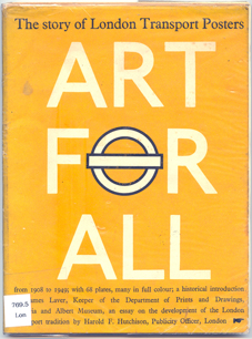
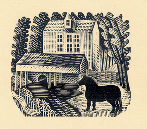
This blog entry celebrates some examples of quality design – because that’s what we should all aim for when making but also when buying. I have come across a great book called ‘Art for All’, telling the story of London Transport Posters. The book has black and white reproductions as well as colour, but the real charm is in the illustrations from original engravings of birds by Clare Leighton, printed in a salmon pink, as well as illustrations by Eric Ravilious (see below).

Image

Image Image

(Art for All – London Transport Posters 1908 – 1949, Art and Technics Ltd. London, 1949)

The quality of design in these images is inspiring, with a great sense of detail without being fussy, and such skill in creating these images in only one colour while containing so much information of texture and pattern. I admire these artists but also the people who commissioned the pieces and enabled these images to be ‘Art for All’. As an aside, Both Leighton and Ravilious produced stunning designs for Wedgwood too.

It makes me think of my own practice and how I generate imagery using drawing and printmaking to create the visual language. Yes, the computer plays a large part in ‘tweaking’ for final output / reproduction these days but it’s the marks and textures, the print quality, a smudge of graphite, that cannot be created by computer. It might be quicker creating the whole image on the computer but it wont be as good as I want it to be. Having said that, it is also the creative process of working out, testing and feeling the work resolve on paper that I most enjoy. Was the design process meant to be easy? Its the struggle and questioning that keeps me doing what I do – I’m enjoying the journey. When so much time as part of having a design practice can be spent on the computer it is important to remember to turn it off and walk away to DO the creative things…and to get better at it…

Having fun with colour

I thought I ought to explain the project…

On Twitter I am exploring my interaction with colour in my everyday life using the Pantone references of colour – the coated and uncoated has become the play on words. Here’s the first few to give you an idea of how things may be going.

the next colour is @pantone 2985 U – of course uncoated, while we waited for @therealjohncale @hmvinstitute last night. pic.twitter.com/g097anMj

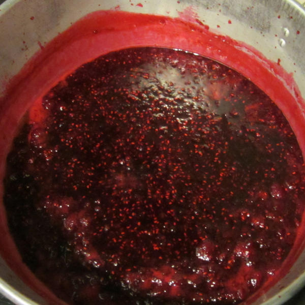
I was uncoated and really should have been wearing the apron! @pantone 200 U – coping with excess raspberry harvest pic.twitter.com/84rE5rSX

Wet! @pantone 427U certainly coated AND with waterproof trousers on. pic.twitter.com/9Rl0ABUj

What a Brum blue sky day to be in the office! @pantone 284U – definitely uncoated, and sandals! Hooray for the weekend. pic.twitter.com/HiHUzTQV

Autumn Equinox colours

With the Autumn equinox upon us and a definite chill on the breeze a trip to the allotment today made me think of the preconceptions of seasonal colours we have, emphasised through school as we made ‘splodged’ leaf paintings and we sang the harvest songs having managed to pass on the marrow glut from home to the local community who would have preferred the old tin of sardines!

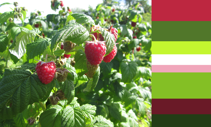
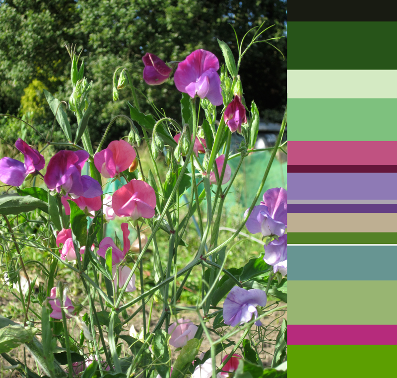
This morning we picked boxes of raspberries and bunches of sweet peas as well as carrots and beans so I thought I would provide an alternative to the conker colours and rusty hues we expect at this time of year, in acknowledgement to the Autumn sun, with the frost just round the corner…

The tip we received from the wise old-timers at the allotment today was to whistle while you pick raspberries to save yourself from eating too many. I understand the truth in that!


sharing the design process of Plot to Plate

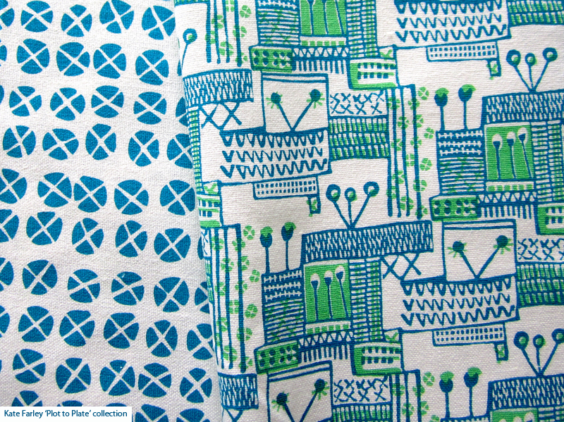
Given that I am about to take my Plot to Plate collection of designs to Top Drawer this weekend I thought people might be interested in the design journey of ideas that result in such a collection of pattern.

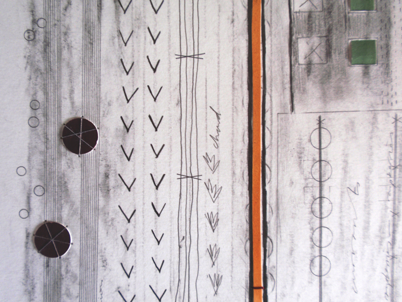
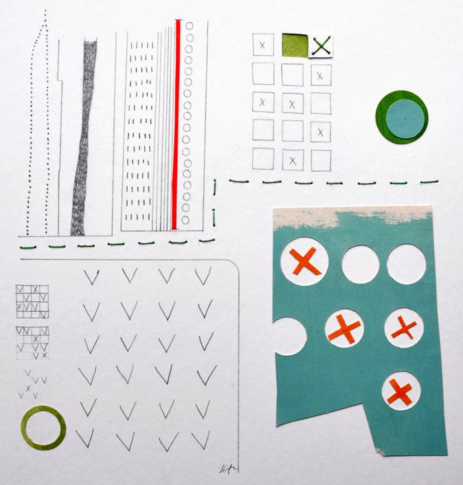
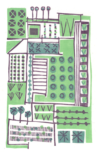
My ideas tend to belong as series of thoughts that I explore in a number of drawings over months, and sometimes years. I challenge myself to explore many ways to represent the same things, often resulting in simplified motifs, some would say scribbles. Drawings are often in rather utilitarian handmade sketchbooks that are not precious so there is no fear of the white blank page before I start. Sometime, in fact quite often, I draw while walking, and trying not to look conspicuous or weird as I track my way round a National Trust kitchen garden, almost creating a diagram, literally a planting plan as I go. Sometimes I make notes in my drawings, of colours, names of plants from the labels in the ground, or note references to research at a later date.

The titles of some of my designs are: xvo, xo, xxvv and these come from the shorthand I created in order to document gardens and allotments as I paced.
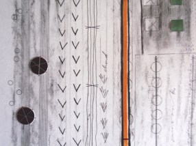


In the studio, and for sometime after I dwell, I study, I revisit the motifs, rhythms and compositions I gathered, I redraw, formalise and create new pieces, as one-off drawings in series to exhibit and sell. Some compositions lend themselves to self-contained lino prints or screenprints and so I spend time developing the designs, cutting the plates, and enjoying the process of editioning. I could never imagine getting bored (my edition sizes are small!) of lifting the paper from an inked block, each time to discover the image. So low-tech, yet engaging.
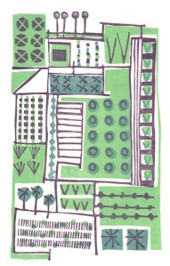
At this point I notice elements that can be scanned in and reworked in Photoshop or Illustrator software to create repeat designs and colourways for further potential – and this is how I created the design collection of ‘Plot to Plate’.

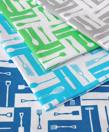
The Plot to Plate signature design of garden, kitchen and dining tools also came from my playing with the dog-tooth check as a classic rhythm, and my keen interest in telling a story as a visual narrative. Pattern can of course be pretty, but I enjoy the challenge of asking it to communicate something beyond itself. In this instance my drawings were made directly for this purpose and I translated them for screen.
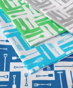
I hope the images explain the fun I have had, and the pride that I feel in this collection.


More examples of prints and drawings can be found on my website gallery pages

www.katefarley.co.uk

Save

green leaves

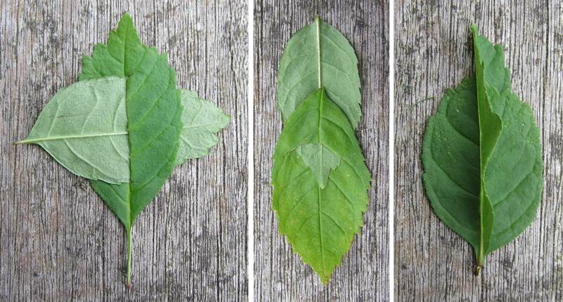
As the Summer seems to be on the turn towards Autumn I celebrate green leaves while I can. Being inspired by my paper manipulation history I played with slotting and folding to entertain the smaller members of the family while enjoying the garden.

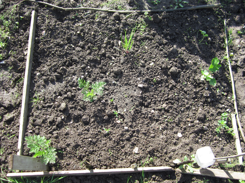
A short trip to the allotment this morning also enabled us to gather Autumn raspberries – yes, the clue is in the name. At least the sweet peas are still flowering as the slugs eat my harvest of carrots, onions, parsnips and beetroot! Now I’m not sure that would be worth getting the sketchbook out for!

sneak a peek

In the run up to my adventure at TopDrawer as part of Spotted I thought you might like to see some of my latest printing. It’s all systems go for my ‘Plot to Plate’ collection as I print, stitch and prepare for my stand SP6. If you plan to visit the show between the 16th and 18th September at Olympia, London, do come and say hello.

http://www.topdrawer.co.uk

My Olympic experience

Wild flower planting, fantastic structures, good spirit, great weather and a bit of sporting competition – having spent two fantastic days at the Olympic Park of London 2012 here are some images I’ve put together.

– an alternative Olympic gold, silver and bronze… structures, site and occasion

Image

– the diagonal trend…

Image

– a few chances too many…?

Image

horizontal lines – land and sea

A short break in Norfolk allows me to breathe the fresh air of the countryside and to refuel. Being Norfolk born and bred the landscape has certainly left its mark in my own visual language, and its always fantastic to collect in my memory the horizontal lines of Norfolk and of course the big skies.

spreading the word…

The last month has been a good one in terms of getting some exposure for the Plot to Plate range and in particular the notebooks. As previously mentioned Elle Deco have included the books in their shopping pages, and WGSN Homebuildlife.com included them on their blog. Having had them also included on the beautiful Design Hunter blog(http://www.designhunter.co.uk) now I can add to that list Global Colour’s Mix magazine including the notebooks in their Micro Trends spread – thanks to all!

we went to the zoo today…

Today we visited Dudley Zoo. Until today I had no idea that we had such a prized set of buildings of international importance only two trains and one bus away from our house! The great man of London Zoo’s penguin pool, Berthold Lubetkin designed this Modernist set of reinforced concrete buildings – Tectons, which were granted World Monuments Fund status two years ago. I include some photos but I recommend a visit to fully appreciate them. The Kiosk reminded me of Arne Jacobsen’s petrol station just outside Copenhagen, also from 1937, and of concrete – but that’s another story!

Lots of care and attention are still needed to get the Tectons back to their 1937 former glory, but they still represent an ideal and aesthetic relevant for today. I have only hinted at what to see there – I wouldn’t want to ruin your search, but the entrance is rather fantastic too. (I thought I ought to include some shots of animals seeing as it was a zoo trip! The penguins are another nod to Lubetkin.)

ImageImageImageImageImage

http://www.dudleyzoo.org.uk/around-dzg/tectons