Design inspirations 1: horizon lines

For a while now I’ve been thinking about what has shaped my visual language and informed my art and design tastes. As a result I have planned a few blog entries in which I will evidence some of my thoughts in terms of influence and my art / design practice.

In some recent press interviews I’ve been asked about my inspiration and I tend to consider the formative years as pretty vital in this regard. It makes sense that we develop strong feelings and bonds to what we experience as children, either to reject them or embrace them – either way I believe those early years help to form our adult judgements.

Looking beyond the windows of the house in rural Norfolk where I was brought up is what I consider one of the greatest inspirations to my work. The open fields, the clear horizon lines and sparse distractions across the farmland of Norfolk have stayed with me in relation to my way of seeing, composition and economy of information in much of my work. Why draw ten lines when I can say it with one? I had a particularly horrid visiting tutor in the beginning of my training who felt that I was lazy in my designing, when actually it was he who struggled with some of the simplicity I was aiming for.

Looking back over some of the works I have made in the last fifteen years there are a few key pieces that explain that relationship with the horizon.

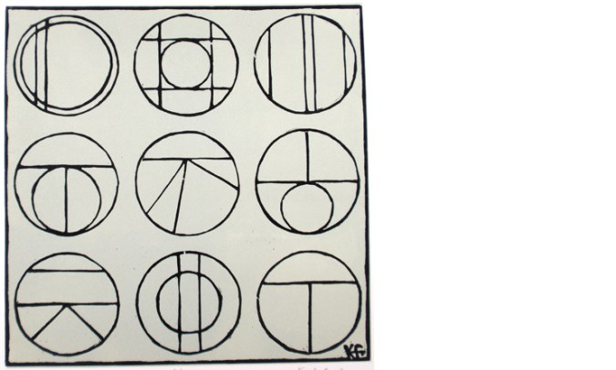
‘Nine Perspectives’, a linocut is made up of diagrams where I explore the land, sea and sky in a variety of ways. I consider the horizon in two-dimensional form, in plan view, elevations and diagrammatic perspectives in order to gain a sense of order.

9perspectives_web

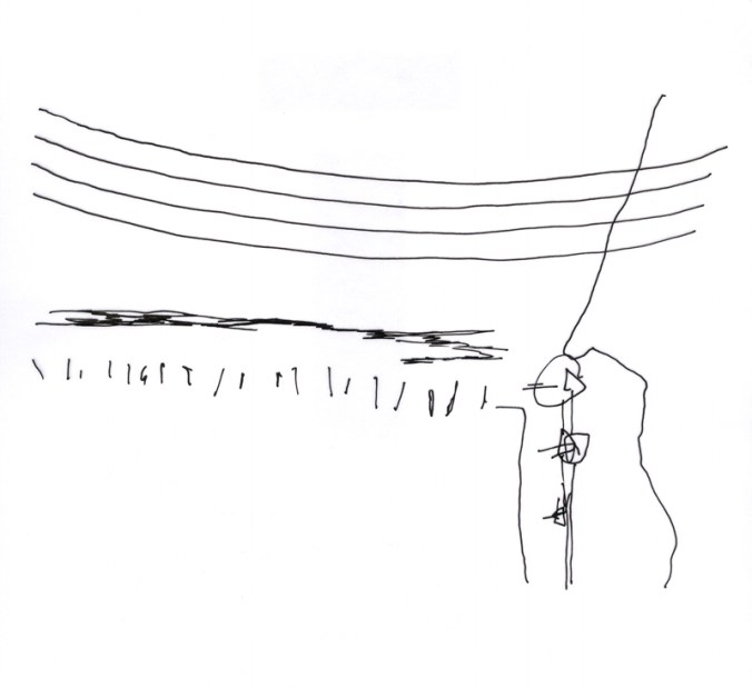
‘Meadows (France)’ is a drawing of a beautifully simple valley near Gourdon. It gave me a perfect view to explore further skewed interpretations of perspectives seen in the landscape. I worked with a sense of the view working round a set square, with two horizons, as I looked in front and to the side of me.

stgermain_web
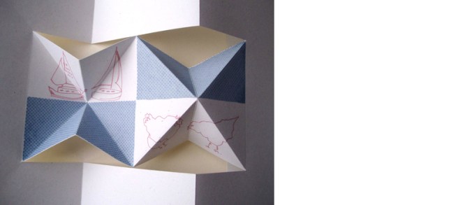
The final image is from a screen printed artist’s book I made several years ago exploring the idea of ‘half full’ as a state of mind, but also from each side of the horizon line. I have used the blue areas as either half full of water (the Norfolk Broads specifically) or half full of sky above the chickens. The folded structure implies a view through the use of perspective, looking in to the distance or reflecting on oneself.

kf_half-full_web

These three works are very old as far as I’m concerned. I have new creative concerns now but they have helped me to test and explore principles in the way that I see and draw that have been important along the way.

lines in the snow

I took these photographs on my way home from Birmingham yesterday and like the way they show the different interpretations of lines and stripes in the snow I recorded. My last blog post was about colour, and so I like the fact that it is almost absent this time around. I’m sure there can be some design inspiration from these.

branchlines_snow
trainline_snowgrid_snowyellowlines_snow1washingline-snow

a colour survey of the plot

Today was my first plot visit of the year and I set about digging over the strawberry patch – an important job given the lousy harvest of last year. I also took time to survey the rather heartless cabbages we have managed to grow and this inspired me to record the beautiful colours of the season from all round the plot. This reminded me of my Autumn survey some months ago, recorded on this blog. No doubt these colours will inspire my drawings and prints of the year to come. Sadly I didn’t get a picture of the robin who hopped about glad of the worms I uncovered but he made me smile all the same.

firstplotvisit2013

tribal textiles in the Midlands

Happy New year to you!

Seeing as I work in the professional world of textiles I’m not surprised that I spend more time than most considering our relationship with textiles. To simplify things – I question what relationship we have with fabric, and the inspiration behind our choices of garments and the materials, colours and patterns that we fill our wardrobes with – when we’ve picked the clothes up from the floor!

To celebrate the new year we went to Alvechurch to see the Alvechurch Morris dancers who put on a show each New Year in the pub car park of the Crown Inn at Withybed. As well as their dances they also perform their entertaining politically cheeky response to the past year’s news in the shape of a traditional George and the Dragon style Mummer’s play. They were also joined by several other dance groups from the region, all proudly dressed in variations of what you would expect Morris dancers to be wearing. There were plenty of pairs of beige jumbo corduroy trousers, and of course the bells round the lower leg, but the use of the strips of fabrics on the backs of the jackets and the feathers in hats really made it a spectacle of eccentric British-ness some would be surprised to see still in existence.

Having lectured on the subject of textiles for a number of years and having tried to make the education experience not British-centric the experience of seeing the Morris dancers in Alvechurch are a reminder of our own tribal dress; just as interesting, ceremonial, entertaining and socially telling as some tribal dress from far flung corners of the world a long way from here.

Some outfits appear rather more planned than others and its tricky to see if some are trying to look ‘thrown together’ but are to the contrary. Some groups (is there a collective noun for Morris dancers?) stick to set colours and one group of women were a sort of goth vamp group at Halloween with a dash of silver – I mean that in the nicest way! Personally I prefer the more traditional looking ones with a collection of faded what looks like Laura Ashley prints alongside stripes and spots. They look more like a mood board than a dance outfit.

Of course the sound and movement is lacking in the photographs but I hope they go someway to celebrate the dress code found in one small pub car park in the Midlands today and every New Years Day.

morris1 morris8 morris7 morris6 morris5

morris4morris3  morris2

http://www.alvechurch-morris.org.uk/index.htm

http://www.thecrownalvechurch.co.uk/index.html

drawing anywhere and everywhere

The last few weeks have been rather busy so I close the year with a brief blog entry which will lead on to a new post in the new year about how we draw what we see… I’m still working it out in my mind but watch this space!

In the meantime I will share with you a drawing made by my daughter this summer, then four years old, of a lady. She made this while on the beach at Cromer, Norfolk. I love the way she started to build up a patterned dress using pebbles and placing sea weed for hair. I hope she never loses her love of drawing – she is a great source of inspiration to my design work and also in my teaching of design.

sandgirl_2012

Aeneas Wilder at mead gallery

We have been to see a stunning exhibition of work by Aeneas Wilder at Mead Gallery, Warwick Arts Centre, University of Warwick that is really worth a visit before 1st December 2012 – without small children or swinging limbs!

This is one of those shows that will stay in my head for a very long time. I was asked this week what I expect to gain from seeing exhibitions of modern art. Well, this is one of those shows that can’t help to engage an audience while providing reasons to talk of ideas and discuss the experience. Physically, the exhibition involves a large architectural structure built of slim wooden building blocks which are entirely self supporting and balanced meticulously. It consists of two rooms connected by a corridor. There is a video which documents the building process too.

It does feel incredibly fragile and vulnerable which makes the experience all the more incredible, and of course goes a little way to explain the concepts behind the work. I wasn’t brave enough to walk all the way through and the children were kept at a safe distance. Any impact to the blocks would result in the structure collapsing, and this event has been schedule with ticketed entry for the 1st December with the artist playing the all important role of destroyer. Lucky for those already in possession of the tickets.


The visual impact and illusions of space and surface was almost discerning. I hope the photographs go some way to represent the show, but I recommend a visit if you can.

Further information: http://www.meadgallery.co.uk             http://www.aeneaswilder.co.uk

form and function of forks

It has transpired that I have accidentally started to collect forks of the dining variety. Having grown up with the beautiful three-pronged Focus flatware designed by Folke Arstrom for Gense, Sweden, and considering that as perfectly normal I have, as far as I remember been interested in cutlery. I am the proud owner of Arne Jacobsen cutlery and our everyday utensils are ‘cafe’ by David Mellor.

Café Stainless Steel

Arne Jacobsen image from: royaldesign.co.uk  David Mellor image from: davidmellordesign.com

Why are some so awkward to use, and why are others a complete joy? I have been discussing this with my textile design students in relation to the principles of Form and Function in design. Before I know it I have rounded up many forks to illustrate my point and I feel rather proud. This collection is underway and its got me keeping my eyes open for new pieces to find. I am particularly keen on the ‘disposable’ not-for-ever kind, and here’s some examples to show you how exciting things are getting!

Autumn rhythms

A stunning Autumn day today, warm out of the wind & bright enough for sunglasses, it gave us the excuse to escape to the countryside south of Birmingham to play in the fields. Having taken photographs of the outing and having been thinking about my explanation of visual rhythms to some textile design students last week I thought I’d create a piece with that in mind.

Art for all – good design for all

My design ethos is one of quality and appropriateness for the place. Good design should be all around us, big and small, the dot on the i, the cushion on the sofa, the roof on the building – no excuses. Why settle for second best, why copy others if you can be original? It is so sad to read of big companies risking reputations, not buying the best but producing poor quality copies – stealing designs. My students tolerate my monologues on the subject!

This blog entry celebrates some examples of quality design – because that’s what we should all aim for when making but also when buying. I have come across a great book called ‘Art for All’, telling the story of London Transport Posters. The book has black and white reproductions as well as colour, but the real charm is in the illustrations from original engravings of birds by Clare Leighton, printed in a salmon pink, as well as illustrations by Eric Ravilious (see below).

Image

Image Image

(Art for All – London Transport Posters 1908 – 1949, Art and Technics Ltd. London, 1949)

The quality of design in these images is inspiring, with a great sense of detail without being fussy, and such skill in creating these images in only one colour while containing so much information of texture and pattern. I admire these artists but also the people who commissioned the pieces and enabled these images to be ‘Art for All’. As an aside, Both Leighton and Ravilious produced stunning designs for Wedgwood too.

It makes me think of my own practice and how I generate imagery using drawing and printmaking to create the visual language. Yes, the computer plays a large part in ‘tweaking’ for final output / reproduction these days but it’s the marks and textures, the print quality, a smudge of graphite, that cannot be created by computer. It might be quicker creating the whole image on the computer but it wont be as good as I want it to be. Having said that, it is also the creative process of working out, testing and feeling the work resolve on paper that I most enjoy. Was the design process meant to be easy? Its the struggle and questioning that keeps me doing what I do – I’m enjoying the journey. When so much time as part of having a design practice can be spent on the computer it is important to remember to turn it off and walk away to DO the creative things…and to get better at it…

Having fun with colour

I thought I ought to explain the project…

On Twitter I am exploring my interaction with colour in my everyday life using the Pantone references of colour – the coated and uncoated has become the play on words. Here’s the first few to give you an idea of how things may be going.

the next colour is @pantone 2985 U – of course uncoated, while we waited for @therealjohncale @hmvinstitute last night. pic.twitter.com/g097anMj

I was uncoated and really should have been wearing the apron! @pantone 200 U – coping with excess raspberry harvest pic.twitter.com/84rE5rSX

Wet! @pantone 427U certainly coated AND with waterproof trousers on. pic.twitter.com/9Rl0ABUj

What a Brum blue sky day to be in the office! @pantone 284U – definitely uncoated, and sandals! Hooray for the weekend. pic.twitter.com/HiHUzTQV