Sometimes themes seem to rattle around in my head, connecting with other dialogues I have had. Last week I attended a really interesting Study Day at the House of Illustration as part of the Women in Print series organised by Desdemona McCannon on the theme of Enid Marx and contemporaries. The subject of women’s careers, and specifically their profile compared with their male counterpoints was discussed – not a new idea, but as a recurring theme I thought it worth revisiting here. In the same week Stylist magazine featured an article about the price of artwork made by women compared to men. It was such a coincidence I’ll expand some thoughts here.
It’s not a secret that women often have a harder time gaining recognition in many lines of work in comparison to their male peers. I wrote in a previous blog post about Eric Ravilious and friends at Compton Verney that it certainly wasn’t lack of skill that kept the women such as Helen Binyon from comparable public attention, and therefore further opportunities through their careers. There are highly talented women in history who we are only just giving air-time to, but the fact is their careers may not have excelled in the way their male counterparts did, or if they did they may well have been paid less for the work because they were women.
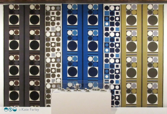
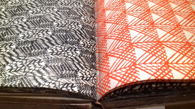
Enid Marx chose not to take issue with gender-bias in her career, and got on with a multi-disciplined design portfolio, with impressive outputs including books, textiles and patterns which were beautifully communicated through the exhibition at the House of Illustration (sorry it’s just ended!) – but you can visit Compton Verney instead. We got to see the exhibition as well as listen to knowledgeable speakers such as Enid Marx expert Lottie Crawford giving a really insightful illustrated paper about the legacy that Enid Marx and her peers have created for us today, as well as Jane Audas taking us through a fascinating journey of clients and sales put in to a broader context of who’s who.
I have heard people wonder why we need to make a point about this being a gender issue, but I would say that this has been said from a male perspective, and not from those being subjected now and in the future to selective opportunities due to gender. As a woman designer, and female academic training mostly women to have design careers where there is a history of undervaluing female contribution, I remain concerned.
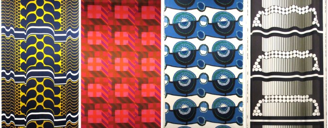
It is sometimes the case that research can be discovered more easily about men because they were promoted more and as a result have a higher profile, whether through greater self-confidence, the social / commercial networks or marketing material, from family or company archives, past exhibitions or publications. During the study day in London the point was made that there was also a sense that women got on with the designing, often alongside raising a family or carrying out other domestic tasks. Did they lack the opportunity to promote themselves, didn’t see the need, or couldn’t find the time? Working in isolation at home can certainly challenge one’s self-belief compared to working in an office with colleagues who can praise you and your work as and when required. This reminds me of the freelance work of Sheila Bownas, almost accidentally discovered and collected by Chelsea Cefai, and brought to a new appreciative public in the last few years. The family knew little of the extent of her prolific output of designs as a textile designer until Chelsea pieced the jigsaw together, and thank goodness we know of her now!
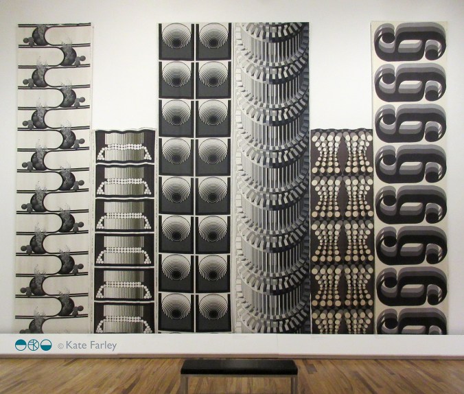
There is another consideration here. Does the discipline these women are working in make a difference to their profile? Enid Marx worked across illustration and textiles, but her illustrations are better known. Is this because as an illustrator your name is usually on the cover of the book, even if it is on the inside, or on the poster? For freelance textile designers it can be quite different. The name of the company is usually printed as legend details on the selvedge, but historically not always the name of the designer. If this is the case we may never trace the designer. This remains the case today in industry when big name brands buy in freelance patterns and the designer’s name is not carried through.
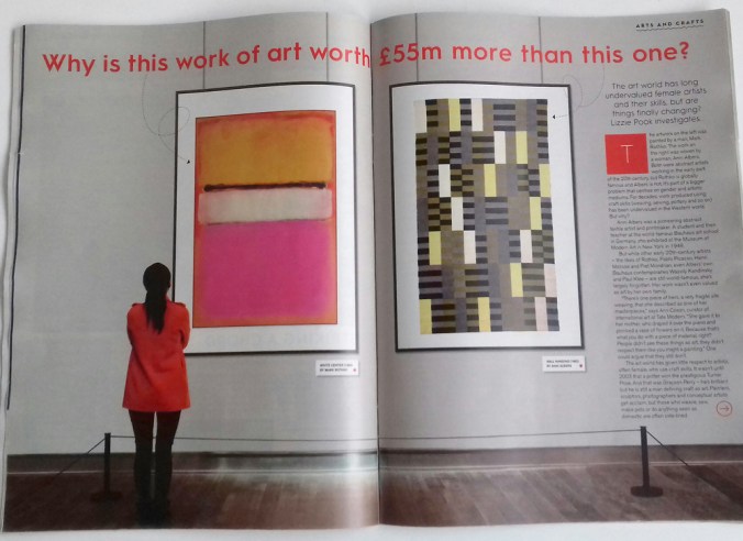
The article in Stylist compares Mark Rothko and his fine art paintings to Anni Albers’ textile practice; the subject of a show coming to Tate this Autumn. When the Bauhaus opened its doors in Germany in the Twentieth century the founder, Walter Gropius, stated anyone could study any discipline, and yet the women were rather heavily steered towards the weaving workshop, considered suitable for women. That was where Anni Albers learned her skill, fell in love with the teacher Josef Albers, took his name on marriage and continued to live in his shadow; he led a fine art practice of painting while she made textiles. I can’t wait to see the Anni Albers show – and for Anni to have the publicity men with lesser creative careers have had before.
Craft, seen as a second-rate subject to Fine Art is part of the discussion throughout the article in Stylist, and it also makes the point that textiles is seen as a domestic activity, thanks to the increased leisure time during Victorian era. Grayson Perry has made significant strides in opening up the conversation about value of craft, but far more needs to be done to change opinions. As an academic one of my biggest concerns is the lack of respect textile design currently receives as a subject in the education curriculum and agenda. It’s becoming one of my catch phrases but I really mean it – we all wear pants! How can textiles be seen predominantly as a past-time, a hobby – when we all wear textiles, sleep under textiles and protect ourselves with textiles? How dare this government puts at risk the supply chain of future textile designers because it doesn’t see it as important enough to be a GCSE? Fashion is nothing without textiles, and this industry is one of the big ones on the global stage – don’t get me started on that!
Refocusing back on the study day, we also discussed the nature of research carried out by women, and that the particular approach / nature of research writing holds a female voice that may not be considered intellectual enough; often relating to social networks, domestic arrangements and family life. Several female audience members agreed that they doubted their own confidence when finding their research voice alongside the traditional academic tone / content they believed was expected by their male counterparts. Are women undermining themselves and lacking confidence in their own abilities?
I don’t have the answers but this is not a conversation that should stop. More dialogues involving men and women about historical and contemporary design practice, craft and textiles are needed. There is not one way, this is not binary, but we need to make sure the different voices, approaches, strategies and practices in the creative subjects and beyond are given a platform. The diverse ways of being whatever it is we are should be valued, and represented by a diverse community. Wouldn’t it be lovely if talent and opportunity were really the key ingredients for building profiles, gaining opportunities, and writing about it!