At the moment I’m juggling lots of different projects; one has been years (really!) in the making, another much quicker, straightforward and some more ‘surprise’ projects. They all have different requirements of my time, and in each week there may be a telephone call to a manufacturer to discuss things with, an email exchange between a client and myself to clarify details of a brief, or a call to a stylist / marketing team to plan a scheme for the future with, and the usual trade show sales team call! This all takes time, and different skills to manage.
A different skill altogether is to maintain a practice that, at the heart of it, seeks to challenge, engage and inspire the creative self that was the reason I set off in this direction at the start, twenty years ago. The sketchbook is the place I go back to, the safe place I can explore those ideas in, old and new, that keeps the journey going, the continuum that is my creative practice. Ideas do evolve over time, and the sketchbooks are testaments to the ongoing inquiry that may lend itself to something commercial in due course, but is not the reason I do the drawing in the first place.
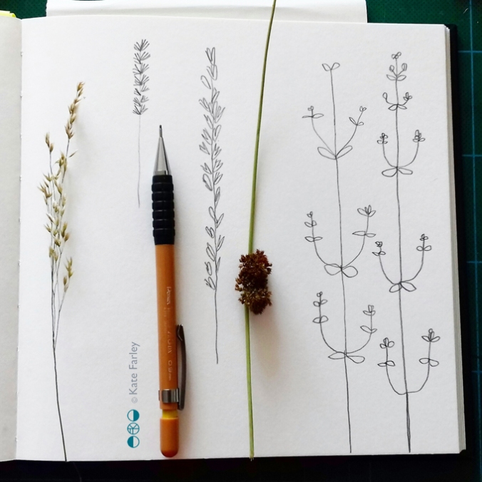
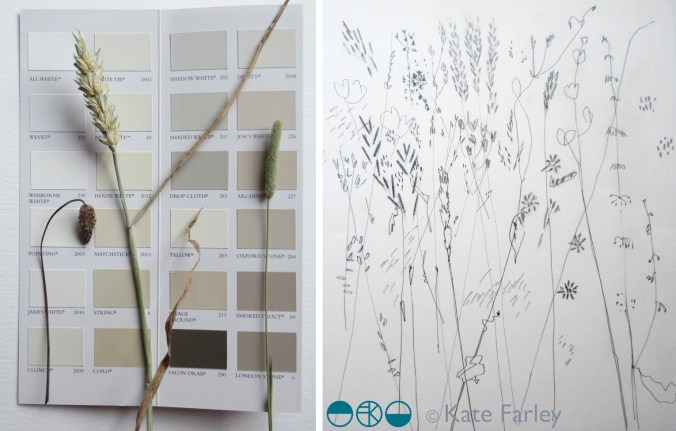
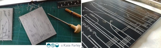
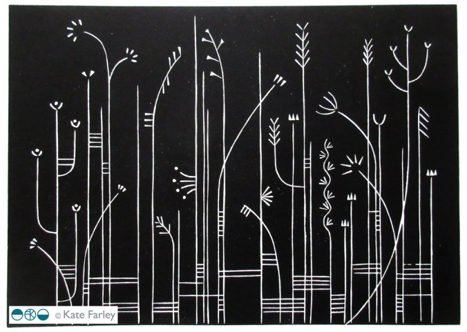
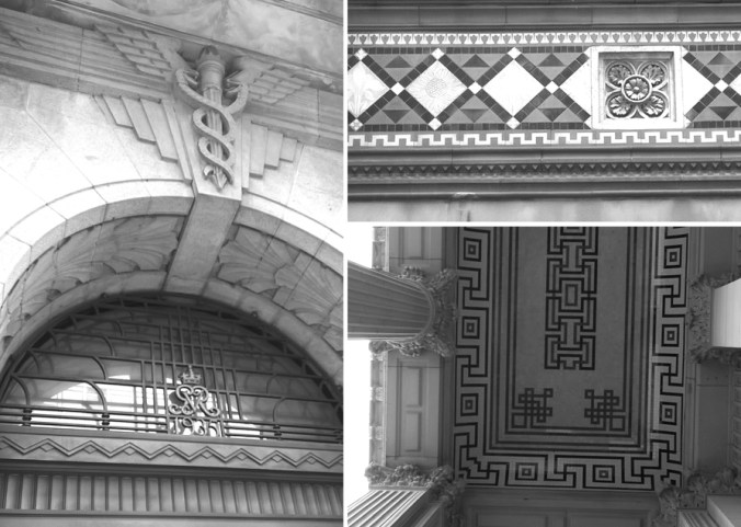
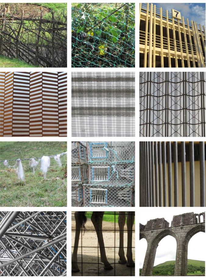
In my role of design lecturer I regularly explain the uses of a sketchbook, the hows and whys a designer may approach the mental and physical task of working in a sketchbook. Retro-filling the pages that have post-its in saying ‘research’ needing to be completed the day before a hand-in lacks rigour and purpose, a scrap-book mentality is not necessarily the best use of printer credits unless you really do look and reflect on the relationship between your work and someone else’s. Dare I say it, I enjoy the task of working on a new white page, and see the potential, not the fear. I don’t often share pages of my sketchbooks, but here’s one page from this week in the studio, having gathered new ‘material’ at the weekend, furthering my ideas for my Grasslines print series…
I say let’s celebrate the sketchbook, the real one with paper pages that doesn’t require likes, favourites of retweets to be justified, the one you do for you. Why / how do you use your sketchbook?