PLAY prints on show

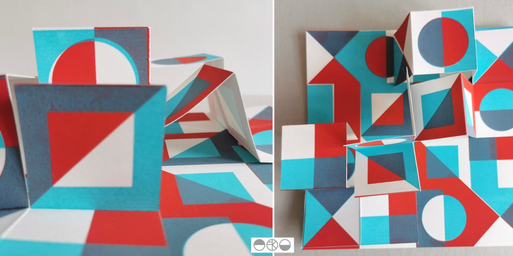
I am really pleased to have had two of my most recent works on paper selected to be included in the Print Cromer exhibition this summer, with the Private View on 19th July. This new body of work has been developed as part of my academic practice at Norwich University of the Arts where I have been exploring pattern structures and repeat blocks. I have explored new pattern iterations by rotating the screens to add additional colours of the same artwork, thereby building greater complexity from limited design information. In an age where digital design and the use of Artificial Intelligence provides limitless opportunities, I want to explore the fundamentals of pattern creation to generate new possibilities that are led by the designer, ensuring the creative path is transparent.
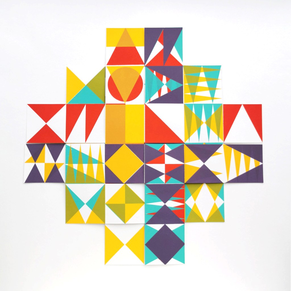
The theme of the exhibition is PLAY, and as a result the palette I created feels full of summer carnivals and fairgrounds. The overprinting of inks with differing levels of transparency provides a building of depth and subtlety of harmonious colour.

I created a number of one, two, three and four-colour prints initially, that featured the screen rotation in adding the colours. I then cut strips of the prints and with further rotation of the strips, interwove them into one base print that had been sliced to enable the slotting. I enjoyed bringing back an element of paper engineering from my book art practice into these new pieces.

In designing each piece, I considered the placement of motifs and relationships of colour. The collection provides variation within a collective identity and belonging. Some pieces feature only triangular motifs, while most incorporate the circular and rectangular elements too. My research utilises design thinking by Lewis Foreman Day, and his distribution of elements. This approach results in scattered focal motifs that work across repeating patterns. Although this is not a feature of my new work, I recognise the placement considerations are also useful in this work too.

A number of these pieces will be for sale during the show.

playing with print

I’ve been enjoying some studio time to explore my print research as works on paper with the hope of exhibiting the work. I enjoy paper engineering and construction (that’ll be the book artist in me!) and have previously tested paper manipulation in relation to this current pattern research. I tend to work in this way, creating drawings or prints to exhibit / sell alongside forming pattern ideas, and it has been useful to see the evolution of the sampling in this way here too.

These new artworks utilise my screens of geometric artwork practically exploring research into motif distribution in printed pattern thinking formalised by Lewis Foreman Day in his book Pattern Design, published in 1901. Having printed the artwork in the first colour, I rotate the screen by 90-degrees and print the second colour, turning the artwork / screen up to four times for maximum complexity. To add a further dimension, I’ve been constructing works on paper that utilise several iterations of the prints to build new compositions by weaving and slotting strips of the printed papers in differing combinations of the four colours in the palette, providing the coherency across the series, and an injection of the spirit of summer fairgrounds through the colour and geometric visual language.

There are two screens of artwork used in this collection, therefore two series of original artwork (PLAY – circles and PLAY – triangles) and I shall continue to evolve the body of work over the coming months. I’d love to know your thoughts on this new work!

catching up with pattern

It’s been a while since posting here, but I’ve been busy enjoying summer adventures and developing exciting pattern research alongside getting the academic year underway. I’ve also moved in to a new studio space so I’ll share that in due course.

My pattern research focusing on the repeat print block and how it can be used to generate multiple variations to evolve pattern options continues, with sampling with screen and lino printing. I thought I’d share the more structural outcomes here, linking back to my book art practice. I enjoy discovering links that connect the broader practice I’ve developed over the last twenty five years.

As I folded the sheets of printed pattern the forms appeared to suggest a built environment so I explored the idea a little in how I photographed the pieces. Testing scale and contexts is a vital part in developing a pattern, and I enjoy the possibilities.

pattern processing

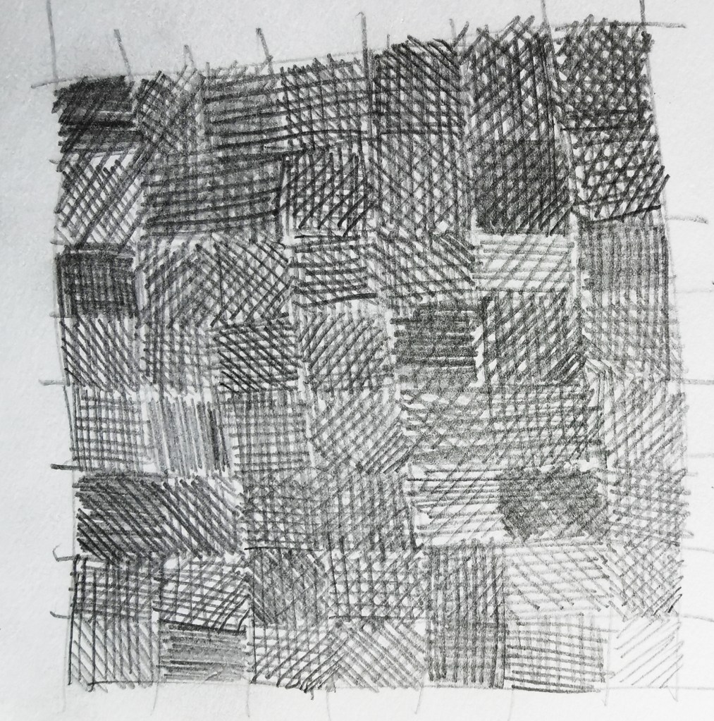
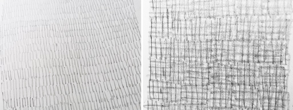
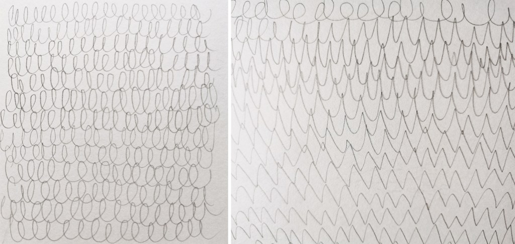
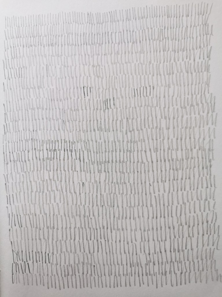
I’m often juggling lots of tasks in my head, but when my mind is busy I can find focus and space to think within and around the process of drawing. The time occupied by my hand drawing gives my head some freedom to work things through. Distraction, mindfulness, process-led, thinking time…

Drawing also creates time to explore rhythms that are playing out more formally in other sketchbooks for other projects. I find it interesting that certain motifs appear in the margins of my notebooks time and time again, made while my mind is occupied. Often those shapes are geometric, but sometimes the circle dominates, at other times, squares. Regularly they link to designs I’m working on and resolving somewhere else, subconsciously seeking solutions.

I enjoy the simplicity of paper and pencil in a world where so much of my time is spent in front of a screen. The physical process of drawing; the feel of the friction between graphite and paper, the sounds created by the rhythmic gestures, are vital to the experience. Satisfaction comes from a page of evolving rhythm and more pattern potential. We know there is seduction in the multiple; the repetition of tins on a supermarket shelf, for example.

New drawings for sale

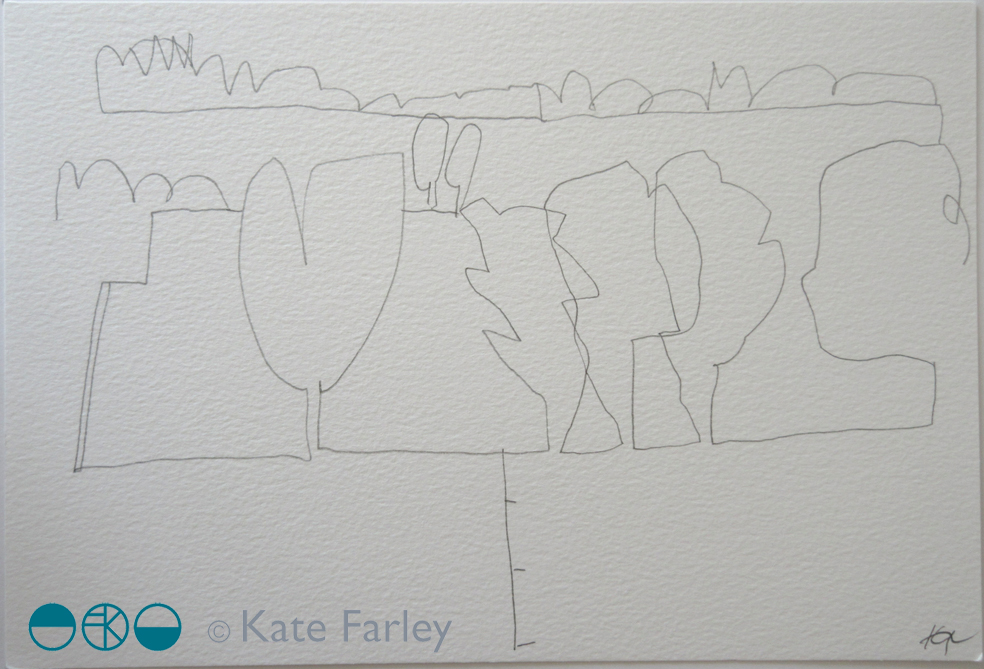
I have made some pencil drawings from my recent trees project (previously featured on the blog) available to buy – there are currently eight still available.

They measure approximately 28 x 19cm, on heavy weight paper, £55 each, with 30% going to Cancer Research UK.

Do take a look over on instagram where they are all listed, & message me if you are interested in reserving one. Feel free to spread the news – I don’t often sell my original drawings ….

Here’s drawing 1, 2, & 3 …

KF_drawing1KF_drawing2KF_Drawing3

special edition news!

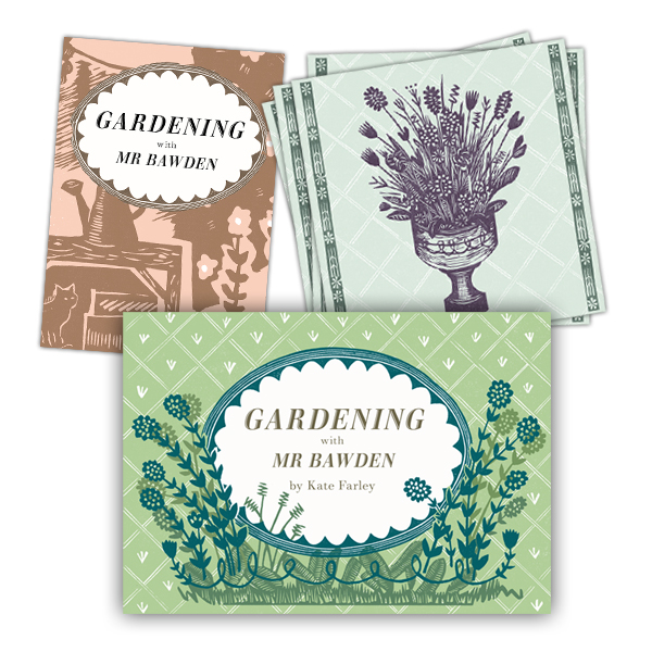
If you follow me or Design for Today on social media you will have seen updates of the book we have collaborated on celebrating artist / designer Edward Bawden’s love of gardening. The book is titled ‘Gardening with Mr Bawden’. It’s been the perfect project for me as I also love gardening, have a background in making artists books and also love lino-printing.

bawden_printing_1

I’ve designed the book taking inspiration from some of the research I’ve found about Bawden, such as his preference for structural plants, his competitive growing of sunflowers, and the ongoing problems with snails. I’ve also made reference to some of the artwork made by Bawden and his dear friend Eric Ravilious, including the view under the tree with the table and tea things, as well as the bench Bawden designed.

All the motifs are my own but I’ve made reference to the sort of patterns Bawden was designing while living at Brick House, Great Bardfield in Essex. I’ve blended the idea of plants growing in the greenhouse, becoming wallpapers in the house. There is a pull-out greenhouse!

There are limited edition sets available to pre-order now which includes a signed book with four greetings cards and a collectors book explaining the project. Click here to order.

gardening-special

garden cuttings

I’ve been working away in the studio on a wonderful project with Joe Pearson of publishing company Design for Today for a while and time has come for us to begin to share the results. It is a book inspired by Edward Bawden and his love of gardening. The content of the book has been informed by my research into his garden at Brick House, Great Bardfield in Essex. Bawden was a very keen gardener and I have researched and worked with anecdotes and visual references to build a picture of what his garden may well have been like and designed the artwork of the fold book with lino prints, a process he used many, many times.

revealingprint_200jpg

Keep an eye on social media for more updates as we lead up to the official launch in May.

Squared collection

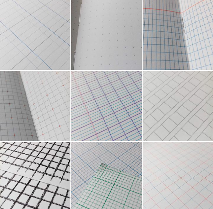
It is no surprise to many that I collect things, some of those collections have even been featured here on the blog. When a colleague asked me last week if I had squared paper I was happy to delve in to my ‘squared paper’ drawer in the studio and share. This small act led me to rediscover this collection that features paper dated from the 1980s up to the present day, of grids, checks, plaids … of beauty. Printed in grey, blue, green, red or other, two-sided sheets, pages of books, tracing paper; the collection is also international in its reach. I’ve posted several on my instagram feed @katefarleyprint but here are some to get you excited!

Screenshot_2018-01-29-18-45-53-2-1


limited edition prints from posters

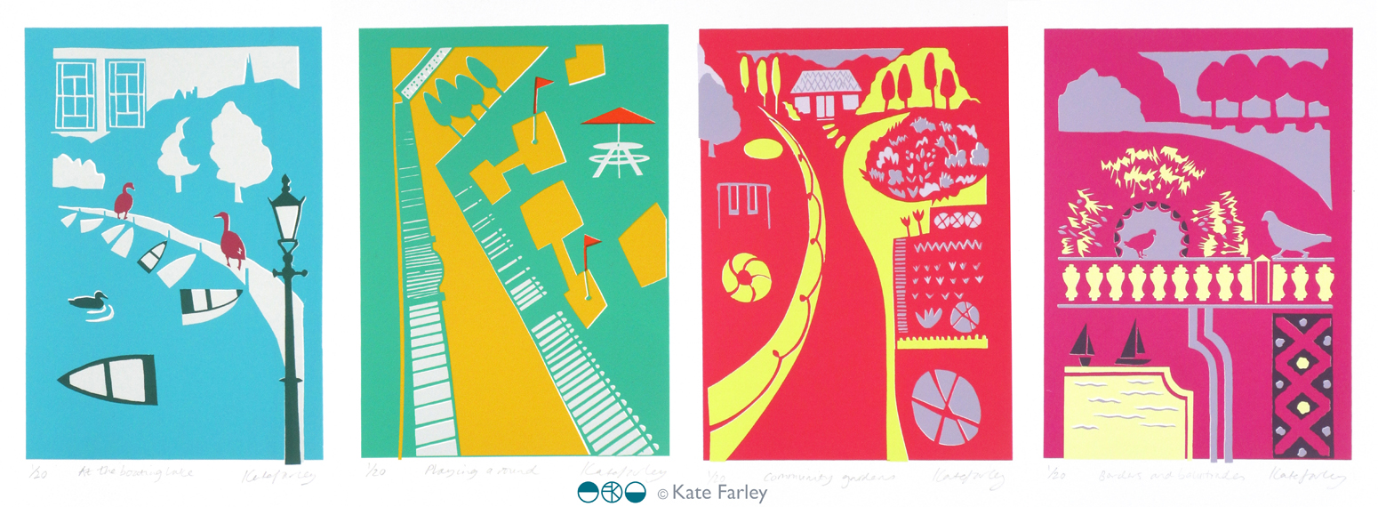
Following the success of my four posters for London Transport Museum, currently on the network of London underground stations, I have been asked by Michael, the commissioner, to edition the designs as screen prints. I jumped at the opportunity, and embraced the task!

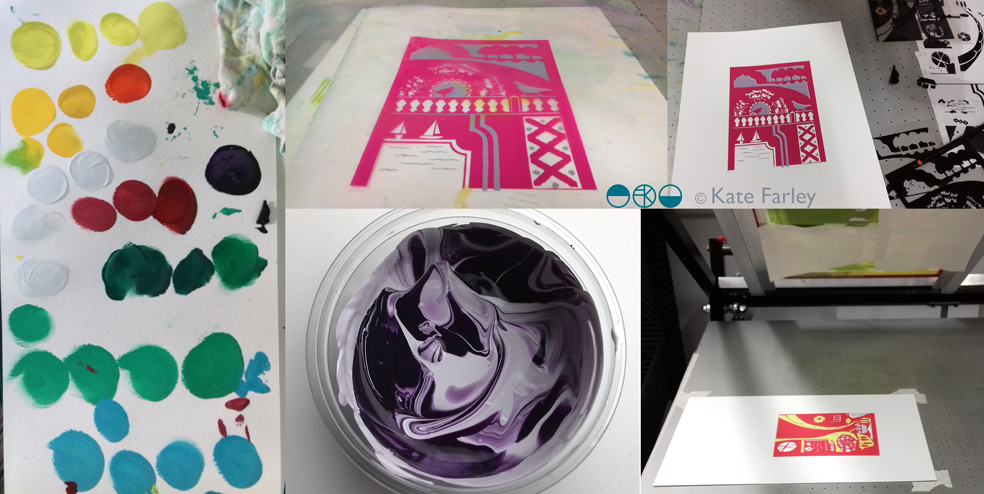
This has been an interesting challenge because although the artwork for the posters was made using paper cutouts, one great joy of digital print production means you don’t have to separate each colour to print; CMYK does it’s thing. However, screen printing requires far more consideration of separate colour on each of the layers as well as registration – the accuracy of each colour layer when printing. Overprinting can result in muddy colours if not fully considered. For the editions of prints I made some artwork adjustments on Adobe Illustrator enabling me to create the positive artwork for each of the four colours in each print, ready to expose photographically on the screens. You can see in my composite image, top right, the black print on acetates which are the screen positives, that I used to expose the images.

poster_print_processlayers100dpi

I love mixing colours to match my references and I take pride in not using colours straight from the pot, but to always see the nuance of hues. I make colours darker using purples and greens, rarely black. I used the final posters to get the right colours, and daylight is always essential. Ink and paper surfaces always give different qualities to contend with too. The final colours are certainly rather bright! Screen printing on paper is also very different to screen printing on fabric, so you have to get your head around the differences including remembering to flood your screen (pulling a layer of ink across) between each print, and using the vacuum on the print bed (to hold the paper firm).

However tired I am, when I am printing I am absorbed in the process – rarely noticing hours passing, and missing the need to feed. This is a good thing as my week as been ridiculously busy on all sides. Printing requires systematic thinking, and at least one clean hand. Preparing screens, mixing colours and registering each colour on the acetate first all needs to be organised. I love it when I’m in the rhythm of editioning.

A deadline to hand the first print from each edition to the commissioner this weekend focused the mind, and when trimmed, signed and wrapped I was really proud of the prints. I was even more pleased when I met up with Michael to give them to him. He appeared to be joyfully moved by the results – holding one print up to the fellow coffee drinkers in pride… phew! They are off to be framed and auctioned at a London Transport Museum event at the Victoria and Albert Museum later this week.

This whole project has taken so many months (years) to come good, but throughout the process I have felt trusted by Michael to do what I do best. He has great confidence in his choice of designers spanning the years, and allows us to get on with the job without interfering with the outcome. His twenty plus years of commissioning poster designers has led him to influence the direction of graphic artwork on London underground, creating the archive for the future through the choice of creative hands and minds, but not by telling the designers what to do. It takes trust and judgement on his part, but in turn I think I’ve created my best work yet. In the many conversations over these years I’ve had with Michael he listens, he wants to hear my opinion on things; we have good discussions – he knows about a lot of things. He also often gets carried away with future ideas and possibilities – I like that, we should all get excited by ideas. Thanks Michael!

LTM_poster_prints2017_1_150


Modernist patterns in the making

Over the last few months, actually for most of this year, I’ve been working on a commission with the Barbican Centre London to create bespoke patterns for products in their newly developed retail space, ready to launch in the Autumn. It’s been a fabulous project as I’ve developed the designs with plenty of dialogue with Head of Retail, Adam Thow, to-ing & fro-ing by email. The brief has altered only slightly since the beginning and I feel really proud of what we’ve produced. There’s a more detailed interview about the project over on their blog.

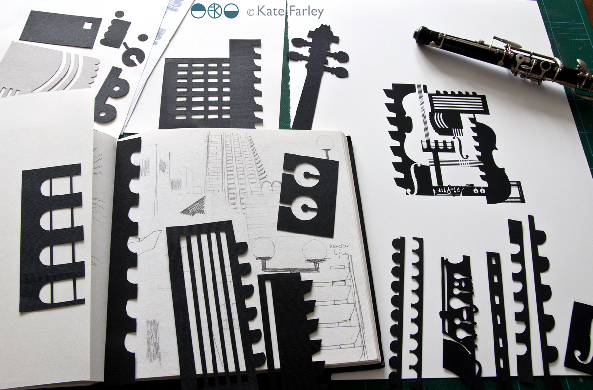
The idea was to explore the Barbican Centre, famous for its architecture, but to also include its activities as a cultural centre of music and performance. I explored lots of ideas and pattern compositions but settled on the idea of a sheet of music, and ended bottom right with the bold double bar lines. Within the patterns I referred to musical notation, and made links between the architectural features and those of instruments, including a violin and oboe, to create a sense of narrative, playing with strong negative and positive shapes. Each of the motifs were hand cut in paper, scanned in, and combined using Adobe Photoshop.

KF_Barbican_print_paperBLOG

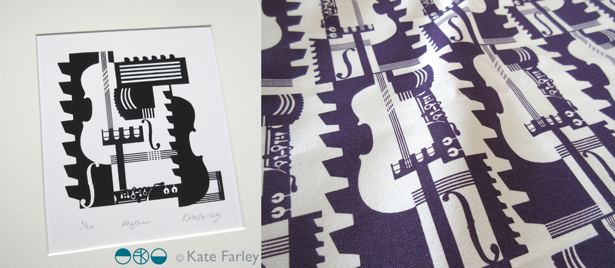
Last week we shared the first images of the design work so I thought I’d share here too. The images here show my developmental design work above, and the final limited edition screen print and pattern for products. Visit @barbicancentre on instagram for more final product shots.

KateFarley_BarbicanPRINTPATTERN1200


Save