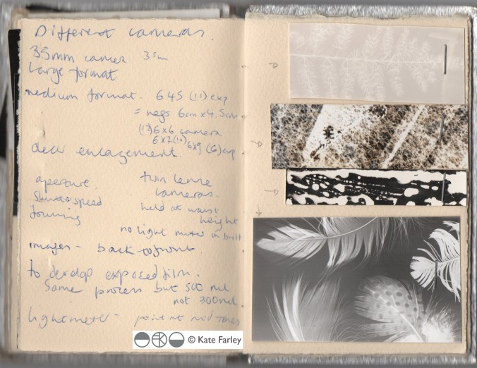
In my role of academic as well as a designer I am regularly required to enthuse about print and pattern, and to be honest that’s fine, as I love designing and teaching pattern for print. This last week has seen me out and about to pass on my passion for pattern, firstly to Wolverhampton Embroiderers’ Guild where I was invited to talk about my practice. It’s always interesting having to consider what bit of the last twenty years to focus on, requiring reflection and evaluation, and how to tell the most relevant story without missing the bits that might be the most informative to others even if they didn’t seem so to me when living them. The audience were really generous with praise, and were really interested in my creative process, so sharing my sketchbooks, and anecdotes felt very easy to such an interested group of makers.
Tuesday saw me overseeing a morning of filming at Birmingham City University (BCU) with Laurence Llewelyn-Bowen and TV crew, working with our third years and our fabulous Print Technician. It was a morning of celebrating the Arts and Crafts legacy, William Morris in particular, and the importance of understanding the value of drawing to the process of pattern making. It was a pleasure promoting our talented third years, in the closing stages of their time with us.
This leads me to yesterday when I and a colleague took a coach of second year Textile Design degree students to Manchester, specifically the Whitworth Art Gallery to see several exhibitions. On walking in to the first gallery and the exhibition ‘Revolutionary Textiles 1910-1939′ I noticed a number of pieces that I had featured in my Historical Textiles lectures when I had taught this group of students as first years, including Barron & Larcher, Josef Hillebrand and Omega Workshops. It was fabulous to see the students’ excitement on recognising patterns and names of designers that had, until then remained theoretical, and not ‘actually real’. Their knowledge meant something tangible, and I think was empowering to them. It was an honour to share that excitement of learning, and understanding.
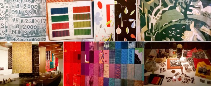
Having worked on the Tibor Reich show at BCU it was great to be reunited with the collection, also on show at the Whitworth, and to see the different emphasis this exhibition made to an amazing and extensive archive owned by the family. The students really responded to the way Tibor worked to create pattern, and explored pattern through drawing with layers of colour and line. I couldn’t help but point out Tibor’s excellent use of a sketchbook to explore ideas.
Image below: top row from Revolutionary Textiles, bottom row Tibor Reich
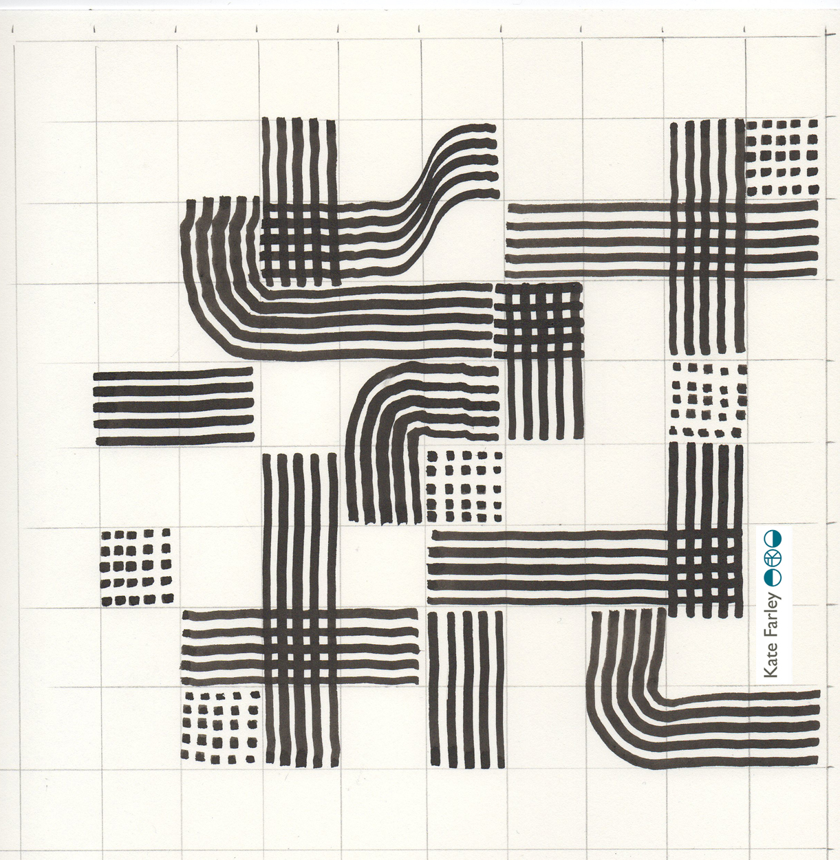
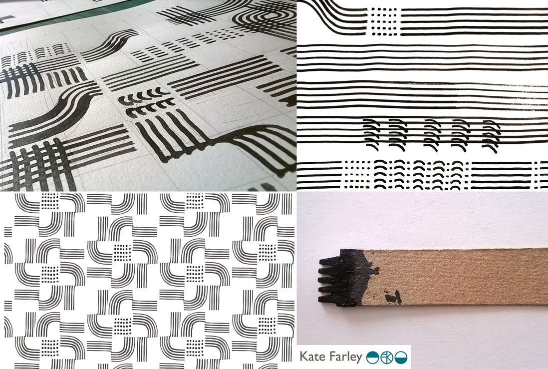
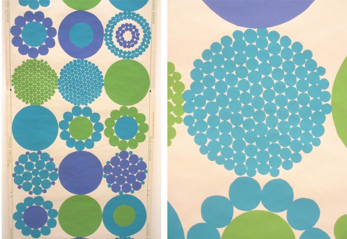
The room that wowed me most was the wallpaper gallery upstairs, and again, this exhibition was exciting and inspiring to the students, leading to some really interesting conversations. There is of course no comparison between seeing metres of wallpaper stretching skywards, to a small screen of Google images. We talked about print production, the scale of motifs useful to a domestic space rather than in relation to a sketchbook page, and why thinking big should be embraced. We admired the Lucienne Day patterns that are so familiar to us, alongside new discoveries, and that is why a curated exhibition, unlike an online search can be so beneficial; the selection provides context. I encouraged the students to question how they would make the marks, the shapes and patterns without computers, and why the variation of hand-made can offer something that digital software excludes. I include an example below to illustrate my point – beauty in the irregular.
We did have time to enjoy the beautiful surroundings of the cafe but also took in a quick trip to see the newly opened Fashion & Freedom exhibition at Manchester City Art Gallery, one I really do recommend too.
So, more pattern inspiration for me, and hopefully some more people inspired by pattern too…