Wallpaper in the creating…

The process of designing my first commercially available wallpaper has been a long & highly considered journey and one I thought would be interesting to share.

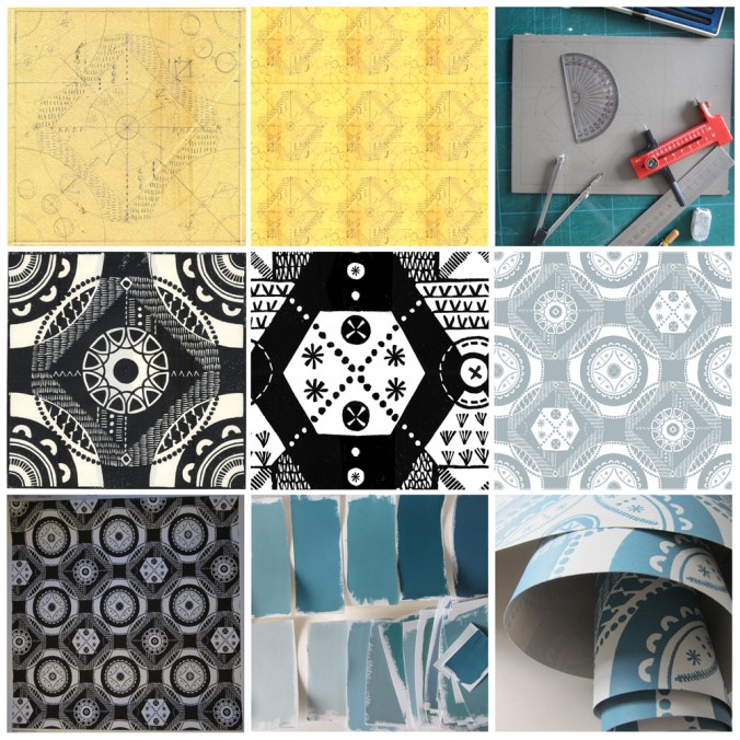
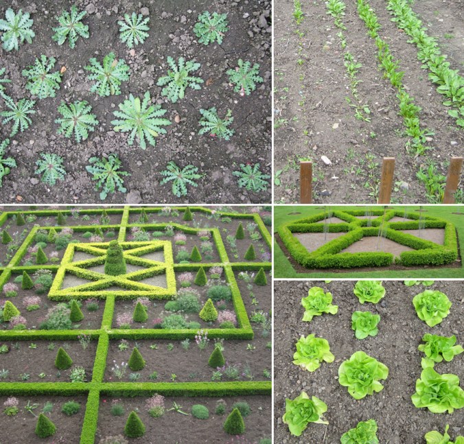
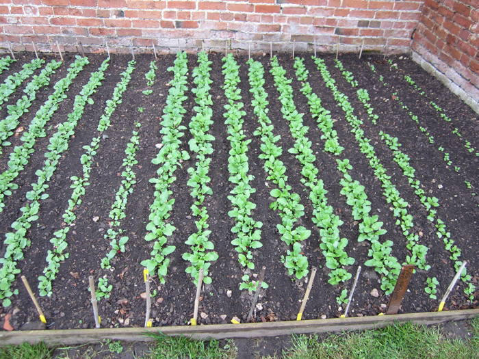
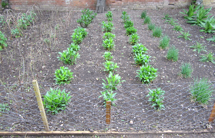
Research: I first made drawings in my sketchbook last summer when I visited the National Trust property Hanbury Hall & Gardens in Worcestershire. I really liked the formal parterre and saw a really close link between garden design and textile design – I wrote about this in a previous blog post: https://katefarley.wordpress.com/2014/05/11/pattern-design-outdoors-and-in/

Composition: Sketches became drawings that became more detailed designs, that were then tested in repeat by scanning them in to the computer and using Photoshop. Edge details, scale of motifs, pattern and textural rhythm all needed to be considered.

Cutting the block: I measured and cut the lino block before taking a really clean print in order to scan the print in to work digitally with the repeat tile.

Editing: Further refinements, several print outs and more alterations took place over several weeks as I got used to seeing and living with the design. Additional lino blocks were cut in order to add different motifs to the design. Additional variations across the larger repeat file create visual interests and a play on the traditional repeat expectations. Some tweaks were so minimal that people unfamiliar to the design wouldn’t be able to spot the changes without having them pointed out, but it’s so important that every dot, dash and space has been considered before the production process is underway, saving time and lots of money.

Production: The digital artwork was sent off to the manufacturers of the roller in order for the design to be printed, and a technical proof was sent back for my approval – exciting and scary times!

Colours: Much thought, research, trying and testing went in to the colour combinations and I painted lots of colour chips using gouache in order to communicate the choice to the printer.

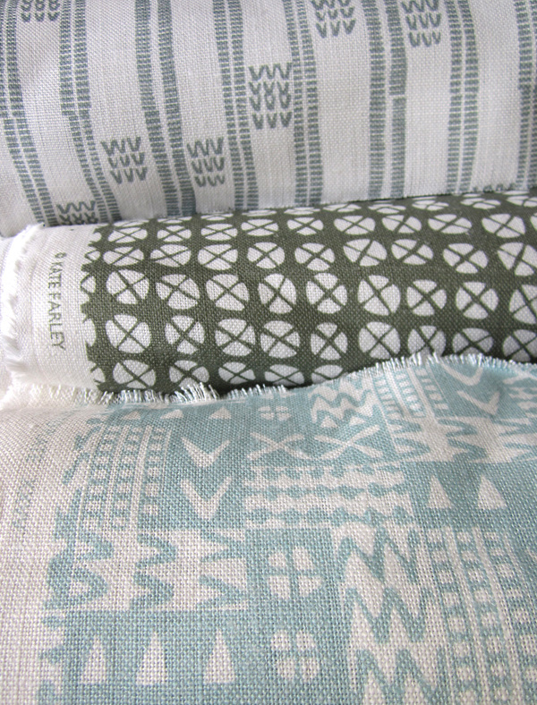
Printing: After signing off the colour proof provided by the printer, the wallpaper went in to production, labels were designed and printed, rolls created.

Results: I’m delighted with the results, the efforts by all those involved with the production process, and look forward to launching this at TENT London very soon.

hanbury_BLOGtile1000rolls_100_DSC_0227

A new design: working it all out

I’ve created more designs than I can remember since I began ‘formal’ pattern making back in 1992. Some aren’t worth worrying about, some I’m still extremely proud of and some are still waiting for the right time to make their debut… (I can’t wait to show you some very special ones next year but I’m sworn to secrecy.)

Some designs work themselves out for themselves; I vividly remember shutting my eyes to get some sleep right in the middle of my final major project on my degree, when suddenly my mind spun in to action, and there in my mind was a design, colour separated and waiting to be drawn out for screen the very next day. Other designs I battle for days on, and eventually win through demonstrating more stubbornness than the design itself.  I don’t give up easily.

In all my designing, however hard or easy it was in the making, I aim for them to appear strikingly straightforward, as if they did just happen on their own. I was accused by a tutor for being lazy – he didn’t understand minimalism – when in actual fact, it’s far harder to let the negative space be as important as the motifs we can sometimes throw at a design like pennies to a pond. Space can be beautiful.

I’ve taken a slightly different direction to making the most recent patterns; some would argue they are more traditional, more formal, more fussy even. I’ve certainly battled with the minutiae. I thought it nice to share the journey a little, but do bear in mind, every dot, line AND space have been considered, reconfigured, tested, discussed and revised more times than I’m counting (and that’s before I even think about colour). I hope you like the results. The design will feature in my new work to launch at TentLondon in September, so watch this space.

KF_workings_1000web

The image shows: initial sketch / proportions of the motif, repeat / rhythm testing of the drawing before the lino block is cut, the lino block being printed, and the final digital artwork. The inspiration is a mix of kitchen gardens and formal gardens of the National Trust.


back to the drawing board

The job of a freelance designer involves so many different tasks that many people with a variety of skills could be employed to keep the components of that designer’s working life going. Juggling what is needed to be done with what would be preferable to do is a tough call on some days. What is it that really makes that difference, to move the company vision forward? I could spend many hours a day sat in front of a screen communicating with manufacturers and stockists, preparing marketing and sales literature, and keeping the ever-growing consideration of social media alive.

There are times when it is so valuable to stop all of that and get back to what makes us creatives tick. There are personal risks involved with making; what if it’s rubbish? The fabulous ideas that roll round the head in the early hours, once realised, are open to harsh criticism in the light of the day – the danger of expressing ideas and developing new work. But for all of that it is so important to keep going back to the beginning, to test new ideas, stare at the blank white sheet of paper, take a deep breath and play – for my creative self!

KFarley_drawingboard

Pattern design, outdoors and in…

If you are a regular reader of this blog you will already know that for the last few years my personal design practice has been inspired by garden design, and most specifically allotments and kitchen gardens in my ‘Plot to Plate‘ collection, launched in 2012. I have spent many hours walking, almost patrolling, up and down rows of National Trust cabbages and onions, armed with my sketchbook, annotating the patterns, translating them to motifs, documenting the small irregularities, the planting plans, the labeling – fruit and vegetables up and down the country, as well as our allotment, plot 8 in Birmingham. Upton, Packwood, Baddesley Clinton, Blickling, Felbrigg, to name a few National Trust gardens I have surveyed and taken inspiration from. Hanbury is my current favourite garden and I have been working on a number of patterns inspired by this property that will one day be complete, to launch at Tent London this September.

It is with this in mind that I write my thoughts. There are so many similarities between garden design and textile design they seem perfect companions in my practice. Long before Mr W. Morris picked up a pencil the natural world of flora has been a dominant subject of inspiration for pattern in the home. Rather than the bouquets and sprigs, posies and trellis it is the formal gardens, the parterres and kitchen gardens that hold the structure and compositional language that we textile designers and design educators regularly refer to…

Stripes, spot repeats, all-overs and multi-directionals, geometric grids and diamonds, checks and plaids are all to see. And so it is, that it makes sense that I really have brought two things that I do enjoy together in my creative practice. It’s too early to share artwork for my new ‘Hanbury’ designs but I will share some garden pattern from Hanbury, and my ‘new’ fabrics by the metre, available very soon, in anticipation…

garden_textiles_hanbury_web  fabricrolls1_web

micro florals

I’m used to gathering flowers and then drawing them over and over in order to learn more about their colours, shapes, forms and structures in order to develop imagery for prints and textile designs. At home this weekend we looked at flowers in a different way. We investigated last years plants that my daughter had pressed safely, and looked at them under the microscope that my son had become rather too keen on discovering inside the utilitarian wooden box it lives in.

We had great excitement as some rather plain plants revealed stunning patterns and textures and were disappointed when something beautiful at full-scale looked rather scary close-up. On trying to capture these images on camera the results were reminiscent of Len Lye animations and got me thinking about other ideas. Here’s a few images to share…

micro_6_web

Norfolk lines

I’m naturally biased when it comes to the Norfolk landscape but seeing as it has shaped my aesthetic, colour preferences and my approach to drawing I am happy to consider it to be inspirational. I don’t spend enough of my time in Norfolk these days but every time I visit I take deep breaths, and big eye-fulls of the vast expanse of open landscape, the ever-changing light qualities and the endless colours of the land, sea and sky. Here’s a medley of Norfolk from this Christmas including sights of seals at Horsey Gap, a rainbow & the beach at Wells-next-the-Sea, and fields near Cawston and Alysham.

Norfolklines_web

‘Chelsea’ drawings to design for David Mellor Design

Many months ago I had the go-ahead from Corin Mellor to design a bespoke pattern to celebrate the fabulous ‘Chelsea’ salad servers that he designed for David Mellor Design. When I first saw the cutlery I immediately really liked the look of them and when I received the servers they were amazing to hold – they still are. Impressive in weight and size, the shape is simple yet stunning, and they inspired me to set about drawing. With a number of design options I provided Corin Mellor, Creative Director and his retail team, they discussed and advised, and before long we agreed on this design that is now printed on to linen union tea towels and sold on my website, David Mellor shops in Hathersage and London as well as Museums Sheffield.

With the tea towel now listed in the ‘Special Products’ section of the David Mellor catalogue I thought it time to show some of the images I have of the process. I took inspiration from my visit to the factory in Hathersage where they make and display the cutlery production process as well as the objects themselves.

I’ve had great feedback and sales, we are having another print-run and they’ve received press in the form of Elle Decoration!

Thanks also to Patternbooth and Design Hunter:

drawing_mellor1webprintedMellorTags_webmellor_square_web

elledeco_Mellor_dec13_web

Design inspirations 2: the natural world

Second in the series of ‘Design Inspirations’ blog entries…

The natural world has long been an inspiration for textile designers. Many years on from William Morris celebrating the natural world of flora and fauna as decoration for textiles we have had Laura Ashley, Marimekko and Orla Kiely, to only name three companies, who have interpreted the natural world and created stylised patterns and imagery which continue to inspire design students of today.

At times the worst thing as a lecturer of design we can hear from a student is that their project will be “about shells” and we dread the worst examples of static and bland studies which do little to explore the beauty and wonder of the natural world’s creations of form, structure, surface, pattern, colour and more, before approaching the bountiful concepts and metaphors in the ‘dot to dot’ of design processing hidden around the shell!

In my drawings I often aim to distil and to simplify a plant structure or shape of a flower in order to create motifs for prints and surface patterns, exploring perspective, diagrammatic language and relationships with place / context. I have a huge archive of drawings made on locations as well as boxes and bags of samples including plants, stones & leaves and one day they may well feature in designs. You never now what you might need! Going anywhere new, even for a holiday means that I keep my eyes open and often pockets filled as a result of finding new things.

Having visited the Gower peninsula for one last summer camping trip I came across these examples of natural forms, which could and would create different visual interpretations in the hands of each creative prepared for the job. That is one reason why I like to play a part in design education; to facilitate the looking, seeing and interpreting, and it is certainly why I like to keep on collecting, and keep on drawing.


Image

The English countryside

We had a beautiful day yesterday involving a quick trip to Ledbury, and specifically Tinsmiths to sort out post-show details. Our visit to this lovely market town coincided with the poetry festival so we also picked up some verse, locally-made pork pies, beer and ice-cream!

It was so hot in the afternoon sun but we did manage to enjoy the scenery around the Malvern Hills to-ing and fro-ing between trees for shade. It’s a stunning landscape, and one that feels so English. I first encountered the area when I cycled Lands End to John O’ Groats back in 1994 and it left its impression on me even then.

The views from the ridge make you feel as if you are a giant overseeing a toy model landscape but it is with this viewpoint I can capture my key interest in the landscape. If I was to draw the view I would have started with lines that recorded the field boundaries defined hundreds of years ago, the footpaths etched in to the land by endless walkers and roads enabling others to pass through. The lines become shapes and a record of that moment of my experience, but what is also captured is hundreds of experiences, of us, living in this English landscape.

summer2

In terms of colours, I was struck by the stark contrast of the dry grass tones compared to the striking pink of the foxgloves and the very green bracken.

summer6 summer5

I’m also a collector of photos of grasses and such-like against blue skies, and so I happily added further imagesummer1s to that collection.

summer4

All in all, a very lovely English day.

Hanbury Hall delights

My creative practice has been inspired by National Trust gardens for the last few years and as a result I’ve had a number of people suggest I visit Hanbury Hall – finally I got round to it at the weekend. Despite the poor weather it was a delight to discover all the pockets of gardens, each carefully considered, and demonstrating the wide variety of formal and informal planting the National Trust excels at.

ImageImageImageImageImageblossom_webImageImageImageImage

Armed with my sketchbook and camera I gathered plenty of inspiration for new prints and will definitely be back later in the season.

Image

Its also a fantastic building inside and out. I dashed around the inside and a particular wallpaper caught my attention.

Image

All in all, I left feeling excited about making new work again having spent so long preparing for my solo show at Tinsmiths, opening later this month… now where did I put that lino?

tulipsHH_web