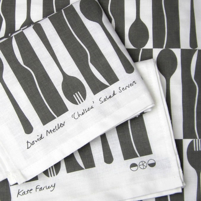
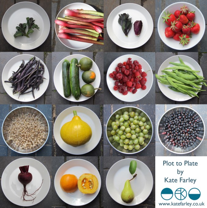
The job of a freelance designer involves so many different tasks that many people with a variety of skills could be employed to keep the components of that designer’s working life going. Juggling what is needed to be done with what would be preferable to do is a tough call on some days. What is it that really makes that difference, to move the company vision forward? I could spend many hours a day sat in front of a screen communicating with manufacturers and stockists, preparing marketing and sales literature, and keeping the ever-growing consideration of social media alive.
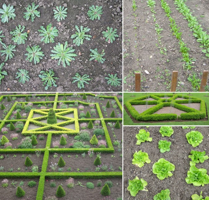
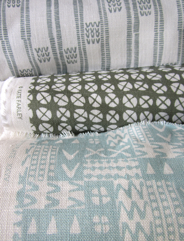
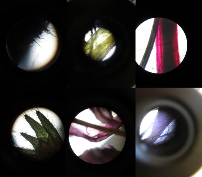
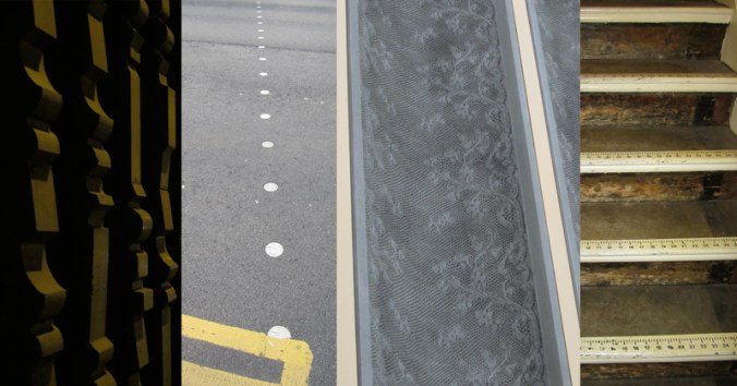
There are times when it is so valuable to stop all of that and get back to what makes us creatives tick. There are personal risks involved with making; what if it’s rubbish? The fabulous ideas that roll round the head in the early hours, once realised, are open to harsh criticism in the light of the day – the danger of expressing ideas and developing new work. But for all of that it is so important to keep going back to the beginning, to test new ideas, stare at the blank white sheet of paper, take a deep breath and play – for my creative self!