I’ve been giving a lot of thought to the idea of looking and seeing, and particularly how we evidence what we have seen. I have boxes of photographic prints of things I’ve seen: cracks in pavements, postboxes around the country, vapour trails in the sky, flowers I’ve grown and plants I wish I’d grown – and much more. When the world turned digital I stopped filling real boxes and filled virtual boxes, and some I look back at, but rarely do I touch the surface of the sights I have collected.
The engagement in social media, and the sharing of pictures begs me to think again about why we take pictures, and why we share them. As I spend most of my time in some sort of real or virtual context of people in the creative industries my Twitter and Instagram feeds are heavily laden with considerately photographed shadows of railings, colour combinations of socks on patterned tiles, recently obtained vintage finds, and dare I say it, beautiful breakfasts! Not only are we collecting imagery, we are proving that we are seeing and experiencing interesting / beautiful / different things and places, judged by us and hopefully ‘liked’ by others. Yes it’s marketing; a branding tool to evidence our aesthetic judgements.
Some questions then, are we seeing more? Do we notice more, and appreciate more?
It does seem as if there have always been people who see faces in clouds, and beauty in peeling paint, but I wonder if social media is driving us to become a load of aesthetes. In my world it may seem that way.
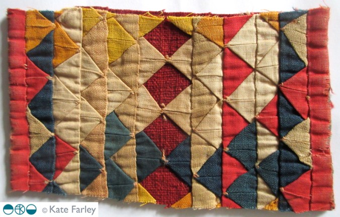
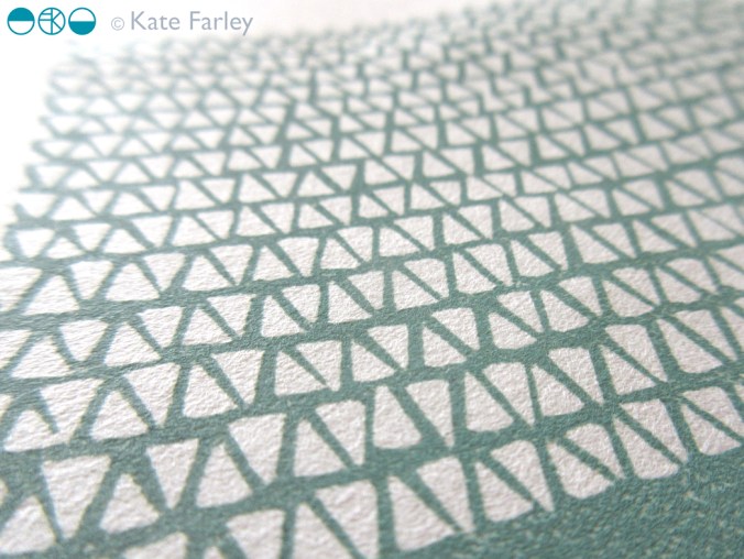
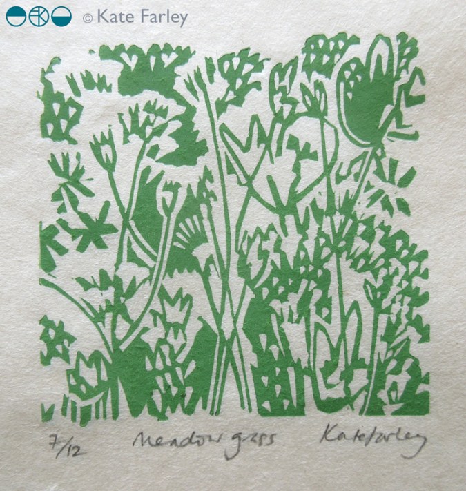
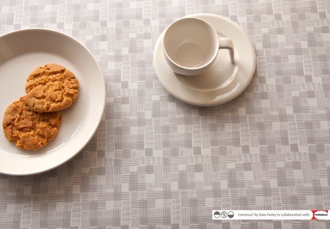
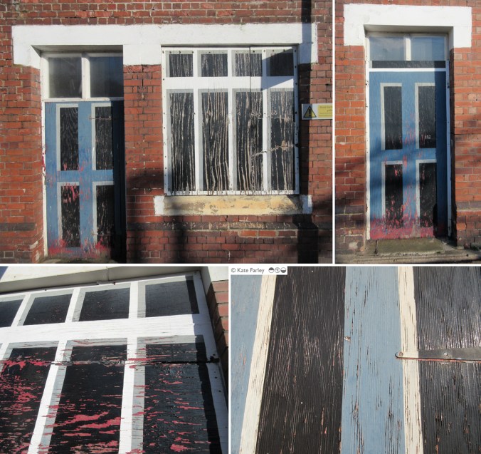
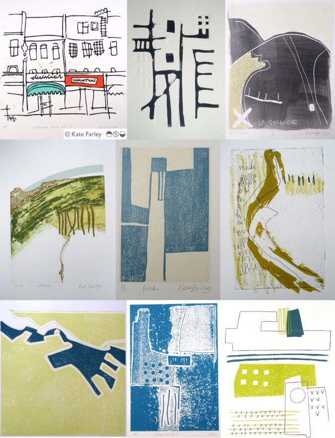
As a pattern maker I’m always on the lookout for eye-candy, and usually of the ‘just happened to be there’ kind of pattern, rather than a designed pattern – having said that, I’m equally likely to be stopped in my tracks by a well-designed wallpaper. There have been many books over the years, and more recently blogs that feature the beauty in the overlooked, or the ugly, or the mundane. The desire to collate / curate these sights are no more in evidence than in the world of Patternity a design-savyy duo with a manifesto about pattern! Their stunning website and book and interesting collaborations are clearly tapping in to this moment of ‘seeing’. Check them out if you are so far unaware.

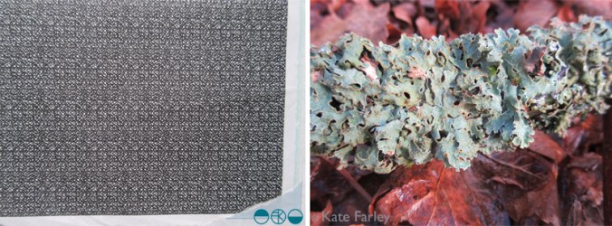
Pattern really is everywhere, formally and informally and that’s the pleasure. I remember the day I was taught the mysteries of repeat pattern making, and that evening in a pub in Great Yarmouth, Norfolk, I took great pride in identifying the repeat ’tiles’ in the carpet, wallpaper and curtains of the glorious / hideous 1990s pub decor.
I had the pleasure to spend time with the fabulous Sarah Campbell last month, and much of our conversation, as we were at New Designers, was about pattern making; why we do it, how we do it, and getting people to pay for us to do it. During the conversation Sarah spotted a lady beside us in a polka dot blouse, and we noted that pattern-makers never really switch off from pattern spotting (pun intended!), pattern making, and pattern appreciating. When we departed we both commented that we look forward to reading each others next blog post – well here you are, this one is for you Sarah – it was a pleasure to see pattern with you!