I’ve been busy printing and presenting my ongoing pattern research over the last few months, testing the design and print process, and receiving useful feedback – which may explain the lack of blog posts recently!
Last September I presented my work at the Fashion and Textiles Courses Association conference, Futurescan 6, held at De Montfort University in Leicester, and had a small exhibition of the work in progress during the conference. It was great to formalise my ongoing work at that time, and receive external feedback from the audience. It was useful to consider how I communicate the research, as the principle is simple but the process complex. I have also discussed this research as part of other presentations over the last few months, for colleagues, for undergraduate students as well as the audience of the Costume and Textiles Association’s programme of Heritage Open Week talks at the Forum in Norwich.
Last week I presented this research to the British Association of Paper Historians as part of their Spring Meeting held at St. Bride Foundation, having been invited to do so by the Wallpaper History Society. My fellow presenters covered wide ranging topics, from paper conservation, Japanese paper as cloth, the College of Arms and the current situation of the paper industry in the global context. It was a fascinating day with lots of common ideas and interests, and I received some very positive feedback to keep me on track.
I have further opportunities to share my research in a couple of months, so more news on that in due course!
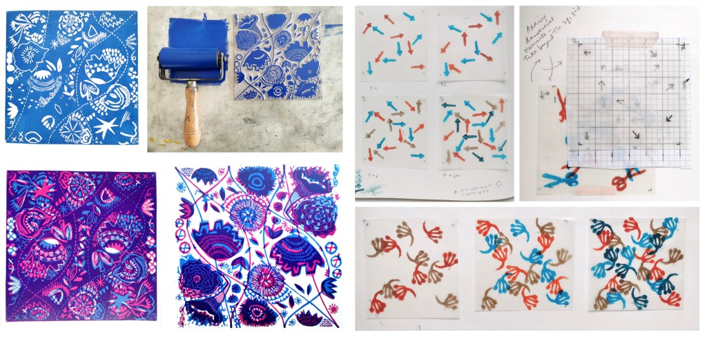
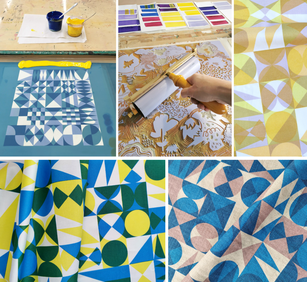
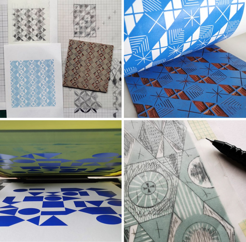
I am continuing to develop both lino blocks as well as artwork for screen printing, which enables me to test different colour handling and substrate options, for wallpaper and cloth. Colour is an important element of this research and particularly the transparency of colour in the overprinting, so the palettes will continue to evolve as I continue the exploration of primary and secondary colours.
As I gear up to making larger work for an upcoming showcase opportunity I look forward to sharing more of the work in progress.
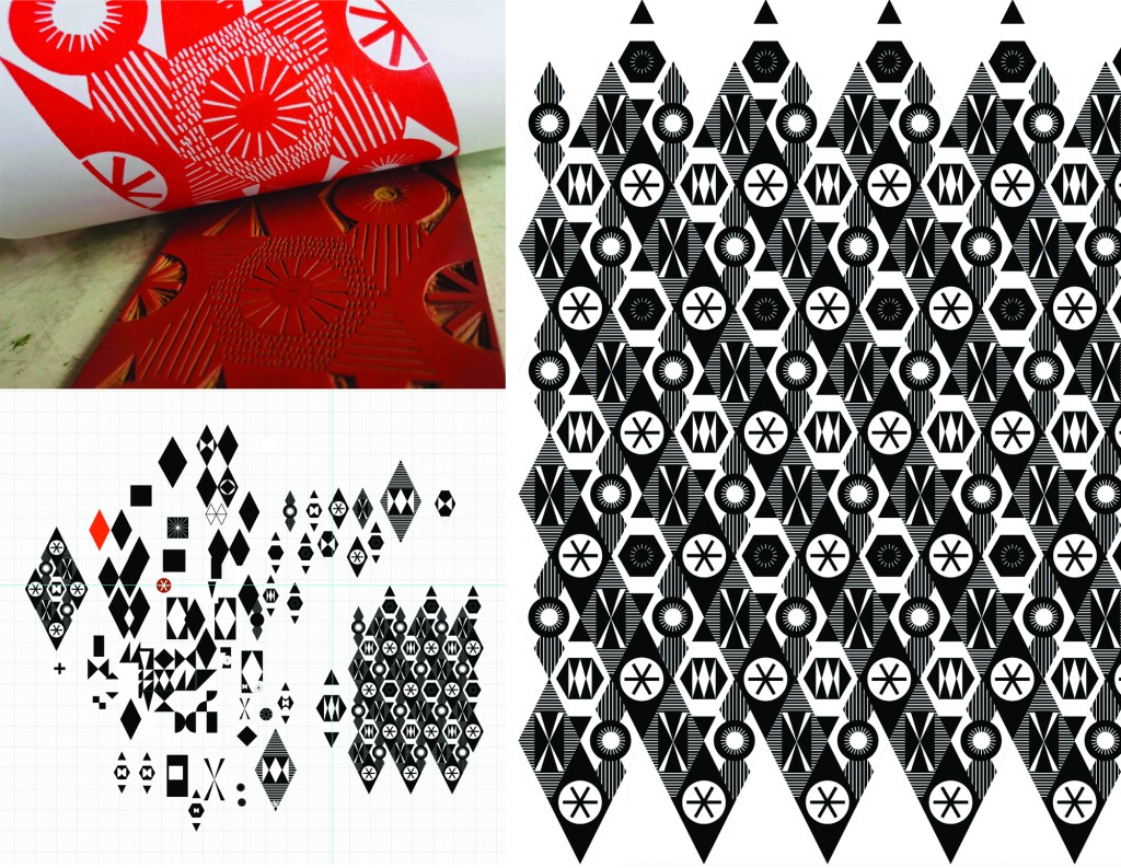
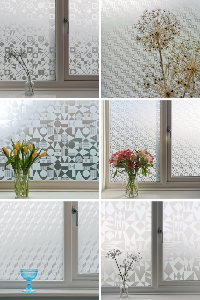
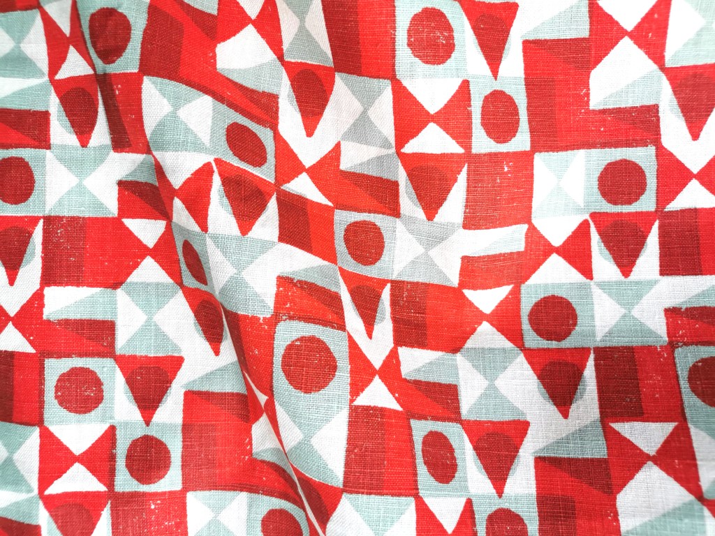
I’m excited to be finally bringing this collection of surface designs to market in collaboration with the Window Film Company. The inspiration for the patterns has stemmed from my fascination with geometric designs, taking the basic ingredients of triangles, circles and squares as my starting point.
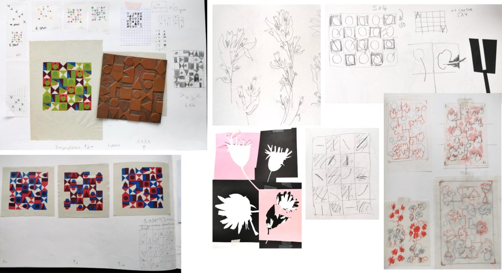
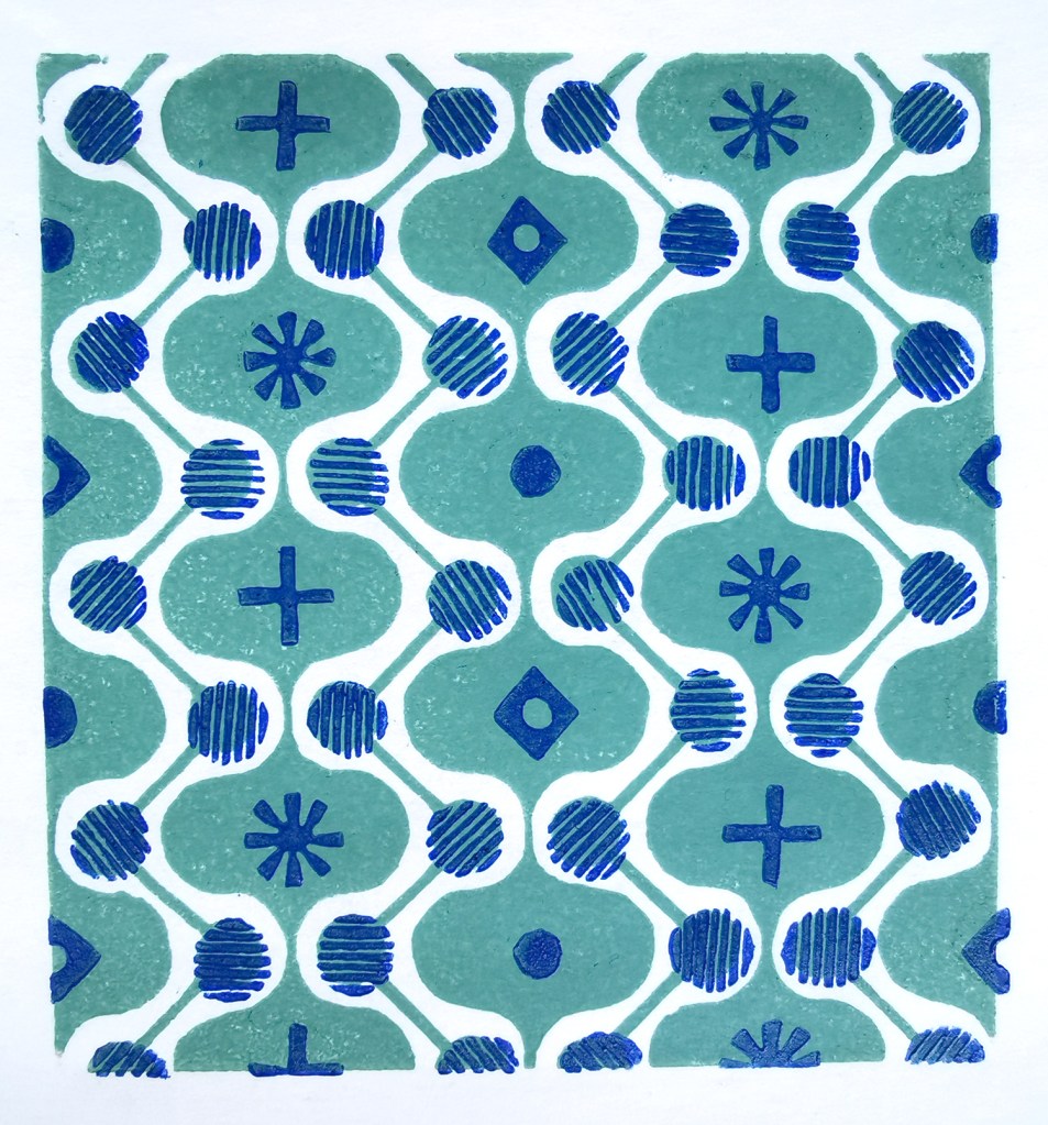
I’ve been exploring geometric pattern structures in relation to design principles established by Lewis F. Day at the turn of the Twentieth century, exploring the equal distribution of motifs within a repeating tile to alter the visual rhythm within two-dimensional surface designs. I have also explored expectation and disruption within the repeat tiles. On establishing an apparent small-scale repeat, I play with unexpected shifts in the placement of motifs to disrupt the rhythm, challenging the sense of order. This work belongs to my ongoing practical pattern research as Associate Professor in Design at Norwich University of the Arts.
The six designs each have their own identity and yet belong together like siblings in a family, with shared features of geometric motifs and formal compositions throughout this collection. Some of the designs started their life as self-initiated physiotherapy back in 2020 / 21 following abdominal surgery and my subsequent recovery. The design challenge, to make small-scale lino blocks of repeating patterns to print by hand, provided me with small physical and mental tasks to focus on between the naps. I had hoped some of the designs would one day be leaving my studio, and I’m pleased and proud to share them now.
Designing for window film requires consideration of motif, shape and pattern construction without the aid of colour, requiring an absolute focus on negative and positive shapes. I enjoy working within design limitations in relation to production requirements and technical specifications, believing the challenges become design opportunities. I spent some time testing the various scale of patterns across the collection, including a micro pattern (Step), through to a much larger scaled pattern (Triangulate), considering window sizes in both domestic and commercial spaces in relation to the motif sizes.
I’ve worked with the very patient Steve at the Window Film Company for all my designs available on film, including the large-scale bespoke design for Birmingham Airport back in 2017. Previous designs from my Construct collection available from the Window Film Company won a House Beautiful award in 2018 too!
Steve worked with me to sample some of the early versions of these designs generated as digital scans from lino prints initially, but I didn’t like the visual quality in the translation of the prints. The original artworks for this collection were generated using collage and screen printing alongside the lino prints as I prefer designing with a physical relationship to image creation. After further consideration I opted to create each of the designs as vector-based files for production, providing sharp graphic quality to the patterns.
Mike at Window Film Co. was also fundamental in getting this collection established, off the computer, on to window film and ready for sale. Our conversations focused on understanding my design identity in relation to previous work. He ensured the designs felt authentic to me, while building on the existing designs I already license to the company.
It’s always exciting to receive a delivery of samples, and I’ve had a few of those over the last few months. The final product is very different to a digital file, so it is important to inspect the artwork as film installed on the window, checking the scale of repeat as well as any discrepancies in the artwork – you must have sharp eyes for detail! With final decisions made and sampling approved, as well as the small matter of naming the designs, we have been able to sign off the artwork, and launch the six designs in the collection: Circulate, Diamonds, Shift, Triangulate, Step, Pairings
Part of my academic role at Norwich University of the Arts is dedicated to my research practice, exploring new knowledge in pattern and print design. Following on from the publication of my book I’ve been keen to get out in to industry and expand my practical experience of print production methods that could enable new ways of designing repeating patterns for paper and cloth. These visits also provide excellent opportunities for me to develop ideas for curriculum changes in the undergraduate course I lead, BA (Hons) Textile Design at Norwich University of the Arts, to ensure our graduates are competitive in securing roles on graduation.
A couple of years ago I spoke to Director of Ivo Textiles Limited, Suzie Zatka-Haas following her visit to our stand at New Designers, a graduate showcase held annually in London. She was keen to understand the best way to promote opportunities in the company to graduates and we discussed the right terms and definitions to ensure textiles students were attracted to the roles. We also discussed the skills they value at Ivo’s and how we can ensure students understand the potential roles open to them, (we have had a Norwich graduate work at Ivo’s for the last few years). We are both passionate about printed cloth and Suzie invited me to visit the factory when I could fit it in around my teaching schedule.
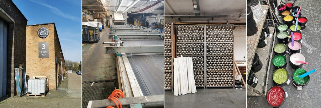
Fast-forward two years and I managed to secure some funding to spend two days onsite at Ivo’s to understand more about the technical constraints of the different printing processes they offer to clients. Suzie was brilliant in making this happen, being open to allowing me in to the factory to learn more. This felt very exciting but I wasn’t fully sure what I’d be able to help with although I offered to assist with anything. I was armed with my printing apron and old clothes—following advice from Suzie!—as well as my sketchbook of design ideas for my current research project in case I had time to talk it through with anyone.
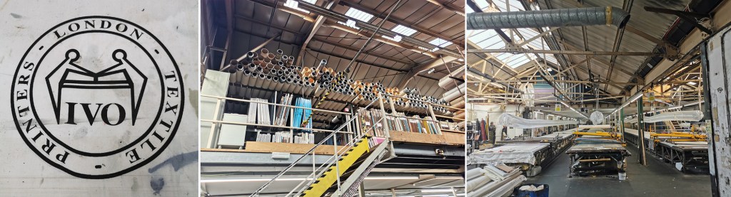
The day before my visit I’d spent the afternoon with Marthe Armitage (blog post here) in her much smaller set-up so I knew this was going to be a contrast. Walking on to a large industrial estate in west London with huge lorries thundering by, the only clue of what was going on inside number 3 were some screen frames leaning up against the outside wall awaiting collection. I was greeted at Reception and my name had made it on to the board for the day.
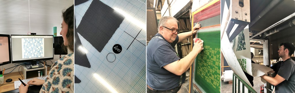
Once the health and safety briefing was over I was led through the factory, trying to take it all in: sights, sounds and smells, and I was re-introduced to Maisie, one of Ivo’s designers that I’d met at New Designers last year. She was to be my host for my stay and ensure I didn’t do anything silly, like wander off and put my hands in the machines. I’m incredibly grateful to Maisie for her time and interest in what I am doing. We discussed university training, the Ivo design studio set-up and then I shared with her my project. It is so useful to talk it through with different people as they all bring ways of looking and new questions.
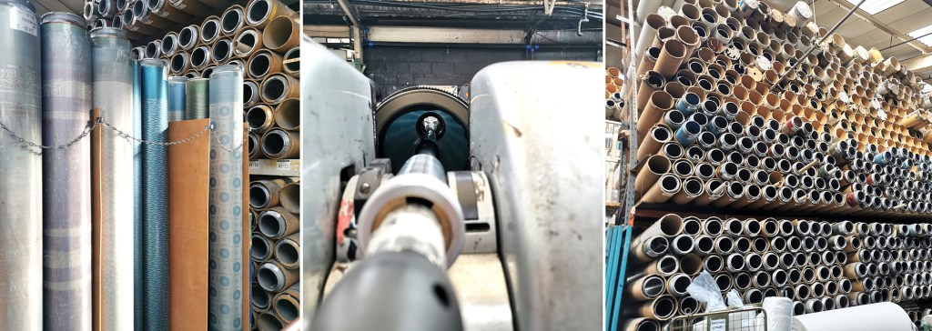
A full tour of the factory was next. There is a vast supply of cloth and screens in every space imaginable, alongside huge machines, some in action and some not, as the job list requires. The colouration department was a room of inks and colour swatches, and the colourist making and matching colour for all the processes. The colourist has been working for considerable time at Ivo’s, like so many there, they are absolute experts in what they do.
I saw the Flatbed printer working on my first day. Large flat screens raise and lower mechanically and the fabric is on the belt below, which moves along after every print is made for each colour to be printed with the subsequent screens. The belt is very long, with many metres passing by before all the colours are printed and the fabric heads off to be baked for the colour to be set at the far end of the table. I was busy taking notes and asking questions. That day a client was onsite to quality-control the printing before signing it off for production.
There is a large archive of artwork from decades ago, spanning the thousands of jobs that have been made here. Original acetates and drawings are rolled up in drawers holding the stories of design. I wasn’t able to photograph the examples – client confidentiality is important here, but it was exciting to see some key players of the 1960s featured. Maisie told me the incredible story of how Ivo’s came to be, and I met Michael, who’s family story it is, leading the company with Suzie.
Gali printing is a further printing process used at Ivo’s (the two tables with yellow frames in the picture above, right). The print tables are fifty metres long! The screens are set up in frames and are mechanically moved up and down, with a mechanised squeegee passing over the inked screen, before lifting up and moving down to the next place to print. It is carefully operated and requires skill and a keen eye to ensure everything is happening correctly with good quality each time. The screens are then changed for each colour and the same processes run again – the gali print operator will walk several miles in creating a ten colour design!
The process I was most intrigued to see was the Rotary printer. Unlike the flat screens, the artwork is prepared on a mesh that is on a cylinder (image below left). The circumference of the cylinder is the repeat size, creating a seamless repeat with fast production. A different cylinder is required for each colour, just as a flat screen per colour is required, but unlike flat bed / gali and hand printing, the squeegee sits inside the cylinder, and with the use of a magnet is pulled down to apply the pressure and add ink to the cloth through the mesh as it turns. Seeing these machines printing many colours at once is fascinating, unfortunately I couldn’t take pictures as it was printing for a client.
On my first day at Ivo’s I also saw a length being hand screen printed, but again, no pictures. It was a very slick operation that is clearly well-rehearsed!
Following the tour we returned to the design studio and I was introduced to some of the different design tasks the designers are involved in. A new graduate had recently started, Caris, so it was good to see her settling in well and enjoying her first professional experience, guided by Maisie. Putting original artwork in to repeat can take several weeks with meticulous digital design work using AVA software. Maisie upped the excitement by suggesting we could work on one of my designs that afternoon and have a day printing with Podge the Printer, a legend for those in the know – wow! Maisie prepped the artwork, with me taking notes and soon the screen positives were ready to be exposed.
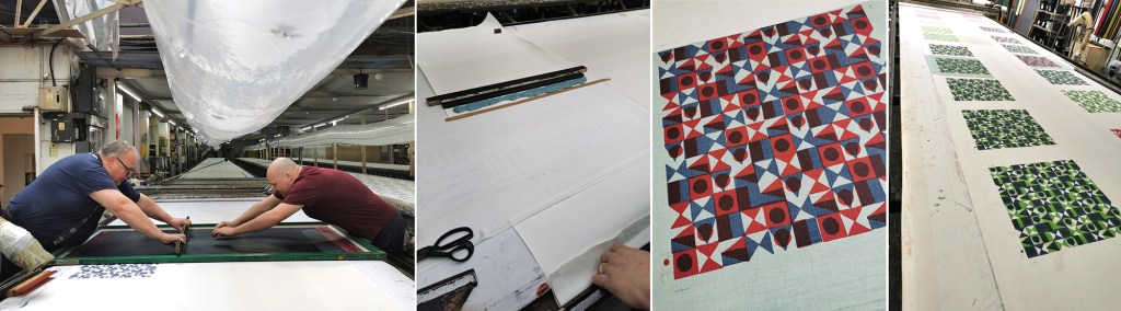
Arriving on the second day, my screens were ready, Podge had prepped the table laying lots of fabric down for me to print on to. Podge is a character – we hit it off! At first he wasn’t quite sure what my research was about, but soon he was getting in to the spirit of it and suggesting options. He said it made a change to have someone exploring options rather than simply being in production mode. We chose some large screens from the archive to add a few tricks he had up his sleeve. Buckets of colour were mine to use. I had a lesson in printing the Podge way and he made sure I held the squeegee at the correct angle with hands over the top – he kept monitoring me so I had to stay on it! He also showed me the S-blade method of printing flat colour without the screen – surprisingly satisfying.
Factory lunch is a set 30 minutes and soon we were back in action. Each time I wanted to change colour, the screen was taken away to be washed / dried ready. I’m not used to having such (any) great service and support when I print in my own studio! It was a really productive day with many metres of fabric printed with several layers of colour, testing my research ideas. Podge’s son who spends lots of time on the Gali came to lend a hand at printing the larger screens, enabling me to try other prints over the top.
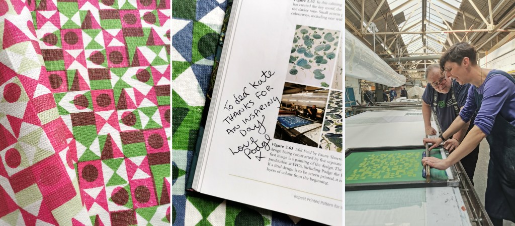
With the deadline to get my fabric set we had to stop printing, I watched as the fabric went through the baker and it came out very hot, but ready for home. I was exhausted, it was hot in the factory and I’d been busy on my feet since 8am. One of the last jobs was to ask Podge to write in the special copy of my book on pattern, as he was included in an image supplied by Fanny Shorter who prints here.
At the end of the day I caught back up with Suzie and thanked her for the opportunity she enabled me to have at Ivo’s. The factory has to run smoothly, meeting industry deadlines and costings for clients so to be open for me to learn from them and explore my research with their expertise was an absolute privilege – they were very generous. I headed home with a bag full of printed cloth and I ached all over from such a physical day, but with a head full of the experience I won’t forget in a hurry … Thank you all at Ivo’s!
As a result of my current pattern research practice, I’ve been keen to get out and discuss print production methods with designers and manufacturers, particularly as I was restricted in doing so while writing my book during the pandemic. A couple of weeks ago I had the opportunity to visit designer Marthe Armitage in her showroom in west London, showing her my sketchbook / design work and discussing each of our design and production processes.
I’m not sure when I first became aware of Marthe’s patterns on wallpaper and cloth, but I’ve used her designs in my university lectures for the last few years to illustrate economic principles of building pattern, using a single block (one colour) to provide flowing and complex patterns, featuring varieties of visual texture within motifs. I bought the book on her life / design career, The Making of Marthe Armitage (published in 2019 by Graphical House) and was impressed by the beautiful drawings that accompany and support the design work I was familiar with. It is a thoughtfully produced book, with some copies available with a hand printed wallpaper wrap cover.
I’ve written before here about the time my ‘phone rang and Marthe was at the other end, ready to discuss her inclusion in my book and we went on to put the process of pattern design to rights. Meeting her more recently and showing her my sketchbook was a wonderful experience. There was straight talking about the current state of patterns available on the market and we agreed with each other about drawing on paper to map out the design on a grid to establish the composition for repeat. She was intrigued by my investigation in to block repeat and rotation of the tile and suggested some of my ideas more fruitful than others – I agree! We were joined by Marthe’s daughter Jo who leads the hand printing and is key to the future direction of the business, as well as Harriet, the Creative Project Manager and Christine, the hand printer who supports Jo in production. I was interested to learn of some new plans in development and gain an understanding of their experiences of print production in the UK.
The showroom in Brentford is a beautifully designed space which includes the printing press for hand printing their wallpapers and plenty of samples to admire, and is open to the public regularly. Tins of ink are displayed alongside samples of designs in progress and colour testing. It was also interesting to see the lino blocks featuring the designs cut by Marthe backed on metal plates ready for the press. Check out the instagram account for up to date news.
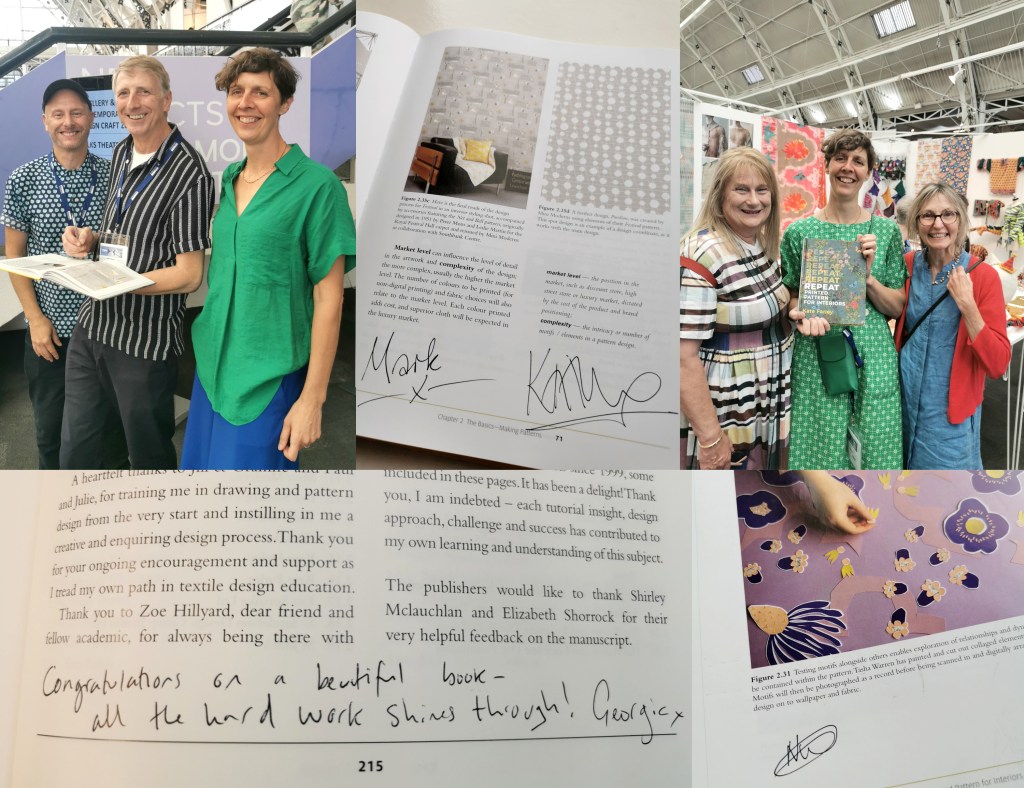
As our meeting came to an end, I grabbed the opportunity to ask Marthe for a photograph of her alongside the beautiful designs and to sign the copy of my REPEAT book in which I’m collecting signatures from the contributors. I am very grateful to Marthe and the team for making time to meet with me, thank you!
In the first term of arriving at Norwich University of the Arts I was welcomed as a member of the Pattern and Chaos research group. Colleagues from across the university would meet and discuss individual research practices and shared ambitions relating to the themes of the group. During one of those early meetings the idea of a Reader, a book featuring many contributions on the themes related to the research group, was being discussed. I enjoyed being involved in setting out early ambitions and five years on the book, edited by Sarah Horton and Victoria Mitchell, is a reality, having been published by Intellect Books in late 2023. Congratulations to Sarah & Victoria!
I’m delighted to be a contributor alongside many other researchers and practitioners, some I have the pleasure to know, others I shall get to know through their text and images in the book.
My contribution to the project is chapter ten. In conversation with both Sarah and Victoria several years ago I shared my ideas of pattern evolution, of taking motifs from one to another, an ogee to a diamond for example, through the process of drawing, transforming them from one to another across the sheet of paper. I gave them a quick sketch as part of my proposal and they patiently waited for more as I worked on the larger body of drawings. The link between themes and variations in music was apparent and I played with this idea as I made the drawings, layering tone and form, as a composer would do in building the greater composition.
The chapter explores the practical research process of drawing and evolving the motifs across formal grids structures and across layers of tracing paper. Although the visual language of these drawings are significantly different to my current research the ideas initiated here were the seeds of my current investigation – I’ll share that progress soon!
A huge thank you to Sarah and Victoria for the ongoing support they provide, both to me and my practice. Between the two of them they always ask the pertinent questions and offer sound advice and encouragement.
It’s been a while since I last wrote here – the summer term at university has been very busy, … I’ve hosted an Industry Awards Day, assessed a lot of work, put up a degree show and taken students to the graduate showcase of New Designers in London, to name a few activities, so not much headspace I’m afraid.
In the middle of all that I agreed to chair a panel at New Designers titled Contemporary Printed Textiles and Surface Design Practice. I had the amazing designers Emma J Shipley, Sarah Campbell and Deborah Bowness as panellists, sharing their expertise – all three designers are interviewees in my REPEAT book. I had some questions up my sleeves to shape the discussions, and despite not having done this sort of thing before I thoroughly enjoyed leading it. To a pretty much packed venue we discussed our individual design processes, clients and customers, how we work through licensing deals, and the decisions behind establishing brand identities. Sarah, Emma and Deborah have decades of experience between them so it was so valuable to share their generous and hard-earned experiences with the attentive audience. We could have carried on for much longer! There was also the highlight of meeting my publisher from Bloomsbury, Georgia, who I’d not met in real life before then, but came along to support me.
I also had another idea in my mind, to ask Sarah, Emma and Deborah to sign my REPEAT book to make it a special keepsake. As New Designers is a textile design industry event I also managed to cross paths with several other contributors and asked them to sign it too, including Mark and Keith of Mini Moderns, Clarissa Hulse, Daniel Heath, Jules of @thepatternsocial fame, as well as past students Tasha, now designer at Habitat and Molly, currently floral print designer at Bay and Brown. It has become a mission to find opportunities to cross paths with the many others included, but this could be a very long task!
The day ended in celebration for my colleague Jill, who retired this month after 38+ years at Norwich University of the Arts. Jill taught me when I was 18 years old, and we’ve worked together over the last five years in Norwich. She came along with Grainne, also one of my tutors, to support our graduates on the stand at the show, so I grabbed a picture with them both and the book. They earned a mention in the acknowledgments as they were hugely supportive of me as a student, introducing me to their love of drawing, colour and pattern that has stood me in the many years since.
It was a really successful few days in London with our graduates doing themselves and us proud, as they jumped with both feet in to this great industry experience, just weeks before I proudly read their names out as they crossed the graduation stage at Norwich City football ground. Now it’s time for some holiday!
I’ve been keen to get back to designing and printing having spent my practice time writing and developing the book for publication over the last few years. I’ve been testing ideas of pattern evolution and pattern construction for some time in a limited way, specifically looking at pattern structure evolution through drawing investigations, but the ideas at the heart of this investigation have themselves evolved over the last couple of years.
With more time and fresh energy I’ve defined a new project brief and research rationale, and I’m excited to have got off to a good start. I’m looking at repeat tiles and construction of pattern formations, so cut shapes and sketches were an obvious way in for idea development. I’m trying not to be too precious with outcomes at this stage, so I’m trusting the process.
I’ve started by testing ideas with geometric shapes as subject matter to keep the aesthetic clean and graphic, focusing on the laying down of colour blocks. I’ve started by working up some ideas for screen printing but anticipate many more drawings, maybe lino prints and certainly digital work will be created over time too. The colour palette will certainly change, but with an exhibition I’m making work for at the same time dictating pieces to be black and one other colour I’ve gone with black and green.
I don’t want to give too much away at this stage, but look forward to discovering the potential over the next few months.
On the 12th January 2023 my book for Bloomsbury on the subject of repeat printed pattern for interiors will be published, … finally there’s not long to wait having worked on it for years!
If you want to order a copy at a pre-publication discount you can do that here.
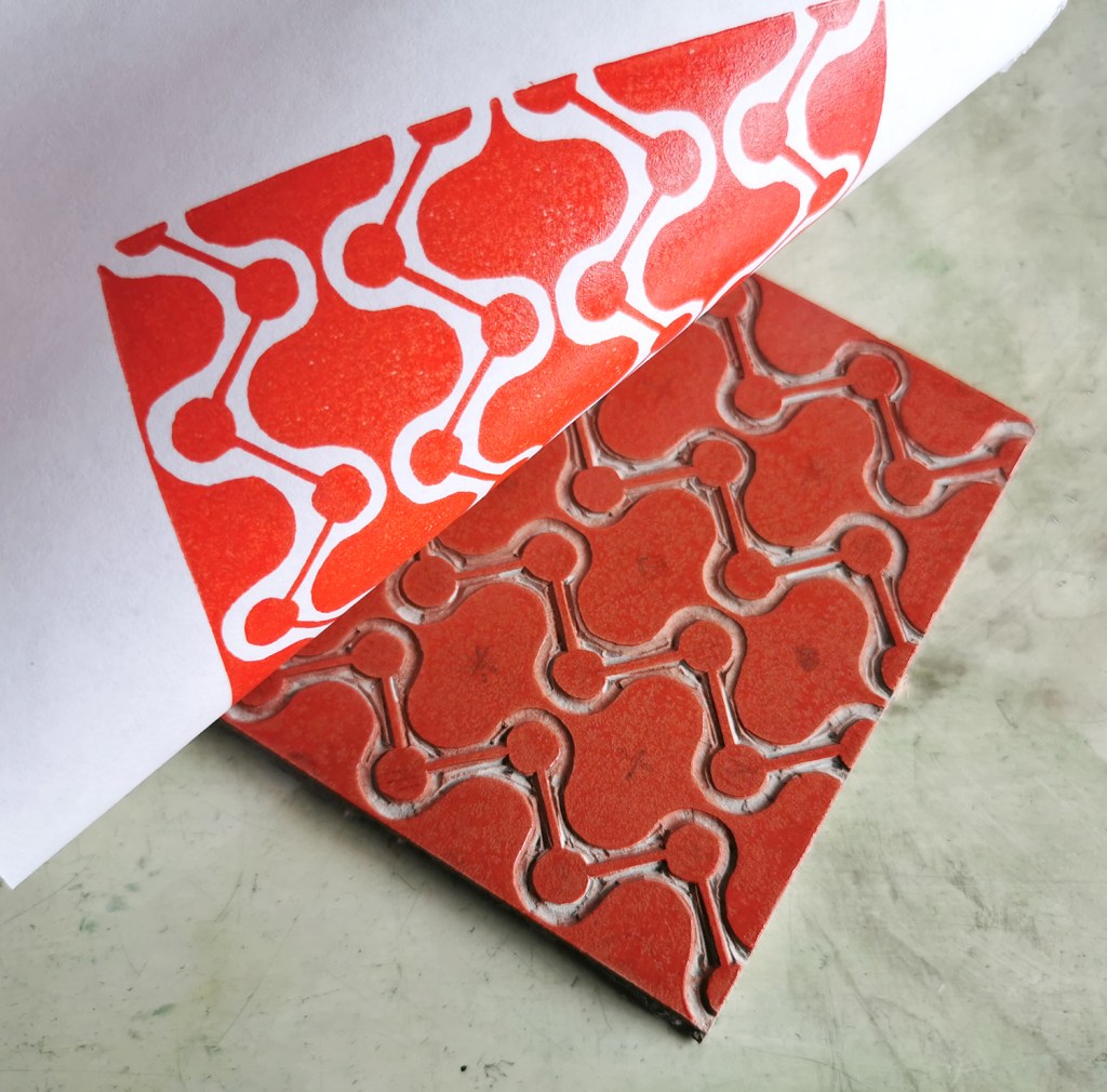
A year ago I was recovering from stomach surgery and had some time away from my academic role while I mended. Not one to be idle, when I was well enough to wield a lino cutting tool and had the energy to sit up I set myself some simple design challenges to focus my brain and help myself get better. This became my physiotherapy and creative distraction from what was a really hard period of time.
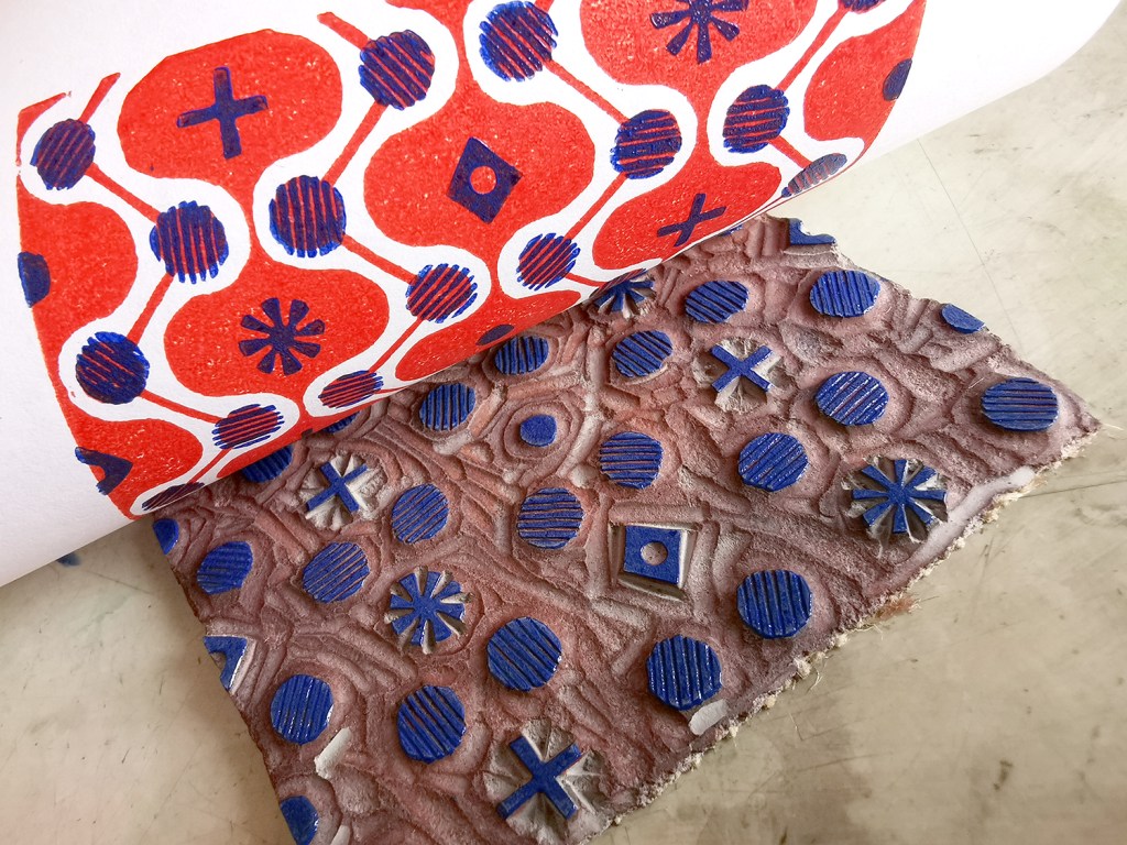
With pattern design as my go-to healer, I decided to explore formal pattern structures, including the ogee, diaper and check, featuring geometric elements. I created lino cut tiles with a small element of repeat pattern, usually but not always in two colours. The lino blocks were small, enabling me to feel as if I was making progress while able to retain focus in short bursts. The printing was another process that tested my physical strength and stamina!
I thought I’d share this one, the ogee structure – one of my favourite pattern structures – I love the play of the negative and positive S-curved forms. I think it is under-represented in contemporary design…
printing the first colouradding the second colour, blue
I often test prints in different colour combinations, as I have done here, below.
alternative colourway
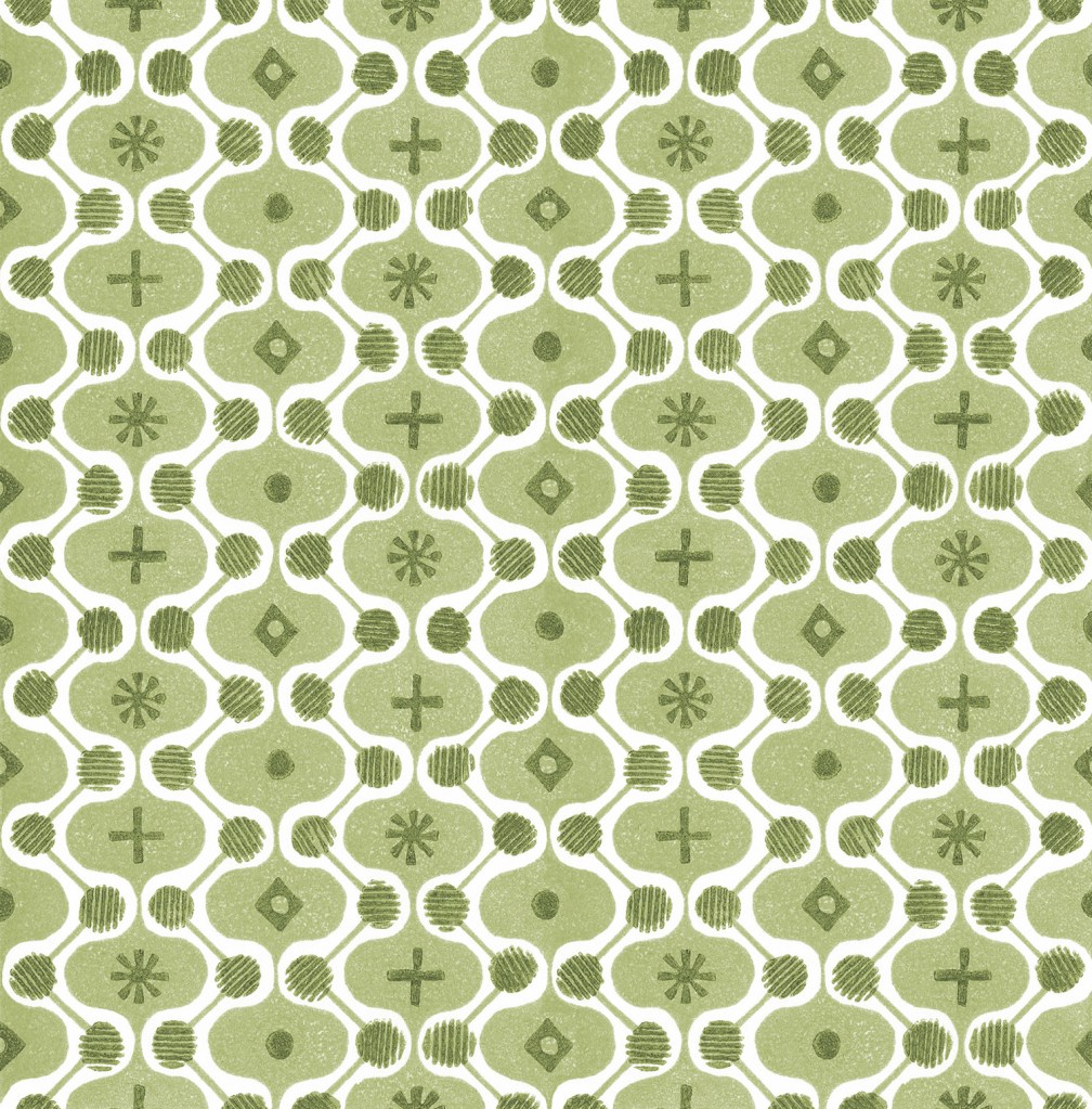
It is a natural desire for a pattern designer to want to test the repeat so you can see a digital outcome below too. I decided to test the two colours as two tones of green for some reason. It has a vague hint of avocado bathrooms of the 1970s now!
digital repeat of the lino printed tile
Unknown to me at that time, I had a further hospital stay and recovery a few months on, and so the collection of patterns grew once more, as my healing and self-prescribed occupational therapy – a career I had once considered!
I’ve had little time to revisit this collection since my recovery but I hope one day soon I will. I’m not sure where this design and its siblings will venture next … any suggestions?
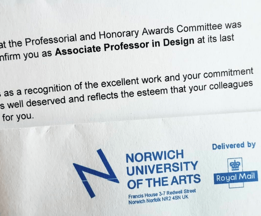
I’ve already shared the news via my other social media channels, but I’m delighted to announce here too I have been confirmed Associate Professor in Design at Norwich University of the Arts. This makes me extremely proud and at the same time reflective about the career I’ve had so far.
At eighteen years old I had very little idea what I wanted to do as a job or career, and considered widely contrasting options of occupational therapy, sports psychology, the army, teaching … something creative …. having grown out of the idea of being a bagpipe player, aged 4, and archeologist, aged 8. There are skills involved in roles across some of these that are required in my current post in academia but equally some a disastrous fit, at least to the me I am now.
Going through art school and university, even the post grad. masters course, I was petrified of the ‘real world’ of work, despite having Saturday and holiday jobs from a young age. I can clearly remember the months I earned nothing as a freelance designer, the humiliation of the job centre line and housing benefit application process, the years of no holidays unless they were working holidays to get free board, and watching peers become adults in an adult world, as I tried to work out what I wanted to do while keeping expenses low and resourcefulness high. The turning point was my first role as Print and Photomedia technician at Central Saint Martins, London, where I met people like me, dividing their weeks with practice and educational roles – this could be my real world too!
Today I can look back over a twenty-plus year academic career and so much makes sense; the joy of hindsight. Since school I have taught at play schemes, Sure Start projects, NHS trust projects, community projects, adult education workshops, school outreach, FE & HE courses. Every project taught me something that informs the educator I am today, and clarified my preferred environment for teaching and learning. For over twenty five years I’ve led a creative practice that has evolved substantially from the one I led in my studio / bedroom in south London, making books at a tiny desk, using the bathroom as a darkroom in the middle of the night, and the print room at CSM when the students had left. Artwork on the London underground network, designs on a huge hospital roof, in an airport, selling products to Japan and America … Projects happen but it’s easy to forget they were all unimaginable to the eighteen year old self. At art school I learned the value of drawing, of playing with the design process, of dedication to make something the best it could be and commitment to colour mixing. Those tutors shaped my rigorous approach to my practice today. Incidentally, my minimalist aesthetic was defined lazy by one visiting tutor I had the displeasure to be taught by – he missed the point I remember thinking, I knew he had got me wrong.
As an academic I’ve learned to continue to learn, continually … One instance: I was thrown in to the deep end to deliver design history lectures to undergraduates many years ago, with no GCSE in basic history, and only faint memories of my own design history education for support – that was a particularly low point. Hundreds of hours investment, much reading and learning, and a fair amount adrenaline got me through those early years. Some students have told me since then, that those lectures were among their highlights, and I feel pleased – retrospectively I can’t help feel grateful to my then boss for not giving me the get-out option. This skill and knowledge is now something I hugely enjoy and benefit from. I love to share my passion for design history – who would have thought? Not the eighteen year old me!
In running my design practice in parallel with my academic career I am busy. It would be easier if I was content to focus on one rather than juggling my headspace and waking hours. I’m not alone in wondering why I maintain both, but it is simple – they need each other, and I need each of them. My teaching is filled with current industry experience, my design practice feeds the lectures, workshops and tutorials I deliver. The design experience feeds my research and my practice validates my teaching. My own creative struggles and insecurities support my understanding and empathy for the students I teach and nurture to be brave soles, out in the real world, like I had to be and continue to be. I love to learn, and if I can share what I learn and understand, I can help others to enjoy the design industry too.
I’ve stood at trade shows, on my stand for 12-hour days, promoting my new collections while checking my uni emails on my phone, to make sure things are running okay in my absence. I’ve spoken to industry partners interested in my work, while at the same time my head is working out how I can link the students to the opportunities they may hold too. I’ve formed relationships with wonderful industry friends who now form a network of support for the graduates I’ve taught. The important thing to learn is that we are all in this, learning together, helping others and together making the world a better place to be. The response to me achieving this recognition has been overwhelming. Colleagues past and present, students and graduates, manufacturers and past collaborators, and so many more people have got in touch – reminding me of many precious moments along the way.
I’m grateful to have this recognition from the university. The contribution I’ve made to both the design industry and academia is acknowledged as valuable to others, and united in potential – and that’s a good starting point for the next twenty years!