Happy New year to you!
Seeing as I work in the professional world of textiles I’m not surprised that I spend more time than most considering our relationship with textiles. To simplify things – I question what relationship we have with fabric, and the inspiration behind our choices of garments and the materials, colours and patterns that we fill our wardrobes with – when we’ve picked the clothes up from the floor!
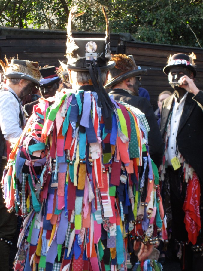
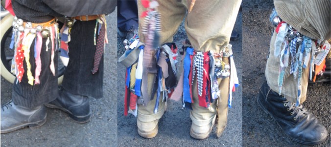
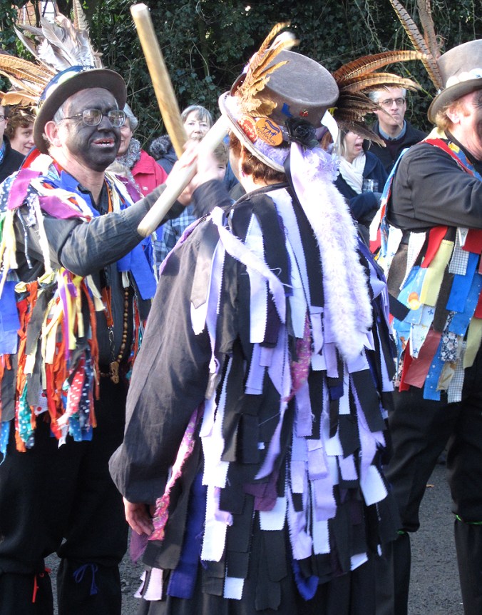
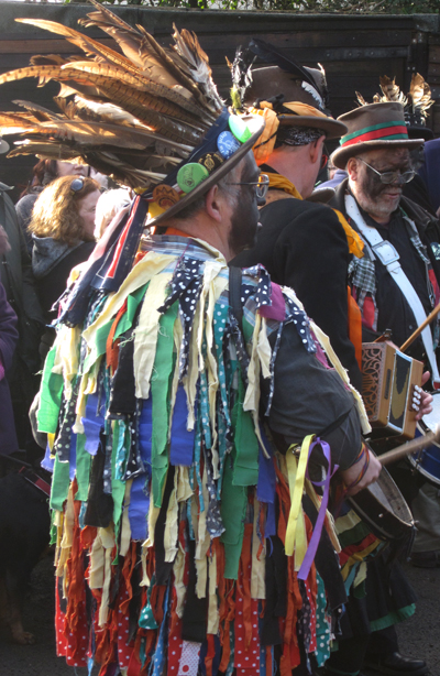
To celebrate the new year we went to Alvechurch to see the Alvechurch Morris dancers who put on a show each New Year in the pub car park of the Crown Inn at Withybed. As well as their dances they also perform their entertaining politically cheeky response to the past year’s news in the shape of a traditional George and the Dragon style Mummer’s play. They were also joined by several other dance groups from the region, all proudly dressed in variations of what you would expect Morris dancers to be wearing. There were plenty of pairs of beige jumbo corduroy trousers, and of course the bells round the lower leg, but the use of the strips of fabrics on the backs of the jackets and the feathers in hats really made it a spectacle of eccentric British-ness some would be surprised to see still in existence.
Having lectured on the subject of textiles for a number of years and having tried to make the education experience not British-centric the experience of seeing the Morris dancers in Alvechurch are a reminder of our own tribal dress; just as interesting, ceremonial, entertaining and socially telling as some tribal dress from far flung corners of the world a long way from here.
Some outfits appear rather more planned than others and its tricky to see if some are trying to look ‘thrown together’ but are to the contrary. Some groups (is there a collective noun for Morris dancers?) stick to set colours and one group of women were a sort of goth vamp group at Halloween with a dash of silver – I mean that in the nicest way! Personally I prefer the more traditional looking ones with a collection of faded what looks like Laura Ashley prints alongside stripes and spots. They look more like a mood board than a dance outfit.
Of course the sound and movement is lacking in the photographs but I hope they go someway to celebrate the dress code found in one small pub car park in the Midlands today and every New Years Day.


 Kate Farley @katefarleyprint