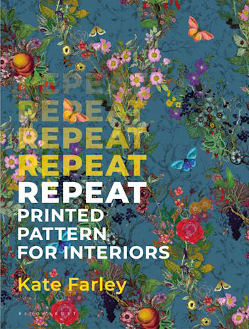
I’m delighted to share the news that after nearly five years in development, we are at the stage of announcing the book I’ve been writing on repeat printed pattern for interiors, with Bloomsbury Publishing is now available for pre-publication order.
The book is a culmination of my design and teaching practice experience over the last two decades and features some historic and contemporary designs and interviews with some leaders in the field including Sarah Campbell, Neisha Crosland, Deborah Bowness and Orla Kiely. It is for anyone who is interested in printed pattern design, including design students. You can read more here.
I’m delighted to be able to feature this beautiful pattern by Timorous Beasties on the cover too.
Thirty years ago I began my art school experience studying a diploma in Surface Pattern, a little unsure of what was meant by the course title, but keen to find out more as it involved drawing, printmaking, pattern and textiles. I thrived at art school, building practical skills and theoretical knowledge, growing in confidence in my ability, encouraged to experiment and play with ideas and processes. When I think back to what I understood of careers in textile design at this time, I have little memory of career planning, or job role research. This was the era of the Yellow Pages; I couldn’t Google it! I made decisions about my degree course based on the fact my tutors suggested I was more of a printer than a knitter or weaver.
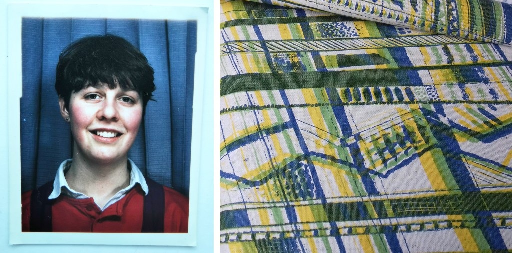
The art school student and the first screen printed pattern
During my degree I undertook a floral print project in the first year and hated it so much I nearly threw it in for fine art printmaking, but then I gave myself a talking to, and realised I wanted to frame my practice in design, to apply my thinking to scenarios, and to problem solve. This has stood me in good stead, both as a designer and academic. I believe the context in which we work is as important as the role we undertake.
I think back to those days and see a very different textile industry to the one we are experiencing now. I graduated at the dawn of digital design, without the range of composite surface materials for interior applications, or bespoke digital production that enabled me to collaborate with Formica when launching my collections in the mid 20-teens. As a freelance designer in the late 1990s I was posting hand painted textile designs in large cardboard tubes across the country to my agent and sending my portfolio out as slides (transparencies) for exhibition applications, hoping they would be returned to save me money and hassle – they rarely were! Thank goodness for the digital cloud of today, allowing files to be accessed around the globe in an instant. Laser cutting and 3D printing have become the norm (even in schools) since then, and expertise in digital software is a basic requirement in graduate jobs. It is easy to take these developments for granted – but our line of work is transformed.
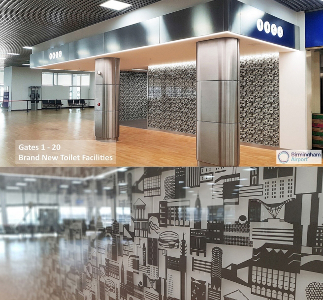
Over the years since that time, I’ve built a career embracing many different opportunities as a designer, artist and designer maker: launching my own brand collections, undertaking illustration or pattern commissions, exhibiting, designing public art (including three large gravel roofscapes and three public toilets!) as well as leading residencies in healthcare settings. I have enjoyed the variety of projects I have completed, building my understanding of several sectors of the industry. Ensuring I remain up to date with industry developments has been key to the relevance I maintain in my academic position.
Birmingham Airport commission, fabricated by The Window Film Company
In the last twenty years we have seen the development of ‘smart’ textiles for medical applications, interactive electronic textiles for military and domestic use, bio-materials and colour developed from bacteria and new design opportunities in the digital realm within the simulated environment – the metaverse, an emerging international arena. At the same time, during a global pandemic we see a resurgence in low-tech craft with textile processes such as crochet and knit identified as beneficial activities for our wellbeing, and a fightback against the consumer culture.
The breadth of opportunity available across the discipline of textile design today is exciting, and fast evolving. Revisiting craft practices for contemporary markets is not new. The Arts and Crafts movement spearheaded by William Morris, advocating for handicrafts and naturally dyed yarn and cloth, was an attempt to battle against technological innovation and the resulting cheap and poor-quality products flooding the market. The current growth of interest in craft practices again connects us to the heritage of making and the close relationship with material and process that nurtures us. Sustainable solutions compete with mass produced problems. Customers are easily overwhelmed by choice and price-points, single use versus something for life – future heirlooms, or landfill. Digital design provides solutions by reducing fabric waste in the fashion industry using 3D digital rendering to identify and fix issues, where previously each garment in each size or colourway would be produced and discarded as products were developed. Craft and technology are not mutually exclusive.
The creative industries we have today were unimaginable to me as a student, and now, I think about the relationship today’s students have with the industry and how far into the future they can imagine. As head of the discipline at my institution I am required to consider the future of textile design, to design an educational experience to not only equip the students and graduates for roles that we know about, but also provide them with the curiosity and creativity to shape the roles we can’t quite define. Ambitious ideas need to be partnered with strong realisation skills, traditional craft and making skills paired with digital competence. Let’s see where the next thirty years takes us!
Construct collection by Kate Farley, in collaboration with Formica
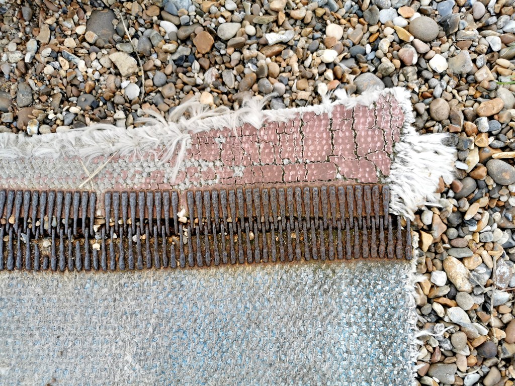
A weekend walk in the search of headspace following a busy week in academia led me to the Suffolk coast and a beautiful 13km walk, down and back, along the beach. Always with an eye on the hunt for pattern, colour and cloth I found all three, relating to the topics of my teaching. Of course I also had a handful of stones and other ‘precious’ detritus.
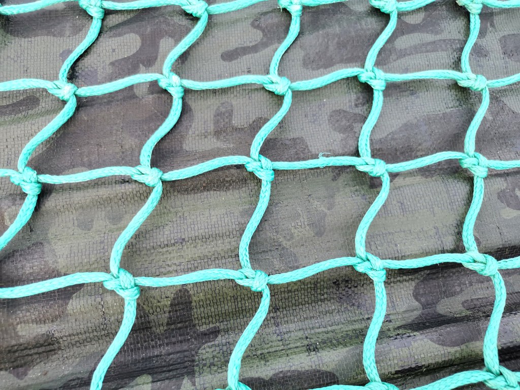
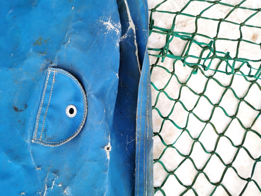
Having spent the week talking textiles, including pattern structures and repeating designs I was amused to connect the patterns on the beach made from the waves running back across the sand being echoed in the fishing nets on the boats higher up the beach.
I have also been discussing with the students the broad application of textiles in the everyday world around us beyond fashion and interior applications and our walk gave me good examples to illustrate my point. We use traditional textile techniques including knitting, crochet, printing or weaving, with the addition of a coating or finish to create materials for practical applications.
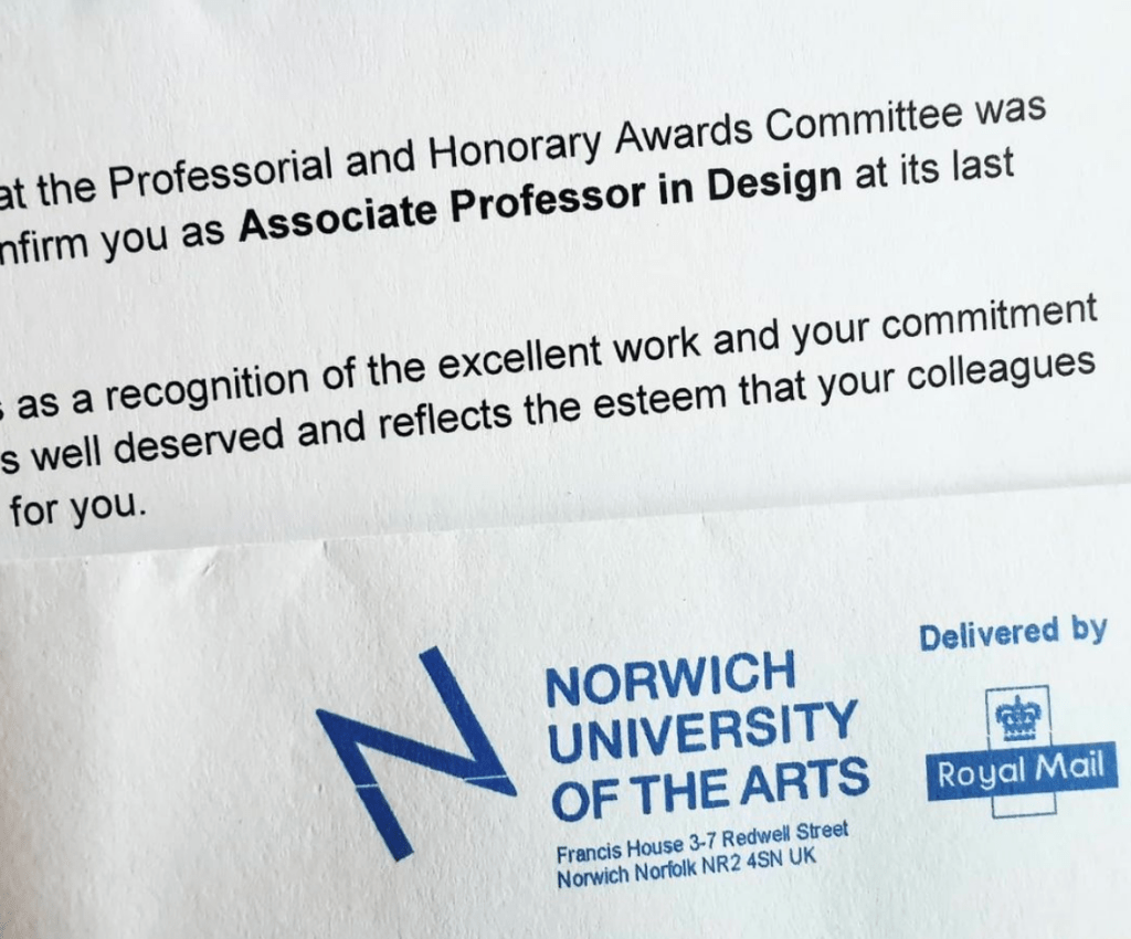
I’ve already shared the news via my other social media channels, but I’m delighted to announce here too I have been confirmed Associate Professor in Design at Norwich University of the Arts. This makes me extremely proud and at the same time reflective about the career I’ve had so far.
At eighteen years old I had very little idea what I wanted to do as a job or career, and considered widely contrasting options of occupational therapy, sports psychology, the army, teaching … something creative …. having grown out of the idea of being a bagpipe player, aged 4, and archeologist, aged 8. There are skills involved in roles across some of these that are required in my current post in academia but equally some a disastrous fit, at least to the me I am now.
Going through art school and university, even the post grad. masters course, I was petrified of the ‘real world’ of work, despite having Saturday and holiday jobs from a young age. I can clearly remember the months I earned nothing as a freelance designer, the humiliation of the job centre line and housing benefit application process, the years of no holidays unless they were working holidays to get free board, and watching peers become adults in an adult world, as I tried to work out what I wanted to do while keeping expenses low and resourcefulness high. The turning point was my first role as Print and Photomedia technician at Central Saint Martins, London, where I met people like me, dividing their weeks with practice and educational roles – this could be my real world too!
Today I can look back over a twenty-plus year academic career and so much makes sense; the joy of hindsight. Since school I have taught at play schemes, Sure Start projects, NHS trust projects, community projects, adult education workshops, school outreach, FE & HE courses. Every project taught me something that informs the educator I am today, and clarified my preferred environment for teaching and learning. For over twenty five years I’ve led a creative practice that has evolved substantially from the one I led in my studio / bedroom in south London, making books at a tiny desk, using the bathroom as a darkroom in the middle of the night, and the print room at CSM when the students had left. Artwork on the London underground network, designs on a huge hospital roof, in an airport, selling products to Japan and America … Projects happen but it’s easy to forget they were all unimaginable to the eighteen year old self. At art school I learned the value of drawing, of playing with the design process, of dedication to make something the best it could be and commitment to colour mixing. Those tutors shaped my rigorous approach to my practice today. Incidentally, my minimalist aesthetic was defined lazy by one visiting tutor I had the displeasure to be taught by – he missed the point I remember thinking, I knew he had got me wrong.
As an academic I’ve learned to continue to learn, continually … One instance: I was thrown in to the deep end to deliver design history lectures to undergraduates many years ago, with no GCSE in basic history, and only faint memories of my own design history education for support – that was a particularly low point. Hundreds of hours investment, much reading and learning, and a fair amount adrenaline got me through those early years. Some students have told me since then, that those lectures were among their highlights, and I feel pleased – retrospectively I can’t help feel grateful to my then boss for not giving me the get-out option. This skill and knowledge is now something I hugely enjoy and benefit from. I love to share my passion for design history – who would have thought? Not the eighteen year old me!
In running my design practice in parallel with my academic career I am busy. It would be easier if I was content to focus on one rather than juggling my headspace and waking hours. I’m not alone in wondering why I maintain both, but it is simple – they need each other, and I need each of them. My teaching is filled with current industry experience, my design practice feeds the lectures, workshops and tutorials I deliver. The design experience feeds my research and my practice validates my teaching. My own creative struggles and insecurities support my understanding and empathy for the students I teach and nurture to be brave soles, out in the real world, like I had to be and continue to be. I love to learn, and if I can share what I learn and understand, I can help others to enjoy the design industry too.
I’ve stood at trade shows, on my stand for 12-hour days, promoting my new collections while checking my uni emails on my phone, to make sure things are running okay in my absence. I’ve spoken to industry partners interested in my work, while at the same time my head is working out how I can link the students to the opportunities they may hold too. I’ve formed relationships with wonderful industry friends who now form a network of support for the graduates I’ve taught. The important thing to learn is that we are all in this, learning together, helping others and together making the world a better place to be. The response to me achieving this recognition has been overwhelming. Colleagues past and present, students and graduates, manufacturers and past collaborators, and so many more people have got in touch – reminding me of many precious moments along the way.
I’m grateful to have this recognition from the university. The contribution I’ve made to both the design industry and academia is acknowledged as valuable to others, and united in potential – and that’s a good starting point for the next twenty years!
As a keen lover of patterns I’m always on the look out for interesting examples to add to my consciousness. I do like a good geometric as well as micro (small scale) repeating patterns so despite being immensely annoyed to find myself back in hospital on a ward for a week I did spot the odd pattern of interest…
I’m interested in small details that make patterns work, and I spend time in my teaching analysing successes and failures of patterns in relation to motifs, pattern structures and repeats to teach the students how to improve their own designs. These NHS designs, printed on fabric for hospital nighties (left), pyjamas (middle) and the surgical gown (right) do demonstrate merit.
Small details on the pyjamas / nighties, such as the spot actually being a hexagon, the less obvious choice, and the squares making up the bigger square block including smaller squares in the darker colour, means they contrast with the larger mid green colour bring visual interest. If the darker squares were the same size they may well appear too dominant. Interestingly, the pyjamas had the green colourway as vertical stripes, and yet the same design in red was placed as horizonal stripes on the nightie. I wonder why this was. Let’s not talk of the fit of these garments! The surgical gown is more simple, but I appreciate the fact that the cross is made up of broken lines, with a small dot in the middle – so much more interesting that if it had been two lines crossing.
These are tiny details that most people will overlook, I know I was probably not the most typical of inpatients, but if you spend any length of time on a ward, nil by mouth for several days your mind wonders. I found there to be a significant challenge in retaining something of myself as a person beyond the sick patient, with all the focus and attention on your health, or lack of. The pattern spotting was a way of still being me.
As I said at the top, I like micro patterns and have shared my collection of envelope insides on the blog before. I like the smaller scale patterns that provide visual rhythms and noise, that get on with doing their job, in a simple utilitarian manner. These patterns on hospital garments also got me thinking about moquette, the hard-wearing fabrics on transport upholstery, and how those patterns signs are there to conceal dirt and wear, whereas these hospital ones with the white background were doing the opposite.
I hope you don’t find yourselves in hospital to have the chance to analyse patterns on your gown, but if you do, I hope you like the ones you’ve got!
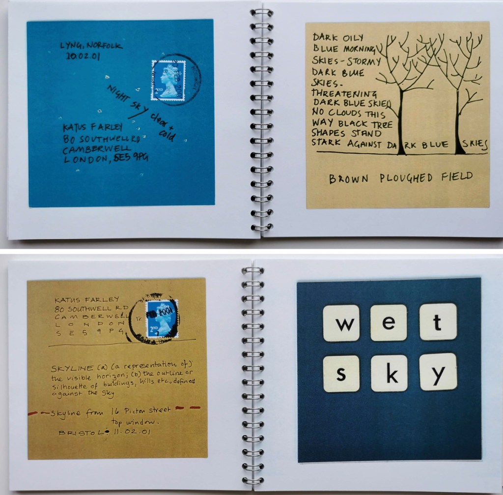
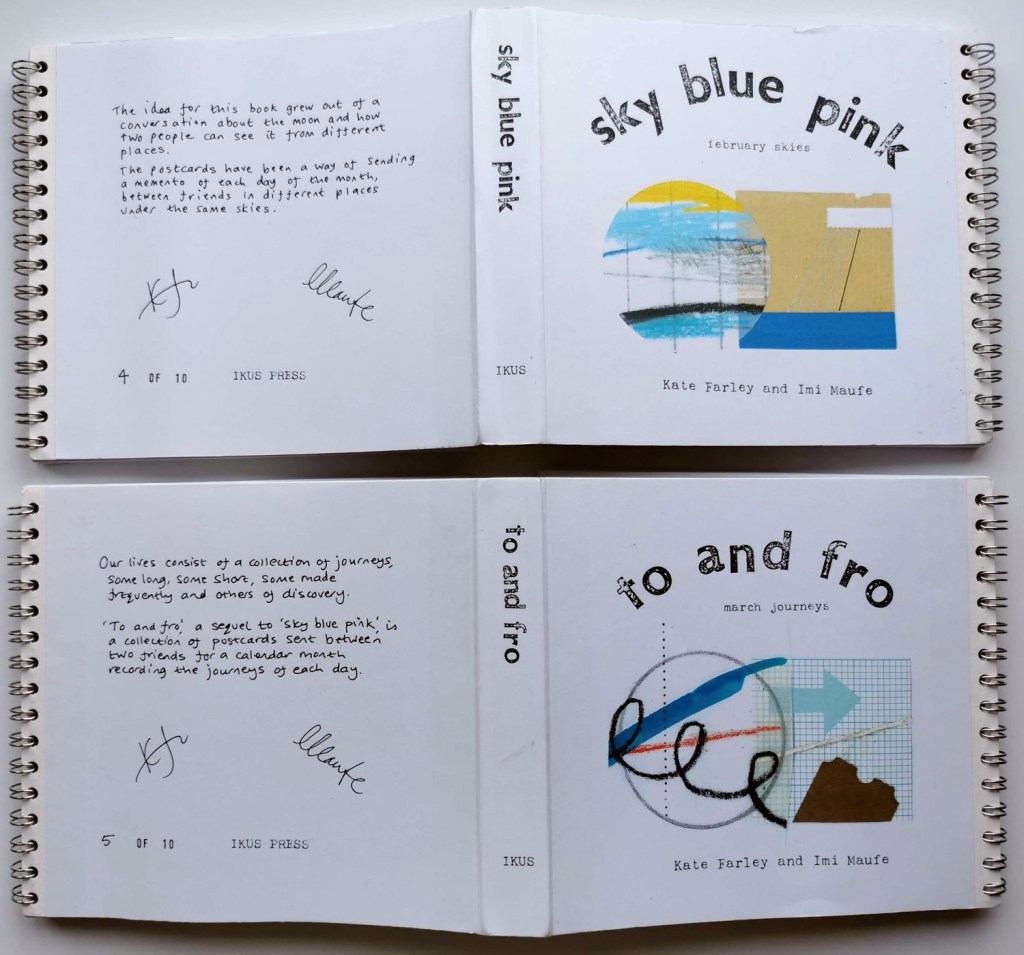
Twenty years ago, in January 2001 two friends established a creative challenge as a way of sharing their days, while living in different British cities, through daily production of artwork. The idea of mail art had already been of interest to them both, and this project formalised the process of sending pieces of artwork through the postal system. It was highly likely that the outcomes would also find themselves featuring in an artists’ book in some shape or form, as so many of our individual creative ideas did at that time.
Rules: Every day in the month of February 2001 we (Kate Farley and Imi Maufe) would make a postcard inspired by the sky that particular day. In fact two identical postcards were made each day by each friend – in case one got lost in the post. The size of each card was agreed to be 11cm square, and it would need to be in the postal system that day.
postcards in Sky Blue Pink, from February 2001, by Kate Farley
February 2001. SKY BLUE PINK
Each day, between Bristol and London, and sometimes Norwich, these postcards crossed the country representing the experiences of lives being lived under the skies of winter. Postcards were made using a combination of image and text, suggesting downpours or sunshine, colours and times of the day. The artwork includes a mix of drawing, paint, printing, photography including a pinhole camera photograph, and collage. Each participant’s creative journey and personal style shines through.
Alongside references to the sky and weather there are details of exhibitions, bicycle rides, parties, shopping, college and work. At one point cards were delivered by hand as they shared a weekend in Bristol. Only one postcard was lost in the system – a post-it note breaks the news.
postcards in Sky Blue Pink, from February 2001, by Imi Maufe
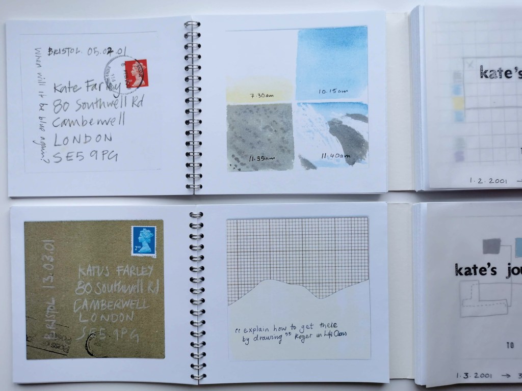
MARCH: TO AND FRO
Having enjoyed the task of finding a few creative minutes, however busy we were each day, to keep the project on track it was decided to try another month on a different theme. To & fro represents the journeys of the month of March 2001, keeping to the same rules apart from the theme, and the interpretation of what a journey could be was up to the individual. Postcards recalling more cycling, mapping around buildings, postcodes passed through, my birthday, journeys by bus, emotional journeys, creative processes and even a Spanish holiday gets a mention. The artwork is varied throughout the month, and between the two participants as with the previous month.
postcards in To and Fro, from March 2001, by Kate Farley
I was working part time as Print and Photomedia Technician at Central Saint Martins in London, alongside design and making artists books, hence the access to the darkroom to make the photogram. I taught pin-hole photography and the view from the 4th floor window at Back Hill across Clerkenwell features. I had bought my Turkish Green Brompton (folding bike) and it gets a mention a few times. Imi was studying in Bristol, and continues her interest in journeys in her practice today.
postcards in To and Fro, from March 2001, by Imi Maufe
In April there was an exciting day when the postcards were gathered and shared. The next stage of the project was to design and construct the book showcasing the original collection of postcards between two friends in order for us to create editions. The book structure needed to show each of the postcards sent on the same day, and reveal the front and back of each. As there were two of each postcard the pages of the book could be designed by sticking each pair of cards on a single page and fold the sheet to indicate the back and front of each card – and also allowing the book to be made and editioned by printing single-sided. My grandma used to say the term Sky Blue Pink and so the phrase became our book title for the weather, and To and Fro was an obvious choice for March.
There was a stressful afternoon of hunting around Bristol-based printers to carry out the colour copying and bind the book. One chap managed to shuffle the pages out of order almost by simply looking at them – we couldn’t entrust the postcards to him – but eventually we found someone who understand the peculiarities of the project and how the two editions needed to be constructed. Wire-binding held the two sets of postcards in individual books, united by the wide and folded cover, nestling the books in to one. They were in editions of 10, published under the IKUS press, formed for this purpose.
both editions: Sky Blue Pink & To and Fro, published 2001
We exhibited these books at artists book fairs, launching them at the International Contemporary Artists Book Fair in Yorkshire and received a really positive response. We sold the majority of the first edition of the books in the first year, including to significant collections such as the British Library, and produced a second limited edition soon after.
This was a time before social media, and today, thinking back over the design process of the book, it’s worth remembering we didn’t have access to scanners and computers, so it really was a rather handmade effort, but I think the outcome is better for it and I can’t believe we are looking at these, twenty years on. Having made those postcards and revisited them again now, it has surprised me how much I remember from those specific days I lived, that I could easily have forgotten entirely if it was not for the act of making time to be creative.
I also take from this, the value of making time to be creative, and to be aware of the world around me. I was busy rushing about but always in my mind I had to notice something and work out how to create the two postcards to visually communicate that day. Maybe I should start this up again, although Covid lockdown makes my life considerably less interesting!
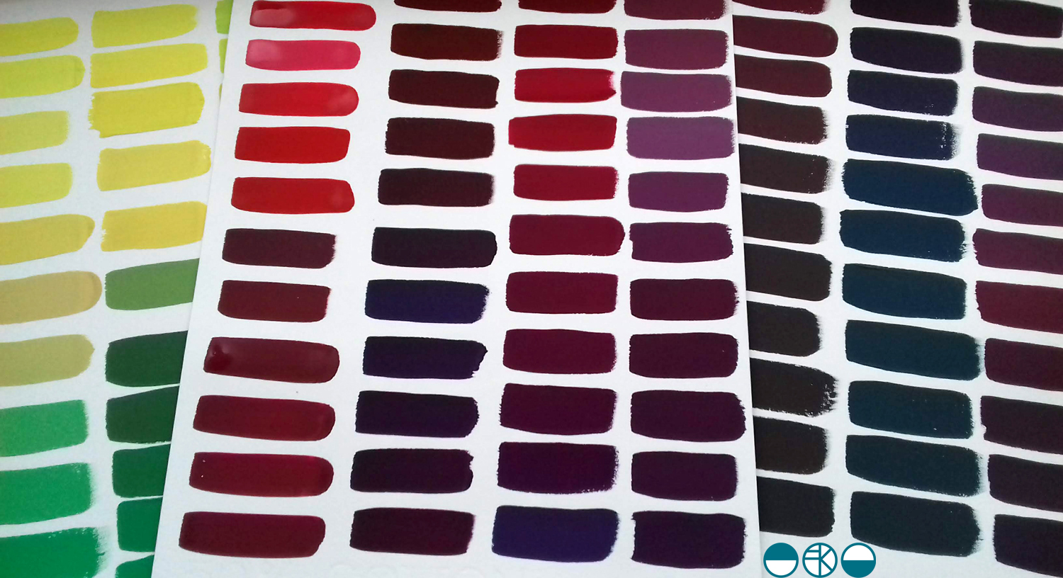
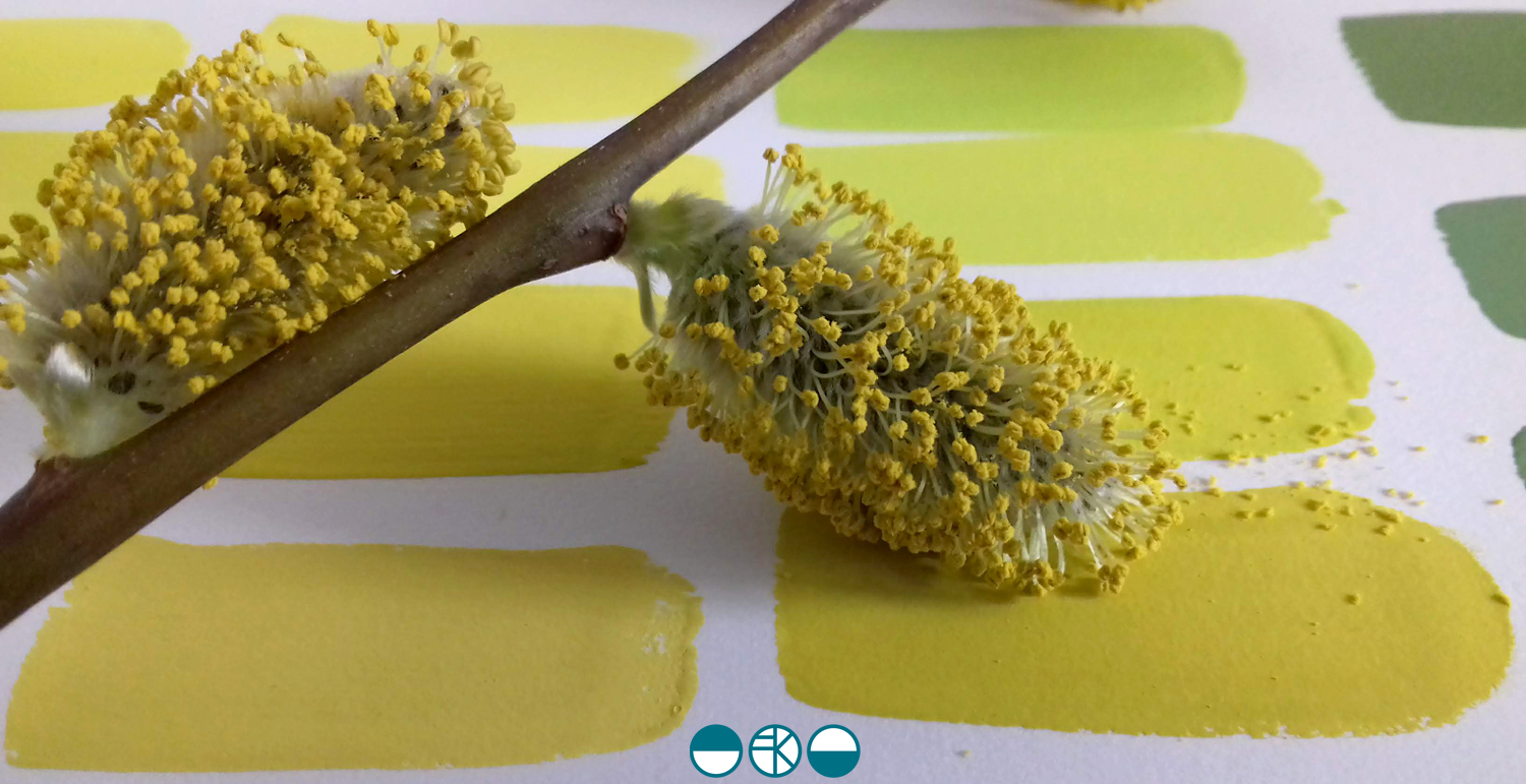
A walk in the Spring sunshine gave impetus to a very simple and mindful exercise back in the studio; to make the colour of the landscape. A sprig of willow contains so many different colours. Those colour qualities will alter as the clouds skud across the sky casting shadows, and as the sun ripens the buds.
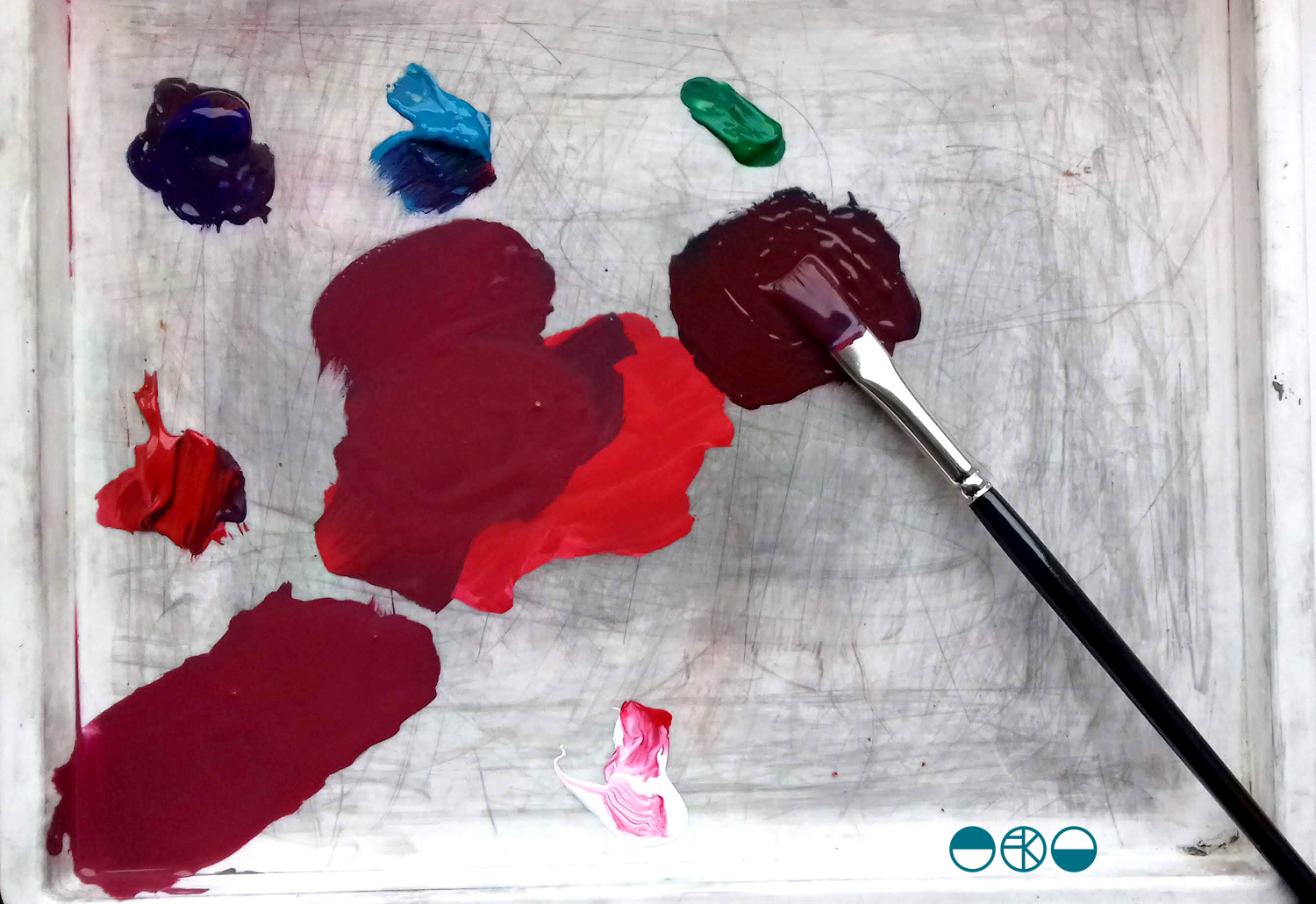
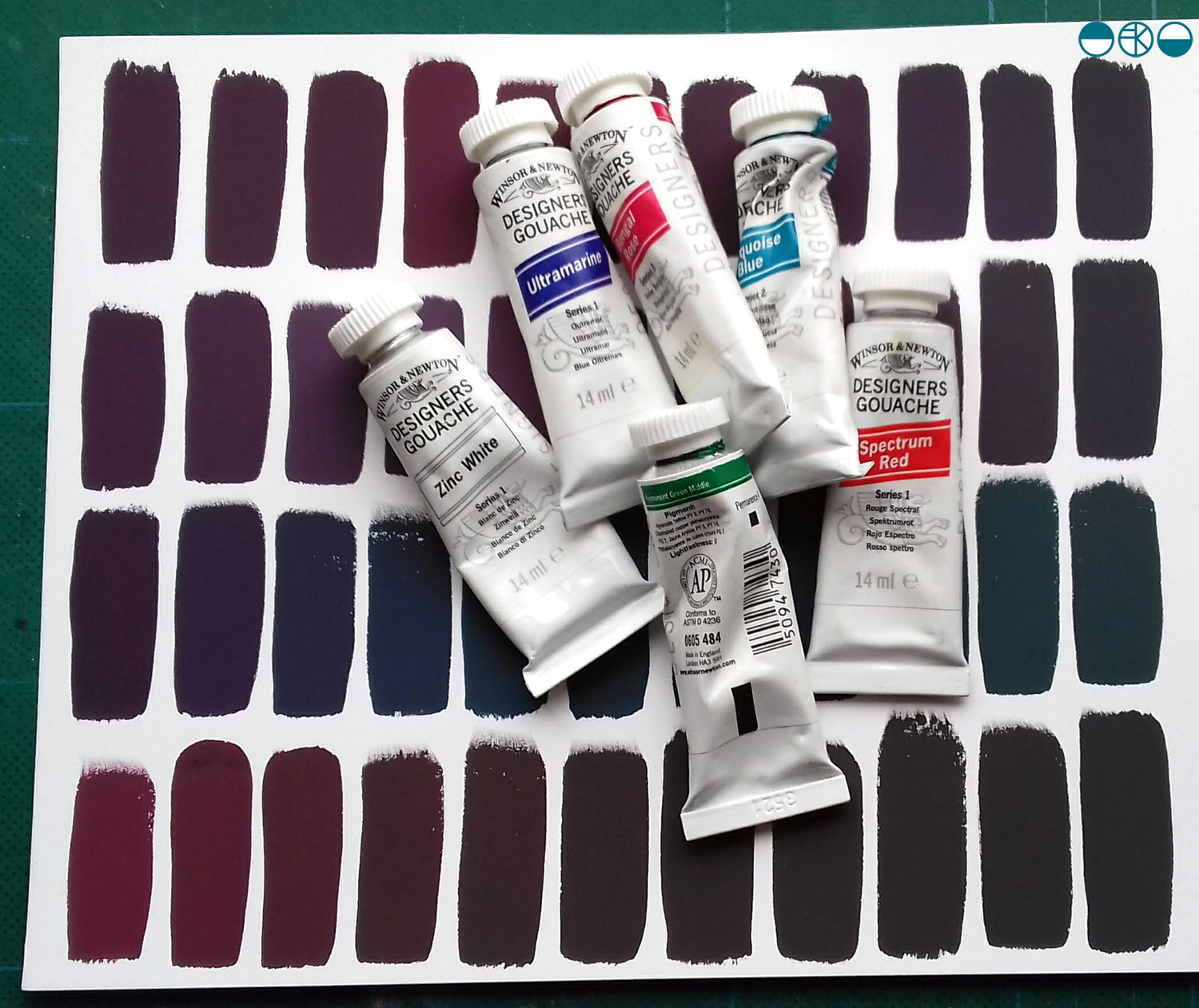
With paints at the ready I knew it wasn’t about making the one colour, but the narrative of generating colour as my process of journeying from one to the next. I wanted to paint each of the swatches of colour I mixed as I evolved the paint story, observing and recording the subtleties of the change in hues. Selecting a limited number of tubes of gouache to begin made it more interesting. To start I selected the dominant colour I was aiming for, and had a little piece of nature with me as reference. I developed the swatches of colour, selecting one, and then another hue to achieve, step by step, slowly and patiently filling the page.
Gouache is a beautiful paint and this exercise reminded me of a wonderful morning teaching colour mixing to BA1 Textile Design students earlier this year. Getting the right amount of water, ensuring the colours are cleanly mixed, and then making that one painted line flat and even – it all takes practice.
I was lucky enough to have excellent colour teaching during my time at art school and consider myself strong at seeing and achieving the right colour mix. At uni I remembering saying to the print technician “it’s nearly right, I’m happy with it”, and she’d say, “Kate, it’s not what you set out to make, keep going until you get there!” I thank her for teaching me that persistence and these days my students know I’m particular (a preferred word to fussy!) when it comes to colour. Getting the colour right is so important and you may as well enjoy the journey to get it right. Textile products sit alongside fashion and interior items made from other materials, and the colours need to match / coordinate, so quitting before you get the right colour may be a sales / employment disaster too!
Interestingly, some of my current students were discussing my approach to colour recently and one shared that I’m not keen on black outlines around shapes in print designs. Another one commented that they hadn’t heard that, but would keep it in mind. I jumped in to defend the comment I’d originally made – a black outline is too obvious, unquestioning, the default, rather like Times New Roman black typeface when you open Microsoft Word. Too easy. I ask students and designers to think about whether the black line is the best for the design. If you think of all the other colours you can use, I think you may find another and better alternative!
At the end of this colour mixing time I am left with souvenirs of the process, memories of the walk and beautiful colour. This is real colour away from the back lit screen I too often see colour from. I shall do this again.
Tomorrow I shall be presenting a keynote paper at a symposium about Motifs at Nottingham Trent University. I’m looking forward to lots of discussions and sharing my own practice-based research including projects with David Mellor Design and Barbican.
Finding a couple of hours to spare in London last month I took the decision to head across the river to the Fashion and Textile Museum, and specifically, the Zandra Rhodes: 50 years of Fabulous exhibition. It proved to be a perfect visit for where my head was at; juggling fashion and textile design in both a design commission and my academic life.
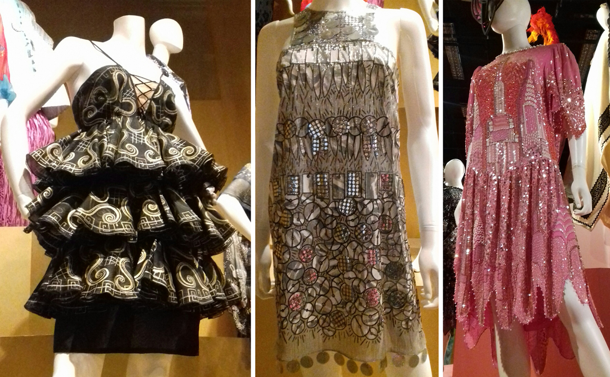
Zandra Rhodes is first and foremost a textile designer although it is her fashion designs that carry the printed and embroidered pattern she is famous for. The silhouettes of the garments, constructed often from multi layered draping fabrics are guided in their execution, in fact dictated by, the pattern design of Zandra’s strong handwriting or pattern, and executed using print processes and surface manipulation.
I’ve included plenty of images of these outfits in university design lectures over the years, discussing how the designer maintains the focused design style and aesthetic but also manages to evolve the work through the decades.
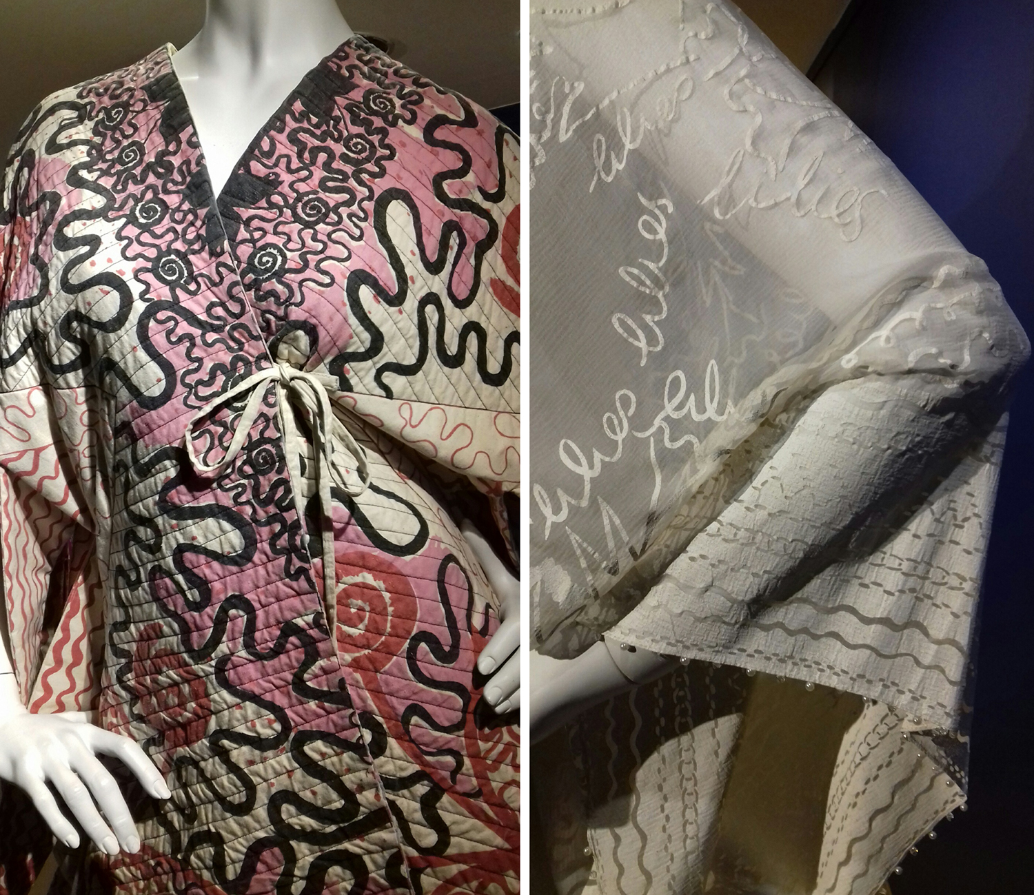
As ever it is very different when you get the chance to see the fabrics in real life. The white printed pigment on chiffon from the ‘Lovely Lilies’ collection (below right) and the quilting over screen printing of her signature swirling motifs as borders and placement prints provides the evidence that Zandra Rhodes is first and foremost exploring fabrics to lead garment design.
The variety of fabric manipulation and surface embellishments was fascinating to see, some rather crude and some pieces held their own more than others. The ease in which the textiles worked as one with the garment design is certainly demonstrated throughout the exhibition, and it was useful to see the screens for printing to see the composition of the designs later on in the exhibition.
The theatricality of Zandra Rhodes’ work was a perfect match for opera costumes, and upstairs in the gallery a number of interesting examples were showcased. I also enjoyed seeing original sketchbooks alongside a film of the designer talking about how important drawing is to her. I hope many textile design students visit the show and take her advice.
There is a significant body of work on exhibition here and it is important to view it as a considerable output of a single designer with a thirst for carnival. Her practice spans fifty years, hence the exhibition title and although her style is not for everyone, her contribution of bravery, exuberance and fabric play should inspire others to take creative risks and find a way to make the work they want to make.
I would also recommend the small showcase of company overview and embroidery work by Norman Hartnell as you enter the gallery – stunning pieces from a different era.
The summer is over and I reflect on one special week away last month that gave me lots of time to think and be creative.
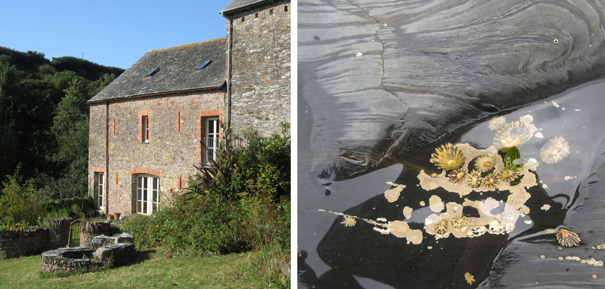
My family and I were invited to participate in a creative field school at Ashridge in Devon, and despite not knowing much about what was in store, we took the very long and scenic route to Devon, down some scary narrow and steep lanes, the car full to the brim, and arrived many hours later, at the most beautiful hidden-away gem of a farm where we settled in for what became a week to remember (Devon via Stonehenge is a long way from Norfolk).
Over the first few hours we met the other intrepid creatives joining us for the time. We were all tasked with delivering one workshop during the week that everyone else, no matter what age, could attend. There were to be some communal meals, talks and evening events including a cabaret – less said about our contribution the better! There was even a printed book we all received ahead of the holiday with a schedule and other useful information in it but once in Ashridge the blackboard outside the studio became our go-to schedule, with times slipping as we relaxed in to the pace of the place. The one clear day from workshops saw us all explore in different directions, and rather unscheduled but special all the same was how we all chose to reconnect with the group when we returned home, back to the studio that evening to share our findings and keep creating.
We learned different skills: from making natural rope using brambles and nettles, we made constructions to share with the group, we made zoopraxinoscopes (animations), boodie-ware picassiettes (mosaic plates), monoprints, ceramic pictographs with rubber stamps, printed aquariums, masks and sashes …
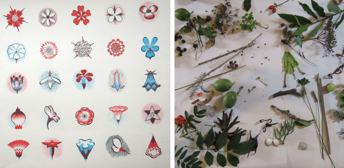
My workshop was called Patterns of Ashridge and I started off by discussing how to draw and stylise natural forms to create patterns, inspired by illustrator Gwen White’s book, A World of Pattern, (left-hand image below) first published in 1957. Everyone committed to the exercise of drawing trees to illustrate a point about stylising through drawing, and then set about gathering things to study for their individual pattern ideas. There were some really successful outcomes completed as folded books, and lots of interesting conversations about what else could be done next.
What felt so special was the shared time; the learning through the workshops and the time available for informal social gatherings. Coffee time at 11am, or afternoon tea was spent clutching the sewing project or nettle cordage as we embraced the new craft skills and helped each other remember what our workshop leader had told us. Having only met a few of the other people before this week, we all took the time to share the experience. We found common grounds; the shared networks including academics in common.
We all appreciated the lack of internet connection and took pleasure in the secluded and peaceful environment of Ashridge. We swam in the sea, explored in the river, picked blackberries and generally appreciated the natural world around us, including newts and owls – it all felt many worlds away from the everyday routines we find ourselves launching back in to as the Autumn comes.
We send a huge thanks to Des and family for such a wonderful and generous experience!
I shall be talking about Gwen White and her books at the Women in Print symposium at the House of Illustration on the 16th September.
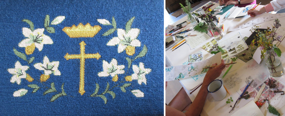
The church kneeler above was from Modbury Church, Devon – there’ll be another post about those in due course!


 I was lucky enough to have excellent colour teaching during my time at art school and consider myself strong at seeing and achieving the right colour mix. At uni I remembering saying to the print technician “it’s nearly right, I’m happy with it”, and she’d say, “Kate, it’s not what you set out to make, keep going until you get there!” I thank her for teaching me that persistence and these days my students know I’m particular (a preferred word to fussy!) when it comes to colour. Getting the colour right is so important and you may as well enjoy the journey to get it right. Textile products sit alongside fashion and interior items made from other materials, and the colours need to match / coordinate, so quitting before you get the right colour may be a sales / employment disaster too!