my motifs in design

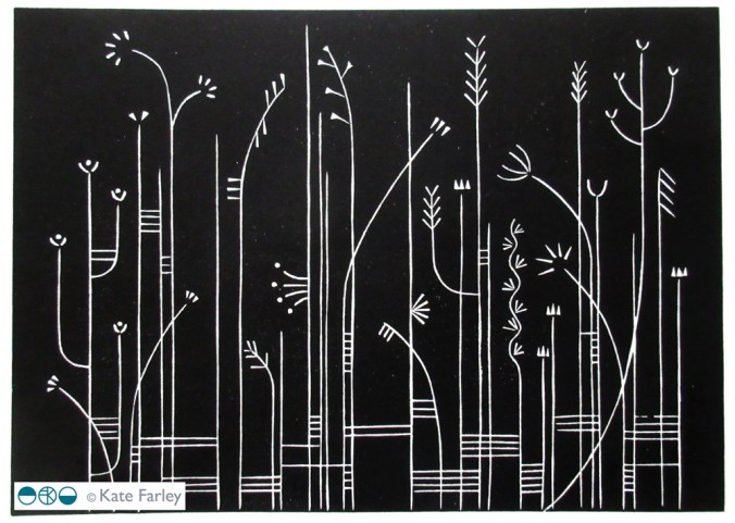
I consider everyday design to be important in shaping our lives for the better or worse, and that includes cutlery design. For regular followers of this blog you will know I like cutlery. My special relation with cutlery started as a child, I collect forks, particularly disposable ones and now as an educator I use cutlery to teach design thinking despite my subject being textile design. I’ve also designed several pattern designs using motifs of cutlery including a collaboration with David Mellor Design.

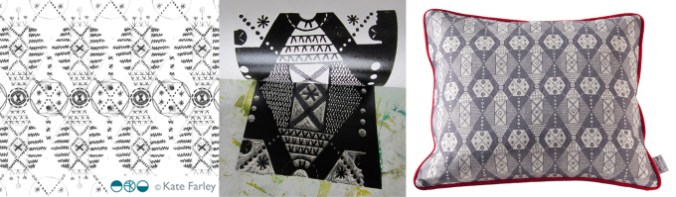
The first time I made a formal design using cutlery I won a prize! I entered Formica’s Design-a-laminate competition in 2005 and won the Retro category for producing “a skillful houndstooth pattern using knives and forks, a reference to Formica’s conventional use if Fifties’ diners and kitchens”, (Blueprint magazine, April 2005). (top left pattern – made by a rubber stamp – see my instagram feed)

cutleryprojectsKF

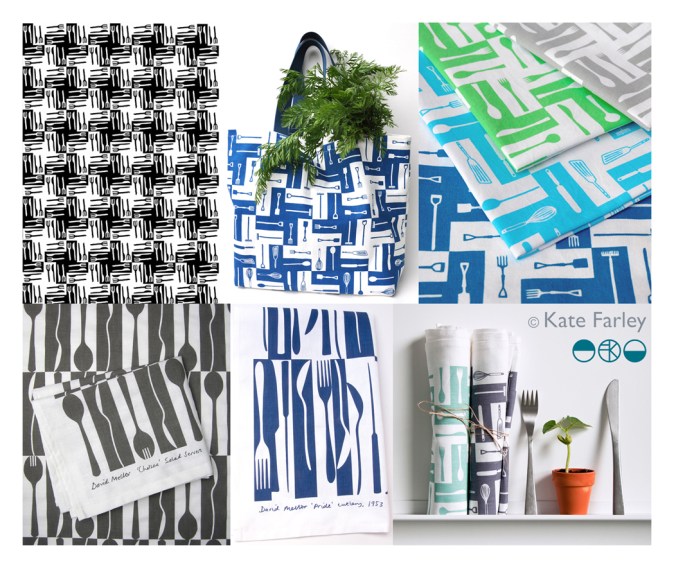
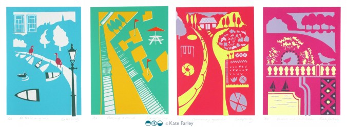
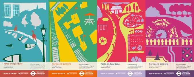
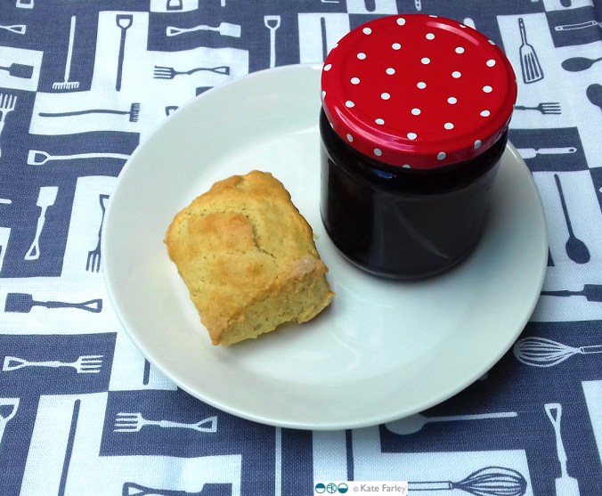
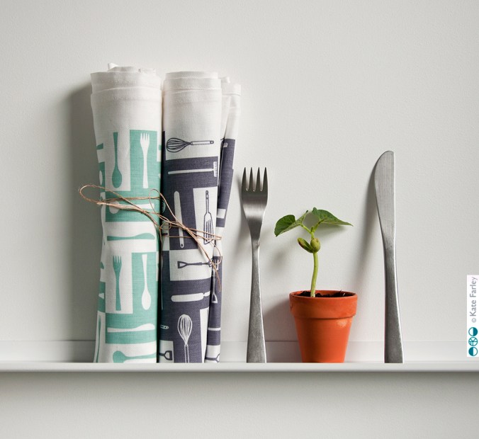
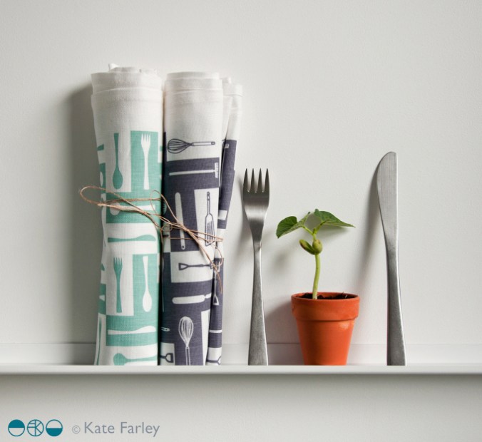
Many years later, in 2012, I launched a new variation of this pattern on gift and home-ware products including a tea towel, and moved the dogtooth check pattern on by incorporating a visual narrative into the design. At the bottom of the graphic I had garden tools such as spades and a rake, then in the middle I incorporated kitchen utensils such as whisks, wooden spoons and fish slice, before topping the design with cutlery – therefore illustrating the journey of plot to plate, (garden, kitchen, dining) using the tools that we use. This has been really well received and I sell through my website and have shown the design at several trade shows and exhibitions. Subsequently I updated the colours to Brassica green and Brassica purple in 2014.

Continuing my design journey of cutlery I approached Corin Mellor to suggest we collaborate on a design to celebrate his Chelsea cutlery in 2013, inspired by the production method of making cutlery and the beautiful shapes of the salad servers. Following the success of this I was asked to create a second design in 2015 inspired by his father’s winning cutlery design ‘Pride’. Both designs of tea towels sell incredibly well both online and their three shops and I’m delighted with the responses I receive – from as far away as Japan!

So why do I remind you of when I designed these patterns…?

With my pattern designs of cutlery out in the public domain since 2005 I received a message from someone I know telling me they had seen my cutlery design on a surface I hadn’t applied it to…., was it new?… alarm bells! I haven’t designed this product! The feeling of being cheated, of being violated, ripped through me leaving anger and frustration at the lack of other people’s respect to a fellow designer – that’s putting it mildly. Don’t get me wrong, I’m grateful for being told, it just took my day in a different direction from my plans. My afternoon was spent searching online to find examples of this product, and there it was… I am offended!

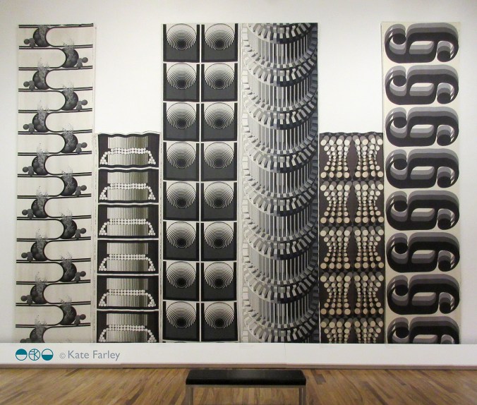
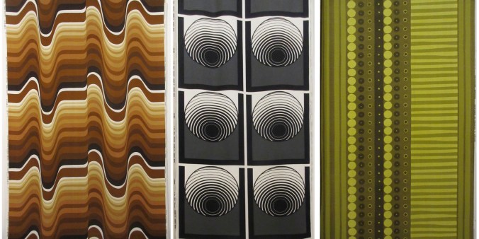
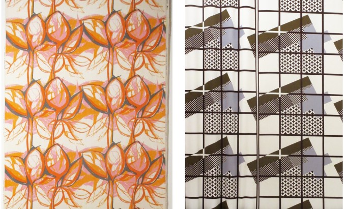
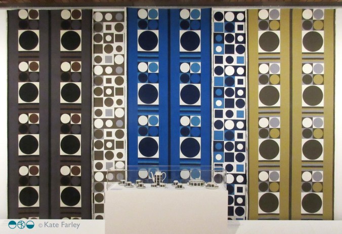
I could take to social media and rant, name and shame and get it off my chest – that’s one way but I’m in a difficult position if I can’t prove someone has copied my work. If I’m not careful I can find myself being accused of slander – hence I’m not telling you the product the design is applied to, but you can see my designs here which gives a clue. You can do your own searches and draw your own conclusions, but please understand why I’m not making wild and angry claims. In the world of design law this is something of a challenge to prove, and having already gone through this with a dear design friend, know it’s a nightmare that is part and parcel of our design careers. The thing is we need to promote our work and get it seen by people. I can’t have a design career while hiding everything.

The internet enables us to share our design stories but also leaves a trail – and at this time I’m grateful my designs are well documented. I pride myself on originality, and for creating high quality designs. The pattern that I believe is too close to mine for comfort lacks any sort of rigour, consideration and refinement compared to mine. If I was going to copy I’d at least make mine better than the original! Why record a cover-version that doesn’t compete with the quality of the first song?

It is always a worry that someone looks at your work and thinks they can ‘take inspiration’ from it. I’m not saying I should be the only textile designer using cutlery as motifs – no way! Both as a designer and academic I take the issue of imitation very seriously, stressing the importance of originality to my undergraduate students to a point they  clearly know my thoughts on intellectual property. If anything, I drive a very wide path clear of anything that can be seen as similar, knowing how damaging it can be to a designer of being accused of copying… there are enough case studies out there! My reputation matters to me.

How can imitation be flattery, as we are told in primary school, if it makes me feel so angry and violated? I’m having to think about what to do next, and also I am rather in need of some time away from a very busy last few months… but I shall seek advice and work out what to do next.

Season’s greetings, and thanks for reading… I’ll let you know next time I design a cutlery pattern! If in doubt, ask…


window film wins gold

In my design practice spanning over almost twenty years I’ve been really keen to test my design skills in relation to different products and this has resulted in me working with some really great companies. I’ve learned lots and have got to test my pattern making skills for the different applications I’m working in relation to, learning from industry partners with their experience and expertise.

I’m really proud of my Construct collection as I set out to combine my interest in constucted cloth (weave in this instance) to inspire a print language, with the final surface designs being applied to hard surfaces. I was inspired by Augustus Pugin’s phrase “truth to materials”, in defiance against fake digitally printed wood-effect interior surfaces and I was interested in presenting a subversive outcome. My designs are not copies or imitations, they are a creative response to the material. I made tools to draw with; forks dipped in ink, relating to the threads of cloth and then manipulated the scans of the drawings in Photoshop to generate the repeat patterns.

KF Construct_blog_p2

When the opportunity came to work with The Window Film Company I was really impressed with their willingness to sample a range of designs and to discuss what worked. We explored the scale of the designs and sampled a number of patterns, resolved the repeating artwork to create the final collection. The products are brilliant, the window film is so easy to install and looks great. The idea of placing the woven textile inspired patterns on the window relates to the idea of hanging curtains. The graphic patterns are soft and calm, and yet provide privacy at the window. I then went on to develop my Threads collection to extend this idea further but employed lino cutting as the visual process, also available at The Window Film Company.

I was delighted to learn back in September that we had been shortlisted in the Best home improvement category at the House Beautiful awards 2017, for both mine, and the designs by Layla Faye, and they were going to be held in central London in November. Last week I went along with some of the The Window Film Company team to the awards and we are delighted to have won gold! It was a complete surprise as the category had some stiff competition, but we are so pleased to have this work recognised.

In the words of Micky Calcott, Director of The Window Film Company, “We’re thrilled to have won gold at such a prestigious and well respected awards ceremony. We work hard to provide customers with products that are practical, but also inspiration and stylish. We’re incredibly proud of our designer ranges and are delighted that our Kate Farley collection has been recognised as delivering something that customers want, enjoy and appreciate.”

My designs have been created with lots of consideration to hand-generated imagery, and in relation to the material it is printed on. The patterns appear straight forward but have involved many decisions along the way, testing the combination of marks and the rhythms that are created, as well as the repeat structures and the positive / negative details. I know the customers don’t have to know the entire creative process to like the designs, but I’m delighted to have the opportunity to reflect on this collection. Winning with this great company is something I’m really proud of. Thank you to Micky and the team, as well as to House Beautiful!WindowFilm_awards17

limited edition prints from posters

Following the success of my four posters for London Transport Museum, currently on the network of London underground stations, I have been asked by Michael, the commissioner, to edition the designs as screen prints. I jumped at the opportunity, and embraced the task!

This has been an interesting challenge because although the artwork for the posters was made using paper cutouts, one great joy of digital print production means you don’t have to separate each colour to print; CMYK does it’s thing. However, screen printing requires far more consideration of separate colour on each of the layers as well as registration – the accuracy of each colour layer when printing. Overprinting can result in muddy colours if not fully considered. For the editions of prints I made some artwork adjustments on Adobe Illustrator enabling me to create the positive artwork for each of the four colours in each print, ready to expose photographically on the screens. You can see in my composite image, top right, the black print on acetates which are the screen positives, that I used to expose the images.

poster_print_processlayers100dpi

I love mixing colours to match my references and I take pride in not using colours straight from the pot, but to always see the nuance of hues. I make colours darker using purples and greens, rarely black. I used the final posters to get the right colours, and daylight is always essential. Ink and paper surfaces always give different qualities to contend with too. The final colours are certainly rather bright! Screen printing on paper is also very different to screen printing on fabric, so you have to get your head around the differences including remembering to flood your screen (pulling a layer of ink across) between each print, and using the vacuum on the print bed (to hold the paper firm).

However tired I am, when I am printing I am absorbed in the process – rarely noticing hours passing, and missing the need to feed. This is a good thing as my week as been ridiculously busy on all sides. Printing requires systematic thinking, and at least one clean hand. Preparing screens, mixing colours and registering each colour on the acetate first all needs to be organised. I love it when I’m in the rhythm of editioning.

A deadline to hand the first print from each edition to the commissioner this weekend focused the mind, and when trimmed, signed and wrapped I was really proud of the prints. I was even more pleased when I met up with Michael to give them to him. He appeared to be joyfully moved by the results – holding one print up to the fellow coffee drinkers in pride… phew! They are off to be framed and auctioned at a London Transport Museum event at the Victoria and Albert Museum later this week.

This whole project has taken so many months (years) to come good, but throughout the process I have felt trusted by Michael to do what I do best. He has great confidence in his choice of designers spanning the years, and allows us to get on with the job without interfering with the outcome. His twenty plus years of commissioning poster designers has led him to influence the direction of graphic artwork on London underground, creating the archive for the future through the choice of creative hands and minds, but not by telling the designers what to do. It takes trust and judgement on his part, but in turn I think I’ve created my best work yet. In the many conversations over these years I’ve had with Michael he listens, he wants to hear my opinion on things; we have good discussions – he knows about a lot of things. He also often gets carried away with future ideas and possibilities – I like that, we should all get excited by ideas. Thanks Michael!

LTM_poster_prints2017_1_150


poster proud

Every designer is likely to have a goal or two, a particular ambition to aim for. Last week I reached one of mine… I have designed posters for London Underground. They are up on the system as I write. I’ve been bursting to share the prospect that this may happen for several years, and now it’s real!

The underground poster archive at London Transport Museum is full of great examples of graphic design, with work by my heroes such as Edward McKnight Kauffer and Abram Games. These designers have inspired me in my quest to explore visual communication through print and pattern for as long as I can remember and now my design work is on the network hopefully catching the eyes of commuters in London, as theirs did.

I was pleased to be given the brief of ‘Parks and Gardens’ and was keen to move the visual qualities on from my Plot to Plate collection of kitchen gardens and parterres, although you may recognise in poster 3, ‘Community Gardens’ some of my motifs from that time. I have continued to play with elevations and perspective, while giving a polite nod to one of the other poster giants, Tom Purvis, whose poster I’ve had on a wall in our home for more than a decade, enjoying it every day. His series for LNER, ‘East Coast Joys’ appears to be made from cut out paper, the picture is made from flat colour in bold shapes. Having used this method for my commission for the Barbican last year I was keen to explore this again. You can see in my first cutout sequence I did begin to connect each poster to the next, as Tom Purvis had in his 6 LNER posters but I found this limited the scope for each poster composition in this instance.

KateFarley_ParksGardens_book_100

I began by gathering lots of imagery by making drawings and taking photographs and considered four different approaches to parks in London, one for each of the posters, from traditional activities such as rowing, to pitch & putt and the formal model boating lake. I wanted to create nostalgic content combined with a contemporary aesthetic. I remembered a hot day rowing on the Serpentine with a friend, I thought of many visits to Brockwell Park and all the different aspects of the ‘rooms’ it has within it. Greenwich was also an obvious one, Clapham Common and Hampstead Heath too. The posters represent lots of different aspects of parks, not four specific ones, and only one suggests a particular skyline looking across at the city.

Once the initial ideas were set I began to cut out the posters as general compositions, as well as single details / motifs to add. I combine both traditional drawing skills and digital manipulation in my practice, and this is how I worked here, scanning in paper drawings (cutouts) and subsequently working in Adobe Illustrator for final compositions / print artwork. I was able to make changes as required, including colour and motif placement options.

KateFarley_papercutouts_LTM17

As a designer I’ve always loved working across different surfaces and products, working with the industry experts in order to learn the best approaches and pitfalls of each context. Posters are large, but someone may look at it for less than a second… it needs to grab attention without being noisy. Large areas of pale colour might encourage graffiti… edges are as important as the centre, and so on. For people who have known my work for many years the look of the posters might not surprise, but my more recent work has been much more graphic, and understated so maybe some of you may not see these as so clearly of my handwriting. Let me know what you think!

Once I was told the posters were going up I had to go and find one. Luckily I was in London for the Design Festival so with wide-open eyes I took to the system and eventually found my first one at Embankment. I’m not sure I can put in to words what that felt like – I wanted to point and shout they were mine! The ticket barrier chap kindly took a picture of me alongside ‘playing a round’. Later that day I came across two more at Euston, and friends have let me know their sightings too!

KateFarley_ontheunderground_pics100

Design projects can take a long time to get to fruition, it is not unusual for years to pass. This can be frustrating when you want to shout out and tell everyone what you’ve been doing in the studio each week. I am always mindful of what I can share on social media, respecting my clients who might want to have control over a specific product launch. Now the posters are up I’m delighted and proud to shout about it… let me know if you see one on your travels!

parksandgardensPOSTERSseries100

You can also buy them from the London Transport Museum shop.

Pattern appreciation at the Whitworth

The Barbara Brown exhibition at the Whitworth in Manchester is really worth catching, especially if you like patterns.
The layout of the gallery enables an overview; the broad visual statement of the textiles designed by Barbara Brown during the 1960s and 1970s, to be seen straight away and makes for a striking sight. Large-scale pattern in different colour-ways jostle for attention and yet the small gatherings of textile designs within the gallery also create more local dialogue for consideration. The repeats are large, not in the Marimekko sense but larger than we often see, taking the full width of the fabric to do the talking. Seeing the textile lengths on exhibition really shows off the bold rhythms of each pattern.

BarbaraBrown_prints

The designs on show demonstrate a variety of motif units across the fabric, some halved, some quartered, others full width. The corner of the gallery most impressive in my opinion was the monochrome series that really pushed her design prowess forward. Although strong graphic statements, these are far from flat patterns. The curves in Ikebana (below left) and Automation (below, third from right), both from 1970, differ in how they control and divide the space, toying with depth and dimensions. There is a sense of sci-fi and computer generated environments across this mono-chrome series. Escher should also get a mention as the optical illusions on the architectural scale appear to pay homage to him too.

BarbaraBrown_mono1_120

I have my favourites, but I really want to highlight the breadth of pattern compositions here. The design statements include many geometrics with cubes, columns and dots. There are stripes, spots, architectural themes and florals. I see more than a hint of Op Art, Psychedelia and modernism across the printed fabrics, some more than others, but the designs appear experts at communicating the populist aesthetic of those years.

BarbaraBrown_3

As a teaching aid for textile design, this exhibition does rather well. Design students can understand the potential to grow large repeats rather than stop at small ‘plonk – plonk’ designs we see far too much of – maybe a result of designing on computer screens. Designers need to understand that even domestic interiors can cope with so much more than a motif 10cm in diameter. Brown’s shapes are also not always contained by outlines, and this presents bold, solid shapes that hold their own. Colour statements include monochrome and full-on colour including oranges and blues. There is a sense of the colour palette dating the patterns but the combinations communicate bravery. The monochrome designs have a very formal spirit, and although different in style do remind me of some of the black and white, large classical columns Timney Fowler print designs of the 1980s.

BarbaraBrown_textiles

Barbara Brown was working in a very different time, and artwork was not created in Adobe Illustrator or Photoshop. Hand drawing full-scale repeats gives you a very different relationship with pattern compositions. Some designs appear not to show signs of drawing, but others do, almost standing out for doing so – particularly Sweet Briar, 1959 (above left).

The exhibition was dominated by the printed fabric lengths but a couple of later knitted pieces offered an insight in to the designer’s creative career progression, and reminded me of the direction Lucienne Day took with her silk mosaics, making a clear distinction away from the commercial print designs. The juxtaposition of some small ceramic pieces next to fabric lengths offered an interesting pause for thought too. Would you have matching china and curtains? Maybe not, but the patterns held their own at both scales and on the different surfaces.

BarbaraBrown_dots_120

This is one of those examples of why you need to see exhibitions in the flesh, and not rely on the computer or phone screen to do the job. Seeing Barbara Browns patterns are eye-catching on a small screen, but they are far more impressive in this setting.

The exhibition is on show until January 2018 (and they always have several interesting things on at the same time – and I can recommend the cafe!) NOW EXTENDED UNTIL MARCH 2018

http://www.whitworth.manchester.ac.uk/whats-on/exhibitions/currentexhibitions/barbarabrown/

Plot to Plate season

Apparently it’s National Allotment Week, but having an allotment is an all year round commitment. It is however this time of year when the winter trips to dig the heavy clay soil ready for the Easter planting pays off, and all the trips returning home with only muddy boots to show are forgotten.

We are having to visit the plot at least twice a week to stay on track with harvesting. The currants and gooseberries are picked, eaten or frozen. Strawberries are only a memory along with Wimbledon, but potatoes continue to be dug. We’ve had too many courgettes for what feels like months, but probably only weeks, we’re coming to the end of French beans, but have the runner beans in full flow.  Raspberries have given us the summer stint, and now, along with the blackberries show us signs we are in late summer, heading for Autumn. I’ve already cooked too batches of blackberry jam, and cream teas are regular occurrences at home!

KateFarley_plottoplate_scone_blog

It’s not all going smoothly! We are having no luck with getting parsnips growing; I fear winter roasts without them! The brassicas are being harvested by slugs and butternut squash had better get a move on if they are to deliver ahead of the frosts. Domination of certain weeds make it difficult but I’m determined not to be beaten – we garden organically but there are times I dream of chemicals! We’ve also realised that although growing purple potatoes (Blue Danube) is rather novel, it’s very odd eating purple mash potato and we are not so sure we like it.

KateFarley_bluedanubepotatoblog

Five years ago I launched my Plot to Plate collection which is a celebration of home-grown food. It is a collection that shares my interests of gardening and pattern design, with products on interior and gift products. Limited edition prints initially investigated the motifs used in the repeat designs. You can read more about the Plot to Plate collection development here.

Having an allotment is a great way of being in touch with the seasons and being in tune with nature. I once heard the chap on the next plot to ours exasperated as weeds covered his once tidy plot that he had left alone for a few weeks. He said he was not going to be bossed about by nature… he quit within the season! I sometimes feel that it’s an extra burden in my busy schedule, but once I’m there, digging or harvesting, those thoughts are put aside. The community of the allotment holders is also great. Today I was discussing our successes and failures, and soon the offer of spare brassicas was made and sweetcorn varieties were being recommended. I’ve written before about the good feeling of sharing allotment produce excess before.

KateFarley_Plottoplate_ttowels_blog

My Plot to Plate collection has grown since 2012, far beyond my original intentions, but I’m really pleased with the evolution. I’ve made drawings of many kitchen gardens over the years – National Trust’s Upton House & Gardens remains one of my favourites, along with Hanbury Hall. My tea towels that celebrate the journey from plot to plate with drawings of the tools involved has inspired lots of my design work since then too, so they make me proud.

So here we are celebrating the allotment, but it won’t be just for this week, it’s a collaboration with nature after all and I’m in for the long haul… happy harvesting!

KateFarley_runnerbeansky_blog


time and sketchbook time

At the moment I’m juggling lots of different projects; one has been years (really!) in the making, another much quicker, straightforward and some more ‘surprise’ projects. They all have different requirements of my time, and in each week there may be a telephone call to a manufacturer to discuss things with, an email exchange between a client and myself to clarify details of a brief, or a call to a stylist / marketing team to plan a scheme for the future with, and the usual trade show sales team call! This all takes time, and different skills to manage.

A different skill altogether is to maintain a practice that, at the heart of it, seeks to challenge, engage and inspire the creative self that was the reason I set off in this direction at the start, twenty years ago. The sketchbook is the place I go back to, the safe place I can explore those ideas in, old and new, that keeps the journey going, the continuum that is my creative practice. Ideas do evolve over time, and the sketchbooks are testaments to the ongoing inquiry that may lend itself to something commercial in due course, but is not the reason I do the drawing in the first place.

In my role of design lecturer I regularly explain the uses of a sketchbook, the hows and whys a designer may approach the mental and physical task of working in a sketchbook. Retro-filling the pages that have post-its in saying ‘research’ needing to be completed the day before a hand-in lacks rigour and purpose, a scrap-book mentality is not necessarily the best use of printer credits unless you really do look and reflect on the relationship between your work and someone else’s. Dare I say it, I enjoy the task of working on a new white page, and see the potential, not the fear. I don’t often share pages of my sketchbooks, but here’s one page from this week in the studio, having gathered new ‘material’ at the weekend, furthering my ideas for my Grasslines print series…

I say let’s celebrate the sketchbook, the real one with paper pages that doesn’t require likes, favourites of retweets to be justified, the one you do for you. Why / how do you use your sketchbook?

sketchbook_grasslines

yellows

I’ve always enjoyed working with colour; choosing combinations, mixing inks and matching colour. I am interested in how we relate colour to brands, how colour suggests quality, market levels, football teams, trends, and this week in particular political parties. Sometimes people say they do not really like colour – but what they often really mean is that they don’t like strong and vibrant colours, but in my mind bright colours are no more important than the whites on white; equally powerful if used well, just not so extrovert.

KFarley_TfL_tiles100

I like seeing the way an inky grey sky makes fields of corn glow golden, and how the crepuscular blue sings out before the night sky takes over. Relationships that colours have can bring connotations, evoke distant memories and create moods. I remember a bag of hand-me-down clothes was excitedly torn open by my twin sister and I, hoping for fabulous new items to wear – in the eighties, when what was actually presented was everything brown and purple – from the previous decade. So disappointing!

Getting the right colour isn’t about a broad brush of red, it’s about seeing the nuances. You’ve only got to see a sale-rail to see the buyer got the shade of mustard a bit too green, or the pink too candy, and not blush. Any colour can vary hugely, our personal perception of colour not only is affected by the technicalities of sight, but also our own relationships with colour, built on past experiences. It took me a while to wear navy, having had to endure it for school for several years.

A friend described my ‘black’ screen prints for the Barbican, and I had to explain it was actually dark grey – it makes a considerable difference to the final result, but if both examples are not shown side by side most people would be none the wiser that the designer made a conscious decision to make a grey look not quite a black.

So here’s some yellow, photographed in Norfolk a few weeks ago. Enjoy, what ever it means to you!

KFarley_yellow_norfolk100

drawing grass lines

I’ve written many times over the years on this blog about the themes that underpin my work, the approaches I take to develop new work, and the things that inspire me. Here I look again at the process of evolving ideas and visual language, to introduce my latest series of prints.

As I develop ideas, often in series of works on paper before any design solutions are considered, I explore the visual language of the subject through drawings, photography and printmaking. The aesthetic nature of the new work evolves and is tested in relation to compositions and rhythms. My knowledge of pattern design, in particular in relation to textiles, feeds this investigation. The motifs, the linking forms, the negative and positive shapes and the quality of line can suggest relationships with historical styles, international influence and contemporary trends. As a designer I use this knowledge to sometimes avoid, and sometimes align to this language, communicating a context far beyond the printed paper I create.

On a cycling and camping tour around Denmark back in 2004 we came across a small book shelf in the campsite shelter containing a range of books. I can’t read Danish. We picked out a few, judging them purely on the graphic design of the spine, and I found a science book of beautiful diagrams of plant structures. I have a photograph somewhere, but the impression those diagrams made on me does not require me to see that page again. I remember the look of those diagrams, and they have fed in to this collection many years from then.

Mid C20th pattern is also something I am interested in, and for this new body of work, particularly the development of stylised florals and diagrammatic interpretation of plants. Lucienne Day was particularly expert at creating designs in that manner, with simple black lines, herself inspired by Miro, Kandinsky and Klee. This is why it’s important to be aware of what has gone before. Not to imitate the past, but to take courage from previous developments in drawing, stylising and pattern making, so we don’t recreate the past, but so we push forward with our own journeys, liberated by not inventing the wheel. I was amused to discover the current exhibition at the brilliant Whitworth Art Gallery in Manchester is Lucienne Day: A sense of Growth – it seemed uncanny!

My photograph collection, both in print and digital form, contains many pictures of reeds; Danish reeds, Norfolk reeds, anywhere else reeds. I also have many records of grasses, and have always been attracted to the structure of such plants. These are often the unloved weeds that may be irrelevant and overlooked by many, but I come back from walks with handfuls of lines, some with seed heads, some without, but always lines of grass, as if nature had fun drawing them. Different stems, leaves and weights of line, and some suggesting very distinct natural habitats. I’ve always been more interested in line quality than texture, and my work over the last two decades demonstrates that very clearly.

KFarley_drawngrass

So that was a long-winded way of saying that this new series of works has been a long time coming, but makes perfect sense to me. I didn’t set out to create drawings of grasses, in fact I started screen printing flowers, but this evolved as part of the create process that is play. Colour came and went too, so as not to detract from the lines. There are some similarities with my threads printed editions and I have had the prints next to each other today – I think they make an interesting dialogue. This is the journey of idea development, by mixing drawing, thinking, printing, reflecting, contextualising, and doing it all again. By the way, this bit of the creative process is one that is very difficult to teach design students, more so with less and less studio time, and a full to bursting curriculum, but knowing your own creative process is halfway to success in my world. Take risks (it’s not rocket science we say) and work at playing.

KateFarley_grasslineslino

I digress. These few prints are only the start of this series, I already have new work evolving, but other projects are jostling for my time in the studio, so for now, I introduce you to Grasslines… and now you know a bit about how they came to be.

KateFarley_Grassline3

gardening spirit

As this is the start of National Gardening Week it seems appropriate that I reflect on how important gardening is to me. Growing up in a gardening family, with a self-sufficient attitude to growing vegetables I suppose it was inevitable that one day I’d have a garden of my own to tend. For years I’d visit mum and be walked around the garden having updates on the state of things, nodding but never knowing the names of things, but seeing the pleasure the process of gardening gives to her. Now I understand.

Here in Birmingham we have an allotment to grow the vegetables and fruit in, and we grow flowers in our garden. We have spent over a decade digging and harvesting plot 8; learning to respect weeds for their various ways of making their presence known – I still want to try weaving couch grass. The feeling of success when we pick the first strawberries of the year, or fill the rucksack with runner beans that can be filling the freezer for wintertime is certainly worth the hours of graft. Last weekend I picked over a kilo of purple sprouting, and we commented that the harvest would probably cost well over £10 in the shops, as organic produce – but with no plastic wrapping or air miles included. Of course our food tastes so much better too! Gardening spells out the seasons as we check for frosts, or pick the first fruits, and enjoy the harvest and flowers of each changing month. The beds of wallflowers make me so happy this time each year, signalling the excitement of the growing year getting underway.

wallflowers_katefarley_blog

It was at the allotment plot that I first developed my pattern collection ‘Plot to Plate‘, launched in 2012. I had been drawing the allotment beds on the site, as well as National Trust kitchen gardens for a while, and a language of graphic pattern made from lino cuts evolved, firstly as limited edition prints, and secondly as motifs to explore repeat pattern with (for example: Plot to Plate VVV textile design – final image with the Auricula). The title design is slightly different in the fact that it was hand drawn, and is an over-sized dog tooth check featuring tools of growing, cooking and eating, such as garden rakes, spades, whisks, wooden spoons and cutlery as a visual narrative up the tea towel, celebrating the journey from plot to plate – available in Brassica green or Brassica purple. plottoplate_ttowels_katefarley150

This collection has evolved to incorporate more formal pattern compositions such as Parterre (below) and Hanbury, inspired by National Trust’s Hanbury Hall and Gardens in Worcestershire, featured on hand screen printed cushions and wallpaper, where I make links between pattern design for textiles and formal garden design.

parterre_katefarley_150

These days my design practice has moved away from the inspiration of the formal gardens but I continue to dig. Our potatoes are in the ground for this year and the greenhouse is working some magic. Gardening provides me with not only creative inspiration but also head-space – a highly valuable asset in today’s world. As a designer and an academic, juggling a young family too, things can be frantic and I’m often running for trains. Faced with two hours of hard clay to dig I’m actually very happy. I can focus on the job in hand while chatting to the friendly robins, making myself physically tired, seeing the result of the work, and at the same time having time to think and mull over some of the other stuff of life. There’s also the sense of community with other allotmenteers; we share the same weather and battles but also share the excess harvests. Every time we get to the point of questioning ourselves about the allotment and if we have time, I remember all that it does for me, how my hard work there actually keeps me well; gives me a sense of well-being I can’t imagine getting from anything else. I shall keep digging, and knowing, for so many reasons, why I do!  Happy National Gardening Week!

vvv_auricular_katefarley

Save

Save