In my design practice spanning over almost twenty years I’ve been really keen to test my design skills in relation to different products and this has resulted in me working with some really great companies. I’ve learned lots and have got to test my pattern making skills for the different applications I’m working in relation to, learning from industry partners with their experience and expertise.
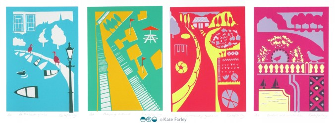
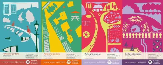
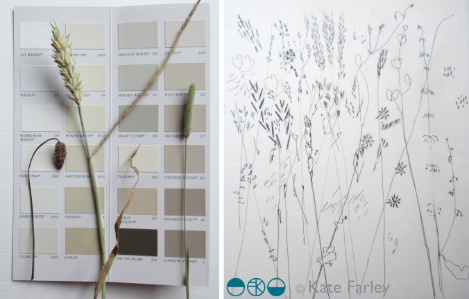
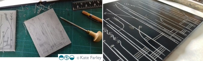
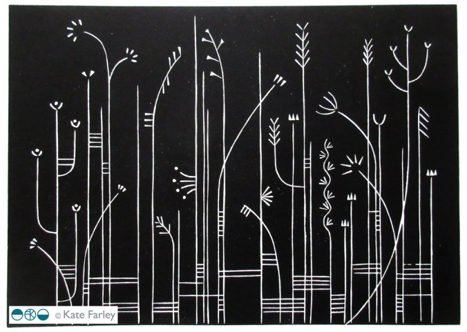
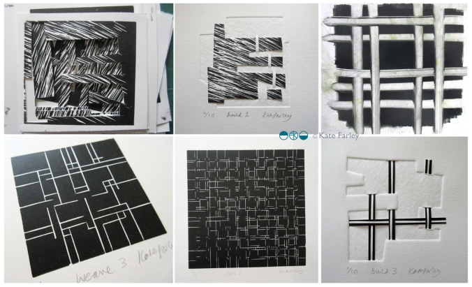
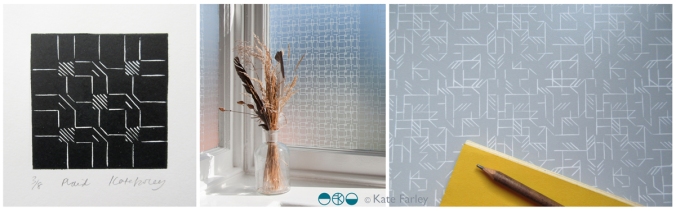
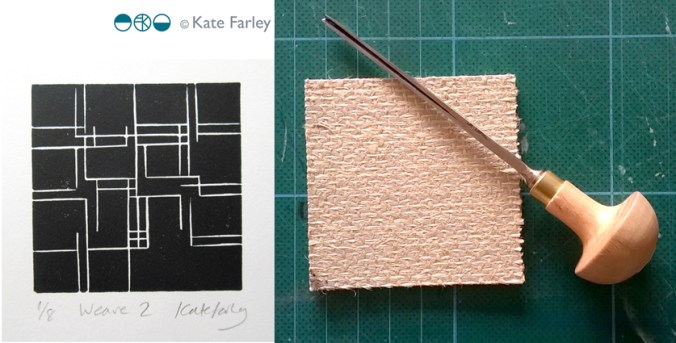
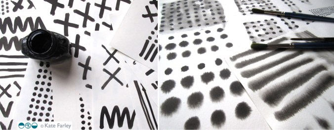
I’m really proud of my Construct collection as I set out to combine my interest in constucted cloth (weave in this instance) to inspire a print language, with the final surface designs being applied to hard surfaces. I was inspired by Augustus Pugin’s phrase “truth to materials”, in defiance against fake digitally printed wood-effect interior surfaces and I was interested in presenting a subversive outcome. My designs are not copies or imitations, they are a creative response to the material. I made tools to draw with; forks dipped in ink, relating to the threads of cloth and then manipulated the scans of the drawings in Photoshop to generate the repeat patterns.

When the opportunity came to work with The Window Film Company I was really impressed with their willingness to sample a range of designs and to discuss what worked. We explored the scale of the designs and sampled a number of patterns, resolved the repeating artwork to create the final collection. The products are brilliant, the window film is so easy to install and looks great. The idea of placing the woven textile inspired patterns on the window relates to the idea of hanging curtains. The graphic patterns are soft and calm, and yet provide privacy at the window. I then went on to develop my Threads collection to extend this idea further but employed lino cutting as the visual process, also available at The Window Film Company.
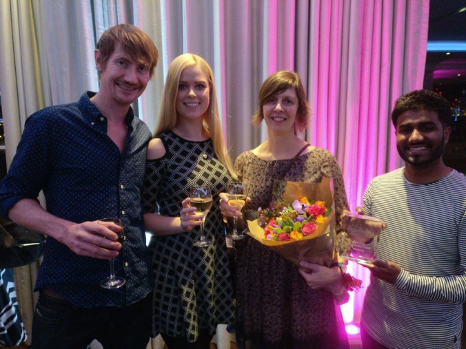
I was delighted to learn back in September that we had been shortlisted in the Best home improvement category at the House Beautiful awards 2017, for both mine, and the designs by Layla Faye, and they were going to be held in central London in November. Last week I went along with some of the The Window Film Company team to the awards and we are delighted to have won gold! It was a complete surprise as the category had some stiff competition, but we are so pleased to have this work recognised.
In the words of Micky Calcott, Director of The Window Film Company, “We’re thrilled to have won gold at such a prestigious and well respected awards ceremony. We work hard to provide customers with products that are practical, but also inspiration and stylish. We’re incredibly proud of our designer ranges and are delighted that our Kate Farley collection has been recognised as delivering something that customers want, enjoy and appreciate.”
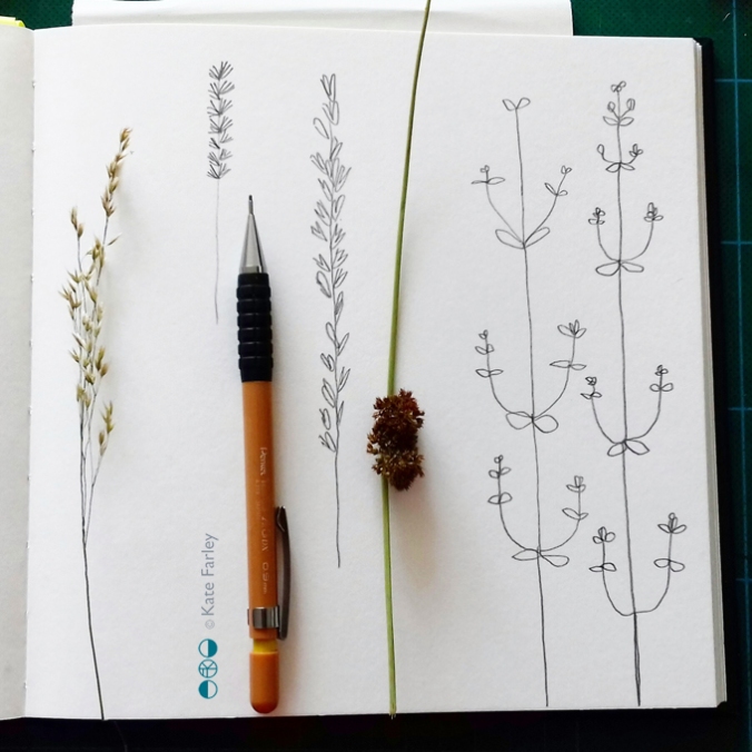
My designs have been created with lots of consideration to hand-generated imagery, and in relation to the material it is printed on. The patterns appear straight forward but have involved many decisions along the way, testing the combination of marks and the rhythms that are created, as well as the repeat structures and the positive / negative details. I know the customers don’t have to know the entire creative process to like the designs, but I’m delighted to have the opportunity to reflect on this collection. Winning with this great company is something I’m really proud of. Thank you to Micky and the team, as well as to House Beautiful!