printed mapping

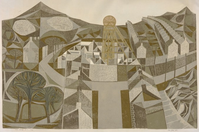
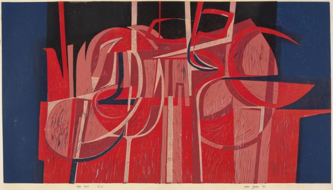
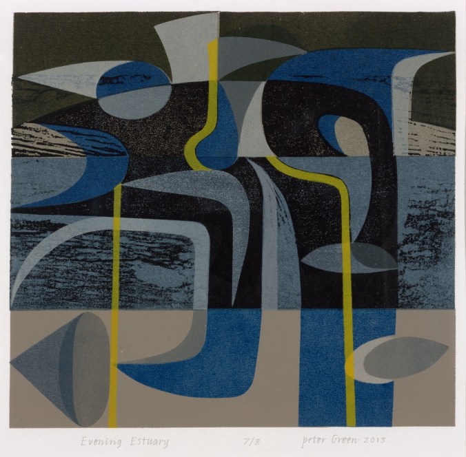
Printed interpretations of landscape have been a challenge in my practice from the beginning, and really formed the backbone of my practice during my degree course in Printed Textiles at Leeds College of Art and Design in the 1990s. I explored various ways to represent the world around me, and although it might seem odd for those aware of my drawing, as there is little similarity now, I was really inspired by the Norwich School and painters such as Cotman and Crome. I saw the way they formed shapes of colours as elements in the landscape and I set about creating contemporary versions of Kirkstall Abbey in Leeds in term-time, and rural Norfolk in the holidays.

Over the years my focus has shifted from rural to urban, resulting in more geometric, grid-like patterns, fighting the urge to be illustrative. As Print Technician at Central Saint Martins I used to create mono-prints including embossed features, representing the Farringdon skyline and dominant buildings. I also explored experimental processes, such as liquid emulsion and photograms of drawings on acetate in the photographic darkroom. I had a fantastic year on a part-time printmaking course at the London College of Printing (now Communication) at Elephant & Castle, and despite a broken elbow I produced many prints including lithographs, screen prints, collagraphs, etchings and lino prints. The expertise of the staff, and the discipline of the day a week of technical experimentation was a brilliant thing.

KFarley_landscapePRINTSweb

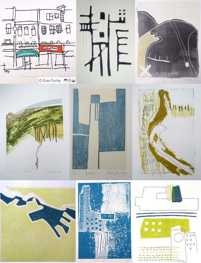
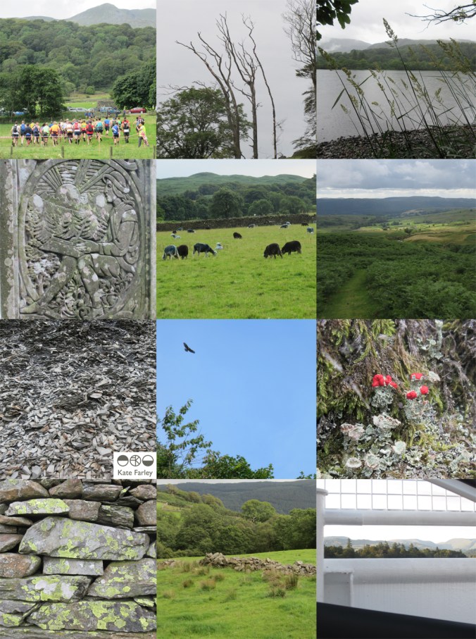
The images above include some of the many ways I have printed the landscapes I’ve experienced, and show some of the ways that I play with line, shape, texture and colour. Those of you who have seen my drawing evolve will probably recognise a preferred line quality, or mark I favour, the economy of mark, and visual rhythms. I am also interested in perspective, elevations and mapping interpretations. I continue to explore landscape in my ongoing sketchbooks, as part of commissions, but also because I simply want to draw and capture the flat fields, the lines of fence posts, and sweeping hills interrupted by a barn.

KFarley_landscapePRINTSbooksweb

I’ve also created many editions of bookworks over the years, and although I’ve written about them here before, I thought I’d include the ones predominantly featuring printed journeys. I love the way the sequence of pages, and folds of paper creates narratives through a landscape. Again there is maybe a familiarity of line quality, and drawn shape, as drawings, prints and books are often developed together, as part of the same creative process. Working summers in France, familiar territory in London and train journeys are regular inspiration for the books shown here. It is a challenge to design the book to work with a particular sized printing plate or sheet size of paper, considering grain direction and readability, but I enjoy the problem solving. Drawing and image has to work with structural content.

Often what is occupying my time in terms of design collections actually grow from ideas explored in those pages many years before. I like to see my relationship with landscape as the constant in the variety of what I do. Having spent some days in the country during the recent holiday I have refuelled that desire to draw horizons again.In hearing of the death of Ellsworth Kelly I am reminded of how instrumental he was at showing me how to see pattern in the environment we live in. I owe the excitement of the journey to many artists who themselves have worked hard to capture the places they know… Patrick Heron, Ben Nicholson, Eduardo Chillida, Eric Ravilious, to name a few.

Since creating these works on paper I show here (some over fifteen years old) I’ve launched ‘Plot to Plate’ and ‘Construct’, but they wouldn’t be here without the many sheets of paper before them. Who knows what else is in store in the next few years…

miles on wheels

I was brought up in a very keen cycling family, as a useful form of transport from a-b as well as for touring holidays and adventures. Growing up in Norfolk meant ignorant bliss when it came to real hills, and yet we did know that it can feel as if you have a headwind on four sides of a flat field!

With the Design Museum’s bicycle focused ‘Cycle Revolution‘ exhibition now on, the theme of their Twitter #FontSunday recently was bicycle brands. This got me thinking. I own many bikes, and each one for different reasons and I have many happy memories of times on two wheels. I took a few photos and started to remember…

KFarley_bicycles_blog

My early school photos show evidence of me learning to ride. Scars, bumps and bruises across my face, the result of falling in to the ditch of the edge of the disused airbase runway in rural Norfolk. I’ve fallen off with full panniers on, in fords deep enough with water to soften the landing, and I’ve broken my elbow as a result of hitting a pothole that was so small it could hardly be photographed for evidence! I’ve cycled Boxing day charity CTC runs, made others fall in love with touring on wheels, and ran round the park being brave enough to let my own children pedal away from me.

I inherited the silver ‘Falcon’ after my dad died, and once I’d grown old enough to fit an adult frame. With huge sentimental value, I love the bike I’ve covered miles and miles on. Youth hosteling with friends in Norfolk, and further afield: Scotland, Wales, France and Denmark. Loaded high and wide, on the open road, enjoying the same freedoms my father had experienced on the same steel frame.

My ‘Rudge Whitworth’, a heavy gent’s black butchers bike with rod brakes and wicker basket was purchased for a tenner from a fellow student at the art school in Great Yarmouth. I loved riding along, with my art box in the basket, seated so high up that I could peer over fences and be nosy. It takes hard work to pick up real speed, and yet once going, it’s impressive. The stopping is more interesting / less easy!

KFarley_bikes_blog

My life changed colour with the purchase of my ‘Turkish Green’ Brompton, from BikeFix in London. I ordered it before I’d seen the true colour but as the staff pointed at many products in the shop, saying, nearly this, bluer that that, brighter than those, I chose my new bike. On the day it arrived I excitedly arrived at the shop to discover the true colour, and to receive ‘training’ of how to fold and unfold the bike before I was allowed out on the streets. When I lived in London I headed off with the bike, all over the place, leading bookbinding workshops, before packing it all up, and heading off to the train home again, some miles cycled, others on tracks. Now this bike is my regular commuter bike to the train and I’ve covered so many miles in over ten years. I transport my children on it when they are too tired to walk, I load up the rack with runner beans in trays ready for the allotment, and I carry the harvest back from the plot, strapped up in front and behind. I fold it without a second thought now.

There are other bikes too. The borrowed, hand-built racing bike I cycled Lands End to John O’Groats on back in 1994, all 1144 miles of it. Then the Dawes Galaxy with ‘modern’ gears, that made me embrace cleats on the pedals instead of the rat traps. The red Falcon that I had before I was tall enough for my Dad’s old bike, I still have that one too.

Each bike I own was made with a different rationale to the next one, in different times, in different workshops and factories, with different ambitions. Each one I own has been part of a different story too.


Visual proverbs – in Ghana and Cheltenham!

As a young student in the 1990s I became aware of the amazing Asafo flags of the Fante, from Ghana. I’d seen an article in a magazine in the college library about an exhibition on at the time, and unable to afford the trip to London I telephoned Peter Adler, curator of the exhibition, as his number was listed in the article, to share my enthusiasm. I’m not sure what I thought I’d achieve but we did have a conversation and I was inspired to find out more about the colourful appliqued flags.

asafo_flags_croc100

What struck me about the flags was the bold shapes of animals and people that were communicating warnings to other units of warriors of the Fante people. Proverbs such as ‘The crab is feared for its claws’, or ‘Fish grow fat for the benefit of the crocodile’ attempt to ridicule the rival warrior groups and set a tone of fear, as if toying with opponents. With influence from the European flags they had seen as adventurers explored West African coastlines and from international trading ships the flags also featured elements of geometric borders and the Union Jack. I like the stylised imagery, but particularly the visual communication of a story in one textile image. I remember I wrote an essay on the subject for a Contextual Studies assignment and I went to great lengths to dye fabric and create my own textile illustrations and book cover – I still have it somewhere.

I’ve shared images of the flags with many groups of students over the years, but as I write a research paper on the subject of visual communication in pattern I am once again reminded of these beauties, and back I go, to the wonderful book: Asafo! African Flags of the Fante, written by Peter Adler and Nicholas Barnard in 1992, published by Thames and Hudson. I recommend this really informative book.

asafo_bookcover100

asafoflags_crabs100

When walking from Cheltenham railway station to the town the other week along the off-road path I came across some graffiti in an underpass that reminded me of the flags, and particularly in the way the animals were used to goad. The images felt as if they were provoking and taunting rival groups by showing off their prowess in the way the artwork of the Asafo flags did. I could imagine the jibes represented in the images of the cats, and in the way the badger is attempting to deflect the attention away from his kind, to the lizards, maybe another urban tribe. I’ll share the images here.

CheltenhamGraffiti150images:

Asafo flags, scans of the pages from the book by Peter Adler & Nicholas Barnard, referenced in the text

Cheltenham graffiti, photograph by Kate Farley

teaching for them and for us

I’ve combined my academic career with my art and design practice since the late 1990s and I’ve felt that each informs the other. Some weeks I’ve wished there were more hours for one than the other, but the two occupations are, for me, valuable and complementary to each other.

My art and design practice is one of learning, journeying and discovering new ways to look, to draw, to interpret the world about me in a visual, drawn or printed language. I feel as if I’m on a really long adventure that won’t stop until I get put in a box. Each commission, or self-established project offers a small experience that builds the bigger lesson that takes me further along that creative path to who knows where. Facilitating the discovery of this excitement in creative exploration is what drives me to teach students in Higher Education.

I have recently visited the excellent Peter Green exhibition: Sixty years of printmaking, at Mascalls Gallery, Kent (the exhibition has just finished I’m afraid), which got me thinking…  It was made clear in the design and content of the show (St. Judes and Emma Mason Gallery with Mascalls Gallery) that Peter combined his printmaking career with an academic one, and a high achieving one at that.

Printmaking is such a physical experience, and although simple in principle, the intricacies of a process and resulting prints can be hard earned. The exhibition of Peter Green’s work really demonstrated the pleasure of investigation, of material, colour and surface quality, not as passing ideas, but as a sustained dialogue between practitioner and process, and between ink and paper. The exhibition showed the drawings, the printing plates, the tools, the sampling and final resolutions. Peter’s vast experience and significant creative journey was evident; and through the exhibition I felt as if he is teaching us to learn from him, not for the technique, but for the commitment and value of doing and pursuing something. I believe that this is fundamental in teaching, whether in formal education or not.

Simon_Lewin_56

It was interesting to read in the catalogue that accompanies the exhibition that he said, “knowledge is about common ownership […] we should learn from each other.” This is how I feel about my relationship with education. We should not be masters to preach the skills and experience, but instead we could share in the experience of learning together. That’s not to deny that someone needs the skills and experience in the first place, but the attitude of someone like Peter who clearly enjoys the creative journey will inspire those a step or two behind him. I think it’s important that those who teach are also those who do.

Simon_Lewin_02

I strongly believe that there are no short cuts, or right answers along the path of art and design. There is no ‘one’ way of doing things. Sadly, so many students come through school thinking they are looking for the tick in the box, the correct result. We try at degree level study to nurture in them the understanding that you learn far more by investigating, questioning and journeying, rather than heading straight for one destination. This is again echoed in Peter’s investigative approach to printmaking – the finding out along the way is as important as the final state.

I read in the catalogue that Peter had moved away from wood engraving as a process as it required a more calculated journey and pre-determined images. I think I work like this too, looking to uncover the solution rather than to execute the obvious, not with wood but as a designer. This makes me think of new or less experienced teachers over-planning and worrying about the outcome of a session; what the students will achieve at the end, as a tangible result. Those with more experience and confidence in their teaching and the learning experience can take risks with that journey of learning and therefore participate rather than dictate. This sounds comparative to Peter’s more recent prints that evolve over time without the planning, but with an open-ended investigation. The exhibition celebrates sixty years of Peter printmaking [today in collaboration with wife Linda], so with such a busy and extensive journey the prints are an exciting archive of process and investigation, with common themes, colour relationships and familiar motifs in evidence during this time, as well as textile designs more recently in collaboration with St. Judes.

No doubt those of us who live with creative practices do so for many reasons, and those of us who teach will each tell of reasons why we do too. The combination of a creative practice and a teaching role is, in my mind, a really good combination, a two-sided relationship, where hopefully the give and the take work themselves out for the benefit of all! Thanks to Peter for reminding me of that good partnership as we embark on another academic year…

Simon_Lewin_36

Thanks to Simon Lewin of St. Judes for permission and access to the images of Peter Green’s prints:

top: Welsh Landscape No.1 1960

middle: Red Night 1963

bottom: Evening Estuary 2013

Useful links:

http://www.mascallsgallery.org

http://www.stjudesprints.co.uk

http://www.emmamason.co.uk

A change of background colour

It’s the holiday season and we’ve been taking part. A camping trip to the Lake District offered a dramatic difference to the usual scenery we live within here in the Midlands, and it was refreshing change for being so. Everywhere seemed so green, really really green, not just the local park green but intense, vivid greens that lush meadows could offer. Naturally with that comes rain, but even then the colours were vibrant. Lichen was glowing, moss saturated, even the sheep were blue! Some colours took me back to studio projects, Pantone references, British Standard colours and colour choices, others offered a welcome diversion.The strange thing is, that when I compiled the image to include with this post the images looked really grey, but it really wasn’t like that through my eyes!

This change of scene is just what the mind needed after an intense workload juggling several design projects and at the end of a hectic academic year. I like what the seasons do to us, make us adapt and notice the time passing. This time of year feels like a celebration, as harvests ripen in the sun (ummm..) and we prepare for a new season of productive design work, education and research.

I shall remember the vivid greens, the birds circling overhead in the sky of blue; the vast views that some people get to enjoy day in day out. I shall remember the feeling of change, and rest, and stopping just for a short while, as a warm memory in the depths of winter when working in the studio. I am bound by the academic year, as well as the seasons on the allotment, the trade show calendar, and birthdays, as so many people are. It’s good to recognise the rhythms and differences brought on by change. Hooray for holidays!

KFarley_lakes_blogpics_web

spinning plates in the portfolio

It’s the holiday season but that’s a tricky thing when it comes to being freelance. Yes I have leave from being an academic at this time of year but the design jobs seem to know when it might be good to take a holiday, then the projects pile up, each with a deadline that results in juggling. I’ve made lists of lists, with schedules and then more lists. Each task gets ticked off, only to be joined by a further task, only to discover that some of the industry does take a holiday and instigate factory shutdowns – good on them! I like their style…

I’m not complaining, it’s just always the way of things, and I actually like times like this. This is the portfolio career that I wanted and imagined. Over the last two weeks I’ve lost count of the number of designs I’ve completed, the different colourways, the scale testing, the rhythms, repeats and patterns I’ve honed. In each project the client has been very different, with highly specialised requirements, and again, that’s really exciting.

Alongside all of this I am also preparing to launch my ‘construct’ collection, and as I can’t share the other design projects yet I thought I’d share one of the images I’ve prepared for the press release. The project has been months in the making, and has been growing in so many exciting directions I’m really looking forward to setting up my stand at Tent London in September. If you think you might visit the show as a trade visitor don’t forget to register for a ticket: http://www.tentlondon.co.uk/trade-registration

Do check back and see more of the collection

TENTflyer15_crop800

redesigning the ‘brand’ self

I’ve been out in the ‘real world’ so to speak for nearly twenty years, and while I found that such a scary idea during my time at art college, having little idea of what I really wanted to do, now I realise it’s okay.  I look back and remember so many exciting things that I’ve been up to and so many great people I’ve worked with that I am grateful for living the portfolio career in art and design.

I made the choice to lead an academic career alongside my own practice and both really support each other. I am sharing and honest in my own learning experiences from industry working across art and design contexts. The students’ creative journeys also inspire the creative investigation in me. We talk of ‘branding’ and ‘professional identities’ in the Second year that I am currently leading in the Textile Design degree course at Birmingham City University, and consider how we and others see us and what we can control and what others interpret. I’m not a corporation or multinational company and yet the word ‘brand’ is commonly used for the self-employed too. Language used in promotional material as well as social media build a story, whether we like the tale or not. Does my design integrity come across? what about my inspiration? is the market level clear?…

I’ve been redesigning my website over the last few months. This is always an opportunity to ask myself more questions, and to reflect on where I’ve come from, where I’ve been and where I plan to go within the world of design, and specifically pattern. I’ve been excited by the process. I’ve chosen headings / page titles that more accurately reflect my current practice and edited substantial information relating to projects of years gone by. I’ve made it more image-based and updated text, again to reflect the shift in my design practice interests. With social media being a really key part of building a ‘brand’ these days this process has been happening as I go, but I’ve finally embraced instagram, having enjoyed Twitter over the last three years.

So, for all the bookbinding workshops I’ve led, the public consultation exercises I’ve participated in, the colours and materials I’ve sourced, the flowers I’ve drawn and the prints that I’ve pulled, this is where I’m at now…

katefarley.co.uk

KFarley_making_blogcut

Plot to Plate printed pattern at Pulse 2015

It always takes far longer to prepare for a trade show than it does to be there but I thought I’d show a bit of the journey of my show. Rather substantial worries kicked in the night before when we feared the contents of my stand were not able to be carried by two human beings, and more worryingly, not allowed on the train to London. Somehow we managed what felt like a physical endurance test, in fact it was… and began to make it my home for the next few days. Olympia is a stunning building to spend time in and we got the show up in a few hours, ready for the off… and there was still time to admire the London Underground graphics at Earls Court.

The Plot to Plate collection has grown substantially since its first trip to Olympia when I was showing in the Spotted section, at Top Drawer back in 2012. I am delighted that the new Hanbury and Parterre cushions have been well received by visitors to the show. These are hand screen printed and then sewn in Birmingham by social enterprise Textiles by St. Annes. The patterns are inspired by National Trust’s Hanbury Hall and Gardens, near Bromsgrove. The Hanbury wallpaper was also popular with interior designers visiting the show and Plot to Plate VVV was the most admired of my fabrics. My ‘parterre’ show dress was also much commented upon, with orders keen to be placed!

I was pleased to be an ‘expert pick’ by David Nicholls of House and Garden in the Pulse Preview and also chosen by Trend Bible in the trend section of the show catalogue.

It was also a pleasure to meet ex students of mine, graduating from the Textile Design degree at Birmingham City University, as visitors to the show in their industry roles, and I could still remember their names! How nice of them to say hello and make time to find out what I was up to.

The new friends made of the exhibitors beside me was really special. Such a supportive group of people, helping out, freely sharing trade insights, generally lovely people really helping the show be a great experience. The end of the show, although a welcome relief to the hours of standing (I really couldn’t carry a chair on the train!) was almost a sad time, as we stripped the walls bare, packed up our belongings, said our farewells and left, with the most ridiculous load I ever plan to carry. Maybe I’ll start making paper thimbles!

Thanks to all who visited and thanks to all who helped along the way! Here are the images which represent in some small way the few days at Kensington Olympia, May 2015.

`KFarley_pulse15

floral inspiration for textile patterns

One of the reasons I love to teach students drawing for textile design is the journey of enlightenment when introducing someone to the world of not only looking, but also of seeing. There are many ways to see when drawing and I’m really interested in the journey from reality to abstraction, whether its a state of mind, a way of transforming or whether it’s a methodical process applied to something in order to arrive at a motif for pattern.

My drawing process has evolved over years of practice but the way that I see is not so different to two decades ago. I remember reading the book ‘Drawing with the Right Side of your Brain’ by Betty Edwards and realising that I already did that and it all made sense. I enjoy playing with perspective, elevation, mapping of whatever it is I’m drawing, whether it’s a landscape or twig. Turning the three-dimensional thing in front of my eyes in to a two-dimensional drawing is always exciting, and challenging, but that’s half the fun. I think the process of printmaking that I further translate my drawings to really suit the clarity of motif dissection, separating colours or specific details on separate blocks or screens for printing for either a limited edition print or commercial textile design.

Each year the pear blossom at the allotment arrives and each year I’m reminded of how perfect they are in all ways. The beautiful petals and the bits I don’t know the names of, all there, waiting to be celebrated in drawing. No doubt Charles Rennie Mackintosh would have made an exquisite watercolour and graphite study. The flowers also remind me of drawings and prints I have made in the past, and not only of blossom, but of flowers that I make diagrammatic in a way to understand and explain the ingredients of the flower. When I discovered the work of Gwen White, and particularly the book ‘A World of Pattern’ I was excited to see someone else communicating what I see and how I translate form to pattern. This method doesn’t suite everybody and it would be a dull world if we all made drawings that looked the same, but every now and then it’s nice to know that my creative brain works like someone else’s brain and that my eyes see what others have seen before me.

KFarley_drawing_blossom_blog

Pear blossom, photograph, Kate Farley

‘Hanbury’ wallpaper, Kate Farley

Passiflora, lino print, Kate Farley

illustrations from Gwen White’s ‘A World of Pattern’ (RH column)


Design inspirations 3: winning games

I have always felt that one’s upbringing has a huge influence over the aesthetics of that designer. The house, the landscape, the products and fabrics that are present in the early years; everyday things, that at the time may not have been seen as important then can be blamed or celebrated in the later career of artists and designers. No doubt plenty of people would disagree with me, that’s not the point. I can clearly see a link between my own aesthetic, and my upbringing, and I’ve written about it in the past- read here  &  read here

On a trip back to the family home in Norfolk I came across the old games we used to play and was mentally transported back years before, simply by seeing the beautiful graphic qualities, clean lines and visual communication that I hold dear in my own practice. My visual language doesn’t necessarily mimic those designs but it’s more of an approach, a set of values & expectations that I set myself. We can expect things to be very different in the future with such digital aesthetics taking firm hold of so much of every day lives for my children and those of tomorrow. From how we create art and design, to how we view it on screen as well as on fabrics and surfaces much is very different. It is not necessarily a criticism of today, but more an appreciation of the inspiration I had and continue to thrive by. I sincerely hope that there will be art and design education in place over the next few years which will inspire the future textile designers, setting the benchmark for beyond that.

Here’s some of the graphic wonders. Red is a very popular box colour and it’s worth noting that many of the games proudly state they were made in England. Pieces were metal, wooden, proper card, nicely printed and beautifully boxed… there, a bit of nostalgia too! It also might be worth noting that in the ‘careers’ game The Arts was kept firmly in the box while ecology, sports, politics and big business made it on to the cover of the box!

KateFarley_games_blog