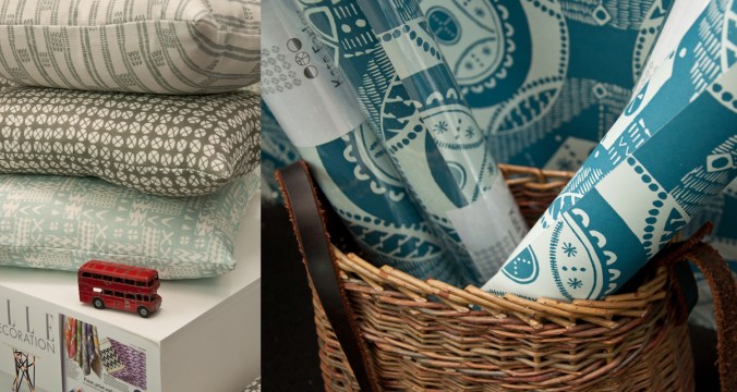
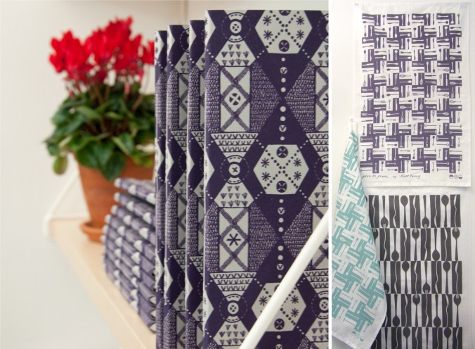
I’ve spent many months working on a new pattern collection and will be launching it at Tent London at London Design Festival this September. I’ve kept any signs of the design development away from social media until now, but here’s a couple of the patterns from the ‘construct’ collection. I shall write more about the ideas behind the collection in due course.
colour
pattern at the pitch, up and down
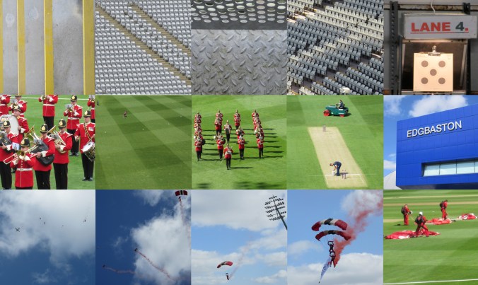
Despite having lived in Headingley, Oval and near Edgbaston I’m not a great fan of cricket but today I spent a number of hours at Edgbaston, the home of Warwickshire County Cricket Club as they hosted a charity community day. The highlight for me was the arrival of the Red Devils, from the skies in the most fantastic spectacle, bringing the ball for the 20-20 match. The marching band looked fabulous in red to the complimentary green of the grass and I also discovered I have a skill in rifle shooting, so there you go, a surprising day.
I gathered lots of images of patterns too. Here’s the day in grey, green & blue pictures…
Design inspirations 3: winning games
I have always felt that one’s upbringing has a huge influence over the aesthetics of that designer. The house, the landscape, the products and fabrics that are present in the early years; everyday things, that at the time may not have been seen as important then can be blamed or celebrated in the later career of artists and designers. No doubt plenty of people would disagree with me, that’s not the point. I can clearly see a link between my own aesthetic, and my upbringing, and I’ve written about it in the past- read here & read here
On a trip back to the family home in Norfolk I came across the old games we used to play and was mentally transported back years before, simply by seeing the beautiful graphic qualities, clean lines and visual communication that I hold dear in my own practice. My visual language doesn’t necessarily mimic those designs but it’s more of an approach, a set of values & expectations that I set myself. We can expect things to be very different in the future with such digital aesthetics taking firm hold of so much of every day lives for my children and those of tomorrow. From how we create art and design, to how we view it on screen as well as on fabrics and surfaces much is very different. It is not necessarily a criticism of today, but more an appreciation of the inspiration I had and continue to thrive by. I sincerely hope that there will be art and design education in place over the next few years which will inspire the future textile designers, setting the benchmark for beyond that.
Here’s some of the graphic wonders. Red is a very popular box colour and it’s worth noting that many of the games proudly state they were made in England. Pieces were metal, wooden, proper card, nicely printed and beautifully boxed… there, a bit of nostalgia too! It also might be worth noting that in the ‘careers’ game The Arts was kept firmly in the box while ecology, sports, politics and big business made it on to the cover of the box!
the colours of 2014
Back in 2012 I started a colour project on Twitter, using Pantone references ( @pantone ) that represent particular colours of the season, place or activity of the day alongside photographs that I have taken. The words relate to the language of colour, seasons and the activities so often word-play is used, particularly in relation to Coated, Uncoated or Process, as used in the Pantone system of colour. Having kept this going for over two years I decided to look back to see the colour swatches of 2014, a record of colour of my year, having recorded pattern of 2014 in my previous post. In chronological order under the swatches are the Tweets to tell you about the images, they read from top L to R, along each row ending with the hyacinth, bottom R.
From this point on we can look forward to 2015…. Happy New Year…
Kate Farley @katefarleyprint · Jan 27
ORANGES! A new breakfast treat, from @pantone180 solid to process = marmalade
Kate Farley @katefarleyprint · Feb 12
Brilliant @pantone Red DS 75-1Uncoated; a gig of captured whispers & exploding electric noise @annacalvi Outstanding!
Kate Farley @katefarleyprint · Mar 2
Yesterday: @pantone DS 290-1 Coated, sights of fresh green but otherwise muddy underfoot – Spring has sprung
Kate Farley @katefarleyprint · Mar 9
Crocus delights: @pantone process, heading home, 49-1Uncoated, Spring sun
Kate Farley @katefarleyprint · Mar 15
Malvern moss green @pantone DS 312-1U = process walking & uncoated. A beautiful spring day #Herefordshire
Kate Farley @katefarleyprint · Mar 29
Spring green @pantone 389 Uncoated, on the eve of BST. Euphorbia at its best!
Kate Farley @katefarleyprint · Apr 11
Bored of blossom? Beautiful @pantone 684 PC – Solid optimism to Process – the Spring growing season.
Kate Farley @katefarleyprint · May 21
Okay so it’s not #RHSChelsea but stunning @pantone 806 Solid pink Uncoated. Sadly rain due to spoil it tonight!
Kate Farley @katefarleyprint · Jun 27
A lot of @pantone 207 PC with @tiborreich on behalf of @textilesBCU Every colour under the sun and rain. #textiles
Kate Farley @katefarleyprint · Jul 10
Today = A sunny @pantone yellow 604 Uncoated and optimistic on all fronts! #colour
Kate Farley @katefarleyprint · Jul 21
A stunning yellow @pantone 386 Uncoated, hot & with plants growing in the wrong place across the plot. #weeds
Kate Farley @katefarleyprint · Jul 25
A stunning, loud and proud @pantone Red hot 032 Uncoated and attracting the insects today. #dahlia #colour
Kate Farley @katefarleyprint · Aug 1
RED! Harvest time with these @pantone 200 Coated at the moment crab apples, soon to become jelly! #colour #harvest
Kate Farley @katefarleyprint · Aug 11
Pink @pantone 679 Uncoated, wild and fresh from #Dartmoor #heather #colour
Kate Farley @katefarleyprint · Sep 3
Blooming special rose @pantone 7417 Uncoated & without an umbrella – let’s hope for no rain! #colour #rose #weather
Kate Farley @katefarleyprint · Sep 8
A stunning @pantone 611 Solid Process flower but I’m waiting for the squash! #colour #PlottoPlate #runningoutoftime
Kate Farley @katefarleyprint · Oct 6
It was sunny yesterday, Uncoated with @pantone orange 021 nasturtiums. #colour #autumn #allotment
Kate Farley @katefarleyprint · Oct 20
Happy to receive @pantone Coated 201 red windfall apples from the allotment at the weekend. #harvest #sharing
Kate Farley @katefarleyprint · Dec 7
A stunning @pantone Solid 158 watching me dig at the plot today, Coated of course #colour #allotment #digging #robin
Kate Farley @katefarleyprint · Dec 30
Blooming! We are enjoying the seasonal @pantone 226 Uncoated and indoors #hyacinth
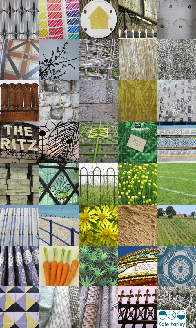
the patterns of 2014
It’s been one of the years I shall remember as particularly busy, continuing to juggle the commitments of family life, my roles as artist, designer, lecturer and of course allotmenteer, and the small matter of a big Birthday. All the time spent doing any one of those things provided opportunities to spy inspiration, food for thought and visual stimuli for me so having looked back over the last twelve months I have enjoyed creating a record of the patterns I’ve seen. The record includes family holidays, research trips, and days out; from the school sports day track, Birthday celebrations, to the rivets in the railway bridge, the stately home and the walk to work, it’s a record of some of what I saw in 2014.
Key themes appear: geometry, stripes and railings and although in a chronological order, there are some great pairings in terms of colours, textures and pattern.
a new starting line
I’ve spent more than two years developing designs and products in the ‘Plot to Plate‘ collection and was incredibly proud to show the collection, with the new ‘Hanbury’ wallpaper at TentLondon in the London Design Festival in September to a great reception. Allotments and kitchen gardens inspired the limited edition prints which inspired the patterns, British manufacturers make the products and I’ve documented much of this process here in the blog.
During this time I’ve also been working on really exciting projects that are at stages too early to share here, and I’ve created commercial print designs for clients in both interior and fashion sectors. Each of these briefs have been creative, with a variety of factors to balance, and most importantly with a client at the end of it. I enjoy juggling a range of projects, each one fulfilling my design drive, alongside my role as lecturer.
Now is the time to take stock of my own research practice again and take issue with ideas that have been germinating in the hinterland of my mind in relation to principle concerns in my design practice, which sit in harmony with my artistic and creative journey. It’s amazing how many threads of research and practice, when brought together make perfect sense, and reveal their value to me. Some discussions I had with visitors at TentLondon were opportunities to hear myself testing these notions, and so it is, back in the studio, with ink on a brush, ink on a roller and ink in the printer, I have started a new chapter, a new sketchbook and a new head-space.
It’s exciting, very daunting, and what drives me… I look forward to sharing this journey in the coming months, for now there is a glimpse…
Plot to Plate prints and patterns at Tent London
What a week! Several trips to London, lots of bubble-wrap, the wearing of a particular dress and stamina, all in the name of Tent London as part of London Design Festival 2014.
The preparation has taken months, alongside the development of patterns and printing I have worked on marketing & promotion, stand design, costings and sales. I’m delighted that my first commercially available wallpaper called ‘Hanbury’ (see previous blog post) has been really well received by interior designers, the public and the press and I look forward to working with really great people who have shown support.
The fabrics have been fairly consistently described as ‘restful’ and ‘calming’ with the muted colour palette being appreciated and described as ‘mid-century’ and ‘modernist’. Its difficult to know sometimes how much people want to know about the generation of pattern designs, but when I described the inspiration and showed the drawings and limited editions of prints of allotments that helped to generate the motifs there was a sense of pleasure and understanding, especially amongst the gardeners! The linens have been popular, especially the Plot to Plate VVV stripe design. I look forward to seeing these fabrics on chairs and hung as curtains in due course.
After months working away in the studio it’s been a great opportunity to have conversations and feedback, meeting like minded people and making the first steps to some fabulous opportunities and working relationships. Thanks to all who came by to meet me, I really value the feedback and support!
A huge thanks go to all of my sisters who played their significant part in keeping me upright, getting me and my work to where we needed to be, and keeping the children going. Thanks to Gavin, as well as Helen for living in the right place, and huge thanks to Stuart for being a great ‘intern’ – above and beyond!
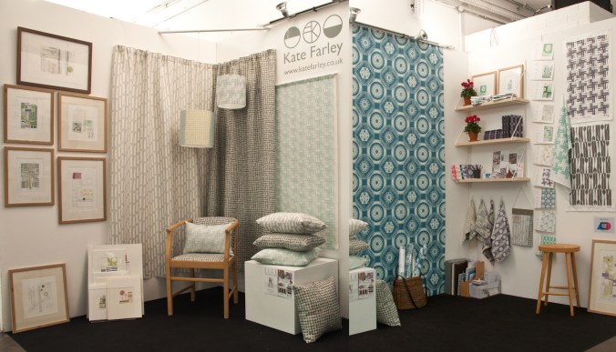
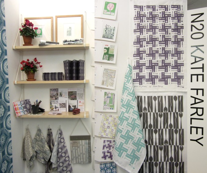
If you didn’t get a chance to visit my stand here’s what it looked like…
Wallpaper in the creating…
The process of designing my first commercially available wallpaper has been a long & highly considered journey and one I thought would be interesting to share.
Research: I first made drawings in my sketchbook last summer when I visited the National Trust property Hanbury Hall & Gardens in Worcestershire. I really liked the formal parterre and saw a really close link between garden design and textile design – I wrote about this in a previous blog post: https://katefarley.wordpress.com/2014/05/11/pattern-design-outdoors-and-in/
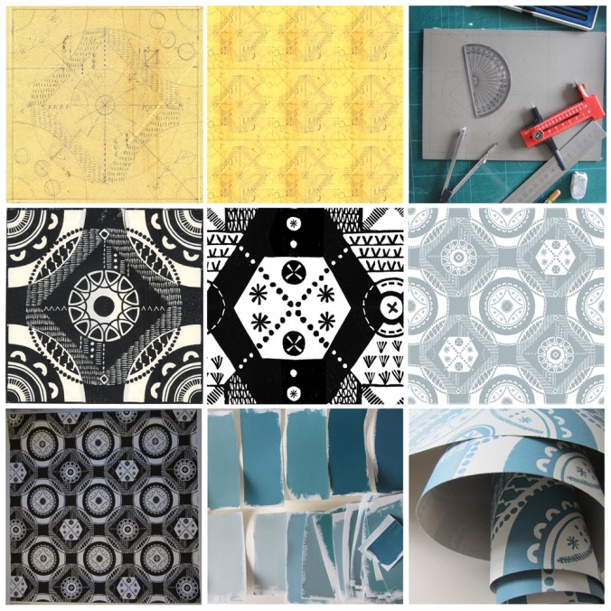
Composition: Sketches became drawings that became more detailed designs, that were then tested in repeat by scanning them in to the computer and using Photoshop. Edge details, scale of motifs, pattern and textural rhythm all needed to be considered.
Cutting the block: I measured and cut the lino block before taking a really clean print in order to scan the print in to work digitally with the repeat tile.
Editing: Further refinements, several print outs and more alterations took place over several weeks as I got used to seeing and living with the design. Additional lino blocks were cut in order to add different motifs to the design. Additional variations across the larger repeat file create visual interests and a play on the traditional repeat expectations. Some tweaks were so minimal that people unfamiliar to the design wouldn’t be able to spot the changes without having them pointed out, but it’s so important that every dot, dash and space has been considered before the production process is underway, saving time and lots of money.
Production: The digital artwork was sent off to the manufacturers of the roller in order for the design to be printed, and a technical proof was sent back for my approval – exciting and scary times!
Colours: Much thought, research, trying and testing went in to the colour combinations and I painted lots of colour chips using gouache in order to communicate the choice to the printer.
Printing: After signing off the colour proof provided by the printer, the wallpaper went in to production, labels were designed and printed, rolls created.
Results: I’m delighted with the results, the efforts by all those involved with the production process, and look forward to launching this at TENT London very soon.
A new design: working it all out
I’ve created more designs than I can remember since I began ‘formal’ pattern making back in 1992. Some aren’t worth worrying about, some I’m still extremely proud of and some are still waiting for the right time to make their debut… (I can’t wait to show you some very special ones next year but I’m sworn to secrecy.)
Some designs work themselves out for themselves; I vividly remember shutting my eyes to get some sleep right in the middle of my final major project on my degree, when suddenly my mind spun in to action, and there in my mind was a design, colour separated and waiting to be drawn out for screen the very next day. Other designs I battle for days on, and eventually win through demonstrating more stubbornness than the design itself. I don’t give up easily.
In all my designing, however hard or easy it was in the making, I aim for them to appear strikingly straightforward, as if they did just happen on their own. I was accused by a tutor for being lazy – he didn’t understand minimalism – when in actual fact, it’s far harder to let the negative space be as important as the motifs we can sometimes throw at a design like pennies to a pond. Space can be beautiful.
I’ve taken a slightly different direction to making the most recent patterns; some would argue they are more traditional, more formal, more fussy even. I’ve certainly battled with the minutiae. I thought it nice to share the journey a little, but do bear in mind, every dot, line AND space have been considered, reconfigured, tested, discussed and revised more times than I’m counting (and that’s before I even think about colour). I hope you like the results. The design will feature in my new work to launch at TentLondon in September, so watch this space.
The image shows: initial sketch / proportions of the motif, repeat / rhythm testing of the drawing before the lino block is cut, the lino block being printed, and the final digital artwork. The inspiration is a mix of kitchen gardens and formal gardens of the National Trust.
back to the drawing board
The job of a freelance designer involves so many different tasks that many people with a variety of skills could be employed to keep the components of that designer’s working life going. Juggling what is needed to be done with what would be preferable to do is a tough call on some days. What is it that really makes that difference, to move the company vision forward? I could spend many hours a day sat in front of a screen communicating with manufacturers and stockists, preparing marketing and sales literature, and keeping the ever-growing consideration of social media alive.
There are times when it is so valuable to stop all of that and get back to what makes us creatives tick. There are personal risks involved with making; what if it’s rubbish? The fabulous ideas that roll round the head in the early hours, once realised, are open to harsh criticism in the light of the day – the danger of expressing ideas and developing new work. But for all of that it is so important to keep going back to the beginning, to test new ideas, stare at the blank white sheet of paper, take a deep breath and play – for my creative self!