Plot to Plate prints and patterns at Tent London

What a week! Several trips to London, lots of bubble-wrap, the wearing of a particular dress and stamina, all in the name of Tent London as part of London Design Festival 2014.

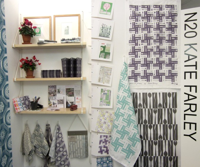
The preparation has taken months, alongside the development of patterns and printing I have worked on marketing & promotion, stand design, costings and sales. I’m delighted that my first commercially available wallpaper called ‘Hanbury’ (see previous blog post) has been really well received by interior designers, the public and the press and I look forward to working with really great people who have shown support.

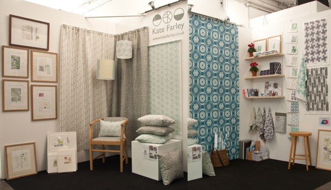
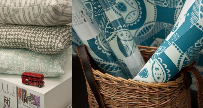
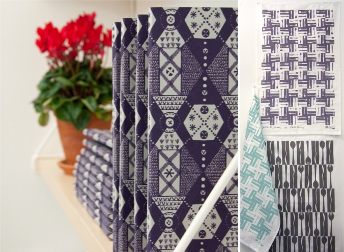
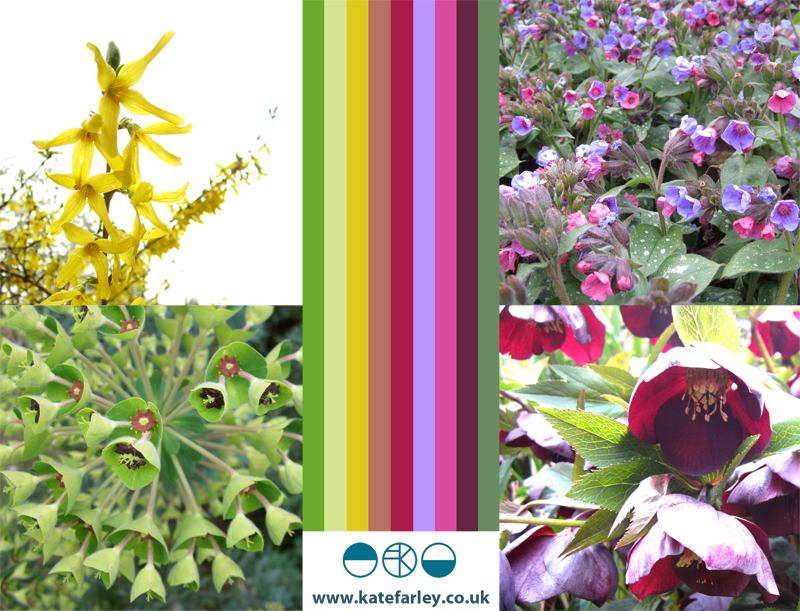
The fabrics have been fairly consistently described as ‘restful’ and ‘calming’ with the muted colour palette being appreciated and described as ‘mid-century’ and ‘modernist’. Its difficult to know sometimes how much people want to know about the generation of pattern designs, but when I described the inspiration and showed the drawings and limited editions of prints of allotments that helped to generate the motifs there was a sense of pleasure and understanding, especially amongst the gardeners! The linens have been popular, especially the Plot to Plate VVV stripe design. I look forward to seeing these fabrics on chairs and hung as curtains in due course.

After months working away in the studio it’s been a great opportunity to have conversations and feedback, meeting like minded people and making the first steps to some fabulous opportunities and working relationships. Thanks to all who came by to meet me, I really value the feedback and support!

A huge thanks go to all of my sisters who played their significant part in keeping me upright, getting me and my work to where we needed to be, and keeping the children going. Thanks to Gavin, as well as Helen for living in the right place, and huge thanks to Stuart for being a great ‘intern’ – above and beyond!

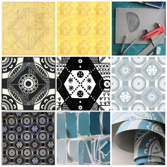
If you didn’t get a chance to visit my stand here’s what it looked like…

KateFarley_Tent_N20_webKateFarley_stand_details1_1500web KateFarley_stand_details2_1500_web KateFarley_N20standdetail3_1500web

Wallpaper in the creating…

The process of designing my first commercially available wallpaper has been a long & highly considered journey and one I thought would be interesting to share.

Research: I first made drawings in my sketchbook last summer when I visited the National Trust property Hanbury Hall & Gardens in Worcestershire. I really liked the formal parterre and saw a really close link between garden design and textile design – I wrote about this in a previous blog post: https://katefarley.wordpress.com/2014/05/11/pattern-design-outdoors-and-in/

Composition: Sketches became drawings that became more detailed designs, that were then tested in repeat by scanning them in to the computer and using Photoshop. Edge details, scale of motifs, pattern and textural rhythm all needed to be considered.

Cutting the block: I measured and cut the lino block before taking a really clean print in order to scan the print in to work digitally with the repeat tile.

Editing: Further refinements, several print outs and more alterations took place over several weeks as I got used to seeing and living with the design. Additional lino blocks were cut in order to add different motifs to the design. Additional variations across the larger repeat file create visual interests and a play on the traditional repeat expectations. Some tweaks were so minimal that people unfamiliar to the design wouldn’t be able to spot the changes without having them pointed out, but it’s so important that every dot, dash and space has been considered before the production process is underway, saving time and lots of money.

Production: The digital artwork was sent off to the manufacturers of the roller in order for the design to be printed, and a technical proof was sent back for my approval – exciting and scary times!

Colours: Much thought, research, trying and testing went in to the colour combinations and I painted lots of colour chips using gouache in order to communicate the choice to the printer.

Printing: After signing off the colour proof provided by the printer, the wallpaper went in to production, labels were designed and printed, rolls created.

Results: I’m delighted with the results, the efforts by all those involved with the production process, and look forward to launching this at TENT London very soon.

hanbury_BLOGtile1000rolls_100_DSC_0227

A new design: working it all out

I’ve created more designs than I can remember since I began ‘formal’ pattern making back in 1992. Some aren’t worth worrying about, some I’m still extremely proud of and some are still waiting for the right time to make their debut… (I can’t wait to show you some very special ones next year but I’m sworn to secrecy.)

Some designs work themselves out for themselves; I vividly remember shutting my eyes to get some sleep right in the middle of my final major project on my degree, when suddenly my mind spun in to action, and there in my mind was a design, colour separated and waiting to be drawn out for screen the very next day. Other designs I battle for days on, and eventually win through demonstrating more stubbornness than the design itself.  I don’t give up easily.

In all my designing, however hard or easy it was in the making, I aim for them to appear strikingly straightforward, as if they did just happen on their own. I was accused by a tutor for being lazy – he didn’t understand minimalism – when in actual fact, it’s far harder to let the negative space be as important as the motifs we can sometimes throw at a design like pennies to a pond. Space can be beautiful.

I’ve taken a slightly different direction to making the most recent patterns; some would argue they are more traditional, more formal, more fussy even. I’ve certainly battled with the minutiae. I thought it nice to share the journey a little, but do bear in mind, every dot, line AND space have been considered, reconfigured, tested, discussed and revised more times than I’m counting (and that’s before I even think about colour). I hope you like the results. The design will feature in my new work to launch at TentLondon in September, so watch this space.

KF_workings_1000web

The image shows: initial sketch / proportions of the motif, repeat / rhythm testing of the drawing before the lino block is cut, the lino block being printed, and the final digital artwork. The inspiration is a mix of kitchen gardens and formal gardens of the National Trust.


back to the drawing board

The job of a freelance designer involves so many different tasks that many people with a variety of skills could be employed to keep the components of that designer’s working life going. Juggling what is needed to be done with what would be preferable to do is a tough call on some days. What is it that really makes that difference, to move the company vision forward? I could spend many hours a day sat in front of a screen communicating with manufacturers and stockists, preparing marketing and sales literature, and keeping the ever-growing consideration of social media alive.

There are times when it is so valuable to stop all of that and get back to what makes us creatives tick. There are personal risks involved with making; what if it’s rubbish? The fabulous ideas that roll round the head in the early hours, once realised, are open to harsh criticism in the light of the day – the danger of expressing ideas and developing new work. But for all of that it is so important to keep going back to the beginning, to test new ideas, stare at the blank white sheet of paper, take a deep breath and play – for my creative self!

KFarley_drawingboard

Colours for the arrival of BST

Today we welcome British Summer Time and the weather has been kind. The colours of spring always seem so purposeful after the winter months, with pink trees and purple or yellow blankets of flowers spread across the parks. At the allotment the grass is rearing its greens, and yet the purple sprouting broccoli let us down. Today I celebrate the colours of our garden, noticing the yellows and purples as predominate hues.

Image

Communicating Colour

Evocative, technical, predictive, informative, for matching, mixing, ordering, cataloguing, of materials, surfaces, finishes, whims and traditions…

Working across the fields of surface design, textiles, public art and fine art I have come across many ways to represent colour in order to communicate qualities. Whether it be for perfecting a match for production, or generating an evocative palette for a client, each niche within the industry has its way of doing things. Black for the Northern Line, double yellow for no parking, gold for the winner, and red for wrong. From Global Color, to Farrow & Ball, Pantone to Berisfords the language of colour is key. Some give codes, other names, sometimes a swatch, others a smudge, universal, local, a science and an art!

Seductive, formal, in a book, or on a card, each help to create the colours in the world around us, and while the skills of the individuals choosing, producing and matching will no doubt be overlooked by most, may the colours continue to sing, calm, provoke and much more.

I’ve brought some of the various forms of colour I work with together to brighten up this grey, wet Monday in February.

communicating-colour_web

spring in a vase

Despite us not having had snow yet this winter we have the pleasure of seasonal flowers that are so beautiful and distinctive, its time to celebrate them here, captured today on digital ‘film’.

I’ve drawn both the snow drop and the daffodil so many times over the years (mending from a broken elbow led me to a season of endless daffs drawings as a way to pass time) and yet each year they surprise me in their beauty. Is it too much to expect that spring will be just around the corner, and we can start this year’s digging?

snowdrops_webdaffs_web

micro florals

I’m used to gathering flowers and then drawing them over and over in order to learn more about their colours, shapes, forms and structures in order to develop imagery for prints and textile designs. At home this weekend we looked at flowers in a different way. We investigated last years plants that my daughter had pressed safely, and looked at them under the microscope that my son had become rather too keen on discovering inside the utilitarian wooden box it lives in.

We had great excitement as some rather plain plants revealed stunning patterns and textures and were disappointed when something beautiful at full-scale looked rather scary close-up. On trying to capture these images on camera the results were reminiscent of Len Lye animations and got me thinking about other ideas. Here’s a few images to share…

micro_6_web

Norfolk lines

I’m naturally biased when it comes to the Norfolk landscape but seeing as it has shaped my aesthetic, colour preferences and my approach to drawing I am happy to consider it to be inspirational. I don’t spend enough of my time in Norfolk these days but every time I visit I take deep breaths, and big eye-fulls of the vast expanse of open landscape, the ever-changing light qualities and the endless colours of the land, sea and sky. Here’s a medley of Norfolk from this Christmas including sights of seals at Horsey Gap, a rainbow & the beach at Wells-next-the-Sea, and fields near Cawston and Alysham.

Norfolklines_web

solid coated, and rather red!

It’s been rather a long time since I posted a Pantone colour as part of my Twitter project  – here’s a beautiful red.

Kate Farley@katefarleyprint

A solid and striking @pantone 186, Coated obviously – its December! Near Chesham. A damp walk cheered up by these. pic.twitter.com/SnEFnBYvJa

Embedded image permalink
For some previous Pantone colours I’ve gathered check out my Facebook page: Kate Farley Print https://www.facebook.com/photo.php?fbid=517821538247455&set=a.517820928247516.132125.503564866339789&type=1&theater