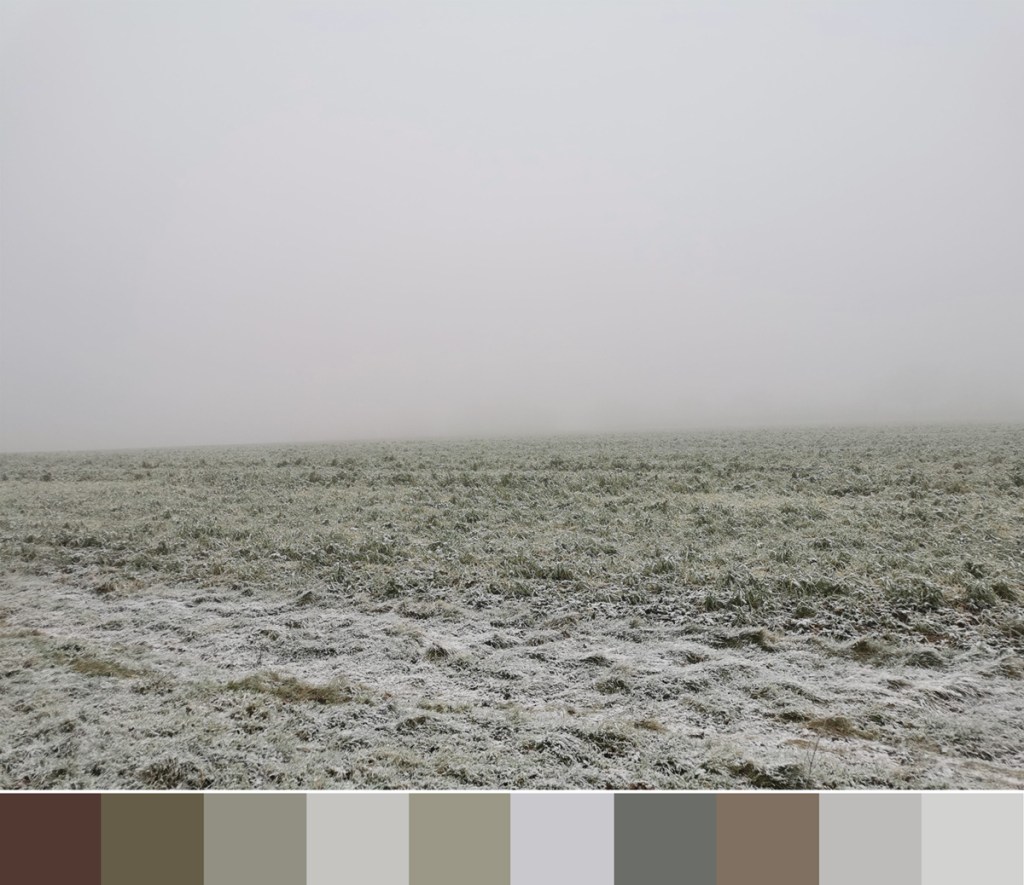
I’ve not had much time for colour mixing with gouache recently but I’ve really enjoyed noticing the contrasts of seasonal colours on our walks so I thought I’d celebrate that here. Some colours are exaggerated by bright sun, while the recent frosty mornings provide a muted coating.
Taking time to notice these small delights are ever more important as we spend few hours outside. I noticed today there was daylight in the sky at 5pm, so that and the first sights of snow drops and daffodils are putting me in the mood for springtime.
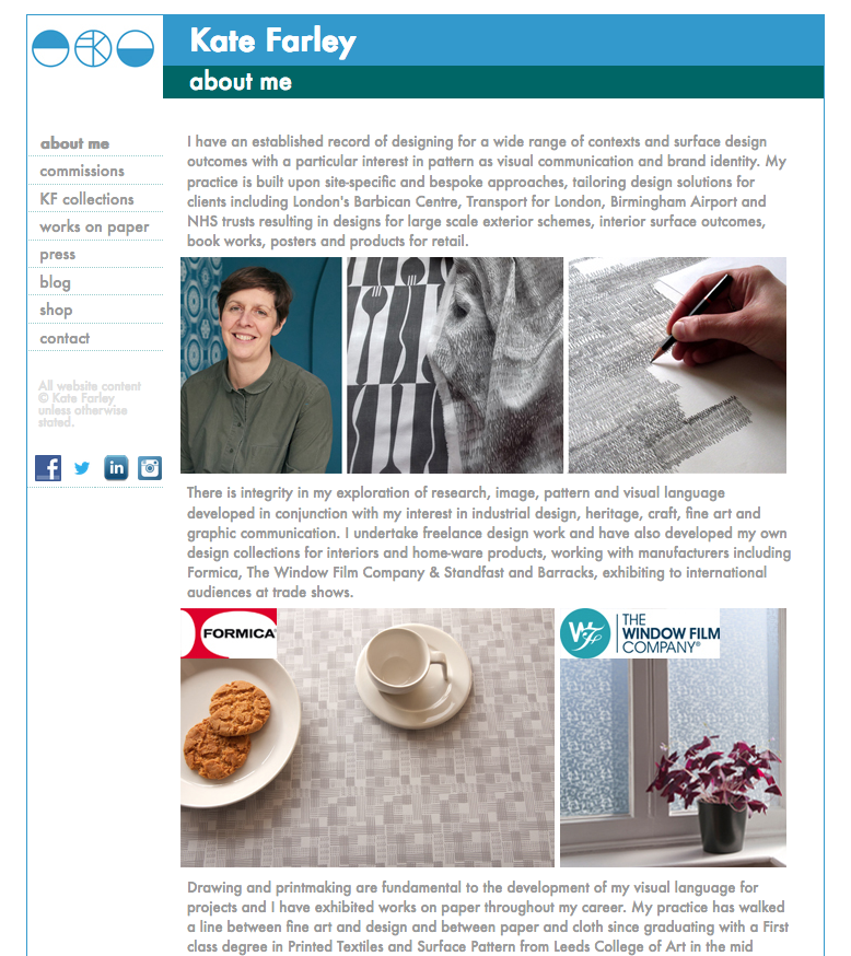
In my line of work CMF is an area of the design / manufacturing industry developing colour, material and finishes in relation to sectors such as automotive design, interiors, products & accessories etc. It involves innovation, design and development of surface and material solutions and is an exciting area of design, including trend research, consumer behaviour, material innovation and sustainability.
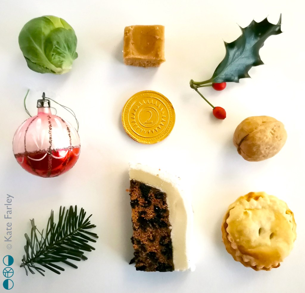
Spending more time sitting in my home celebrating Christmas got me thinking of the specific colours, materials and finishes I relate to Christmas. Home-made fudge, mince pies and Christmas cake, the walnut and chocolate coin in the stockings, obligatory sprout, some holly and fir greenery and a bauble that has been handed down to me, and that has somehow survived decades of Christmases. With the end of the year here, we have another sort of ‘finish’, so I’ve created a CMF board for today – I hope you like it!
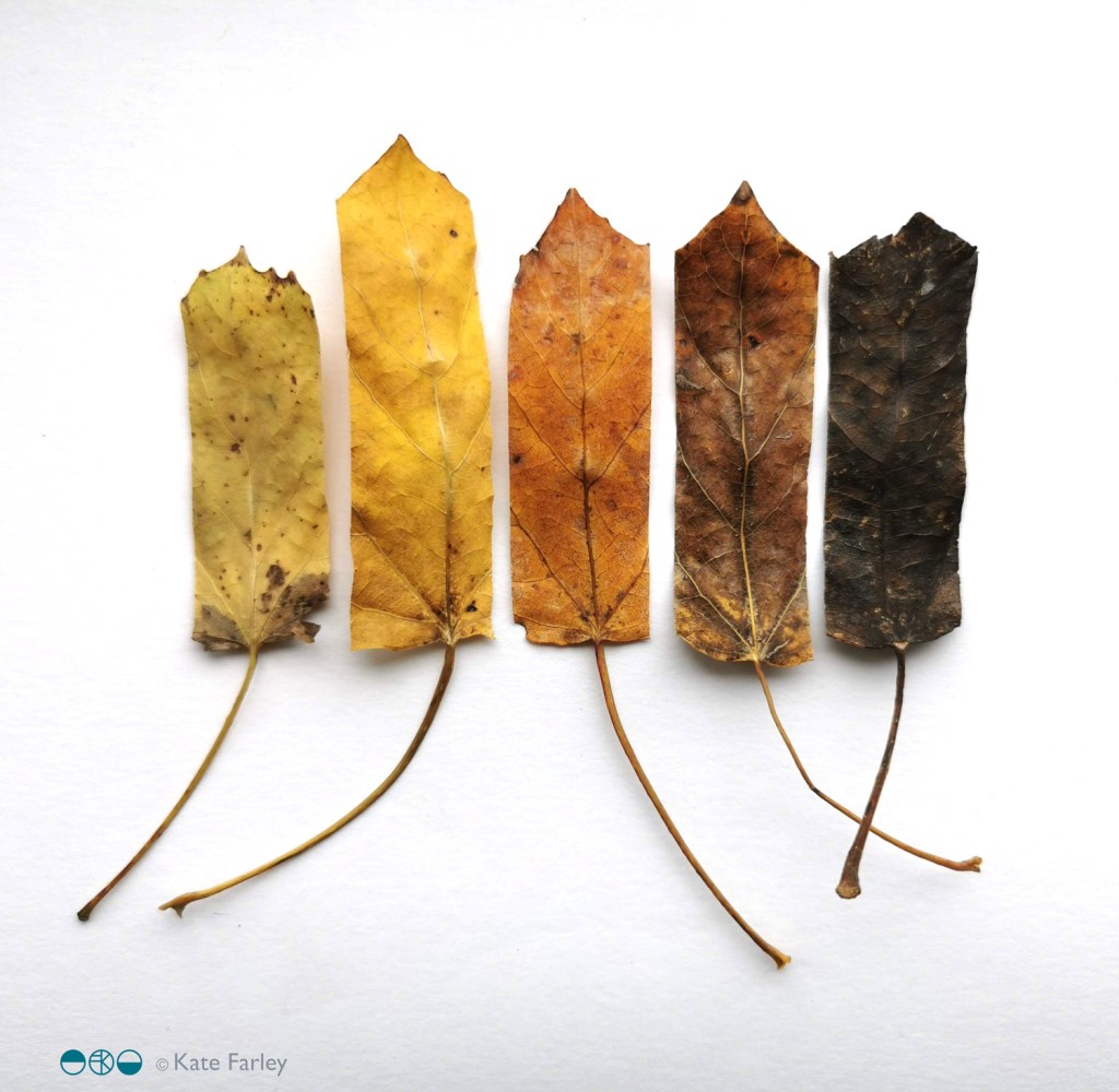
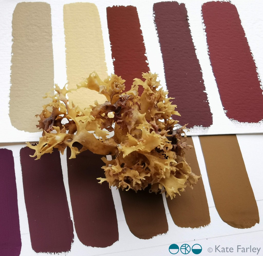
I’m not the biggest fan of Autumn, mainly as I hate to accept the end of summer, but every year the colours of the new season are beautiful so it is difficult to stay disappointed for long. Having spent a week in hospital recently I really missed seeing nature so once out again I noticed a heightened awareness; my senses really enjoyed connecting with the outdoors again.
Wheatfen Nature Reserve, Norfolk
Over the last few months I’ve been paying more attention to colours of nature, gathering plants, feathers, shells etc and mixing the colours using gouache – see previous posts – I find it a wonderfully meditative process and one that brings great results too. The process really makes me look at the colours of the artefact and work out the nuances of hues, tints and shades. I’ve taken some slow recuperative walks in the countryside to rebuild my strength, allowing me to gather colour and appreciate Autumn. The colour chips here were made from the leaves from one tree, arranged in colour order. I wanted the colour to be the main thing to identify rather than them being leaves, so by trimming the edges of the leaves I’ve made them more like swatches.
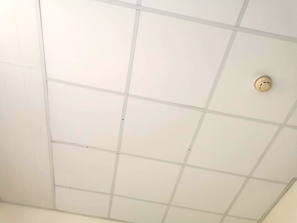
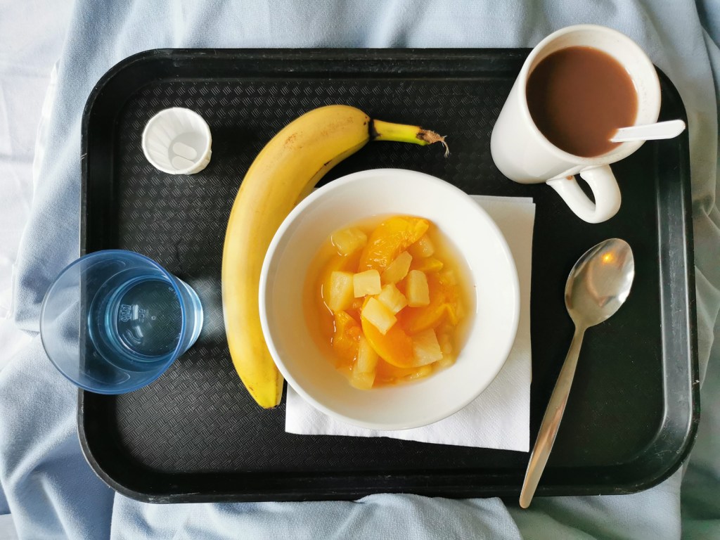
I’ve had an interruption to normal services as a result of some general surgery, added complications and time to heal. I’m not one to sit idle so it’s been a challenge to be patient, giving myself time to recover and gain strength. The time in hospital – a week – was an ordeal despite wonderful ward staff, and it gave me time to think about how important our surrounding environments can be, for our wellbeing and sanity.
I got to know the walls and particularly the ceiling of the room very well. In my hazy mind I toyed with the grid of ceiling panels being a response to the Dutch De Stijl design by Theo van Doesburg, or a drawing by Agnes Martin. The four holes in the ceiling were also a stark reminder of the surgeon’s cuts. The prints on the curtains were so poor I refused to capture them, but they were insipid, uninspiring, and frankly poor design – I remember analysing their weakness with one of the staff late one night – I think she said I was crazy!
I vividly remember the power of the textiles surrounding me – I had a scarf which was a huge comfort to me – a familiar texture and smell of home. The fresh sheet and hospital blanket were also providing a strange comfort in the utilitarian room.
Twenty years ago I attended Arts in Health lectures including discussions on the subject of hospital environments aiding recovery and wellbeing, and I remember seeing incredibly exciting and positive schemes across the world where designers were embracing colour, nature, pattern and material to drive rehabilitation. I had hoped things had moved on from the institutional walls of hospitals. We now have the interior design buzz word biophilia, using nature for our wellbeing as an integral component in the design solutions, linking humans to other life forms, but it has yet to arrive here. The space in which I coped was bland, institutional and bleak. Such a missed opportunity – and particularly when the hospital ‘art’ is so often shoved out front in the public foyer, and not where the patients spend hours on end, day after day – don’t get me started on public art commissions at hospitals!
The relief to be home, surrounded by colour and pattern – and my family – was intense. Those first breaths of fresh air, the sight of a bright autumn day was incredibly uplifting. I still hold a heightened sense of this awareness of nature, even now a week on, as I recover and appreciate my health returning to business as usual.
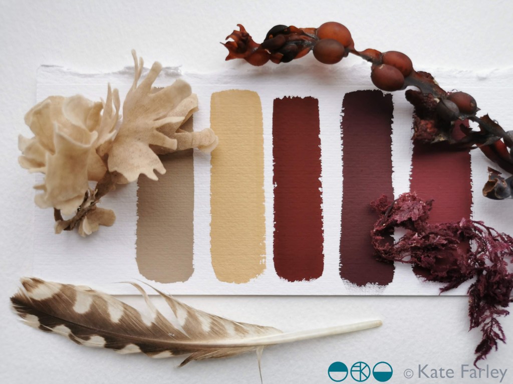
I’ve been continuing my colour mixing series, this time taking inspiration from the beach and the artefacts I gathered. The gouache works wonderfully to capture the colour, responding to small specks of added colour as I take the starting colour on a journey to and past the colours of the item I am studying.
Some new drawings are taking shape that use these colour chips and I am excited about where they are going – one day I’ll share them. In the meantime I hope you enjoy the colour of the beach of north Norfolk.
Back in March I began a new series of colour of works on paper that were simply about mixing and matching colour, evolving hues through the process of painting individual swatches to build the narrative in a sequence, as if a technical exercise at art school. You can read about those pieces here.
I’ve continued to gather pieces from nature on the walks I’ve been on this summer and have continued with the process of mixing colour and so I thought I’d share some here.
I’m doing this simply as I love to make colour, and really enjoy working with the gouache paint for its colour qualities. The process occupies my mind, suggests potential avenues for future work and connects me with nature through the mementoes I make. The seasons change and the colours alter, but the swatches hold memories in the process of mixing, and I can almost smell the dry heat of the corn, and the cool shade of the wood where I found the Jay feather.
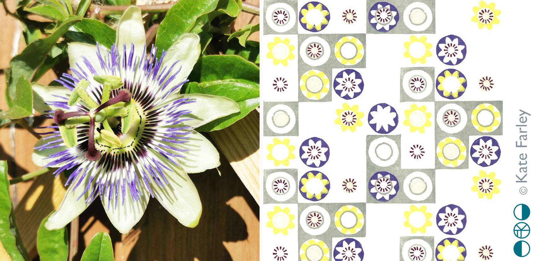
Many years ago my flatmate was given a passion flower plant and when the flowers came we were both in awe of their splendid form; a thing of beauty in our otherwise less than beautiful flat in Camberwell, south London. I made drawings of the flowers and sometime later developed some patterns from it, screen printing it as repeating designs and placement prints. I created the motifs by deconstructing the elements that constitute the flower head.
More years passed and sometime around 2012 I revisited those screen printed patterns, this time interpreting them as lino cuts as part of my Plot to Plate series of editioned lino prints. Last year I planted two passion flower plants in our new garden and last week we had the first bloom. It took me right back to that first flower in the flat in Camberwell, and was reminded of the pattern again.
Whenever I look back at old work I’m likely to want to make changes, and this is the case here too, but each design also holds a moment, defines a time, and sometimes that makes it what it is. I’d not imagined I’d connect that flower to my practice almost twenty years later…
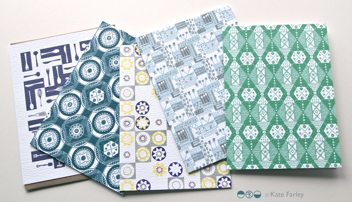
This pattern remains available as a set of patterned Plot to Plate greetings cards.
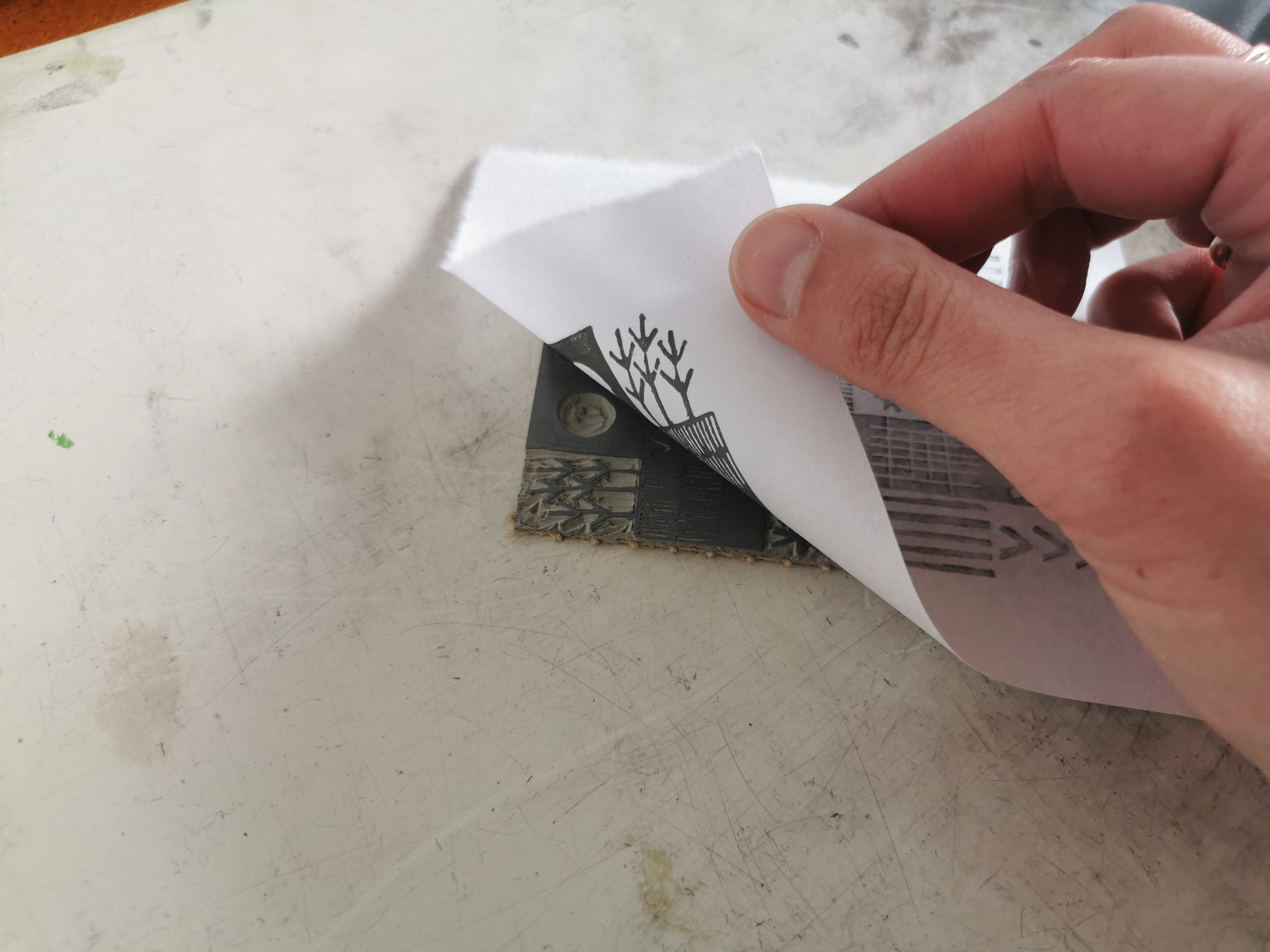
My mind tends to want to be busy and I often develop several ideas in parallel. Pattern making and pattern evolution ideas are shaping up so I went back to the lino block and started to cut – I find it best to make the idea come to life so I can work through the potential and pit falls. Watch this space …
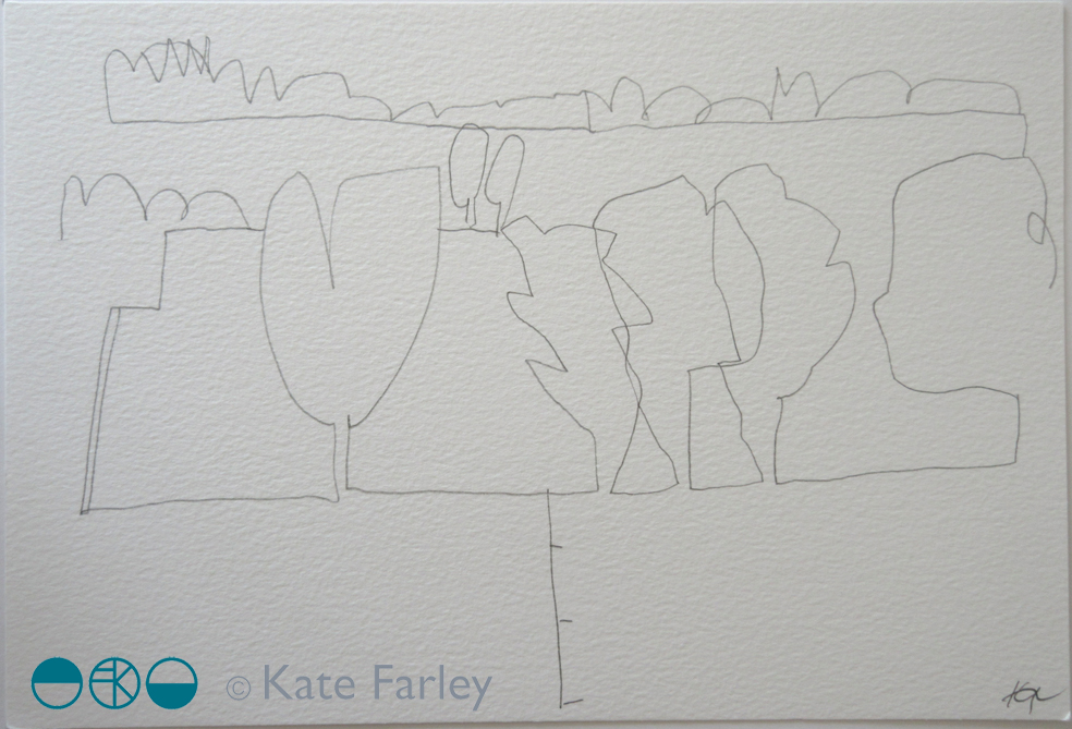
I have made some pencil drawings from my recent trees project (previously featured on the blog) available to buy – there are currently eight still available.
They measure approximately 28 x 19cm, on heavy weight paper, £55 each, with 30% going to Cancer Research UK.
Do take a look over on instagram where they are all listed, & message me if you are interested in reserving one. Feel free to spread the news – I don’t often sell my original drawings ….


 I’ve continued to gather pieces from nature on the walks I’ve been on this summer and have continued with the process of mixing colour and so I thought I’d share some here.