I thought I ought to explain the project…
On Twitter I am exploring my interaction with colour in my everyday life using the Pantone references of colour – the coated and uncoated has become the play on words. Here’s the first few to give you an idea of how things may be going.
 Kate Farley @katefarleyprint
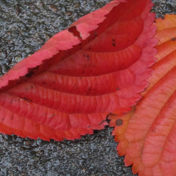
 Seeing red. @pantone Red 032 Coated and with the wet look… again. https://katefarley.wordpress.com/2012/10/02/having-fun-with-colour/ … pic.twitter.com/RLzW1cQ
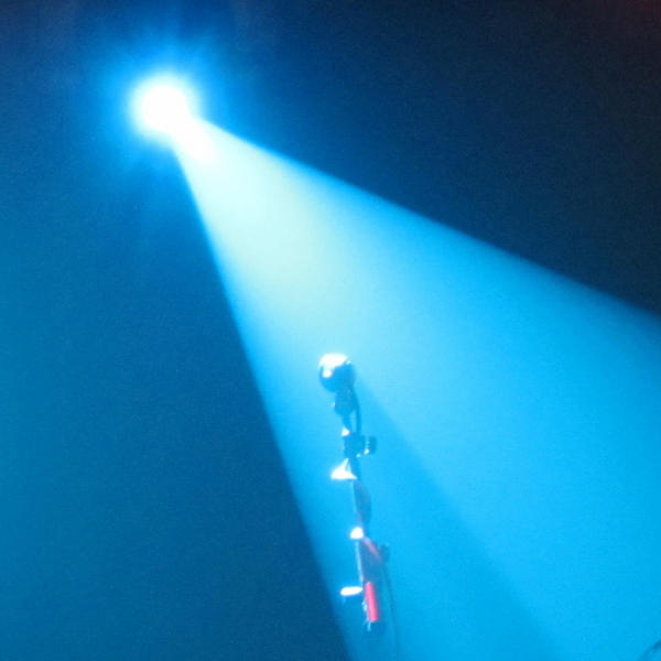
the next colour is @pantone 2985 U – of course uncoated, while we waited for @therealjohncale @hmvinstitute last night. pic.twitter.com/g097anMj
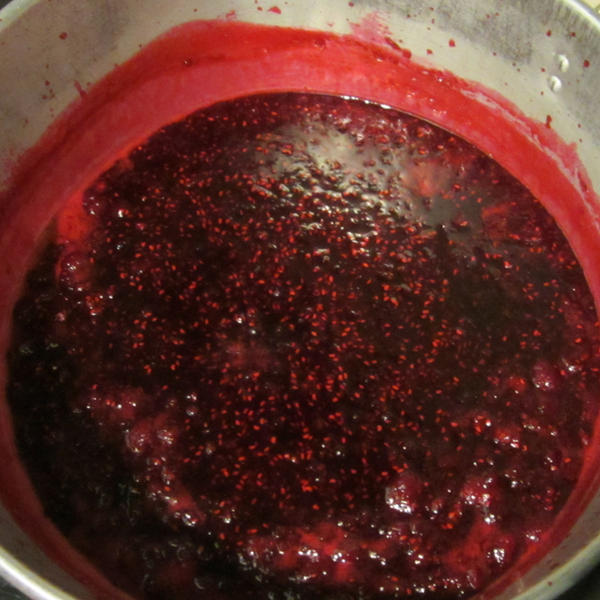
I was uncoated and really should have been wearing the apron! @pantone 200 U – coping with excess raspberry harvest pic.twitter.com/84rE5rSX
Wet! @pantone 427U certainly coated AND with waterproof trousers on. pic.twitter.com/9Rl0ABUj
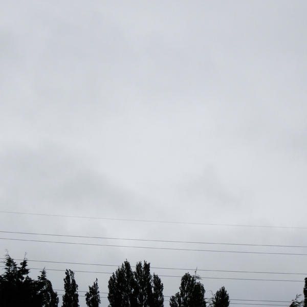
What a Brum blue sky day to be in the office! @pantone 284U – definitely uncoated, and sandals! Hooray for the weekend. pic.twitter.com/HiHUzTQV