I’m currently working on some large scale lino blocks to print floral patterns as part of my continuing pattern research. At the same time I’m also teaching our BA2 group how to create repeating printed patterns, so it’s always nice when there is some parallels between what I’m up to and what the students are doing.
I have been returning to my sketchbook of floral drawings I made from my trip to the Italian Alps, and exploring them again with new paper cutouts as I think about overprinting and block rotation. I’ve not proofed the plate yet, but here’s some work in progress images from the studio.
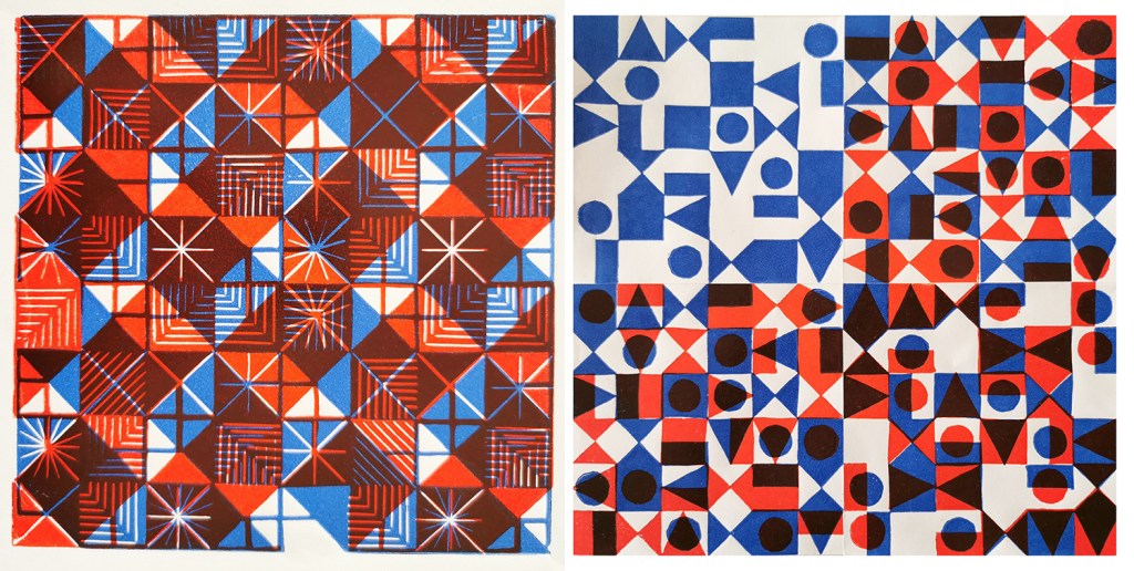
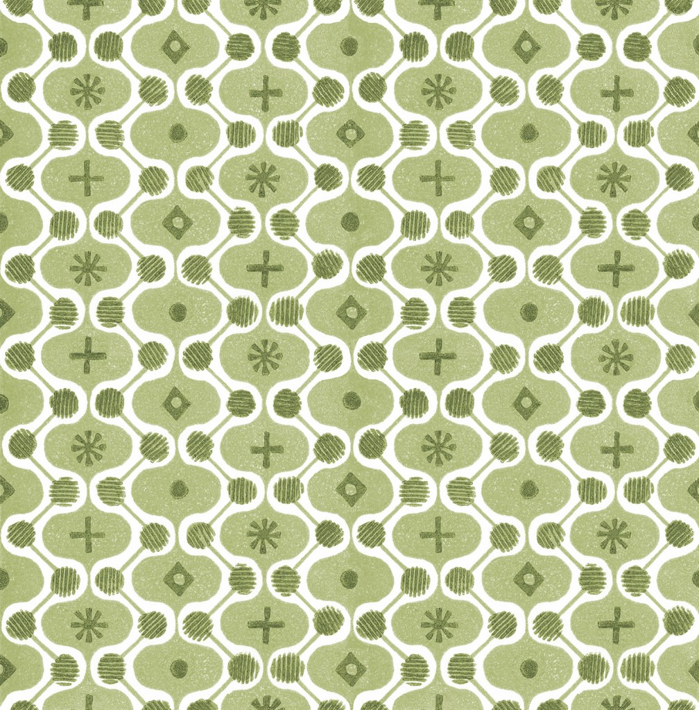
I am really pleased to have had two of my most recent works on paper selected to be included in the Print Cromerexhibition this summer, with the Private View on 19th July. This new body of work has been developed as part of my academic practice at Norwich University of the Arts where I have been exploring pattern structures and repeat blocks. I have explored new pattern iterations by rotating the screens to add additional colours of the same artwork, thereby building greater complexity from limited design information. In an age where digital design and the use of Artificial Intelligence provides limitless opportunities, I want to explore the fundamentals of pattern creation to generate new possibilities that are led by the designer, ensuring the creative path is transparent.
The theme of the exhibition is PLAY, and as a result the palette I created feels full of summer carnivals and fairgrounds. The overprinting of inks with differing levels of transparency provides a building of depth and subtlety of harmonious colour.
I created a number of one, two, three and four-colour prints initially, that featured the screen rotation in adding the colours. I then cut strips of the prints and with further rotation of the strips, interwove them into one base print that had been sliced to enable the slotting. I enjoyed bringing back an element of paper engineering from my book art practice into these new pieces.
In designing each piece, I considered the placement of motifs and relationships of colour. The collection provides variation within a collective identity and belonging. Some pieces feature only triangular motifs, while most incorporate the circular and rectangular elements too. My research utilises design thinking by Lewis Foreman Day, and his distribution of elements. This approach results in scattered focal motifs that work across repeating patterns. Although this is not a feature of my new work, I recognise the placement considerations are also useful in this work too.
A number of these pieces will be for sale during the show.
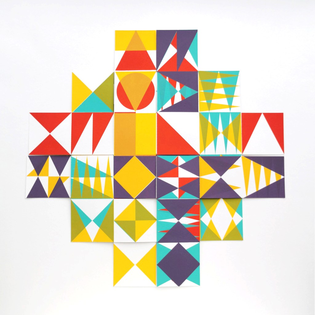
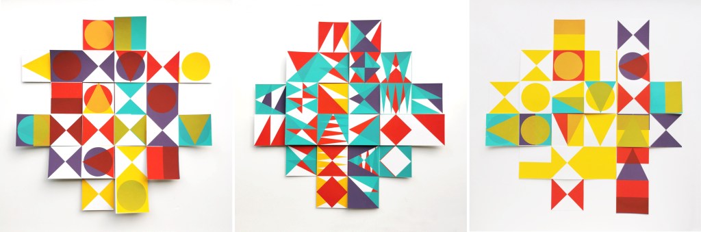
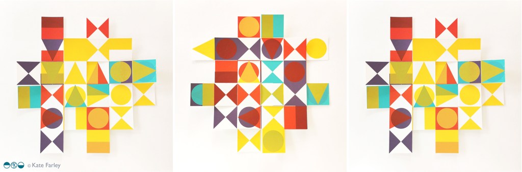
I’ve been enjoying some studio time to explore my print research as works on paper with the hope of exhibiting the work. I enjoy paper engineering and construction (that’ll be the book artist in me!) and have previously tested paper manipulation in relation to this current pattern research. I tend to work in this way, creating drawings or prints to exhibit / sell alongside forming pattern ideas, and it has been useful to see the evolution of the sampling in this way here too.
These new artworks utilise my screens of geometric artwork practically exploring research into motif distribution in printed pattern thinking formalised by Lewis Foreman Day in his book Pattern Design, published in 1901. Having printed the artwork in the first colour, I rotate the screen by 90-degrees and print the second colour, turning the artwork / screen up to four times for maximum complexity. To add a further dimension, I’ve been constructing works on paper that utilise several iterations of the prints to build new compositions by weaving and slotting strips of the printed papers in differing combinations of the four colours in the palette, providing the coherency across the series, and an injection of the spirit of summer fairgrounds through the colour and geometric visual language.
There are two screens of artwork used in this collection, therefore two series of original artwork (PLAY – circles and PLAY – triangles) and I shall continue to evolve the body of work over the coming months. I’d love to know your thoughts on this new work!
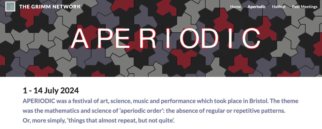
I have been fortunate in having my pattern research selected for inclusion in a really exciting exhibition opportunity in Bristol, led by academic Lucy Ward from University of the West of England.
“APERIODIC brings together artists, scientists, musicians and others in an exhibition about pattern. The show presents work that explores ideas relating to the mathematics and science of ‘aperiodic order’: the absence of regular or repetitive patterns. Or, more simply, ‘things that almost repeat, but not quite’. The exhibition is part of the APERIODIC festival of art, science, music and performance taking place this July in Bristol.” official exhibition text(APERIODIC, 3-14 July 2024 at Kit Form Gallery, Bristol)
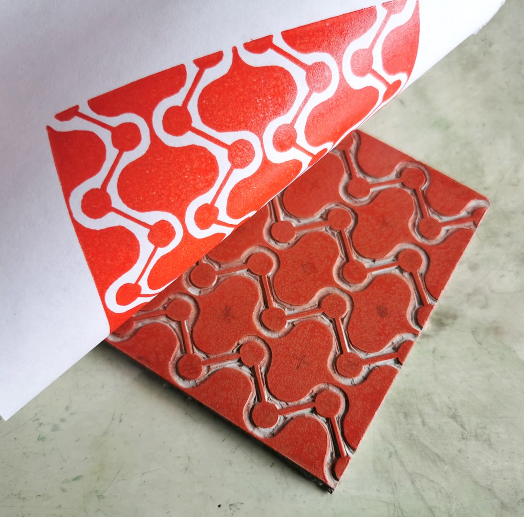
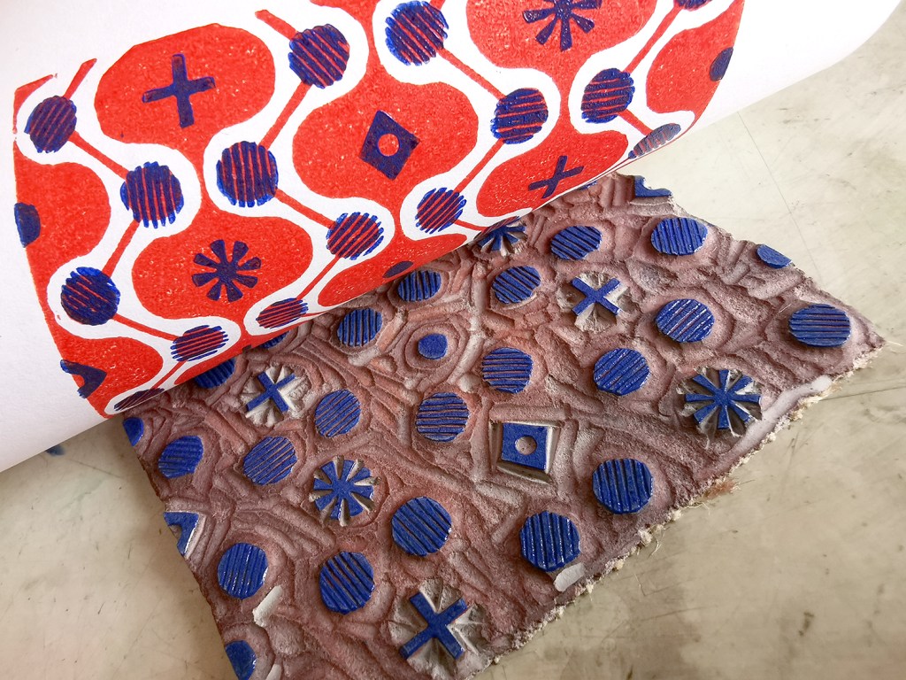
The two pieces I had selected explore block rotation in the over printing of further colour layers, resulting in a building up of a more complex design:
Geo / grid / starLino print
Fields of seemingly reliable compositions of geometric motifs provide the rhythm of assurance through repetition of geometric rhythms but the swapping of small details amongst the motifs unsettles the overall pattern and disrupts the repeating design. The block is rotated before printing of the second colour.
6-spot rotation, multi-direction Lino print
Built upon Lewis F. Days’ principles of distribution of motifs in pattern design (1901), motifs are placed within a tile, 6 x 6 to provide balance and direction when repeated. As the second colour is applied the block has been rotated by 90 degrees in each printing of the tile over the original blue. The repeat is broken and a disorder is established.
One of the highlights of having the work selected for exhibition was the opportunity to have a mathematician review my work aligned to their own interests in pattern. Yotam Smilansky is a Lecturer in Dynamical Systems and Analysis at the University of Manchester, with a special interest in aspects of order and disorder in geometric patterns so I was interested in what they had to say about the work on exhibition.
Yotam Smilansky on Kate Farley, ‘Geo / grid / star’ and ‘6-spot rotation, multi-direction’:
“We notice a certain form, a sense balance, but it might take us a little while before we realise exactly what’s going on. Then we get it: the complicated object before us is made of a single ingredient, copied and superpositioned. It is surprising, even magical, how the unassuming process of layering rotated copies of a single pattern can result in a rich family of objects with a wide range of properties. This is evident, for example, in the moiré patterns of twisted bilayer graphene, where a slight change of angle results in completely different electrical properties, and is beautifully demonstrated in Farley’s mesmerising prints.“
Yotam’s response interested me as I’ve been exploring ways to disrupt and challenge the repeating tiles through transformation and evolution of individual elements within an apparently repeating pattern. I’m certainly keen to continue with this work and am grateful for this opportunity to gain feedback as well as discover the work of other pattern-makers. You can read other reviews of exhibiting artists by mathematicians here.
Thank you Lucy, Yotam and all those supporting the event.
I’ve been keen to get back to designing and printing having spent my practice time writing and developing the book for publication over the last few years. I’ve been testing ideas of pattern evolution and pattern construction for some time in a limited way, specifically looking at pattern structure evolution through drawing investigations, but the ideas at the heart of this investigation have themselves evolved over the last couple of years.
With more time and fresh energy I’ve defined a new project brief and research rationale, and I’m excited to have got off to a good start. I’m looking at repeat tiles and construction of pattern formations, so cut shapes and sketches were an obvious way in for idea development. I’m trying not to be too precious with outcomes at this stage, so I’m trusting the process.
I’ve started by testing ideas with geometric shapes as subject matter to keep the aesthetic clean and graphic, focusing on the laying down of colour blocks. I’ve started by working up some ideas for screen printing but anticipate many more drawings, maybe lino prints and certainly digital work will be created over time too. The colour palette will certainly change, but with an exhibition I’m making work for at the same time dictating pieces to be black and one other colour I’ve gone with black and green.
I don’t want to give too much away at this stage, but look forward to discovering the potential over the next few months.
Drawing has always been an important element of my design practice. It gives me time to refocus, to get away from everything else, to appreciate the beauty in things and keeps my eyes and hand working together in my lifelong investigation of how I look and how I record what I see.
The flowers drawn here were some of the last from the summer borders, consisting of dahlias, sunflowers, hollyhocks and verbena, captured quickly in pen, while I sat by the window, enjoying the warmth of the sun and the shadows that the flowers created while I drew.
A year ago I was recovering from stomach surgery and had some time away from my academic role while I mended. Not one to be idle, when I was well enough to wield a lino cutting tool and had the energy to sit up I set myself some simple design challenges to focus my brain and help myself get better. This became my physiotherapy and creative distraction from what was a really hard period of time.
With pattern design as my go-to healer, I decided to explore formal pattern structures, including the ogee, diaper and check, featuring geometric elements. I created lino cut tiles with a small element of repeat pattern, usually but not always in two colours. The lino blocks were small, enabling me to feel as if I was making progress while able to retain focus in short bursts. The printing was another process that tested my physical strength and stamina!
I thought I’d share this one, the ogee structure – one of my favourite pattern structures – I love the play of the negative and positive S-curved forms. I think it is under-represented in contemporary design…
printing the first colouradding the second colour, blue
I often test prints in different colour combinations, as I have done here, below.
alternative colourway
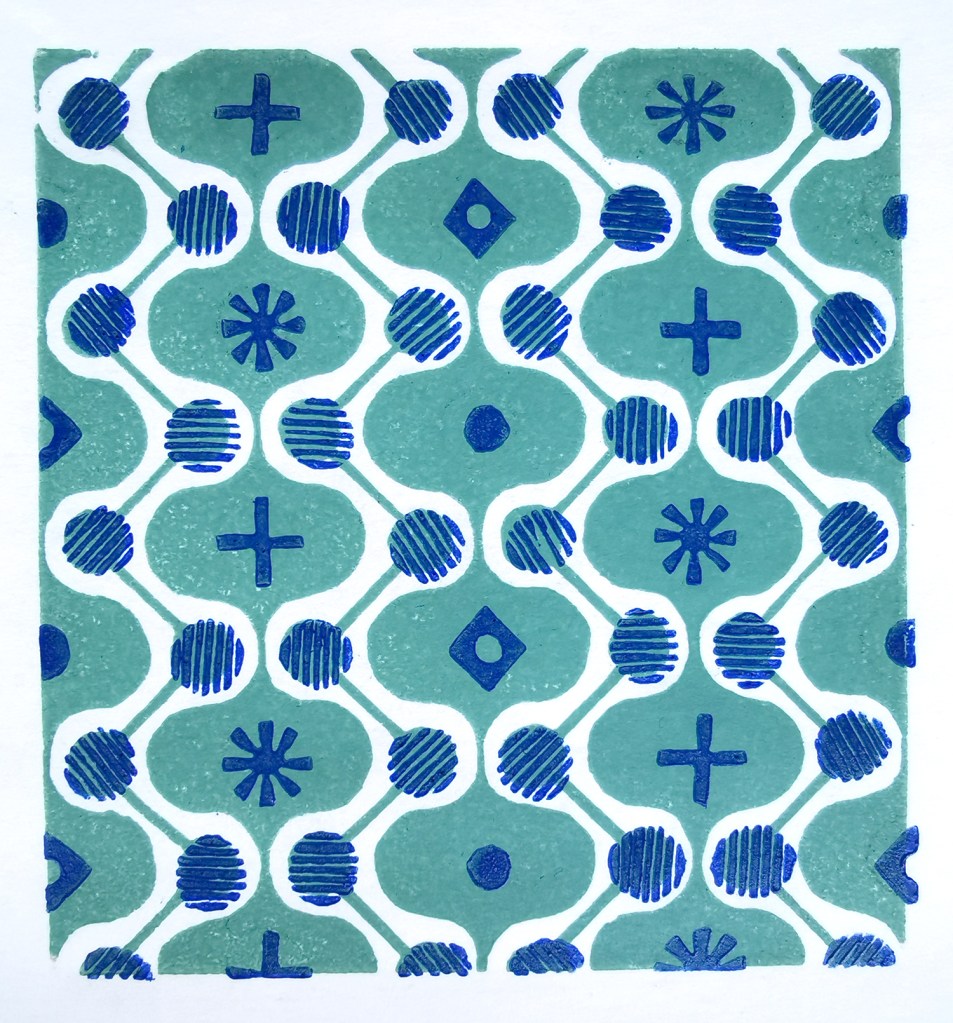
It is a natural desire for a pattern designer to want to test the repeat so you can see a digital outcome below too. I decided to test the two colours as two tones of green for some reason. It has a vague hint of avocado bathrooms of the 1970s now!
digital repeat of the lino printed tile
Unknown to me at that time, I had a further hospital stay and recovery a few months on, and so the collection of patterns grew once more, as my healing and self-prescribed occupational therapy – a career I had once considered!
I’ve had little time to revisit this collection since my recovery but I hope one day soon I will. I’m not sure where this design and its siblings will venture next … any suggestions?
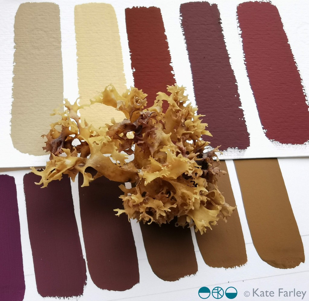
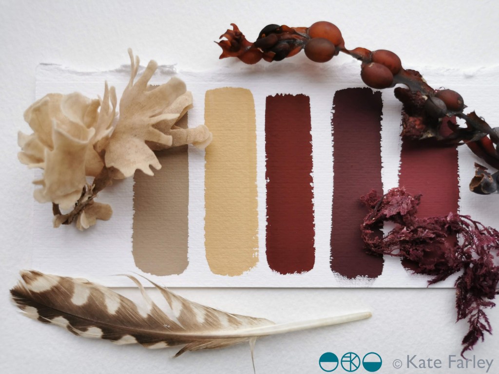
I’ve been continuing my colour mixing series, this time taking inspiration from the beach and the artefacts I gathered. The gouache works wonderfully to capture the colour, responding to small specks of added colour as I take the starting colour on a journey to and past the colours of the item I am studying.
Some new drawings are taking shape that use these colour chips and I am excited about where they are going – one day I’ll share them. In the meantime I hope you enjoy the colour of the beach of north Norfolk.
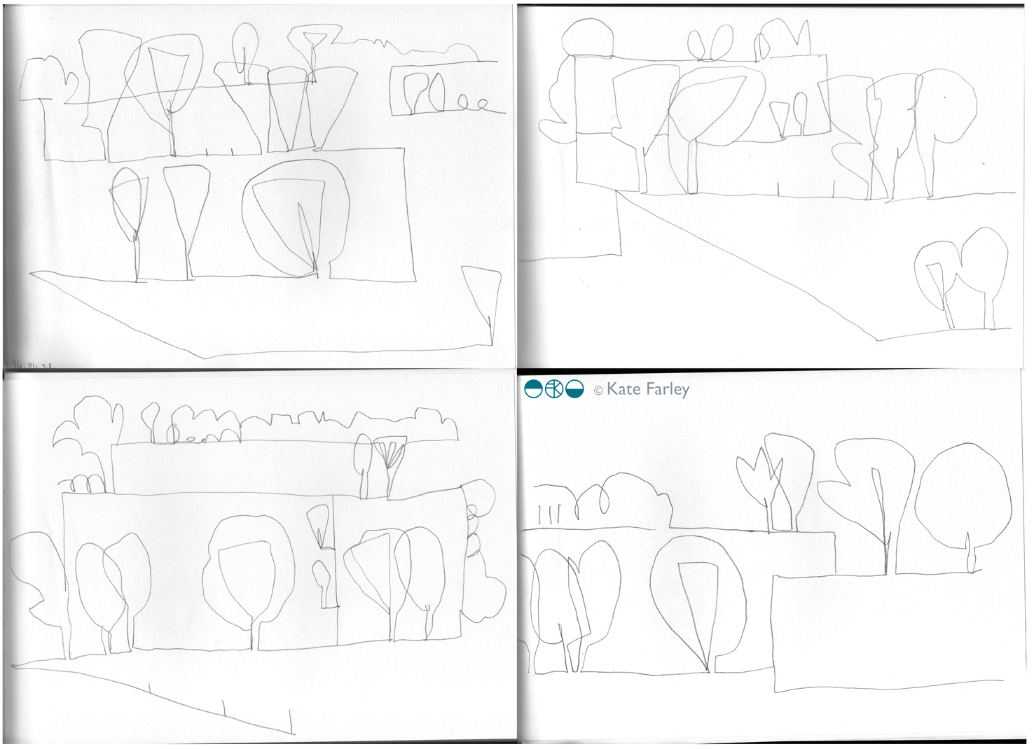
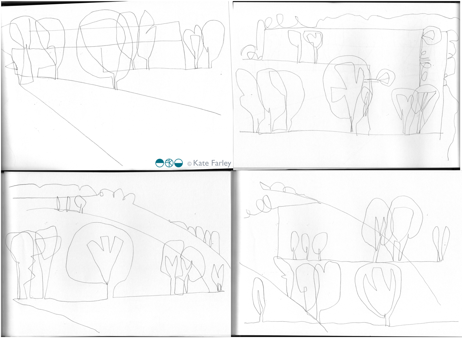
Several weeks ago I started, with no other intention other than to pass the time, making drawings of the trees across the fields I could see as we waited our turn at the farm shop. This was simply about making time for me to clear my head of all the other stuff and pressures of this new routine we find ourselves in. Drawing is such a key part of what makes me tick, whether it’s for rest or work.
Week 2 came so I took my sketchbook and made new drawings that naturally evolved from the first week’s observations. In the second week I also took scissors to capture the shapes as paper cutouts in contrast to the lines I had focussed on in pencil. Each week I’ve made these drawings and over time I’ve noticed the growth of leaves, making it harder to focus on the tree structures, but I’ve also moved the drawing on as a familiarity of my subject is developing. I wrote a blog post on those first weeks here.
I’ve spent the last quarter century drawing landscapes with trees and remember a significant moment as a student of design, when I discovered the water colours by Crome and Cotman in the gallery in Leeds – particularly strange given they were from the Norwich School and I’d left Norwich to study in Yorkshire, but maybe that was the initial pull. I studied the way they divided the landscape with brushed areas of paint and they helped me to see that I too could explore ways to stylise the way I saw the landscape.
The drawings included in this post are all from week 5. I’ve added hints of fields containing the trees and those lines of containment are the edges holding the paths of trees. I’ve used the horizons from both a vertical and horizontal viewpoint and continued to stylise the tree forms throughout the five weeks. It’s getting harder as the trees flesh out their forms and we lost the details of the branches. I’m also suggesting depth of field with the scale of the trees near and far although I’m pulling the composition down to stretch out and extend the foreshortened landscape.
Throughout my career I’ve toyed with ways to map the perspective of landscape and use diagrammatic language, perspective and distorted elevations to represent viewpoints of 3D in 2D. The intention of the arcs was to suggest the sweeping viewpoint but in fact I think it hints at hillsides, and that really isn’t the case here in Norfolk. An undulating landscape maybe, but certainly not rolling hills – still, we can’t get it all right!
I’ve thoroughly enjoyed this drawing exercise so far and look forward to week 6 and what the drawings will discover next time. I’m also, rather naturally I suppose thinking about pattern evolution and how these may become design work. I have lots of ideas to mull over and be excited by … but there’s no rush.
Having posted some of the drawings on instagram over the weeks I’ve received lovely comments and messages from people enjoying the drawings and I’m so grateful for the votes of confidence in what I am doing, I really appreciate that. Many thanks, I hope you continue to enjoy the drawing! ….
I’ve been so pleased to have my Construct pieces in this touring exhibition, positioned alongside such fascinating and varied work of others. It’s interesting to see my own work in new contexts and I wrote about this previously here.
“The installation at Touchstones Rochdale marks the final exhibition in a series of shows displaying work by Rob Anderson, Aimee Bollu, Caroline Broadhead, David Clarke, Nuala Clooney, Rachael Colley, Rosie Deegan, Kate Farley, Daniel Fogarty, Joe Hartley, Kate Haywood, Jasleen Kaur, Julie Mellor, Maria Militsi, Rebecca Ounstead, Matt Rowe, Jonathan Trayte and Abbie Williams.”